Climate Science Glossary

Term Lookup

Enter a term in the search box to find its definition.

Settings

Use the controls in the far right panel to increase or decrease the number of terms automatically displayed (or to completely turn that feature off).

Term Lookup

Settings


All IPCC definitions taken from Climate Change 2007: The Physical Science Basis. Working Group I Contribution to the Fourth Assessment Report of the Intergovernmental Panel on Climate Change, Annex I, Glossary, pp. 941-954. Cambridge University Press.

Home Arguments Software Resources Comments The Consensus Project Translations About Support

Bluesky Facebook LinkedIn Mastodon MeWe

Twitter YouTube RSS Posts RSS Comments Email Subscribe


Climate's changed before
It's the sun
It's not bad
There is no consensus
It's cooling
Models are unreliable
Temp record is unreliable
Animals and plants can adapt
It hasn't warmed since 1998
Antarctica is gaining ice
View All Arguments...


Username
Password
New? Register here
Forgot your password?

Latest Posts

Archives

IEA CO2 Emissions Update 2010 - Bad News

Posted on 3 June 2011 by dana1981, John Abraham

This article has also been published on The Conversation, which publishes articles exclusively from individuals in the university and research sector (primarily from Australia).  We recommend checking it out.  The article has also been quoted and linked at ABC Drum.

The International Energy Agency (IEA) has released unpublished estimates of 2010 global carbon dioxide (CO2) emissions, and the news is not good.  Between 2003 and 2008, emissions had been rising at a rate faster than the IPCC worst case scenario.  However, the global recession slowed the emissions growth considerably, and in fact they actually declined slightly from 29.4 billion tons (gigatons, or Gt) CO2 in 2008, to 29 Gt in 2009.

However, despite the slow global economic recovery, 2010 saw the largest single year increase in global human CO2 emissions from energy (fossil fuels), growing a whopping 1.6 Gt from 2009, to 30.6 Gt (the previous record annual increase was 1.2 Gt from 2003 to 2004).  As illustrated in Figure 1, in 2009 we had dropped into the middle of the IPCC Special Report on Emissions Scenarios (SRES) scenarios, but the 2010 increase has pushed us back up toward the worst case scenarios once again.

EIA vs. IPCC CO2

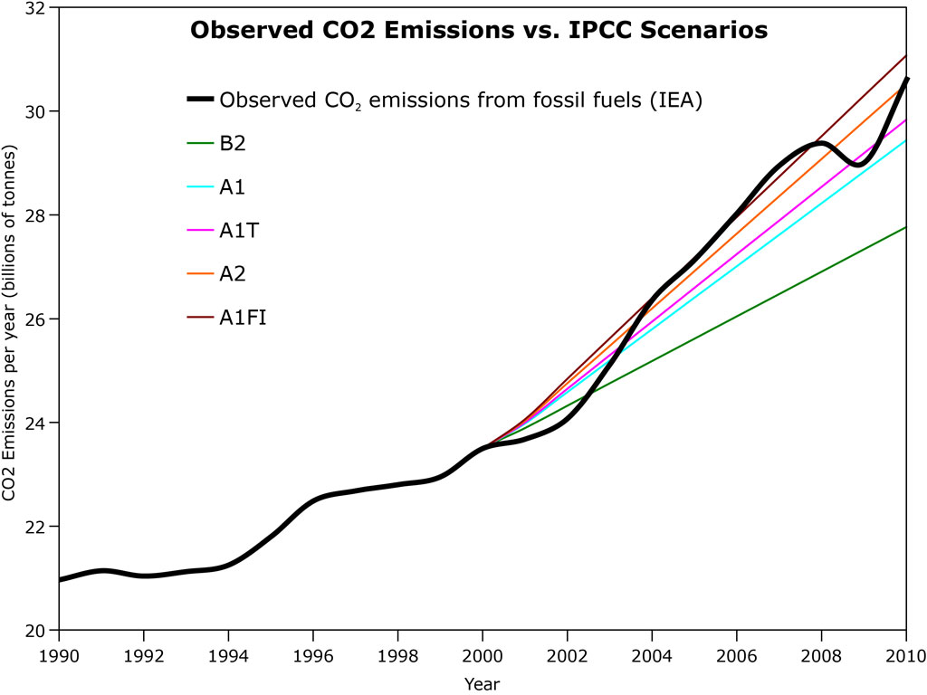
Figure 1: IEA global human CO2 annual emissions from fossil fuels estimates vs. IPCC SRES scenario projections.  The IPCC Scenarios are based on observed CO2 emissions until 2000, at which point the projections take effect.  Also added to the Hi Rez Graphics page.

Currently, in terms of both cumulative and annual emissions, we are on track with Scenario A2, the description of which matches what's happening in the real world fairly accurately thus far:

  • Relatively slow end-use and supply-side energy efficiency improvements (compared to other scenarios).
  • Delayed development of renewable energy.
  • No barriers to the use of nuclear energy.

The major exception being that several countries are transitioning away from nuclear power in the wake of the Japanese Fukushima disaster, which could slow emissions reductions even further.  So, what does continuing on our current path look like?

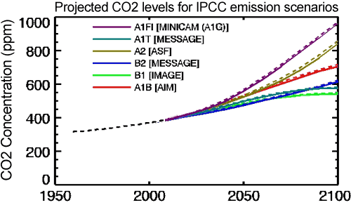
Figure 2: Atmospheric CO2 concentrations as observed at Mauna Loa from 1958 to 2008 (black dashed line) and projected under six IPCC emission scenarios (solid coloured lines) (IPCC Data Distribution Centre)

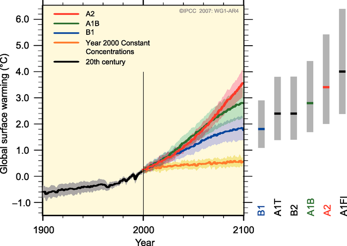
Figure 3: Global surface temperature projections for IPCC Scenarios. Shading denotes the ±1 standard deviation range of individual model annual averages. The orange line is  constant CO2 concentrations at year 2000 values. The grey bars at right indicate the best estimate (solid line within each bar) and the likely range.  (Source: IPCC)

Scenario A2 puts us at 850 ppm atmospheric CO2 in 2100, with an average global surface temperature 3.5°C hotter than in 2000 (more than 4°C above pre-industrial levels).  If we return back up to Scenario A1FI (fossil fuel intensive), which we were exceeding until the global financial crisis, we're looking at 950 ppm CO2 and 4°C global warming over the 21st Century (more than 4.5°C above pre-industrial temperatures in 2100).

Clearly this is very bleak news.  In an interview with The Guardian, IEA Chief Economist Fatih Birol said:

"I am very worried. This is the worst news on emissions...It is becoming extremely challenging to remain below 2 degrees. The prospect is getting bleaker.  That is what the numbers say."

Indeed, limiting global warming to 2°C above pre-industrial temperatures, which is considered the "danger limit" but which may even be too risky, is a challenge to achieve even in the most optimistic IPCC CO2 emissions scenarios.  In fact, the UK Hadley Centre Met Office recently found that just to limit global warming to 3°C, we should have started taking serious action to reduce emissions in 2010 (Figure 4).

Hadley emissions results

Figure 4: Hadley Centre modeled warming by 2100 in various CO2 emissions scenarios (Source)

Right now we're on track with the orange and red arrows in Figure 4.  If we continue with this business-as-usual high emissions path, the consequences could be dire.  Some of the impacts listed in the IPCC report for global warming of 3–4°C above pre-industrial levels include:

  • Hundreds of millions of people exposed to increased water stress
  • 30–40% of species at risk of extinction around the globe
  • About 30% of global coastal wetlands lost
  • Increased damage from floods and storms
  • Widespread coral mortality
  • Terrestrial biosphere tends toward a net carbon source
  • Reduction in cereal productions
  • Increased morbility and mortality from heat waves, floods and droughts

The IEA also found that about 80% of the power stations likely to be in use in 2020 are either already built or under construction, which means we're "locked in" for continued emissions from these power plants, which constitute about one-third of global human CO2 emissions from fossil fuels.  So it's going to be difficult to transition off of these high emissions scenario paths, and we'll have to find wiggle room in other sectors like transportation.

Birol said that this alarming news should serve as a "wake-up call" for international climate negotiations and other emissions reduction efforts:

"This should be a wake-up call. A chance [of staying below 2 degrees] would be if we had a legally binding international agreement or major moves on clean energy technologies, energy efficiency and other technologies."

These findings should serve as an alarm bell to warn us that our window of time to avoid potentially catastrophic consequences from climate change is running out fast.  We need to get on track with the green arrow in Figure 4, which involves immediate and rapid action to reduce global carbon emissions.

0 0

Printable Version  |  Link to this page

Comments

Prev  1  2  

Comments 51 to 61 out of 61:

  1. scaddenp @49, the idea for using charcoal was suggested to me by half remembered history of steel manufacture, with charcoal being used in many early steel making processes, including the first blast furnaces. Obviously what was done before can be done again. As to modern approaches to using charcoal for steel manufacture, I cannot help you, though St Google advises me that the CSIRO is interested in the process.
    0 0
  2. Thanks for the graphic in Figure #1, though I'm having some trouble with the label "Observed CO2 Emissions". Two things. #1 A casual reader might think the picture shows EVERYTHING. For example emissions from increasing wild fires. There's no reason to think emissions from wildfires went down during the recession. Unless I'm just confused (very possible) a revision might be in order. #2 Also, I'd be interested to know if this really is an apples-to-apples comparison. How did IEA generate their data? From the scant bit I read, it sounds like they looked at international energy consumption and projected. If so, their data doesn't show emissions from a number of other sources. But IPCC's scenarios, so I believe, imagine at least some emissions sources beyond energy consumption. Go easy on me, I'm a newbie, and its a lot of material to compare. So the question is... do the lines show the same thing? Or are their some emissions sources in IPCC's lines that are not in the IEA curve in Figure 1? If so, and we added some amount to the IEA curve in accord with the IPCC's scenario definitions, wouldn't that push the IEA curve higher than A1FI? Thanks for comments Mark, USA
    0 0
  3. PS sorry Dana, I just saw the back and forth at comment 44. So the graph was energy combustion only.... ok that's clear. However, I still think a revision is in order for the reason that casual viewers might go away with the impression that OVERALL emissions (including everything) are still within IPCC ranges (which don't include lots of things such as permafrost carbon). If the lines on the figure are energy-combustion lines only, the lay newcomer should be told there is more to the story. I'm not enough of an expert to suggest a specific tweak. Thanks for your work Mark (USA)
    0 0
  4. Mark - I did cover it in the caption to the figure, but your'e right it would be good to include in the figure itself for when it's re-used. We'll look into that.
    0 0
  5. (laughing, sort of) I don't trust the average nonscience member of the public to make the proper inferences even from the caption Dana. Human fossil fuel emissions, yes its there in B&W, but for dissemination of of this awesome figure to a nonscience global public, I think the text even in the caption should explicitly say there are other human sources and there are also indirect feedbacks, and TOTAL emissions are the sum of all three. We gotta educate non science folk, but trusting them to make the proper inferences might take too long. Thanks for your attention.
    0 0
  6. John A small addition might help make this (excellent) post more clear to the reader. When I reread the post this a.m., I noticed this: "Figure 4: Hadley Centre modeled warming by 2100 in various CO2 emissions scenarios (Source) "Right now we're on track with the orange and red arrows in Figure 4. If we continue with this business-as-usual high emissions path, the consequences could be dire. Some of the impacts listed in the IPCC report for global warming of 3–4°C above pre-industrial levels include...." But "orange and red arrows in Fig. 4" lead to + 4-5.2 C and + 5.5-7.1 C warming --- not 3-4 C. It's certainly OK to say "we'll let's just assume we're going to change our ways...and get back down to the "blue arrow" = + 2.9-3.8 C warming. But you should be explicit that you are switching scenarios in that paragraph. Different people might label that your assumption -- that humanity will acts "late and slow" to get back to the "blue arrow" where emissions return to 1990 levels by 2050" -- as either optimistic, reasonable or minimizing (a form of denial). But unless I am missing something here, it is simply confusing. One sentence in the above paragraph, noting why you are "switching scenarios" would take care of it.
    0 0
  7. The burning of high sulfur coal creates sulfate particles which block incoming solar radiation thus limiting temperature increases in the short term. How much sulfate effect is included in the IPCC A2 scenario? To what extent is the current economic downturn flattening the temperature growth curve?
    0 0
  8. Hello, I just registered to ask a question on this article. I am a Ph.D student on atmospheric science but my main area of research is cloud physics ('aerosol indirect effect' which is covered in IPCC WG1 report) and I am not familiar with CO2 emission (instead of concentration) statistics or anything treated in WG3 report. I found this article very interesting (and alerting!) and want to introduce this article at a forum whose main attendances are non-scientists, which is part of volunteering work for environmental movement here in Korea. My question is, why are the numbers for SRES scenarios in the Figure 1 (which is around 20~30 Gton/yr) different from the numbers of Fossil Fuel CO2 provided at the SRES website (http://sres.ciesin.org/htmls/data_list.html), which is lower than 10Gton/yr? There must be some sort of notion difference between them. If it's too much work for you to explain, a nice reference will do. Thank you.
    0 0
  9. dakiller6, the SRES tables you link to show gigatons of carbon ("GtC")... figure 1 above shows gigatons of carbon dioxide. Basically, one set of figures is counting only the mass of the carbon atoms while the other is including the two oxygen atoms as well.
    0 0
  10. dakiller6 - to convert from carbon figures to carbon dioxide, multiply by 3.67.
    0 0
  11. CBDunkerson and Rob Painting - Thank you!
    0 0

Prev  1  2  

You need to be logged in to post a comment. Login via the left margin or if you're new, register here.


The Consensus Project Website

THE ESCALATOR

(free to republish)


© Copyright 2024 John Cook
Home | Translations | About Us | Privacy | Contact Us