


 Arguments


Baked Curry: The BEST Way to Hide the Incline
Posted on 1 November 2011 by dana1981
Sadly, the so-called climate "skeptics" continue to find new ways to spin the Berkeley Earth Surface Temperature (BEST) results. First they came up with bogus excuses why the BEST results are not valid. Then they tried to change the subject, doubling-down on other climate myths. Now Judith Curry - a member of the BEST team no less (though her involvement in the project has been relatively minimal) - has claimed that the BEST team has tried to "hide the decline" in recent temperatures.
"This is “hide the decline” stuff. Our data show the pause, just as the other sets of data do. Muller is hiding the decline."
Curry's comments were in response to a BBC radio interview with the leader of the BEST team, Richard Muller, who said:
"We see no evidence of it [global warming] having slowed down"
So is Muller right that BEST shows no evidence of global warming slowing down, or is Curry correct in accusing her colleagues of hiding the decline in temperatures?
Misguided Curry
Firstly, it's worth noting that the BEST team addressed the myth that global warming stopped in recent years in their FAQ:
"decadal fluctuations are too large to allow us to make decisive conclusions about long term trends based on close examination of periods as short as 13 to 15 years."
In short, Curry's comments are contradicted by actual statistical analysis done by other members of the BEST team. As SkS has discussed at length with Dr. Pielke Sr., over short timeframes on the order of a decade, there is too much noise in the data to draw any definitive conclusions about changes in the long-term trend.
On his blog, tamino does the statistical analysis of the BEST data and finds that because the timeframe in question is so short, the uncertainty is too large to say for certain that the short-term trend in question is any different than the long-term trend. Right off the bat, it's clear that Dr. Muller was correct to say there is no definitive evidence that global warming has slowed down.
Hiding the Incline
The Daily Mail article containing the Curry interview includes a graph of BEST data originating from serial misinformation source GWPF, with a cherrypicked starting point of January 2001, through the final BEST data point in May 2010 (a period shy of a decade). Figure 1 highlights the magnitude of the cherrypick by comparing the full BEST record to the fraction of the record included in the article.
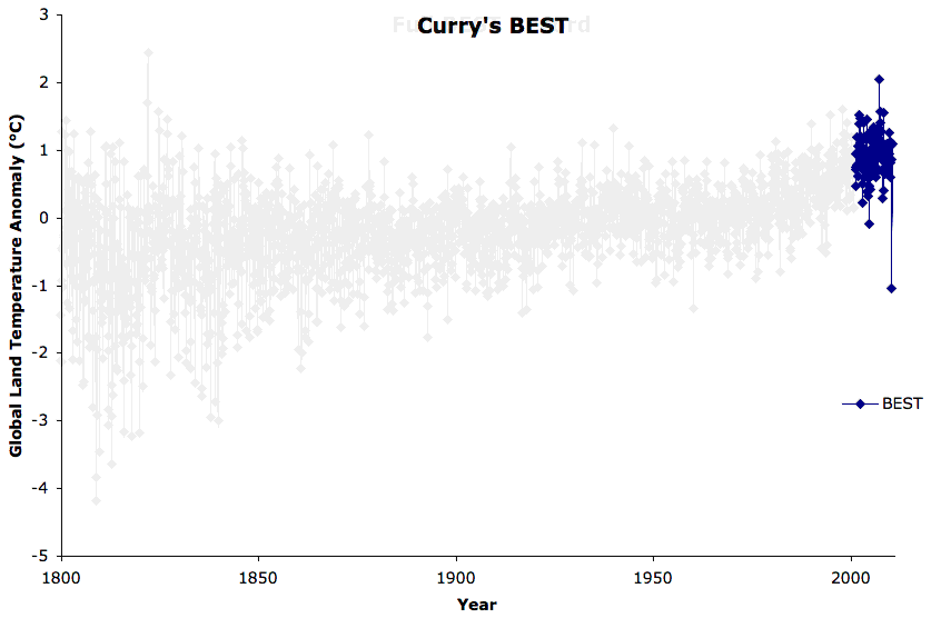
Figure 1: Entire BEST record vs. the data examined in the Judith Curry Daily Mail article
Eagle-eyed readers may notice a problem towards the end of the record, as tamino did: the April 2010 BEST anomaly is -1.04°C, which represents a sharp cooling of 1.9°C from the previous month, and is followed by a 2.1°C warming the following month (Figure 2).
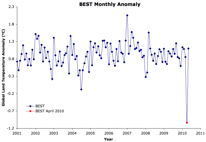
Figure 2: BEST record since January 2001, with the April 2010 anomaly highlighted in red
Was there really such a large temperature drop and rise between March and May 2010? It doesn't show up in any other surface temperature record. When we examine the BEST data, the problem is immediately apparent. The uncertainty levels in April and May 2010 are 2.8°C and 2.9°C, respectively. Going back to January 2001, the next-largest uncertainty level is 0.21°C, and the average uncertainty is less than 0.1°C. Tamino plots the monthly data hockey stick-like uncertainties (Figure 3).
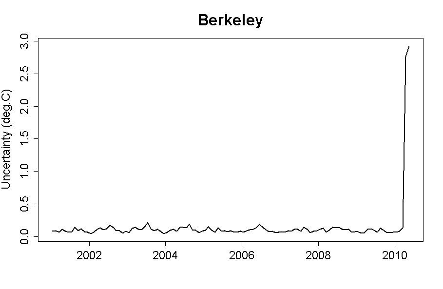
Figure 3: BEST monthly uncertainties since 2001, with a huge spike in April and May 2010
So what happened with the April and May 2010 data? While the March 2010 anomaly was based on 14,488 stations, April and May were based on only 47 stations, all in the Antarctic (h/t Nick Stokes). In other words, April and May 2010 should be excluded from BEST data analysis because they are incomplete, their uncertainties are just too large, and April 2010 is quite obviously an anomalous outlier. Frankly they should not have been published in their current state.
Figure 4 shows how the short-term trend changes when we exclude those two unreliable data points.
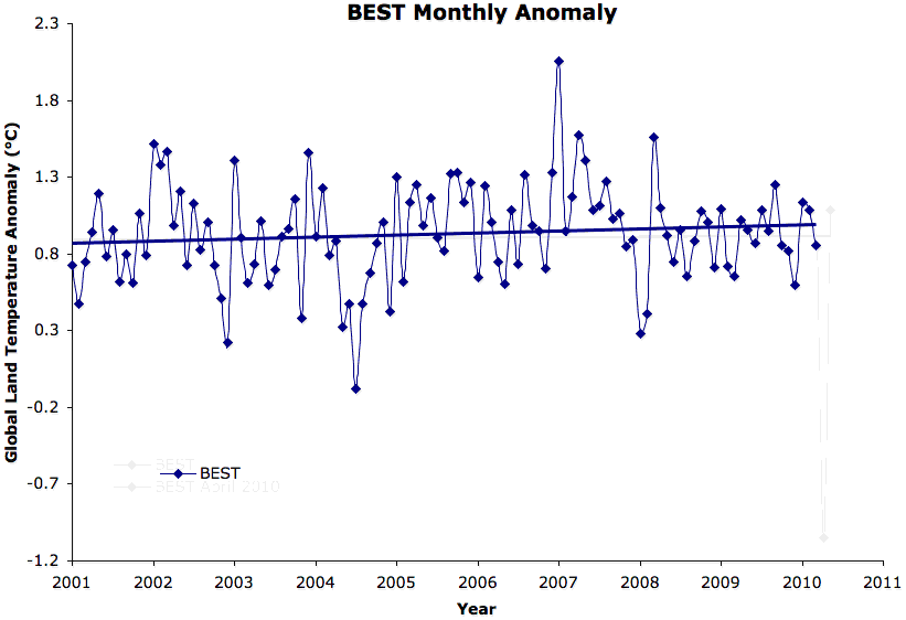
Figure 4: BEST data and linear trend since January 2001 including and excluding April and May 2010
The BEST linear trend increases from 0.03°C per decade when including the faulty data points, to 0.14°C per decade when they are excluded. It's also important to remember that according to NOAA, which is the dataset most similar to BEST, 2010 was the second-hottest year on record over land (behind 2007), and the hottest globally (effectively tied with 2005). Ironically, the analysis the "skeptics" are using to argue that global warming has stopped ends in a record hot year for global surface temperatures.
In short, the problem is not that Muller is hiding the decline, the problem is that Curry is hiding the incline.
Enough Cherrypicking Already
As we have recently discussed, although we can't say for certain statistically, it's likely that the global surface temperature warming trend has slowed over the past decade, because virtually all short-term temperature impacts have been in the cooling direction over that timeframe. Climate "skeptics" desperately want us to believe that the trend has slowed because global warming has magically disappeared, but that's simply not the case. In fact, as Santer et al. (2011) showed,
"Because of the pronounced effect of interannual noise on decadal trends, a multi-model ensemble of anthropogenically-forced simulations displays many 10-year periods with little warming. A single decade of observational TLT data is therefore inadequate for identifying a slowly evolving anthropogenic warming signal. Our results show that temperature records of at least 17 years in length are required for identifying human effects on global-mean tropospheric temperature."
Although the Santer et al. analysis applied to the temperature of the lower atmosphere, the same argument applies to surface temperatures. Figure 5 shows the BEST trend from March 1993 to March 2010 (the most recent 17-year period available in the data, excluding the two final unreliable points).
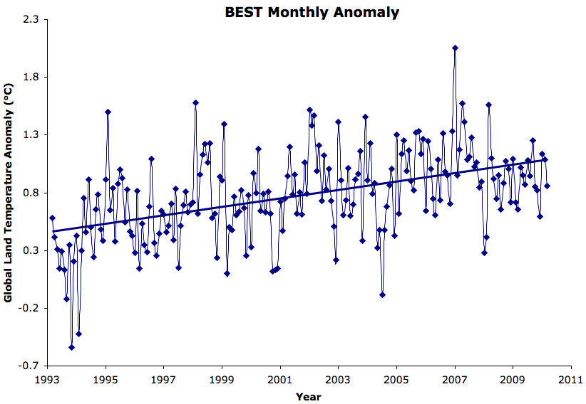
Figure 5: BEST most recent 17 years of data with linear trend
Over the most recent 17-year period, the BEST trend is 0.36°C per decade*, clearly showing the anthropogenic warming trend over that period.
Examining the causes of decadal variability is both interesting as useful, but exploiting decadal variability to try and incorrectly argue that global warming has magically stopped is neither. And of course those who argue that global warming has magically stopped conveniently ignore the continued increase in ocean heat content (Figure 6).
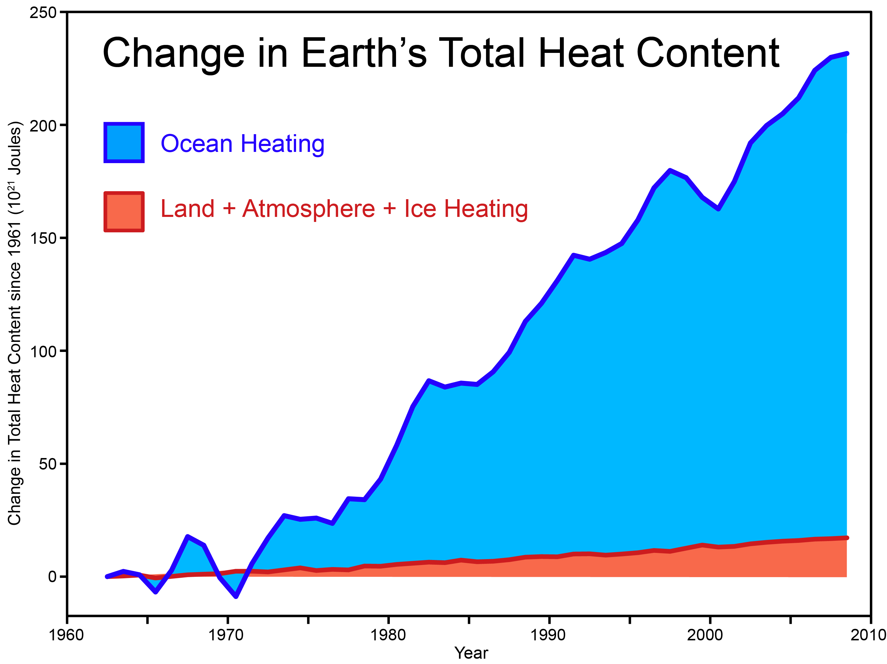
Figure 6: Total Global Heat Content from Church et al. 2011
Note that Curry has agreed that tamino's analysis (replicated in this post) is correct and useful, but
"my statement to Rose was about the plot with the 10 year running mean ending in 2006 being misleading. It is misleading."
As it so happens, most of the BEST graphs include 12-month running means (i.e. see their research papers). Moreover, how plotting a 10-year running mean is automatically "misleading" is a mystery (unexplained by Curry), and Curry's accusations of deception remain unsupported, unwarranted, and unwise.
Accusing other scientists (especially one's colleagues) of deceit for doing proper statistical analysis is simply unconscionable, and why Curry would accuse others of "hiding the decline" while herself hiding the incline is a mystery. On her blog, Curry complains that the article misrepresented her to some degree (while standing behind some of her worst comments, and acknowledging that the quotes attributed to her in the article are correct), but frankly when dealing with fake skeptics like those at The Daily Mail, most of us know that misrepresentation is the norm.
We conclude by offering Dr. Curry the same advice we recently offered Dr. Pielke: DNFTD (Do Not Feed The Delayers). In short, if an interviewer tries to "tease out" from you a quote about "hiding the decline," or some other denialist myth, don't let them.
===================
* There is probably a small contribution to this trend from the 1991 Mount Pinatubo eruption. The 15-year trend is 0.30°C per decade, 16-year is 0.28°C per decade, and 18-year is 0.41°C per decade.


 0
0  0
0


Comments