Climate Science Glossary

Term Lookup

Enter a term in the search box to find its definition.

Settings

Use the controls in the far right panel to increase or decrease the number of terms automatically displayed (or to completely turn that feature off).

Term Lookup

Settings


All IPCC definitions taken from Climate Change 2007: The Physical Science Basis. Working Group I Contribution to the Fourth Assessment Report of the Intergovernmental Panel on Climate Change, Annex I, Glossary, pp. 941-954. Cambridge University Press.

Home Arguments Software Resources Comments The Consensus Project Translations About Support

Twitter Facebook YouTube Mastodon MeWe

RSS Posts RSS Comments Email Subscribe


Climate's changed before
It's the sun
It's not bad
There is no consensus
It's cooling
Models are unreliable
Temp record is unreliable
Animals and plants can adapt
It hasn't warmed since 1998
Antarctica is gaining ice
View All Arguments...


Username
Password
New? Register here
Forgot your password?

Latest Posts

Archives

Climate Emergency: Time to Slam on the Brakes

Posted on 8 March 2011 by James Wight

Global warming is an increasingly urgent problem. The urgency isn’t obvious because a large amount of warming is being delayed. But some of the latest research says if we want to keep the Earth’s climate within the range humans have experienced, we must leave nearly all the remaining fossil fuels in the ground. If we do not act now we could push the climate beyond tipping points, where the situation spirals out of our control. How do we know this? And what should we do about it? Read on.

James Hansen, NASA’s top climatologist and one of the first to warn greenhouse warming had been detected, set out to define dangerous human interference with climate. In 2008, his team came to the startling conclusion that the current level of atmospheric carbon dioxide (CO2) is already in the danger zone.

Since the Industrial Revolution, atmospheric CO2 has increased from 280 to 390 parts per million (ppm). Don’t be fooled by the small number – 390 ppm is higher than CO2 has been in millions of years. CO2 is rising by 2 ppm per year as we continue to burn fossil fuels. To stabilise the Earth’s climate, we must reduce CO2 to the relatively safe level of 350 ppm. And we must hurry, because the task will soon be an impossible one.

The 350 target is based not on climate modeling, but on past climate change (“paleoclimate”). Hansen looked at the highly accurate ice core record of the last few hundred thousand years, sediment core data going back 65 million years, and the changes currently unfolding. He discovered that, in the long term, climate is twice as sensitive in the real world as it is in the models used by the IPCC.

The key question in climate modeling is how much global warming you get from doubling CO2, once all climate feedbacks are taken into account. A feedback is something that amplifies or cancels out the initial effect (eg. interest is a feedback on a loan). The models include “fast feedbacks” like water vapor, clouds, and sea ice, but exclude longer-term “slow feedbacks” like melting ice sheets (an icy surface reflects more heat than a dark surface).

Both models and paleoclimate studies agree the warming after fast feedbacks is around 3°C per doubling of CO2. Slow feedbacks have received far less attention. Paleoclimate is the only available tool to estimate them. To cut a long story short, Hansen found the slow ice sheet feedback doubles the warming predicted by climate models (ie. 6°C per CO2 doubling).

Long-Term Climate Sensitivity

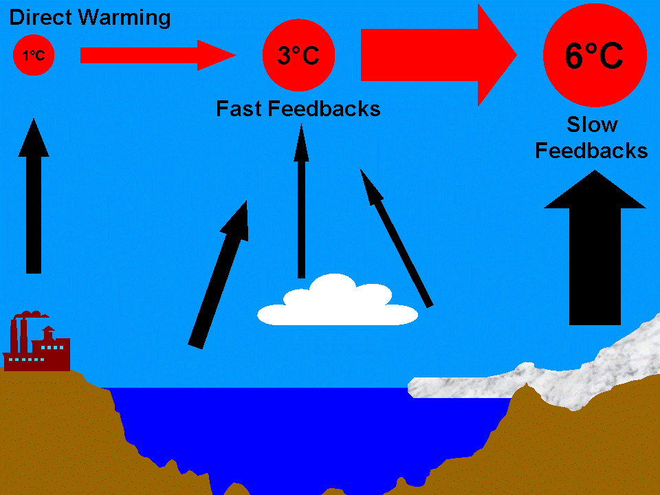
The global climate has warmed only 0.7°C, but has not yet fully responded to our past emissions. We know this because the Earth is still gaining more heat than it is losing. There is further warming in the pipeline, and Hansen’s results imply there’s a lot more than in the models. If CO2 remains at 390 ppm long enough for the ice sheet feedback to kick in, the delayed warming would eventually reach 2°C. That would result in an Earth unlike the one on which humans evolved and a sea level rise of not one metre, not two metres, but 25 metres. Imagine waves crashing over an eight-storey building.

It’s hard to dispute this would be “dangerous” climate change. But how quickly could it happen? In the past, ice sheets took millennia to respond, though once they got moving sea level rose several metres per century. But maybe ice sheets can melt faster if CO2 rises faster, as it is now doing. The IPCC predicted they would grow by 2100, but instead they are starting to shrink “100 years ahead of schedule”. Once an ice sheet begins to collapse there is no way to stop it sliding into the ocean. We would suffer centuries of encroaching shorelines. The climate change we started would proceed out of our control.

If ice sheets can melt significantly this century, then Hansen’s long-term warming has near-term policy implications. The tragedy we have set in motion can still be prevented, if we get the Earth to stop accumulating heat before slow feedbacks can kick in. To do so we must target the greatest, fastest-growing, and longest-lived climate driver: CO2.

Under business as usual, we are heading for up to 1,000 ppm by 2100, or nearly two doublings (and that’s not including possible carbon feedbacks). This would surely be an unimaginable catastrophe on any timescale. Even the mitigation scenarios governments are quarreling over are based on IPCC assessments now several years out of date. The lowest CO2 target being considered is 450 ppm, which Hansen concluded would eventually melt all ice on the planet, raising sea level by 75 metres. The Earth has not been ice-free since around the time our distant ancestors split off from monkeys.

Instead of stepping on or easing off the accelerator, we need to be slamming on the brakes. We must not only slow the rise of CO2 in the atmosphere, but reverse it. We must reduce CO2 from 390 to 350 ppm as soon as possible. That should stop the planet’s accumulation of heat. Stabilizing the CO2 level will require rapidly reducing CO2 emissions until nature can absorb carbon faster than we emit it – in practical terms, cutting emissions to near zero.

The only realistic way of getting back to 350 ppm is leaving most of the remaining fossil fuels in the ground. We must:

1) phase out coal by 2030. It is not enough to slow down coal-burning by converting it to liquid fuels, because CO2 stays in the atmosphere for a very long time. The fundamental problem is with the coal being burned at all.

2) not burn tar sands or oil shale. Their reserves are virtually untapped but thought to contain even more carbon than coal. Canada cannot keep burning them.

3) not burn the last drops of oil and gas if their reserves are on the high side. If it turns out we have already used about half, then we can safely burn the rest.

4) turn deforestation into reforestation. We’d still be left with the gargantuan task of removing CO2 from the atmosphere. Nature can absorb some carbon, but it has limits.

CO2 Emissions and Atmospheric Concentration with Coal Phaseout by 2030

It won’t be easy, but with these actions CO2 could peak around 400 ppm as early as 2025 and return to 350 ppm by century’s end. I believe we can achieve this; it’s primarily a question of political will. But our window of opportunity is rapidly slamming shut. Even one more decade of business as usual, and CO2 can be expected to remain in the danger zone for a very long time.

I should point out estimating a CO2 target from paleoclimate is fraught with uncertainties. I’ve had to simplify for this short article. I explain in more detail on Skeptical Science, or you can read Hansen’s paper free here. If there is one lesson recent climate research should teach us, it is that it’s a mistake to call uncertainty our friend. Arguably the most important aspect Hansen ignores, carbon feedbacks, is likely to make things even worse. There is more than enough reason to heed Hansen’s warning.

Right now we stand at an intersection. What we do in this decade is crucial. If we choose one path, by the end of the decade the world could be well on its way to phasing out coal. If we choose the other, we face an uncertain future in which the only certainty is a continually shifting climate. I’ll leave the final word to Hansen et al, whose concluding statements were pretty strongly worded coming from a dense, technical, peer-reviewed paper:

Present policies, with continued construction of coal-fired power plants without CO2 capture, suggest that decision-makers do not appreciate the gravity of the situation. We must begin to move now toward the era beyond fossil fuels. […] The most difficult task, phase-out over the next 20-25 years of coal use that does not capture CO2, is Herculean, yet feasible when compared with the efforts that went into World War II. The stakes, for all life on the planet, surpass those of any previous crisis. The greatest danger is continued ignorance and denial, which could make tragic consequences unavoidable.

Editor's Note: Many thanks to James who wrote this blog post which is also the Basic Rebuttal to the argument "It's not urgent" (if you ever encounter this argument, just point people to http://sks.to/urgent ). James originally wrote a much longer blog post but I asked him to shorten it (the longer version now acts as the Advanced Rebuttal). So he patiently rewrote a much shorter version which I asked to shorten again (that version now acts as the Intermediate Rebuttal). In this final version, James informed me, "I cannae shorten it no more, captain!"

0 0

Printable Version  |  Link to this page

Comments

Prev  1  2  3  

Comments 101 to 111 out of 111:

  1. Albatross @99 the paper I refer to is Hansen (2006) which is not too old. Your diagram @63 from realclimate appears to be quite impressive; however the temperature data does not look quite so impressive when used in context with AR4. Figure 1: IPCC Scenarios A1B, A2 & B1 Compared with Measured HadCRUT3 Temperature Data (after AR4, 2007) Figure 1 is based on IPCC AR4 Figure TS.26 on to which I have plotted the latest HadCRUT3 data. The black dots in the original diagram appear to be HadCRUT3 data but they are slightly misaligned with actual HadCRUT3 data (my blue dots). Therefore, I offset the HadCRUT3 data by adding 0.018°C to achieve a reasonable fit with the individual data points shown in AR4. The blue line with white dots is the smoothed HadCRUT3 data. It is evident from Figure 1 that the smoothed HadCRUT3 curve give an excellent fit with observed data presented as the solid black line in AR4. It is also evident that the observed temperature trends are significantly below the "likely" warming/emission scenarios presented in AR4. Indeed, the current trend is similar to the emissions-held-at-year-2000-level scenario. I would appear that Mother Nature is putting the brakes on for us.
    0 0
  2. Angus @101, Aaah, the goal posts shift :) First, forgive me, but I am not going to take your posted Figure at face value. Given the choice between a practicing climate scientist and you, I choose Dr. Schmidt. Also, I note with interest that you are using HadCRUT-- but "skeptics" claim that the CRU folks fudged the data, despite what the numerous investigations found. And we know very well why HadCRUT has become the darling of "skeptics", despite those allegations-- it is because it runs cooler than NCDC and GISTEMP. Now I expect you to now claim why the GISTEMP cannot be trusted et cetera, but that would just amount to you dismissing the truth again. "I would appear that Mother Nature is putting the brakes on for us." As much as I would like for that to happen, Hansen et al's recent peer-reviewed paper published in Rev. Geophys. disagrees with your opinion. Specifically, referring to their Fig 21. (see hyperlink, used 5 and 11-yr running means to negate impacts of ENSO and the solar cycle) they conclude that: "On the contrary, we conclude that there has been no reduction in the global warming trend of 0.15°C–0.20°C per decade that began in the late 1970s" [Source NASA GISTEMP] So feel free to believe whatever you want the data to show you Angus, it does not change the reality or the science. Again, if asked to choose between your opinion and the hard facts and data presented by prominent climate scientists, I choose the scientists. I'll close with this graph from SkepticalScience which shows the primary global air temperature records--onwards and upwards: Some advice Angus, the next time you take your car in for a service and the technician informs you that your break pads urgently need replacing or your breaks need servicing, I do hope for the safety of you and your family that you listen. Now they could be wrong, it could be a conspiracy, but in all likelihood s/he is right and is looking out for you and your family.
    0 0
  3. Albatross @101, there does not seem to be much in your post that actually refers to my post @100. Your post seems to consist of quoting typical "skeptic" arguments and then disagreeing with them. Nevertheless, I respond as follows in attempt to clear up any misunderstanding with the data that was actually posted by me. Re "Aaah, the goal posts shift," I am not aware that the goal posts were shifted. In angusmac @100, I presented data from AR4 because both you and the Moderator were of the opinion that I was off topic in @66. Re, "I am not going to take your posted Figure at face value. Given the choice between a practicing climate scientist and you, I choose Dr. Schmidt." You don't need to take Figure 1 at face value. Just look at Figure TS.26 from AR4 here, then move, copy or eyeball the 2005 data to 2010. It is permissible to move the data because they are "indistinguishable" (Hansen, 2011). Voila! You have my Figure 1. Please note that the 2000-2011 temperature data follows the zero-emissions scenario and all done by "prominent climate scientists." Re Hansen (2010), "the global warming trend of 0.15°C-0.20°C per decade that began in the late 1970s." You have missed my point completely. If you re-read my posts @66 and @100, you will see that (on topic) I compare emissions scenarios with current and future temperatures based on Hansen (2006) and AR4. These studies show that their emissions scenarios diverge at 2000 but more importantly so do actual temperatures. The emissions continue to increase whilst temperatures follow the zero-emissions scenarios. Therefore Albatross, it would be useful (and I suggest on topic), if you amended the 1880-2010 temperature diagrams presented by you to compare them with emissions scenarios from the modern period, instead of just posting the temperature diagrams as stand-alone. AR4 uses 1985-2025 for its emissions/temperature comparison. It would be interesting to see your comparison for this period. In summary, I have presented data from two studies by prominent climate scientists, (Hansen, 2006) and AR4. These studies, when updated with current temperature data, show that actual temperatures are tracking their zero-emissions scenarios not their moderate/high emissions-scenarios. Hence my statement that, "I[t] would appear that Mother Nature is putting the brakes on for us" is corroborated by these studies because Mother Nature is not following the moderate/high emissions-scenarios. Nevertheless, I would urge caution in jumping to conclusions too soon; Hansen (2006) suggests that we could expect reasonable results for distinction between his scenarios and useful comparison with the real world by 2015.
    0 0
  4. Angus @103, It seems that you sincerely think that you are onto something here-- unfortunately, you are not. I do not have time right now to address this today (family comes first), but I'll do my best to reply on Monday. PS: "Eyeballing" graphs as you suggest is incredibly dangerous and not at all scientific.
    0 0
  5. Angus @103, Actually, your posts on this thread are very typical of those used by "skeptics", and I have directly taken issue with the content of your posts without having to make generalizations. The goal posts shifted because you went from my presentation of the RC graph to your own version of the IPCC graph-- so I was referring to you avoiding specifically discussing the RC graph, which is in fact impressive. I'll deal with how you misrepresented that graph in my follow-up post. You seem to be very fond of Hansen et al. (2006). Rather ironic and odd that you are trying to use/invoke that paper in your argument that there is no reason to apply the breaks, when the following is what the authors conclude in their abstract: "Global surface temperature has increased ~0.2°C per decade in the past 30 years, similar to the warming rate predicted in the 1980s in initial global climate model simulations with transient greenhouse gas changes" Also, "Comparison of measured sea surface temperatures in the Western Pacific with paleoclimate data suggests that this critical ocean region, and probably the planet as a whole, is approximately as warm now as at the Holocene maximum and within ~1°C of the maximum temperature of the past million years. We conclude that global warming of more than ~1°C, relative to 2000, will constitute ‘‘dangerous’’ climate change as judged from likely effects on sea level and extermination of species." Nothing in that paper supports your opinion that there is no reason for concern or your assertion that nature is "applying the brakes" for us, quite the opposite in fact. And one could argue that paper is from 2006, but as I showed above, Hansen et al. (2010) came to the same conclusion regarding the continuation of global warming. So I'm afraid it is you who is missing the point Angus, and I'm confident that observers following this would agree with me on that.
    0 0
  6. Angus @101, I have reproduced the RC graphic below for convenience: You claim @101 that: "Your diagram @63 from realclimate appears to be quite impressive; however the temperature data does not look quite so impressive when used in context with AR4." This is patently false, and you should know it. The RealClimate (RC) figure is impressive and does compare the GISTEMP global surface-air temperature anomaly (and those from other centres) with the IPCC mean (and spread) derived using the expected GHG levels for scenario A1B (see here). Now, as readers will see from looking at the aforementioned IPCC figure for scenario A1B, that it is in fact the most aggressive GHG emission scenarios until around circa 2020, after which A1F1 and A2 become the most aggressive scenarios. First, contrary to your claim, the RC validation is made in the context of AR4. Second, RC are using the most aggressive GHG scenario, probably because CO2 levels are tracking at the upper bound of the predicted levels. So RC are using the appropriate scenario from AR4-- at least for now. And third, the observed global temperatures is tracking very close to the IPCC ensemble mean and is thus well within the 95% confidence interval for temperatures predicted for the most aggressive IPCC emissions scenario, A1B. "These studies show that their emissions scenarios diverge at 2000 but more importantly so do actual temperatures. The emissions continue to increase whilst temperatures follow the zero-emissions scenarios." This is also a grossly misleading statement. As is clearly visible form your graphic @101, the predicted rate of warming of global temperatures (based on different scenarios) only really start to diverge from the zero emissions scenario after 2010. Additionally, the RC graph shows that the global temperatures are very closely following the IPCC ensemble mean predicted for the most aggressive GHG emission scenario (A1B)-- there are no signs of divergence as you falsely claim (and besides even if there were, temporary/transient slowdowns and even cooling periods have occurred multiple times in the last 40 years while the long-term trend has been distinctly up). The real test is going to be in the years following 2010, and here I am not talking individual years, but the long-term trend. Your wording is also interesting here, because it suggests that "zero emissions" equates to "no warming", when in fact as the data show and as I keep reminding you, the long-term warming continues; additionally, the no emissions scenario only shows a marked decrease in predicted warming after 2010, with very slow warming continuing out to 2100 (see here). You are seeing what you want to see Angus, not reality, and worse yet, you are distorting (and thereby potentially misleading others) to affirm your belief that there is not a problem.
    0 0
    Moderator Response: [DB] Fixed comment references.
  7. Albatross I will respond to @106 but it may take some time because I am trying to source data on your RC chart. However, I hazard a guess that the rest of SkS are total bored with our dialogue. Wake up SkS! It can’t be that boring – we all may learn somthing. If you are still following this please give us some encouragement. Meanwhile Albatross, I request that you desist from giving me personal advice – especially when it is patently wrong. For example @102, if I needed to replace my brake pads on my car, I would accept the advice of a service station technician as you suggest. However, if I needed someone to “break pads” on the car, I would go to a wrecker’s yard.
    0 0
  8. Albatross @106 you state that it, "is patently false" that my statement that the RC temperature data does not look, "quite so impressive when compared with the AR4." I disagree and I show the RC chart here for easy comparison with the AR4 chart and Fig 1@101. The main differences between the RC chart and the AR4 and Fig 1 charts are as follows:
    1. The emissions scenarios and their corresponding temperature outcomes are clearly shown in the AR4 chart. Scenarios A2, A1B and B1 are included in the AR4 chart. None of these scenarios are shown in the RC chart.
    2. Real world temperature is tracking the commitment emissions scenario, i.e., emissions-held-at-year-2000 level in the AR4 and Fig 1 charts. There is no commitment scenario in the RC chart to allow this comparison.
    3. AR4 states that the emission scenarios diverge after 2000. The AR4 chart shows that the temperatures derived from these scenarios diverge after 2002 and not 2010 as stated by you @106. The divergence between real world temperatures and the A1B emissions scenario is approximately 0.07°C for 2005 and 0.11°C for 2010.
    4. The RC chart shows real world temperatures compared with predictions from models that are an "ensemble of opportunity". Consequently, Gavin Schmidt @ RC states, "Thus while they do span a large range of possible situations, the average of these simulations is not 'truth'." [My emphasis].
    5. The temperatures in the AR4 chart are approximately 0.25°C higher than those in the RC chart. This may be due to the AR4 charts being baselined to 1961-1990 and not 1980-1999 as stated in RC.
    In summary, I have compared real world temperature data with the particular emissions scenarios chosen by the relevant peer-reviewed authors. Contrarily, you have cited a chart which compares real world temperature data with average model data which the author states does not represent "truth." I hope that the above answers your "patently false" and "gross misrepresentation" accusations against me.
    0 0
  9. What we need to do, in order to have a chance of retaining something like the climate that modern human civilisation developed in, is to rapidly remove *all* the fossil carbon we've put into the climate system in the last 250 years. That means we need to capture some 340 billion tons of carbon and sequester it in a form in which it will be stable for thousands of years. Studies show that there has been no significant net change in carbon held in surface reservoirs (oceans, soil, atmosphere, biomass etc.) for about the last million years, and very little over the last 2 million years. This means that it will not be sufficient to just reduce or eliminate anthropogenic fossil fuel CO2 emissions, because the carbon we have released into the climate system will not be removed by geological processes on any timescale that we can imagine. Total carbon will remain at elevated levels for millions of years unless we actively remove what we are responsible for, or until slow geological processes change the balance such that there is a net reduction in carbon in surface reservoirs. Consequently, the effects of the additional carbon, including ocean acidification and an enhanced greenhouse effect, will also persist for millions of years, unless we actively reverse that by sequestering the carbon. This is why Hansen is right to say that there is now no chance of any impending ice age, as there would have been in 10,000 or 20,000 years' time in the absence of industrial civilisation.
    0 0
  10. Icarus, your timeframes seem to be at odds with the studies by Matthews and Weaver 2010 and with Hare and Meinshausen 2006, both discussed last year at RealClimate
    0 0
  11. Long after we've slammed on the brakes, the jaws of life will be applied by quarrying and simple milling, or more sophisticated processing, of olivine and serpentine rock. Just one example from Scholar There are plenty of others. We've exaggerated and accelerated the geological processes which gradually release carbon from its locations in soil and rock strata. If we're serious about reducing CO2 in the atmosphere and oceans, we'll have to do something about speeding up the other side of the geological balancing act. Biochar, growing trees and no/low till agriculture merely redress a little of our disturbance of the daily, seasonal, biological carbon cycle of the planet's surface. To really get at the fossil material side of things, we'll have to dig up stuff to imitate the geological cycles we've interfered with by digging up (and incinerating) other stuff. Probably we'll still detour around the full-scale ice age we're due for, but we'll be back on track sooner rather than later.
    0 0

Prev  1  2  3  

You need to be logged in to post a comment. Login via the left margin or if you're new, register here.


The Consensus Project Website

THE ESCALATOR

(free to republish)


© Copyright 2024 John Cook
Home | Translations | About Us | Privacy | Contact Us