Climate Science Glossary

Term Lookup

Enter a term in the search box to find its definition.

Settings

Use the controls in the far right panel to increase or decrease the number of terms automatically displayed (or to completely turn that feature off).

Term Lookup

Settings


All IPCC definitions taken from Climate Change 2007: The Physical Science Basis. Working Group I Contribution to the Fourth Assessment Report of the Intergovernmental Panel on Climate Change, Annex I, Glossary, pp. 941-954. Cambridge University Press.

Home Arguments Software Resources Comments The Consensus Project Translations About Support

Twitter Facebook YouTube Mastodon MeWe

RSS Posts RSS Comments Email Subscribe


Climate's changed before
It's the sun
It's not bad
There is no consensus
It's cooling
Models are unreliable
Temp record is unreliable
Animals and plants can adapt
It hasn't warmed since 1998
Antarctica is gaining ice
View All Arguments...


Username
Password
New? Register here
Forgot your password?

Latest Posts

Archives

A peer-reviewed response to McLean's El Nino paper

Posted on 18 March 2010 by John Cook

A paper published mid-2009 claimed a link between global warming and the El Nino Southern Oscillation (ENSO) (McLean et al 2009). According to one of its authors, Bob Carter, the paper found that the "close relationship between ENSO and global temperature, as described in the paper, leaves little room for any warming driven by human carbon dioxide emissions". This result is in strong contrast with two decades of peer-reviewed research which find ENSO has little influence on long-term trends. Why the discrepancy? A response has now been accepted for publication in the Journal of Geophysical Research (Foster et al 2010) explaining why McLean 2009 differs from the body of peer-reviewed research.

First, let's examine how McLean et al arrived at their conclusion. They compared both weather balloon (RATPAC) and satellite (UAH) measurements of tropospheric temperature to El Niño activity (SOI). To remove short-term noise, they plotted a 12 month running average of Global Tropospheric Temperature Anomaly (GTTA, the light grey line) and the Southern Oscillation Index (SOI, the black line).


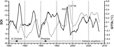
Figure 1: Twelve-month running means of SOI (dark line) and MSU GTTA (light line) for the period 1980 to 2006 with major periods of volcanic activity indicated (McLean 2009).

The Southern Oscillation Index shows no long term trend while the temperature record shows a long-term warming trend. Consequently, McLean et al found only a weak correlation between temperature and SOI. Next, they applied another filter to the data by subtracting the 12 month running average from the same average 1 year later. The comparison between the filtered data for El Nino and Temperature are as follows:


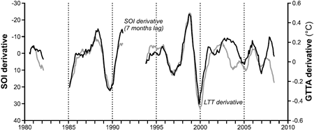
Figure 2: Derivatives of SOI (dark line) and MSU GTTA (light line) for the period 1981–2007 after removing periods of volcanic influence (McLean 2009).

From this close correlation, McLean et al argued that more than two thirds of interseasonal and long-term variability in temperature changes can be explained by the Southern Oscillation Index. This result contradicts virtually every other study into the connection between ENSO and temperature variability, particularly with regard to long-term warming trends. Past analyses have found ENSO was responsible for 15 to 30% of interseasonal variability but little of the global warming trend over the past half century (Jones 1989, Wigley 2000, Santer 2001, Trenberth 2002, Thompson 2008). Why does McLean come to a different result? This question is examined in Comment on "Influence of the Southern Oscillation on tropospheric temperature" by J. D. McLean, C. R. de Freitas, and R. M. Carter (Foster et al 2010).

Foster et al examine the filtering process that McLean et al applied to the temperature and ENSO data. This filtering has two steps - they take 12-month moving averages then take the differences between those values which are 12 months apart. The first step filters the high-frequency variation from the time series while the second step filters low-frequency variation. The problem with the latter step is it removes any long-term trends from the original temperature data. The long-term warming trend in the temperature record is where the disagreement between temperature and ENSO is greatest.

Why do McLean et al remove the long-term trend? They justify it by noting a lack of correlation between SOI and GTTA, speculating that the derivative filter might remove noise caused by volcanoes or wind. However, taking the derivative of a time series does not remove, or even reduce, short-term noise. It has the opposite effect, amplifying the noise while removing longer-term changes.

To further illustrate how the filtering process increases the correlation between SOI and temperature, the authors construct an artificial "temperature" time series as -0.02 times the SOI time series. They then add white noise and a linear trend. This has the effect of creating a temperature time series with a long term warming trend. The correlation between the raw artificial temperature series and the SOI series is very low (R2 = 0.0161). However, when the McLean et al filters are applied to both time series, the correlation is now very high (R2 = 0.8295). This is because the filtering removes low frequency elements such as the long term warming trend.

Artificial temperature time series vs Southern Oscillation Index - filtered and unfiltered
Figure 3: (a) Southern Oscillation Index (SOI) data (black) versus artificial data proportional to the SOI, and with normally-distributed white noise and a sinusoidal signal added (red). (b): Filtered versions (using the McLean et al procedure) of the series in (a).

Despite the extreme distorting effect of their filter, McLean et al consistently refer to the correlations as between SOI and tropospheric temperature. They draw no attention to the fact that the correlations are between heavily filtered time series. This failure causes what is essentially a mistaken result to be misinterpreted as a direct relationship between important climate variables.

Another interesting feature of McLean et al 2009 is a plot of unfiltered temperature data (GTTA) against the Southern Oscillation Index (SOI) to illustrate the quality of the match between them. However the temperature signal is a splice of weather balloon data (RATPAC-A) to the end of 1979 followed by satellite data (UAH TLT) since 1980. RATPAC-A data show a pronounced warming trend from 1960 to 2008 with the temperature line rising away from the SOI line. This warming trend is obscured by substituting the weather balloon data with satellite data after 1980. It is especially misleading because the mean values of RATPAC-A and UAH TLT data during their period of overlap differ by nearly 0.2 K. Splicing them together introduces an artificial 0.2-degree temperature drop at the boundary between the two. Unfortunately, the splicing is obscured by the fact that the graph is split into different panels precisely at the splicing boundary. This splicing + graph splitting technique is an effective way to "hide the incline" of the warming trend.

 
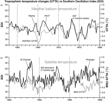
Figure 4: Seven-month shifted SOI with (a) weather balloon RATPAC-A temperature data 1958–1979 and satellite UAH temperature data (b) 1980–1995. Dark line indicates SOI and light line indicates lower tropospheric temperature. Periods of volcanic activity are indicated.

It has been well known for many years that ENSO is associated with significant variability in global temperatures on short timescales of several years. However, this relationship cannot explain temperature trends on decadal and longer time scales. McLean et al 2009 grossly overstates the influence of ENSO, primarily by filtering out any long-term trends.

0 0

Printable Version  |  Link to this page

Comments

1  2  Next

Comments 1 to 50 out of 68:

  1. John Thanks for this post. Bob Tisdale at Climate Observations has a number of posts on ENSO. I'd love to hear your thoughts on Bob's work.
    0 0
    Response: Thanks Kelly, like I didn't have enough on my to-do list :-)
  2. I'm not a climatologist. I'm a lowly engineer. But anyone that now anything about control theory knows that a derivative is noise amplifier. If you're wrestling with getting control of a process, the FIRST thing you do is kill the derivative.
    0 0
  3. I thought it was always obvious that if you removed the long term trend from the variability you would be left with the variability and that McLean et al had not hidden this procedure (which always made me wonder why on earth the paper was promoted as a disproving of global warming from GHG). But the details added here are useful. That division of the two graphs in figure 4 is becoming something of a standard in anti-GHW efforts isn't it?
    0 0
  4. The problem with McLean's "proof" is that El Ninos have been around for a long, long time (pre 1850). And was there the same level of warming then? Nope. http://www.ncdc.noaa.gov/oa/climate/globalwarming.html#q4 http://www.atmos.washington.edu/gcg/RTN/rtnt.html There's strong evidence for historical ENSOs going way back in time. So what's suddenly so different now to think the ENSO is somehow driving the current global climate warming trend? What changed? Did McLean offer a reason? Nope. A great explanation for ENSO and climate is at Gavin Schmidt's RealClimate page: http://www.realclimate.org/index.php/archives/2006/05/el-nino-global-warming/
    0 0
  5. Amazing. A scientist caught manipulating data to achieve a pre-determined result. Lets wait to see if the denial-o-spehere goes wild with outrage. I somehow doubt it. The conclusions Bob Carter drew from this work,even if it were not flawed, are nuts. I also wonder if he will now retract his opposition to carbon trading schemes...
    0 0
  6. Typo right below figure 2: "This result contradicts virtually every other study into the connection between ENSO and temperature variability, particularly with regard to long-term warming trends."
    0 0
    Response: Oops, thanks for pointing that out. Unfortunate misspelling :-(
  7. Good point SLRTX. That's a question I often asked-namely "even if McLean et al are correct-& everyone else is *wrong*-how come the El Nino Events of the last 50-60 years are suddenly causing a long-term warming trend, but apparently were incapable of causing warming in the more than 300 years prior to this that El Nino's have been known to exist?"
    0 0
  8. Here's another point. We know there is at least *some* correlation between ENSO & Warming (however small), but in what direction does the correlation work? i.e. its just as possible that warming is *causing* more El Nino events as it is that El Nino is leading to increased warming. Strange, though, how the authors immediately took the latter meaning of the correlation.
    0 0
  9. Yet another example of why scientists desperately need to run synthetic data through their tests BEFORE they publish - having someone else do it for you makes you look incompetent at best. (My first exposure to this axiom was the Santer et al 2008 response to Douglass et al 2007)
    0 0
  10. You made a spelling mistake in the paragraph following figure 2, second sentence. Otherwise a very interesting piece. Thanks for posting it!
    0 0
  11. Another general comment I'll just throw out there... The fact that this paper by McLean et. al. was published in a peer-reviewed journal proves: 1. There is no conspiracy to keep "skeptics" from publishing. Either that, or the conspiracy is full of holes. 2. The peer-review process is not perfect. No one ever said it was. It's a collective process that, over time, will weed out the papers that don't hold up to scrutiny (read the response in Foster, et. al.). So, true rational skeptics understand that getting to the truth is a process. Irrational skeptics have no process that they can describe. Science is, by it's very nature, skeptical, but rationally skeptical: http://www.skeptic.com/about_us/manifesto.html
    0 0
  12. Great post! Small point: You have Foster et al 2009 referenced at the start of the post and then Foster et al 2010 at the end referencing the same hyperlink
    0 0
    Response: Fixed. It's great having you guys all proof-reading my text for me :-) Of course, it would be even greater if I didn't make these obvious typos in the first place :-( In my defence, I was up late last night reading Foster 2009 2010.
  13. Could someone explain a bit more how the white noise is generated (amplitude? frequency?). I don't have access to the full papers at the moment and I'm not sure if it is shown in the diagrams above. Also, why do they add a sine-wave to it?
    0 0
  14. Swanson et al. (2009, PNAS) have examined the role of natural climate variability in the 20th century warming, from their abstract: "Here we present a technique that objectively identifies the component of inter-decadal global mean surface temperature attributable to natural long-term climate variability. Removal of that hidden variability from the actual observed global mean surface temperature record delineates the externally forced climate signal, which is monotonic, accelerating warming during the 20th century." ENSO and other internal climate modes are oscillations on an underlying long-term warming trend, especially post 1950. Internal climate modes can and do of course play a role in modulating global air temperatures, and can either enhance (e.g., El Nino) or mute (e.g., La Nina) the underlying warming trend in global air temperatures (GAT), they are, however, not driving the warming. A super El Nino has been estimated to increase global temperatures by about 0.2 C (NASA). If what McLean et al. proposed were true, why then was 1983 not the warmest year in the 20th century, or why were global air temperatures in 1983 (GISS GAT +0.26C) not at least comparable to those in 1998 (GISS GAT anomaly +0.56); the 1982-1983 event was estimated to be the strongest of the 20th century (MEI >3). And why is 2010 probably going to be the warmest year in at least 130 years, even though the current El Nino is moderate, and we are just emerging from a unusually long and deep minimum in the solar cycle? According to the near real-time AMSU data (UAH), it looks like March 2010 is going to be the warmest in the satellite record, on the heels of the warmest November (2009) and the warmest January (2010).
    0 0
  15. Wonderful, thanks!
    0 0
  16. This would have gone past my radar in peer-review, indicating I'm not an expert on climatology... I so much like to see good correlation with as little variables as possible, it's easy to forget that exluding one variable may result in closer correlation in some instances (here done with the exclusion of the long term trends.)
    0 0
  17. A trivial (and common) mistake: you wrote "according to one of it's authors". It should be "according to one of its authors".
    0 0
    Response: Funnily enough, that same typo has existed on the El Nino page since July 2009. But you lot are in eagle-eyed nitpick mode now so no grammatical stone is left unturned.
  18. Sic! "The Southern Oscillation Index shows no long term trend while the temperature record shows a long-term warming trend. Consequently, McLean et al found only a weak correlation between temperature and SOI. Next, they applied another filter to the data by subtracting the 12 month running average from the same average 1 year later..." So they showed SOI does not explain warming trend! Sweet!
    0 0
  19. You're dead right Albatross. Look at that nice orange line for 2010, very clearly above anything for the last 12 years.
    0 0
  20. Excellent post and an even greater example of how peer review and science is auto correcting. SLRTX hits the nail on the head. This seems to be a rather embarrassing mistake to me. Not just by the reviewers, but much more so by the authors. Am I mistaken?? Dan
    0 0
  21. John B at #5: There are other reasons for opposing carbon trading schemes than a disbelief in AGW - many people question whether they even achieve the goal of reducing CO2 emissions (they certainly make a lot of money for the permit traders, though, money that might better be diverted into actual CO2 emission reduction). But that's a discussion for another day, on an article about how to reduce CO2 (yet another for your to-do list, John? ;-) Re the derivative hiding the long-term trend - I'm obviously not with it today, because it took me a couple of minutes to figure out that, if you have a long-term constant trend, then subtracting sets of points 12 months apart will always give you the same value. The high correlation of the derivative with the SOI, though, means that the SOI can be used to remove the ENSO signal from the temperature chart, and what's left will be due to any long-term trend, volcanic activity, and other forcings. Should make it easier to see the trend, without the distraction of the large dips & bumps caused by ENSO.
    0 0
  22. The "trick" of demonstrating a strong correllation between detrended temperatures and X to argue that X is the cause of the trend in global temperatures seems a common argument on the "skeptic" side. Of course if it really were the cause, then the correllation would be stronger with the raw data than with the detrended data! Spencer did that on WUWT to argue that ENSO is responsible for the rise in atmospheric CO2, Svensmark has used that argument to show that the rise in temperatures is due to GCR. Rather dissapointing to see it in a peer reviewed article rather than a blog or an unpublished response, as the flaw in the argument is so obvious.
    0 0
  23. John, you've included Figure 5 from Foster et. al. when you meant to include Figure 4. Fig 4 is the artificial data with the linear trend. Fig 5 uses a sinusoid.
    0 0
    Response: Considering the multitude of typos (and mistaken graphs) in this article, I'll take this as a cautionary tale to not stay up too late reading peer-reviewed papers or write blog posts in a sleep deprived state the next morning. I've updated the graph with the correct Figure 4 from Foster et al 2010.
  24. Bern> Exactly! This correlation is interesting even if it is only a correlation between heavily filtered curves. It should be turned around, to improve the case for global warming. As you say, the correlation could be used to remove some of the long term variability in the global temperature. It would be interesting to see what the modified record looks like, but it won't be a nice straight line, for the following reasons: In fig 2 of Foster et al. the Fourier transforms of two datasets are compared. One is the global temperature data, the second is the southern oscillation data. We can divide the Fouries transformed picture into three parts: High frequencies (periods shorter than 1 year), middle frequencies (corresponding to 1-6 year cycles) and low frequencies (longer than 6 years). The filter used by McLean et al. more or less removes the high and low frequencies, and the result is a (surprisingly!) high correlation between the two curves. So if we remove the high frequencies from the global temperature record, somehow subtract the SOI influence from it - which seem to more or less remove the middle frequencies - we still have the discrepency in the low frequencies. Eyeballing fig 2 seems to suggest that actually the two datasets differ a lot in the low part of the frequency spectrum. So it seems that after removing low frequencies and the SOI influence, we will still have "unexplained cycles" left with periods in the range of like 6 years and up.
    0 0
  25. Should we expect correlation between a regional event and a global one. Even for Australia, trying to find correlation between drought years and El-Nino found limited connection, but when the IOD was introduced into the equation only then was some significant and useful correlation found.
    0 0
  26. It seems to be a rather trivial result. SOI=sin(t+lag) GTTA=sin(t)+a*t+b dSOI/dt=cos(t+lag) dGTTA/dt=cos(t)+a Phase-shift dSOI/dt by its lag, dSOI'/dt = cos(t), and plot the two series on the same plot. The independent warming trend, a, is 0.01 C/year so the displacement is not discernible when plotted on a scale from -1 to 1 Celcius. By the way, NOAA has explained the variability by resolving onto climate indices.
    0 0
  27. Do you know if McLean got a right to reply on this comment? I can't find the comment on the AGU website.
    0 0
  28. Is this the paper that Tamino pulled apart a while ago? If memory serves the technique they used removes the trend they then analysed the detrended data and concluded there is no trend. Or is that what you were saying?
    0 0
  29. HR: yes, but they couldn't put together a response that would pass review...
    0 0
  30. Tony O, yes, that's a shorter way of saying the same thing.
    0 0
  31. I think this is an example of "you can use statistics to generate relationships that you want people to see". This doesn't add any substance to the debate at all. One thing abut science is that you can get a group of peers that will refute a specific premise AND you can find a group of peers that will support the same premise. While peer reviews do have their place in the evolution of science, the process is open to manipulation in that a group can focus on peers scientists that have a contrary view. As far as el Nino is concerned, from my perspective (and experience as where I live is affected by el Nino) I am convinced there exists a relationship between spikes in global temperatures and el Nino activity. The following image is a rough plotting of el Nino activity (1950 to present) along with average global temperatures for the same period. I don't think you need a Phd in statistics to see that there certainly appears to be a correlation between peak temperatures and el Nino activity. More importantly, the period from 1978 to the present is characterized by extreme el Nino activity versus a prevalence of el Nina, where periods of related cooling occurred between 1950 and 1975. I am left wondering what the response will be from those saying that the climate change is attributable only to increases in atmospheric CO2 while the comparison of data indicates warming temperatures related to high el Nino activity. At the very least, climatologist should factor out global temperature increases attributable to el Nino activity in order to substantiate their claim.
    0 0
  32. Ok..my image link did not show up..please go to http://www.stratified.com/comap_1.jpg to view it....sorry I did follow the instructions for posting images here but it didn't work for me..:(
    0 0
  33. Geo Guy, the point here is not to accept or refuse a methodology. The problems is that McLean et al. filtering procedure does not allow any claim on the trend. Indeed, after the case exploded, they said they were just looking at assessing the lag thus admitting that no conclusions on the trend can be draw from their analysis. That ENSO influences the global mean temperature variability is widely recognized. What is not is that ENSO has an influence on the trend. There are many analisys around showing this point, it's relatively easy, you can try yourself or read this related post and references therein
    0 0
  34. Here you go Geo Guy; As to your comments, El Nino and other oceanic variations are short term events with flat trend lines. They thus aren't any more examples of 'climate change' than the seasons or day and night are.
    0 0
  35. GeoGuy, @ 31. First, climate scientists do not attribute all the observed warming to increases in GHGs, the numerous drivers are documented and quantified in AR4. Second, scientists have filtered out natural variability form internal climate modes (incl. ENSO) and detected a monotonic and accelerating warming trend in the 20th century. Please read my post @14, or read the paper by Swanson et al. (2009, PNAS). Also, McLean et al. (2009) seem to be guilty of confirmation bias, as were Lindzen and Choi (2009). Does that not concern you?
    0 0
  36. Albatross> Kyle L. Swanson, George Sugihara, and Anastasios A. Tsonis, Long-term natural variability and 20th century climate change, (16120–16130  PNAS  September 22, 2009  vol. 106  no. 38) looks very interesting, but also not so easy to read. I'l try to summarize it, and hope that those who know more (thats you, Albatross) can correct my misunderstandings. The way I see it, they use known climate models, run them under conditions assuming NO CO2 increase to deduce how global temperature varies from year to year in dependence on sea surface temperature. This step is not about how the global temperature varies over the whole period, by definition of the model the average is supposed not to vary at all, but about the year to year variations around this average. The weak point is that you are working with models, not with actual, measured data, the strong point is that you can get precise information inside each model. You do this for a number of popular models, and somehow average them, to get a prediction (regression coefficients) about how a particular distribution of temperature of the sea surface temperature in a certain year will influence the global mean temperature in this year. It's important that these coefficients do not see global warming, since we are interested in the natural variations from the general trend. The outcome of the theory is this set of regression cofefficients. Then, there are a number of internal consistency checks (including testing the models against each other). I'm a bit unsure about the next step, but I believe that what happens is that the computed regression coefficients are used with actually measured sea surface temperatures. This should give the internal variability (unrelated to global warming) which depends on the distribution of the sea surface temperature. The result is not perfect, but it does suggest that the known variation are completely explainable in terms of SST, which is new to me!
    0 0
  37. Marcel @36, Just to clarify, I am by no means an expert in climate science. I'm just relaying the information. My take on your interpretation of Swanson et al. (2009) is that you did identify the salient features. Yes, it was a modelling study, but models, for all their limitations, are great tools for gaining insight into complex systems because one can conduct controlled experiments. Yes, OHC is going to be a huge player in how our climate responds to the energy imbalance from higher GHG concentrations. How the oceans redistribute that heat and how the energy imbalance affects the THC will be key. As Murphy et al. (2009, JGR-A09 have shown, most of the energy arising from the energy imbalance have been absorbed by the oceans. AOGCMs need to improve, and the next round of models in AR5 will be much better than those used in AR4, both in terms of gris spacing, as well as other aspects (atmospheric chemistry). That said, I would not go so far as to say that " the known variation are completely explainable in terms of SST". Swanson note that: Finally, a fraction of the post-1970s warming also appears to be attributable to natural variability. The monotonic increase of the cleaned global temperature throughout the 20th century suggests increasing greenhouse gas forcing more-or-less consistently dominating sulfate aerosol forcing, although our technique cannot exclude other mechanisms not contained in the current generation of model forcing (22). They acknowledge the role of internal climate variability: This result is another link in a growing chain of evidence that internal climate variability played leading order role in the trajectory of 20th century global mean surface temperature. This seems contrary to their earlier statement that "a fraction of the post-1970s warming also appears to be attributable to natural variability. Their main conclusions: First, it suggests that climate models in general still have difficulty reproducing the magnitude and spatiotemporal patterns of internal variability necessary to capture the observed character of the 20th century climate trajectory. Second, theoretical arguments suggest that a more variable climate is a more sensitive climate to imposed forcings (13). Viewed in this light, the lack of modeled compared to observed interdecadal variability (Fig. 2B) may indicate that current models underestimate climate sensitivity. The second point is interesting, b/c it suggests that the climate sensitivity could be higher than currently thought. Anyhow, ENSO etc. are transient cycles, whereas the radiative forcing from higher GHGs is increasingly monotonically, and will become an increasingly important player with time.
    0 0
  38. Geo Guy Here's a link to a non peer reviewed analysis of temperature anomaly, ENSO and SATO (volcanic activity indicator) along with links to source data and my R script. Why not run the data yourself, I find it much more helpful than trying to patch together some charts. link Kelly
    0 0
  39. If El Nino events were the source of a long-term warming trend, there is a thermodynamics problem. Where is the heat coming from? We know it's not from increased insolation, and the heat leaking from the earth's core is too weak. On the other hand, my understanding of current theory is that El Nino & La Nina events cancel each other out over time. One releases heath into the part of the earth whose temperature we can measure; the other removes heat and sinks it in the ocean. Because it is a transfer, there is no need to postulate a new (as yet unknown) source of heat.
    0 0
  40. James Annan (one of the co-authors of the refutation) has some comments. He references this site. http://julesandjames.blogspot.com/2010/03/mclean-debunked-at-last.html
    0 0
  41. #19: could someone explain to a science illiterate why the global average shows a temperature below zero? I know "global temperature" is in some way kind of an abstract concept, but not as much as to show such unexpected figures, am I right? Thanks for your patience and help.
    0 0
  42. that's the lowest they can measure accurately, the name of the channel is 'near-surface layer' but actually it's something like a mile and a half up, was it 850mb-level? Does someone know the actual average height of the plane?
    0 0
  43. "could someone explain to a science illiterate why the global average shows a temperature below zero?" The values are not actual temperatures. Each temperature record has a baseline, which is the average of temperatures over a given period. The baseline is zero, and the the temps are represented as departures from the baseline - known as 'anomalies'. This has no impact at all on trends, of course, as each value is equally offset. Here's the GISS anomaly data for monthly temps. http://data.giss.nasa.gov/gistemp/tabledata/GLB.Ts+dSST.txt At the top of the page they give you the baseline period, at the bottom they tell you how to convert the anomalies back to the *real* temps. On the chance you're referring to the UAH daily temp website, which appears to show only negative, values, I have no idea why that is. Perhaps someone else knows the answer to that.
    0 0
  44. Barry, the UAH numbers are negative because they are brightness temps - the temperature of a pure black-body spectrum that would yield the same total observed energy. So brightness temp is always lower than actual temp, with a greater difference less "black" the object is. Ned & Tony, Tamino *is* one of the authors of Foster et. al. so he's getting his due credit.
    0 0
  45. Typo in my previous comment. ... a greater difference the less "black" the object is.
    0 0
  46. GFW: Ned & Tony, Tamino *is* one of the authors of Foster et. al. so he's getting his due credit. Not quite sure what my name is doing there. Is this a response to something I posted in another thread?
    0 0
  47. Ned, at 30, you replied to Tony at 28. Tony asked if this paper was saying the same thing that Tamino did months ago on his blog. You agreed this paper said the same thing as Tony's summary of Tamino. You might have been agreeing purely with the summarization without paying any attention to the attribution, but if you weren't then my tidbit of information would be of interest. I have great respect for Tamino - he ability to explain statistics, and use those explanations to demolish shoddy arguments is most impressive.
    0 0
  48. Oh, sorry. I was just agreeing with how Tony had summarized the problems with the McLean 2009 paper. But thanks for the reminder about the authorship of Foster et al. I also have great respect for Tamino, though I think he sometimes lets his temper get the better of his judgment. I do read Tamino's site every day, and find it immensely valuable. But as I get older and maybe or maybe not wiser I find that I prefer the calm, insult-free environment that John Cook and many of the commenters have managed to create over here (at least in the more non-political threads).
    0 0
  49. Mangeclous (41): near surface isn't surface. I'm not sure what altitude is used but this picture illustrates how fast temperature drops with altitude for the first 10km above the surface:
    0 0
  50. Here is Mclean et als reply to the Foster comment. Warning: this is not peer-reviewed (this becomes obvious very quickly). It also contains reference to the climategate emails which I know some people are a little sensitive about. http://icecap.us/index.php/go/joes-blog http://icecap.us/images/uploads/McLeanetalSPPIpaper2Z-March24.pdf
    0 0

1  2  Next

You need to be logged in to post a comment. Login via the left margin or if you're new, register here.


The Consensus Project Website

THE ESCALATOR

(free to republish)


© Copyright 2024 John Cook
Home | Translations | About Us | Privacy | Contact Us