


 Arguments
Software
Resources
Comments
The Consensus Project
Translations
About
Support
Arguments
Software
Resources
Comments
The Consensus Project
Translations
About
Support
![]()
![]()
![]()
![]()
![]()
![]()
![]()
![]()
![]()
![]()


![]()


Latest Posts
- Skeptical Science New Research for Week #30 2024
- Why were the 1930s so hot in North America?
- Why is the Texas grid in such bad shape?
- A major milestone: Global climate pollution may have just peaked
- 2024 SkS Weekly Climate Change & Global Warming News Roundup #29
- Skeptical Science New Research for Week #29 2024
- June 2024: Earth’s 13th-consecutive warmest month on record
- Plugging a video channel: Dr Gilbz
- Can we air condition our way out of extreme heat?
- 2024 SkS Weekly Climate Change & Global Warming News Roundup #28
- Fact brief - Were scientists caught falsifying data in the hacked emails incident dubbed 'climategate'?
- Skeptical Science New Research for Week #28 2024
- The world’s fourth mass coral bleaching is underway, but well-connected reefs may have a better chance to recover
- How rural families are saving thousands with electric vehicles
- What’s next after Supreme Court curbs regulatory power: More focus on laws’ wording, less on their goals
- 2024 SkS Weekly Climate Change & Global Warming News Roundup #27
- Skeptical Science New Research for Week #27 2024
- How much will climate change drag down the economy?
- Rebuttal Update Project - Summer break and relaxed publication schedule
- Climate Adam: How deadly heatwaves are blown up by climate change
- 2024 SkS Weekly Climate Change & Global Warming News Roundup #26
- Fact Brief - Does temperature have to rise before CO2 does?
- Translation #20 of The Conspiracy Theory Handbook published!
- Skeptical Science New Research for Week #26 2024
- Six incredibly popular climate policies
- At a glance - What caused early 20th Century warming?
- What record global heat means for breaching the 1.5C warming limit
- 2024 SkS Weekly Climate Change & Global Warming News Roundup #25
- Fact Brief - Was the Medieval Warm Period a global event?
- Skeptical Science New Research for Week #25 2024
Comment Search Results
Search for it hasn't warmed since 1998
Comments matching the search it hasn't warmed since 1998:
- At a glance - The greenhouse effect and the 2nd law of thermodynamics
John Mason at 00:46 AM on 7 May, 2023NigelJ #28 - yes it is a complex challenge achieving balance in this business. The deniers have the advantage that they can make stuff up. We cannot!
Also, some myths are very straightforward to rebut - e.g. "it hasn't warmed since 1998". This particular one we are discussing here is something of a pig by contrast!
Realclimate has improved by strides since its inception. I was working on "Further details" about the Urban Heat Island effect - a debate largely triggered by a paper by Ross McKitrick and Pat Michaels in 2004. Realcimate's response was robust but only undererstandable to someone with serious statistical training. I nevertheless linked to it but with a note to that effect.
Fortunately, most of the myths on the database can be laid to rest in the At-a-glance pieces in less than 500 words, that being the ideal word limit for that class of rebuttals. Like I said, the one we are commenting on is a bit of an outlier in this respect because so much needs introducing to the layperson. But I firmly believe we need to be near-absolutely inclusive in this business - near because I accept that there are people out there who have reading difficulties, but nevertheless reaching the biggest possible audience is the aim here. - Climate meme debunked as the ‘tropospheric hot spot’ is found
One Planet Only Forever at 00:36 AM on 13 June, 2015topal,
The reference was to a "hiatus" of the global average surface temperature. And the global average surface temeprature is not the energy budget of the planet. The energy budget has many accounts for energy to be stored in with the biggest being in the ocean depths due to ocean circulation patterns.
A major ocean circulation pattern that can take energy into or deliver energy out of the ocean account is the El Nino/La Nina. When the condition is El Nino the ocean account releases heat to the surface creating a temporary condition of global average surface temeprature that is higher than the ENSO neutral condition. When the condition is La Nina the ocean account takes in heat from the air at its surface creating a temporary condition of global average surface temeprature that is lower than the ENSO neutral condition.
Te history of two major measurements related to the ENSO are the NOAA Reported ONI here and the Australian reported SOI here. Reviewing the pattern it is clear that the SOI El Nino indication comes a few months before the ocean surface temperature reaches the threshhold for declaring an El Nino eevent to be occurring. Both sources provide detailed explanations of how the values are determined and how they relate to the ENSO.
When you look at 1998 in particular you see just how significant the 1997/98 El Nino condition was. You will also see how significant the La Nina was before and after it. When you look at the temperature records of that period using the SkS Temeprature Trends here, whatever one you choose even the satellite ones, there is a trough before and after the massive peak of 1998. The random sort of cyclical ENSO influence on the surface temperature is clearly the best explanation for the wide swings of global average surface temperature.
The signicant troughs or lower global average surface temperatures before and after 1998 are often ignored or 'deliberately missed' by people trying to claim that it hasn't warmed since 1998. And of course it becomes obvious why they pick 1998, or any of the other more recent peaks in the varying global average surface temperature record.
Reviewing the ONI and SOI since that time shows that there have been more La Nina than El Nino conditions, and the El Nino conditions have not been as significant as the 1997/98 event. This mean that the global average surface temperature influence of the ENSO has been more of a cooling influence through this period. And the fact that the global average surface temperature in 2014 was warmer than 1998 even though the ENSO was neutral is an indication that significant warming has occured since 1998.
Of course there are many other random and cyclical factors that have temporary effects on the global average surface temperature. It is just that the ENSO is clearly a significant one.
I hope hat helps you understand why the effect of increased CO2 has continued to occur, and why reviewing the global average surface temperature values through a short time period like the past 17 years is not a robust way of evaluating what is going on. A recent report by NOAA discussed here actually makes a minor correction of the surface temperature data and finds that the minor correction significatly changes the recent trend of the global average surface temperature.
The understanding of what is going on continues to improve. And the evidence that the warming effect of increased CO2 is occurring as expected is becomeing even more robust.
p.s. The Free Course offered in the link at the top of the right hand side of the SkS webpage will help you better understand this far more than my comment. I have not completed the course, I have only been able to get through about half of it to date.
- Understanding adjustments to temperature data
PhilippeChantreau at 01:07 AM on 3 March, 2015Ryland, I'm surprised that you start your post describing accurately some newspapers' attitudes then ends by chiding scientists for not including the margin of error. Seems you're the one being naive. The only thing doing damage to climate scientists is to be targeted by despicable people who will back at nothing to undermine the public's understanding of science. The silly talk about margin of error is laughable coming from the clowns who keep saying that it hasn't warmed since 1998 or that there is a pause. Let's start there for statistical accuracy why don't we? But the media never calls this kind of BS a "scandal" do they?
The real problem of climate scientists comes from the stooges willing to organise harassment campaigns, steal e-mails to twist their meaning, threaten them with physical violence, use every dirty trick in the book with no regard whatsoever for any kind of intellectual honesty or scientific accuracy. The real problem comes from media outlets that are used to foster the ideological agenda of their owner and manipulate peope's minds without any scruples or regard for such details as physical reality. The real problem is that scientific illiteracy is so deep and prevalent that a buffoon like Monckton can manage to attract attention with his delirious ramblings and gather more credibility than those who know what they're talking about. That's the real problem. There is no other.
Regardless what they do, climate scientists are damned. There is no debate with people like that. It's like being on trial with Staline as the judge. They're only out to silence you and they'll stop at nothing so long as they are reasonably sure they'll get away with it. Margin of error? Give me a break.
- Cowtan and Way 2014: Hottest or not?
Kevin C at 09:59 AM on 3 February, 2015Ryland: Exactly. The public discourse is focussed on meaningless metrics which they demand scientists produce and discuss as if they are meaningful. Which puts scientists in an impossible position. Either we talk about what society wants us to talk about, which is a betrayal of the science, or we talk about the science, in which case the public draw the wrong conclusion based on the metric they are wrongly fixated on, i.e. we betray the public.
The major motivation behind our work was the fact that a big chunk; likely the majority of the difference between the major records is probably bias (which can be fixed) rather than uncertainty (which can't). And the differences are being used to promote confusion, like this:
- If 2005 wasn't hotter than 1998 in every version of the record, it wasn't the hottest year.
- If 2010 wasn't hotter than 2005 in every version of the record, it wasn't the hottest year.
- If 2014 wasn't hotter than 2010 in every version of the record, it wasn't the hottest year.
- If none of 2005, 2010 and 2014 were the hottest year, then it hasn't warmed since 1998.
Now no rational person would make the argument in that form. But our cognitive biases enable us to make precisely this kind of argument to ourselves without thinking about it, and we do it all the time on all sorts of issues.
Of course by creating a new version of the temperature record we have made things worse by increasing the scope for disagreement. That was a known risk, but I hope it will be offset in the long term by the biases being addressed. And projects like ISTI and UKMO's EUSTACE are doing exactly that.
- The role of the ocean in tempering global surface warming
BojanD at 23:08 PM on 28 October, 2014@johncl meant this post, for uninitiated.
And this is a different approach to convey the same thing, but addressing 'hasn't warmed since 2002'. Note that both trends are almost aligned. In essence, the pause is an artifact of fast warming during 1992-2006 period. - It hasn't warmed since 1998
MrGibbage at 02:14 AM on 16 September, 2013So, if the point of this page at SkepticalScience is to suggest that the planet hasn't been cooling since 1998, and has in fact been warming, then who do we believe? Dr. Fyfe, who suggests that it hasn't cooled or warmed, or Skeptical Science? Does this page need to be updated?
- It's El Niño
Bob Tisdale at 00:26 AM on 3 December, 2012KR says at 124: “If as you say La Nina's absorb more heat (due perhaps to changes in cloudiness or other effects) than El Nino releases, how can this have driven warming since the 1970's? There has been a preponderance of El Nino events over that period (fewer than average La Nina events to raise total climate energy, esp. late 1970's-1998).”
You need to look at surface temperature and ocean heat content separately, because they respond differently to ENSO.
Let’s discuss surface temperatures first:
KR, we agree on something. “There has been a preponderance of El Niño events over that period…” Glad you confirmed that ENSO has been skewed toward El Niño since the late 1970s. This means that more warm water than normal has been released from the tropical Pacific and redistributed, and it means that more heat than normal has been released to the atmosphere. That answers your question, “how can this have driven warming since the 1970's?”
Now let’s address the ocean heat content portion of your question: “If as you say La Nina's absorb more heat (due perhaps to changes in cloudiness or other effects) than El Nino releases…”
This makes itself known in the Ocean Heat Content for the tropical Pacific. The 1973-76 La Niña created the warm water that served as the initial fuel for the subsequent 1982/83 through the 1994/95 El Niño events, with the La Niña events that trailed those El Ninos replacing part of the warm water. That’s why the tropical Pacific OHC trend is negative from 1976 until the 1995/96 La Niña.
The 1995/96 La Niña was a freak, and discussed in McPhaden 1999. “Genesis and Evolution of the 1997-98 El Niño”.
http://www.pmel.noaa.gov/pubs/outstand/mcph2029/text.shtml
McPhaden writes:
For at least a year before the onset of the 1997–98 El Niño, there was a buildup of heat content in the western equatorial Pacific due to stronger than normal trade winds associated with a weak La Niña in 1995–96.
In other words, there are parts of ENSO that cannot be accounted for with an ENSO index.
The impact of the 1995/96 La Niña stands out like a sore thumb in the graph of tropical Pacific OHC. Then, moving forward in time, there’s the dip and rebound associated with the 1997/98 El Niño and 1998-01 La Niña.
KR asks: “Why now? What has changed? The ENSO has been an existent pattern for perhaps hundreds of thousands of years. Why would it suddenly change behavior in recent years, when it hasn't in the past?”
Paleoclimatological studies find evidence of ENSO back millions of years ago—not just hundreds of thousands of years. See Watanabe et al (2011). Your second question (“Why would it suddenly change behavior in recent years, when it hasn't in the past?”) is an assumption on your part. El Niño events were also dominant during the early warming period of the 20th Century, and global temperatures warmed in response then, too.
KR asks: “Finally, what about the greenhouse effect?”
Downward longwave radiation appears to do nothing more cause a little more evaporation from the ocean surface, which makes perfect sense since it only penetrates the top few millimeters.
- It's El Niño
Kayell at 03:26 AM on 25 November, 2012
PART 2
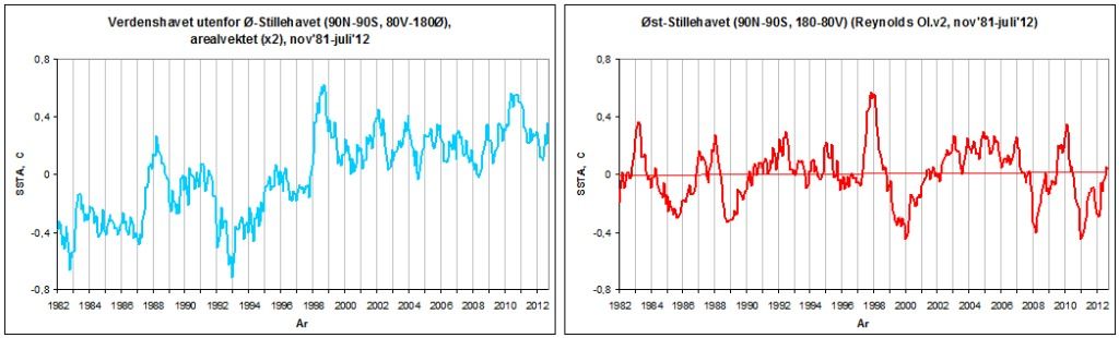
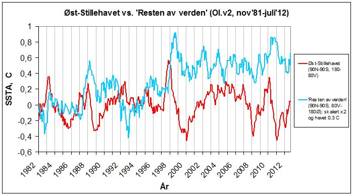
We continue to explore the satellite-based SST data from Reynolds OI.v2 (Nov'81-Oct'12) and see what patterns it might reveal.
This graph, global SSTA:
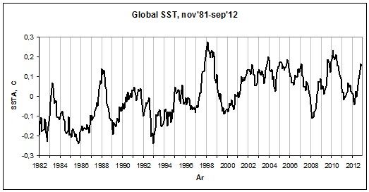
is the area weighted sum of the two following subsets:
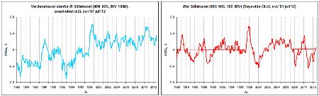
(left: The World Ocean Outside the East Pacific - 90N-90S, 80W-180E; 2/3rds of the global ocean
right: The East Pacific Ocean - 90N-90S, 180-80W; 1/3rd of the global ocean)
It was when looking at these two SSTA graphs, together producing the global graph above, that Tisdale had his eureka moment.
If we superimpose the two global subset graphs above on each other, we see quite clearly specifically where the discrepancy between the East Pacific and the global SSTA curve (recalling Part 1) primarily arises:
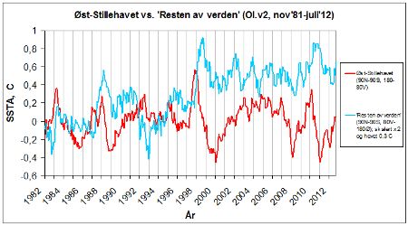
The NINO3.4 region is located in the East Pacific Ocean. Its signal totally dominates the SSTA evolution of that basin. According to the graph above, there is no upward trend in SSTA in the East Pacific Ocean since at least 1981. That's 1/3rd of the global ocean. Look at this map (from GISTEMP):
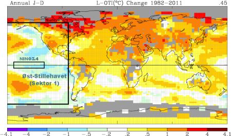
It shows the global distribution of temperature change between 1982 and 2011. Please disregard the continental parts at this point. The oceanic change (its size and distribution) is calculated using Reynolds OI.v2. I've defined the East Pacific Ocean (65N-60S, 180-80W) and the NINO3.4 region (5N-5S, 170-120W), the latter making up ~5,7% (!) of the former.
There's a distinct pattern manifesting itself here. Peculiarly, the West Pacific is one of two sectors of the world ocean (the other being the North Atlantic) displaying a particularly large positive change over the period in question. It has experienced a pronounced warming. And this even while sitting just next to (and being intimately oceanically linked to) the one major region of the world ocean that hasn't warmed at all. In fact, barring those two sub- to extratropical warm tongues coming in from the West Pacific, the East Pacific Ocean (and specifically the equatorial NINO3.4 region) has actually cooled since 1982.
This striking contrast between two neighboring, tightly interconnected sectors of the same ocean basin alone should tell us something.
What is going on?
Let's get back to the SSTA graph for the world ocean outside the East Pacific:
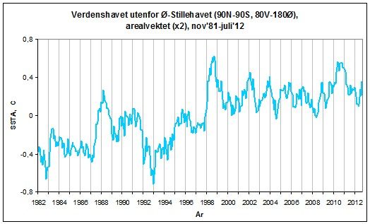
A staircase if ever there was one. This is how the change in SSTs outside the East Pacific in the GISTEMP map above actually progressed through time. If we were to draw a straight trendline from 1981/82 to 2011/12, we would only see the total upward change. We would miss (obscure) all that which happened in between, what led to that total, how (and specifically at what times) the change in temperature took place.
Blessed with a natural scientific curiosity, we're of course interested in the how and when. We want to investigate the total change a bit closer.
There are two definite upward shifts to be found along the curve above - one in 1987-88 and one in 1998-99. Do these years sound familiar in any way? In addition, there's one, albeit much smaller, in 2010. Outside of these two (three) pretty eye-catching sudden thrusts, there is no traceable upward trend in the dataset. If anything, there's a hint of the opposite. The entire rise in SST for this vast region from 1981/82 to 2011/12 is to be found in these two (three) particular instances of abrupt elevation of the mean level of anomalies. Without these instances, no general warming. Note how the specific shift events (particularly the first two) put all other up and down fluctuations along the curve to shame. They shoot up like towering pinnacles at the front of each new step.
I've adapted the graph to visualize the steps:
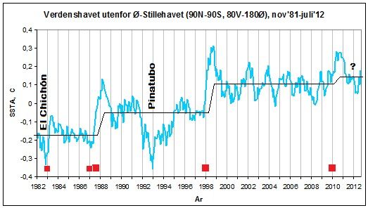
The red squares down by the x axis denote the great El Niños that directly preceded the shifts: The double Niño of 1986/87/88, the Super-El Niño of 1997/98 and the globally influential Niño 2009/10 (I have also included the giant El Niño of 1982/83, almost as powerful as the 1997/98 event, but noticeably suppressed globally by the El Chichón eruption).
Ok. We've now looked at how the SSTA evolved in the world ocean outside the East Pacific through time. It basically all happened in two (three) sudden upward shifts, one in 1987-88 and one through 1998 (+ the minor (and still unresolved) one in 2010).
Now let's look at how it evolved spatially.
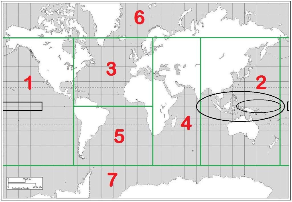
We split the world ocean into 7 sectors:
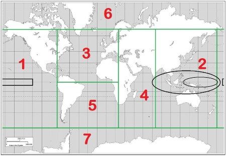
(Sector 1: East Pacific Ocean (65N-60S, 180-80W); Sector 2: West Pacific/East Indian Ocean (65N-60S, 80-180E); Sector 3: North Atlantic Ocean (65N-0, 80W-20E); Sector 4: West Indian Ocean (65N-60S, 20-80E); Sector 5: South Atlantic Ocean (0-60S, 80W-20E); Sector 6: Arctic Ocean (90-65N); Sector 7: Southern Ocean (60-90S). The black rectangle in Sector 1 is the NINO3.4 region. The two black ellipses in Sector 2 mark different definitions of the West Pacific Warm Pool (WPWP). Nevermind those for now.)
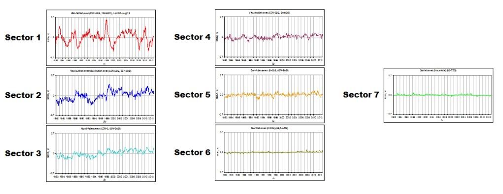
If we area weight the SSTA data for each of these sectors against each other, we come out with something like this:
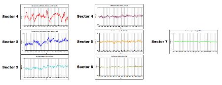
This shows the absolute influence each separate sector has on the final global SSTA graph shown at the top of this post.
It is quite revealing. The Pacific reigns supreme. Not really big news. But still.
There is something in particular one should note about these graphs. The (NINO) amplitudes of the East Pacific completely overwhelms the amplitudes of all other sectors of the world ocean. No wonder the global graph looks so similar to the East Pacific one, the main difference being the trend. The East Pacific (Sector 1) temperature swings also dwarf those of the West Pacific/East Indian Ocean (Sector 2). Only at two points along the Sector 2 curve above there's a rise that is (nearly) comparable to the amplitudes of Sector 1. These two instances occur in 1987-88 and in 1998-99. Those dates are getting familiar.
But why is the SSTA evolution of the East Pacific (Sector 1) and the West Pacific/East Indian (Sector 2) so different from one another?
To understand this, one has to understand how the ENSO process works. More on that in Part 3.
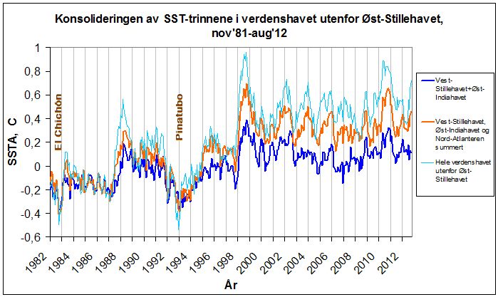
But first (and rounding off Part 2) let me show you something. What happens if we add the area weighted SSTA data from the other basins outside the East Pacific to the SSTA curve of the West Pacific/East Indian? That is, Sector 2 +3+4+5+6 and 7.
This is what happens:

(The lower graph, the blue one, is Sector 2 (West Pacific/East Indian Ocean). The middle graph, the orange one, is Sector 2+3 (The North Atlantic). The upper graph, the pale blue one, is the world ocean outside the East Pacific (65N-60S).)
Watch how the upward shifts and the steps are simply consolidated going from Sector 2 (West Pacific/East Indian) to global outside Sector 1 (East Pacific). - 93% of Fox News climate change coverage misleading
TomPainInTheAsk at 11:55 AM on 1 October, 2012
Arguments in the SkS Top 20 marked by “-” were not seen very much in play among the thousands of Yahoo News comments. Perhaps they are in decline, or they are not currently promoted by News Corporation's Fox News and WSJ editorials. It is easy to identify what lies Fox News currently broadcasts without watching Fox programs, just by the frequency of remarks in Yahoo News.
1 Climate's changed before 4.6%
2 It's the sun 4.5%
3 It's not bad 4.3%
4 There is no consensus 3.4%
-5 It's cooling 3.4%
6 Models are unreliable 3.1%
7 Temp record is unreliable 2.6%
8 Animals and plants can adapt 2.4%
-9 It hasn't warmed since 1998 2.1%
10 Antarctica is gaining ice 2.0%
-11 CO2 lags temperature 2.0%
12 Ice age predicted in the 70s 1.9%
13 Climate sensitivity is low 1.9%
-14 We're heading into an ice age 1.8%
-15 Ocean acidification isn't serious 1.8%
16 Hockey stick is broken 1.8%
17 Climategate CRU emails suggest conspiracy 1.7%
18 Hurricanes aren't linked to global warming 1.7%
-19 Glaciers are growing 1.6%
20 Al Gore got it wrong 1.6%
Below are frequent arguments I encountered that are not in SkS's current Top 20.
24 Sea level rise is exaggerated
27 Mars is warming 1.2% (followed by Jupiter, Neptune, and Pluto!)
28 Arctic icemelt is a natural cycle
29 Increasing CO2 has little to no effect 1.1%
32 IPCC is alarmist 1.0%
39 CO2 is not a pollutant 0.8%
54 It's a natural cycle 0.5%
60 Scientists can't even predict weather 0.5%
85 Solar Cycle Length proves its the sun 0.3%
86 CO2 is not the only driver of climate 0.2%
102 Arctic sea ice loss is matched by Antarctic sea ice gain 0.2%
106 Solar cycles cause global warming 0.2%
111 The IPCC consensus is phoney 0.1%
126 Most of the last 10,000 years were warmer 0.1%
133 The sun is getting hotter 0.1%
136 Skeptics were kept out of the IPCC? 0.0% - Foster and Rahmstorf Measure the Global Warming Signal
KR at 07:33 AM on 20 December, 2011
John Hartz - Takeaways?
My personal opinion here, but I see the takeaways as:
* Major portions of mid-term climate variability can be attributed to (with statistical significance) various exogenous (outside) factors.
* Accounting for those exogenous factors shows a very clear linear warming trend over the last 32+ years, with all temperature records in agreement.
* Not incidentally, accounting for the exogenous factors shows a warming trend demonstrating statistical significance of warming over periods as short as 11 years, since 2000!
* Related skeptic memes that this is evidence against: It hasn't warmed since 1998, Climate is chaotic, "It's internal variability", It's a natural cycle, etc. - 2011: World’s 10th warmest year, warmest year with La Niña event, lowest Arctic sea ice volume
Ogemaniac at 23:54 PM on 1 December, 2011
@ Tom Curtis
" if there was a strong el nino in 2013, we would hear the denier refrain for the next 5 years that it hasn't warmed since 2013"
Don't you mean for the next 13 years, and counting? That's how long they have been hanging their hats on 1998 as prime cherry to pick. - It hasn't warmed since 1998
tanahano at 10:47 AM on 21 November, 2011
The world has not warmed since 1998 according to UAH, RSS, and NOAA. Most weather websites have said that 1998,2005, and 2010 are a three way tie with no real difference therefore the world hasn't warmed since 1998. Even if it did...would only have been 0.02 c at most. Not significant at all. - It hasn't warmed since 1998
Rickoxo at 15:34 PM on 31 October, 2011
Infrequent poster but I've been reading about the Muller's BEST data set and then saw some counter arguments and critique supposedly from one of the co-authors of the report. I am not making any argument from expertise about the data, but there are a number of quotes from Professor Judith Curry, supposedly the second author on all of the papers, she's a climatologist out of Georgia Institute of Technology.
I checked around and all of the skeptic websites have their rehashing of an article that seems to have originated in the daily mail. From what I understand, that's a pretty cruddy source, but using a link below, I went to Curry's own website and it sounds like this is what she's saying:
This quote is from the daily mail article:
In fact, Prof Curry said, the project’s research data show there has been no increase in world temperatures since the end of the Nineties – a fact confirmed by a new analysis that The Mail on Sunday has obtained.
‘There is no scientific basis for saying that warming hasn’t stopped,’ she said. ‘To say that there is detracts from the credibility of the data, which is very unfortunate.’
Read more: http://www.dailymail.co.uk/sciencetech/article-2055191/Scientists-said-climate-change-sceptics-proved-wrong-accused-hiding-truth-colleague.html#ixzz1cIFa5qrh
Here is a blog from Judith Curry, climate etc. I don't know much about it, but the most recent post goes into detail about a conversation she had with Muller and a second post clarifying her comments and what happened in the daily mail interview.
http://judithcurry.com/
I went and re-checked the article linked on the home page about the skeptic myth that it hasn't warmed since 1998. It says it hasn't been updated for a while. I get that Muller released his data and leaked his summaries before the data had been peer reviewed and Curry makes a number of comments saying she wished he hadn't done that and that he did it on his own. I get her critique hasn't been peer-reviewed either.
A number of the articles referenced a site called wood for trees that has a simple app that lets you access the BEST data and make simple plots. I know nothing about its accuracy or validity, but you can use it to check various date ranges.
http://www.woodfortrees.org/plot/best/from:2002/plot/best/from:2002/trend
I'm curious if anyone has any better info on this argument and if there is any agreement or counter argument related to Curry's declaration that the BEST data set shows that warming has stopped over the last 10-12 years?
Also, please don't hear me saying that in and of itself proves anything about anything. I'm not "going anywhere" with this quote and from reading Curry's blog, she says it doesn't prove or disprove global warming. But it does call into question many of the models and most specifically, it makes Muller look like a bit of a dodo for the way he presented his data and his initial denial of the data then later retractment and admission supposedly of what the data says.
Thanks for any thoughts,
Rick - The BEST Kind of Skepticism
Dale at 21:11 PM on 24 October, 2011
les @53
Muller hasn't "sucker-punched" anyone. He's confirmed what everyone knows and acknowledges: that the Earth has warmed.
cRR @54
I have no problem with the GHG's causes warming argument. They do. Just because I don't believe every argument from the AGW side doesn't mean I don't believe in how the greenhouse effect works. As for heat, the first graph implies that ocean heat content has risen steadily. It hasn't.
CBDunkerson @55
The SkS article does not say "some amount". It states that "human activities are causing climate change". There's no mention of natural cycles/influences at all. Basically, the SkS comment is misleading.
Marcus @56
Please read what I said above. Just because the decade was the hottest, does not imply the temperature kept rising. Yes, 9 of the top 10 hottest years on record were from that decade, but only once was the 1998 record broken: 2005. 2010 was hotter than 1998, but didn't break the record set in 2005.
BTW, cooling of the stratosphere can also happen due to reduced inbound UV. Which has been dropping for quite a while. In fact, GHG warming should also develop a tropical hotspot, which doesn't exist. Yet UV reduction would result in cooler upper stratosphere and no tropical hotspot.
Sunspot trends? Oh come on. There's many natural cycles, and sunspot trends is just one of them. TSI is a better trend to follow than sunspots anyways.
Arctic ice can also (and has been) melt from below up. This could possibly indicate warmer waters out of the thermohaline. But since the world got warmer, the ice is gunna melt mate. - Continued Lower Atmosphere Warming
dana1981 at 02:48 AM on 15 October, 2011
Dr. Pielke, you say"Since 2002, as shown in the lower tropospheric plot and in the upper ocean data, little of that heat has accumulated there. There is not enough melt of sea ice or glaciers to account for it there. "Global warming" has nearly stopped using these two metrics, irrepsective of the long term trend and whether it is due to natural variations or an incomplete understanding of human climate forcings."
However, we all agree that global warming is not measured only by TLT and upper ocean data."What one sees in the defense of SkS of the long term linear trend is an effort to explain away differences that occur whenever they (unexpectedly) appear. This may provide encouragement for the convinced but, I suspect, is making a large number of others (e.g. including policymakers) suspicious of the claims."
A main point of Santer et al. is that these short-term deviations from the long-term trend are not unexpected, and thus I strongly disgree with your characterization of our post.
What I think makes policymakers suspicious are arguments like yours, when they are told that the lower atmosphere hasn't warmed since 1998 or 2002."My recommendation is, that instead of spending the effort to show that 2002 to 2011 (or 1999 to 2011) is too short of a time to necessarily see the linear trned, if it is there, that you focus on reporting on the observed data without a pre-chosen view that you are trying to defend."
Our "pre-chosen view" is simply that we must examine all available climate data, and not selectively omit certain pieces of it (like TLT temperatures prior to 2002 or 1998, or the entire UAH record, for example).
"I agree with almost all of your comments about the issue with the use of short term trends. While it shows that lower tropospheric warming has essetially halted in the last few years (which we seem to agree on), it tells us nothing about the future, nor the reasons for the lack of warming. "
I would agree that the trend in the short-term, very noisy TLT data has slowed the past few years (though Dikran, who has much more statistics expertise than me, might smack me for saying so), but this is not an unexpected result (and I would go so far as to call it an expected result, given changes in ENSO, aerosols, and solar activity over that period), and certainly agree this tells us nothing about the future."Lets also agree, however, to focus on the actual best measure of global warming - the oceans."
On this we don't agree, and I think your pursuit of this goal is doing much more harm than good.
In order to convince others that we should focus on OHC, you have also made this argument that TLT has not increased since 1998 or 2002. There are a lot of people who are looking for excuses not to take action on climate change, and they will gladly latch onto your "no warming since 1998" argument whilst ignoring your "we should focus on OHC" argument (Anthony Watts being one of them). Your strategy here gives the delayers the ammunition they need.
As we have said many many times, OHC is a very important metric, but there should not be a single metric. We should examine all metrics, including OHC, TLT, surface temps, ice mass, etc. And as noted above, my main concern is providing ammunition for those who seek to undermine any and all action to address climate change, which is what your argument here does. I suggest you re-evaluate your messaging strategy, because it is currently doing more harm than good. - The Earth continues to build up heat
Glenn Tamblyn at 14:31 PM on 14 October, 2011
Several comments about the graph supplied by Albatross from RC.
It would be interesting to know the basis of how the 7000-2000 data was estimated pre-Argo
Looking at when the 700 & 2000 lines diverge around 2003, really this is when the Argo data started to become available. So this may be simply joining to disparate data sets together. But the really interesting period is 2007-2010. That divergence looks real. And during a Solar minimum at that.
And that huge climb around 2000-2001! Could that be the energy transferred during the 1998 El Nino supressed the value a year or so earlier then it recovered?
We really, REALLY need to see a paper on this!
I wonder how many skeptics will look on this as a very big nail in the coffin of the 'it hasn't warmed since 1998' meme? - One-Sided 'Skepticism'
Glenn Tamblyn at 11:51 AM on 17 September, 2011
Dr Pielke
Thank you for taking the to discuss issues with us here at SkS. Let me assure you that we at SkS are motivated by a deep concern for the wellbeing of our societies and future generations. Although we try to keep the discourse polite this is an extremely serious subject so the critical views we sometimes express of some individuals is motivated by that seriousness.
To the questions you have posed and comments you have made, let me give a composite answer.
In principle Total Heat Content of the climate system, predominantly the oceans IS the metric we would use to assess whether climate warming is occuring. However our capacity to measure the various sinks that make up this is varied, with measurement of the oceans being, historically the weakest link. With the deployment of the Argo array this situation is improving, extending area and depth coverage. We still have very limited data on the abyssal depths and thus are still poorly equipped to assess heat fluxes to the ocean bottoms, particularly in regions of significant downwelling are not adequate. Certainly the common use of the surface & satellite temperature records as a metric for climate change as a whole is inadequate. That said, the surface temperature record is what constitutes 'climate' for 7 billion of us here on Earth so for the purposes of broad communication with the general public the surface record is still a reasonable metric for Communications Purposes! However the common phenomena of many people trying to slice and dice the surface record to prove some point - 'It hasn't warmed since 1998', 'It was the Great Climate Shift of 1976' etc based solely on the surface record is invalid. The appropriate metric for Analysis of climate (as distinct from illustrative communication about it) is THC.
So to time scales for significance. The IPCC has adopted 25 years as the appropriate timescale for measuring climate change, the WMO standard is 30 years. This reflects the fact that the metric's we have had available to measure climate have only very recently included ocean heat content. Certainly I would disagree that any timescale less than 25 years or so is particularly meaningful for assessing climate change based just on the surface record. If we are using Total Heat Content then in principle we may be able to use a shorter timeframe for assessing it since by looking at the total we are factoring out so called 'internal variability' that really constitutes varying fluxes between the separate sinks that make up the whole. If you want to figure out the dog by just looking at its tail you need to look at the tail for longer.
However, how much shorter the appropriate timescale is when assessing THC depends very much on the quality of the data available. THC may in principle substantially remove 'internal variability' from our analysis. But in its place there is now much higher measurement uncertainty - we are measuring the right thing but the quailty of our data isn't as good. So the appropriate timescale for use with THC needs to be studied very seriously using the best statistical techniques, having regard to the character of the measurement uncertainties. Until such time as we can get a sound answer to this, my view is that we should continue with the use of 25-30 years timescales, even when assessing THC until such time as we have a robust statistical basis to guide us on how far we can dial those numbers down.
To Hulme's 2 Hypotheses, firstly I can only assume that his use of the word 'climate' in this context refers to surface measurements. He appears to be differentiating between a focus on GH gases alone, or considering all the climate forcing, including GH gases. Of course in the sense in which he has framed the options, his 2b is the MORE correct. However it is still not an adequate hypothesis. Say rather that there are a range of human induced forcings and then there are a range of feedbacks that follow as a consequence. However the various human forcings need to be given some relative ranking. Both of their current climate impact and also of there future impact. These main forcings are CO2, Other major GH Gases (Methane. Nitrous Oxide), truly minor GH gases (CFC's etc), Aerosols, Various land use changes. CO2 is a major component currently with the other GH gases less so. Aerosols are also quite significant although it has been harder to quantify this (we NEED that satellite aerosol data). And land use changes have been signifiant as well. When we look to the future (assuming no action by society) CO2's impaact just keeps growing. We can perhaps manage Nitrous Oxide to some extent but this is difficult without devastating world foor production. We may be able to manage human methane emissions but increases in natural emissions such as from permafrost and clathrates are a wild card here. Unless we intend to repeal all the worlds Clean Air ACts, aerosols are unlikely to increase too much. And if we take action on CO2, CO2 levels may stabilise but that does not mean fall. But the actions we would take will hugely lower aerosols. Land use could continue to contribute but eventually will drop as we simply run out of land to 'change'. In the long run, CO2 levels unaddressed will become the dominant driver where as currently it is just first among many.
To Hulme's two perspectives, I would say neither is completely correct and would reword the proposition thus:
“The overwhelming scientific evidence tells us that human greenhouse gas emissions, land use changes and aerosol pollution are resulting in climate change (defined as a change to the THC of the Earth) that cannot be explained by natural causes. Climate change is real, we are causing it, it is happening right now, and will certainly get worse in the future if current human practices continue.” - Could global warming be caused by natural cycles?
JMurphy at 20:56 PM on 3 May, 2011
It must be confusing trying to use the UAH figures each month to try to determine the state-of-play of the planet. As well as desperately trying to convince yourself that because March 2011 has the same anomaly as March 1980, AGW has magically gone away, you would also be up and down, from happy to sad, like a jack-in-the-box :
Most of 2010 highest since 1998 ? The globe obviously hasn't warmed since 1998.
Jan 2008 lower than since the beginning of readings ? We are now in global cooling.
Early 2007 showing highest anomalies since 1998 ? The globe obviously hasn't warmed since 1998.
Jan 2000 lower than since the beginning of readings ? We are now in global cooling.
1998 the highest since the beginning of readings ? That's obviously not right and can be ignored, or used to state that the globe hasn't warmed since that time.
Nov 1984 lowest anomaly ever (since the beginning of readings) ? We are now in global freezing. - It hasn't warmed since 1998
muoncounter at 10:04 AM on 11 December, 2010
The new images here should remove any doubt that those still clinging to the 'it hasn't warmed since 1998' mantra are truly in deep denial.

The above is temperature anomaly for the period 2000-2009. The clincher is the companion image, both available full scale here, which represents 1970-1979, when things were a lot bluer. Be sure to check the color scale. - A basic overview of Antarctic ice
HumanityRules at 09:53 AM on 2 December, 2010
79 muoncounter
"This is akin to the 'it hasn't warmed since 1998' nonsense."
Are you suggesting it's my argument that's akin to this? Because I thought I was trying to argue the opposite. I was trying to argue that generating trends on the back of short term data sets was dangerous. I specifically asked you if you were happy with fitting short term trends because I am not. If anything, because we have so little data, this is even more susceptible to false interpretation than the global temperature record. We actuall have no idea how interannual variability in the antarctic ice mass balance.
So my worry still continues that V09 can make such strong assertions about the rate of ice mass loss doubling over the past decade is suspect. It really all does hinge on the anomalous 2006 data and the fact the author choose to start and end her trends on that year. That is not a matter of opinion, that's a fact. This is not just a problem with V09, Chen 09 comes to the same conclusion by ending and starting her/his trend around the same year. 2006 seems to be the important period for generating these trends. I wonder how you think the 2006 data should be interpreted and handled? Or whether these papers should acknowledge the problem of inter-annual variability? - A basic overview of Antarctic ice
muoncounter at 01:13 AM on 2 December, 2010
#78: "Just because a trend line fits this short data set doesn't mean it contains any meaning."
It the trend fits, it fits. The meaning is in the eye of the beholder. If you choose to disagree, fine. But then how do you take such meaning out of the 'blip', which is a far shorter time sample than the data presented by Velicogna. This is akin to the 'it hasn't warmed since 1998' nonsense.
"this is a completely separate question" Not really, especially in a thread that starts off "Skeptic arguments that Antarctica is gaining ice". One thing these data do not show is a gain in ice. So your criticism must therefore be directed at those who make conclusions using no data whatsoever. - A detailed look at galactic cosmic rays
Glenn Tamblyn at 10:06 AM on 29 September, 2010
Interesting article in this weeks New Scientist about possible links between the Solar Cycle and climate. The mention Svensmarks theory and that it has issues, but also mention another mechanism where GCR's may have more impact. Rather than creating CCN's to seed cloud formation, they may contribute to explaining the fact that clouds are often charged on their top and bottom surfaces as GCR's may ionise existing droplets. Speculation is that this could impact on the lifetime of a cloud, precipitation rates from a cloud etc. Certainly a more plausible then Svensmarks more convoluted mechanism.
But these may not be the only impacts of Solar variability. Possibly variations in solar wind and magnetic field strengths could impact on the rate of deposition of cometary and meteoritic dust from space, another source of CCN's.
Preliminary evidence suggests that although TSI only varies by about +/- 0.1% over a solar cycle, the Ultraviolet component of this may vary by as much as 1-2%. Ultraviolet is preferentially absorded in the stratosphere by ozone, but in addition UV is also part of the cycle vy which Ozone is actually created and destroyed, as well as the processes by which CFC's are destroyed, all of which can impact on climate.
Also the stratosphere is where methane is converted to CO2 & Water so changes in the chemistry up there due to Solar cycle influences could impact on levels of Methane. Interestingly, Methane levels in the atmosphere plateaued for much of the 2000's, only to resume rising towards the end of the decade, roughly in line with the 'It hasn't warmed since 1998' period. Coincidence?
And there may well be other mechanisms yet to be found by which different components of the solar system that vary with the solar cycle may have climate impacts - UV, Solar wind, Magnetic Field strengths, Simply correlating just GCR's to Atmospheric Temperature variability alone and implying a single major forcing here is stretching too long a bow. I suspect we will find a range of different mechanisms, caused by different phenomena associated with the solar cycle that each make modest contributions to climate variability.
This doesn't in any way detract from the central theories about AGW that are based on solid radiative physics. Rather these would be simply additional secondary mechanisms that contribute to climate variability. Put simply, AGW currently describes the physics driving underlying trends. A range of other factors, including but not limited too solar cycle factors probably explain shorter term climate variability that is overlaid on top of the underlying trend. And periods such as a decade of lesser warming is still just short term variability..
Never forget, to produce his graph correlating GCR's with temperature Svensmark not only removed the impacts of ENSO, Volcanoes etc to reveal the residual impact, but also he had to remove a .14 DeC PER DECADE TREND as well.
AGW due to GH Gases AS WELL as Solar Cycles influences. Not INSTEAD OF. - A database of peer-reviewed papers on climate change
Jesús Rosino at 02:20 AM on 1 April, 2010
These are the ones I've seen:
'It hasn't warmed since 1998'
Limits on CO2 Climate Forcing from Recent Temperature Data of Earth
'Oceans are cooling'
Cooling of the global ocean since 2003
'Hockey stick is broken'
A 2000-year global temperature reconstruction based on non-treering proxies
'Climate's changed before'
A 2000-year global temperature reconstruction based on non-treering proxies - Every skeptic argument ever used
Dennis at 00:41 AM on 3 March, 2010
I just added a new argument below "it hasn't warmed since 1998) when I meant to add a link to an existing argument (which I thendid correctly). Please delete it. (As a software developer, I blame the tech writers for not being clear enough in the instructions!) - 1998 DIY Statistics
nofreewind at 23:01 PM on 8 January, 2010
This post was started with the statement "It hasn’t warmed since 1998" is still a very popular argument." Then the author began to obtusely deconstruct that statement using all type of complicated data not related to temperature over a much longer period than the past 12 years. I show a few simple graphs to prove the point. Here are all four graphs, it hasn't warmed since 1998, don't you think that is something to consider?
Here is the IPCC projections, circa 2001. They were wrong.
Marcus, what do sunspots have to do with the topic of this post? Where I hang out with my skeptic pals, sunspots are just another theory to consider, certainly their seems to be some correlation, (cycle length maybe, the Minimums had none etc), but there are diversions it seems. Give it 10 years!
"willing dupes of the fossil fuel indusry". HILARIOUS! How many miles of driving using gasoline have you been "duped" into to. How do you heat your home? Why is your electricity so cheap(not oil but coal). Maybe that would I suggest you junk your vehicle and use wood to heat your house, and coal(on to wind), let's not get into that on this topic. Anyone here who believes that big oil has had anything but minuscule influence on this scientific debate is being deceived. Do you want to know about money, read this. , i'll show you the money!
Glaciers melting - they have been melting since 1850, don't you know.
Arctic Ice - The past two years there has been an enormous recovery from the 2007 September low. And I just read a warmer arctic scientist state he expects further recovery this year.
Antartica, at least as far as sea ice goes, no strong trend, except maybe slightly up. Of course there are all kinds of measurements going on in Antartica. - The physical realities of global warming
chris at 08:04 AM on 3 December, 2009
That's an odd interpretation TS. It looks like the maximum temperature is 2005. Obviously we aren't so ill-informed that we don't understand that 1998 was lifted around 0.2 oC above the long term trend by the strongest El Nino of the last century! Come December, every year of the "noughties" will be warmer than every year of the 90's bar the well understood anomalous 1998.
So yes the earth's surface temperature hasn't warmed since 2005. That's probably not surprising given that the solar output has decreased a tad during the last 20 years and the glaringly obvious fact that we're smack at the bottom of the solar cycle. We expect all the greenhouse warming of the last 5 years to be (temporarily) opposed by the solar cyle, since we all know rather well that the solar cycle has an effect on the surface temperature near 0.1 oC max-min (and min to max!).
That's pretty straightforward, wouldn't you say? - It's the sun
chris at 04:07 AM on 5 November, 2008
re #186/187
rob, the sun certainly keeps us snug, but it hasn't made any significant contribution to the marked warming of the last 30 odd years!
(i) remember that the paper that indicates high solar activity "over the past 60 years" in the context of the previous 1150 years (Usoskin 205; link in John Cook's top post), only addresses the relationship between solar output and the Earth's surface temperature up 'til 1975. Since that time the solar output has been tending downwards a tad, while the Earth's surface temperature has gone up markedly. As the authors indicate, variations in solar outputs can't have made a significant contribution to the marked warming of the last 30-odd years.
(ii) Storage heaters once warmed up and disconnected from their energy supply do continue to release heat through the next day (they're full of bricks!), but the maximum heat release after disconnecting from the mains occurs immediately, and then drifts downwards (an exponential decay of release of thermal energy as the heater tends towards a new equilibrium temperature equivalent to ambient temperature - it's slightly more complicated since the ambient temperature isn't constant and in any case is (hopefully!) responding to the hot bricks). So the oceans may release thermal energy stored following a period of high solar output, but the maximal rate of release of thermal energy should occur pretty soon following a downward drift in solar output, and this release of thermal energy will drift downwards much like your storage heater.
However that's completely contrary to the temperature record. The solar output maxed around 1950, and since then has been pretty constant, drifting downwards a tad in the last 20-odd years [see, for example, Mike Lockwood and C. Fröhlich (2008) "Recent oppositely directed trends in solar climate forcings and the global mean surface air temperature. II. Different reconstructions of the total solar irradiance variation and dependence on response time scale"; Proceedings of The Royal Society A 464, 1367–1385; as well as the long list of similar studies linked in John Cook's top post under "Other studies on solar influence on climate"].
A storage heater doesn't hold onto all of its heat for a long, long period before starting to release it. Neither does the ocean.
(ii) Another difficulty with your argument relates to the "top of the atmosphere" radiation budget. I’m pretty sure that satellite monitoring of solar irradiation and that returning from space shows an imbalance (‘though need to hunt down the relevant papers). There's excess solar energy being retained in the climate system, consistent with greenhouse gas warming. If the warming was due to some magical delayed release of stored thermal energy in the oceans, one would expect a top of the atmosphere balance of solar and re-radiated energy, or even a slight excess dissipation of energy into space. I don't think the data supports that interpretation.
(iv) Notice that the temperature hasn't declined since 1998. The temperature has been on a rising trend from the mid- 1970's, through the 1980's, 1990's and early 2000's. The surface temperature in 1998 was lifted by around 0.2 oC above the trend by the strongest El Nino of the 20th century [see, for example: http://data.giss.nasa.gov/gistemp/2005]. In such an event solar thermal energy absorbed by the ocean surface is anomalously spread over vast tracts of the Western Pacific and Indian ocean to the Eastern Pacific and the S. American coast, combined with the suppression of cold water upwelling along the Western S. American coast. This gives us a marked but transient upward jump in the Earth's surface temperaure. In 2005 we pretty much reached the 1998 surface temperature without the large temperature enhancement of a strong El Nino. So the temperature was still trending upwards through 2005...
(v) Note also that the increased surface temperature resulting from enhanced greenhouse gas concentrations relates to the new equilibrium temperature corresponding to the Earth’s new “balance” in response to an enhanced forcing. But of course both at equilibrium, and during the “journey” towards the new equilibrium, stochastic (and non-stochastic) elements of the climate system introduces “noise”. So we don’t expect a perfect progressive increase in temperature as greenhouse gas concentrations rise. We only have to look at the temperature record to see that the marked warming of the last 30-odd years constitutes a rising trend “overlaid” with noise that takes the year on year temperature on short upwards and downwards excursions.
(vi) Note also that while changing solar output or the very slow cyclic drift of the Earth's orbital properties that underlie the ice age cycles does cause CO2 to re-equilibrate somewhat from the oceans to the atmosphere, this effect is very, very small in the context of current rising atmospheric CO2. So while atmospheric CO2 levels rose by around 90-100 ppm during the 5000 years of the last glacial to interglacial transition (in response to a temperature rise of around 6 oC), we've had a 70 ppm rise in atmospheric CO2 since the start of the 1960's. So atmospheric CO2 is rising more than 100 times faster now than during the ice age transitions that are the best example of your scenario of heat-induced release of CO2 from the ocean. And of course we known that CO2 isn't coming out of the oceans in response to warming. CO2 is being forced INTO the oceans in prodigious amounts.


THE ESCALATOR

(free to republish)