Are humans too insignificant to affect global climate?
What the science says...
| Select a level... |
 Basic
Basic
|
 Intermediate
| |||
|
Atmospheric CO2 levels are rising by 15 gigatonnes per year. Humans are emitting 26 gigatonnes of CO2 into the atmosphere. Humans are dramatically altering the composition of our climate. |
|||||
Climate Myth...
Humans are too insignificant to affect global climate
To suggest that humanity is capable of impacting and disturbing forces of such magnitude is reflective of a self-centred arrogance that is mind numbing. Humanity is a subset of Nature. Nature is not a subset of humanity. We have travelled full circle. We are back in the mindset that prevailed when Society’s leaders dictated what people in Copernicus’ days may or may not think. The Earth is once again flat. (source: Financial Sense University)
Are humans too insignificant to affect global climate? After all, our planet is a big place. Isn't it arrogant to claim puny little humans could make a dent in such a huge climate? However, whether human activity might affect climate is not a question of arrogance. It's merely a question of numbers. In particular, there are two numbers to consider.
Atmospheric CO2 is rising by 15 Gigatonnes per year
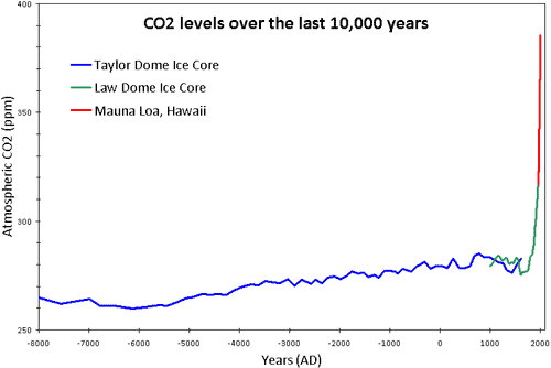
The first on-site continuous measurements of atmospheric CO2 were implemented by Charles Keeling in 1958 at Mauna Loa, Hawaii. This station provides the longest continuous record of atmospheric CO2. Currently, atmospheric CO2 levels are being measured at hundreds of monitoring stations across the globe. For periods before 1958, levels of atmospheric CO2 are determined from analyses of air bubbles trapped in polar ice cores.
What we observe is that in pre-industrial times over the last 10,000 years, CO2 was relatively stable at around 275 to 285 ppm. Over the last 250 years, atmospheric CO2 levels have increased by about 100ppm. Currently, the amount of CO2 in the atmosphere is increasing by 15 gigatonnes every year.
 Figure Figure 1: CO2 levels (parts per million) over the past 10,000 years. Blue line derived from ice cores obtained at Taylor Dome, Antarctica (NOAA). Green line derived from ice cores obtained at Law Dome, East Antarctica (CDIAC). Red line from direct measurements at Mauna Loa, Hawaii (NOAA).
Humans are emitting 26 Gigatonnes of CO2 per year
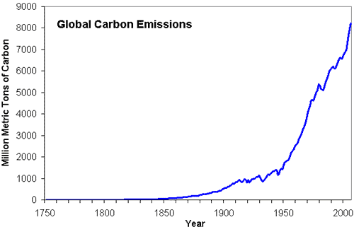
Global CO2 emissions are derived from international energy statistics, tabulating coal, brown coal, peat, and crude oil production by nation and year. This means we can calculate how much CO2 we're emitting not only in recent years, using United Nations data, but also estimate fossil fuel CO2 emissions back to 1751 using historical energy statistics. What we've found is fossil fuel and cement emissions have continued to increase, climbing to the current rate of 26 Gigatonnes of CO2 per year.

Figure 2: Total Global Carbon Emission Estimates, 1750 to 2006 (CDIAC).
In other words, humans are emitting nearly twice as much CO2 than what ends up staying there. Nature is reducing our impact on climate by absorbing a large chunk of our CO2 emissions. The amount of human CO2 left in the air, called the "airborne fraction", has hovered around 55% since 1958.
Detecting the human signature in atmospheric CO2
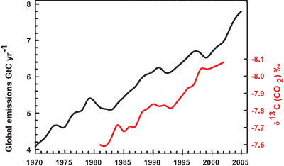
Further confirmation that rising CO2 levels are due to human activity come by analysing the types of CO2 found in the air. The carbon atom has several different isotopes (different number of neutrons). Carbon 12 has 6 neutrons, carbon 13 has 7 neutrons. Plants have a lower C13/C12 ratio than in the atmosphere. If rising atmospheric CO2 comes fossil fuels, the C13/C12 should be falling. Indeed this is what is occuring (Ghosh 2003) and the trend correlates with the trend in global emissions.

Figure 3: Annual global CO2 emissions from fossil fuel burning and cement manufacture in GtC yr–1 (black), annual averages of the 13C/12C ratio measured in atmospheric CO2 at Mauna Loa from 1981 to 2002 (red). (IPCC AR4)
So we see that humans have indeed changed the composition of our atmosphere in dramatic ways. If anyone could be accused of arrogance, you might say it's more arrogant to think we can pollute without consequences.
Intermediate rebuttal written by John Cook
Update July 2015:
Here is a related lecture-video from Denial101x - Making Sense of Climate Science Denial
Last updated on 13 July 2015 by MichaelK. View Archives


 Arguments


But I agree, buying electric cars and more efficient lightbulbs are only a tiny drop, to borrow your metaphor, compared to the effort required to lower and eventually stop CO2 emissions.
Sure, humans don't have the ability to seriously harm life on earth, and the Cold War was really about the rise of polar bear batallions.
Everyone seems to agree that if we follow the present trend, by the end of the century the temperture of the planet will increase by 4 degrees. Your article shows that at worst case the human cause is 1%. So 1% of 4 degrees is only 0.04 degrees. When you factor in all of the other variables your article mentions, plus forest fires, volcanos, etc., if all human causes were removed, there would be no noticable affect on the temperature even considering your water vapor loop which is present and obviously included in the 4 degrees change.
[PS] "Your article shows that at worst case the human cause is 1%" This does not follow from the article at all. Can you please be more explicit where in our article that you get the idea that long term change in temperature (as opposed to short term variations) is only 1% human? We obviously need to improve clarity. AR5 put it at more like 110% (the earth would be cooler without anthropogenic effects). Discussed here.
Denny @21, as the moderator [PS] indicates, the IPCC AR5 found that in the period 1951-2010, more than 100% of warming was due to anthropogenic factors, as shown in this graph derived from AR5 data by Real Climate:
The likelihood that anthropogenic factors caused only 50% or less of the warming is very small (0.06%) based on that graph, while the likelihood that it is less than 100% is only 33.14% - ie, less than one chance in three. The IPCC final statement is more conservative than the graph, allowing a likelihood of not less than 95% ("extremely likely") that the anthropogenic factors caused more than 50% of the warming.
The IPCC can be this confident because the primary natural forcings (solar and volcanic) are known to have had a negative trend over that period; the ENSO influence is known to have been near neutral; and because the sixty year period provides a close coincidence with the period of natural cycles thought by some to have a significant influence on temperaure (AMO, PDO) and hence are neutral, or very nearly so. Other purported natural influences are either also negative because associated with one of the influences above (eg, cosmic rays), or of such poor scientific basis as to be magical thinking. Because of this, denying that the anthropogenic contribution over that period is in the range of (approximately) 75-125% amounts to magical thinking and/or pseudoscience.
What is worse, anthropogenic contribution is not constant over time. It amounted to less than 50% from 1901-1950, and likely around 30%, for example. Taking the 1901-2010 interval, it is closer to 75% than 100%. With ongoing emissions at a Business As Usual rate (RCP8.5), the anthropogenic contribution will become overwhelming. That is, it will still be close to 100%, but the probability of it falling below 75% will become vanishingly small unless something very unusual happens (ie, an increase in solar activity unprecedented in tens of thousands of years (and potentially over the entire life time of Sun to date). Further, because such natural factors are unpredictable, they are not included in the projection, so that if some unprecedented natural warming did occur, so that the anthropogenic contribution fell to 80%, then likely the total warming will have increased to 5 C, not the 4 C projected.
I am a teacher and one of my objectives is to
I need some help on what type of information to provide 7th graders to read and come to a conclusion on their own. I have printed some information from procon.org. Are there any other websites or information(7th grade reading ability) which I can share with them. I am staying away from indoctrination and trying to let them read and conclude through graphs and facts. Any advice?
Teacher:
The National Climate Data Center has an excellent web page. I used it in class (10th grade). I read the selection and then wrote questions on the things I thought most important for the students to read. The 2017 Global annual report is here. 7th graders could read the list of hot years and other graphs. Have students click on the Temperature Anomolies Time series annual at the very top to see the red graph (deniers complained so the graph was removed from the main report). Ask if the graph shows temperatures increasing or decreasing (no statistics needed).
The report for the USA only is here. I like to look at the seasonal graphs (at the bottom of the page) and ask the students if they see more red/orange or more blue (red is hot and blue is cold). A statistical analysis is not needed to determine there is much more red. You can just look at your state if you wish. The regional summaries are also good to read but may be hard for your students.
The National Snow and Ice Data Center has a good web page. The yearly summary is at the end of the January 2018 page here. Read the page first (it is too long for 7th graders) and then assign what you like (I really like the graphs). The October report here has good discussion of the minimum sea ice level and some interesting graphs. The sea ice maximum is generally in March but is not usually as interesting.
Good luck. Post again if those are too hard to read or not what you want.
Teacher:
As far as evidence of human influence, see the graph Sir Charles posted here. How can you look at the wheelchair graph, which clearly shows the natural influence for the past 5,000 years was cooling, and not see clear human influence? The natural change has been cooling for thousands of years, all heating is due to human influence.
The Skeptical Science Graphics page here has a lot of good graphs (no copy of the wheelchair). The obvious changes in many happening around 1880 demonstrate clear human influence.