Climate Science Glossary

Term Lookup

Enter a term in the search box to find its definition.

Settings

Use the controls in the far right panel to increase or decrease the number of terms automatically displayed (or to completely turn that feature off).

Term Lookup

Settings


All IPCC definitions taken from Climate Change 2007: The Physical Science Basis. Working Group I Contribution to the Fourth Assessment Report of the Intergovernmental Panel on Climate Change, Annex I, Glossary, pp. 941-954. Cambridge University Press.

Home Arguments Software Resources Comments The Consensus Project Translations About Support

Bluesky Facebook LinkedIn Mastodon MeWe

Twitter YouTube RSS Posts RSS Comments Email Subscribe


Climate's changed before
It's the sun
It's not bad
There is no consensus
It's cooling
Models are unreliable
Temp record is unreliable
Animals and plants can adapt
It hasn't warmed since 1998
Antarctica is gaining ice
View All Arguments...


Username
Password
New? Register here
Forgot your password?

Latest Posts

Archives

Does ocean cooling prove global warming has ended?

What the science says...

Select a level... Basic Intermediate

The most recent ocean measurements show consistent warming.

Climate Myth...

Oceans are cooling

“Ocean heat touches on the very core of the AGW hypothesis:  When all is said and done, if the climate system is not accumulating heat, the hypothesis is invalid.

[…]Now that heat accumulation has stopped (and perhaps even reversed), the tables have turned.  The same criteria used to support their hypothesis, is now being used to falsify it.” (William DiPuccio)

In 2008, climate change sceptic Roger Pielke Sr said this: “Global warming, as diagnosed by upper ocean heat content has not been occurring since 2004”. It is a fine example of denialist spin, making several extraordinary leaps:

  • that one symptom is indicative of the state of an entire malaise (e.g. not being short of breath one day means your lung cancer is cured).
  • that one can claim significance about a four year period when it’s too short to draw any kind of conclusion
  • that global warming has not been occurring on the basis of ocean temperatures alone

So much for the hype. What does the science say about the temperature of the oceans – which, after all, constitute about 70% of the Earth’s surface? The oceans store approximately 80% of all the energy in the Earth’s climate, so ocean temperatures are a key indicator for global warming.

No straight lines

Claims that the ocean has been cooling are correct. Claims that global warming has stopped are not. It is an illogical position: the climate is subject to a lot of natural variability, so the premise that changes should be ‘monotonic’ – temperatures rising in straight lines – ignores the fact that nature doesn’t work like that. This is why scientists normally discuss trends – 30 years or more – so that short term fluctuations can be seen as part of a greater pattern. (Other well-known cyclic phenomena like El Nino and La Nina play a part in these complex interactions).

Looking at the trend in ocean heat, this is what we find:
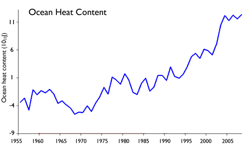
Source: Levitus 2009

There are, however, disputes about the accuracy of Argo buoys and expendable measuring devices dropped into the sea, and the reporting of temperatures down to only 700 metres. How do scientists resolve these kind of disputes – bearing in mind that such disputes are the very stuff of science, the essence of true scepticism? One way is to find more data sources – different ways of measuring the phenomenon in dispute. By using results from seven different teams of scientists, all using different tools and methods, we are able to see a clear trend. And while there is variation between team results due to the differences in technique and measurement methods, one thing they all agree on: long term, temperatures are going up.
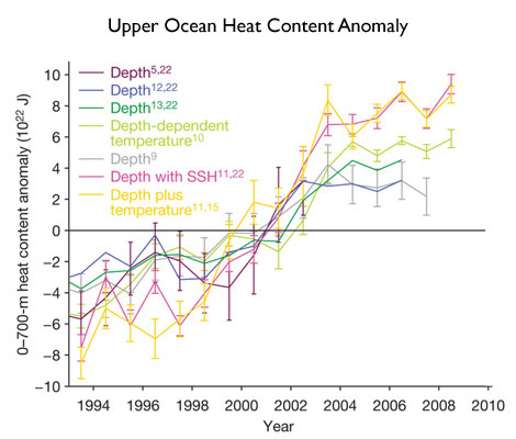
Source: Lyman 2010

The reaction of the oceans to climate change are some of the most profound across the entire environment, including disruption of the ocean food chain through chemical changes caused by CO2, the ability of the sea to absorb CO2 being limited by temperature increases, (and the potential to expel sequestered CO2 back into the atmosphere as the water gets hotter), sea-level rise due to thermal expansion, and the amount of water vapour in the atmosphere.

While there is a great deal we don’t know about how the oceans behave, we do however know that it’s safer to discuss all aspects of climate change using multiple sets of data, rather than just one, as Pielke Sr did. If ocean heat is a guide, then global warming is still on track to cause great disruption if we don’t modify our actions to reduce the release of anthropogenic CO2.

Claims that global warming is not happening on the basis of short-term ocean temperatures are not supported by the evidence.

Basic rebuttal written by GPWayne

Last updated on 1 August 2013 by gpwayne. View Archives

Printable Version  |  Offline PDF Version  |  Link to this page

Argument Feedback

Please use this form to let us know about suggested updates to this rebuttal.

Further reading

The IPCC AR4 section on Oceanic Climate Change and Sea Level (15Mb PDF) gives a good overview of ocean heat and sea level change. Interestingly, they use the ocean heat data with the erroneous 2003 cooling trend (see Figure 5.1).

Josh Willis writes a good overview of the challenges of measuring ocean temperatures in Is It Me, or Did the Oceans Cool?

Comments

Prev  1  2  3  

Comments 51 to 74 out of 74:

  1. #50: "Can you direct me to a source" You could call your local HS physics teacher or look here. Low thermal conductivity translates to high thermal inertia, as 'inertia' is commonly understood to mean resistance to a change of state. I see the results of a very similar experiment every day in the summer because I live in a brick house in a hot climate. But this is not about bricks or shuttle tiles. It's about the response of the oceans, so please respond, in the context of KR's comment #46, to the discussion of the thermal inertia of the oceans presented in the linked NOAA paper in #49.
  2. Folks, The discussion #43 - #51 on the penetration of temperature variation as a function of frequency is a well-known result of the heat equation. As a quick sketch, if you impose a sinusoidal temperature variation at the top surface of an infinite block, the temperature variation within the brick will also be a sinusoidal variation in the time variable, but the amplitude will die exponentially as a function of depth. The characteristic length for the exponential fade is proportional to the square root of the period of variation: L ∝ √Period. So the longer the period of variation, the deeper the temperature of variation reaches, so the greater the effective heat capacity or"thermal inertia" of this situation. Some references: Brief general discussion of the heat equation: http://mathworld.wolfram.com/HeatConductionEquation.html Start with eqn.2 and read to eqn.5. Unfortunately, they don't discuss oscillatory solutions: However, if you assume a positive separation constant in eqn.5, it becomes: (1/κ)*(1/T(t))(dT/dt) = (1/X)(d^2 X/dx^2) = 1/λ^2 Assuming T(t) = exp(iωt), and X(x) = exp(-λx), iω/κ = 1/λ^2 λ = sqrt(iω/κ) = √(ω/κ) * √i = √(ω/2κ) * ( 1 + i) Therefore the solution is: T(t)*X(x) = exp(iωt) * exp(-ix√(ω/2κ)) * exp(-x√(ω/2κ)) Taking the real part of the solution, we get: cos(ωt - x√(ω/2κ)) * exp(-x√(ω/2κ)) So this is a wave traveling downward at speed v = √(2κω), with angular frequency ω, and fading out with characteristic length L = √(2κ/ω) So the slower the frequency, the longer the cycle period, and the greater the depth of penetration. This solution applies straightforwardly to the brick, or to the ground. It applies to the oceans as long as they are not disturbed, so the layers are not mingled. If the layers are mixed, then the depth of penetration is increased; and the longer the period of the driving temperature variation, the greater the likelihood of mixing. So the application to the ocean still makes sense: The liquidity still supports the point that the greater the period, the greater the depth of heat penetration and thus of the thermal inertia.
  3. Should also look at the excellent Science of Doom articles on back radiation and ocean warming
  4. 52 nealjking From all that is it possible to put absolute values on abyssal warming to forcings of different magnitudes over different time periods? The reason I ask is there seems to be some subjective descriptions of different time periods as being long and short. was used to suggest forcing over only 1-2 decades have had significant impacts on abyssal warming. While the discussion around this image. suggests volcanic forcings (4-5 years) fall into the category of forcings that only have a temporary effect on OHC at the top level, similar to season variation. There seems to be some convinient placing of different forcing into particular categories in order to make wider points about what is going on here. I'm interested to know if the conclusions about all these different forcings can be resolved by a consistent description of heat transfer in the oceans?
  5. HumanityRules, #54: To get anything quantitative, one would have to specify: - the magnitude of the driving temperature variation at each frequency - take into account the very complicated mixing of layers (one thing I can see from the graphs is that different things are happening at different latitudes; that means that water at different layers are mixing) - take into account the initial conditions. In the end, the best thing to do is to model the system numerically: including both the heat flow and the very complicated water flow. All I'm using this set of frequency-specific analytical solutions for is to understand a few qualitative features: i.e., why the long-period oscillation has more "thermal inertia" than the short-period oscillations. It helps the intuition a bit, but isn't good for making very detailed comparisons.
  6. HR #54 And what does the colour (top) chart show? I for one do not have any idea what the net effect is. Oceans near the equator (low latitudes) have much greater surface areas than at high latitudes. In fact the area of the Earth's surface above 60 degrees is only about 7%. So a big patch of cold or warm water near the equator on the above chart mulitplied by the depth represents a much greater volume of water than at high latitudes. What is needed to make sense of this chart is a volume x temperature integral over the whole surface of the oceans down to the average depth of 3700m. Anyone for that challenge?
  7. This is a response to Charlie A in another thread. There are three points. 1) Just because there is more data with better coverage does not mean there was no information prior to full deployment of Argos. It just takes more work to make those comparisons properly. That's what Lyman 2009 did. It's pointless to throw out data... 2) Your start date at 2003 is still arbitrary. By what standard are you claiming "global coverage" of Argos floats? Why not pick 2005 when the coverage was even better? Why not try several start and stop points and get a sense of the variability in your results? 3) As has been pointed out, the top 700m is not (by a long shot) the entire ocean. Even small and hard to measure leakages of heat into deeper waters could have a large impact on the budget. That was the point of Trenberth's comment...to argue for a better assessment such reservoirs of heat, because clearly, due to conservation of energy, they must be there. A lot of research has been finding exactly that (thank chris!!), though the mechanisms are unclear.
  8. Charlie A (from elsewhere), the South Pacific below 30 South represents approximately 11% of the worlds total ocean surface. Therefore. if the gain in ocean heat content to a depth of 700 meters in the period 1980-2002 was essentially flat or declining, then the South Pacific must have been loosing heat at a rate almost ten times as fast as the rest of the worlds Oceans where gaining heat. Checking SST data, I notice that that the surface of the South Pacific was gaining heat at about the same rate as the rest of the world's oceans. Checking Schukman et al 2009 I see that the South Pacific has been gaining heat over the period 2003 to 2008, and if anything has been doing so faster the then rest of the world's oceans. In other words, based on readily available data there is no reason to think the South Pacific has behaved significantly different from the rest of the worlds oceans in terms of heat gain. Furthermore, although there have not been many probes into the South Pacific, there have certainly been some; and certainly sufficient to show it has been behaving in a very unusual manner compared to the rest of the world's oceans. Apparently what data there is from the South Pacific does not show any such unusual behaviour. So, I will take it that the South Pacific has not been cooling at a rate ten times greater than the rest of the oceans have been warming. Given that, the sampling of the other 90% of the worlds oceans which has been quite extensive represents a fair sample of the global heat content of the ocean. Therefore, excluding pre 2003 data is cherry picking, pure and simple.
  9. Speaking of cherry-less OHC data, here is some from Domingues 2008 (observations in black): [Source]
  10. @ Tom Curtis -- I provided the link for you to look at any other combination of depth and ocean basin. Here are a couple of plots of total number of temp profiles globally. They show the same very rapid rise of observations in 2003/2004. I only mentioned the South Pacific because that is the area that had the lowest level of sampling prior to Argo. The animated GIF is color coded. The blue is Argo, Red is XBT. The green is TAO, which has lots of observations but at only a few sites. I'll repeat that graph so others can see. On the plots of number of profiles, green is XBT and red is the fixed TAO buoys. Black is the total number of observations.
  11. The data source for the graphics above is the Climate Prediction Center of NOAA. http://www.cpc.ncep.noaa.gov/products/GODAS/data_distribution.shtml The animated GIF is a combination of multiple images from the website, combined and resized, but otherwise unaltered. ---------------------------- The significance of OHC is that the average global net radiative imbalance over any period, no matter how short, can be estimated by taking the difference of the OHC between the start and end of that period. That has always been theoretically true. Over the last 6 to 8 years we have finally gotten the spatial and temporal density of sampling of ocean temperatures that is needed to put that into practice. The relatively slow addition of heat to the ocean, in the absence of significant volcanic activity creates a discrepancy between the expected heat content and the observed heat content. There are several possibilities ... the two main ones being that the 1) OHC measurements being in error, and 2) that we have erroneous values for forcings such as CO2, solar, and aerosols. Another possibility, but unlikely is that there is a large amount of heat being gained in other parts of the earth system, such as the land or atmosphere or into melting of ice. People that have looked at the numbers for global heat content find that ice melt and changes in atmospheric heat content are insignificant compared to the OHC. It is an interesting puzzle that will most certainly become a major area of study in the future.
  12. Charlie A @60, if you want to claim the approximately 24,000 profiles per annum from around 1993 to 2001 (for 500 to 1000 meters) is insufficient to be a representative sample, may I suggest you go learn some statistics. Choosing to ignore the data from those approx 24,000 profiles is, however, still cherry picking.
  13. Sorry, I am missing something. What's CharlieA's take on Hansen et al 2011? Not relevant till its published? Or rejecting von Schuckmann and Le Traon (2011)?
  14. Tom Curtis, the spatial distribution is also important. You suggest that I go learn some statistics. You should also make that suggestion to those scientists that have published error estimates for OHC measurements which agree with my observation. 24 million samples aren't sufficient if there are large areas of the ocean without data. Look at the last few frames of the animated GIF and see how much of the ocean has no profiles over an entire year. If you choose to ignore that, then there is no use in further discussion.
  15. Charlie A, spatial distribution is important if there is reason to think the areas not covered are behaving significantly differently from the areas that are. As you seem to be suggesting the significant change in trend in the OHC of the upper 700 meters in 2003 as being an artifact of sampling, you are committed to the non-sampled areas behaving in a significantly different way from the sampled areas. At the very best, if you treat the entire southern ocean as being unsampled that means you require it to be loosing heat at around twice the rate the sampled areas are gaining heat over the 1990's and early 2000's. Well, what is your evidence of that? The available evidence suggests otherwise. And, of course, if there was no major cooling of the Southern Ocean, then the data taken elsewhere is representative so that while the trend may have been less than that recorded, it was still strongly positive. Finally, given that the trend in the Southern Ocean was unrecorded, it is as likely to be strongly positive as not. Indeed, given what we know about the trend elsewhere, and the trend in Southern Ocean SST, and the trend in the "ARGO era", it is more likely to be positive than negative, or even neutral. IN fact, with equal probability, had it recorded it could make the recorded trend stronger rather than weaker.
  16. I think the way this discussion evolved and moved has left some misconceptions. My posts on the other thread were in response to others saying that Pielke Sr's choice of 2003 as the start point for comparison of observed OHC with radiative imbalance projections. When he started posting on this subject, back in 2007, he stated that he chose 2003 as the start point because that is when there were nearly complete global coverage. The data from Climate Prediction Center of NOAA supports that, or at least supports 2004 being the year of reasonably complete spatial coverage. Prior to that, the coverage was much spottier, both temporal and spatial. Trends can still be determined, but only over the longer periods needed to average out the sampling noise. On the other thread, some OHC plots by Tamino were cited as evidence that there has been no change in trend. My alternative plot was criticized as being a "cherry pick" and not looking at long enough of a period. (I'll post those plots in another comment). In the comment #65 just above, Tom Curtis says "As you seem to be suggesting the significant change in trend in the OHC of the upper 700 meters in 2003 as being an artifact of sampling," Tom, I think if you look around this site you will find that most do not accept that there has been a significant change in the trend. Tamino's graph says there is no change. Various contributors to this site say that 2003 onward is too short of a period to consider, and to even analyze a trend since 2003 is "cherry picking". So that the discussion can continue with common understanding, I'll make a series of statements below. Then we can discuss where we agree and disagree. 1. There is a change in trend in OHC in 2003. Maybe. The measurement accuracy and frequency of measurement is much better since 2003/2004 than before and it does appear that taking the OLS trendline over the last 7 or 8 years does provide a reasonable estimate of the average OHC gain over that period. It is dangerous to assume a trend change that occurs simultaneously with a change in measurement method is real, but there is now sufficient data to say that the observed trend since 2003/2004 is actual, rather than an artifact of the transition in measurement method. My plot with 21 quarter (63 month/5.25 year) smooth, I believe, is a reasonable presentation of the data. Note that I also include the 3 month unfiltered data for comparison. 2. The change in OHC trend, if any, is indicative of a long term change. Unlikely. While the long term OHC measurements have very high uncertainty, the average uncertainty over a long period, such as 1970-2000 gives a reasonable estimate of the long term trend over that period. Without evidence to the contrary, I assume that the long term trend will continue at more or less this same average rate. In this sense, Tamino's highly filtered plot is accurate. 3. OHC measurements in the "Argo era" (staring 2003 or 2004) are reasonably accurate estimates of the average global radiative imbalance when measured over periods as short as 1 year, and definitely an accurate estimate of the average radiative imbalance over the entire post 2004 period. I do agree with this statement. 4. OHC measurements over a 1 to 5 year period, when combined with estimates of ice melt are a suitable way to estimate the global radiative imbalance over that 1 to 5 year period. I do agree with this statement. This is an important assumption as it shows us a way toward more accurate estimates of the various forcings. This is the point where estimates of OHC in the abyss become important. The amount of heat going into the deep ocean is a matter of significant debate at this time. 5. The direct forcing from CO2 increases can be accurately estimated. I strongly agree. The uncertainty with this forcing is small. 6. The change in solar forcing can be accurately measured. Partial agreement. The delta is reasonably well measured, but with concerns about drifts and step changes between satellites. It is clear that that the absolute values of solar forcing are not well measured, since various satellites disagree by several watts/meter squared. 7. Aerosol forcings remain highly uncertain. Absolutely. There is a high variance in the aerosol forcings assumed, with various climate models using different assumptions. The uncertainty in aerosol forcings are significantly greater than the uncertainty of equivalent radiative forcings associated with Argo era OHC content measurements averaged over just a few years. 8. OHC measurements (of upper 700 meters) since 2003 (or 2004) indicate that the average global radiative is much smaller than previously assumed. I'm agnostic on this point. We have now have good measurement and tracking of upper ocean OHC. Estimates of OHC in the deep ocean widely vary, and in some cases appear to be driven by an attempt to close the energy budget. 9. OHC measurements can be used to diagnose the climate response to warming in regards to changes in albedo. Maybe. That's why the reason behind the slowing of OHC rise(or at least upper ocean OHC) since 2003 needs to be investigated and, if possible, the cause determined. =========================== yes, it's a long post, but hopefully it is organized such that specific points of agreement and disagreement can be directly addressed.
  17. Scaddenp -- you and others are perhaps confused about my statements because the posts above are a continuation of a discussion that started here. My depiction of OHC was somehow considered to be cherry picking and improper smoothing, while Tamino was heralded as "a world-class professional time-series analyst" for his plot. Described by Skeptical Science moderator DB as "Smoothed (5-year averages), one gets this:" I chose to concentrate on data since 1985 to expand the detail. My smoothing technique is a standard 21 quarter moving average, aka boxcar average, with the moving average of each quarter plotted. The smooth plot terminates 10 quarters before the unsmoothed quarterly data, because that is the point where I would have to start making assumptions about future data in order to generate a smoothed datapoint. I do believe that the OHC data does show a change in trend. This sort of change in trend has been seen before ... as can be seen in the source data at NODC.
    Response:

    [DB] Despite your impying it, the provenance of your first graphic is not Tamino's.

    The whole point is the selective use of the outlier, 2003, as the start point. 

    The issues with this practice are detailed here.

    Suggestions:

    • Do the work with the bigger picture to give context
    • Do the requisite significance testing

    If after that you feel Tamino to be in error, then go to Open Mind and say so.

  18. Tamino isn't "heralded as a 'world-class professional time-series analyst' for his [OHC] plot." He established his bona fides long prior. The question is whether you will take your concerns directly to Tamino or if you will remain on a separate site criticizing his work...
  19. CharlieA - your link to previous discussion is broken. Hansen 2011 is also only looking at 2005-2010 for Argo but reaching very different conclusions.If you dont like VS 2011 for OHC, what is your objection and do you have better? As to Tamino, I think that his claim of cherry picking as a motive is suspect - the stated reasons for starting at 2003 are also valid - but the comments on the effect of starting at 2003 still stand. One thing is for sure, Argo is a superb tool and another 5 years of data is going to be very interesting.
    Response:

    [DB] Fixed Link.

  20. Charlie A @67, I do not think anyone on this forum has accused you of Cherry Picking because of your graph with its start point in 1980. Nor is there anything wrong with that graph beyond the fact that it labels the OHC of the 0 to 700 meter layer as being the OHC simpliciter (a fault of the source of the graph, but not the sources documentation). Tamino's graph was produced in one of two recent posts pointing out, and rebutting denier cherry picking. It is not a rolling five year average as DB's initial comment might suggest, but a plot of successive non-overlapping five year averages with the penultimate point being the mean of the years 2005-2009, and the last datum being an average of the data from January 2010 to present. (See the comment by Ned.) I personally think Tamino should have made the years 2006-2010 the final datum to not compare apples and oranges, but that is a minor point and would not make a substantive difference to the graph. I say it makes no substantive difference because the mean of 2001-2005 would clearly be less than the mean of 2006-2010. Indeed, based on your plot of the running 21 quarter mean, it would be about 2.5*10^22 Joules less, which suggests that Tamino's use of just over a years data for the final datum under estimates the trend rather than over estimates it. The red line on Tamino's graph plots a lowess smooth of the original data (not the means). In this case it overstates the final trend in the data, but in another example it understates it, so clearly Tamino is not fiddling with the smooth to exaggerate the trend. When I say Tamino was rebutting cherry picking, I mean examples like this from Bob Tisdale: (Copied from Tamino) Or this recent example by Berényi Péter in a comment on Skeptical Science: In the later case, Berényi Péter simply wants to treat all pre-2003 data as void. That is, of course, absurd. The pre-2003, indeed, the pre-2005 OHC data is rightly suspect for determining inter-annual variability. It is, however, fairly robust for determining the decadal trend. As I have pointed out above, assuming the pre-2003 trend to be significantly different from that recorded implies a multitude of bizzare, and unsubstantiated hypotheses. (BP's effort was, of course, a double cherry pick in that he selects the 0-700 meter data when 0-2000 meter data was readily available.) In Bob Tisdale's case, the cherry pick involves picking the year with the largest departure above the trend line as a start point for the prediction. This has the straight forwardly dishonest effect of displacing the "predictions" above the trend line so that even should data follow the trend, they will still be seen to be below the doctored "predictions". (From Tamino) From your 66 above, it is plain that you are not trying to cherry pick in any such fashion. That makes it rather surprising that you chose to defend Pielke's rather straightforward cherry pick in 2007. Contrary to your claim, both Willis et al 2004 (which Pielke references) and Lyman, Willis and Johnson 2006 (which, surprisingly, he does not) show 2003 as the highest datum point, and indeed, 2003 lies above the long term trend in both. Despite this, in the true spirit which Tidale later copied), Pielke makes the 2003 the start point of his "prediction" for future OHC as a test case for AGW. Finally there is nothing wrong with choosing 2003 (or better 2005) as a start year for an analysis of OHC. What is wrong is suggesting that previous measurements of the OHC trend are some how invalid because they predate the "Argo era". There are certainly issues in resolving annual variability in OHC prior to 2005, but that is not the same as issues resolving decadal trends. On this point I will let Willis have the last word:
    "Second, This estimate only goes back to 2005. The reason for this is that Argo still has a number of floats for which no PI has responsibility for quality control of the data. For early incarnations of these floats, this could mean that significant (albeit correctable) biases still exist in the pressure data. Normally, these biases are corrected by the PI, but since these floats are sort of homeless, they have not yet been corrected. It is also difficult (or in many cases impossible) for the end user to correct these pressure data themselves. Argo is still trying to figure out how to deal with these data and I sure they will receive bias corrections eventually, but for the moment we need to exclude them. So, for this reason I am still not comfortable with the pre-2005 estimates of heat content. Anyway, the consequence of this is that we still do not have a good estimate of ocean heat content changes from about 2002 to 2005, when the dominant data source for ocean heat content went from XBTs to Argo floats. For this reason, I remain a bit skeptical of any heat content estimates during that period. That said, however, I do think that longer-term estimates like those of Levitus et al., Domingues et al., and Lyman et al. are robust with respect to the long-term heat content increases. The issue with the 2002-2005 period is that the uncertainty during this period is still much larger than any year-to-year fluctuations that may exist."
    (From an email to Roger Pielke Snr)
    Response:

    [DB] If my sloppy attribution of Tamino's graph is the cause of all this, I humbly apologize to all parties.

  21. I see Pielke Sr's graph no more cherry picking than are temperature anomalies. Anomalies are looking at changes in temperature. Pielke's graph is looking at changes in OHC. @Tom Curtis -- do you agree that the change in OHC, at least in theory, is a good proxy for the global radiative imbalance ? If you agree, then the question becomes, over what period must we measure OHC in order to get a reasonably accurate estimate of radiative imbalance over that period. Obviously, with poor spatial and temporal distribution of samples, the period over which one must average must be longer. With more complete coverage, such as with Argo over the last several years, the period over which we can accurate deduce global radiative imbalance becomes shorter. ------------------------- When looking at temperature anomolies, the absolute temperature becomes less important. When looking at the OHC to diagnose radiative imbalance over the last 8 (or 6, or 5) years, the absolute starting point of the OHC graph is not relevant.
  22. Charlie A, I would agree that the total OHC would be a reasonable proxy for global radiative imbalance. Obviously the more heat reservoirs you include (ice melt; atmospheric heat; land heat) the better it is. Conversely the more restricted the Ocean Heat you measure (top 700 meters, top 300 meters) the less valuable a proxy it is.) Having said that, it seems evident that flows between different heat reservoirs in the climate system are large relative to the annual increase in OHC. Also measurement error prior to 2005 has to be considered significant at annual resolution. Therefore I would not consider annually resolved OHC a good proxy at this time.
  23. Charlie A #66 Your 9 points are a pretty reasonable summary Charlie A. What is very clear from the 0-700m OHC Charts 1993-2010 is the step jump in the 2001-04 period when the changeover from predominantly XBT to Argo occurred. If you plot a separate XBT trend up to 2001 and an Argo trend after 2004 the step is most apparent and can only be an artifact of the transition, because the deltas from satellites show no such step up in radiative imbalance at that time. Linearizing the spliced XBT to Argo with the step jump in place produces an inflated slope on the combined curve.
  24. One might also consider there there is a relationship between ocean heat content and atmospheric heat content. In a nutshell, the ocean leads the atmosphere around by the nose. It has a lot to do with the fact that there is as much mass in the first 10 meters of the ocean as there is in all the air above it. Plus, there are increases in specific humidity to account for. So, it would be interesting to see a refutation of rising OHC that would be compatible with the observed rise in atmospheric heat content.
  25. Camburn, good to see you agree on value of the Argo instrumentation. Hansen has taken a punt on what he expects OHC to do over next few years. What's your position if he turns out to be correct then?

Prev  1  2  3  

Post a Comment

Political, off-topic or ad hominem comments will be deleted. Comments Policy...

You need to be logged in to post a comment. Login via the left margin or if you're new, register here.

Link to this page


The Consensus Project Website

THE ESCALATOR

(free to republish)


© Copyright 2024 John Cook
Home | Translations | About Us | Privacy | Contact Us