


 Arguments


How reliable are CO2 measurements?
What the science says...
| Select a level... |
 Basic
Basic
|
 Intermediate
| |||
|
CO2 levels are measured by hundreds of stations across the globe, all reporting the same trend. |
|||||
Climate Myth...
CO2 measurements are suspect
"The Keeling curve, which is widely used to show the increase in CO2 emissions, is based on data from the top of Mount Mauna Loa in Hawaii. Mauna Loa is a volcano and it doesn’t seem to me that a volcano is the best place to be taking CO2 measurements" (disinter)
At a glance
Mauna Loa is an active volcano on 'Big Island', the largest of the chain that makes up the state of Hawaii. It does not erupt that often; the last four times at the time of writing (2023) were in 1950, 1975, 1984 and 2022-23. The summit is 4,169 metres (13,679 feet) above sea level.
The observatory that takes regular CO2 measurements is situated some 6.4 kilometres (4 miles) from the summit, on the volcano's northern slopes. Here, the prevailing winds are the north-easterly Trades, blowing in clean air off the Pacific Ocean. Hour to hour CO2 levels in this airflow vary by no more than 0.3 parts per million (ppm).
Light southerly winds, bringing air from the volcano, can however occur under very specific weather conditions, normally late at night. Such conditions are readily detectable because unlike the steady 'baseline' readings, CO2 levels suddenly start to jump up and down wildly. These highly erratic CO2 levels are so different from the baseline data that they can easily be filtered out with mathematics. During the 2022-23 eruption, measurements from Mauna Loa Observatory had to be suspended from Nov. 29, 2022 and observations from then until July 4, 2023 were from the Mauna Kea Observatories, approximately 21 miles north of Mauna Loa.
Measurements of CO2 at Mauna Loa commenced in 1958. NOAA’s Earth Science Research Laboratory program also measures CO2 in over 60 locations around the world, taking air samples in flasks. Flask measurements and the Mauna Loa data show excellent agreement. This confirms that occasional detections of volcanic CO2 at Mauna Loa do not affect the final results. The data-filtering process paints a true picture of the situation.
The upward-sloping trend in CO2 concentrations at Mauna Loa is a reflection of human activity. It represents our burning of fossil fuels and other types of carbon emissions. Superimposed on that upward trend is an annual wiggle. The wiggle represents the Fast Carbon Cycle, involving photosynthetic plants in the Northern Hemisphere. That's where most of the planet's landmasses happen to be. Every spring the plants become more active as the growing season starts and CO2 levels start to drop. But autumn comes along, the leaves shrivel and fall and CO2 rises again. It's like the heartbeat of the planet, superimposed on the upwards slope that very definitely represents us.
In conclusion, scientists know all about the volcanic activity at Mauna Loa and the specific conditions in which volcanogenic gas emissions will be and are detected. To suggest otherwise is an example of the misrepresentation often required in order to promote the talking-points of science-denial.
Please use this form to provide feedback about this new "At a glance" section. Read a more technical version below or dig deeper via the tabs above!
Further details
This myth is a classic example of ignoring critically relevant evidence in order to state a conclusion. Misrepresentation is the technical term. The fact that Mauna Loa is a volcano is of course well-known among Earth scientists. Mauna Loa observatory is, however, situated some 6.4 kilometres (4 miles) from the crater, on the volcano's northern slopes. Here, the prevailing north-easterly Trade Winds blow in clean air off the Pacific Ocean. Hourly measured CO2 levels in this airflow vary by no more than 0.3 parts per million (ppm) (fig. 1).
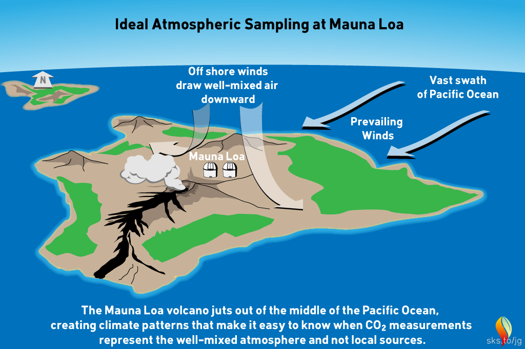
Fig 1: geography and typical meteorology of the Mauna Loa district. Graphic: jg.
Light southerly winds, bringing air from the volcanic vents, can however occur under specific weather-conditions. In such circumstances, a temperature inversion can form over the fumaroles around the summit. The inversion traps volcanic CO2 emissions that drift northwards on that southerly breeze. Such conditions only occur late at night. Their effect is readily detected. Unlike the steady 'baseline' readings from the trade winds, when the southerly wind is blowing, CO2 levels start to fluctuate wildly. These highly erratic CO2 levels differ so much from the baseline measurements that they are easy to spot. They can be removed by mathematical data-filtering. Essentially they represent sporadic outbreaks of 'noise'.
The following graph (fig. 2) shows atmospheric CO2 levels over the last 10,000 years. It includes ice core data for CO2 levels before 1950. For values after 1958, direct measurements from the Mauna Loa Observatory on Hawaii were used.
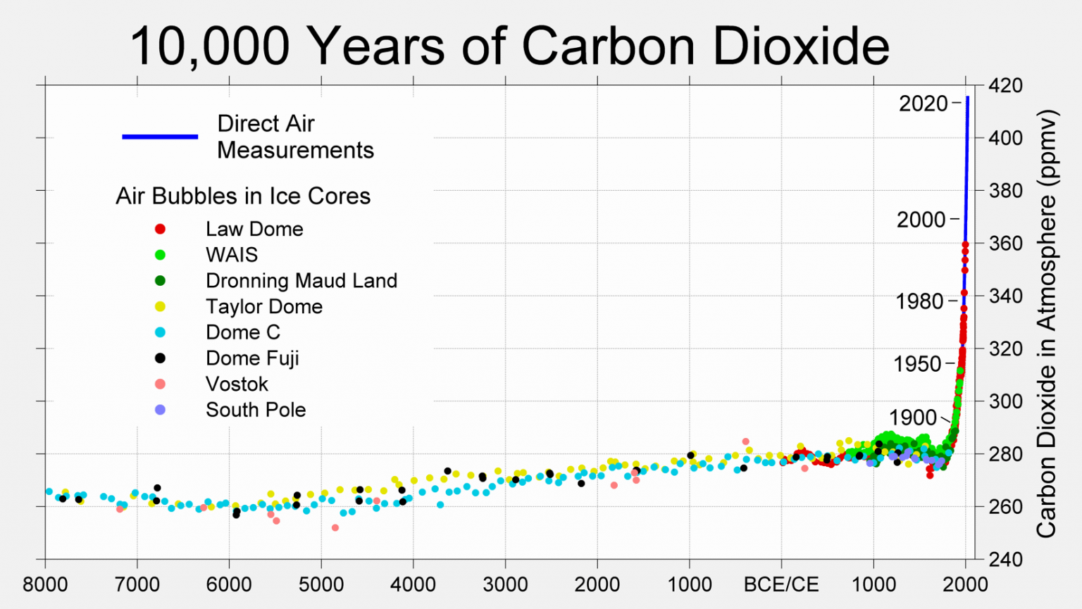
Figure 2: CO2 levels (parts per million) over the past 10,000 years. Source: Berkeley Earth
Mauna Loa is often used as an example of rising carbon dioxide levels (fig. 3) because it is the longest, continuous series of directly measured atmospheric CO2, the so-called 'Keeling Curve', that we have. The reason why it's acceptable to use Mauna Loa as a proxy for global CO2 levels is because CO2 mixes well throughout the atmosphere. Consequently, the trend in Mauna Loa CO2 (1.64 ppm per year when this rebuttal was first written in 2010, now 2.69 ppm, July 2022-2023) is statistically indistinguishable from the trend in global CO2 levels (fig. 4). If global CO2 was used in figure 2 above, the resulting "hockey stick" shape would be identical.
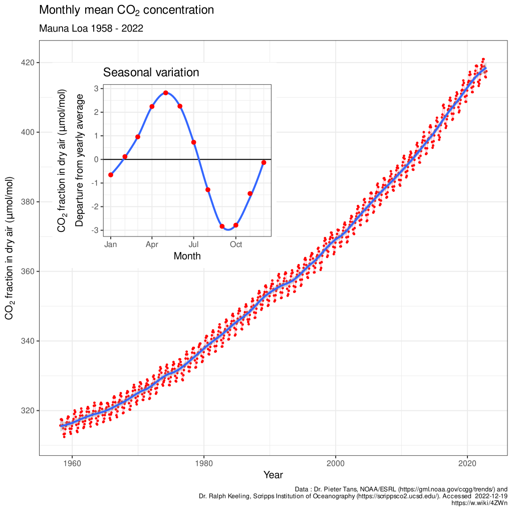
Figure 3: The Keeling Curve - monthly mean CO2 concentration data (with the occasional volcanic anomaly filtered out), Mauna Loa Observatory, 1958-2022. Inset shows the annual 'wiggle' caused by seasonal plant-growth and dieback in the Northern Hemisphere. Image licensed under the Creative Commons Attribution-Share Alike 4.0 International licence.
This video is an excellent graphic example of where our data for CO2 levels come from and how the wiggles vary. It shows surface measurements of CO2 varying over different latitudes from 1979 to 2006. The graph is created by Andy Jacobson from NOAA and includes a global map displaying where the measurements are coming from, a comparison of Mauna Loa CO2 to South Pole CO2 and the graph expands at the end to include ice core measurements back to the 19th Century. The key point is that the wiggles are of low magnitude near the equator but are bigger in the north, as might be expected because seasonality is more pronounced at higher latitudes.
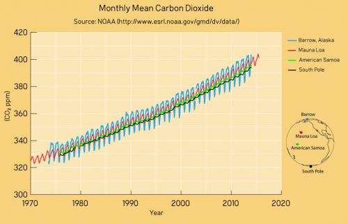
Figure 4: CO2 measurements from Mauna Loa and some other global sampling stations over recent decades. The trends are identical as are the positions of the wiggles that vary in magnitude according to seasonality in the Northern Hemisphere. Data from NASA; graphic by jg.
Satellite data is also consistent with surface measurements. This video shows the global distribution of mid-tropospheric carbon dioxide. The data comes from the Atmospheric Infrared Sounder (AIRS) on the NASA Aqua spacecraft. Superimposed over the global map is a graph of carbon dioxide observed at the Mauna Loa observatory. However CO2 levels are measured, the same trend is observed. Upwards and upwards and upwards.
Last updated on 1 October 2023 by John Mason. View Archives


As Tom Dayton suggests, if the question is whether CO2 has a short residence time, that should be discussed in the thread CO2 has a short residence time. If anyone is still uncertain about how consistent CO2 measurements are globally, please go to the World Data Center for Greenhouse Gases, search for CO2 data from various stations, and look at them yourself. Here are some examples of graphs. These data haven't been "normalized" or "fixed" to match each other; they're completely independent data sets. Some are from the polar regions, some from the tropics, some from the northern hemisphere, some from the southern, some from ocean sites, and some from inland sites.
[BW 2015-08-22 - link to graphic on imageshack (co2stnsfull.png) no longer valid]
Here's an enlargement showing 1990 to the present:
[BW 2015-08-22 - link to graphic on imageshack (co2stnspost1990.png) no longer valid]
Note how consistent the following are: the actual value, the upward trend, and the seasonal cycle.
[BW 2015-08-22 - embedded graphics deleted as no longer showing valid content (were showing advertisments instead) and were breaking page formatting]