Climate Science Glossary

Term Lookup

Enter a term in the search box to find its definition.

Settings

Use the controls in the far right panel to increase or decrease the number of terms automatically displayed (or to completely turn that feature off).

Term Lookup

Settings


All IPCC definitions taken from Climate Change 2007: The Physical Science Basis. Working Group I Contribution to the Fourth Assessment Report of the Intergovernmental Panel on Climate Change, Annex I, Glossary, pp. 941-954. Cambridge University Press.

Home Arguments Software Resources Comments The Consensus Project Translations About Support

Twitter Facebook YouTube Mastodon MeWe

RSS Posts RSS Comments Email Subscribe


Climate's changed before
It's the sun
It's not bad
There is no consensus
It's cooling
Models are unreliable
Temp record is unreliable
Animals and plants can adapt
It hasn't warmed since 1998
Antarctica is gaining ice
View All Arguments...


Username
Password
New? Register here
Forgot your password?

Latest Posts

Archives

Did global warming stop in 1998, 1995, 2002, 2007, 2010?

What the science says...

Select a level... Basic Intermediate

Global temperatures continue to rise steadily beneath the short-term noise.

Climate Myth...

Global warming stopped in 1998, 1995, 2002, 2007, 2010, ????

"January 2008 capped a 12 month period of global temperature drops on all of the major well respected indicators. HadCRUT, RSS, UAH, and GISS global temperature sets all show sharp drops in the last year" (source: Watts Up With That).

A common claim amongst climate skeptics is that the Earth has been cooling recently. 1998 was the first year claimed by skeptics for 'Global Cooling'. Then 1995 followed by 2002. Skeptics have also emphasized the year 2007-2008 and most recently the last half of 2010.

NASA and climate scientists throughout the world have said, however, that the years starting since 1998 have been the hottest in all recorded temperature history. Do these claims sound confusing and contradictory? Has the Earth been cooling, lately?

To find out whether there is actually a 'cooling trend,' it is important to consider all of these claims as a whole, since they follow the same pattern. In making these claims, skeptics cherrypick short periods of time, usually about 20 years or less.

The temperature chart below is based on information acquired from NASA heat sensing satellites. It covers a 30 year period from January 1979 to November 2010. The red curve indicates the average temperature throughout the entire Earth.

The red line represents the average temperature. The top of the curves are warmer years caused by El Niño; a weather phenomenon where the Pacific Ocean gives out heat thus warming the Earth. The bottoms of the curves are usually La Niña years which cool the Earth. Volcanic eruptions, like Mount Pinatubo in 1991 will also cool the Earth over short time frames of 2-3 years.
UAH
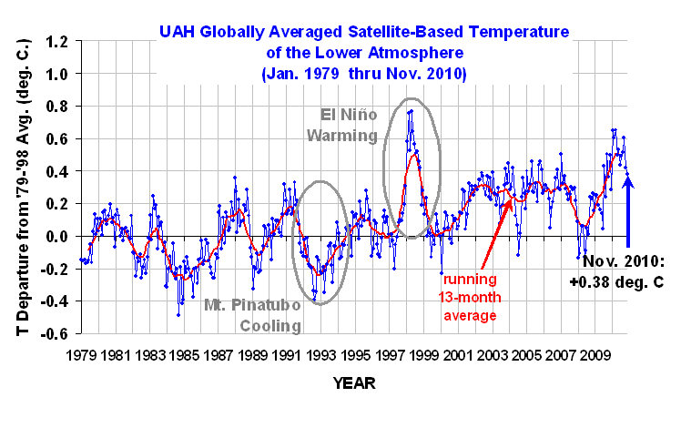
Figure 1: University of Alabama, Huntsville (UAH) temperature chart from January 1979 to November 2010. This chart is shown with no trend lines so the viewer may make his own judgment.

Below is the same temperature chart, showing how skeptics manipulate the data to give the impression of 'Global Cooling'. First they choose the warmest most recent year they can find. Then, in this case, they exclude 20 years of previous temperature records. Next they draw a line from the warmest year (the high peak) to the lowest La Niña they can find. In doing this they falsely give the impression that an ordinary La Niña is actually a cooling trend.

UAH

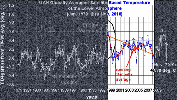
Figure 2: Representation of how skeptics distort the temperature chart. Even though the chart clearly indicates increased warming, skeptics take small portions of out of context to claim the opposite.

What do the past 30 years of temperature data really show? Below is the answer.

UAH

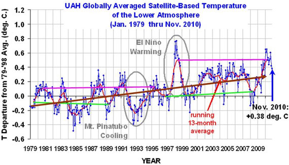
Figure 3: Trend lines showing the sudden jump in temperatures in the 1995 La Niña (Green lines) and the 1998 (Pink lines) El Niño events. Brown line indicates overall increase in temperatures.

The chart above clearly shows that temperatures have gone up.  When temperatures for the warm El Niño years (pink lines) during 1980-1995 are compared to 1998-2010, there is a sudden increase of at least 0.2o Centigrade (0.36o Fahrenheit). Temperatures also jumped up by about 0.15oC (0.27oF) between the cool La Niña years (Green lines) of 1979-1989 and those of 1996-2008 (the eruption of Mount Pinatubo in 1991 lowered the Earth's temperatures in the midst of an El Niño cycle). The overall trend from 1979 through November 2010 (Brown line) shows an unmistakable rise.

This is particularly clear when we statistically remove the short-term influences from the temperature record, as Kevin C did here:

In spite of these facts, skeptics simply keep changing their dates for 'Global Cooling', constantly confusing short-term noise and long-term trends (Figure 4).

Escalator

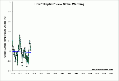
Figure 4: Average of NASA GISS, NOAA NCDC, and HadCRUT4 monthly global surface temperature anomalies from January 1970 through November 2012 (green) with linear trends applied to the timeframes Jan '70 - Oct '77, Apr '77 - Dec '86, Sep '87 - Nov '96, Jun '97 - Dec '02, and Nov '02 - Nov '12.

 Basic rebuttal written by dana1981


Update July 2015:

Here is a related lecture-video from Denial101x - Making Sense of Climate Science Denial


Last updated on 7 September 2017 by MichaelK. View Archives

Printable Version  |  Offline PDF Version  |  Link to this page

Argument Feedback

Please use this form to let us know about suggested updates to this rebuttal.

Comments

Prev  1  2  3  4  5  Next

Comments 51 to 75 out of 101:

  1. I sea a game of ice hockey in the near future.... Sharpen your blades and repair the goal.
    Response: (DB) I hear spring training has lifeguards. Long term, will be an indoors-only pasttime.
  2. This is my first post here. I hope the note and images come through properly. ***************************************** I’m afraid that your negation of the skeptics arguments was in itself too simplistic and inappropriate. I agree with your preliminaries and with what you showed through Figure 2. However, only the TV talking heads would try to use Figure 2 as you show it. Let me suggest another possible view of the same data from UAH (extended to April 2012). I would appreciate your comments on the analysis. First, let’s look at the 17 years from 1979 through 1996. The green line is my “eyeball-least-squares-fit” to the data. A more precise analysis might not exactly match, but it certainly wouldn’t show a significant increase or decrease in global temperature during this period. Now let’s look at the more recent years. Obviously, we want to try to avoid confusing the analysis with an El Niño, so let’s just look at the period from 2002 to 2012. Can anyone show me the temperature global temperature increase that has happened during this last decade. If this data is real, I can’t see any response to an accelerating atmospheric CO2 concentration. (Does anyone challenge the raw data or its reduction to this curve?) Now if we put these two together, it seems to indicate that there were a step change that occurred between about 1996 and 2002. Yes., it’s warmer now than it was in 1979. Yes, the last decade has been the warmest in a while, but how can you, in good conscience, draw a straight line from 1979 to 2012 and relate that to any parameter that as been rising steadily at an accelerating rate? It may be mathematically, and statistically, correct, but it is a scientifically poor analysis of this data. I have also seen some analysis on this site that say that just because temperature change isn’t happening, doesn’t mean climate change is over. What was cited was that what was really important was Global Heat Content, because that was how to understand the net increase in heat being captured by the oceans. A curve was shown through about 2003 and looked to show a steadily increasing global thermal heat content. You almost had me convinced. Global heat content does look to be a pretty sound way to look at whether the earth is absorbing more heat or not. However, the data stopped at 2003. I searched around and found a figure on the NOAA site . Now please help me understand what is steadily increasing in response to the accelerating atmospheric concentration of CO2 . For reference, I am a liberal research engineer, who also happens to be an anthropogenic global warming (nay , climate change) skeptic. Not a non-believer, a skeptic. I agree there are changes happening. I’m sure that man is causing at least some of it. But the doomsaying conclusions I hear being expounded just don’t seem to be justified by the data that I have been able to find. I would be happy for you to help me see the error in my ways. Your site has the potential to be a place where data can be discussed and countered and recountered. The other sites all seem to be only one sided. Are you willing to open this site to not only beating down the stupid comments made by the right wing talking heads on TV, but to honestly looking at the experiments, the data, the interpretation of that data, and the alternative conclusions that can be drawn?
  3. matzdj, That's a very pretty up-down escalator you've created. Read this post and then this one. Some places to start (I won't argue with you, if you're as open minded and concerned as you say, then you should be able to figure this out very easily for yourself). 1) Don't use Spencer's graphs. He uses lots of "tricks" like stretching the Y axis, and adding the rather silly "polynomial fit for entertainment purposes." Try woodfortrees.org, like this. 2) Don't use short trends. They're useless. Your entire 2002-2012 choice is a waste of everyone's time. 3) Forget "step changes." There's no such thing. That's for the wave-your-arms-magic-and-fantasy crowd. 4) Read about Foster and Rahmstorf 2011. 5) Look at this post giving another perspective on how to look at temperatures. 6) Look harder for the ocean heat content information. This site is a good place to do that. There's actually a post coming up on that within a few days. A few of them, actually. Bottom line: a) Don't use short trends. b) Don't assume that because the simple observations are noisy that you can't extract a clearer signal from the data. c) When you do look at the signal, and you also consider the complexity and other factors in the system, everything makes sense. d) Read and learn more before you adopt a position.
  4. Mastzdj, I am surprised an engineer would claim "my “eyeball-least-squares-fit” to the data." Any scientist knows an eyeball line is not a least squares line. Using my special Mark-2 ultra-sensitive eyeball your lines are incorrect. They should have an upward slope in both cases where you have flat lines. Please provide a graph with a least squares fit and not an eyeball fit.
  5. matzdj: Your proposed 'step change' has been discussed here before. The problem is that there is no physical mechanism that can make that happen. You'd need an 0.3 degree step, which is about the size of the '98 el Nino (refer to the departure from linear in fig 3). That el Nino ended, as all of these cyclic events do. That leaves your 'step' unsupported. No, the scientifically unsound analysis is the one that does not look at all the data, does not take into consideration the noise and creates effects without cause.
  6. Muon beat me to it, matzdj. The theory of AGW did not start with measurement of temperature. It started with physics. If you or Roy are going to propose a step change, you'll need to provide a consistent physical mechanism. I second Sphaerica's recommendations as well, particularly Foster & Rahmstorf, as it is the kind of basic analysis ignored by those who start and end their analyses with a string of uncontextualized data.
  7. The 'step change' myth is addressed here.
  8. There are statistical tests that can be used to determine if there is evidence of a step change in time series data, and when used correctly show that there is little evidence for a step change. IIRC this has been discussed in detail at Tamino's blog. It seems to me that the step change is essentially the eye being fooled by the spike caused by the 1997/98 el-nino event. If you plot the UAH data without that blip, it looks to me rather like the warming has continued at pretty much the same rate throughout, certainly it no longer looks as if there has been a step change. Our eyes are very easily fooled into seeing structure in data that simply isn't there, which is why we have statistics. While there are problems with statistical hypothesis testing, it is very useful for guarding against incorrect intuitions. If the evidence for an hypothesis is not statistically significance, then you should not promulgate the hypothesis on the basis of the observations alone. If you also have convincing theoretical justification, that is a nother matter.
    Response:

    [DB] "IIRC this has been discussed in detail at Tamino's blog."

    Try this blog post by Tamino: Changes

    A related post is Steps.

    Another recommended classic is Wiggles.

  9. Mastzdj wrote "Now please help me understand what is steadily increasing in response to the accelerating atmospheric concentration of CO2 ." The key here is to realise that the observed climate is a combination of a deterministic response to a change in the forcings (e.g. CO2 radiative forcing), known as the "forced component", and the chaotic variability that does not depend on the forcings (e.g. the El-Nino/La Nina oscillation - ENSO), known as the "unforced component" or "internal variability of the climate" or simply "weather noise". It is difficult to see the effect of one element of the forced component in a graph that shows both the forced and unforced component. If you want to see the effect of CO2 more clearly, then first you need to control for the effects of things like ENSO and changes in other forcings. If you do so you will get a plot like this: Where the effect is clearly evident (click the "intermediate" tab for an explanation and a link to the journal paper). "Are you willing to open this site to not only beating down the stupid comments made by the right wing talking heads on TV, but to honestly looking at the experiments, the data, the interpretation of that data, and the alternative conclusions that can be drawn?" Yes of course, however do bear in mind that the interpretation of the data and allternative conclusions may not be as strong as you may think. A pysical explanation for a step change would be a bit start, I am a statistician, so I am much more impressed by statistically significant evidence and a plausible physical explanation than I am of subjective interpretation of data with no statistical support or physical mechansim.
  10. Repost 1 Gee Whiz! I'm glad that I got so many comment on my post. I haven't had time to go through them all yet yet, but I promise I will. Here are some of my comments so far: Sphaerica, I didn't said that there is no "global warming'. What I'm trying to understand is how you build a causal relationship between a steadily increasing parameter like atmospheric CO2 concentration over this last 40 years and what appears to be a step change in average temperature level. I've read the first two articles you suggested but the key thing that I gained from them was a set of temperature rise data that was quite different than my starting point, which as you know came from Roy Spencer. I recognize that there are lots of questions about some of this proposals and theories and analyses, but is there any argument about the data reduction he shows from the NOAA GISS data? (I'm just talking about the data points and not the curve fits of the 13 month averages). The original post in this thread started with that curve, using it without question. Is there an argument that the blue dots on this curve are not valid? http://home.comcast.net/~matzdj/SkepticalScienceNote051412/UAHRaw.jpg If it's considered good data and a proper reduction of that data to average monthly global temperature, my argument still stands. Global temperature is higher now than it was in 1979. We all know that there is more C02 in the atmosphere now than in 1979. But, if you think about it, there are also many more microchips in use today than in 1979. Which causal relationship would you like to draw? [You mentioned inappropriate data presentation. I've read the book 'Cheating with Graphs". I try to look past the curve fit and don't see any axis stretching on this chart. ] I am convinced that you you have to look at the data, not just statistically analyze it. Even something as simple as averages can be very deceiving. I went hunting last week. I fired at a duck and mssed by 6 in front. Then I took a second shot and missed by 6 inches behind. On the average, the duck is dead. You comment that a 10 year analysis is too short for climate. I agree. But the lack of temperature increase over the period 2002-2012 when there was accelerating CO2 emissions certainly doesn't do anything to confirm the CO2 vs T relationship. Is there any expermental result that would convince you that the theory of CO2 relationship with global warming was incorrect? Has anyone identified an experiment that could possibly show that? Is there anyone running experiments that could say the theory is wrong? It seems to me that the anthropogenic believers don't waste their time looking. It's not science any longer. It's now a belief and almost a theology. The post about Foster and Rahmstorf 2011 looks interesting, but I need to get the original article and try to understand it a lot better. From the "moving" curve posted by Dikran Marsupial. it appears their starting data was very similar to the UAH curve I started with, but they extracted out all the other effects. I hadn't seen this article and it looks interesting. As a general comment, it is very interesting that when Temperature was rising, it was used as the evidence of global warming, but now that it looks like that trend has flattened, all of a sudden, we need to find a new way to prove that our original theory still holds. You're not supposed to start with the answer and then search for some data that matches the answer. As I said in my post, I was intrigued by the thought that heat content is probably a better way to look at global warming. However the NOAA chart I showed in my post seems to say that it's recent trend has also flattened . You commented a) Don't use short trends. b) Don't assume that because the simple observations are noisy that you can't extract a clearer signal from the data. c) When you do look at the signal, and you also consider the complexity and other factors in the system, everything makes sense. d) Read and learn more before you adopt a position. I try not to use short term trends, but I also try to not to ignore the short term trend that doesn't fit the model, unless I can find a cause that was not in the model. Then I try to fix the model to include that effect. Why is there no global temperature or global heat content response to increasing CO2 over the last 10 years. Who in the IPCC is trying to answer that question? I can accept noisy data. What I can't accept is a 15 year set of data that is cyclical, but around a relatively stable mid-point demonstrating the low end and another similar set at a high mid-point being considered the high end and then having straight line being drawn between them. That is not good data interpretation. The correlation coefficient of a linear fit from 1979 to 2012 can't be very good - even if you ignore the El Nino and Mt Pinatubo anomalies. I can accept that the complexity of the system makes it hard to interpret. I will seriously try to understand Foster and Rahmstorf , but I would much prefer to add all those exogenous effects into the model rather than trying to extract out the trend I was looking for to find an underlying trend. Data manipulation can lead the most sincere analyzer to put his biases into the manipulation. Finally (to Sphaerica) I am trying to learn as much as I can before adopting a position. My present position is that I don't have one because when I look I can't find "settled science". i'm not saying that there is no relationship. I'm saying that I can't see it in the data that I can find. To michael sweet, I agree with you that an eyeball fit is certainly not as precise as a good statistical fit. I got lazy. I can't disagree with you that the data might have a slight upward drift. But all the statistics in this world would not show the data from 1979 thru 1996 having a trend that would lead to a midpoint that is 0.3°C higher by the 2002 until 2012 period. If I have the time, I'll try to extract the data and verify how good my eyeball is, but I can't believe that it will lead to a different conclusion. You can only get a different conclusion by including the latter data and trying to fit these two totally separate data sets with a single line. Has anyone tried checking to statistically see whether these two sets of data (1979-1996 and 2002-2012) are likely to be from two totally separate data sets? To muoncounter and DSL Just because you don't know the physical mechanism, doesn't mean there wasn't one. If Einstein had looked at his data that way, he would never have come up with Relativity. Keplar 's would have been happy with the "known' model and never come up with ellipses for the planetary orbits. Since we know it's hotter and we know that CO2 is increasing and we know that CO2 is a global warming gas, we seem to have a definitive causal relationship. It seems to me that the AGW folks are using the the classical, " If the only tool you have is a hammer, everything looks like a nail." I refused to go to the graduate school that had the Philosophy that no experimental result was confirmed until you have a theory. That's nonsense. If the experiment is unbiased and data reduction is done without bias, then you cannot honestly discard the conclusions it leads to just because you don't understand the physics of might have happened. I agree that CO2 is a global warming gas, as are water vapor and methane and others. And clouds act as global coolers. The physics response of doubling CO2 calculated to about 1°C global temperature rise. It is only because of the projection models, with their assumed feedbacks, that leads to gloom and doom of 6° increases. How is the data we are discussing here consistent with that? Do any of these model predict what we have seen from 2002-2012? To Dana I need to spend a lot more time with the post that you described, but a quick glance seemed to once again be rationalizing how this result could occur, even if the answer that was posed was still correct. I can't buy continual rationalization. There was also a comment that the poster didnt' t like a lot of the data sets used that discussed the potential of a step change in Temperature. Well....what is the data set that everyone is willing to accept? Is there one? I've been following the UAH data for the last 10 years. When I started, I didn't notice the flat period from 1979-1996 and only saw the higher levels in the post-1998 period. Since then, temperature has been higher, at an apparently fixed level (with cyclical variations around it). What I want to know is, " how is that consistent with steadily increasing levels of CO2 causing increases in global temperature?" To Dikran Marsupial, Your curve without the El Nino anomoly makes an interesting point. I blocked out that region when I did my visual analysis in an attempt to not bias my eye. By any chance has anyone done a Student-t analysis of the data from 1979-1996 versus the population from 2002-2012 to see whether they appear to be data from the same population? Finally, Dikran, how did you have the two sets of curves flip up and back on your post. That's a great tool. Is this from the analysis of Foster and Rahmstorf ? I'm concerned about manipulating the heck out of data before trying to interpret it, but it is a worthwhile venture to try to find an underlying trend. I would be very interested in trying to understand what the causes of cooling were that masked the steady increase in temperature caused by CO2. Thank you all for you inputs, I will stay on my search Dave
    Response:

    [DB] "Why is there no global temperature or global heat content response to increasing CO2 over the last 10 years."

    Incorrect. Numerous posts exist on this website debunking this meme (this site's search function will reveal many). Multiple datasets covering your timespan all show no statistically significant deviation from the well-established long-term warming trend.

    Participants, Dave has posted a very long comment with multiple areas of focus that are better covered on other threads. Please take those individual discussions to those more appropriate threads lest we deal with a dogpiling response to a gish gallop. Thank you in advance.

  11. DB, My apologies for that last long post. i won't do that again. It was all in response to comments made about my earlier post. All one subject - trying to understand the link between CO2 and Global Temperature that transcends observed correlation. I've seen some of the posts on the global heat content. The bar chart I showed: is from NOAA. Do you dispute their report? In the last 10 years, how is global heat content change consistent with any steadily increasing parameter - like atmospheric CO2. Yes it has increased. Yes it is higher now than it has been for the recent 30+ years. Doesn't it look like there is a flattening? Why is anything that doesn't meet the belief, always blown off as short term or anomalous or bad data or funded by big oil. If the experiment was good and the data reduction unbiased, it is unscientific to not consider it. Dave How long would this data have to not increase before there would be an acceptance that it is not increasing? The most important data is the data that doesn't fit your models. If you can't explain it, you need to change your model to incorporate it. Dave
    Response:

    [DB] "Doesn't it look like there is a flattening?"

    You rely on the fallible eyecrometer when in-depth analysis sheds a more accurate, and different, light on the matter. This has been studied thoroughly and is fully documented on this site.

    For starters, a select few may be found here, here, here, here and here.

    It is not a question of belief; the data is what it is and show the warming to be irrefutable. To maintain otherwise displays innocent ignorance or denial.

  12. Dave #61: Heat content is a property, like many in the climate system, that has a variation (noise) about a trend of some magnitude. Some may be actual variation, some may be measurement errors, of a value not shown on the plot. These contribute to the fact that the heat content graph you show is not rising monotonically (though you might see that the 0-2000m heat content at NOAA does appear to be rising pretty smoothly). Consequently, it is not straightforward to determine whether the rising trend from about 1983 on your chart has actually abated in any way. You certainly cannot do it by eye, as your eye will be all-too-easily drawn to illusory patterns. Plot your NOAA data from 1983-2006, add a trend, determine if it is significant, examine the residuals, then add in the last five years of data. Are they close to the rising trend? Is there any evidence in that plot that what you are seeing is anything but noise about the rising trend? Have we departed from the trend? You can do the same with temperature data, as in Tamino's excellent Riddle Me This post. Plateaux are very frequently illusions - as Richard Alley and SkS' own Escalator show, you're always on a plateau if you allow yourself to be fooled into thinking that noise is signal. So far, from the evidence of that plot alone, I don't see anything that is unexplainable.
  13. muoncounter55 : "Your proposed 'step change' has been discussed here before. The problem is that there is no physical mechanism that can make that happen." What about hysteresis ?
  14. Helena @63, "hysteresis" is not an explanation. It is merely the name for a class of explanations. Saying "What about hysteresis" contributes no more to explaining the event than a scholastic saying that opium induces sleep because of its " dormitive virtue". It is sloganeering, not discussion.
  15. Tom, do we agree that hysteresis is a possible class of explanation for step changes, especially in a complex system ? I'm not saying that's what's happening (i actually do not think that is is what we are seeing), but such phenomena do exist.
  16. matzdj wrote "I try not to use short term trends, but I also try to not to ignore the short term trend that doesn't fit the model, unless I can find a cause that was not in the model." I can't let this pass. It has already been explained to you that short term trends are essentially meaningless as the magnitude of the long term trend is small compared to the noise (i.e. internal climate variability). Thus you are in no position to say that the short term trend doesn't fit the model. If you look at the error bars on the model, then the current observations fit within them as well as might reasonably be expected. Essentially you need to learn what the model actually says. Here is an example of model output from RealClimate, the black line is the most likely outcome, but anything in the 95% range is in line with expectations. Note that even with the recent "levelling off" the observations are well within the error bars (in fact they are only just over one standard deviation from the mean). "By any chance has anyone done a Student-t analysis of the data from 1979-1996 versus the population from 2002-2012 to see whether they appear to be data from the same population?" Yes, and I said so in my previous post (although the proper test isn't as simple as a t-test because the populations would be different whether there was a step change or a linear trend). I even set a break-point analysis of this data as an assignment for my MSc class in Bayesian statistics. The 2002-2012 period is just too short to determine reliably whether there is a trend or not. The image is an animated GIF, I didn't create it, but there are software packages that can create them in the public domain. If you are worried about manipulating the data, then the key is not to have a pre-concieved view on what the outcome should be (bear in mind the famous quote "he uses statistics in the same way that a drunk uses a lamp-post - more for support than illumination" ;o). The next most important thing is to perform a statistical hypothesis test to see if the statistics back up your subjective interpretation.
  17. helena@65 "Hysteresis" is not an explanation, as Tom rightly points out. Now if you could give a physical explanation why the climate should exhibit hysteresis, then that might be an explanation. However, before trying to explain the reason for there being a step change, you first need to show that there is evidence that a step change has actually ocurred, rather than a long term trend with noise. The analysis has been done more than once, and the statistical evidence for a step change is very small.
  18. matzdj wrote "The most important data is the data that doesn't fit your models. If you can't explain it, you need to change your model to incorporate it." I think the problem here is that you clearly don't know what the models actually say. I think it is incumbent upon you at this point to do some research before making such bold statements.
  19. DM : I do not have any idea on what exactly would cause the climate system to exhibit this exact hysteresis properties. I am merely responding to "muon" statement by saying that hysteresis property (and therefore step changes)and metastable states are not uncommon in complex systems ; in the climate system, there are many places where you can store heat or cold.
  20. Helena, the point is that saying that the climate exhibits hysteresis is no more informative than saying that it exhibits step changes, it is a statement about the observations, it isn't an explanation for thos observations. However, as I said, there is little evidence that there has actually been a step change that needs explaining!
  21. In these posts, am I hearing Dikran say that there does appear to be a step change in the observed data, but it has not extended for long enough for us to statistically verify that it is not within the existing model? I'l buy that. But doesn't that suggest that maybe we should wait a bit longer to see what is going to happen before suggesting that the sky is falling and planning to spend Trillions of dollars on things aimed only at reducing CO2 emissions, just in case? {snip} Dave
    Response: TC: Of topic ramblings snipped. Dave, you are welcome to comment here, but you are not welcome to ignore the comments policy. Read it carefully and comply. Failure to do so will result in moderation, and if you consistently fail to comply, moderators will take the easiest method of moderating your posts (deleting). In this particular case, just because one part of a post in on topic does not mean all are. Future of topic ramblings (Gish gallops) will result in the simple deletion of the offending post.
  22. matzdj You need to read the responses to your posts more carefully, I said very clearly that there is no real evidence for a step change in the observations and that it is very likely just the eye being fooled by the 1998 ENSO related peak. Neither hyperbole about the sky falling in nor failure to pay attention to the responses to your posts are likely to encourage people to respond to your posts any further. Here at SkS we are interested in the science. If you want to continue with your point then I suggest you perform a proper statistical analysis of the observations and present the calculations here.
  23. One often sees claims such as the below by matzdj made by pseudoskeptics: The most important data is the data that doesn't fit your models. If you can't explain it, you need to change your model to incorporate it. A little digging almost invariably finds that statements such as these are, by my estimation, unequivocally incorrect. For example, based on what we have known, for decades, about cyclical variation in solar radiation reaching the Earth and on the reflection of solar radiation by aerosol pollutants, we can predict that when we combine an extended trough in incoming solar radiation and extensive aerosol pollution, we expect to see cooling at a global scale. Further, based on what we have known, again for decades, of the physics of radiative transfer in IR-trapping atmospheric gases, we expect to see warming at a global scale when these gases are increasing in concentration. Based on the above understanding, periods where global temperatures or global heat content plateau or even decline slightly are expected to be the result of reduced solar radiation or increased reflection from aerosols outweighing the warming forcing from IR-trapping gases. (Global surface & atmospheric temperatures are, of course, vulnerable to large shifts in energy between these components and the oceans given the latter's much larger heat capacity.) As I have stated above, as far as I know this has been known for decades and is based on the interlocking support of physics theory, experiment (via lab or model), and empirical measurement. Bottom line for the TL;DR crowd: the current behaviour of the climate system is consistent with the present mainstream understanding of the factors driving the Earth's energy balance and its climate, contra claims to the contrary by self-identified climate skeptics.
  24. matzdj: "there does appear to be a step change in the observed data" If you look long enough at the various temperature records, you will convince yourself of the existence of many past 'steps.' The problem is this: Climate science is not a stack of graphs. Climate science is applied physics, earth science, astronomy. These are where we find the causes for the data we see; they do not support 'steps'. No one claims that climate responds in a straight line fashion to a single forcing. Invoking 'temperature hasn't risen but CO2 keeps going up' is a good indication that you don't fully understand that the system is not just driven by CO2.
  25. Dave, I have responded to "trillions spent just in case" on a more appropriate thread. Please keep comment here to topic.

Prev  1  2  3  4  5  Next

Post a Comment

Political, off-topic or ad hominem comments will be deleted. Comments Policy...

You need to be logged in to post a comment. Login via the left margin or if you're new, register here.

Link to this page


The Consensus Project Website

THE ESCALATOR

(free to republish)


© Copyright 2024 John Cook
Home | Translations | About Us | Privacy | Contact Us