Did global warming stop in 1998, 1995, 2002, 2007, 2010?
What the science says...
| Select a level... |
 Basic
Basic
|
 Intermediate
| |||
|
Global temperatures continue to rise steadily beneath the short-term noise. |
|||||
Climate Myth...
Global warming stopped in 1998, 1995, 2002, 2007, 2010, ????
"January 2008 capped a 12 month period of global temperature drops on all of the major well respected indicators. HadCRUT, RSS, UAH, and GISS global temperature sets all show sharp drops in the last year" (source: Watts Up With That).
A common claim amongst climate skeptics is that the Earth has been cooling recently. 1998 was the first year claimed by skeptics for 'Global Cooling'. Then 1995 followed by 2002. Skeptics have also emphasized the year 2007-2008 and most recently the last half of 2010.
NASA and climate scientists throughout the world have said, however, that the years starting since 1998 have been the hottest in all recorded temperature history. Do these claims sound confusing and contradictory? Has the Earth been cooling, lately?
To find out whether there is actually a 'cooling trend,' it is important to consider all of these claims as a whole, since they follow the same pattern. In making these claims, skeptics cherrypick short periods of time, usually about 20 years or less.
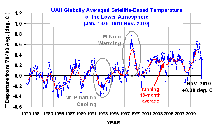
The temperature chart below is based on information acquired from NASA heat sensing satellites. It covers a 30 year period from January 1979 to November 2010. The red curve indicates the average temperature throughout the entire Earth.
The red line represents the average temperature. The top of the curves are warmer years caused by El Niño; a weather phenomenon where the Pacific Ocean gives out heat thus warming the Earth. The bottoms of the curves are usually La Niña years which cool the Earth. Volcanic eruptions, like Mount Pinatubo in 1991 will also cool the Earth over short time frames of 2-3 years.
Figure 1: University of Alabama, Huntsville (UAH) temperature chart from January 1979 to November 2010. This chart is shown with no trend lines so the viewer may make his own judgment.
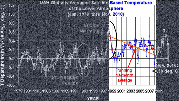
Below is the same temperature chart, showing how skeptics manipulate the data to give the impression of 'Global Cooling'. First they choose the warmest most recent year they can find. Then, in this case, they exclude 20 years of previous temperature records. Next they draw a line from the warmest year (the high peak) to the lowest La Niña they can find. In doing this they falsely give the impression that an ordinary La Niña is actually a cooling trend.
Figure 2: Representation of how skeptics distort the temperature chart. Even though the chart clearly indicates increased warming, skeptics take small portions of out of context to claim the opposite.
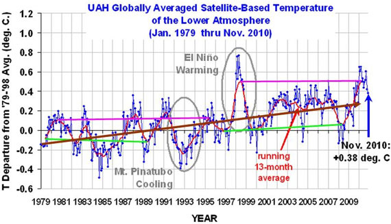
What do the past 30 years of temperature data really show? Below is the answer.
Figure 3: Trend lines showing the sudden jump in temperatures in the 1995 La Niña (Green lines) and the 1998 (Pink lines) El Niño events. Brown line indicates overall increase in temperatures.
The chart above clearly shows that temperatures have gone up. When temperatures for the warm El Niño years (pink lines) during 1980-1995 are compared to 1998-2010, there is a sudden increase of at least 0.2o Centigrade (0.36o Fahrenheit). Temperatures also jumped up by about 0.15oC (0.27oF) between the cool La Niña years (Green lines) of 1979-1989 and those of 1996-2008 (the eruption of Mount Pinatubo in 1991 lowered the Earth's temperatures in the midst of an El Niño cycle). The overall trend from 1979 through November 2010 (Brown line) shows an unmistakable rise.
This is particularly clear when we statistically remove the short-term influences from the temperature record, as Kevin C did here:
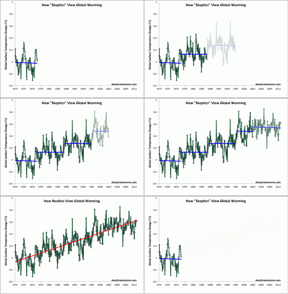
In spite of these facts, skeptics simply keep changing their dates for 'Global Cooling', constantly confusing short-term noise and long-term trends (Figure 4).
Figure 4: Average of NASA GISS, NOAA NCDC, and HadCRUT4 monthly global surface temperature anomalies from January 1970 through November 2012 (green) with linear trends applied to the timeframes Jan '70 - Oct '77, Apr '77 - Dec '86, Sep '87 - Nov '96, Jun '97 - Dec '02, and Nov '02 - Nov '12.
Basic rebuttal written by dana1981
Update July 2015:
Here is a related lecture-video from Denial101x - Making Sense of Climate Science Denial
Last updated on 7 September 2017 by MichaelK. View Archives


 Arguments


Does anybody know where I can find a graph of atmospheric global temperature with all possible 10-year trend lines drawn on top of it? I thought I'd seen it on SkS or Tamino's site, but I've Googled my brains out to no avail.
Tom. IIRC, a commenter ,CTG at Hot Topic NZ, uploaded something similar to what you describe. Had a silder bar so you could make adjustments too. Ask Gareth at Hot Topic.
Thanks, Rob! Based on your clues I found it. Sombody should add it to this SkS post, at least in the Further Reading section....
I need it to respond to a comment on the recent Economist article.
With respect to MoreCarbonOK's comment on the recent Australia thread, I find it interesitng that MoreCarbonOK would assert
but then support it with WoodForTrees graphs in which none of the trend lines (as far as I can see) peak in 1998 - they are set to start in 2002.
I'm no good at statistics, but even that strikes me as fishy support for an argument.
It's not cherry-picking? Hrmmm, what were you saying in 2007, when the trend since 1992 was 0.286C per decade? The current trend from 1992 is 0.168C per decade. Pretty warm, despite it covering your period of cooling.
You are cherry-picking, Henry. I didn't even mention your primary cherry-pick, which was to use <4% of the thermal capacity of the climate system to claim "global cooling." That's like reviewing a restaurant based on having had a bit of an appetizer and a glass of water. You've sought ought the periods and surface temp analyses that support your position. You give no methodological justification for choosing the sets/periods (why not GISS, which has better global coverage? Why not account for the findings of Cowtan & Way 2013?). You fail to point out that 6-8 year "cooling trends" have occurred several times over the last forty years, yet the overall trend since 1960 (when solar and surface temp began to part ways, e.g. Pasini et al. 2012) is strongly positive.
Try regressing out the signals from solar, ENSO, and aerosols, and see if your conclusions still hold. Are the oceans cooling? Is global land ice mass growing?
MoreCarbonOK - "yes, I read everything that you said!" And you apparently ignored it - you have considered absolutely nothing about statistical significance.
Your arguments are really just climastrology, curve-fitting, with no understanding of the difference between short term variation and trends, and with absolutely no connection to physics.
On a side note, I have to point out that Henry P's analysis should be submitted for publication. It's perfect for a journal like, oh, Pattern Recognition in Physics.
Andrew Dessler reproduced The SkS Escalater in his U.S. Congressional testimony yesterday.
This is an appraisal of a thesis that was presented off-topic on a different SkS thread by commenter MoreCarbonOK (a different thesis to the one linked @84 above). The thesis is set out in two parts at MoreCarbonOK's blog here and here. This thesis is a bit of a Kelloggs, containing a lot of serial errors that are perhaps best explained backwards.
(1) The thesis concludes that average global daily maximum temperatures vary cyclically, described by a sine wave (centres on y=0) with a wave-length of 88 years (a time interval of great significance apparently). This finding is incorrect because if such a sine wave were fitted to the data use, it would have a wave-length of 180 years +/- 50 years.
(2) Despite arguments to the contrary, the sine wave is derived solely on the basis of 4 data points that present little more than a straight line. Such a sine wave is illusory.
(3) The data plot is not as described "showing speed of warming in degrees C or K/annum versus time." This is accumulative data. Deriving "speed of warming" data from an accumulative sine wave of constant amplitude would result in a sine wave with amplitude increasing exponentially with increasing years-before-present (and presumably also with increasing years-after-present).
(4) The accumulative data is plotted at the start of the period it represents rather than at the mid-point. As these periods are all "...to date", the correct plot would be half the time-interval before-present. Thus the conclusion that the "drop in speed of warming started ca. 40 years ago" presents a value twice as large as it should be (although it is wrong for other reasons).
(5) The accumulative data is calculated as an average but the spread of the raw data within this average has been ignored. The high variance of the data dwarfs the calculated downward trend which is thus statistically insignificance. No trend whatever can be argued from the data. (Happily the averages were calculated without error.) The averages with their 95% confidence intervals are shown below.
0 to 38 years bp. - 0.035 ave, -0.009 to 0.080
0 to 32 years bp. - 0.027 ave, -0.020 to 0.075
0 to 22 years bp. - 0.015 ave, -0.046 to 0.075
0 to 12 years bp. - -0.013 ave, -0.155 to 0.128
(6) The data calculated is accumulative data. Deriving actual data presents a less-straight trend-line for the average 'maxima' and doubles the downward trend but the variance triples so there remains no trend of statistical significance.
(7) The use of linear regression to analyse lumpy climate data (in this case to calculate rate of change of 'maxima' at each of the 46 selected stations over 4 time periods of different length) is well known to often result in dramatic averages that are hwoever statisitcally insignificant due to the presence of very large variances. The data used (in 1-6 above) will be further subject to very large inaccuracies due to the use of regression yet no account what ever has been made for this.
(8) The thesis fails to consider what work already exists on the subject of 'maxima' or DTR. A quick look at say the global DTR work of the BEST project or the regional DTR work of Wang & Dickinson (2013) with a quick back-of-the-envelope calculation should have saved a lot of wasted effort trying to reinvent the wheel and doing it so badly.
Thank you, MA Rodger, for that dissection of MoreCarbonOK's claim!
I wasn't exactly sure where to put this, so if it's considered "off-topic" here just tell me and I'll repost it in the appropriate thread. A new study in Climate Dynamics, according to its lead author, Marcia Wyatt, identifies a stadium wave signal which may be responsible for the pause in global warming and, Wyatt said in a press release, "predicts that the current pause in global warming could extend into the 2030s." Is there some reason we should not believe her but instead believe those, such as the IPCC, who contend that this is a short-term trend that will soon be overtaken by more global warming?
jsmith, the Stadium Wave Theory is nothing but curve fitting. There are a bazillion other cycles that can fit as well or better, but none of them nor the Stadium Wave has any physical science basis nor any other a priori basis. For just one devastating critique, see Stoat's Part 1 and then Part 2. A short summary was written by a rabbett. Another brief critique is at And Then There's Physics.
But as Dana noted, Marcia Wyatt herself stated: "While the results of this study appear to have implications regarding the hiatus in warming, the stadium wave signal does not support or refute anthropogenic global warming. The stadium wave hypothesis seeks to explain the natural multi-decadal component of climate variability."
jsmith - The 'Weekly Digest' posts appear to be basically open threads, I would suggest that if you find something without a relevant post (see the Search box on the upper left) you might post it there. At the very least someone might be able to direct you to an existing conversation on that topic.
The 'stadium wave' is, IMO, a case of inappropriate bandpass filtering and of curve fitting.
Band pass: Take a signal, any signal, and add a bit of noise (white, pink, red, it matters not). Then bandpass filter it (drop slow and fast variations) to remove anything outside your frequency of interest. What remains will match your filter, guaranteed. It's extremely likely that your result is part of the noise, but unless you examine the entire spectrum you may not realize (or, in some cases, care) that the dominant signal falls outside your bandpass.
An exemplar of this is McLean et al 2009, making claims about the ENSO causing climate change - after a bandpass filtering that removed long term (climate) trends.
Curve-fitting: See basically anything by Scaffeta; given a number of free parameters and an array of cyclic phenomena, you can always find cycles correlation (causation be damned) with a dataset. But if you don't have a physical mechanism, and if you don't treat such correlation as a motivation to see if there might be some causal connection, it's nonsense. At some point I'm going to have to try fitting climate change to multi-year cicada populations and grey vs. black squirrel ranges - I'm sure I can make a fit occur. But like the astrology inherent in Scafetta's work, it won't mean anything. And such a decomposition won't have any predictive power, because it's not based on actual physics.
[JH] The comment threads of both the Weekly Digest and the Weekly News Roundup posts ae indeed open threads. Of course, all comments posted on them must comply with the SkS Comments policy.
Kevin Cowan's video:
https://www.youtube.com/watch?v=u_0JZRIHFtk
... is private. However, it gets used on at least the two following pages:
http://skepticalscience.com/16_more_years_of_global_warming.html
http://www.skepticalscience.com/global-cooling-january-2007-to-january-2008.htm
You can see the image that indicates what the video is about, but when you press play the message "This video is private" appears against a dark snowy background.
Please feel free to delete my comment once this issue is fixed.
Szwast 2006 link is broken (source moved).
Ugh, too many tabs, sorry totally posted that in the wrong thread :(
it shoulda been in this topic - http://www.skepticalscience.com/global-warming-on-mars-intermediate.htm
Surely this article in need of another update, since all global temperature datasets now show 2014 as the hottest on record?
Potholer54 has a good new video, "Why Temperatures Never Go Up In Straight Lines."
The Earth's surface is in a warming trend.
The stratosphere is in a cooling trend.
So would not there be a "Goldilocks Layer" in between, somewhere in the mid-troposphere?
That Goldilocks Layer is close to the middle troposphere, which is a recent favorite of Christy.
So in the Goldilocks Layer, we have no warming, over the whole globe since the beginning of the satellite data.
Who could deny that?
Hey guys at SkS, this article is attributed to Dana1981 but was written by yours truly villabolo. :-)
villabolo:
IIRC, the web code for SkS attributes the article to the last person that made minor edits. A known bug. Not sure how to fix it.
villabolo @98
Nice to hear from you!
To answer your question: whenever a rebuttal gets updated, the date gets changed. It is then a decision of the author who is making the update whether or not an author-change is warrented. For minor tweaks like fixing links or typos this doesn't happen but for more substantial changes it is usually done. That you were the original author of the basic version has been preserved in the archives for the rebuttal:
https://skepticalscience.com/archive.php?a=174&l=1