


 Arguments


Lessons from Past Climate Predictions: IPCC TAR
Posted on 10 September 2011 by dana1981
 The Intergovernmental Panel on Climate Change (IPCC) Third Assessment Report (TAR) was published in 2001, following the First Assessment Report (FAR) in 1990, and the Second Assessment Report (SAR) in 1995. Chapter 9 of the TAR discusses the report's projections of future climate change.
"A few Atmosphere-Ocean General Circulation Model (AOGCM) simulations include the effects of ozone and/or indirect effects of aerosols (see Table 9.1 for details). Most integrations do not include the less dominant or less well understood forcings such as land-use changes, mineral dust, black carbon, etc. (see Chapter 6). No AOGCM simulations include estimates of future changes in solar forcing or in volcanic aerosol concentrations.
There are many more AOGCM projections of future climate available than was the case for the IPCC Second Assessment Report"
As noted in our analysis of the IPCC SAR, the TAR reduced the projections of aerosol emissions and its associated (negative) radiative forcing in the second half of the 21st Century. As a result, the net radiative forcing in the TAR emissions scenarios were larger than those in the SAR, which led to higher warming projections by 2100. The equilibrium climate sensitivity of climate models also evolved between the SAR's "best estimate" of 2.12°C for doubled CO2 (which we saw led to an underestimate of the observed warming) and TAR:
"A traditional measure of climate response is equilibrium climate sensitivity derived from 2×CO2 experiments with mixed layer models, i.e., Atmospheric General Circulation Models (AGCMs) coupled to non-dynamic slab oceans, run to equilibrium. It has been cited historically to provide a calibration for models used in climate change experiments. The mean and standard deviation of this quantity from seventeen mixed-layer models used in the SAR are +3.8 and +0.8°C, respectively."
Emissions Scenarios (SRES)
The IS92 emissions scenarios used in the SAR were replaced by the IPCC Special Report on Emission Scenarios (SRES), although the TAR also used the IS92 scenarios in order to allow comparisons with the projections in the SAR. The SRES cover a wide range of the main demographic, economic and technological driving forces of future greenhouse gas and sulphur emissions. Each scenario represents a specific quantification of one of the four storylines described below.
- A1: a future world of very rapid economic growth, global population that peaks in mid-century and declines thereafter, and the rapid introduction of new and more efficient technologies. The three A1 groups are distinguished by their technological emphasis: fossil intensive (A1FI), non-fossil energy sources (A1T), or a balance across all sources (A1B).
- A2: a very heterogeneous world. The underlying theme is self-reliance and preservation of local identities. Fertility patterns across regions converge very slowly, which results in continuously increasing population. Economic development is primarily regionally oriented and per capita economic growth and technological change are more fragmented and slower than in other storylines.
- B1: a convergent world with the same global population, that peaks in mid-century and declines thereafter, as in the A1 storyline, but with rapid change in economic structures toward a service and information economy, with reductions in material intensity and the introduction of clean and resource-efficient technologies. The emphasis is on global solutions to economic, social and environmental sustainability, including improved equity, but without additional climate initiatives.
- B2: a world in which the emphasis is on local solutions to economic, social and environmental sustainability. It is a world with continuously increasing global population, at a rate lower than A2, intermediate levels of economic development, and less rapid and more diverse technological change than in the B1 and A1 storylines. While the scenario is also oriented towards environmental protection and social equity, it focuses on local and regional levels.
Projections
The IPCC TAR ran the various emissions scenarios through a simple climate model tuned to seven AOGCMs, and produced Figure 1 below. "Tuning" to the AOGCMs refers to constraining the simple model parameters to match the results of the AOGCMs. For example, matching the AOGCM net heat flux across the ocean surface by adjusting the simple model ocean parameters. The TAR justifies this approach in Appendix 9.1, where further details are provided:
"By using such simple models, differences between different scenarios can easily be seen without the obscuring effects of natural variability, or the similar variability that occurs in coupled AOGCMs (Harvey et al., 1997). Simple models also allow the effect of uncertainties in the climate sensitivity and the ocean heat uptake to be quantified."
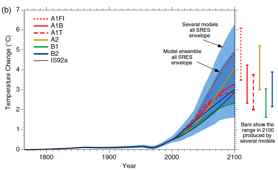
Figure 1: Historical anthropogenic global mean temperature change and future changes for the six illustrative SRES scenarios using a simple climate model tuned to seven AOGCMs. Also for comparison, following the same method, results are shown for IS92a. The dark blue shading represents the envelope of the full set of thirty-five SRES scenarios using the simple model ensemble mean results. The light blue envelope is based on the GFDL_R15_a and DOE PCM parameter settings. The bars show the range of simple model results in 2100 for the seven AOGCM model tunings.
Bear in mind that these are models of anthropogenic forcings and temperature changes, which do not include any natural forcings like changes in solar irradiance or volcanic eruptions. As noted above, the SRES scenarios project much more warming by 2100 than scenario IS92a from the IPCC SAR.
As we have previously discussed, thus far we are on track with the SRES A2 emissions path. Therefore, for the sake of simplifying the evaluation of the IPCC TAR projections, we digitized the results from the simple model tuned to seven AOCGMs using the A2 scenario (the yellow line in Figure 1). Figure 2 shows the comparison between this projection and the observed average global temperature from GISTEMP.
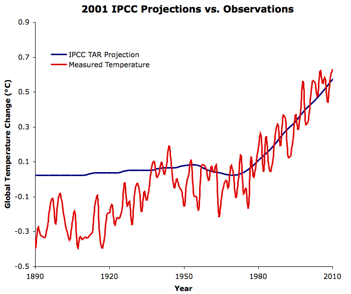
Figure 2: IPCC TAR simple model projection tuned to seven AOGCMs for emissions scenario A2 (blue) vs. GISTEMP (red)
From this comparison, we arrive at a similar conclusion to that in the IPCC FAR analysis. Up until the mid-20th Century, most of the surface temperature change is dictated by natural forcings and variation. Starting in the mid-20th Century, human emissions become the dominant factor dictating the global temperature trend. We can also evaluate the accuracy of the IPCC TAR projections by isolating the recent data (Figure 3).
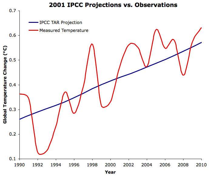
Figure 3: As in Figure 2, for the time period 1990 to 2010
Learning from the TAR
The IPCC TAR scenario A2 projection is very close to the observed temperature change, and of course the observations are well within the envelope of all model run results shown in Figure 1. If we remain on track with the SRES A2 emissions scenario, the TAR projects the average global surface temperature in 2100 will be approximately 4°C above pre-industrial levels; an exceptionally dangerous amount of warming.
The average effective climate sensitivity of the AOGCMs used to produce Figure 1 (and thus the blue lines in Figures 2 and 3) was 2.8°C for doubled atmospheric CO2. The projected warming rate in Figure 3 is slightly lower than the observed trend in GISTEMP. Adjusting for the difference in warming trends between the TAR projection and GISTEMP data, assuming all else is correct, would give us an equilibrium climate sensitivity of approximately 3.4°C for doubled CO2. Thus the comparison between observations and the IPCC TAR projected warming provides yet another piece to the long list of evidence that equilibrium climate sensitivity (including only fast feedbacks) is approximately 3°C for doubled CO2.


[dana1981] That depends if I can find a publisher willing to publish it. If not, we'll probably just publish it on SkS.