Northern hemisphere warming rates: More than you may have heard
Posted on 14 January 2011 by muoncounter
Guest post by muoncounter
Winter is the time of year when denials of global warming seem to come from all sides. It is therefore a useful time to determine just what our current rates of warming are.
The very thorough SkS post Assessing global surface temperature reconstructions put the average global warming trend at 0.14-0.16 deg C/decade.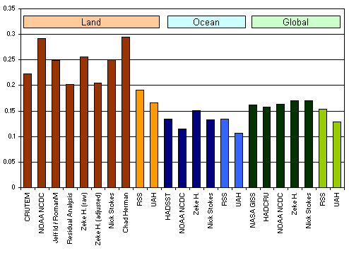
This rate is typical of the linear trend of modern temperature records which in some cases go back to 1880. And some skeptics take comfort in this rate, claiming that it is nothing to worry about. But is this rate of change an accurate description of what we are currently seeing?

--- NASA GISS, 7 Jan 2011
The northern latitudes (upper graph) have warmed more than the rest of the globe. This figure also makes it clear that the rate of warming since approximately 1970 is much greater than the linear trend over the entire record.
For the global average, warming in the last century occurred in two phases, from the 1910s to the 1940s (0.35°C or 0.63ºF), and more strongly from the 1970s to the present (0.55°C or 1.0ºF) at a rate of about 0.16ºC (0.3ºF) per decade. An increasing rate of warming has taken place over the last 25 years, and 12 of the 13 warmest years on record have occurred in the past 13 years.
A recent SkS article on
This begs the question: What is the recent (30 or more year) warming rate in other parts of the northern hemisphere?
A surprisingly straightforward way to analyze temperature trends over large areas is by comparison of the long term (100 year) trend to the more recent (50 year) trend. This Mapview interface to the HadCrut/GHCN data makes this task very easy. Individual 5x5 degree grids may be selected and a linear fit applied (as shown in Figure 1a). The time window may then be altered from this graph screen, giving a recalculated linear fit (Figure 1b) upon redraw. The slope of each linear fit in degrees C per decade, along with an estimate of statistical significance, is given in the right-hand panel of each graph.
Figure 1a. 100 year trend for 5x5 degree grid in central Europe(50-55N, 10-15E, roughly centered on Berlin)
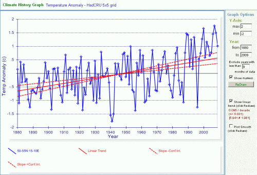
Figure 1b, 50 year trend, same 5x5 degree grid
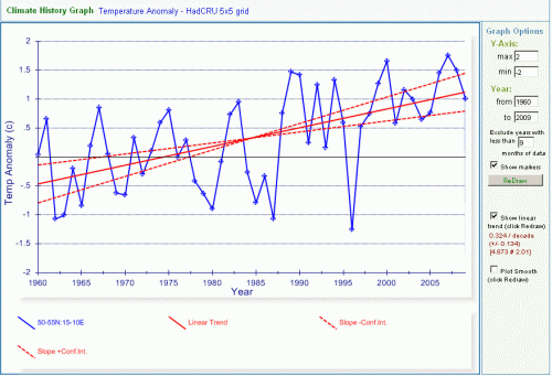
Table 1a shows the results of applying this process to 5x5 grids across a large part of
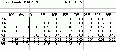
The arithmetic average of all these 100 year trends is 0.09 degC/decade.
Table 1b shows the trends for the same grids with linear fits for the interval 1960-2009:
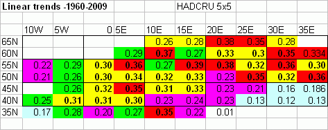
The average of all these 50 year trends is 0.28 degC/decade. Red indicates greater than 0.35, yellow 0.3-0.35, green 0.25-0.3 and purple 0.2-0.25 degC/decade.
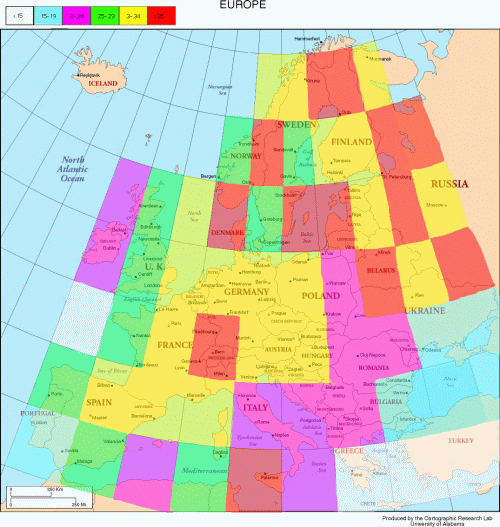
It is clear from this analysis that during the last 50 years, large parts of


 Arguments


leftright... The Yooper