Climate Science Glossary

Term Lookup

Enter a term in the search box to find its definition.

Settings

Use the controls in the far right panel to increase or decrease the number of terms automatically displayed (or to completely turn that feature off).

Term Lookup

Settings


All IPCC definitions taken from Climate Change 2007: The Physical Science Basis. Working Group I Contribution to the Fourth Assessment Report of the Intergovernmental Panel on Climate Change, Annex I, Glossary, pp. 941-954. Cambridge University Press.

Home Arguments Software Resources Comments The Consensus Project Translations About Support

Bluesky Facebook LinkedIn Mastodon MeWe

Twitter YouTube RSS Posts RSS Comments Email Subscribe


Climate's changed before
It's the sun
It's not bad
There is no consensus
It's cooling
Models are unreliable
Temp record is unreliable
Animals and plants can adapt
It hasn't warmed since 1998
Antarctica is gaining ice
View All Arguments...


Username
Password
New? Register here
Forgot your password?

Latest Posts

Archives

Monckton Myth #3: Linear Warming

Posted on 18 January 2011 by dana1981

In his recent response to Steketee's article in The Australian, Monckton's argument #5 reads as follows:

In the 40 years since 1970, global temperatures have risen at a linear rate equivalent to around 1.3 °C/century. CO2 concentration is rising in a straight line at just 2 ppmv/year at present and, even if it were to accelerate to an exponential rate of increase, the corresponding temperature increase would be expected to rise merely in a straight line. On any view, 1.3 °C of further “global warming” this century would be harmless. The IPCC is predicting 3.4 °C, but since the turn of the millennium on 1 January 2001 global temperature has risen (taking the average of the two satellite datasets) at a rate equivalent to just 0.6 °C/century, rather less than the warming rate of the entire 20th century. In these numbers, there is nothing whatever to worry about – except the tendency of some journalists to conceal them.

This paragraph contains a number of erroneous statements.  Firstly, according to both GISTEMP and HADCRUT3 (satellite data only began in 1979), the global temperature trend since 1970 is 1.6–1.7°C per century.  Secondly, the atmospheric CO2 concentration has been accelerating (not linear).  The rate of increase in atmospheric CO2 in the 2000's (2.2 parts per million by volume [ppmv] per year) was in fact 47% faster than the rate of increase in the 1990s (1.5 ppmv per year).  Monckton uses these incorrect assertions to create the support for his incorrect argument - that if we continue with business-as-usual, global temperatures over the next century will increase at a constant, linear rate (or slower).

Temperature Response to CO2

Monckton claims that an exponential increase in atmospheric CO2 concentration would result in a linear increase in global temperature.  But of course that depends on what the exponent is in the exponential increase.  Monckton is referring to the logarithmic relationship between radiative forcing (which is directly proportional to the change in surface temperature at equilibrium) and the atmospheric CO2 increase.  Note that we are not currently at equilibrium as there is a planetary energy imbalance, and thus further warming 'in the pipeline' from the carbon we've already emitted.  Therefore, estimates of the rate of warming due to CO2 thus far will will be underestimates, unless accounting for this 'warming in the pipeline' (which Monckton does not).

This logarithmic relationship means that each doubling of atmospheric CO2 will cause the same amount of warming at the Earth's surface.  Thus if it takes as long to increase atmospheric CO2 from 560 to 1120 ppmv as it did to rise from 280 to 560 ppmv, for example, then the associated warming at the Earth's surface will be roughly linear.  So the question then becomes, how fast do we expect atmospheric CO2 to rise over the next century?

How Fast will Atmospheric CO2 Rise?

The IPCC addressed this question by examining a number of different anthropogenic emissions scenarios.  Scenario A1F1 assumes high global economic growth and continued heavy reliance on fossil fuels for the remainder of the century.  Scenario B1 assumes a major move away from fossil fuels toward alternative and renewable energy as the century progresses.   Scenario A2 is a middling scenario, with less even economic growth and some adoption of alternative and renewable energy sources as the century unfolds.  The projected atmospheric CO2 levels for these scenarios is shown in Figure 1.
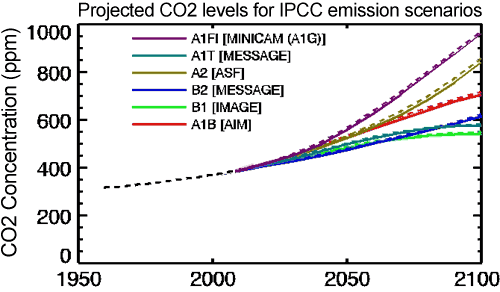
Figure 1: Atmospheric CO2 concentrations as observed at Mauna Loa from 1958 to 2008 (black dashed line) and projected under the 6 IPCC emission scenarios (solid coloured lines). (IPCC Data Distribution Centre)

In short, following the 'business as usual' approach which Monckton argues for, without major steps to move away from fossil fuels and limit greenhouse gas emissions, we will likely reach 850 to 950 ppmv of atmospheric CO2 by the year 2100.  It will have taken approximately 200 years (from 1850 to 2050) for the first doubling of atmospheric CO2 from 280 to 560 ppmv, but it will only take another 70 years or so to double the levels again to 1120 ppmv.  This will result in an accelerating rate of global warming, not a linear rate.  Under Scenarios A2 and A1F1, the IPCC report projects that the global temperature in 2095 will be 2.0–6.4°C above 1990 levels (2.6-7.0°C above pre-industrial), with a best estimate of 3.4 and 4.0°C warmer (4.0 and 4.6°C above pre-industrial average surface temperatures), respectively. 
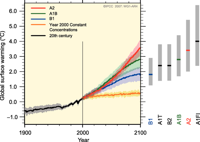
Figure 2: Global surface temperature projections for IPCC Scenarios. Shading denotes the ±1 standard deviation range of individual model annual averages. The orange line is  constant CO2 concentrations at year 2000 values. The grey bars at right indicate the best estimate (solid line within each bar) and the likely range.  (Source: IPCC).

Life in the Fast Lane

Monckton claims that these projected amounts of warming have not been borne out in the surface temperature changes over the past decade.  But there are many factors which impact short-term global temperatures, which may conceal the long-term warming caused by increasing atmospheric CO2.  So if we want to know if the IPCC projections are realistic, rather than examining noisy short-term temperature data, we should examine how much atmospheric CO2 is increasing.

When we look at this data, we find that observed CO2 emissions in recent years have actually been tracking close to or above the worst case (A1F1) scenario.
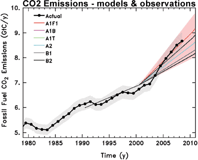
Figure 3: Observed global CO2 emissions from fossil fuel burning and cement production compared with IPCC emissions scenarios. The coloured area covers all scenarios used to project climate change by the IPCC (Copenhagen Diagnosis).

What Lies Ahead

So if we continue in a business-as-usual scenario, we should expect to see atmospheric CO2 levels accelerate rapidly enough to more than offset the logarithmic relationship with temperature, and cause the surface temperature warming to accelerate as well.  Monckton's claim of a "straight line" increase in global temperature ignores that in his preferred 'business as usual' scenario, we are currently on pace to double the current atmospheric CO2 concentration (390 to 780 ppmv) within the next 60 to 80 years, and we have not yet even come close to doubling the pre-industrial concentration (280 ppmv) in the past 150 years.  Thus the exponential increase in CO2 will outpace its logarithmic relationship with surface temperature, causing global warming to accelerate unless we take serious steps to reduce greenhouse gas emissions.  In fact, to continue the current rate of warming over the 21st Century, we would need to achieve IPCC scenario B1 - a major move away from fossil fuels toward alternative and renewable energy.

As for what amount of global warming is "harmless" and "dangerous" we will examine this question later on in another upcoming Monckton Myth.

0 0

Printable Version  |  Link to this page

Comments

Prev  1  2  

Comments 51 to 86 out of 86:

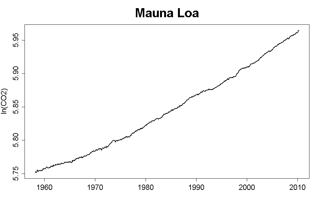
  1. NETDR, you can tell CO2 is increasing FASTER THAN EXPONENTIAL very easily. Plot ln(CO2) vs year. Then take the residuals. If the differential of the residuals is positive, then the acceleration is FASTER THAN EXPONENTIAL, if it is zero then it is exponential, and if it is negative then it is slower than exponential. The residuals show it is faster than exponential. Even if it were only exponential, then radiative forcing would increase linearly. That isn't the same as temperatures increasing linearly unless the Earth reaches equilibrium in each year. Which it doesn't.
    0 0
    Moderator Response: Please don't use all caps. Use italics or, if necessary, bold.
  2. Here are the key points, as I see them-of the 100ppm rise in CO2 since pre-industrial times, about *half* has been within the last 30 years. Of that 50ppm, around 20ppm has been within the *last decade alone*! So that alone debunks the whole "Linear Growth in CO2" argument. The 2nd point is that, of the roughly +0.7 degrees of warming we've seen in the past 60 years, around +0.5 degrees has been in the last 30 years alone-that, in spite of the fact that the last 30 years has seen an overall downward trend in total solar irradiance (on the order of -0.02W/sq. meter/year). So, even *if* CO2 emissions don't grow at a faster rate, & even *if* solar irradiance levels off or continues to fall, we're still looking at a lot of warming over the next 30 years. Yet everything suggests that-if we continue the BAU approach-CO2 levels will rise much faster over the next 30 years than they did in the previous 30 years!
    0 0
  3. "we are not currently at equilibrium as there is a planetary energy imbalance, and thus further warming 'in the pipeline' from the carbon we've already emitted" Except there's no "planetary energy imbalance" there for the last eight years. There's a huge upward shift in OHC data before 2003, however, en masse ARGO float deployment only began in that very year, therefore OHC was not measured properly before 2003. Net TOA (Top of Atmosphere) radiative imbalance is also measured by satellites. Accuracy of that measurement is extremely poor, but its precision is much better. That is, there's an unknown additive constant for the entire measurement period, but otherwise measurement of relative changes is pretty reliable. Now, OHC is proportional to the temporal integral of TOA imbalance. This latter quantity, as all climate indicators, fluctuates, but if its long term average is above zero, the integral should have an upward trend with a steady slope. Unfortunately, as I have said, satellite data tell us nothing about the sign (if any) of the imbalance. But they do tell us there was no downward shift in average imbalance at TOA around 2002-2003. That is, the increase in OHC data at that time is an artifact indeed. If there's no planetary energy imbalance, the pipeline is empty. If it is empty, we already had the bulk of warming that may come from the slight increase in atmospheric opacity in the 14-16 μm CO2 thermal IR band due to past emissions. If climate response is that fast, equilibrium sensitivity is low. Q.E.D.
    0 0
  4. @BP. Ah, still repeating the old 2003-2008 furphy are you? I'm sorry, but since when does 5 years of data constitute a statistically significant trend? Whatever issues might exist with pre-2003 data, the 2003-2007 data is based on an incomplete deployment of the ARGO buoys-which could very well make *that* the artifact. Since mid-2007, when all 3,000 buoys were deployed, through to mid-2010 we saw consistent warming. After 6 months of cooling, we're seeing temperatures starting to climb once more. So you see that your claims are *not* QED, & your use of that term highlights a great degree of arrogance on your part!
    0 0
  5. @NETDR: "Plot it and see for yourself. Oh I forgot alarmists never plot anything or think for themselves do they ? " If this doesn't deserve to be moderated into oblivion, I don't know what is. It's bad enough that deniers repeat the same debunked BS over and over again, but now they're actually projecting their own failings onto people who actually understand the science? NETDR, the only people who agree with you are those opposed to AGW for political reasons. You have failed to disprove AGW theory. Just give it up.
    0 0
  6. @ BP: "Except there's no "planetary energy imbalance" there for the last eight years." Sure there is. Even eyeballing the graph clearly shows there is still warming going on. Hey, at least now I have reference posts to point Type II Deniers when they say "no one really claims there's no warming"...
    0 0
  7. #56: "Type II Deniers" asteel, Is there an official taxonomy?
    0 0
  8. neutrino I found 4 % difference in the forcing between linear and the quadratic. This is insignificant in my opinion. If you plot the Ln of the CO2 between 1958 and 2010 it looks like a horizontal asymptote but it does increase very slowly. . The difference is you multiply the Ln by 5.35 to get 21.4 % How do you get the 5.35 ? If the effect were multiplied by 5.35 times the Ln Tamino would have mentioned it. He didn't. Tamino computed the Ln of the growth rate in 2010 was .0055 / year. Was he wrong ? Why didn't he compute 5 times as much it would have served his argument better. You may have a reasonable explanation, but various climate sensitivities using unproven positive feedbacks don't pass the sniff test. That gets into another off topic discussion. Which I keep getting hit with and when I respond I get yelled at ! Not exactly an even playing field ?
    0 0
  9. @muoncounter: I developed one back on Digg to keep track of the various contrarian claims flying around. it goes something like this: I) There's no warming II) There's warming, but it's not us/it's cyclical III) There's warming, it may be us but we can't stop it/it's not bad IV) The climate is too complex to know/we can't be sure enough to act I found that this covered almost every case.
    0 0
  10. @NETDR: "So from 1958 to 2010 [52] years the increase in CO2 has gone from 1 PPM per year to 2 PPM per year. Big deal. In the next 50 years if it goes from 2 PPM per year to 4 PPM per year that is a very small amount." Actually, no. That *isn't* a very small amount. It's a significative one, and it shows the growth is exponential. In other words, you are wrong. You have been called out on your error, and now instead of owning up to it you are trying to redefine the debate by talking about "insignificant" values and "very small" amounts. Thing is, they aren't. They're quite *significant* numbers. What irks me most about deniers is their incapacity to admitting when they are wrong, and their propensity to change the debate when they feel the heat. At least real skeptics concede when they're proven wrong...
    0 0
  11. #59: I like it. Our own Four Horsemen ...
    0 0
  12. BP #53 - see Monckton Myth #1: Cooling Oceans. John debunked your claim less than a week ago.
    0 0
  13. NETDR - Watching the discussion, it seems that there's a bit of talking past each other going on. In order to understand your claims, could you answer this question: according to you, and your linear, quadratic, exponential and super-exponential fits, if current trends continue, what do you claim CO2 levels will be in 2050? 2100? What would the associated temperature anomaly be? Not percentage differences, but actual numbers. If we speak about numbers, maybe we can disambiguate things and see if we're on the same page, or reading from different books altogether.
    0 0
  14. NETCDR@58 wrote "If you plot the Ln of the CO2 between 1958 and 2010 it looks like a horizontal asymptote but it does increase very slowly." Nonsense, here is a plot of ln(CO2) for that period from Tamino's analysis: It doesn't look anything like a "horizontal asymptote" (unless you have your own personal definition of "asymptote"), not only is ln(CO2) rising, it is rising at an increasing rate. Your argument doesn't survive first contact with the data.
    0 0
  15. A reasonable argument is posted in this article. However, if you add up-to-date actual measured tempratures to Figure 2, it is evident that they are tracking closer to the orange line (constant CO2 concentrations at year 2000 values)than the other scenarios. It seems that we are not warming as fast as the models predict we should.
    0 0
  16. angusmac, I've got 3 little words for you-deep solar minimum. For the record, warming was only slightly less for 2000-2010 than it was for 1990-2000, so imagine what it will be like when total solar irradiance starts to trend upwards again. Also, you are aware that the period of 2000-2010 on that graph would be the *tiniest* little blip-where currently all 4 scenarios still overlap?
    0 0
  17. Also, Angusmac, methane concentrations in the atmosphere actually leveled out for the first part of the 2000-2010 period, so that also probably had some impact on total warming trends. Unfortunately, all the evidence says that methane levels have begun to rise again (we'd also better pray those clathrates don't melt, or else its "all over, red rover"!)
    0 0
  18. angusmac@65 You've got better eyes than I do if you can see that from Figure 2. However, a least squares fit from 2000 is showing a trend of between 0.12 and 0.17 per decade (depending on the data set used, and ignoring exogenous factors), which is very different to the "constant CO2 concentrations at year 2000" values that I've been able to find.
    0 0
  19. #54 Marcus at 13:22 PM on 20 January, 2011 Since mid-2007, when all 3,000 buoys were deployed, through to mid-2010 we saw consistent warming. Unfortunately that's either untrue or false. In fact there's no heat accumulation in the system even from mid-2007 to mid-2010. Nothing Nada Nicht Nichego. Semmi. It is the pre-2003 era where people have to look for Trenberth's missing heat when it could easily escape the rather sparse & error prone MBT/XBT measurement network. With ARGO in full swing it is no longer the case.
    0 0
  20. BP@69 If you look at the data you plot in post 53, you will find there are several such short periods (e.g. 1980-1990) where there is little or no rise (or even a decrease) in OHC, even though this happens in the context of a long term increase in OHC. You argument is a clear example of unintentional cherry picking, focusing on short periods where the natural variability masks the long term warming. It is essentially the same argument as global warming stopped in 1998 etc.
    0 0
  21. @Dikran Marsupial: I think you are being overly generous when you say this is "unintentional" cherry-picking on BP's part. BP, you know very well that you can't derive a trend from such a short period of time - so why do it, if not to present a false impression of reality? Please stop your politics interfere with your view of science. Thanks.
    0 0
  22. #70 You argument is a clear example of unintentional cherry picking, Having seen BP cherrypick periods like this more than once, and get called on it each time, "unintentional" is not the first word that springs to mind.
    0 0
  23. Dikhran Re: My statement that the plot of the log of CO2 looks looks like a horizontal asymptote. Notice that your graph starts at 5.75 and ends at 5.95. If you start the plot at zero it does look like an asymptote with very slight slope. This is a common practice of trying to make a trivial amount of increase appear large. (5.95 - 5.75)/ 5.75 = 3 % in 52 years ! That is if you will excuse the expression "trivial"! In another 90 years it [the effect] will have increased 6 %. That is pretty close to an asymptote.
    0 0
    Moderator Response: You're still dodging the crucial issue that several people have put to you: Do you claim that the effect of that CO2 increase on temperature will be trivial?
  24. NETDR@73 Funnily enough, starting a graph at an unreasonably low level is a common practice for trying to make something look trivial when it isn't, so much so that the practice was lampooned by DenialDepot here. Starting at 0 is clearly absurd as it equates to a concentration of 1ppmv, which is essentially physically impossible. Whether a 3% rise in log(CO2) depends on climate sensitivity, as I have pointed out to you repeatedly. If the climate is sensitive to a change in radiative forcing, then even modest increases can be significant. As you are not connecting radiative forcing and climate sensitivity, you are in no position to know whether it is trivial or not, which is why your arguments are not getting a better reception. At least we have established that you *are* using your own personal definition of the word "asymptote"! For most of us it means a function that is converging to, rather than diverging from a constant value.
    0 0
  25. Actually NETDR is right, I've just plotted the HADCRUT surface temperature dataset, in degrees Kelvin (starting at zero), and it definitely looks like an "horizontal asymptote" to me. I don't know about you chaps, but I'm off to buy a V8! ;o)
    0 0
  26. Dikran, Interestingly Lindzen used the same "trick" of global SATs that you showed @75 in his debate with Andy Dessler.
    0 0
  27. BP, You continue to focus on ridiculously short periods, as you state in your post @69, to obfuscate and confuse people. And what makes it even more shameful on your part is that I know that you know deductions made about trends in these data over such short periods are meaningless, both scientifically and statistically. Besides, your post if off topic, so
    0 0
  28. Aargh, hit enter too soon. ...so I am surprised your post @69 was even permitted.
    0 0
  29. NETDR, there is an intercept because we didn't start at 1 ppm CO2 at the year 0 AD. I don't think you've followed what we're actually plotting here... please go through the maths to see. Assuming no acceleration above exponential (even though we know there is, you can tell from the residuals which you have simply ignored) you can use the linear fit for the whole period to estimate 2100 CO2 ppm. It's 580 ppm CO2. But that's wrong, because it's accelerating. If we use the fit to the log(CO2) as a function of time for the past 20 years, you get over 670 ppm CO2 by 2100. That clearly shows it's accelerating, anyone with a spreadsheet and a clue can check this for themselves. (and of course, as there is an acceleration, that means that 670 ppm is a minimum bound and the real value is higher). What do you estimate that CO2 will be by 2100?
    0 0
  30. NETDR, The equation I used (∆F = 5.35*ln(C/Co) comes from a 12y old paper Myhre 98. As far as I know thats the standard aproximation of the CO2 radiative forcing. Its odd you focused on the 5.35 rather than the important fact that the ln is taken of a ratio of CO2 concentrations. Your 4% increase is from a baseline of 1ppm not from todays or pre industrial numbers. So again from your own numbers, the forcing from now till 2100 would be 1.51W/m^2 for linear compared to 2.92W/m^2 for quadratic. Thats a 94% increase in radiative forcing! Calling that a trivial difference is disingenuous. Saying that the linear is close enough is just plain wrong. Even your conservative quadratic gives nearly double the forcing at the end of the century. Just because you feel that a 4% increase in the total radiative forcing due to CO2 is trivial doesnt change reality. That trivial 4% translates to a 1.41W/m^2 forcing which, given a climate sensitivity of 0.8, works out to an additional 1.13C temperature increase.
    0 0
  31. #77 Albatross at 04:22 AM on 21 January, 2011 You continue to focus on ridiculously short periods, as you state in your post @69, to obfuscate and confuse people. You come dangerously close to an ad hominem attack by attributing evil intentions to me. Unfortunately it is you who got confused, and only because you failed to put the necessary effort into trying to understand what actually was said. And what makes it even more shameful on your part is that I know that you know deductions made about trends in these data over such short periods are meaningless, both scientifically and statistically. There was neither statistics nor trends in my line of arguments. Just have a look at the NOAA NODC Global Ocean Heat Content site. Heat content anomaly of the upper 700 m of oceans in the fourth quarter of 2003 is 11.655±0.975×10²² J, while in the third quarter of 2010 it is 9.589±0.690×10²² J, that is, it has got definitely smaller in seven years. It is not a trend, it is a net heat loss (of at least 4×10²¹ J). As Earth is losing heat instead of gaining it during this period, it gets pretty hard to claim a mysterious "pipeline" is still filling. What is more, I have also said we have no valid, reliable OHC data before mass deployment of ARGO floats started in mid-2003. I can support this statement by net TOA radiation balance measurements performed by satellites. There's simply no drop in this quantity in 2003 that could decrease the slope of its integral (which should be proportional to OHC). It means the statement "OHC is flat" is not contradicted by data even before 2003. Therefore you can't even claim some heat was put into the "pipeline" before 2003 which didn't have a chance to come out yet but it can haunt us any time in the future. Anyway, it would be nice to know what physical processes do you think are supposed to constitute said pipeline. Heat capacity of the upper 700 m of oceans is more than two hundred times that of the atmosphere. Latent heat absorbed by melting ice is negligible. If there were a 0.6 W/m2 radiative imbalance at TOA as proposed, that would mean an annual heat gain of 0.97×10²² J. That could melt 2.9×10¹⁶ kg ice, which would increase global sea level by 80 mm in each year. Annual sea level rise during this period as measured by Jason is 2 mm and only a fraction of it could come from ice melting. Effective heat capacity of land is also negligible, as it is only the upper 1 m or so of soil that follows atmospheric temperatures. Of course the deep ocean (below 700 m) remains as a last resort. However, to sequester heat there without increasing heat content of the upper layers one would need a teleport mechanism which is described nowhere. And once again, choosing properly measured intervals or regions instead of ones that are not is hardly cherry picking. Of course I can see the tendency as much as anyone in mainstream climate science to pick far away places or ancient times with very sparse or nonexistent measurement networks as examples for scary processes, but that is surely no way to go. First you have to understand what is given. As soon as it is done, you can venture further, but never sooner. Besides, your post if off topic, so I am surprised your post @69 was even permitted. It is not off topic. dana1981 happened to deploy the "warming in the pipeline" meme. I could see no other way to refute it than to show the pipeline was empty. In order to do that I needed both OHC & net TOA imbalance. However, if it is not advisable to challenge opinions expressed in articles at this site, that's entirely another matter. In that case I'm surprised too.
    0 0
  32. Berényi - Replied over on Does ocean cooling prove global warming has ended
    0 0
  33. #81 BP, you said "Heat content anomaly of the upper 700 m of oceans in the fourth quarter of 2003 is 11.655±0.975×10²² J, while in the third quarter of 2010 it is 9.589±0.690×10²² J,....a net heat loss (of at least 4×10²¹ J)." With a mass of 5×10²¹ grams and 1 J per gram per degree C, 0.2 degrees rise in the atmosphere means 1×10²¹ J went into the atmosphere. That accounts for 1/4 of the missing heat. Also OHC rises from the third to the fourth quarter every year (part of the annual cycle, see Climate-cherry-pickers-cooling-oceans.html) So that explains another part of the loss (you picked the 4th quarter in your starting year and the 3rd quarter in your ending year).
    0 0
  34. My response will too appear at the appropriate thread when I have some time. For the record BP, you chose the ridiculously short time frame, not anyone else, you. So now we all have to march down that road, just like Monckton has forced us to do.
    0 0
  35. #86 Albatross at 12:24 PM on 21 January, 2011 For the record BP, you chose the ridiculously short time frame, not anyone else, you. Of course I am the person responsible for radically decreasing MBT coverage in 1991 and XBT coverage soon after it while restarting measurements in 2003 by ARGO, leaving a gaping chasm in between. Who else? It was in this barely measured period when intercalibration of different measurement systems was utterly impossible that OHC increased like crazy. As soon as I was not able to withhold ARGO any more, OHC miraculously stopped increasing. Bad luck, for the record. You can read the full story here.
    0 0
    Moderator Response: Albatross has replied on the correct thread: "Oceans are cooling."
  36. NETDR: I challenge you to draft a science-grade paper detailing your analysis and post it on a public website for review and comment.
    0 0

Prev  1  2  

You need to be logged in to post a comment. Login via the left margin or if you're new, register here.


The Consensus Project Website

THE ESCALATOR

(free to republish)


© Copyright 2024 John Cook
Home | Translations | About Us | Privacy | Contact Us