Climate Science Glossary

Term Lookup

Enter a term in the search box to find its definition.

Settings

Use the controls in the far right panel to increase or decrease the number of terms automatically displayed (or to completely turn that feature off).

Term Lookup

Settings


All IPCC definitions taken from Climate Change 2007: The Physical Science Basis. Working Group I Contribution to the Fourth Assessment Report of the Intergovernmental Panel on Climate Change, Annex I, Glossary, pp. 941-954. Cambridge University Press.

Home Arguments Software Resources Comments The Consensus Project Translations About Support

Bluesky Facebook LinkedIn Mastodon MeWe

Twitter YouTube RSS Posts RSS Comments Email Subscribe


Climate's changed before
It's the sun
It's not bad
There is no consensus
It's cooling
Models are unreliable
Temp record is unreliable
Animals and plants can adapt
It hasn't warmed since 1998
Antarctica is gaining ice
View All Arguments...


Username
Password
New? Register here
Forgot your password?

Latest Posts

Archives

Wall Street Journal 'Skeptics' Misrepresent the IPCC

Posted on 3 March 2012 by keithpickering

A recent comment thread at RealClimate contains some loose talk about Skeptical Science (SkS), including one commenter's complaint that SkS has not (or not adequately) discussed the climate projections of the IPCC's 1990 First Assesment Report (FAR). Although we have posted about the FAR in the past, this is a good time to take another look.

Figure 1 shows the IPCC's 1990 projections from FAR, figure 6.11, page 190 (the original pdf is a scanned image that is slightly skewed; I have corrected that here).

ipcc projections

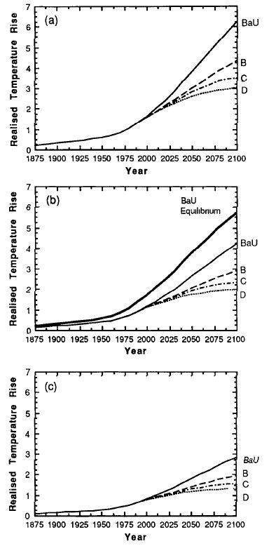
Figure 1: IPCC FAR Figure 6.11, surface temperature projections

As you can see, the IPCC shows three graphs in the figure, for three different equilibrium climate sensitivities (how much the planet will warm in response to a doubling of atmospheric CO2 once it reaches energy equilibrium). This is because in 1990, the value of equilibrium climate sensitivity was not well known, and IPCC was covering several possibilities: (a) is for a sensitivity of 4.5° for CO2 doubling (which FAR labels as a "high" estimate); (b) is for 2.5° (FAR calls this the "best" estimate), and (c) is for 1.5° (called the "low" estimate).

Within each graph are four projections based on four emissions scenarios. So there is not one climate projection in the FAR, but twelve different projections based on twelve different possibilities. Here are my measurements of the temperature increase rates (in °C per decade) shown in the figure of these twelve possibilities, for the period 1990-2010 (Table 1).

Table 1: FAR Figure 6.11 Surface Temperature Projections

  Emissions Scenarios:
Equilibrium SensitivityBaUBCD
4.5° (High estimate, graph a) .35 .25 .25 .25
2.5° (Best estimate, graph b) .24 .20 .18 .17
1.5° (Low estimate, graph c) .18 .14 .12 .11


The discussion on RealClimate was kicked off by recent editorials in the Wall Street Journal (WSJ). Back on January 27, sixteen scientists and engineers (many with undisclosed ties to the oil industry) wrote an editorial in the WSJ minimizing the dangers of global warming. 

The editorial drew quite a few negative reviews because of its bad science.  Economist William Nordhaus publicly complained that the Gang of 16 had misrepresented his work, and subsequently wrote an article setting the record straight that his research shows the opposite of what the WSJ "skeptics" claimd (climate mitigation actually saves money).  And at least two negative letters to the editor appeared in WSJ's own pages: one by Robert Bryer of the American Physical Society, and one by Kevin Trenberth and 37 other noted climatologists. The original editorial ran about 1200 words, while the two letters to the editor were about 700 words combined.

On February 21, the WSJ doubled down with another 1900 words from the Gang of 16. One would think that a reputable newspaper, having been accused of misrepresentation in the first instance, would exercise great caution when publishing a second go-round by the same authors. Alas, this was not the case. The WSJ and its Gang of 16 have simply dug the hole deeper, this time by misrepresenting the FAR. Here's the graph that appeared in the WSJ:

WSJ FAR misrepresentation

Figure 2: The WSJ figure (misrepresentation), intended to show how bad climate models are

The eye is immediately drawn to the high-slope line labelled "IPCC 1990."  This line shows a temperature increase of 0.32°C per decade, far outside of most climate projections. Looking back at Table 1, only one projection is anywhere close to the 0.32°C per decade increase that the WSJ graph shows: the business-as-usual (BaU) scenario coupled with a sensitivity of 4.5°C. This raises two important questions.

1. When the IPCC report shows three possibilities for climate sensitivity, is it fair to claim (or to imply) that the highest of those three is more preferred by the IPCC than the other two?

I think any fair-minded person would say the answer is no.  In fact, most people would say that if any were preferred, it would be the middle of the three, not either extreme.  And since the IPCC itself labels the middle of these estimates as "best," they have answered the question themselves. Using the "high" estimate alone, as the WSJ has done, is misleading at best.

Beyond that, current science has narrowed the range of possibilities for equilibrium climate sensitivity considerably. Both the 1.5°C and 4.5°C sensitivities now seem unlikely. The best estimte from the most recent IPCC report is about 3°C, while Royer et. al. (2007) puts it at 2.8°C based on 500 million years of climate data. So the middle of the three possibilities in 1990 has indeed turned out to be the most likely.  The IPCC's label of "best" was correct at the time.

2. Of the four emissions scenarios in these graphs, which has been closest to the emissions we have actually experienced during the past 20 years?

Figure 3 shows the FAR's projections of radiative forcing for the four emissions scenarios they considered.

FAR scenarios

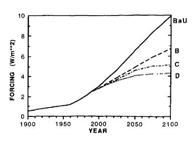
Figure 3: FAR Figure A.6, radiative forcing under different emissions scenarios

Once again the figure from the pdf scan was skewed and was corrected before analysis.  Table 2 summarizes those forcing estimates.

Table 2: FAR Figure A.6 radiative forcing projections from 1990 to 2010

ScenarioChange in forcing, 1990-2010
BaU +1.23 W/m²
B +0.78 W/m²
C +0.70 W/m²
D +0.63 W/m²
Actual +0.63 W/m²

 The actual forcing increase of +0.63 W/m² is from NOAA's Annual Greenhouse Gas Index. The FAR projections were based on four emission scenarios, and we now know that Scenario D was virtually identical to what we have actually experienced, and about half that of the BaU scenario. The BaU scenario of 1990 did not actually happen.

The collapse of the former Soviet Union led to a decimation of Soviet Block industry which nearly halved Eastern European emissions.  In addition, the Montreal Protocol put an end to manufacturing of some of the most potent chlorofluorocarbons (CFCs, which are greenhouse gases), and its effect has been swift.  Also, growing global recognition of the threat of climate change has rapidly increased the adoption of renewable energy, both in the US and especially in Europe; government subsidies such as feed-in tarrifs have encouraged this trend. Meanwhile, the rising price of fossil fuels has led to slower economic growth than most would have predicted in 1990.

If we look again at the temperature predictions for Scenario D, the FAR predictions were increases of 0.25, 0.17, and 0.11°C per decade, based on sensitivities of 4.5, 2.5, and 1.5°C for CO2 doubling, respectively.  The central figure of 0.17°C, based on the best sensitivity estimate, is virtually identical to the actual observed temperature increase over the past 30 years (Figure 4).  Foster & Ramstorf (2011) puts the increase at 0.16 +/- .02°C per decade.

FAR projection comparison

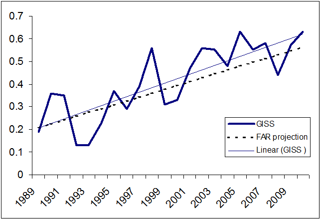
Figure 4: Actual IPCC FAR projections under observed emissions (Scenario D) compared to observed temperatures from NASA GISS

To summarize, the IPCC's First Assesment report of 1990 hit the bullseye in terms of climate modeling. It was a remarkably accurate projection, especially considering that the climate models available in 1990 were crude by modern standards.

As it happened, world events took an unpredictable turn in the 1990s which limited emissions growth to the low end of IPCC FAR predictions.  The work of the IPCC, such as FAR, has been a spur to these collective actions, and is the reason IPCC was awarded the 2007 Nobel Peace Prize.

The Wall Street Journal's misrepresentation of the IPCC's work does a disservice to its audience, to the public, and to mankind as a whole.

0 0

Printable Version  |  Link to this page

Comments

Prev  1  2  

Comments 51 to 96 out of 96:

  1. 52, Anteros, The problem is that any focus on the "prediction" and the "error" concerning the emissions scenario is a huge waste of time, a distraction, and down-right silly. If the emissions scenario was inaccurate for a period of five or ten years it simply means they failed to properly predict the economics and policies of an entire world of hundreds of nations and billions of people over a very short time frame. What is more important is that it says nothing whatsoever about the science. And it provides no comfort whatsoever to those who wish to claim that the science is invalid. You are like a man who has been told he as diabetes because you eat too much ice cream, but the doctor was wrong about the ice cream, your real sin is chocolate cake. So do you walk out of the doctor's office whistling gleefully because he was wrong about the factors behind your diabetes? Your focus on the emissions scenario and your eagerness to use words like "big error" and "wrong" demonstrate nothing except for your own narrow focus and apparent wish to ignore the science at any cost. And your eagerness to declare the entire process as wrong rather as a result, rather than to recognize that the difference in emissions scenario confirms, rather than diminishes, the strength of the science, makes all of your words suspect.
    0 0
  2. Anteros is clearly not interested in arguing his case in good faith. This is no surprise, for if he did argue it in good faith his case would vanish. Further, in order to prosecute his case, he is clearly prepared to misrepresent the IPCC, and anybody else that suites his purpose. Therefore I see no point in further discussion with him. I will note that when I took his criticisms at face value, and pointed out the consequences (@43 above), he merely dismissed it as "quibbles about hundredths of a degree". To show the significance of these "quibbles" below: The graph is the WSJ graph with the IPCC FAR 1990-2030 trend for scenario A shown in green. It also shows in yellow the IPCC FAR trend from 1990 to 2030 for scenario C, ie, the scenario that most closely matches the actual historical forcings if we allow for the IPCC FAR's incorrect estimate of forcing for a doubling of CO2; and in orange the trend for scenario D, as discussed above. Anteros can talk about quibbles as much as he likes, but it is transparent that had the WSJ 16 correctly represented the IPCC FAR projections (by any reasonable standard of "correctly") it would have significantly weakened their case. Anteros has suggested that we cannot learn from past mistakes if we do not recognize them. He is correct, which is why it is heartening that in both SkS discussions the nature of the errors made in IPCC FAR have been clearly identified. This contrasts sharply with Anteros and the WSJ 16 whose sole purpose seems to be to point vociferously at the error without discussing its causes, thereby distracting people from any real thought on the situation.
    0 0
  3. >>If the only thing the IPCC was offering up to the world was an estimation of climate sensitivity, the FAR would have been a very short document. That's a very disingenuous argument. It assumes that the IPCC's main goal consisted in predicting how much CO2 the world would release. In fact, that prediction consisted only a very small part of the IPCC report, and as others have pointed out, has nothing to do with the science of AGW, and does not diminish the egregious errors of the WSJ article.
    0 0
  4. Coming in late.... It looks like Anteros (or the sources he/she is using) are playing the following game: - both the expert and the fake skeptic agree that C = A * B - the expert says "my best estimate of B is 2.5, but it could be as low as 1.5 or 4.5" - the expert says "I don't know what A is going to be in the next 20 years. If it is 10, then C will probably be 25, but it could be as low as 15 or as high as 45, because of my uncertainty in B. Let's call that value of A 'Business as Usual'. If A is 5, then C will probably be 12.5, but in the range 7.5 to 22.5. If A is 2, then the range for C changes to 3 to 9, with a best estimate of 5". - 20 years later, it turns out that A was about 4, and that C was about 12, which implies that B is about 3. - To the expert, none of the scenarios for A were matched exactly, but the results for C = A * B, lead to only a slight change in the "best estimate" for B (within the range from 20 years ago), so the expert is pretty happy and thinks she's done well. After all, her area of expertise is in the estimation of B and the measurement of C, not guessing what will happen to A. - the fake skeptic, on the other hand, is claiming that the expert predicted that A would be 10 and B would be 4.5, so C should have been 45, so the fact that C was 12 means that the expert got everything wrong and can't be trusted to give us an accurate value for B. Whether the fake skeptic is really that silly, or thinks everyone else can be fooled is an exercise for the reader.
    0 0
  5. ...while I'm at it.... Hasn't anyone noticed (or did I miss a comment?) that the original "Reality vs. Alarm" graph has used the trick that Tamino talks about here? They've started each IPCC prediction from the single value for that year, rather than a more realistic middle-of-the-noise value. The peak temperature for 1990 gives the "IPCC 1990" line a jump start above all the rest. If that projection started at 0.1 instead of 0.3, then the line wouldn't be that far off. By using 0.3, the graph is assuming that whatever caused the temporary upward spike in 1990-1991 will never go away as the "IPCC 1990" projection moves forward in time.
    0 0
  6. Bob - yes, there are really a lot of problems with the WSJ graphic, and we've only touched on a few here. The link in comment #1 to our post on the subject shows how to do the analysis properly.
    0 0
  7. Anteros @22 "It seems you would all rather take the word of a sketchy, hand-drawn impressionistic graph than the specific written predictions of the FAR." The graphs and the text agree, when extended out to 2100. But the WSJ didn't extend their graphs out to 2100. And it is clear, looking at the graphs, that the IPCC projections indicate that the early part of their projection (the part we're in now) shows warming at a lower rate than the overall century-long rate. It is therefore utterly decpetive for the WSJ to use the overall century rate as the IPCC projection for the first twenty years: that wasn't the IPCC projection at all, for those first twenty years. "We used the 0.3 degrees per decade from the prediction of the FAR BAU. As I pointed out in my first comment, the error was in the SkS post above, suggesting that the [estimated from a graph] 0.32C was closest to the high climate sensitivity. It isn't - it is the 2.5C/2xCo2 best estimate." It is for the first twenty years. If the WSJ had wanted to be honest, they could have published the actual IPCC graph, which actually goes out to 2100. They didn't, and because they didn't, they gave a false impression of "where we should be now". "The FAR predicted, specifically that the BAU scenario would eventuate if few or no steps were taken to limit emissions of GHG's. And for those people clutching at straws with the Montreal protocol, that was signed and sealed 3 years before the IPCC FAR." The Montreal Protocol did not enter into force until 1989, and it is clear from the details of the emissions scenarios that neither BaU nor Scenario B anticipated any significant reduction of CFCs. See FAR Annex, figure A-3.
    0 0
    Response:

    [DB] Fixed spacing.

  8. Anteros @32 “Can I enquire how you got your figure of 0.35C per decade for the 'high' sensitivity and the BAU scenario? I ask because the FAR states that it is 0.5C per decade.” I extracted the graph from the pdf at high magnification, corrected the skew, and measured the pixel positions of the axes and the lines themselves. The slope in the first twenty years is obviously lower than it is for the entire century, even from a cursory examination. Pixel measurement allows you to quantify that. Sorry for the odd spacing of my previous post ... should have previewed first!
    0 0
  9. Anteros #50 When you say "the BAU scenario never eventuated” you are absolutely right. But you fail to see that it was defined in a specific manner - that did eventuate. In other words "few or no steps were taken to limit the emission of GHG's". BaU was defined in an even more specific manner in the FAR Annex, and the BaU scenario shows a continuing large increase in CFCs throughout the 21st century. Only the FAR scenarios C and D show the effects of the implementation of Montreal.
    0 0
  10. Bob makes a good point @55. The WSJ signatories appear to have started each projection in the year of the publication, and used an averaged trend starting from that year's temperature value. The models project the entire twentieth century though, and as such it would be more appropriate to zero the models at the same base period used by HadCRUT3. However, I wouldn't say that the effect would be as great as lowering the starting point to 0.1 in the figure above. The 1961-1990 average for the model runs seems to be just under 0.75, if not 0.75 itself. The change to 1990, though, is about 0.2˚C, which would drop the start value of that graph above by only about half a degree celsius (this is a rough estimate). The effect is not as important as the effects of using the correct trend over that time period, and the correct forcing (both scenario-wise, and correcting for the overstated concentration/forcing relationship I point out and Tom expounded).
    0 0
  11. Bob @55, "They've started each IPCC prediction from the single value for that year, rather than a more realistic middle-of-the-noise value. " You raise a very valid point and yet another problem with their graphic that misrepresent the IPCC. It is interesting that you also noticed that, as I was pondering that very point myself this morning and the Tamino post that you linked to also came to mind. Using Lindzen et al's faulty logic, they would have felt justified in starting the predictions at the peak in 1998 had the AR been released that year, and that of course would be very wrong. This is just as bad, if not worse than Pat Michaels' repeated misrepresentation of Hansen et al''s 1988 prediction (well Hansen said it was "treading close to scientific fraud"). I guess the fake skeptics have, for now, given up on that one and have found a new set of predictions to tamper with to mislead the public. I wonder how MIT feels about one of its profs engaging in potential scientific fraud in the public eye? What is lost in this fake debate though is how well subsequent predictions have performed: Caption: Annual global temperatures from NASA GISS (red) and Hadley Centre (blue) up to 2010, compared to the temperature projections of the IPCC TAR (grey dashed lines and grey range, as shown Figure 5d of the TAR Summary for Policy Makers). [Source] Rahmstorf: "Temperature trends are now near the centre of the TAR projections, with linear trends of 0.19 and 0.17 +/- 0.08 ºC per decade in the GISS and Hadley data, as compared to projected linear trends ranging from 0.15 to 0.20 ºC per decade in the TAR projections (depending on emissions scenario)." [Source]
    0 0
  12. keithpickering @59 The FAR BAU was not just projecting large CFC increases, but also large methane increases. As one of the commenters on the RealClimate thread, I concluded at the time that the FAR BAU projection had stood the test of time well, projecting a 0.23 deg C /decade rise 1990-2010 for a higher GHG scenario than actually occurred. (Of course this is the same FAR that also contains the classic fig 7.1c complete with Medieval Warm Period & Little Ice Age.) The only mitigation I have seen for the poor representation of FAR BAU provided in the WSJ letter is perhaps AR4 fig TS.26 which also latches on to the FAR "0.3 deg C/decade" for the 21st century average and applies it to 1990-2005. Then, at least TS.26 had a more considered start point. And while that one aspect of TS.26 may be a bit of a low point, the WSJ graph actually represents the flawed and lacklustre pinnacle of correctitude in an otherwise grossly fallacious diatribe.
    0 0
  13. Gavin and "wrong": "[Response: Note that projections are a function of two things - the scenario and the model. What was wrong in FAR was the scenario (too fast growth rate of GHGs, no aerosols, no ozone, no BC etc.), not the model (though the projections were with simple emulators not GCMs). Indeed, models today have similar sensitivities and with the same scenario will give the same temperature rise. - gavin]" Anteros is saying nothing in this thread that wasn't said over at RC (other than his quote-mining Gavin in an extremely misleading way). Those refuting him are saying nothing new. His refusal to learn is clear. Can't we just make it stop?
    0 0
  14. dhogaza @63, "Can't we just make it stop?" If only dhog, these guys are like energizer bunnies. But your point is taken. I made the mistake last night of breaking the DNFTT rule, and shall not make it again. I strongly urge others to (unlike I did), as difficult as it is, to refrain from FTT.
    0 0
  15. For me, the fact that the WSJ is owned by Rupert Murdoch says it all.
    0 0
  16. funglestrumpet: Murdoch didn't really change anything. The paper's editorial and op-ed pages were anti-science before he bought it (when science clashed with the papers political views). It published an infamous "satellite data shows cooling and is the wooden stake through the heart of global warming" piece when the very first UAH reconstruction was published. That was not the first attack on climate science, and that was long before Murdoch bought it. It published a bunch of pseudo-scientific attacks on issues like conservation and acid rain in its day, probably ozone layer stuff as well though I don't remember. It may be more a case of Murdoch buying a paper with an editorial stance much too his liking than of Murdoch buying a paper and twisting its editorial stance into alignment with his own.
    0 0
  17. re: Alex C @ 60 I just used the eyecrometer on the provided "Reality vs. Alarm" graphic, and 0.1 looked like reasonable mid-range value from '89 to '93. The link to Tamino shows how you should do it, which is more in line with what you say, so I didn't see the need to analyze further. The other projections in the "Reality vs. Alarm" graph don't pop out quite the same way that the 1990 one does - they are much more in the middle. And the year of publication doesn't necessarily reflect the year that the projection starts - look at Albatross's updated TAR graph in comment 61. Although published in 2001, the projection starts to spread (gray band) from a point of origin in 1992. It takes time to collect data, run the models, analyze the results, etc. How would the WSJ graphic look if the first report was held off (contents unchanged) until 1992, and the SAR until 1996, the TAR was rushed out the door in 2000 instead of 2001, and the fourth delayed until 2008? Would the fake skeptics be saying "the warming greatly exceeds all the projections!"? Somehow, I doubt it.
    0 0
  18. (-snip[snip] It makes me wonder if those alleging bad faith have checked in a mirror recently.-) It is also surprising that my criticisms remain unanswered. I found it encouraging to agree with a point made by Barry Bickmore, and I can't help notice that not one person has made a comment to him, but my observation of exactly the same thing provokes such ire amongst the regulars here. The most important point about the attempt to discredit the WSJ article [which, I repeat, I have no motive to defend - it is just a poor op-ed] is the allegation that the 1990 FAR line is closest to the high sensitivity prediction. It isn't - that is false. Graph A provides a very clear visual image of what the FAR defines as the high sensitivity prediction - 0.5C per decade. You'll note that it is virtually straight. Remember that the central best estimate is 0.3C (graph B). The WSJ line is 0.32C. Here is what the post above says -
    Looking back at Table 1, only one projection is anywhere close to the 0.32°C per decade increase that the WSJ graph shows
    That is because the numbers in Table 1 are completely different from the numbers given by the FAR. The FAR says 0.5C per decade, Keith Pickering's table 1 says 0.35C. Even Albatross concedes that there may have been a mistake. But Keith Pickering defends it. (-snipI'll leave it with you. The WSJ graph (0.32) - which is it closest to, A (0.5) or B(0.3)?, honestly?-)
    0 0
    Moderator Response:

    [DB] As Tom Curtis has amply demonstrated at comment 52 above and at comment # 70 below, and by many others at various points in this thread, you continue to erect a house of misquote cards and then proceed to demolish them.  All the while throwing inflammatory accusatory darts questioning the integrity of others (multiple instances in multiple comments, since snipped).

    Moderating this site is a tiresome chore, particularly when commentators repeatedly submit offensive or off-topic posts. We really appreciate people's cooperation in abiding by the Comments Policy, which is largely responsible for the quality of this site.

    Please note that posting comments here at SkS is a privilege, not a right.  This privilege can and will be rescinded if the posting individual continues to treat adherence to the Comments Policy as optional, rather than the mandatory condition of participating in this online forum.

    Finally, please understand that moderation policies are not open for discussion.  If you find yourself incapable of abiding by these common set of rules that everyone else observes, then a change of venues is in the offing.

    Please take the time to review the policy and ensure future comments are in full compliance with it.  Thanks for your understanding and compliance in this matter.

  19. dhogaza @ 66 Agreed. It just seems to me that if we are going to get the public to agree with what is rapidly becoming an urgent need for action on the issue, we cannot continue letting Murdoch and his like have such influence on the issue. While Murdoch might legitimately claim that his editors have editorial freedom, it would be a very unusual editor to be so politically inept as to not pay heed to the views of those responsible for them keeping their job. It calls to mind the probably apocryphal tale of the company chairman saying: “It is only a suggestion, gentlemen, but don’t forget who’s making it.” In the U.K., Murdoch has just lost a lot of influence because the politicians have at last found strength in numbers and given him the finger – a bit like a group of shopkeepers getting together to reject a mafia protection racket; on reflection, a lot more than a ‘bit’ like. Pity we can’t give him the finger globally. Imagine if all the Murdoch owned American media had a completely and genuinely independent editorial policy. They can’t all be single without children or grandchildren who will suffer if we continue with business as usual. Some of them must have learnt that sex is intended to be performed as a duet instead of in solo. I don’t speak American English, but I think the word ‘jerk’ applies somehow.
    0 0
  20. Anteros claims at 68 that:
    "Graph A provides a very clear visual image of what the FAR defines as the high sensitivity prediction - 0.5C per decade. You'll note that it is virtually straight."
    For your convenience, here is a graph illustrating that contention: As has already been mentioned by Keith Pickering @58, it is obvious that the slope of the graph prior to about 2020 is less than the slope from about 2020 to 2100. Given this obvious fact, Anteros apparently believes that "arguing in good faith" requires him to use the slope of the line from 2020 to to 2100 as the "IPCC prediction" for the period 1990 to 2011. In this regard, it should be noted that in his post @46, Anteros claimed that:
    "You claim that the FAR prediction comes with an error range. Again, indeed it does, but the limits of that error range (the specified uncertainty) are merely the two other CS's considered - 1.5 & 4.5C/2xCo2."
    The upper limit of the error range was a rise of 1.5 degrees C over four decades, or a trend of 0.375 C per decade. This compares with his current (@68) estimate that the trend rate over that period for scenario A with 4.5 C per doubling of CO2 is 0.5 C per decade. So, apparently Anteros believes that "arguing in good faith" means making contradictory assertions about the same situation in different contexts based on whatever is rhetorically most useful. As has already been well established, Anteros understanding of "arguing in good faith" also involves gross misquotation of, and misrepresentation of the IPCC FAR and Gavin Schmidt. I am certainly glad that none of the SkS regulars "argue in good faith" as Anteros appears to define the phrase. We have far more integrity than that.
    0 0
  21. Tom wrote: "As has already been well established, Anteros understanding of "arguing in good faith" also involves gross misquotation of, and misrepresentation of the IPCC FAR and Gavin Schmidt." Not to mention repeatedly ignoring the presentation of overwhelming evidence directly contradicting his claims and then simply repeating his (blatantly false), 'I am so disappointed that no one has answered me' mantra. When someone is in denial over the content of the discussion itself there really is no point.
    0 0
  22. funglestrumpet: Oh, I totally agree that Murdoch is evil. I was just pointing out that the editorial policy of the WSJ was to blatantly misrepresent or lie about science long before Murdoch bought it. He's certainly done nothing to improve the accuracy or reduce the ideological pandering of the editorial board of the paper ...
    0 0
  23. Keith, (I hope this is not too off topic, and more interesting than debating Anteros) I just wanted to say many thanks for your highlighting of the contribution of the CFC phase out to reducing emissions, it's very poorly recognised that the Montreal Protocol has been around 5 times more effective at reducing radiative forcing emissions than the Kyoto Protocol ( Velders et. al. PNAS, 2007), and every bit of attention to this is most welcomed. Lamentably the climate benefits achieved by the Montreal Protocol to date are in dire threat of being eroded by the continued growth in the use and emissions of HFCs (and HCFCs - although these are being phased out atmospheric concentrations are still growing). This is entirely avoidable as genuinely climate friendly future proof natural refrigerant solutions exist, and are becoming more widely available and used, but face stiff resistance from some sectors of industry. Additionally the need for transition in developing countries in particular is lacking in support, training and awareness. A recent paper by Velders et.al. 2012 in Science reinforces the 'world avoided' by phasing out CFCs and calls further attention to the need to address HFCs by including them in the Montreal Protocol. Although very useful in setting the scene for 25th anniversary negotiations (of 1987 Vienna Convention) in Bangkok in July and in Geneva in November, far more attention to the HFC threat is required to move the intransigent Parties towards consensus on the now much-debated HFC amendment proposals. Here's the new graph: "Projected radiative forcing by ODSs, HFCs, low-GWP substitutes, and CO2 (12). The blue hatched region indicates what would have occurred in the absence of the Montreal Protocol, with 2 to 3% annual production increases in ODSs [data taken from (5)]. Added to the radiative forcing from ODSs [data from (9)] are the contributions from HFCs from the upper-range scenario [data from (11)]. Also shown are the radiative forcing from alternative sce- narios in which substitution is made with chemicals having shorter lifetimes (lower GWPs); their contri- bution is calculated using methods described in (11) with the parameters from (16). Under the Montreal Protocol, use reductions started in 1989 for CFCs and in 1996 for HCFCs." The 2011 UNEP report "HFCs: A Critical Link In Protecting Climate and the Ozone Layer" published in time for but overlooked by Durban is another useful resource, as is the paper by Molina M., Zaelke D., Sarma K., Anderson S., Ramanthan V., & Kaniaru D., Reducing abrupt climate change risk using the Montreal Protocol and other regulatory actions to complement cuts in CO2 emissions, Proc Nat. Acad. Sci. (2009). Recovery and destruction of the bank of old CFCs and HCFCs is another useful contribution the Montreal Protocol could make if much more effective measures could be agreed and acted on. PS - my favourite T-shirt: "Is that the truth, or was your News Limited?"
    0 0
  24. > "few or no steps were taken to limit the emission of GHG's". Nonsense. 7(h) The Greenhouse Effect www.physicalgeography.net/fundamentals/7h.html May 7, 2009 – Artificially created chlorofluorocarbons are the strongest greenhouse gas per molecule.
    0 0
  25. P.S. -- want a prediction? ftp://ftp.ingv.it/pub/pietropaolo.bertagnolio/o3/shindell98-o3climchange.pdf "... increasing greenhouse-gas concentrations alter planetary-wave propagation in our model, reducing the frequency of sudden stratospheric warmings in the Northern Hemisphere4. This results in a more stable Arctic polar vortex, with significantly colder temperatures in the lower stratosphere and concomitantly increased ozone depletion. Increased concentrations of green- house gases might therefore be at least partly responsible for the very large Arctic ozone losses observed in recent winters6–9. Arctic losses reach a maximum in the decade 2010 to 2019 in our model, roughly a decade after the maximum in stratospheric chlorine abundance. The mean losses are about the same as those over the Antarctic during the early 1990s, with geographically localized losses of up to two-thirds of the Arctic ozone column in the worst years. The severity and the duration of the Antarctic ozone hole are also predicted to increase because of greenhouse-gas-induced stratospheric cooling over the coming decades." _________ Right on schedule: Scientists Detect First-Ever Arctic Ozone Hole October 3, 2011 It marks the first time that ozone loss in the Arctic region has matched ozone loss above Antarctica, both they and Postmedia News are reporting. According to LiveScience Senior Writer Wynne Parry, the researchers discussed their finding in this Sunday’s edition of the journal Nature, writing, “”For the first time, sufficient loss occurred to reasonably be described as an Arctic ozone hole.”
    0 0
  26. Further to GreenCooling @73, this is what the IPCC FAR had to say about their emissions scenarios:
    "The scenarios cover the emissions of carbon dioxide (CO2), methane (CH4), nitrous oxide (N2O), chlorolluorocarbons (CFCs), carbon monoxide (CO) and nitrogen oxides (NOx) from present up to the year 2100. Growth of the economy and population was taken as common for all scenarios. Population was assumed to approach 10.5 billion in the second half of the next century Economic growth was assumed to be 2-3% annually in the coming decade in the OECD countries and 3-5 % in the Eastern Euiopean and developing countries. The economic growth levels were assumed to decrease thereafter. In order to reach the requued targets, levels of technological development and environmental controls were varied."
    (Note: The PDF is obviously a scanned document, and scanning has introduced minor spelling and grammatical errors which I have corrected in this and following quotes.) They go on:
    "In the Business-as-Usual Scenario (Scenario A) the energy supply is coal intensive and on the demand side only modest efficiency increases are achieved. Carbon monoxide controls are modest, deforestation continues until the tropical forests are depleted and agricultural emissions of methane and nitrous oxide are uncontrolled. For CFCs the Montreal Protocol is implemented albeit with only partial participation. Note that the aggregation of national projections by IPCC Working Group III gives higher emissions (10-20%) of carbon dioxide and methane by 2025."
    Unfortunately, they do not provide either graphs or tables of expected GHG concentrations. It is, however, possible to infer that they expected CO2, CH4 and NOx emissions to increase in line with economic activity based on the fact that they assume no measures to counteract that trend. That is, they expected an annual increase of CO2 (and other GHG)emissions of 2% per annum through the 1990s. That, however, is not what happened: The very sharp reduction in CO2 emissions in Eastern Europe (light blue on the graph) contrasts starkly with the expected 3% plus economic growth, and presumably emissions growth assumed in the IPCC FAR model. That greatly reduced emissions growth in the 1990's has been followed by above expected emissions growth in the 2000s due to the rapid growth in India and (especially) China. The net effect, however, has been a near linear growth over the two full decades rather than the exponentially increasing growth expected by the IPCC FAR Business As Usual scenario. A similar pattern is found with NOx, but Methane (CH4) has not only failed to grow as expected, but has flat lined. CFCs are a special case. The IPCC FAR clearly expects some reduction in CFC concentration based on the "partial" implementation of the Montreal Protocol. Implementation of that protocol has been far from partial, however. The resulting reduction in CFC-11 concentrations, and flat lining of CFC-12 concentrations would be a far greater reduction than projected by the IPCC FAR. The relevant GHG concentrations are shown by NOAA: The net effect of all these emission reductions has been a significant decrease in GHG forcings relative to 1990 expectations. Total forcings have not even maintained the linear trend from 1978-1990, let alone the ongoing growth expected by the IPCC FAR in the Business As Usual model: (Radiative Forcing relative to NOAA, modified to show continuation of 1978-1990 trend for comparison. Original image is found here.)
    0 0
  27. Tom Curtis and GreenCooling - Thank you for that very relevant data. We are perhaps quite fortunate that the economy and the Montreal Protocol have acted to reduce warming as much as they have. This does point to some shorter term mitigation strategies, I will note: CHC/HCFC reductions, soot reductions, and other short-lived GH influences. Those are the low-hanging fruit, the easy pickings, and may have a strong effect as we address over a longer term the baseline issue of CO2 emissions.
    0 0
  28. We also discussed the role of CFC emissions reductions in Patrick Michaels Continues to Distort Hansen 1988, Part 1 and the Advanced rebuttal to "Hansen's 1988 prediction was wrong". As also discussed in those posts, climate scientists are not in the business of predicting how GHG emissions will change. That is primarily a policy question, decided by policymakers and the public. That's why climate scientists create so many potential emissions scenarios, and create climate projections for those scenarios.
    0 0
  29. @Tom Curtis #76: The first sentence of the PDF document you quote from reads: "The Steering Group of the Response Strategies Working Group (Working Group III) requested the USA and The Netherlands to develop emissions scenarios for evaluation by the IPCC Working Group I." Is there another document that details how the USA and the Netherlands developed the four scenarios?
    0 0
  30. John Hartz @79, thank you for the question. Prompted by it, I looked at the annexe of the IPCC FAR, and found the graph of the concentrations of key GHG in the scenarios in figure 4.3. Using those graphs, and the graphs of actual concentrations from NOAA above, I made a comparison of 2010 concentrations. The first figure is the IPCC FAR BAU scenario concentration, while the figure in brackets is the actual figure. The final figure is the percentage of the projected concentration which was actually achieved: CO2: 400 ppmv (394 ppmv) 98.5% CH4: 2250 ppbv (1800 ppbv) 80% NO2: 328 ppbv (323 ppbv) 98.5% CFC 11: 417 ppbv (246 ppbv) 40% CFC 12: 734 ppbv (534 ppbv) 73% So stated, this underestimates the impact of the relatively low emissions in the 1990s. Because of thermal lag, the reduced forcings in the 1990s will result in reduced temperatures in the following decades. For comparison, in 2000 the projected BAU CO2 concentration was 384 ppmv, while in real life the concentration was only 368 ppmv, or 96% of the projected value.
    0 0
  31. @Tom Curtis #80: Do you have any information about the individuals comprising the group who produced the forecasts? Did the group include economists? Did they use an economentric model and forecasts developed by another global organization such as the World Bank?
    0 0
  32. John Hartz @81: 1) At the beginning of the Annex, the authors are listed as:
    "Model calculations contributed by: C. Bruhl; E. Byutner; R.G. Derwent; I. Enting; J. Goudriaan; K. Hasselmann; M. Heimann; I. Isaksen; C. Johnson; I. Karol; D. Kinnison; A. Kiselev; K. Kutz; T-H. Peng; M. Prather; S.C.B. Raper; K.P. Shine; U. Siegenthaler; F. Stordal; A. Thompson; D. Tirpak; R.A. Warrick; T.M.L. Wigley; DJ. Wuebbles. Co-ordinators: G.J. Jenkins; R.G. Derwent."
    2) Regarding the specific scenarios is says:
    "Modelling studies have been undertaken by a number of research groups to investigate the climate consequences of several man-made emission scenarios The first category of emission scenarios is that generated by IPCC Working Group III, which represents a broad range of possible controls to limit the emissions of greenhouse gases, these we refer to as policy s c ena r ios."
    Given that the scenarios originated from WG III I presume economists where heavily involved. 3) It further says:
    "Each scenario includes emi s s ions of the main greenhouse gases, and other gases (such as NOx and CO) which influence then concentrations The emissions of carbon dioxide and methane are shown in Figure A 2 as examples For further information on the background to and method of generation of, these policy scenarios, see Expert Group on Emissions Scenarios (1990)."
    That report, so far as I can determine, is not available on the web, and certainly not available from the IPCC. Its full title is given by the IPCC TAR as:
    "University, Vancouver. IPCC (Intergovernmental Panel on Climate Change), 1990: Report of the Expert Group on Emission Scenarios. World Meteorological Organization and United Nations Environment Programme, New York"
    The 1992 report, Emissions Scenarios for the IPCC - An Update report discusses the 1990 scenarios extensively. In the executive summary it says:
    "Scenarios are not predictions of the future and should not be used as such. This becomes increasingly true as the time horizon increases, because the basis for the underlying assumptions becomes increasingly speculative. Considerable uncertainties surround the evolution of the types and levels of human activities (including economic growth and structure), technological advances, and human responses to possible environmental, economic and institutional constraints. Since completion of the 1990 Scenario A (SA90), events and new information have emerged which relate to that scenario's underlying assumptions. These developments include: the London Amendments to the Montreal Protocol; revision of population forecasts by the World Bank and the United Nations; publication of the IPCC Energy and Industry Sub-group scenario of greenhouse gas emissions to AD 2025; political events and economic changes in the former USSR, Eastern Europe and the Middle East; re-estimation of sources and sinks of greenhouse gases (reviewed in this Assessment); revision of preliminary FAO data on tropical deforestation; and new scientific studies on forest biomass. These factors have led to an update of SA90, the current exercise providing an interim view and laying a basis for a more complete study of future emissions. ..."
    It seems to me that Anteros would do well to read the first and second paragraphs repeatedly until he understands the difference between a "prediction" and a "projection" as currently defined by the IPCC, and used at SkS (regardless of the looser use in the IPCC FAR), and thoroughly understands that emissions developments in the 1990s where not BAU as projected by the IPCC FAR. I presume that as the update relied on the World Bank for population projections, the original scenarios did as well, but that is just conjecture.
    0 0
  33. Thanks KR@77 and Dana@78, very good to see the previous discussion of CFCs. We are indeed fortunate that the Montreal Protocol has reduced emissions, but it is very unfortunate this is not better recognised in the policy debate. The projections of the erosion of the significant climate benefits by the Scientific Assessment of Ozone Depletion 2010 are I think cause for alarm, but very few ENGOs are paying any attention, and even one of the biggest that has been working on this problem is scaling back their campaign. I don't for a second argue that CO2 is not the main game, but the ongoing neglect of the significance of short term, fast acting mitigation strategies like controlling HFCs & HCFCs (and recovering and destroying CFCs) is baffling. The implications of the bottom panel from the Executive Summary (linked above) are bad enough, but the effect of using the 100 year GWP figures for HFC gases significantly understates the forcing impact of gases that have an average atmospheric lifetime of 21.7 years. Use of 20 year GWP figures almost doubles the projections depicted below. "Bottom panel: Global GWP-weighted emissions expressed as Gigatonnes of CO2-equivalent per year. The emissions of individual gases are multiplied by their respective GWPs (direct, 100-year time horizon; CO2 = 1) to obtain aggregate, equivalent CO2 emissions. Shown for reference are emissions for the range of CO2 scenarios from the Intergovernmental Panel on Climate Change (IPCC) Special Report on Emission Scenarios (SRES). The CO2 emissions for 1950–2007 are from global fossil fuel use and cement production. Beyond 2007, the shaded region for CO reflects the maximum (A1B) and minimum (B2) SRES scenarios. The dashed line marks 2010, the middle year of the first commitment period of the Kyoto Protocol. Also shown is the magnitude of the reduction target of the first commitment period of the Kyoto Protocol, which is based on a 1990– 2010 projection of global greenhouse gas emission increases and the reduction target for participating countries." The full Scientific Assessment of Ozone Depletion 2010 and associated Twenty Questions and Answers about the Ozone Layer 2010 Update contain a wealth of further information that may be of interest. I'm sure there are better places to discuss the looming threat posed by HFCs, and to challenge the widely held notion that the work of the Montreal Protocol is done (and ignorance of its role in protecting climate in the past), and would welcome any suggestions?
    0 0
  34. Tom Curtis @ 80 "CFC 11: 417 ppbv (246 ppbv) 40%" One of those figures (probably the "40%") is incorrect.
    0 0
  35. ribwoods @84, my apologies. It should be 60%.
    0 0
  36. Reading this post late, I am struck by how much Anteros is stuck on the same problem that Michaels had: treating BAU as a common term, rather than a scientifically defined term. If BAU means "business as usual" - and "business" hasn't notably changed - then they may have a point. But in both cases, Michaels, and now Anteros, have to ignore the fact that the term BAU is defined to be a particular forcing (different I think, one being Hansen's 1988 BAU and the other being the 1990 FAR BAU -but because the terms are defined, there really isn't an excuse for the confusion. Anteros, it can be hard to see the problem with something when you have espoused it so vehemently - take a look at Micheal's BAU problem - see if you can recognize where Michael's erred, and then see if you recognize it in your own position. At this point I think we have a new myth "BAU means whatever happened".
    0 0
  37. GreenCooling - I am interested in the refrigerants you mention - one of the problems we have right now in renewable energy is that R-134/R410-A (the common ones after the Montreal Protocol took effect) is limited to a high temp of about 120F in a ground source heat pump. But to get to the high temp you need to really work the compressor, so we need a refrigerant that can easily handle higher temperatures (180F would be ideal...). Less compressor work = less electricity = smaller PV/wind array or (in the worst case) the less coal burned. This is for the concept of a ground source heat pump (GSHP) powered by PV as a way to handle both heating and cooling (heating alone is better handled by straight up solar thermal). Do you know, or can you point me towards, the temperature properties of the all natural refrigerants you mention above? Are you thinking of ammonia or CO2 as the refrigerant? I've read about ammonia powered chillers driven by evacuated tube solar thermal panels. Currently not small enough for residential, but intriguing.
    0 0
  38. What a self serving justification! No wonder there are non be believers The FAR projection was extended from the lowest temperature at the time, 1989 If the average of the 3 years temperatures 1989-1991 Then the projected sloped line is at the top of the observed temperature range (-Snip-) Oh and Albatross : I don't know wher you got the heat sink graph from, but recent (-Snip-) articles show that the ocean is heating at a slower rate than the land mass which is why they explain the rise in temperatures over the Northern Asian land mass
    0 0
    Response:

    [DB] "recent (-Snip-) articles show that the ocean is heating at a slower rate than the land mass"

    Kindly provide a link to the peer-reviewed paper published in a reputable scientific journal for this unsupported assertion.

    Inflammatory snipped.

  39. @ 88, The heat content graphic @30 is based on Church et al. (2011); the data were kindly provided to SkS by Drs. Church and White.
    0 0
  40. "recent articles show that the ocean is heating at a slower rate than the land mass" What articles would these be please?
    0 0
  41. Fairoakien: With regards to your statement on ocean heating: that oceans heat more slowly than the atmosphere and Earth surface will surprise no knowledgeable person, thanks to the high specific heat capacity of water. That is why the oceans are such a large heat sink, and hence as long as the oceans are still accumulating heat there is no sensible basis on which to claim that global warming has stopped.
    0 0
  42. Fairoakien - "The FAR projection was extended from the lowest temperature at the time, 1989..." The FAR projection (in Fig. 4, which in absence of other information from you I suspect you are speaking of) is presented as a trend comparison. In fact, the FAR projections shown (Fig. 1, Fig. 3 of this post) are the results of model runs showing anthropogenic temperature gains over a baseline state: "The contribution of the change in greenhouse gas concentrations to the change in global-mean surface air temperature (C) during 1875 to 1985 together with projections..." Fig. 6.11, page 190, emphasis added. ...and not scenario expectations for absolute temperature. This is because the FAR isn't assuming that CO2 is the only forcing. I suggest you do a bit more reading before you try accusing anyone else of "self-serving justification".
    0 0
  43. Fairoakien - "...the ocean is heating at a slower rate than the land mass..." As expected - this was predicted by Svante Arrhenius from first principles in 1896 - land has less accessible thermal mass, and will react to changes faster than the oceans.
    0 0
  44. Fairoakien: 1) The graph shown by Albatross shows total heat gain by the Ocean, and by Land, atmosphere and ice. Because the Oceans occupy two thirds of the Earth's surface, and have an average depth of 3.75 km. Therefore they can absorb much more heat than the land surface and atmosphere, even though land surface and atmosphere increase in temperature at a faster rate. It is quite frankly unclear to me whether the land or ocean is heating (gaining energy) at a faster rate when compared on a m^2 basis, cubic meter basis of effected areas, or per tonne basis of effected volume. As others have indicated, a link to, or full citation of a paper which discusses any of these would be interesting. 2) You raise an interesting point about figure (4). Examining it, it appears to me as though Keith Pickering to the 1989 to 2011 linear trend and then drew in the FAR projection (Best estimate of climate sensitivity, best approximation of actual change in forcings) in with the same origin to enable easy direct comparison. That strikes me as an appropriate way of proceeding. The only more appropriate way is to normalize both projection and temperature record over the period 1969 - 2011 and adjust the means to match. It is important to note that, contrary to your description, the graph does not simply originate from 1989 as the trend lines do not pass through the 1989 temperature record. In other words, Pickering did not use the same absurd technique used be the WSJ 16 except in reverse. Given your condemnation of Pickering's method (as you mistakenly take it to be), I expect an equally strenuous condemnation of the WSG 16's actual technique. Finally, the IPCC FAR did not predict 1990 temperatures. The models were run from 1765 and result in inconsistent temperatures for 1990. The clear intention is to predict trends from 1990 rather than to predict absolute temperatures. Therefore Pickering's (or the alternative I described) are the only appropriate methods of comparison.
    0 0
  45. Fairoakien: Given the wealth of empirical evidence showing that global warming is unambiguously occuring: - temperature trends - unabated ocean heat content build-up - expansion of Hadley cells - melting of land and sea ice globally - shortened winters - changing migration and seasonal behaviours of animals - changing areas of plant growth - increased frequency and severity of warm severe weather events - and so on and so forth And given the empirical evidence unambiguously shows humans are responsible for the greenhouse gas forcing causing the warming: - changing CO2 isotope ratios in the atmosphere - decreased atmospheric oxygen from fossil fuel combustion - tropospheric warming and stratospheric cooling - increased greenhouse gas forcings as shown by satellite and surface measurements of longwave infrared radiation - known physics theory (blackbodies, quantum properties of CO2, &c) supporting atmospheric greenhouse effect - and so on and so forth Why is it that you appear to assert a single graphic comparing a 1990 surface temperature projection to the actual surface temperature record is making you a "non believer"? When you examine all the evidence, why is belief even coming into the picture?
    0 0
  46. Actually thoughtful @87 Without wanting to endorse any particular company the Bitzer Refrigerant Report is a very useful source of detailed information on refrigerant properties. Natural refrigerants include the "friendly five" of Ammonia, Carbon Dioxide, Hydrocarbons, Air and Water, but NH3 or HCs (R290 or R600a or a blend) would be most useful in Ground Source Heat Pumps, although some kind of heat exchange or secondary loop might be required if leakage into occupied spaces is a possibility. The folks at ammonia21.com and hydrocarbons21.com have a lot of good information available, and I've seen HC GSHPs in use at supermarkets in Sweden, so it can be done. There are some amazing new developments in ammonia chillers using waste heat or solar, have a look at what Firechill is doing for instance. If you'd like to get in touch directly i'd be more than happy to put you in touch with some real experts - brent at greencooling dot org
    0 0

Prev  1  2  

You need to be logged in to post a comment. Login via the left margin or if you're new, register here.


The Consensus Project Website

THE ESCALATOR

(free to republish)


© Copyright 2024 John Cook
Home | Translations | About Us | Privacy | Contact Us