


 Arguments
Software
Resources
Comments
The Consensus Project
Translations
About
Support
Arguments
Software
Resources
Comments
The Consensus Project
Translations
About
Support
![]()
![]()
![]()
![]()
![]()
![]()
![]()
![]()
![]()
![]()


![]()


Latest Posts
- Skeptical Science New Research for Week #17 2024
- Water is at the heart of farmers’ struggle to survive in Benin
- At a glance - The difference between weather and climate
- India makes a big bet on electric buses
- 2024 SkS Weekly Climate Change & Global Warming News Roundup #16
- EGU2024 - An intense week of joining sessions virtually
- Skeptical Science New Research for Week #16 2024
- How extreme was the Earth's temperature in 2023
- At a glance - Is the science settled?
- What is Mexico doing about climate change?
- 2024 SkS Weekly Climate Change & Global Warming News Roundup #15
- Fact Brief - Did global warming stop in 1998?
- Skeptical Science New Research for Week #15 2024
- EGU2024 - Picking and chosing sessions to attend virtually
- At a glance - The Pacific Decadal Oscillation (PDO) is not causing global warming
- Climate Adam: Is Global Warming Speeding Up?
- 2024 SkS Weekly Climate Change & Global Warming News Roundup #14
- Gigafact and Skeptical Science collaborate to create fact briefs
- Skeptical Science New Research for Week #14 2024
- How can I make my retirement plan climate-friendly?
- At a glance - Global warming and the El Niño Southern Oscillation
- A data scientist’s case for ‘cautious optimism’ about climate change
- 2024 SkS Weekly Climate Change & Global Warming News Roundup #13
- Skeptical Science New Research for Week #13 2024
- You can start applying for the American Climate Corps next month
- At a glance - Human fingerprints on climate change rule out natural cycles
- Want clean electricity? These are the overlooked elected officials who get to decide.
- 2024 SkS Weekly Climate Change & Global Warming News Roundup #12
- Climate - the Movie: a hot mess of (c)old myths!
- Skeptical Science New Research for Week #12 2024
Comment Search Results
Search for satellite data
Comments matching the search satellite data:
- Climate - the Movie: a hot mess of (c)old myths!
nigelj at 04:41 AM on 2 April, 2024Two Dog @55
"You make the same point I am searching for - namely that "blips" in the temperature record can be driven by natural factors. What puzzles me is others on this thread, whilst they recognize these natural impacts, appear confident that the natural factors that we are aware of are "temporal and not significant" (my words) when pitted against the powerful impact of human GHG emissions"
Nobody has claimed natural factors are all 'insignificant' forcings. Only that the natural cycles are in a cooling or flat phase in recent decades so cannot explain the recent warming trend. However the solar cycle is not a particularly powerful factor, and if it was in a warming phase it would struggle to explain more than a small amount of the recent warming. Refer to the climate myth "It's the sun" on the left hand side of this page.
"They rely on climate scientists for this - a group who are highly unlikely to admit the strength and frequency of natural factors is unpredicatble and hard to measure."
Incorrect. Climate scientists freely admit that the frequency of natural factors can be unpredictable to an extent. I provided you with data on the solar cycle, ENSO, and The PDO oscillation which depicts the degree of regularity of these cycles. You can see there is a repeating cycle bit its not perfectly regular.This data is prepared by climate scientists.
In addition whether they are not precisely predictable doesnt stop us detecting how they are affecting temperatures at any given time.
Climate scientists are quite open about accuracy of data. If you dig into the details the data has error bars. However the data has generally good accuracy. Solar irradiance in particular is meaured by satellite sensors with reasonable accuracy, and the Sorce network used since 2003 is highly accurate:
www.ngdc.noaa.gov/stp/solar/solarirrad.html
ENSO index is not that hard to measure with decent accuracy:
www.ncei.noaa.gov/access/monitoring/enso/technical-discussion
"I think this is where the climate scientists tend to differ from the physicists and geologists, whose very existance does not require them to claim knowledge of all factors that impact the climate."
Incorrect. Most climate scientists are in fact physicists, geologists, chemistry graduates etc. There is a degree in climatology, but its very recent and not many climate scientists have that degree. It typically has modules in physics and geology anyway. I suggest google it for your local university.
- 2023 SkS Weekly Climate Change & Global Warming News Roundup #44
MA Rodger at 10:04 AM on 11 November, 2023Just Dean @22,
My apologies for misreading your comment @20.
The climatology community do not generally spend their time awaiting monthly global temperature anomalies and (as in the kerfuffle with the so-called 'hiatus' a decade back) tend to react to issues after they have arisen; and then not very fluently. So in that regard Jason Box is an oddity.
Concerning the contribution of El Niño to 2023 global temperatures, it is true that there were stronger La Niña conditions in mid-2022 than there was in mid-1996 and particularly in mid-2014. Thus the change from a cooling La Niña would perhaps suggest more resulting warming in 2023. But the flip side of that is the La Niña conditions so far in 2023 being far weaker than 1997 & 2016 suggesting less resulting warming. (Note the 2009-10 El Niño also began from strong La Niña conditions in 2008.) The net effect for 2023 should then perhaps be 1997 or 2015-like. But they are not.
Thus I would suggest there is ample evidence from the global temperature record to indicate something with perhaps even more warming impact on global temperatures than the coming La Niña.
If the temperature rise (using ERA5 with assumed Nov/Dec 2023 anomalies as per @21) the global temperature rise through the first year and then the additional second year rise run as follows:-
1996-97 ... +0.12ºC ... ... 1997-98 ... +0.19ºC
2008-09 ... +0.13ºC ... ... 2009-10 ... +0.10ºC
2014-15 ... +0.15ºC ... ... 2015-16 ... +0.18ºC
2022-23 ... +0.30ºC ... ... 2023-24 ... +???ºC
Perhaps it would be worth setting out the same data for was the most powerful El Niño of recent decades. This was overwhelmed by the El Chichón eruption of April 1982 which resulted in a cooling in 1982:-
1981-82 ... -0.20ºC ... ... 1982-83 ... +0.19ºC
So perhaps the Jan 2022 Hunga Tonga eruption and its water vapour is acting as a booster for 2023. (I mentioned satellite data @21 supporting this contention. See th 6 min video from Andrew Dessler here. It's now 3 months old.)
- 2023 SkS Weekly Climate Change & Global Warming News Roundup #44
MA Rodger at 20:48 PM on 10 November, 2023Just Dean @20.
It is not correct to make a comparison of 2023 with El Niño years 1998 & 2016. We are in the first year of a 2023/24 El Niño and the earlier ones were 1997/98 and 2015/16. 2023 is not the El Niño year in which the temperatures jump.
(Using ERA5 numbers), if we assume the October anomalies coutinue for Nov/Dec, 2023 would show a record year averaging +0.16ºC above all previous years. 1998 & 2016 saw similar +0.15ºC & +0.18ºC respectively. But 2023 is not another 1998 or 2016. We would have to wait for 2024 to make a comparison with previous El Niño years. And the coming El Niño is not looking anything like 1998 or 2016. It is forecast to be "moderate El Niño event", so more like 2010.
That is why 2023 is being described as "Staggering. Unnerving. Mind-Boggling. Absolutely gobsmackingly bananas." The big question, which is yet to be answered, is 'Why?'
You'll be familiar with this graphic if you follow Jason Box. It well-explains the temperature rise 2014-2023 but it does not show anything that would explain the "staggering, unnerving, mind-boggling & absolutely gobsmackingly bananas" temperatures we've seen over the last five months.
(If you want to see how bananas, have a play on the UoMaine Climate Reanalyser and compare 2023 with previous years, then blank off 2016-23 and repeat for 'pre-El Niño' 2015. And again for 1997.)
My suggestion as to 'Why?' is that the Jan 2022 Hunga Tonga eruption which was exceptionally large and being sub-ocean blew large amounts of both SO2 and H2O into the stratosphere. These two would cancel each other out so the rather chilly 2022/23 winter (globally) with the SO2 marginally more powerful. But that SO2 has dropped out now and the remaining H2O is still there providing us the bananas. If this is the situation (& there is satellite data showing SO2 dropping out quicker than the H2O), the bananas do thankfully have a shelf-life.
- John F. Clauser: the latest climate science-denying physicist
Rob Honeycutt at 06:32 AM on 28 October, 2023TWFA... "It's not that I don't care about surface temperature, I care about whether the models for surface temperature have been applied to predicting temperatures above and below, a perfectly logical query."
Yes, this is a perfectly reasonable and logical query. So, pause right there before you move forward with any assumptions.
The answer to the best of my understanding:
Yes, climate models are applied to the surface and up through the various layers of the atmosphere. Once you get above the surface you run into challenges with measuring those various layers. The surface has the advantage of extensive direct data, above that you have to rely on either balloon data (which is sparse) or satellite data (which is an indirect measure of temperature and actually poorly measures some layers, like the mid-troposphere).
For deep ocean models, I'm unsure. But I would imagine those would have little affect on shorter time scales and is more important measure as a longer term reservoir for accumulating heat energy.
For sea surface or near surface modeling, there is a lot of coupling between the ocean and atmosphere, thus those are going to be inherent to climate models.
The other important point to understand about climate modeling is that they are, as mentioned earlier, "boundary conditions" modeling.
You can think of "initial conditions" modeling like the hurricane storm tracks you see on the news. We know where the model is and the models project the likelihood of where it will track over the following days.
Climate models are different. What they're doing is running model ensembles. Essentially, they're doing longer term weather/climate runs, over and over, in order to see what the mean state is. As they say, "All models are wrong, but they are skillful." We're not asking models to tell us whether this year will be warmer or cooler than the last. We know that's inherently noisy. We're asking climate models to tell us, over time, how much warming we can expect to see.
Understand that? They're wrong because one model run will say next year is warmer and another will say it's cooler. But they are "skillful" because they can tell us, with a high degree of confidence, the longer term trend for the climate system.
- Wildfires are not caused by global warming
Scott at 00:16 AM on 26 July, 2023Something is not adding up here. The diagram from the IPCC shows the area of wild fires increasing (for the Western US). Yet research published by the Royal Society shows the opposite (globally) and I give a link to the article:
doi.org/10.1098/rstb.2015.0345
"Analysis of charcoal records in sediments [31] and isotope-ratio records in ice cores [32] suggest that global biomass burning during the past century has been lower than at any time in the past 2000 years."
"The availability of satellite data now allows a more consistent evaluation of temporal patterns in area burned. Thus, from an analysis based on MODIS burned area maps between 1996 and 2012, Giglio et al. [35] present some rather notable outcomes. In contrast to what is widely perceived, the detected global area burned has actually decreased slightly over this period (by 1% yr−1). A more recent global analysis by van Lierop et al. [36], based primarily on nationally reported fire data supplemented by burned area estimates from satellite observations, shows an overall decline in global area burned of 2% yr−1 for the period 2003–2012."
In particular in Europe there has been a gradual declining trend in area burnt since 1980:
![Wildfire occurrence (a) and corresponding area burnt (b) in the European Mediterranean region for the period 1980–2010. Source: San-Miguel-Ayanz et al. [37].](https://royalsocietypublishing.org/cms/asset/8f6375bb-8f56-4e47-a3e0-3195336d9530/rstb20150345f02.jpg)
Wildfire occurrence (a) and corresponding area burnt (b) in the European Mediterranean region for the period 1980–2010. Source: San-Miguel-Ayanz et al. [37].
Given that the concern should be for GLOBAL CO2 why is the emphasis on wild fires in the Western US? I'm beginning to suspect that the IPCC is a political body with a political agenda to push.
- CO2 effect is saturated
bobhisey at 21:30 PM on 12 July, 2023My arguement is not against global warming, but in falsely ascribing it to CO2.
A full discussion can be seen in "Carbon Dioxide - Not Guilty" on kindle for 99c.
- 2nd law of thermodynamics contradicts greenhouse theory
Bob Loblaw at 11:19 AM on 13 June, 2023Continuing to look at likeitwarm's links.
As Rob Honeycutt points out, looking at peaks is not good practice. The second link provided in comment 1550 actually provides linear trends for all three datasets they display, and all are within agreement of climate model predictions. The temperature series with the greatest amount of short-term variation is the UAH one - which is not surface temperature. It is satellite-derived tropospheric temperature.
Looking at the peaks and seeing "flat spots" is a classic error. So classic that Skeptical Science produced a graph call The Escalator. It has recently been updated. You can read about that update on this blog post.
For convenience, here is the graphic in that post (and you can always see it in the right margin of each web page here.)

- At a glance - How reliable are climate models?
Rob Honeycutt at 00:42 AM on 2 June, 2023FYI... Christy doesn't do any climate modeling. He manages a satellite data set.
- At a glance - How reliable are climate models?
Bob Loblaw at 11:40 AM on 31 May, 2023Oh, and if you want to read about how unreliable Christy's satellite temperature data has been over the years, read about it here and take a look at this graphic showing how often Christy has had to fix errors:

- At a glance - How reliable are climate models?
Bob Loblaw at 11:27 AM on 31 May, 2023Gordon @ 5:
Congratulations on exposing the sources you are using for your comments here. It is unfortunate that so much of the "contrarian" talking points keep going back to the same unreliable sources.
This looks like another variation of a diagram from John Christy's flawed work, which has been debunked many times before. It is even featured in the Models are unreliable page that this short "at a glance" is updating. It is unfortunate that people like you can't be bothered to read the full blog posts you are challenging.
Here is the figure from that SkS page:

Here are a couple of RealClimate posts on the matter:
...and the key figure from those posts.

- Antarctica is gaining ice
Bart Vreeken at 19:51 PM on 24 May, 2023Thank you very much, scaddenp #579
So text was just removed, which is very annoying! I wasn't sure if I had done anything wrong myself.
But indeed, a rising air temperature and reduced sea ice mean more snowfall and a higher Surface Mass Balance according to multiple models. The question is how that relates to the increased melting and calving along the edges. Nobody knows exactly, and therefore it's good to have a close look on what happens.
BL #577 "He's made a big thing about NASA's 149 Gt/yr value"
Huh ...? I simply changed the number, for it was wrong. Bob Loblaw was the one who kept talking about it. And yes, "it ignores all the data in between." But that's not what the discussion was about. Replacing the 'last-first' by 'regression' doesn't make it better, for that still ignores all the data in between.
- Arctic sea ice has recovered
Albert at 15:26 PM on 20 April, 2023I tried to insert a graphic from DMI showing Arctic ice extent from 1979 but without success.
https://ocean.dmi.dk/arctic/icecover_30y.uk.php
The URL shows a decline of about 15% from 1979 to about 2012 but unfortunately most warmists only refer to the minimum monthly values rather than all the data.
Its like only giving January rainfall totals instead of the yearly totals.
The graph above showing Arctic ice just shows reconstructions because there was no accurate way to measure total Arctic ice before satellites.
I could show you reconstructions showing significantly different trends but I know it would be a waste of time.
- The Big Picture
peppers at 02:50 AM on 21 March, 2023HI One World, and also Rob made some sea level comments as well.
Im sorry I don’t have more time, and some of you commit large swaths of time here and I appreciate that.
Using NASA data, presuming they have the best resources and equipment, satellites and those argo sea probes et al. to gather original data, they show sea level rising since 1993 to be 3.8 inches.
https://sealevel.nasa.gov/
But what I think you are trying to indicate, and what the graphs show mostly, are that the rate of sea rise increases as the warming continues higher and higher. An exponential effect is presented. So taking past temperature increases will not explain future expected gains. It is either an exponential increase or the suggestion is that the increase is delayed so that as we go up in temperature, the rise happens decades later and there is a build.
I think we have finished with the run away suggestions for nature. The train bearing down on a child and all that. I see that as tactics to get people to listen and pay attention, but nothing true in our environment. Nature balances. She reacts. This Co2 rise is a reaction and right now she is reacting to this human population boom, which is unprecedented in history. And all the energy use associated with all these new counts of people on earth, living longer and healthier than ever, this is increasing Co2 counts and enriching our surface world in all the ways Co2 can do that.
Nasa used 4-5 scales to predict sea rise, 1. tracking if nothing is done, 2. some is done and 3. complete zero new emissions is achieved ( which cannot happen until the population levels out in 60 or so years ).
By 2100 there is Nasa modeling of .4 to .8 meter rise, using the data set of 2. some is being done. Doing what we can will be instrumental in keeping high tide from being higher than usual in that future time. I’ve tries to stay with the median predictions, so this is not discrepancy conversation of the outer 5%’s.
Science American believes no new storms are made but the severity of moisture based storms may increase by 2-4 miles per hour. The threat of sea rise is about the most serious threat.
I understand better where you are coming from. I still have the higher philosophical orientation to grapple with.
If mankind has finally achieved the goal of conquering the mission of dreams pondered throughout the pain filled ages, of solving misery and pain and finding medical success beyond any expectations. Is this worth it? A sea level rise?
The highest gain has been with infant mortality, which has plummeted from the high middle ages at 400-500 per thousand to 5.5 infants per thousand today. Think of all the occasions of birth deaths which also took the mother too, to quantify misery. That and antibiotics alone have caused this phenomenon of Co2 rise. Life spans have increased 61%, living conditions have soared, medicine is in a wonderland of abilities and birth to adulthood stats are beyond anyone’s wildest dreams. The question is; is that worth a side effect of sea level rising a foot and a half, maybe 2 feet at high tide.
This endeavor appears to goad and cajole and shame people using fossil fuel and I suppose that is the fastest way to get attention. But I do not believe it to be honest. This appears to be unwittingly human caused and one must decide if it is worth the subsequent consequences ahead. It is not from derelict and wanton people, it is from the results of scientific achievement, sought after for ages and finally achieved within the science that coincided with the industrial revolution. The origin of this is important to be able to consider context to this issue. If I were there and had the choice in my hands, I’d have us standing exactly where we were today. Reducing Co2 is still important, but I wouldn’t be bullying any brothers from any mothers over this. It is important, but not that important all things considered. - It's not bad
peppers at 02:49 AM on 21 March, 2023HI One World, and also Rob made some sea level comments as well.
Im sorry I don’t have more time, and some of you commit large swaths of time here and I appreciate that.
Using NASA data, presuming they have the best resources and equipment, satellites and those argo sea probes et al. to gather original data, they show sea level rising since 1993 to be 3.8 inches.
https://sealevel.nasa.gov/
But what I think you are trying to indicate, and what the graphs show mostly, are that the rate of sea rise increases as the warming continues higher and higher. An exponential effect is presented. So taking past temperature increases will not explain future expected gains. It is either an exponential increase or the suggestion is that the increase is delayed so that as we go up in temperature, the rise happens decades later and there is a build.
I think we have finished with the run away suggestions for nature. The train bearing down on a child and all that. I see that as tactics to get people to listen and pay attention, but nothing true in our environment. Nature balances. She reacts. This Co2 rise is a reaction and right now she is reacting to this human population boom, which is unprecedented in history. And all the energy use associated with all these new counts of people on earth, living longer and healthier than ever, this is increasing Co2 counts and enriching our surface world in all the ways Co2 can do that.
Nasa used 4-5 scales to predict sea rise, 1. tracking if nothing is done, 2. some is done and 3. complete zero new emissions is achieved ( which cannot happen until the population levels out in 60 or so years ).
By 2100 there is Nasa modeling of .4 to .8 meter rise, using the data set of 2. some is being done. Doing what we can will be instrumental in keeping high tide from being higher than usual in that future time. I’ve tries to stay with the median predictions, so this is not discrepancy conversation of the outer 5%’s.
Science American believes no new storms are made but the severity of moisture based storms may increase by 2-4 miles per hour. The threat of sea rise is about the most serious threat.
I understand better where you are coming from. I still have the higher philosophical orientation to grapple with.
If mankind has finally achieved the goal of conquering the mission of dreams pondered throughout the pain filled ages, of solving misery and pain and finding medical success beyond any expectations. Is this worth it? A sea level rise?
The highest gain has been with infant mortality, which has plummeted from the high middle ages at 400-500 per thousand to 5.5 infants per thousand today. Think of all the occasions of birth deaths which also took the mother too, to quantify misery. That and antibiotics alone have caused this phenomenon of Co2 rise. Life spans have increased 61%, living conditions have soared, medicine is in a wonderland of abilities and birth to adulthood stats are beyond anyone’s wildest dreams. The question is; is that worth a side effect of sea level rising a foot and a half, maybe 2 feet at high tide.
This endeavor appears to goad and cajole and shame people using fossil fuel and I suppose that is the fastest way to get attention. But I do not believe it to be honest. This appears to be unwittingly human caused and one must decide if it is worth the subsequent consequences ahead. It is not from derelict and wanton people, it is from the results of scientific achievement, sought after for ages and finally achieved within the science that coincided with the industrial revolution. The origin of this is important to be able to consider context to this issue. If I were there and had the choice in my hands, I’d have us standing exactly where we were today. Reducing Co2 is still important, but I wouldn’t be bullying any brothers from any mothers over this. It is important, but not that important all things considered. - The Big Picture
John Hartz at 04:58 AM on 19 March, 2023The following article may contain updated data pertinent to the ongoing discussion of sea level rise on this comment thread.
NASA Uses 30-Year Satellite Record to Track and Project Rising Seas, Staff, NASA's Global Climate Change, Mar 17, 2023
- The Big Picture
michael sweet at 10:24 AM on 18 March, 2023Here is a map of surface height change in Greenland. That includes snowfall, melt runoff, ocean melting and iceberg calving.

The caption reads:
Maps of elevation change from satellite altimetry reveal where the Greenland Ice Sheet is changing mass. Map created using data acquired by the CryoSat-2 satellite radar altimeter. Credit: CPOM
I note that the major areas of ice loss are on the west and northwest side of the island, the opposite of Holland.
- It's the sun
MA Rodger at 19:14 PM on 12 February, 2023Philippe Chantreau @1312,
While Curry is evidently referring to the ACRIM gap of 1989-91 when she talks of "a gap in the satellites measuring the sun's output that occurred at the time of the Challenger shuttle disaster" of 1986, mainly because there is no other "gap". But her reference to AR6.6 'Short-lived climate forcers' as giving discussion of some "great uncertainty in the amount of solar forcing in the late 20th century" that "arises" from the ACRIM gap is deluded nonsense. AR6.6 concerns aerosol forcing and thus the solar aspects of this and nowhere considers any gaps in TSI data.
As you say, the ACRIM gap was an issue of long ago although I think it remains an issue when used in historical proxy TSI reconstructions and whether the Maunder Minimum TSI was 1Wm^-2 or 2Wm^-2 lower than today. But this is not apparently what was Curry attempting to describe in her deluded rant. (The graphics below are from an Andy May discussion of TSI dated 2018.)


- The escalator rises again
Eclectic at 14:29 PM on 7 February, 2023at WUWT : "The New Pause lengthens again: 101 months ..."
At my time of writing, that WUWT thread has 462 comments (in roughly 3 days). Much of it is frothing-at-the-mouth stuff, including some also having total denial of any climate effect of CO2.
The WUWT author uses only the UAH satellite-derived temperatures of the middle/upper troposphere. And uses a magic wand on the data.
Jim Hunt at #6 (above) touches on the hydrological cycle. Which is getting uncomfortably close to the Great Unmentionable at WUWT blogsite. Which is the continued rise of the elephantine Ocean Heat Content. The OHC rise knocks the author's [Mr Monckton's] claims into a cocked hat. But it is never mentioned on Monckton's regular monthly "New Pause Lengthens" article. Is such mention normally deleted by the WUWT moderators ~ or is the monthly Monckton bunfight so engrossing that the participants never lift their eyes to see the forest itself?
- The connection between Hurricane Sandy and global warming
MA Rodger at 21:56 PM on 29 January, 2023stranger1548 @9,
Perhaps a link to Kossin et al (2020) 'Global increase in major tropical cyclone exceedance probability over the past four decades' would assist.
More generally, idea that tropical cyclones will be fewer but more intense is a pretty basic finding when considering the impacts of a warmer climate. While the warmer seas will cause cyclones to reach higher intensities, the fators which assist in cyclone formation are reduced (cyclones being kilometer-high funnels built of nothing but swirling air).
Perhaps it is worth mentioning the problems of deciding if a storm in, say, the 1890s or even the 1950s reached Force 3 or even whether the number of storms in the early record is significantly wrong. Thus with reliable records stretching back just fifty years (so using satellite data) it is very easy to argue that any trends found in the records of storm numbers are just some form of natural variability. Where I think such argument can be dismissed is in the seasonal ACE data. The graphic below is a couple of years out of date (snatched from Wikipedia which also has an interesting graph plotting PDI & SST and which also needs updating [PDI is similar to ACE but for landfall cyclones]), with 2021 ACE=145 and 2022 ACE=95, thus 2022 breaking the run of "above normal" seasons. So over the full record back to 1850, we see 46 of these "above normal" seasons in the North Atlantic (the graph below only shows back to 1950) with 18 of these in the last 30 years and just 28 in the 143 years 1850-1992. And it is pretty-much impossible to find anything approaching the run of six "above normal" seasons 2016-21 in the earlier records, this accounting for the potential for any significant errors in those records.

- Skeptical Science New Research for Week #50 2022
peterklein at 07:12 AM on 16 December, 2022I mostly became mostly aware of the climate and global warming issue about the time that Al Gore began beating the drum (even while he continued to fly globally in his private jet). Since then, I've read about climate change and climate modeling from many sources, including ones taking the position that ‘it is not a question if it is a big-time issue, but what to do about it now, ASAP?’.
In the past few weeks, it appeared to me there has been a of articles, issued reports, and federal government activity, including recently approved legislation, related to this topic. While it obviously has been one of the major global topics for the past 3+ decades, the amount of public domain ‘heightened activity’ seems (to me) to come in waves every 4-6 months. That said, I decided to write on the topic based on what I learned and observed over time from articles, research reports, and TV/newspaper interviews.
There clearly are folks, associations, formal and informal groups, and even governments on both sides of the topic (issue). I also have seen over the decades how the need for and the flow of money sometimes (many times?) taints the results of what appear to be ‘expert-driven and expert-executed’ quantitative research. For example, in medical research some of the top 5% of researchers have been found altering their data and conclusions because of the source of their research funding, peer ‘industry’ pressure and/or pressure from senior academic administrators.
Many climate and weather-related articles state that 95+% of researchers agree on major climate changes; however (at least to me) many appear to disagree on the short-medium-longer term implications and timeframes.
What I conclude (as of now)
1. This as a very complex subject about which few experts have been correct.
2. We are learning more and more every day about this subject, and most of what we learn suggests that what we thought we knew isn't really correct or at least as perfectly accurate as many believe.
3. The U.S. alone cannot solve whatever problem exists. If we want to do something constructive, build lots of nuclear power plants ASAP (more on that to follow)!
4. Any rapid reduction in the use of fossil fuels will devastate many economies, especially those like China, India, Africa and most of Asia. Interestingly, the U.S. can probably survive a 3 or 4% reduction in carbon footprint annually over the next 15 years better than almost any country in the world, but this requires the aforementioned construction of multiple nuclear electrical generating facilities. In the rest of the world, especially the developing world, their economies will crash, and famine would ensue; not a pretty picture.
5. I am NOT a reflexive “climate denier” but rather a real-time skeptic that humans will be rendered into bacon crisps sometime in the next 50, 100 or 500+ years!
6. One reason I'm not nearly as concerned as others is my belief in the concept of ‘progress’. Look at what we accomplished as a society over the last century, over the last 50, 10, 5 and 3 years (e.g., Moore’s Law is the observation that the number of transistors on integrated circuits doubles about every two years!). It is easy to conclude that we will develop better storage batteries and better, more efficient electrical grids that will reduce our carbon footprint. I'm not so sure about China, India and the developing world!
7. So, don't put me down as a climate denier even though I do not believe that the climate is rapidly deteriorating or will rapidly deteriorate as a result of CO2 upload. Part of my calm on this subject is because I have read a lot about the ‘coefficient of correlation of CO2 and global warming, and I really don't think it's that high. I won't be around to know if I was right in being relaxed on this subject, but then I have more important things to worry about (including whether the NY Yankees can beat Houston in the ACLS playoffs, assuming they meet!).
My Net/Net (As of Now!)
I am not a researcher or a scientist, and I recognize I know far less than all there is to know on this very complex topic, and I am not a ‘climate change denier’… but, after
also reading a lot of material over the years from ‘the other side’ on this topic, I conclude it is monumentally blown out of proportion relative to those claiming: ‘the sky is falling and fast’!
• Read or skim the book by Steven Koonin: Unsettled: What Climate Science Tells Us, What It Doesn't, and Why It Matters /April 27, 2021; https://www.amazon.com/Unsettled-Climate-Science-Doesnt-Matters/dp/1950665798
• Google ‘satellite measures of temperature’; also, very revealing… see one attachment as an example.
• Look at what is happening in the Netherlands and Sri Lanka! Adherence to UN and ESG mandates are starving countries; and it appears Canada is about to go over the edge!
• None of the climate models are accurate for a whole range of reasons; the most accurate oddly enough is the Russian model but that one is even wrong by orders of magnitude!
• My absolute favorite fact is that based on data from our own governmental observation satellites: the oceans have been rising over the last 15 years at the astonishing rate of 1/8th of an inch annually; and my elementary mathematics suggests that if this rate continues, the sea will rise by an inch sometime around 2030 and by a foot in the year 2118… so, no need to buy a lifeboat if you live in Miami, Manhattan, Boston, Los Angeles, or San Francisco!
• Attached is a recent article and a Research Report summary.
Probably the most damning is the Research Report comparison of the climate model predictions from 2000, pointing to 2020 versus the actual increase in temperature that has taken place in that timeframe (Pages 9-13). It's tough going and I suggest you just read the yellow areas on Page 9 (the Abstract and Introduction, very short) and the 2 Conclusions on Page 12. But the point is someone is going to the trouble to actually analyze this data on global warming coefficients!
My Observations and Thinking
In the 1970s Time Magazine ran a cover story about our entering a new Ice Age. Sometime in the early 1990s, I recall a climate scientist sounding the first warning about global warming and the potentially disastrous consequences. He specifically predicted high temperatures and massive floods in the early 2000’s. Of course, that did not occur; however, others picked up on his concern and began to drive it forward, with Al Gore being one of the primary voices of climate concern. He often cited the work in the 1990’s of a climate scientist at Penn State University who predicted a rapid increase in temperature, supposedly occurring in 2010 and, of course, this also did not occur.
Nonetheless many scientists from various disciplines also began to warn about global warming starting in the early 2000’s. It was this growing body of ‘scientific’ concern that stimulated Al Gore's concern and his subsequent movie. It would be useful for you to go back to that and review the apocalyptic pronouncements from that time; most of which predicted dire consequences, high temperatures, massive flooding, etc. which were to occur in 10 or 12 years, certainly by 2020. None of this even closely occurred to the extent they predicted.
That said, I was still generally aware of the calamities predicted by a large and diverse body of global researchers and scientists, even though their specific predictions did not take place in the time frame or to the extent that they predicted. As a result, I become a ‘very casual student’ of climate modeling.
Over the past 15 years climate modeling has become a popular practice in universities, think-tanks and governmental organizations around the globe. Similar to medical and other research (e.g., think-tanks, etc.) I recognized that some of the work may have been driven by folks looking for grants and money to keep them and their staff busy.
A climate model is basically a multi-variate model in which the dependent variable is global temperature. All of these models try to identify the independent variables which drive change in global temperature. These independent variables range from parts per million of carbon dioxide in the atmosphere to sunspot activity, the distance of the earth from the sun, ocean temperatures, cloud cover, etc. The challenge of a multi-variant model is first to identify all of the various independent variables affecting the climate and then to estimate the percent contribution to global warming made by a change in any of these independent variables. For example, what would be the coefficient of correlation for an increase in carbon dioxide parts per million to global warming?
You might find that an interesting cocktail party question to ask your friends “what is the coefficient of correlation between the increase in carbon dioxide parts per million and the effect on global warming?” I would be shocked if any of them even understood what you were saying and flabbergasted if they could give you an intelligent answer! There are dozens of these climate models. You might be surprised that none of them has been particularly accurate if we go back 12 years to 2010, for example, and look at the prediction that the models made for global warming in ten years, by 2020, and how accurate any given model would be.
An enterprising scientist did go back and collected the predictions from a score of climate models and found that a model by scientists from Moscow University was actually closer to being accurate than any of the other models. But the point is none were accurate! They all were wrong on the high side, dramatically over predicting the actual temperature in 2020. Part of the problem was that in several of those years, there was no increase in the global temperature at all. This caused great consternation among global warming believers and the scientific community!
A particularly interesting metric relates to the rise in the level of the ocean. Several different departments in the U.S. government actually measures this important number. You might be surprised to know, as stated earlier, that over the past 15 or so years the oceans have risen at the dramatic rate of 1/8th of an inch annually. This means that if the oceans continued to rise at that level, we would see a rise of an inch in about 8 years, sometime around 2030, and a rise of a foot sometime around the year 2118. I suspect Barack Obama had seen this data and that's why he was comfortable in buying an oceanfront estate on Martha's Vineyard when his presidency ended!
The ‘Milankovitch Theory’ (a Serbian astrophysicist Milutin Milankovitch, after whom the Milankovitch Climate Theory is named, proposed about how the seasonal and latitudinal variations of solar radiation that hit the earth in different and at different times have the greatest impact on earth's changing climate patterns) states that as the earth proceeds on its orbit, and as the axis shifts, the earth warms and cools depending on where it is relative to the sun over a 100,000-year, and 40,000-year cycle. Milankovitch cycles are involved in long-term changes to Earth's climate as the cycles operate over timescales of tens of thousands or hundreds of thousands of years.
So, consider this: we did not suddenly get a lot more CO2 in the atmosphere this year than we had in 2019 (or other years!), but maybe the planet has shifted slightly as the Milankovitch Theory states, and is now a little closer to the sun, which is why we have the massive drought. Nothing man has done would suddenly make the drought so severe, but a shift in the axis or orbit bringing the planet a bit closer to the sun would. It just seems logical to me. NASA publicly says that the theory is accurate, so it seems that is the real cause; but the press and politicians will claim it is all man caused! You can shut down all oil production and junk all the vehicles, and it will not matter per the Theory! Before the mid-1800’s there were no factories or cars, but the earth cooled and warmed, glaciers formed and melted, and droughts and massive floods happened. The public is up against the education industrial complex of immense corruption!
In the various and universally wrong ‘climate models’, one of the ‘independent’ variables is similar to the Milankovitch Theory. Unfortunately, it is not to the advantage of the climate cabal to admit this or more importantly give it the importance it probably deserves.
People who are concerned about the climate often cite an ‘increase in forest fires, hurricanes, heat waves, etc. as proof of global warming’. And many climate deniers point out that most forest fires are proven to be caused by careless humans tossing cigarettes into a pile of leaves or leaving their campfire unattended, and that there has been a dramatic decrease globally on deaths caused by various climate factors. I often read from climate alarmists (journalists, politicians, friends, etc.), what I believe are ‘knee-jerk’ responses since they are not supported by meaningful and relevant data/facts, see typical comments below:
• “The skeptical climate change deniers remind me of the doctors hired by the tobacco industry to refute the charges by the lung cancer physicians that tobacco smoke causes lung cancer. The planet is experiencing unprecedented extreme climate events: droughts, fires, floods etc. and the once in 500-year catastrophic climate event seems to be happening every other year. Slow motion disasters are very difficult to deal with politically. When a 200-mph hurricane hits the east coast and causes a trillion dollars in losses then will deal with it and then climate deniers will throw in the towel!”
These above comments may be right, but to date the forecasts on timing implications across all the models are wrong! It just ‘may be’ in 3, 10 or 50 years… or in 500-5000+ before the ‘sky is falling’ devastating events directly linked to climate occur. If some of the forecasts, models were even close to accuracy to date I would feel differently.
I do not deny there are climate related changes I just don’t see any evidence their impact is anywhere near the professional researchers’ forecasts/models on their impact as well as being ‘off the charts’ different than has happened in the past 100-1000+ years.
But a larger question is “suppose various anthropogenetic actions (e.g., chiefly environmental pollution and pollutants originating in human activity like anthropogenic emissions of sulfur dioxide) are causing global warming?”. What are they, who is doing it, and what do we do about it? The first thing one must do is recognize that this is a global problem and that therefore the actions of any one country has an effect on the overall climate depending upon its population and actions. Many in the United States focus intensely upon reducing carbon emissions in the U.S. when of course the U.S. is only 5% of the world population. We are however responsible for a disproportionate part of the global carbon footprint; we contribute about 12%. The good news is that the U.S. has dramatically reduced its share of the global carbon footprint over the past 20 years and doing so while dramatically increasing our GDP (up until the 1st Half of 2022).
Many factors have contributed to the relative reduction of the U.S. carbon footprint. Chief among these are much more efficient automobiles and the switch from coal-driven electric generation plants to those driven by natural gas, a much cleaner fossil fuel.
While the U.S. is reducing its carbon footprint more than any other country in the world, China has dramatically increased its carbon footprint and now contributes about 30% of the carbon expelled into the atmosphere. China is also building 100 coal-fired plants!
Additional facts, verified by multiple sources including SNOPES, the U.,S. government, engineering firms, etc.:
• No big signatories to the Paris Accord are now complying; the U.S. is out-performing all of them.
• EU is building 28 new coal plants; Germany gets 40% of its power from 84 coal plants; Turkey is building 93 new coal plants, India 446, South Korea 26, Japan 45, China has 2363 coal plants and is building 1174 new ones; the U.S. has 15 and is building no new ones and will close about 15 coal plants.
• Real cost example: Windmills need power plants run on gas for backup; building one windmill needs 1100 tons of concrete & rebar, 370 tons of steel, 1000 lbs of mined minerals (e.g., rare earths, iron and copper) + very long transmission lines (lots of copper & rubber covering for those) + many transmission towers… rare earths come from the Uighur areas of China (who use slave labor), cobalt comes from places using child labor and use lots of oil to run required rock crushers... all to build one windmill! One windmill also has a back-up, inefficient, partially running, gas-powered generating plant to keep the grid functioning! To make enough power to really matter, we need millions of acres of land & water, filled with windmills which consume habitats & generate light distortions and some noise, which can create health issues for humans and animals living near a windmill (this leaves out thousands of dead eagles and other birds).
• So, if we want to decrease the carbon footprint on the assumption that this is what is driving the rise in the sea levels (see POV that sea levels are not rising at: www.tiktok.com/t/ZTRChoNTg) and any increase in global temperature, we need to figure out how to convince China, India and the rest of the world from fouling the air with fossil fuels. In fact, if the U.S. wanted to dramatically reduce its own carbon footprint, we would immediately begin building 30 new nuclear electrical generating plants around the country! France produces about 85% of its electrical power from its nuclear-driven generators. Separately, but related, do your own homework on fossil fuels (e.g., oil) versus electric; especially on the big-time move to electric and hybrid vehicles. Engineering analyses show you need to drive an electric car about 22 years (a hybrid car about 15-18 years) to breakeven on the savings versus the cost involved in using fossil fuels needed to manufacture, distribute and maintain an electric car! Also, see page 14 on the availability inside the U.S. of oil to offset what the U.S. purchases from the middle east and elsewhere, without building the Keystone pipeline from Canada.
Two 4-5-minute videos* on the climate change/C02/new green deal issue, in my opinion, should be required viewing in every high school and college; minimally because it provides perspective and data on the ‘other’ side of the issue while the public gets bombarded almost daily by the ‘sky is falling now or soon’ side on climate change!
* https://www.prageru.com/video/is-there-really-a-climate-emergency and
https://www.prageru.com/video/climate-change-whats-so-alarming - Models are unreliable
MA Rodger at 20:41 PM on 2 December, 2022sailingfree @1322,
The four 'corrections' to Christy's senate presentation presented in the gif in the OP above are originally set out within this RealClimate post. While that post makes no mention of problems with the averages presented by Christy (eg apples being compared with oranges), I am a bit sceptical of Christy's Global graphics given the graphed 'correction' in that RealClimate post.
The RSS TMTv4 plotted in the 'correction' would not have been available in Feb 2016 (it was a month later) so Christy's 'Ave 3 satellite datasets' plotted as 'squares' would presumably be UAH TMTv5.4, RSS TMTv3.3 & NOAA STAR. While the divergence between model & satellite data in Christy's Tropical graphic appear to match, the Global divergence seems 'stretched' in the Christy version relative to the 'corrected' version. Thus scaling the graphics gives Christy showing +0.47ºC divergence while the 'corrected' version shows just +0.39ºC for just RSSv3/UAH, a value which presumably would be even smaller (+0.36ºC) if NOAA STAR as plotted in the 'correction' is the third 'satellite dataset'.
I think this is probably Christy plotting his averages with more carelessness than would be expected from a genuine researcher rather than it being an 'apples-&-oranges' thing.
- Models are unreliable
Bob Loblaw at 07:37 AM on 2 December, 2022sailingfree:
The models are three-dimensional, so they give temperature in a three-dimensional grid of latitude/longitude/altitude. To get a "global" average from 0 to 50,000 feet, you'd need to average in all three dimensions.
To compare to the satellites, the vertical averaging of model data would need to be a weighted average, using the same weighting function as the satellites.
- Models are unreliable
Bob Loblaw at 09:18 AM on 1 December, 2022sailingfree:
I presume you are asking about the Christie graph in the blog post? The image is actually an animated graphic, but on the intermediate tab you can see additional static images from the animation.
You can also click on the graphic to load this page, with more explanation:
https://skepticalscience.com/graphics.php?g=243
On that page you can get a higher-resolution copy of the first annotated image:
https://skepticalscience.com/pics/Slide12.jpg
...but to address your question, the Christie graphic talks about surface to 50,000 feet. That is a pressure of about 115 mb.
On this blog post, there is a chart of weighting functions for satellite measurements:

As you can see, the satellite temperatures represent a non-uniform weighted response at different altitude, so proper weighting of other sources is required for a valid comparison. In addition, the processing of satellite radiation data into temperatures is complex, and explains much of the differences between different satellite sets (which is not shown by Christie, as mentioned in the annotations for the figure).
Without knowing details, Christie may or may not have done a proper weighting - but the other problems with his graph (as noted in the annotations in the blog post image) are not a good indication that he can be relied on.
- Models are unreliable
Bob Loblaw at 04:47 AM on 27 November, 2022Eddie:
I have not watched the video you linked to, but this SkS repost of a RealClimate blog post discusses how Spencer has gotten things wrong in the past:
Comparing models to the satellite datasets
- 2022 SkS Weekly Climate Change & Global Warming News Roundup #42
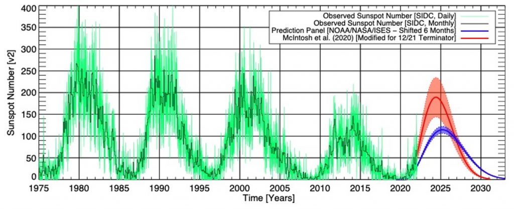
MA Rodger at 19:06 PM on 30 October, 2022The TSI data linked by scvblwxq1@6 shows the TSI for sunspot cycle 25 to-date, so TSI for the period 2018-to-date. The same website also gives TSI data back to the start of the satellite record, so since the end of 1978 (sunspot cycles 21 to 24). Comparing the two data sets (they need splicing together) shows the rise in TSI so far for sunspot cycle 25 has yet to top the peak of sunspot cycle 24, itself a rather weak sunspot cycle, as the graphic of sunspot numbers below suggests.
- Temp record is unreliable
Bob Loblaw at 01:16 AM on 12 October, 2022Wongfeihung1984:
Every method of calculating (from direct measurements of local temperatures) or estimating (via proxy, satellite, etc) global temperatures has uncertainties. "Reliable" is a subjective term, and is not very useful.
Each original source of a global temperature time series will have some sort of indication of uncertainty. You really need to pick a particular method, find the original source, and see what it says. Generally, uncertainty will increase as you go back in time, and as you move towards more local temperatures from fewer data sources.
The Tai-Chi link in my comment #526 includes this graphic, as an example, showing one standard deviation in the uncertainty:

- Taking the Temperature: a dispatch from the UK
MA Rodger at 21:12 PM on 30 July, 2022Fixitsan @76,
You blather is entirely off-topic but if you were to examine the comment of michael sweet @69, you may perhaps see where the value of 5mm/year for global SLR is sourced. And you will possibly then note that the data used is from tidal gauges which measure the sea level round the coasts while the NASA data is satellite data that measures the level of the entire ocean. You may wish to consider which measure is more important for humanity.
The method of calculating SLR is also different.
But if you have anything sensible to say on this subject of SLR, I would suggest a different SkS thread, perhaps this one -'How much is sea level rising?' - Antarctica is gaining ice
Andrew LB at 07:26 AM on 20 June, 2022
"Over the last two decades, the Greenland and Antarctic ice sheets have been losing mass, glaciers have continued to shrink almost worldwide, and Arctic sea ice and Northern Hemisphere spring snow cover have continued to decrease in extent (high confidence) (see Figure SPM.3). (4.2-4.7)"
NASA Study in 2015 clearly states Mass Gains of Antarctic ice sheet are greater than losses. I'll quote it.
A new NASA study says that an increase in Antarctic snow accumulation that began 10,000 years ago is currently adding enough ice to the continent to outweigh the increased losses from its thinning glaciers.
The research challenges the conclusions of other studies, including the Intergovernmental Panel on Climate Change’s (IPCC) 2013 report, which says that Antarctica is overall losing land ice.
According to the new analysis of satellite data, the Antarctic ice sheet showed a net gain of 112 billion tons of ice a year from 1992 to 2001. That net gain slowed to 82 billion tons of ice per year between 2003 and 2008. https://www.nasa.gov/feature/goddard/nasa-study-mass-gains-of-antarctic-ice-sheet-greater-than-losses
On a separate personal note, having lived less than a 2 minute walk from the pacific ocean for the past 40 years, i have yet to see any rise in sea level. One of the docks near my home has pole marked to indicate the current tide height and it's been there for at least 30 years, and a zero foot tide is still indicated spot on all these years later.
I think a lot of the people on this site are unaware of their own motivations and almost religious adherence the government mandated narraitive. It's usually a good idea to actually listen to the people in charge of international climate policy and you'll realize it's all a lie. United Nations climate official Ottmar Edenhofer said the following just a couple years ago.
"One has to free oneself from the illusion that international climate policy is environmental policy. This has almost nothing to do with the environmental policy anymore, with problems such as deforestation or the ozone hole,"
And just a few years prior to that he said:
"the next world climate summit in Cancun is actually an economy summit during which the distribution of the world's resources will be negotiated."
And a bit more insight:
"This is the first time in the history of mankind that we are setting ourselves the task of intentionally, within a defined period of time, to change the economic development model that has been reigning for at least 150 years, since the Industrial Revolution,"
"This is probably the most difficult task we have ever given ourselves, which is to intentionally transform the economic development model for the first time in human history."
And my favorite is how they went on to say that in order to make this happen, they must plunge the world economy into a depression in order to force the end of capitolism.
- Antarctica is gaining ice
Philippe Chantreau at 01:26 AM on 18 June, 2022When this myth was addressed, there was a small upward trend of Antarctic sea ice, that was squeaking by the statistical significance criteria.
As of now, the Antarctic sea ice long term trend in the satellite record is difficult to distinguish since the margin of error is more than twice as large as the trend(!): 0.6% +- 1.6% per decade.
Incidentally, 2022 saw the lowest Antarctic sea ice extent in the satellite record.
https://nsidc.org/data/seaice_index
None of this really affects the basic argument in this myth rebuttal, which is that the loss of land based sea ice is a concern for sea level rise, whereas variations in sea ice are not.
The data does not allow to identify any significant long term change at this time, although what has been happening since 2014 certainly seems interesting.
- UAH atmospheric temperatures prove climate models and/or surface temperature data sets are wrong
MA Rodger at 20:58 PM on 14 June, 2022knaugle @4&5,
As we are commenting on SkS, perhaps it would be appropriate to note that Cowtan's "Temperature plotter" is one of the resources provided here at SkS.
And do note that UAH TLTv5.6 data only runs to July 2017 so any trend comparison using more recent dates (so an end date beyond 2017.6) will be comparing apples and oranges. For Jan 2000 to Jul 2017 HadCRUT5 (not on the trend engine) yields a trend of +0.226ºC/decade, pretty-much as per GISS & BEST.
You note the OP above hasn't been updated for a while. The 20 min video mentioned by Eclectic @6 doesn't really explain why UAH TLT 5.2 evolved into UAH TLT 5.6 and then into UAH TLTv6.0. And at one point the video actually uses the table shown in Fig 1 of the OP above.
Post-v5.2 (& I am no expert but if you are interested there is a UAH log of work done which shows one side of it), the evolution of UAH TLT to become 5.6 apparently does still include being driven by folk outside UAH observing problems and the UAH folk taking a long time to notice and to admit it was a problem and then to correct the problem.
Thus v5.3 arrived in 2010 addressing a spurious annual cycle which had been known about in 2008 but apparently first spotted back in 2003.
But much of the difficulty and thus the incrementing versions is down to the performance of individual satellites.
UAH TLTv6.0 appeared in 2015 and strangely UAH are more interested in proclaiming a new lower rate of warming than explaining what the new version is adressing. But perhaps not so strange if you watch that video. - UAH atmospheric temperatures prove climate models and/or surface temperature data sets are wrong
MA Rodger at 04:41 AM on 8 June, 2022knaugle @2,
I would not myself say that UAH TLTv5.6 "showed reasonably close agreement" with anything other than HadCRUT4 which itself showed less warming than other SAT records like GISTEMP.
And while RSS TLTv3.3 showed lower warming than all others back in the day, RSS TLTv4.0 is now showing more warming than UAHv5.6 did.
A comparison between HadCRUT4, UAH TLTv5.6 & v6.0 and RSS TLTv4.0 is plotted in this WoodForTrees presentation. Note how UAH v6.0 diverges over a short period 2000-12 which is symptomatic of a satellite calibration issue, something the UAH folk themselves accuse other satellite records of ignoring.
- It's albedo
blaisct at 05:08 AM on 15 December, 2021Once again thanks for your comment (MA Rodger and the editor) and the additional papers on the subject. I will try to do better with the links.
The earlier data I was referring to was earthshine 10 years and CERES 10 years which showed that the data for the earths albedo was very noisy and flat. The flat part was what was expected for anthropogenic greenhouse gas , AGH, global warming. My initial understanding of AGH radiative forcing was that AGHs absorbed radiation (got hot) and that the higher the AGH concentration (at constant radiation) the more heat it could hold back thus the temperature would increase but the energy in vs out of the zone where this occurred would be the same (albedo would be flat). My understanding has been expanded to include: AGHs hotter temperature will reduce humidity and thus reduce cloud cover, expose more earth surface to the sun thus reduce earths albedo; therefor, albedo vs time for AGHs may not be flat.
The new (new to me) data I sited Earthshine 20 years showed a decrease albedo from both earthshine and CERES data – my only interest is this report was the agreement with earthshine an CERES data. The editor’s link CERES 20 years 1 and another link CERES 20 years 2 provided a lot more CERES data with different analyses. These three papers are the first time I have seen data showing a decrease in albedo (increase in TOA radiation) vs time. If all climate change was due to AGHs this graph would be flat. Using the CERES 20 years 2 graph for TOA radiation out. (of the three links I chose this one because it has the In Situ data (earth surface temperature)) one can see the good correlation between In Situ data and CERES data

Figure 1
“Comparison of overlapping one-year estimates at 6-month intervals of net top-of-the-atmosphere annual energy flux from the Clouds and the Earth's Radiant Energy System Energy Balanced and Filled Ed4.1 product (solid red line) and an in situ observational estimate of uptake of energy by Earth climate system (solid blue line). Dashed lines correspond to least squares linear regression fits to the data.”
. If there was any AGH global warming mixed In with the TOA (red) data it would have a slope lower than the In Situ data. The report CERES 20 years 1 did look for the AGH flat line signal and found it in the “Clear Sky” LW (long wave) data but nowhere else (1 of four graphs).
Two of these reports put a lot of emphasis on clouds decrease (new to me). (Decrease in cloud cover increased surface exposure to suns radiation and heats the earth more.) The report CERES 20 years 2 also found correlation to Water vapor, trace gases, surface albedo, as well as clouds. Both of these reports express doubts on the current understanding of climate change and make recommendation to further understand what is causing cloud cover to change.
While this new data is interesting and worth following up on it is still very noisy (low R^2) and another 20 years would be better.
I recognize that AGH global warming would promote other forcing including reduce clouds, reduced ice, reduced snow cover all exposing more surface to direct rays of the sun. Other man-made albedo changes can do the same thing. Here are two examples that may relate to the new papers.
Let’s start with the “heat island effect”, UHI. While the global warming from UHI’s lower albedo is small it does have observable effect on cloud formation, CERES 20 years 2.

“Figure 3
Attribution of Clouds and the Earth's Radiant Energy System net top-of-atmosphere flux trends for 2002/09–2020/03. Shown are trends due to changes in (a) clouds, (b) surface, (c) temperature, (d) combined contributions from trace gases and solar irradiance (labeled as “Other”), (e) water vapor, and (f) aerosols. Positive trends correspond to heat gain and negative to loss. Stippled areas fall outside the 5%–95% confidence interval. Numbers in parentheses correspond to global trends and 5%–95% confidence intervals in W m−2 decade−1.”
When air rises from a UHI it is hotter than the incoming air without a source of moisture to saturate it; so, it leaves as dryer air. This air generally rises and moves to the east. Look at figure 3 (a) and see the lower cloud formation change off the coast of east USA, Tokyo, and downwind Europe. With time (1880-2021) the UHI does not get hotter but it gets bigger thus the volume of low moisture air gets bigger. I am not going to argue the significances of the albedo part of UHI other than to recognize it is lower than 1 W/m^2 but not zero. What UHI is not given credit for is what happens downwind to this hotter low humidity air. Does it cool the ocean, reduce the snow line, melt ice, or reduce the cloud cover down wind, since this hot dry air should rise the clouds should be the first target. I can also see a chain of events: Hot low moisture air (from AGHs, UHIs, or other land changes) rises and go downwind, reduces cloud cover, over water the sun heats the ocean, the hotter ocean currents circulate to the poles, and melt some ice.
I’ll leave the quantification of this observable (figure 3 (a)) new (to me) correlation to others. A new UHI contribution to GW will be the albedo effect + the lower cloud effect + any other.
Second, is land use changes such as forest to crop or pasture land or grass land to crop land. Albedo decrease in grass land to crop land change is documented in Grass to Crops. Forest to crop land change increase in albedo is documented in Forest to Crops. Over 205 years the paper Global albedo study calculates that all the pluses and minuses add up to little change in albedo from land use changes. It is assumed (by me) that decreased albedo of a parcel of land means an increase in temperature and vs/vs. The study Amazonia Forest to Crops shows that increasing albedo does not always mean cooler temps. This report shows that when rain forest was replaced with crop land that the temperature increased, the rain decreased, and the cloud cover decreased. The Figure 3 (e) above shows bright red spot for “water vapor” (I assume that is change to lower humidity) in Amazonia. This is not an uncommon effect from replacing forest with crop or pasture land. The report Forest study observes that forests vs crop/pasture conversion gets warmer as the conversion gets south of 35’N latitude.
This unintuitive (to me) observation that an increase in albedo does not always result in a decrease in temperature can be explained by moisture. The resulting temperature depends on a constant enthalpy (total heat in the air= gases + moisture). Enthalpy is usually determined by the albedo (higher albedo lower enthalpy vs/vs); therefore, land exposed to the same albedo (enthalpy) can have a wide range of temperatures depending on the moisture (relative humidity) of the albedo (enthalpy). This relationship has been captured in a psychrometric chart,
(Sorry for the poor quality of this chart)
Example of a rain forest conversion to crop land: Start out with a rain forest at 25’C (bottom scale) go straight up to 90% humidity curve; this is our hot humid rain forest. If we convert this rain forest to crop land with a higher albedo, we move to a lower enthalpy line (anyone will do). The constant enthalpy line run diagonal (upper left to lower right). If the moisture is maintained at 90% the temperature will drop as expected for the higher albedo. Following the same enthalpy line (same albedo) go to a lower humidity curve that may result (and does in Amazonia) and one will see the temperature will increase (even to above the starting rainforest temperature at very low humidity).
A concern is how NASA and the IPCC pair surface temperature data with relative humidity and albedo. The three all connected in enthalpy. A misunderstanding of climate change could occur if Amazonian (rain forest to crop land) high albedo, high temperature, lower humidity type data was included in correlations with Canadian (forest to crop land) lower albedo, cooler temperatures, high humidity, type data. Does anyone know if this has been looked at? The report CERES 20 years 1 has looked at ocean enthalpy correlations. I have not seen any land enthalpy data. - It's albedo
blaisct at 07:22 AM on 9 December, 2021The data presented earlier in this thread has been updated in document Earth's Albedo 1998–2017 as Measured From Earthshine

Figure 3
“Earthshine annual mean albedo anomalies 1998–2017 expressed as reflected flux in . The error bars are shown as a shaded gray area and the dashed black line shows a linear fit to the Earthshine annual reflected energy flux anomalies. The CERES annual albedo anomalies 2001–2019, also expressed in , are shown in blue. A linear fit to the CERES data (2001–2019) is shown with a blue dashed line. Average error bars for CERES measurements are of the order of 0.2 .”
This new data shows a good agreement between earth shine data and CERES satellite data one can also add the earth’s temperature for this time to this graph and fined good agreement with the albedo (+0.4'C or 0.8 W/m^2 in 20 years). The implication is that the earths albedo change can account for all the temperature rise over this time period. The document suggest that this albedo change was possibly due to reduced cloud cover. Leaving the question what caused the reduced cloud cover.
- It's the sun
cph at 22:01 PM on 9 November, 2021HK@1292 - "BTW, if clouds and snow/ice changed by themselves and not as a feedback to warming caused by GHGs, we wouldn't get a cooling stratosphere..."
--- I did not understand your last sentence. I am of the opinion that, for example, a changed cloud albedo cannot be explained by a rise in temperature alone. Changes and anomalies in global mean cloud cover can also be caused by fewer (sulfate) aerosols or expanding deserts (dry regions become drier).
https://www.carbonbrief.org/satellite-data-reveals-impact-of-warming-on-global-water-cycle

Evaporation increases by + 2.3 mm / year, which is not fully compensated for by increased precipitation of + 1 mm / year. A decreasing runoff through the rivers of -1.01 mm / year and a falling groundwater level of -0.75 mm / year quantify the drainage of the continents. This drainage (through drained bogs, wetlands, groundwater, aquifers, canalization of rivers and a constantly growing sealing of urban areas) is just as man-made as the CO² emissions, rising temperatures and the resulting higher evaporation. Too little H²O in desert regions and the earth's atmosphere, which in summer extend through droughts up to the Arctic Circle, are a temperature driver. Too much CO² is just as warming as too little H²O. Less evapotranspiration -> less cloud albedo -> higher incoming radiation energy and record temperatures on the earth's surface -> even faster drying out with even higher temperatures - imho, similar to the ice-snow albedo, form a vicious circle.
The authors estimate a "statistically significant" increase in evapotranspiration of around 10% above the long-term mean (corresponds to a temperature increase over land areas of ~ + 1.44 ° C). During the same period, precipitation only increased by 3% and global river runoff decreased by 6%.
---
What is noticeable here is a simultaneous decrease in relative humidity and cloudiness, which certainly correlates with a general increase in the number of hours of sunshine.

")
- It's albedo
MA Rodger at 01:40 AM on 26 October, 2021I was reluctant to look into the values of Cloud Radiative Effect by location as up-thread the idea that added cloud & associated albedo came without added warming from water vapour seemed to be too difficult to accept by an insistent commenter and I wasn't sure how supportiive the result would turn out to be.
However, Calisto et al (2014) does provide in its Fig 7 the positive and negative components of CRE by latitude for both Land & Ocean and they can be easilyare here adapted to show net CRE as in the following graphic (assuming the graphic is visible to others when I link to it). The net CRE by latitude is the gap between the bold red trace & the green/blue trace in the upper panels.
- Reviewing the horrid global 2020 wildfire season
Mike at 11:16 AM on 23 September, 2021
This is the story that I meant to link. It says "Wildfires released 1.26bn tonnes of CO2 in July, according to the data, with more than half of these emissions attributed to fires in North America and Siberia. In August, fires caused 1.38bn tonnes of CO2 to be released."
a billion tonnes of CO2 seems like a lot. But this where scaling becomes problematic. Is a billon tonnes of CO2 a lot? How does it compare to other sources, like private vehicle emissions for the US in a month, etc. I read a source that said the US emission level for 2019 was abt 5.1 billion metric tons. are metric tons and "the Independent" tonnes the same thing? If yes, then a billion tons of emissions in a month is really quite large at about twice the monthly US emission level. Am I understanding this correctly?
- Reviewing the horrid global 2020 wildfire season
Mike at 03:02 AM on 23 September, 2021
I have trouble getting a handle on the scale of emissions from forest fires. I assume these emissions are dwarfed by human emissions, but I am would like to have a clue about the scale. So, if 2021 summer was the worst on record for forest fire emissions, how bad is that?
Is this a significant feedback or journalistic clickbait?
Cheers
Mike
- It's albedo
MA Rodger at 20:30 PM on 19 September, 2021Bob Loblaw @99,
I did note when tapping out #98 that the CarbonBrief item written about Pascolini-Campbell et al (2021) objected to the hot-linking of their image of the paper's Fig3 into this thread so I provided the direct link to the image (which I wouldn't have considered to be 'hot-linking') and that works fine for me, but apparently me alone.
The image of the paper's Fig 3 is perhaps a bit too fuzzy to display in-thread here but I see there the clearer version is on-web at Nature where 'hot-linking' works.
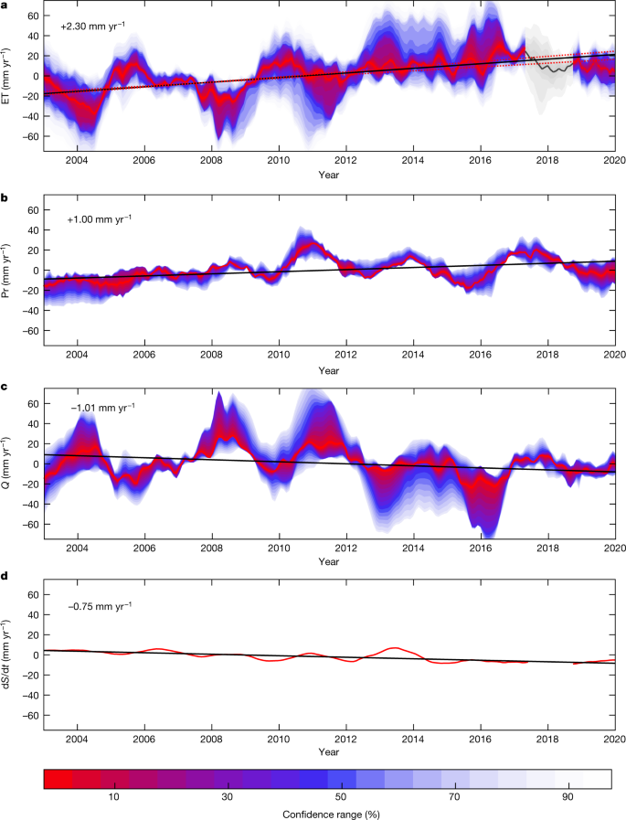
'Timeseries for evapotranspiration (top), precipitation (second from top), discharge (second from bottom) and change in ground water storage (bottom) over 2003-19. The black line shows the average trend and the shading shows the confidence range, where red regions indicate a high confidence.'
One further oddity is that the four trends are a long way from adding up to zero, probably due to all the very wobbly data. (The paywall prevents my access to the full paper & I couldn't immediately see any obvious explanation within the 'Extended data figures and tables'.)
- It's albedo
coolmaster at 15:37 PM on 17 September, 2021@96
MA Rodger: you state that "albedo is ... depends primarily on the wavelength of the light that hits the body/molecule." This is not correct. The reflected light is pretty-much independent of wavelength being no more than "bluish". The spectrum of reflected light is thus not significantly different from the spectrum of sunlight.
coolmaster: I'm not sure if you know that e.g. plants are green (wavelength = ~ 550nm), a tomato red (~ 650nm) and blueberries (~ 450nm) blue when illuminated by sunlight with a full spectrum.
Illuminated by a full spectrum (white), the objects appear to your eyes & brain in more or less monochrome light. So - many of the incident wavelengths are absorbed and only single colors are reflected.
A snow surface is white and has a high albedo because all wavelengths are reflected in the range that is visible - nevertheless, snow absorbs very strongly in the long-wave range of IR radiation.
What you describe as "bluish" is the Raleigh scatter.
This has absolutely nothing to do with absorption, relative reflection and albedo.
Your posted graph shows the spectral properties of the light emanating from the earth - and not the energy content of sunlight, that matters in an energy balance.
Without having read the article - I guess you will hardly find the unit W / m², which is the important one for the radiation budget of the earth. So please don't mix it all up here. (MOD)
MA Rodger: The TOA radiation balance under clear sky conditions averaged globally by Wild (2019) shows 19Wm^-2 more cooling than his all-sky average.
coolmaster: No you are utterly wrong - it is vice versa.
Or do you feel yourself cooler in sun under clear sky - and feel heat when a cloud covers the sun ????
The radiation net effect of clouds and water vapor (CRE = -19W / m²) You still seem to confuse CRE with the atmospheric feedback of the clouds, which consists in the fact that with increasing temperature less cloud cover, changed lapse rate and optical depth are determined (+ 0.42Wm-2 ° C-1). Earth - is - loosing - the clouds !
MA Rodger: ☻ And to correct your bold assertions @94 / Your own derivation of a greatly different value of 344km^3/yr uses solely Fig 3a of the former paper which gives an annual rate of increase as 2.3mm/yr (it should actually be 2.3mm/yr/yr)???? and for the 16-year period the increase would be thus 5,500km^3/yr, in the circumstance not a significant difference from 7,000km^3/yr.
coolmaster: 1500km³/yr is more than I suggested to retain.
www.carbonbrief.org/satellite-data-reveals-impact-of-warming-on-global-water-cycle
Can you give us just a reference or a page in the www. quote where the unit mm / yr / yr is used ???? You should then definitely get in touch with Ms. Madeleine Pascolini-Campbell and explain to her that she was mistaken by a factor of ~20.
After all, her work and GRACE-FO are regarded worldwide as one of the most important findings of the last few years. So if you know better - go ahead ... Your pocket calculator with the built-in joker must have been very expensive.
- It's albedo
MA Rodger at 21:56 PM on 12 September, 2021coolmaster @92,
Your final paragraph is packed full of unsupported assertions which you say will result from your grand scheme of annually diverting 1,335km^3/y of water that would otherwise discharge into the oceans and thus radically increase global albedo through increased cloud. The "unsupported" nature of your assertions is easily demonstrated with the two references you provide.
♣ The graphic you present is from Wikithing but is adapted from Abbott et al (2019) 'Human domination of the global water cycle absent from depictions and perceptions' who provide the numbers in their Fig 3. Relevant to your grand scheme is the size of the various global water reservoirs. The giant reservoir is of course the oceans which hold 1,340M km^3. Next is ice with 25M km^3 and surface/soil water with 23M km^3 while trailing along far behind is the atmosphere holding just 0.0125M km^3 water.
Your proposed grand scheme seems to be assuming atmospheric water can increase by 0.001335M km^3 annualy, or a 10% annual increase. Note this 10% annual increase in atmospheric water would add to the GH-effect, perhaps by some 4Wm^-2 annually, so 100x stronger than today's AGW.
♣ The CarbonBrief reference describes Pascolini-Campbell et al (2021) 'A 10 per cent increase in global land evapotranspiration from 2003 to 2019' which is iteslf paywalled [Abstract] but the reported 10% increase in evaporation rate 2003-19 over land equates to some 7,000km^3/y while the reported 3% increase in rainfall equates to 3,300km^3/y and the decrease in direct discharge from land to ocean a further 3,000km^3/y.
This suggests your grand scheme wouldn't make a ha'p'orth of difference. Evaporation over land is shown to have increased five-time the amount you propose yet AGW and SLR continued apace.
- It's albedo
coolmaster at 11:18 AM on 12 September, 2021MA Rodger: "You tell us that you suppose I "can see the difference for the SLR" in regard to the source of human water use."
Sorry - - that was obviously a misjudgment on my part. The same applies to you here: All good things are 3
The oceans work like a bathtub:
'- The inflow comes from the rivers discharge ...greenland, antarctica incl. (~49500km³) & ocean precipitation (379500km³)
- and the outflow happens by ocean evaporation. (420750km³)

We take the ! additional ! 1335km³ so from the rivers and not from the groundwater ---> SLR stopped.
You already know the page that quantifies the drainage of the continents.
www.carbonbrief.org/satellite-data-reveals-impact-of-warming-on-global-water-cycle
The volume corresponds to 907 PWh and will replenish groundwater and aquifers and circulate again and again to large parts over the land areas and incl. create a multiplication effect that increases cloud cover, precipitation, evaporation and runoff.
- It's albedo
Bob Loblaw at 02:35 AM on 15 August, 2021Also in response to blaisct's comment #66 posted over on the Urban Heat Island discussion.
Blaisct:
You continue to make poor choices in the numbers and calculations that you are doing. Going over your latest effort by number:
1. You continue to select an albedo for urban areas that is too low for anthropogenic surfaces, and you have failed to cite a reference for your value. In my comment # 64 on the Urban Heat Island discussion, I gave a reference to several artificial surface materials, all with albedo values that exceed the the value you have chosen. "Urban" areas are a mix of things like grass, roads, houses, etc. You would need to calculate how much of the surface is covered by each type, and work out an albedo for an "urban" area that way. If that is what you have done, you need to show your detailed calcuations on how you arrive at the 0.08 value.
2. There are no assumptions in the 0.31 albedo value for the earth as a whole. That is based on satellite measurements, and includes reflection from the surface, clouds, clear atmosphere, etc. Note that the only part of the surface reflection that reaches space is the part that makes it back out through the atmosphere and cloud cover. To calculate this in a model (which is what you are trying to do), you need to account for spatial variations (and daily/seasonal cycles) of solar input, surface albedo, cloud cover, and atmospheric conditions.
3 to 14. You continue to make unreasonable assumptions about the area that is undergoing a surface change, and how it relates to population. There is no reason to think that they are related through a simple proportion.
15 to 20. You continue to make errors in converting solar output (1367 W/m^2 measured perpendicular to the sun's rays) to an areal average over the surface of the earth. As MIchael Sweet points out, there is a factor of 4 involved, not a factor of 2. I also mentioned this in my earlier comment. If you do not understand why this is the case, then it is difficult to see how you can expect to do any useful calculations. You also need to consider seasonal variations in solar radiation distribution and seasonal albedo.
21. Converting radiative forcing to global temperature change involves looking at the top-of-atmosphere changes (what is seen from space), not surface changes alone. To properly incorporate surface changes into a calcuation, you need to use a much more complicated model of climate response to surface albedo changes.
22. You still get a wildy incorrect answer, due to bad data input and bad assumptions.
I have not bothered to follow the link to the Mark Healey document you mention. If that is the source you are getting your incorrect ideas from, then it is not worth bothering. The result you quote (that albedo changes can account for all the obsvered temperature rise) is completely inconsistent with the science.
Over at RealClimate, they have recent posted several articles on the just-released IPCC reports. One of those summarizes 6 key results. In that post, they provide the following graph from the IPCC report, which shows the estimated temperature response due to a variety of factors over the last 100 to 150 years. "Land use reflection and irrigation" is the second-last bar on the right. Note that the calculated effect is minor cooling, not warming.

Michael Sweet's suggestion to read the IPCC reports is a good one. I often suggest that people start with the first 1990 report, as this covers a lot of the basic climate science principles in a manner that is easier to understand for the non-expert. In the 1990 report, they mention the Sagan et al paper I linked to in my first comment. Google Scholar can probably help you fnd a free copy.
https://science.sciencemag.org/content/206/4425/1363.abstract
- It's Urban Heat Island effect
blaisct at 01:01 AM on 14 August, 2021Thanks All for the input. You are increasing my understanding of the albedo effect. I appreciate the articles you mentioned and see that the subject is very complex and calculations like mine are only useful for understanding the simple significance of the many variables and not useful for reaching conclusions or predictions. One general conclusion that seem to come from all the articles and papers is that albedo is most likely significant but there is not agreement on how significant, or the range of each of the variables, or the total interaction of all the albedo variables. I sure hope that the GW experts are improving their models with new NASA satellite data. Does anyone out there know how much of the current GW data (1.1’C) in the IPCC model is accounted for by albedo change?
For entertainment only, I redid the significance of the 0.7% urban of total earth surface what if calculation to include some of the comments.
1. The reported albedo of urban areas is about 0.08 (double the 0.04). (Albedo on a 0.0 to 1.0 scale)
2. The reported total albedo of the earth is about 0.31. (Assume that includes clouds and urban albedo)
3. % of earth that is urban: =0.7%
4. The non-urban area of the earth is: 100%-0.7%= 99.3%
5. The contribution of urban areas to the total albedo is: 0.08 * 0.7% = 0.00056
6. The total non-urban area albedo contribution to the total is: (0.31-0.00056)/ 0.993 = 0.31162
7. Assume the non-urban area albedo in the 1880 era was the same as today: =0.31162
8. Current earth population is about = 7.8 B
9. 1880 era population is about =1.3 B (Using 1880 as the approximate start of IPCC temp data)
10. Assume the 1880 era urban area was proportional to population: = 1.3/7.6*0.7% = 0.12%
11. The 1880 era urban area contribution to total albedo was: 0.07*0.12% = 0.0000933
12. The 1880 era non-urban area contribution to the total albedo was: (1- 0.12%)*0.31162 = 0.311257
13. The 1880 era total albedo estimate is: 0.311257+ 0.0000933 = 0.311351
14. The difference in 1880 vs 2021 albedo is : 0.311351 – 0.31 = 0.00135 (or about 0.14% albedo change)
15. The reported output of the sun reaching the earth is about: 1367 W/m^2
16. Assume that the urban albedo is only seeing one half (balk of urban areas are in the middle half of the earth’s surface) of the above due to the curvature of the earth: 50%
17. Average surface of the earth cloud cover: =67%
18. Average albedo of clouds: = 50%
19. Total sun’s output reaching cloud covered urban areas + non cloud covered urban (corrected for curvature) is : 455 W/m^2.
20. Therefore, this energy of the albedo difference is: 0.00135* 455= 0.61W/m^2
21. I have seen conversion factors for converting this to ‘C in earth temperature rise of 0.5 to 0.7 ‘C/W/m^2. I’ll use the 0.5.
22. The equivalent earth temperature rise of the above albedo change from 1880 to now is: 0.61*.5 = 0.31’C
The IPCC reported temperature rise over the 1880 to now is about 1.1’C. This what if calculation implies that a 0.7% urban area could account about 30% of this temperature rise – not insignificant.
One of the papers (in your previous references) on land use albedo change seems to agree that man-made albedo changes (mainly in agriculture by Mark Healey https://www.scirp.org/pdf/ijg_2020062914563820.pdf) are significant and could account for all the IPCC temperature rise. Mark Healey’s paper suggest that land use changes since 1910 are stronger than the UHI albedo effect.
I am switching over to the “It’s albedo” thread. What are all the possible albedo changes since 1880? - Models are unreliable
Bob Loblaw at 01:42 AM on 9 August, 2021To follow-up again on MA Rodger's excellent description, two things to note:
- Satellite data are not a measurement of atmospheric temperature. Satellites measure radiation. To transform the radiation data into an estimate of temperature requires some sort of model. A detailed atmospheric radiation transfer model. To call the results "observations" is playing loose with the term, although it is a common use of the term.
- In the last diagram that MA Rodger provides, note the expression "the models and observations are not from the same physical system". As MAR notes, the results from the climate models are an average of the entire atmosphere from the surface to 70,000 feet (>20km). The "observations" (Christy's model conversion of the satellite data) cover the pressure range from 300 to 200 hPa, which is roughly from 30-40,000 feet (9km to 12 km). That the two are "not from the same physcial system" is known prior to doing any statistical analysis.
Christy's "analysis" takes two things that are known to be different, and tries to make it look like the difference disproves some aspect of climate theory.
- Models are unreliable
MA Rodger at 00:25 AM on 9 August, 2021sailingfree @1294,
You ask "Did Christy use model predictions for the bulk atmosphere?"
He says he does.
It is not easy to be sure what Christy "uses" as he is not a reliable researcher. In specific cases it would/should be possible to see what he says he is "using" and then compare the numbers he "used" with what he says. But this is not always a trivial task and Christy's public statements are not considered of the slightest scientific importance by those best positioned for this task. So they mainly ignore them. But note the issue of modelled tropical tropospheric temperatures (which is real) is being addressed with, for example Vergados et al (2021) or Po-Chedley et al (2021).
You mention @1292 the "102 model runs", so a specific case of data use (although Christy happily reuses his grand finding oblivious to any errors it contains). The prime-time appearance of "102 model runs" was presumably Christy's testimony to the U.S. House Committee on Science, Space & Technology 2 Feb 2016 and in this case Christy's use of data has been questioned more than once but this is technical enough for even climatologists to trip over this task (as the correction within yet another RealClimate posting illustrates). What is perhaps most telling in this situation is the silence of John H Christy who thus acts more like a troll than a proper scientist who would be expected to defend his position by resolving any doubt on the matter.
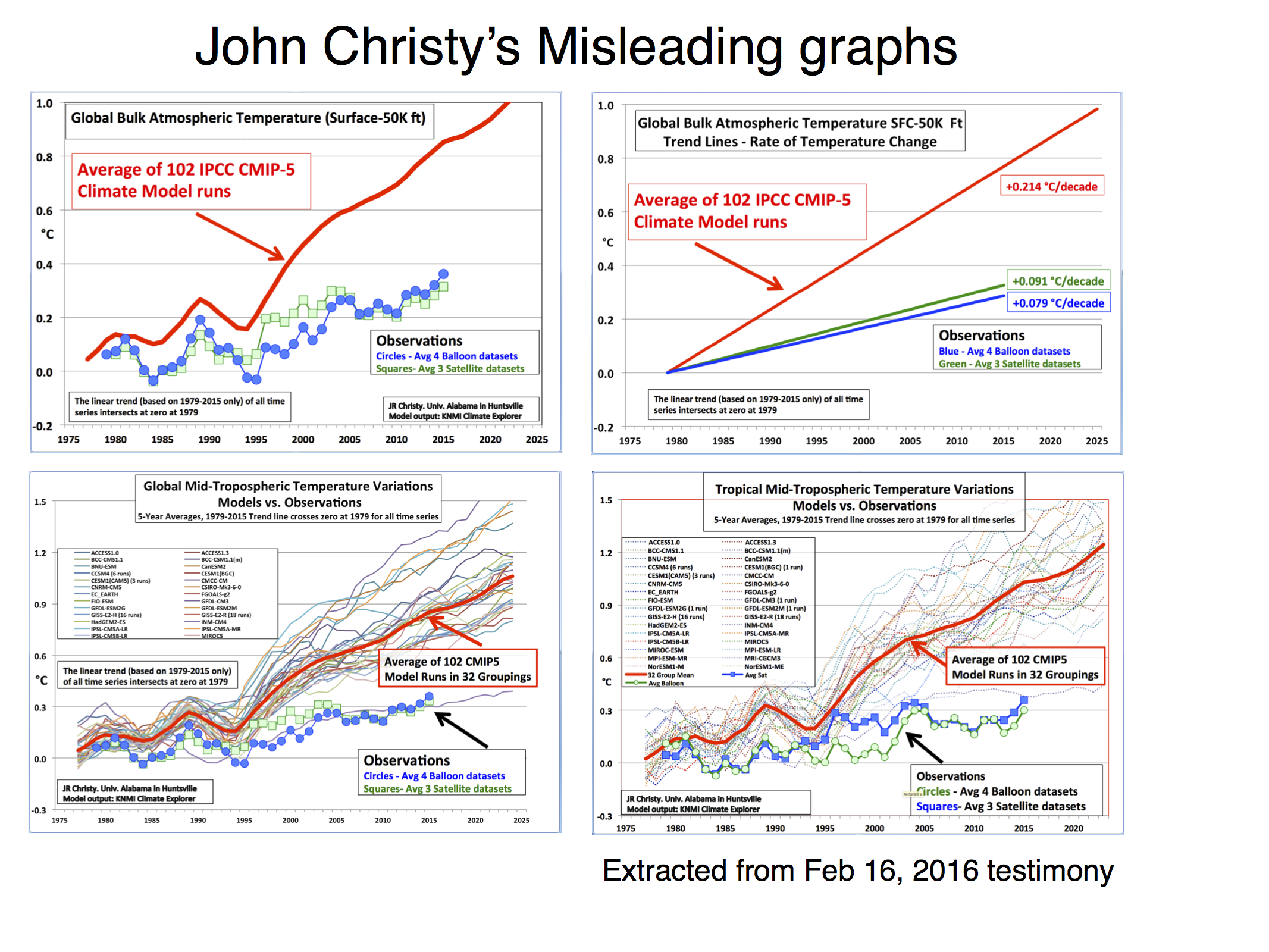
So on these graphics we see John Christy saying he uses "Global Bulk Atmospheric Temperature, Surface to 50,000ft" and also 'Global' and 'Tropical' "TMT Temperature Variations" (which actually go a bit higher than 50,000ft). The TMT satellite data is a statistical sample of emissions from a great swathe of altitudes, even up into the stratosphere where it is cooling due to AGW.
 The RSS browser tool with the correct choice of 'Channel' and 'Region' shows a TMT Tropical trend of +0.145ºC/decade. This compares with the UAH TMT Tropical trend of +0.09ºC/decade. Christy's assessment of model data puts the comparable model trend at +0.214ºC/decade although the model assessment presented by the RealClimate critique linked above gives a model trend of +0.19ºC/decade.
This +0.214ºC/+0.19ºC isn't a massive difference but this and the visual trickery employed by Christy has resulted in a film (actually a 7 minute YouTube video).
Christy latest wheeze is to brandish yet another fun-with-figures graphic (below) which compares TMT data (measured from surface up to 70,000ft with differing strength) with a small layer of the modelled atmosphere (roughly from 30,000ft to 40,000 ft). Presumably this is because the denialists require redder meat with the passing years.
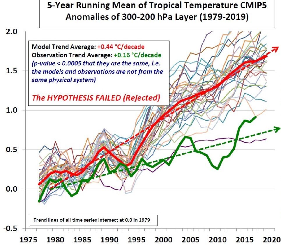
- Models are unreliable
MA Rodger at 13:03 PM on 8 August, 2021sailingfree @1292,
The GCM models cover the entire climate system so it is up to the analyst creating a graph what part of the modelled climate system he takes data from for his comparison.
The problem with Christy is that he is rather too enthusiastic about demonstrating his denialism and so makes a very poor job of his comparisons.
RealClimate provide comparisons of model output with temperature data including global & tropical TMT data and have also provided a critique of Christy's efforts.
- 2021 SkS Weekly Climate Change & Global Warming News Roundup #31
One Planet Only Forever at 03:11 AM on 4 August, 2021Eclectic, It would indeed be amusing to hear the WUWT crowd, especially Dr. Spencer and "The Error-Prone Viscount", attempt to present a rational solid argument justifying not presenting the real satellite data TLT temperature values.
The -26C baseline value for the average TLT makes sense. But the large negative value would trigger questions that could scramble the cognitive dissonance into a flurry of fuzzy attempts to dismiss the clear evidence that satellite data averages are not to be considered to be a rational replacement for the surface temperature averages.
- The number of lives that clean energy could save, by U.S. state
Jds at 04:50 AM on 21 July, 2021Data graphs... Interesting... Fact sheets, do tell. Article by who? Really. Source links to a group that links it's source information back to itself.
C02 is not a poison until it reaches highly concentrated levels. Rarely happens.
.04% of our atmosphere is c02. .0016% of that .04% is manmade. Multiply the two figures together to get the % of the atmosphere which is manmade c02. That's .000064. If you added .000064% pink panther fiberglass to your outhouse your butt would still be cold in the winter.
Studies reveal!!! What studies? Oh, Yale. University. Must be smart kids there these days. Reading books. Looking at thermometers.
Been researching C02 detectors myself lately. Basic description for the most detailed I shall provide now.
Too housing contains filter mechanism. Bounces Electrons (little buggers) back and forth between electrode plates. Electrolytes (salt water? Potassium? Gatorade?) change c02 to o2 through oxidation (rust) and reduces (evaporates)... get ready far this... oxygen into water. O into H2O. Yup... water into wine as well I suppose. The electrodes are biochemically sensitive to these changes.
I'll have to look this convuluted one up again for further details. It didn't mention any silicone chips nor as usually typical the almighty laser.
Fancy thermometer at best. Get yours free shipping from Walmart for like $30.
You can't even find anyone who wants to admit being the inventor of these snake oil charms nor will you find any original patents. Yet hundreds of mostly fly by night companies sell them for prices up into the thousands.
Shows parts per million.
NASA has these million dollar detectors that shoot lasers from far above to hit the earth surface and I suppose eventually be picked up by some big Gatorade coated hunk of metal which detects out of each of the million parts that exist in the atmosphere... 400 are C02. Further calculations determine that we cased half of this.
Here is an interesting argument. It has been millions of years since the global temperature and C02 levels have been this high and man wasn't even around back then which proves man is the current cause!!! Most unintelligent argument to date. Who caused the high rates back then if we were not around? Wooly mammoth? Hairy hippos? It's like saying your daughter's boyfriend must not have worn a condom the last time they had sex because your great grandmother was pregnant at one time.
Please think before you make pointless arguments.
We humans if all in one spot on a globe shoulder to shoulder would not even be much of a pin point. Combine all of our biggest cities into one megalopolis... a small freckle on the on the face of ma Gaia.
Mother earth has made home for countless creatures... if we were to just add the ones we have yet to discover to the internet... google would overheat and break down from an overload. And yet we still search for even one or to life forms elsewhere.
Mother earth has survived subzero trips to the shore and hot lava baths. She is covered in worm poo and skunk diddle.
And you worry she will die from second hand smoke which has been circulating since the dawn of her birth.
Your numbers are baseless. Your charts disconnected. Your facts biased. Your proofs conjectured. Your projections assumed. Your own researched will lead you down rabbit holes that will have you as well ask questions to determine validity. Give it time and you find... fancy thermometers. People pointing lasers at silicone chips. Digital readings.
There are no valid reputable respectable people in the realm of all of our highest minds who can validate and properly explain the how function of your fancy thermometers. They just assume like you did that the producers knew what they were doing by way of high intelligence and education and not one in the line of them would ever attempt to decide or hoodwink. Nobody dares to question fancy thermometer for fear they will look unintelligent themselves.
And you can take my statements directly to any of our scientists. Then bring those kids to me. I would like to see their heads sink in sullen shame as we review all of the information available in the world about fancy thermometer... and here them admit to it's nonsense.
Nice charts. Splendid graphs.
Pretty fancy thermometers.
Now prove to me that our c02 without one shred of any doubt 100% caused the average number of tsunamis per year to go from 2 to 3.
Show me just one autopsy report stating cause of death was... air pollution.
Show me the beaches where brilliant scientists are dutifully lined up measuring constant instant by instant changing ocean depths and receding shorelines.
Show me that the number of facilities which extract atmospheric data from the air are evenly distributed across the world and not primarily clumped into rural areas. The ratio difference of such facilities between rural and non grows every year in favor of the rural. That in itself makes for apparant temperature anomalies.
Show me where climate summits, committees, activist gatherings and fancy thermometer operators ever saved or even improved the life of even one person. Common sense of a child would tell you if they spent one tenth of the time exploring ways to prepare ourselves for natural disasters that are unavoidable regardless of our activities (you do know such things exist?) they would save many lives. Just one tenth of your focus shifted toward a more fruitful activiy... it is not much to ask.
Show me empirical evidence and precision studies prove that a two degree raise in global temp makes an unstable earth when global temperates rise and fall many multiples of degrees higher and lower within seasons (Siberia holds 100° record differential), months, weeks, days, hours... any increment of time. Regionally two degree shifts happen within seconds... why can you not make a connection to calamity in these instances? Why do you refuse to admit 2° shifts over a century might be a small % normal. bet if I told the right activist that scientists predict an unpredicted ten degree shift in average global temperature within the hour... those activist would fall in panic, run out the back door with their fancy thermometers pass out from the frantic exhaustion of getting their ownselves heated over a common occurrence.
Show me the credentials of each and every root source of every last statistic you have blind faith in. I would like to know if fancy thermometer makers might not be pushing a few numbers. Bet your bank account some are.
Show me how C02 is killing anything currently. Start looking for actual single file individual case examples in the anals of all our history of even one person who passed out from too much carbon dioxide... I'll give you the rest of your life to produce such papers... good luck. Before you can do that I will prove c02 allows for more life to flourish.
Show me a year that has not had both record high and low temperatures. Of course we must remember readings are not evenly dispersed yet and the lasers attached to satellites are yet to be a cover all.
Show me again the ice age many of the scientists from the 70's were warning us about... where is it? Guess that concept was beginning to sell less copies so they had to change the format or big guv who has an interest in people who have a concern the main public is following will stop funding them... seriously I want you to reread that last statement a few times... let it sink in. Think about the implications and how very real they might we'll be.
Show me causation, not correlation. The person did not get a sun tan on a hot day because a coconut dropped on their head that day.
And really a bunch of the information I may come up with is questionable as well. Who knows what's right? They give us estimates, rounded figures, apple orange comparisons. Coming up with pictures of prehistoric creatures bases on fragments of a single jawbone... then tell us approximately how millions of years since jawbone beast roamed earth... somewhere within this multimillion year range... and the temperature at that time was... and their favorite food was... and they squatted when they pooed fluffy spinich like clumps. Really. They know these facts due to the data represented by their Walmart C02 detectors.
Suckers are not born every minute. They develop through passages of time by way of emotional stimulations. They are targeted. Their opinions are advocated, supported and fed so to break down their defenses. Once trust is gained... (after all, fancy thermometer man has my same concerns therefore his concerns are for me personally as well)... they strike.
And you buy... in full... pun intended (aren't most all?).
And I buy as well... in part.
I wish not to find you reGret the weather... the Thunder... the iceBerg. Us grown ups are patiently waiting for your heroes... your people of the year... fan favorites... to grow up yourselves and drop the hatred and blame. Please stop pointing to the minute spinach stains on the teeth of others when immense festering cavities are being ignored.
8% of human c02 production counted is through breathing. So you can't get us to net zero anyway unless you well... kill us. A % of our CO2 production which makes up part of the statistical reports you adhere to... are from farm animals... eating, pooing, breathing... existing. Us meat eaters are trying to be rid of them as well for your satisfaction but only so much can fit on the plate.
Getting to NetZero is impossible. Waste of time anyway.
Proving that the .00005% is the only factor in 2° rise in the last century is harder than proving the chickens furting in a tornado caused more property damage.
Please be useful.
Activism is well intentioned griping. Would you like reward for it? I don't ever think I found any activist of any cause who enriched our environment beyond a sprinkling... especially the griping or as as I like to call the negative activist. Even the great MLK who was a positive activist is predominantly known by his most endearing followers by just four words... "I had a dream" sad how the majority of the world only knows this much of the man. The four words can be attributed to anything. Further research will educate a follower his dream was basically that some day all races will get along... not to insult but many have said same message with less recognition. It was a world wide sprinkling recognized best because of his ability to sell the product of his speech with the decor of his character. Charisma was the salesman. Same for the young swedish girl with face twisting sputtering gripe furiously. If said in a calm sensible tone she would have been ignored. So I see the point of bringing out the personality to sell the product. A 90 yo business owner/salesman friend told me to be successful you must sell the sizzle not the steak...
I will not abide to that when it comes to you and this subject you invested in. Instead I simply ask you...
where's the beef?
- The Albedo Effect and Global Warming
MA Rodger at 10:29 AM on 20 July, 2021blaisct @14,
You say you are curious about recent NASA satellite data "finding increase heat loss to space." And you correctly add, the forcing due to increased GHGs will restrict "heat loss to space," this resulting in an energy imbalance and planetary warming.
I'm not entirely sure what it is you enquire about, but this NASA web page 'NASA Satellites See Upper Atmosphere Cooling and Contracting Due to Climate Change' does report a measured cooling of the mesosphere from which they inferred "more heat is lost to space" from the mesosphere.
Assuming this to be what prompts your enquiry:-
The mesosphere roughly lies between 60km and 90km above the surface, sitting above the stratosphere. Both these regions of the atmosphere sit above the mechanism which results in global warming. Both these high-up regions of the atmosphere are cooling as would be expected with CO2-induced global warming. CO2 is well-mixed up to about 50km and lower altitude increases will also impact levels above 50km.
The blanket analogy does not properly capture what is going on as an increase in a greenhouse gas like CO2 cools as well as warms due to mechanisms not present in blankets.
The atmosphere radiates to space (indeed radiates anywhere) only via greenhouse gases. The other atmospheric gases do not radiate at the relatively low atmospheric temperatures. If GHGs are added to a bit of atmosphere, there will be more molecules to radiate so radiation flying about. Also the amount of radiation depends on the gas temperature which increases collisions with GHGs and so stimulates more radation.
In the lower troposphere, the level of GHGs is high enough such that the radiation cannot travel far before it encounters another GHG molecule and is reabsorbed by the atmosphere. Down low, none of it gets to space. What is important for global warming is the altitude above which the GHG density becomes low enough to allow emissions to space. As the lower atmosphere becomes cooler with increased altitude and the level of radiation is dependent on temperature, the higher this altitude is, the cooler the atmosphere radiating to space is and the cooler t is the less radiation can reach space. And if you add GHGs, that altitude rises resulting in less space-bound radiation and thus a warming planet.
But go above that critical point above which radiation can reach space and an increase in GHGs means more radiation flying about and more of it being "lost to space." This is why the mesosphere with rising CO2 levels is expected to cool with global warming. (The stratosphereric cooling is a different story again.)
Hope that helps explain that NASA webpage statement "Scientists have long predicted this [mesosphere cooling] effect of human-driven climate change."
- The Albedo Effect and Global Warming
blaisct at 06:35 AM on 20 July, 2021Reading about resent NASA satellite data on finding increase heat loss to space makes me wonder how this increase in heat loss is consistent with the Radiative Forcing theory of the IPCC. My understanding of that theory is that as atmospheric CO2 increase it hold in more heat and makes the surface temperature hotter like a blanket effect while the heat loss to space remains the same. The NASA data does not seem to support the Radiative Forcing theory or I must not understand the Radiative Forcing theory. Where is the extra heat coming from?
Also reading about the “heat island” effect from big cities (up to 15’F difference between urban and suburban) makes me wonder could this be related to the NASA data on heat loss? Has population gotten big enough to have an impact on global warming? The “heat island” effect is caused by the much lower albedo (reported as 0.04, cloud free) of urban areas vs the earth as a whole (reported at 0.31). Using IPCC data one can calculate that an albedo change of only 0.15% (+1’C) is needed to account for all of the temperature change from 1880 until now. (that is a hard to detect 0.001%/year). While we are waiting on that detection level we can use related data to estimate man-made albedo change like population or atmospheric CO2.
The earth’s urban area is reported at 3.1% of the total area of the earth. The urban area back in 1880 (start of IPCC global warming data) is estimated at 0.7% (proportional to population) over 4X change. In 1880’s the “heat island” albedo effect was probably insignificant plus there was not many black parking lots or paved roads. The IPCC reports a 1’C rise in temperature since 1880. Using published information one can calculate the heat rise of the current 3.1% urban area at 4’C rise (since 1880) in earth temperate just from the urban area albedo change. (Using IPCC data of sun’s radiation to the earth at 1367w/m^2 and surface temperature rise correlation of 0.5 ‘C/w/m^2). The calculated 4’C rise is more heat than necessary to account for the 1’C observed this is probably due the reflective increase in clouds (water evaporation that eventually become clouds and reflects sun light) that would come with more heat from urban area. This overly simplified estimate of the man-made albedo effect suggests a more scientific version of albedo change should be included in any global warming model or theory. As the population of the earth gets bigger and urban areas grow this effect will get bigger. There are also other man-made albedo effects (destruction of rain forest, forest fires, melting of sea ice, and agricultural practices) which would be proportional to their % of the earth’s surface and their individual albedos.
The earth’s population should be a good indicator of urban area increase and thus man-made albedo change. Atmospheric CO2 is also corelated to population should also be a good indicator of urban area increase (albedo decrease). Are CO2 and albedo confounded in their correlation to global warming? Which force is bigger? The above calculation suggest albedo. NASA's ongoing map of the earth's cloud free albedo should be a big help in including albedo in global warming models, initial results seem to support the above.
- SkS Analogy 22 - Energy SeaSaw
One Planet Only Forever at 12:42 PM on 11 May, 2021Evan, I try to learn as I try to help other people understand what is happening. I appreciate your attention to my comments, and your feedback.
I have a few more suggestions for your consideration starting with the last point you made in your comment @16 (potentially only my comments “Regarding 10 years of temperature data being a sufficiently long time to provide a degree of technical rigour” affect what you have presented in your See-Saw item).
I find it helps to expose people to the fuller record of basic data like CO2 levels and Global Average Surface Temperature. That can help them see how unusual or unnatural the recent values are and that CO2 and Temperature are related. That is why I recommend looking at the history of Temperature and CO2 data:
- back to 1880 for the surface temperature which shows that one of the biggest See-Saws was a warm bump in the 1940s that many “global warming - climate change” doubters mistakenly believe was Globally warmer than now because it was very warm in parts of the USA (And some people experienced that or knew someone who was alive back then similar to your “Winter recollections”).
- back to 1979 for the satellite data (to see that, though satellite temperatures are not the surface temperature, the pattern of temperature is similar)
- and back 800,000 years for CO2 levels, like the animation by NOAA that allows the details of recent decades to be seen along with the final full length record. It shows that:
- several 100 to 120 ppm changes happened in the previous ice-ages
- the high level of CO2 of 300 ppm was only reached once in all that time, until recently
- for the past 4000 years the CO2 level has been between 270 and 280 ppm.
- CO2 levels are now at 420 ppm, 140 above the pre-industrial level of 280 ppm, and continues to increase, and indeed an increase of 100 ppm since 1960.
The higher recent rates of warming do indeed over-whelm the impressions of the See-Saw. However, the magnitude of the warming is more important. Even if the decade rate was only 0.10 degrees C, eventually the warming would be clear in spite of the larger swings of the See-Saw.
Regarding how people will perceive a message
There is a diversity of awareness, understanding and perspective. Not everyone will see things the way you intend.
You asked: “Many people feel a difference in winters now than during their childhood (1970's or earlier). Can you tell how old I am? :-)”
What I can tell is how far North you likely live. You are likely part of the small portion of humanity who live north of, or near to, 60 degrees N latitude. The arctic regions have warmed faster than the rest of the global surface. People may legitimately recollect that Northern winters were different decades ago. But global average warming since the 1960s is far less than 1 degree C with non-arctic areas warming less than the average (and there is more warming at night than the daytime. So, people in non-arctic areas may not recall a difference. I was born before 1970 and have lived between 50 an 55 degrees N. In spite of my bias of being aware of the warming and climate change that has occurred, I cannot claim a clear recollection that winters were significantly different when I was younger. So there are likely many people who do not have a legitimate recollection that winters were different decades ago.
Regarding 10 years of temperature data being a sufficiently long time to provide a degree of technical rigour
I do agree you may want to reconsider what you say about the adequacy of a 10 year set of temperature data.
As KR suggests, unless the data has had significant variable influences like ENSO and volcanic impacts scrubbed out of the data, which raises questions about how those impacts are “scrubbed out”, temperature data sets longer than 20 years may be needed to avoid unintended interpretations.
I spent a little time learning about “decades of temperature data using the SkS Temperature Trend Calculator. I looked at the Trend values for sets of 10 years in the GISTEMPv4 and UAHv6.0 TLT data starting in 1979 (everyone can do this to verify the results):
- The Satellite data set shows a negative trend for the decades starting in 1987, 1998, 2000, 2001, 2002, 2003, and 2004.
- There are also many decades where the Positive Trend is less than 1/10th of the 2 sigma range of variability starting in 1980, 1986, 1997, 1999, and 2005 (decades with almost no clear warming, like the set starting with 1997 being 0.015 +- 0.445 degrees C per decade meaning a value range from -0.430 to +0.460, or 2005 being 0.005 +- 0.376 meaning -0.371 to +0.381).
- In the Surface Temperature data set only the decade starting in 1987 had a negative trend. There were no decades with a positive trend that was less than 1/10 of 2 sigma.
This may explain why the likes of Dr. Roy Spencer focus on their satellite data manipulations and try to claim the superiority of that data over surface temperature data. That run of values from 1997 through 2005 was a long period of being able to claim that the warming had appeared to have ended even though CO2 levels continued to increase (the UAHv6 data set trend for the 19 year period of 1997 to 2015 is negative. In the UAHv5.6 data set the longest negative Trend was for the 11 years 1998 – 2009, and in the RSSv4 TLT data set the longest negative trend is the decade starting with 2003). So shorter sets of data, rather than the fuller story, can be the “Friend” of the likes of Dr. Roy Spencer (and updated manipulations of the data can also be “Friendlier to the likes of Dr. Roy Spencer.).
A final point about presenting decade averages
I do like the presentation of the averages of the 70s, 80s, 90, 2000s, 2010s when a graph cannot be shown. And I agree that such a presentation is not improved by adding earlier decades. But I also consider a “moving average” presentation to be better, but it needs to be Graphed (referring to the SkS Temperature Trend Calculator works). The moving average values can’t be described in words the way the decade averages can be. However, the discrete decade averages are a 120 month "moving average" with the data points being every 10 years (on a graph the decade averages would be points in the middle of each decade). As you can see from the investigation I summarized above, any set of 10 years of data can be a Decade average. And when those averages are done for each new month of data the series of points will look like a line (note that Dr. Roy Spencer presents a 13 month moving average because that makes it easier to present the data points. They go on the middle point of the data set – no need to set the graphic up to present a 12 month average between the middle two months of a 12 item data set).
- 2021 SkS Weekly Climate Change & Global Warming News Roundup #19
Jim Hunt at 18:07 PM on 10 May, 2021Al @6,
They don't brand Dr. Koonin "a nought but a vacuous blowhard", and it sounds as if they weren't sent a copy of his book for reveiw. However based on a review of the book in the Wall Street Journal the science content has been assessed as "very low" by Climate Feedback:
Scientists who reviewed the article found that it builds on a collection of misleading and false claims. For instance, Koonin states that “Greenland’s ice sheet isn’t shrinking any more rapidly today than it was eighty years ago”. Contrary to the claim, scientific studies using airborne and satellite altimetry observations show considerable thinning has occurred along the margin of the Greenland ice sheet since 2003. As explained below by Twila Moon, from the National Snow and Ice Data Center, the Greenland ice sheet lost more mass during the 2003-2010 time period than during the entire time period from 1900 to 2003. Furthermore, this melting has generated a measurable sea level rise over the last 20 years.
Koonin also claims that “the rate of sea-level rise has not accelerated”. Contrary to the claim, scientific studies show that rates of global sea level rise have changed over time and accelerated, notably since the 1990s, primarily due to glacial ice melting and the expansion of seawater as it warms. As pointed out by Zeke Hausfather, Director of Climate and Energy at The Breakthrough Institute, sea levels are rising faster now than at any point since records began in the early 1900s
etc. etc.
- SkS Analogy 22 - Energy SeaSaw
One Planet Only Forever at 04:15 AM on 7 May, 2021Evan,
I am not a climate science specialist, but as an experienced engineer I have experience in evaluating data to see what is important, and to see through misleading claims (Technical Sales Reps often struggle to answer the questions that good engineers will ask them about technical claims they make to promote their product).
Do not lose sight of the point I make in my comment @1 "... a 10 year moving average, or longer, ..."
When the data is evaluated using a tool like the SkS Temperature Trend Calculator, all of the data should be looked at, starting in 1880 for the surface temperature data sets (called Global and Non-global) and 1979 for the Satellite data sets). Note that manipulations of satellite data do not represent the "Surface Temperature" (They are manipulations of data to represent the averages of temperatures within a thickness of atmosphere, so they are not "surface temperatures").
What is important to avoid is making a statement that could be interpreted to mean that "the Complete Next Decade of data" must be waited for to see if the new "10 year average data point" is warmer or not. The rolling average updated each month gives an indication of the trend, and the longer the rolling average is the less noise there is in the trend line (without needing to remove the variable influences like ENSO).
The National Climate Normal values in Canada are updated every 10 years using the most recent 30 years of data. So from that perspective a 30 year rolling average is better. And this can be seen by comparing the trend line of the 10 year rolling average to the trend line of the 30 year rolling average. However, because the satellite data set only starts in 1978, a 20 year rolling average shows the trend better than the 30 year rolling average, especially 10 years ago when the data set was only about 40 years.
- A Climate Bet Impossible to Lose
Bob Loblaw at 11:17 AM on 2 February, 2021Johnny's point about "raw data" raises an important issue. What is "raw" data? When does data processing start?
For the satellite data, what is being measured is actually microwave emissions form the atmosphere, and it take a lot of modellig to derive "temperature" from that data. Rob's post has some good links in the "Selection of data sets" paragraphs that explain much more.
Pretty much any environmental variable has some sort of processing that needs to be carried out. Even something as simple as the regular temperature measurements aren't that "raw":
- In the "olden days" (and probably still at some community-based volunteer observing stations), a liquid-in-glass thermometer was used. The "raw" data is the length of liquid in a tube, and the model used to transform that into temperature involves the temperature-dependence of liquid volume.
- Most current system measure temperture electronically, where the resistance of some material (either platinum or a semicondutor material) is measured. It is then transformed into temperature using models that relate the electrical properties of materials to temperature.
Both of these still just give you the temperature of the thermometer, not the air, so the temperature measurement system has to try to make sure the thermometer is at air temperature, usually using a Steveson Screen or some other form of ventilated radiation screen.
That gives you local air temperature, and then you need to make sure that your local temperature is telling you the information you need at a regional scale. There is a good series of posts here on how temperature measurements taken for the purpose of weather observations are used to estimate global temperature changes:
https://skepticalscience.com/OfAveragesAndAnomalies_pt_1A.html
Everything in science has "models" involved at some point. Some are simple and extremely well-defined. Others are complex and involve considerably more uncertainty.
- A Climate Bet Impossible to Lose
Johnny Vector at 08:49 AM on 2 February, 2021Speaking as a satellite systems engineer, please don't refer to that second graph as "raw data". That is already at least a "Level 1" product. Level 0 is raw data, right from the sensors. I build astrophysics instruments, so I don't know for sure that the graphed data is L1; I strongly suspect it's Level 2, which has had even more processing done to it.
I mention this not for the sake of pedantry, but because it's worth pointing out always that any satellite numbers in Kelvins have already undergone a large amount of processing. The only numbers that come down in Kelvins are the internal temperatures of the satellite itself. (Okay, even those probably are downlinked in A/D counts, but the conversion to Kelvin is usually a simple linear calibration.)
Anyway, I think it's worth avoiding the term "raw data" when referring to anything that's already been heavily processed based on a model, especially when there are two models whose outputs are outside each others' one-sigma error bars.
- 2021 SkS Weekly Climate Change & Global Warming Digest #1
Philippe Chantreau at 05:01 AM on 15 January, 2021DSJR,
I will not comment on your quality or ethics, as I really have no interest in it. This is not about you, or me, but helping readers form understanding. I reiterate that the framing of your argument on satellite data suggests nefarious intent, although you provided no substantiation of such intent. Perhaps you don't see that and it's a language issue.
There is on this site abundant discussion of satellite data, including the repeated shortcomings of the UAH team, who had to have others show major mistakes on at least 2 occasions. There are also detailed posts on the height of the "slices" where the measurements are taken from which temperatures are derived. Go hack at it there. Perhaps this is about other satellite data than the ones we are most familiar with, then more references are needed, so we can check for ourselves. Usually, when corrections are done, papers about the why and how of the corrections are published.
As for the idea that solar and wind power plants have any measurable effect at a global scale on surface temperatures, I'll say that what you provided falls short by so much that, under the current state of knowledge, it puts that hypothesis in the "not even wrong" category. However, my opinion is always open to modifications in the face of new findings. If the idea attracts research and it turns it had merit, I will acknowledge that. However, as of now, I don't see that we are anywhere close to have the weight of evidence necessary.
Don't take it personally. Once again, this is not about you.
- 2021 SkS Weekly Climate Change & Global Warming Digest #1
Dr. S. Jeevananda Reddy at 15:07 PM on 12 January, 2021phillippe
You used the word used by WUwt — in science whether English is first language or second is immeterial. My first two articles published in international journal in 1970. My 10 articles were published in international reputed peer reviewed journal in 1983/84.
Let me present three examples:
1. At TROPMET conference scientists analysed the satellite data and presented their results. The satellite data was provided by Ahmedabad institute – a scientist from Ahmedabad got up and said the data is not accurate. Then I asked him, if so why did you supply such data? or why you did not inform those scientists? There was no answer. Same was the case with satellite global average temperature data series. I presented this data on the global average surface temperature data series – around 1980 to 2000 in 2008 in my book. Later this data series disappeared from internet and appeared new data series saying that previous data series are not correct. Both satellite and surface data series by different groups present different values. Why?
2. When I was a scientist with ICRISAT, my group [two other scientist] tried to test A&M Texas Sorghum Growth model for India. They experimental data for Indian locations and few other countries and tested the model by adjusting radiation component. They presented the results at a meeting Chaired by DG of ICRISAT [a former soil professor from Hawaii] and Arkin from Texas who developed the model was also present. The result showed poor correlation for grain and biomass. Then the chairman/DG asked me you test the model by replacing the soil water balance model used in the model with my model [ICSWAB]. With this they presented the result on the next day. The correlation improved from around 0.30 to 0.85. But Arkin refused to change his model. Stopped the work. Then they brought in Monteith’s model from UK. This also failed. In fact the soil water balance model used in Arkin model works under conserved soil moisture which was the case where he developed but in India the model should account rainfall with crop and soil parameters. This is simple science and not English.
3. I submitted a paper to an international journal. They sent to two reviewers. One made few observations and accepted for publication. The other made good comments but said “the data can be fitted to linear curve”. Based on this observation, the regional editor rejected the paper for publication. Then I wrote to the Editor-in-Chief a 100 latter questioning the integrity of editorial committee members. This was sent to three regional editors [Australia, UK & USA], who concurred with my views. Then the Editor-in-Chief asked me to divide it in to three articles [articles related to editorial committee members of that journal]. They were published under discussion/comments on the articles I referred. After this, Editor-in-Chief asked me to resubmit the paper rejected. I did not do that but included in my 1993 book – as the reviewer used same statement which I used in the case of his article in Agronomy Journal/USA. IMD Journal is one of reputed journal — I published several articles during 70-80s, referred to date. - 2021 SkS Weekly Climate Change & Global Warming Digest #1
Philippe Chantreau at 04:01 AM on 12 January, 2021Thanks MA Rodger for doing that leg work, most enlighting. DSJR makes rather strange assertions about satellite temperature data, that suggest nefarious intent and are borderline conspiracy thinking. Not surprising coming from a WUWT contributor, it's their bread and butter.
We have discussed the satellite data and its shortcomings on numerous occasions and suffice to say that it is an element that adds to the overall picture but not nearly as satisfying as the real surface data found in GISTEMP or HadCRUT. The refinements and corrections to the satellite data were also discussed.
I find DSJR voluminous contribution to be a very peculiar mix designed to sound very technical (but how much is actually relevant?) yet with whoppers that don't square at all with true expertise. Curious...
- 2021 SkS Weekly Climate Change & Global Warming Digest #1
Dr. S. Jeevananda Reddy at 17:47 PM on 11 January, 2021Negelj
Global Warming: It is an estimate of the annual average part of temperature trend. The trend of 1880 to 2010 is 0.6oC per century in which global warming component is 0.3oC – 1951 to 2100 is 0.45oC – according to linear trend. But in reality it is not so as the energy component is constant over which superposed sunspot cycle. However, the reliability depends up on the data used. For example number of stations in around 1850 were < 100 and by around 1980 [started satellite data collection started around this time] they were more than 6000 and with the availability of satellite data the number of stations drastically come down to around 2500. The satellite data covered both urban-heat-island effect and rural-cold-island effect and showed practically no trend – US raw data series also showed this. However, this data was removed from internet [Reddy, 2008 – Climate Change: Myths & Realities, available on line] and replaced with new adjusted data series that matches with ground data series. Here cold-island effect is not covered. With all this, what I want say is warmings associated with solar power plants is added to global warming. How much?? This needs collection of data for all the solar power stations. Met station covers a small area only but acts like UHI effect – I saw a report “surface temperatures in downtown Sacramento at 11 a.m. June 30, 1998 – this presents high variation from area to area based on land use [met station refers to that point only]. So, solar wind power plants effect covers similar to heatwaves and coldwaves. Here general Circulation Pattern plays main role.
Nuclear Power: Nuclear power production processes contribute to “global warming process” while hydropower production processes contribute to “global cooling process”; the nuclear power production processes don’t fit into “security, safety & economy” on the one hand and on the other “environment & social” concepts; unlike other power production processes, in nuclear power production process different stages of nuclear fuel cycles are counted as separate entities while assessing the cost of power per unit and only the power production component is accounted in the estimation of cost of power per unit; carbon dioxide is released in every component of nuclear fuel cycle except the actual fusion in the reactor. Fossil fuels are involved in the mining-transport-milling conversion-processing of ore-enrichment of the fuel, in the handling of the mill tailings-in the fuel can preparation-in the construction of plant and it decommissioning-demolition, in the handling of the spent waste-in its processing and vitrification and in digging the hole in rock for its deposition, etc. and in the manufacturing of necessary required equipment in all these stages and thus their transportation. In all these stages radiological and non-radiological pollution occurs – in the case of tail pond it runs in to hundreds of years. Around 60% of the power plant cost goes towards the equipment, most of which is to be imported. The spent fuel storage is a critical issue, yet no solution was found. Also the life of reactors is very short and the dismantling of such reactors is costly & risky, etc., etc.
Michael Sweet/ Negelj
In 70&80s I worked and published several articles relating to radiation [global solar and net and evaporation/evapotranspiration] – referred in my book of 1993 [based on articles published in international and national journals]. Coal fired power plants reduces ground level temperature by reducing incoming solar radiation. In the case of Solar Panels create urban heat island condition and thus increases the surrounding temperature. In both the cases these changes depends upon several local conditions including general circulation patterns. Ground condition plays major role on radiation at the surface that define the surface temperature [hill stations, inland stations & coastal stations] – albedo factor varies. Also varies with soil conditions – black soil, red soil. Sea Breeze/land breeze – relates to temperature gradient [soil quickly warm up and quickly release the heat and water slowly warm up and slowly release heat] and general circulation pattern existing in that area plays the major role in advection.
Response to Moderator
See some of my publications for information only:
Reddy, S.J., (1993): Agroclimatic/Agrometeorological Techniques: As applicable to Dry-land Agriculture in Developing Countries, www.scribd.com/Google Books, 205p; Book Review appeared in Agricultural and Forest Meteorology, 67 (1994):325-327.
Reddy, S.J., (2002): Dry-land Agriculture in India: An Agroclimatological and Agrometeorological Perspective, BS Publications, Hyderabad, 429.
Reddy, S.J., (2008): Climate Change: Myths & Realities, www.scribd.com/Google Books, 176.
Reddy, S.J., (2016): Climate Change and its Impacts: Ground Realities. BS Publications, Hyderabad, 276.
Reddy, S.J., (2019a): Agroclimatic/Agrometeorological Techniques: As applicable to Dry-land Agriculture in Developing Countries [2nd Edition]. Brillion Publishing, New Delhi, 372p.
2.1.2 Water vapour
Earth’s temperature is primarily driven by energy cycle; and then by the hydrological cycle. Global solar radiation reaching the Earth’s surface and net radiation/radiation balance at the Earth’s surface is generally estimated as a function of hours of bright Sunshine. Total cloud cover [average of low, medium & high clouds] has a direct relation to hours of bright Sunshine (Reddy, 1974). Cube root of precipitation showed a direct relation to total solar radiation and net radiation (Reddy, 1987). In all these latitude plays major role (Reddy & Rao, 1973; Reddy, 1987). Evaporation presents a relation with net and global solar radiation (Reddy & Rao, 1973) wherein relative humidity plays an important role that reduces with increasing relative humidity. If ‘X’ is global solar radiation received under100% relative humidity then with the dryness [with relative humidity coming down] it may reach a maximum of 2X; and under net radiation also with increasing relative humidity net radiation is reduced. That means water vapour in the atmosphere is the principal component that controls the incoming and outgoing radiation and thus temperature at the Earth’s surface. Thar Desert presents high temperature with negligible water vapour in the atmosphere as maximum energy reaches the earth’s surface. However, these impacts differ under inland (dryness), hill (declining temperature with height – lapse rate) & coastal (wetness) locations and sun’s movement (latitude and declination of the Sun — seasons) (Reddy & Rao, 1973). IPCC integrated these under “climate system” and the advective condition by general circulation pattern [GCP].
Cold-island effect [I coined this, see Reddy (2008)] is part of human induced climate change associated with changes in land use and land cover. Since 1960’s to meet the food needs of ever increasing population, started intensive agriculture – conversion of dryland to wetland; & creation of water resources; etc. In this process increased levels of evaporation and evapotranspiration contributed to raise in water vapour up to around 850 mb levels in the lower atmosphere. Unusual changes in water vapour beyond 850 mb level [for example at 700 mb level] become a cause for thunderstorm activity (Reddy & Rao, 1978). Wet bulb temperature (oC) at the surface of the Earth provides the square root of total water vapour (g/cm2) in the vertical column of the atmosphere; and also wet bulb temperature (oC) is a function of dry bulb temperature (oC), relative humidity (%) and square root of station level pressure (height) relative to standard value in mb [p/1060] (Reddy, 1976). Thus, unlike CO2, water vapour presents a short life with steadily increasing with land use and land cover changes. However, met network in this zones have been sparse and thus the cold island effect is not properly accounted under global average temperature computations. Though satellite data takes this in to account, this data series were withdrawn from the internet and introduced new adjusted data series that matches with adjusted ground data series. Annual state-wise temperature data series in India wherein intensive agriculture practices are existing, namely Punjab, Haryana & UP belt, showed decreasing trend in annual average temperature – cooling. Some of these are explained below:
Reddy (1983) presented a daily soil water balance model that computes daily evapotranspiration, known as ICSWAB Model. The daily soil water balance equation is generally written as:
▲Mn = Rn – AEn – ROn - Dn
In the above equation left to right represent the soil moisture change, rainfall or irrigation, actual evapotranspiration, surface runoff and deep drainage on a given day (n). The term Actual Evapotranspiration [AEn] is to be estimated as a function of f(E), f(S) & f(C), wherein they represent functions of evaporative demand on day n, soil & crop factors, respectively. As these three factors are mutually interactive, the multiplicative type of function is used.
AEn = f(En) x f(S) x f(C)
However, the crop factor does not act independently of the soil factor. Thus it is given as:
AEn = f(En) x f(S,C) and f(S,C) = K x bn
Where f(S,C) is the effective soil factor, K = soil water holding capacity [that varies with soil type] in mm and bn is the crop growth stage [that vary with crop & cropping pattern] factor that varies between 0.02 to 0.24 — fallow to full crop cover conditions (with leaf area index crossing 2.75). Evaporative demand is expressed by the terms evaporation and/or evapotranspiration. Evaporation (E) and evapotranspiration (PE) are related as:
PE = 0.85 x E [with mesh cover] or = 0.75 x E [without mesh cover].
However, the relationship holds good only under non-advective conditions [i.e., under wind speeds less than 2.5 m/sec]. Under advective conditions E is influenced more by advection compared to PE. In the case of PE, by definition, no soil evaporation takes place and thus PE relates to transpiration only – where the crop grows on conserved soil moisture with negligible soil evaporation. With the presence of soil evaporation, the potential evapotranspiration reaches as high as 1.2 x PE or E with mesh cover. McKenney & Rosenberg (1993) studied sensitivity of some potential evapotranspiration estimation methods to climate change. The widely used methods are Thornthwaite and Penman presented 750 mm and 1500 mm wherein Thornthwaite method is basically uses temperature and Penman uses several meteorological parameters (Reddy, 1995).
In this process the temperature is controlled by solar energy but moisture under different soil types [water holding capacity] it is modified. This modified temperature cause actual evapotranspiration and thus water vapour. This is a vicious circle. For example average annual temperature in red soils Anantapur it is 27.6oC; in deep black soils Kadapa it is 29.25oC & in medium soils Kurnool it is 28.05oC. That means, local temperature is controlled by soils.
Reddy (1976a&b) presented a method of estimating precipitable water in the entire column of the atmosphere at a given location using Wet Bulb Temperature. The equations are given as follows:
Tw = T x [0.45 + 0.006 x h x (p/1060)1/2]
W = c’ x Tw2
Where T & Tw are dry and wet bulb temperatures in oC; h is the relative humidity in %; p is the annual normal station level pressure in mb [1060 normal pressure in mb, a constant] ; W is the precipitable water vapour in gm/cm2 and c’ is the regression coefficient.
WMO (1966) presented methods to separate trend from natural rhythmic variations in rainfall and assessing the cycles if any. (Late) Dr. B. Parthasarathy from IITM/Pune used these techniques in Indian rainfall analysis. Reddy (2008) presented such analysis with global average annual temperature anomaly data series of 1880 to 2010 and found the natural cycle of 60-years varying between -0.3 to +0.3oC & trend of 0.6oC per century [Reddy, 2008]. This is based on adjusted data series but in USA raw data [Reddy, 2016] there is no trend. The hottest daily temperature data series of Sydney in Australia shows no trend [Reddy, 2019a]. Thus, the trend needs correction if the starting and ending point parts are in the same phase of the cycle – below and below or above and above the average parts. During 1880 to 2010 period two full 60-year cycles are covered and thus, no need to correct the trend as the trend passes through the mean points of the two cycles.
3.2.4 What is global warming part of the trend?
According to IPCC AR5, this trend of 0.6oC per century is not global warming but it consists of several factors:
a. More than half is [human induced] greenhouse effect part:
i. It consists of global warming component & aerosols component, etc. If we assume global warming component alone is 50% of the total trend, then it will be 0.3oC per Century under linear trend;
ii. Global warming starting year is 1951 & thus the global warming from 1951 to 2100 [150 years] is 0.45oC under linear trend;
iii. But in nature this can’t be linear as the energy is constant and thus CSF can’t be a constant but it should be decreasing non-linearly;
iv. Under non-linear condition by 2100 the global warming will be far less than 0.45oC and thus the trend will be far less than half;
b. Less than half the trend is ecological changes [land use and land cover change] part – mostly local & regional factors:
i. This consists of urban-heat-island effect and rural-cold-island effect;
1. Urban-heat-island effect – with the concentrated met network overestimates warming;
2. Rural-cold-island effect – with the sparse met network underestimates cooling;
2.2.1 Uncertainty on “Climate Sensitivity Factor”
The word “climate Crisis” is primarily linked to global warming. To know whether there is really global warming, if so how much, climate sensitivity factor plays the main role. Climate sensitivity is a measure [oC/(W/m2)] – how much warming we expect (both near-term and long-term) for a given increase in CO2? According to Mark, D. Zilinka (2020), “Equilibrium climate sensitivity, the global surface temperature response to the CO2 doubling, has been persistently uncertain”.
Recent modelling data suggests the climate is considerably more sensitive to carbon emissions than previously believed, and experts said the projections had the potential to be “incredibly alarming”, though they stressed further research would be needed to validate the new numbers. Johan Rockström, the director of the Potsdam Institute for Climate Impact Research, said. “Climate sensitivity is the holy grail of climate science. It is the prime indicator of climate risk.
The role of clouds is one of the most uncertain areas in climate science because they are hard to measure and, depending on altitude, droplet temperature and other factors can play either a warming or a cooling role. For decades, this has been the focus of fierce academic disputes. Catherine Senior, head of understanding climate change at the Met Office Hadley Centre, said more studies and more data are needed to fully understand the role of clouds and aerosols. With this vital disputes how anyone can say there is global warming without solving this issue; so I said “global warming hysteria factor is climate crisis”.
- 2021 SkS Weekly Climate Change & Global Warming Digest #1
Dr. S. Jeevananda Reddy at 21:46 PM on 10 January, 2021nigelj
on the solar and wind — see the reference I quoted earlier.
About nuclear power — I am against this and fighting on this. In India Hydropower is the major component after coal and in USA it is nuclear power — equivalent to hydropower % in India with coal % similar.
Coal power — the dust compensate the heat at the power station. Also water is used to cool some of it.
CO2 levels in SH are nearly one-third of NH. Also prior to 1960 a smooth increasing CO2 curve is an hypothetical curve.
IPCC claim that CO2 can cause catastrophic global warming. Because CO2 is not capable of causing significant global warming by itself, their contention is that increased CO2 raises temperature slightly and that produces an increase in water vapour, which does have the capability of raising atmospheric temperature. However, it is not the case, and on the contrary water vapour/relative humidity controls the energy coming from the Sun that controls the temperature at the ground. Since 1960 with the steadily rising irrigated agriculture and development of water resources caused steady rise in water vapour in the atmosphere but it has short life – not cumulative like carbon dioxide. That means under cold-island effect the temperature must decrease. This was recorded in satellite data. But later this data series were withdrawn from the internet and introduced new data series that matches with adjusted ground data series. Also annual state-wise temperature data series where intensive agriculture practice exists, namely Punjab, Haryana & UP belt showed decreasing trend in annual average temperature. Also climate sensitivity factor that converts CO2 in to heat/temperature is heuristic so far. Also the trend in global average annual temperature is not global warming but it is a part of trend is global warming that to based on adjusted data series.
A recent report states that CO2 level of 1970 was the height in the last 800,000 years — which is false observation. In fact CO2 measurements started around 1960 — According to WMO Fact Sheet 4 of August 1989— 45 stations of which 3 from SH and no station in tropics.
According to Freja Vamborg, a senior scientist at C3S, it is unquestionably an alarming sign that May 2020 has been the warmest month on record globally. However, even more concerning is the facts that average temperatures of the last 12 months have become one of the hottest 12-month-periods ever recorded in our dataset. Of course, this does not as such represent a long-term climate trend, as monthly temperature deviations vary, and some regions showed below average conditions. May 2020 tied with May 2016 for average global land and ocean temperatures, while April 2020 was on par with April 2016 for the hottest temperatures since records began in 1880. The global average temperature for May 2020 was 15.7oC (60.3oF), according to two independent measurements by the European Copernicus Climate Change Service (C3S) and the US National Oceanic and Atmospheric Administration’s (NOAA) included in the State of the Climate: Global Climate Report for May 2020. -— Both studies found abnormalities over Siberia and the Arctic Ocean with temperatures about 10.0oC (18oF) above average for this time of the year. That means these part of irregular variation part of natural variability. This is nothing to do with the CO2 linked global warming.
- What Tucker Carlson gets wrong about causes of wildfires in U.S. West
Daniel Bailey at 03:35 AM on 7 October, 2020JoeZ, increased forest fire activity across the western U.S. in recent decades is due to a number of factors, including a history of fire suppression and human encroachment in forest regions, natural climate variability, and human-caused climate change. Forest management would help in some areas, however the wildfire numbers and burned area are also increasing in non-forest vegetation types. Wildfire activity appears strongly associated with warming temperatures (California spring/summer temperatures have increased by more than 5 degrees Fahrenheit since 1970) and earlier spring snowmelt.
Source: NASA
"For all ecoregions combined, the number of large fires increased at a rate of seven fires per year, while total fire area increased at a rate of 355 km2 per year. Continuing changes in climate, invasive species, and consequences of past fire management, added to the impacts of larger, more frequent fires, will drive further disruptions to fire regimes of the western U.S. and other fire-prone regions of the world."
https://agupubs.onlinelibrary.wiley.com/doi/full/10.1002/2014GL059576
Since the 1980s, the wildfire season has lengthened across a quarter of the world's vegetated surface.
"We show that fire weather seasons have lengthened across 29.6 million km2 (25.3%) of the Earth’s vegetated surface, resulting in an 18.7% increase in global mean fire weather season length. We also show a doubling (108.1% increase) of global burnable area affected by long fire weather seasons (>1.0 σ above the historical mean) and an increased global frequency of long fire weather seasons across 62.4 million km2 (53.4%) during the second half of the study period."
https://www.nature.com/articles/ncomms8537
"The start of the Southwestern fire season—as indicated by the date of first large-fire discovery—has shifted more than 50 days earlier since the 1970s, accounting for about one-third of the increase in the length of the fire season. The substantially earlier SW fire season start is consistent with warmer temperatures and earlier spring seasons leading to earlier flammability of fuels in SW forests."
https://www.ncbi.nlm.nih.gov/pmc/articles/PMC4874415/
"Anthropogenic increases in temperature and vapor pressure deficit significantly enhanced fuel aridity across western US forests over the past several decades and, during 2000–2015, contributed to 75% more forested area experiencing high (>1 σ) fire-season fuel aridity and an average of nine additional days per year of high fire potential.
Anthropogenic climate change accounted for ∼55% of observed increases in fuel aridity from 1979 to 2015 across western US forests, highlighting both anthropogenic climate change and natural climate variability as important contributors to increased wildfire potential in recent decades.
We estimate that human-caused climate change contributed to an additional 4.2 million ha of forest fire area during 1984–2015, nearly doubling the forest fire area expected in its absence.
Natural climate variability will continue to alternate between modulating and compounding anthropogenic increases in fuel aridity, but anthropogenic climate change has emerged as a driver of increased forest fire activity and should continue to do so while fuels are not limiting."
https://www.pnas.org/content/113/42/11770
"By 2100, if greenhouse gas emissions continue to rise, one study found that the frequency of extreme wildfires would increase, and the average area burned statewide would increase by 77 percent. In the areas that have the highest fire risk, wildfire insurance is estimated to see costs rise by 18 percent by 2055. "
https://climateassessment.ca.gov/state/overview/#wildfire
"The clearest link between California wildfire and anthropogenic climate change thus far has been via warming-driven increases in atmospheric aridity, which works to dry fuels and promote summer forest fire, particularly in the North Coast and Sierra Nevada regions.
Importantly, the effects of anthropogenic warming on California wildfire thus far have arisen from what may someday be viewed as a relatively small amount of warming. According to climate models, anthropogenic warming since the late 1800s has increased the atmospheric vapor-pressure deficit by approximately 10% and this increase is projected to double by the 2060s. Given the exponential response of California burned area to aridity, the influence of anthropogenic warming on wildfire activity over the next few decades will likely be larger than the observed influence thus far where fuel abundance is not limiting.
Since the early 1970s, California's annual wildfire extent increased fivefold, punctuated by extremely large and destructive wildfires in 2017 and 2018. This trend was mainly due to an eightfold increase in summertime forest‐fire area and was very likely driven by drying of fuels promoted by human‐induced warming. Warming effects were also apparent in the fall by enhancing the odds that fuels are dry when strong fall wind events occur.
The large increase in California’s annual forest-fire area over the past several decades is very likely linked to anthropogenic warming.
Human‐caused warming has already significantly enhanced wildfire activity in California, particularly in the forests of the Sierra Nevada and North Coast, and will likely continue to do so in the coming decades."
https://agupubs.onlinelibrary.wiley.com/doi/abs/10.1029/2019EF001210
Wildfire mitigation efforts can reduce wildfire intensity and severity while improving forest resilience to fire, insects and drought. The total area burned by wildfires is a trend driven by the warming climate (which is warming because of human activities), so mitigation efforts will not likely be able to affect the total area burned trend.
https://link.springer.com/article/10.1186/s42408-019-0062-8
Droughts in the Southwestern US have been made nearly half-again worse by human activities and are projected to worsen yet.
https://science.sciencemag.org/content/368/6488/314
These droughts couple with rising temperatures, reduced soil moisture and lower humidity to kill vast amounts of trees, providing an ever-increasing amount of fuel loads for wildfires.
https://science.sciencemag.org/content/368/6488/238
California’s frequency of fall days with extreme fire-weather conditions has more than doubled since the 1980s. Continued climate change will further amplify the number of days with extreme fire weather by the end of this century.
https://iopscience.iop.org/article/10.1088/1748-9326/ab83a7

https://twitter.com/CAL_FIRE/status/1311722710284693505
There is strengthened evidence that climate change increases the frequency and/or severity of fire weather around the world. Land management alone cannot explain recent increases in wildfires.
Analysis shows that:
• Well over 100 studies published since 2013 show strong consensus that climate change promotes the weather conditions on which wildfires depend, enhancing their likelihood.
• Natural variability is superimposed on the increasingly warm and dry background conditions resulting from climate change, leading to more extreme fires and more extreme fire seasons.
• Land management can enhance or compound climate-driven changes in wildfire risk, either through fuel reductions or fuel accumulation as unintended by-product of fire suppression. Fire suppression efforts are made more difficult by climate change.
• There is an unequivocal and pervasive role of climate change in increasing the intensity and length in which fire weather occurs; land management is likely to have contributed too, but does not alone account for recent increases in wildfire extent and severity in the western US and in southeast Australia.
Human-induced climate change promotes the conditions on which wildfires depend, enhancing their likelihood and challenging suppression efforts. Although the global area burned by fires each year is declining, the majority of this trend is explained by conversion of natural savannahs and grasslands to agriculture in Africa (Andela et al. 2017). In contrast, the area burned by forest wildfires is increasing in many regions, including in the western US and southeast Australia.
• “Fire weather” refers to periods with a high likelihood of fire due to a combination of high temperatures, low humidity, low rainfall and often high winds.
• Human-induced warming has already led to a global increase in the frequency and severity of fire weather, increasing the risks of wildfire.
• Land management can ameliorate or compound climate-driven changes in wildfire risk.
• Wildfires can have broad impacts for human health and wellbeing and for the natural environment.
US fires:
• Fire weather has become more frequent and intense in western US forests.
• Fire weather is driving more wildfire activity in western US forests.
• Demographic factors alone cannot account for the magnitude of the observed increase in wildfires in the western US, but increased population leads to greater impacts.
• Land management practices are contributing factors, but cannot alone explain the magnitude of the observed increase in wildfires extent in the western US forests in recent decades.
Australia fires:
• The scale of the 2019–2020 bushfires was unprecedented.
• Fuel management through prescribed burns and improved logging practice cannot fully mitigate increased wildfire risk due to climate change.
• Extreme weather and Pyroconvection are projected to increase wildfire risk under future climate change in southeastern Australia.
Scientific evidence that climate change is causing an increase in the frequency and extent of fire weather, contributing to extreme wildfires around the world, continues to mount.
The severe droughts in the USA and Australia are signs that the tropics, and their warm temperatures, are expanding in the wake of climate change, due to the warming of the subtropical ocean.
https://public.wmo.int/en/media/news/climate-change-increases-risk-of-wildfires
https://sciencebrief.org/topics/climate-change-science/wildfires
https://sciencebrief.org/briefs/wildfires
https://news.sciencebrief.org/wildfires-sep2020-update/
PDF here
Climate change will continue to drive temperature rise and more unpredictable rainfall in many parts of the world, meaning that the number of days with “fire weather” – conditions in which fires are likely to burn – is expected to increase in coming decades.
- 2020 SkS Weekly Climate Change & Global Warming News Roundup #25
nigelj at 07:34 AM on 23 June, 2020Slarty Bartfast @12
"What I did say about the Arctic is that we don't know what the temperature trend is because there are no long term weather stations within 1000 km of the North Pole, and there never have been."
History of climate monitoring in the arctic here. According to the article land based observing stations around the arctic circle were established in the 1880's, giving data on greenland and northern russia and the various islands etc. There were multiple land based and drift stations over the open ocean, including close to the north pole, established from 1960 - 1990. Since that period there have been fewer weather station, and more reliance on satellite data.
I guess it depends on how you define "long term data" but the article shows there is good data for the whole of the arctic from 1960 - 2020 a fairly long period of time.
- 2020 SkS Weekly Climate Change & Global Warming News Roundup #25
MA Rodger at 05:51 AM on 23 June, 2020Slarty Bartfast @12,
To be exact as to what you wrote on your error-filled blog site, regarding the North Pole you wrote "there is no evidence of warming at the poles ... there is no weather data within 1000 miles of the North Pole and never has been."
If you consider that to be a factual statement then you are a bigger fool that I thought.
There is directly measured evidence of warming of the North Pole as we have satellite data showing it. Additionally there is much more indirect evidence, not least the dozens of met stations which operated within 1,000 miles of the pole and which include those located within 1,000km of the pole.
And I am curious why you say that a global averaged temperature trend of +1 °C per century is "entirely possible due to natural variations resulting from chaotic behaviour within the climate system". Indeed on your blogsite you write "most of what you see in the smoothed and averaged temperature data is noise not systemic change (i.e. warming)" [my bold].
So my question, Slarty Bartfast, concerns the likelihood of temperature records not measuring what everybody else says they do. You present a crazy tale which you say proves that a random chaotic source is "entirely possible" to be what is being measured as being a global warming signal and then, a big leap here, you assert this situation "is" actual and not merely "possible". So I ask, is this actual situation dependent on you pressing the 'go' button on your Infinite Improbability Drive? I ask because your slap-dash and ridiculous thesis does stretch credulity to breaking point.
- YouTube's Climate Denial Problem
nigelj at 12:28 PM on 12 April, 2020duncan61 @34, you claim some data supports sea level rise and some data says there is more ice, so presumably no sea level rise. You give no details or examples or sources.
Sea level rise is measured by both tidal gauges and satellite and they both unequivocally show sea leve rise. Satellites are also able to monitor the mass balance of ice sheets and show Greenland is losing ice dramatically and Antarctica is losing ice slightly. Glaciers are also monitored and most are losing ice. If you just bothered to read the appropriate information under secptical myths on the left side of this page you can get some details.
Now the denialist side of the debate typically make claims that glaciers are advancing, but if you read carefully they refer to just a small subset of glaciers, or they say sea ice is increasing somewhere when this doesn't actually affect sea level rise so its not relevant. Or they say Antarctica is not losing ice or much ice, while not mentioning that plenty of other places are. Or sometimes the denialists data is just made up.
None of this is new, in fact its now almost ancient history. I have several times explained these sorts of climate things diplomatically but you dont seem to get it. I cannot make you understand if you can't or won't, and I can't teach you critical thinking skills if you cant or wont.
We have tidal gauges and satellites and historical photos and god knows what all pointing to melting ice and sea level rise and its very hard for me to believe these systems of measurement and observation would all be 100% wrong because so many differerent monitoring systems show the same thing. I equally find it hard to believe its all some conspiracy. But perhaps you are built differently.
Personally I think you are just trolling for attention, and that you will come back with a whole lot of silly data.
- Sea level is not rising
JohnSeers at 19:45 PM on 16 March, 2020@duncan61 @30
Scientists use satellites to measure the sea level. The entire earth is scanned every 10 days yielding millions of data points. Tide gauges provide thousands of measurements everyday. Land surveys provide a few million more datapoints.
You have one datapoint which is by eye on TIDAL water with which you claim you can detect a few centimetres change? (Well, 0 cm to be more pedantic).
Who to believe?
Reference for you:
https://climatekids.nasa.gov/sea-level/
- Sea level is not rising
Eclectic at 17:58 PM on 15 March, 2020Sorry Duncan, but the human memory is often shoddy over the course of 44 years [your 58 minus 14] . . . and especially so, when handicapped by psychological bias.
( Can even be shoddy over 4 years or less ! )
Which is exactly why all scientists rely on records & data from tide gauges, satellite sensors, and so on.
But Duncan, there's no pressing need for you to be worrying that you are losing your marbles . . . for as I explained in #28 , there is a 150+ mm fluctuation over the cycle of a decade or so, owing to variations in the local oceanic currents. But in the overall long term, the measured average sea level rise at Fremantle is about 200 mm ~ which is very similar to sea level rise measured in most parts of the world. Unsurprisingly.
- How I try to break climate silence
One Planet Only Forever at 02:40 AM on 12 March, 2020Regarding my comment @8,
The following set of links are the specific ones I find are helpful, hard to dispute:
- ... and particularly that increased CO2 from the burning of fossil fuels could become a significant influence: I initially refer to Wikipedia History of climate change science. If there are questions about Wikipedia’s validity, I refer to the SkS History of Climate Science. That is a well-presented alternative to Wikipedia that has matching content and adds reference to “The Discovery of Global Warming” by Spencer R. Weart, and the Timeline webpage on the American Institute of Physics website.
- Evidence of recent increase in levels of atmospheric CO2: NOAA Greenhouse Gas Website (also shows trends for CH4, N2O and SF6)
- Evidence of recent increase of global average surface temperature: NASA/GISTemp data set, (I refer to the SkS Trend Calculator if the person wonders about other temperature data sets, and I discussion the difference between surface temperature data and satellite data)
- Evidence of recent reduction of Arctic, Antarctic and Greenland ice extents and mass: NSIDC, particularly the Arctic Sea Ice News and Analysis page.
- Rising sea levels due to warming of oceans as well as loss of ice, not just Antarctica and Greenland: NASA Sea Level Change.
- Sustainable Development Goals
- UN Department of Economic and Social Affairs DESA
- SDG Knowledge Platform
- 1972 Stockholm Conference page of the history of Sustainable Development (part of the SDG Knowledge Platform)
- How I try to break climate silence
One Planet Only Forever at 12:03 PM on 10 March, 2020A long comment with details added for anyone interested.
My starting point, or foundation, is “Try to Help Others and Do No Harm”, with the awareness that Everybody’s actions combine to become the future. And being aware that compromising on understanding and its helpful application, or compromising on the required corrections, is understandably harmful.
I think it is essential for people to learn to be as helpful as possible and as harmless as possible. That means personally expanding awareness and improving understanding and applying what is learned to help develop sustainable improvements, and helping others do that. And voting helpfully, and helping others vote more helpfully, is a key part of that individual action.
Rather than provide examples of what I do I will share the basics of the approach I try to use to help others expand their awareness and improve their understanding and apply that learning to be less harmful and become more helpful. It is a work in progress, but this is its current form. (A recent example would be my comments on the “Silk Road article”).
A bit of personal Background:
I try to stick to the fundamentals of constantly improving awareness and understanding regarding any issue and applying what I learn to try to help others and avoid harm being done or reduce the risk of harm. I learned that was the foundation of being a Good Engineer. And it was reinforced by my MBA education which I pursued out of interest in expanded awareness and understanding to be helpful, not in order to get richer quicker.
My MBA education in the 1980s, and my engineering career, taught me that misleading marketing can be temporarily effective but eventually fails, so Good Managers should not use it. My MBA education also taught me that there were very few case studies of Businesses that were Helpful Good Ethical participants in society. Seems that the pursuit of popularity and profit can compromise good understanding and helpful intentions.
I live in Alberta, Canada. I often encounter people who don’t get climate science and the required corrections of developed human activity. Many appear to resist getting it because getting it would require them to give up beliefs and actions that they have developed a liking for.
What I try to do when given an opportunity to discuss climate change:
The following is an Idealized outline of my approach to a comment that initiates the opportunity to discuss human climate change impacts. I try to follow it to avoid getting sucked into a foundation-less argument. I also try to not ‘match the attitude’ of the person I interact with if they start to get angry. That can be difficult because mimicking is a good thing in an interaction when we are collaborating, but the Fight side of Fight or Flight seems to wire us to mimic the increased aggressive behaviour of the person we are engaged with.
I Start by establishing that:
- Everyone’s actions add up to become the future. This is key to inoculate against beliefs that Others should act first, especially that totally incorrect but very common demand that the Chinese and Indian populations are the climate change impact problem, rather than understanding that per-person impacts are the point. It also blocks someone from claiming the freedom to believe and do as they please because one person’s actions are no big deal.
- Improved awareness and understanding applied to help develop sustainable improvements and reduce harm done is a Governing Objective. This ties to my primary interest in raising awareness of the Sustainable Development Goals (all of the SDGs), and the key importance of limiting human climate change impacts.
- I see little point in further discussion without this fundamental awareness and understanding being established.
I then try to establish the following points of understanding, based on the source information I refer to (I am careful about referring to the IPCC or SkS. Many people seem to have developed an impulsive dislike of the IPCC and SkS, especially in Alberta):
- In the 1800s there was the initial development of awareness and understanding that GHGs in the atmosphere increase the temperature at the surface of the planet, and particularly that increased CO2 from the burning of fossil fuels could become a significant influence: I initially refer to Wikipedia History of climate change science. If there are questions about Wikipedia’s validity, I refer to the SkS History of Climate Science. That is a well-presented alternative to Wikipedia that has matching content and adds reference to “The Discovery of Global Warming” by Spencer R. Weart, and the Timeline webpage on the American Institute of Physics website.
- Evidence of recent increase in levels of atmospheric CO2: NOAA Greenhouse Gas Website (also shows trends for CH4, N2O and SF6)
- Evidence of recent increase of global average surface temperature: NASA/GISTemp data set (I refer to the SkS Trend Calculator if the person wonders about other temperature data sets, and I discussion the difference between surface temperature data and satellite data)
- Evidence of recent reduction of Arctic, Antarctic and Greenland ice extents and mass: NSIDC, particularly the Arctic Sea Ice News and Analysis page.
- Rising sea levels due to warming of oceans as well as loss of ice, not just Antarctica and Greenland: NASA Sea Level Change.
If I get agreement on those fundamentals, I bring up the Sustainable Development Goals and the understood need to achieve all of them through individual action, particularly getting individuals to vote for parties that will try to achieve the SDGs, all of them. And I point out that stopping climate change impacts of human activity is a major helpful action, because more significant human caused climate change makes it harder to achieve almost all of the SDGs.
I then return to discussing the fundamental objective of learning to help develop sustainable improvements and learning to stop harmful actions, tied to knowing that Everybody’s actions add up to the future (negatives if they are harmful). And I try to make the point that there is no neutral position. There is no harmless bystander. Harm is harm. It is not balanced by doing good. A rare exception is trying to help an individual in a way that may harm them – the medical intervention dilemma. Aside from that type of rare Ethical dilemma all other considerations are pretty simple Do No Harm, and Try to Help Others.
How I bring up climate change when given an opportunity to discuss any of the Sustainable Development Goals (there is so much covered by the SDGs that there are many opportunities for this type of discussion):
I use an approach that is similar to the climate change one above:
- Start by pointing out that Everyone’s actions add up to become the future. And Improved awareness and understanding ….
- Raise fundamental awareness and all of the SDGs, and the history of development of awareness and understanding that resulted in the SDGs: WWI – League of Nations (failure) WWII – UN, Universal Declaration of Human Rights (still a battle to have embraced and honoured by all Leadership) – everything since including Millennium Development Goals and SDGs.
- Once agreement of importance of achieving all of the SDGs is established introduce the importance of stopping human climate change impacts because climate change makes achieving the SDGs so much harder.
Regarding how people vote:
I find it challenging to get people I encounter to consider changing their vote. Even if I can get a person to understand and agree that the threat of climate change impacts requires significant corrections of what has developed popularity and profitability, it can be very difficult to get them to change what party they vote for. Many people in Alberta are motivated by the wealth that they have developed a liking for obtaining from the export of fossil fuels combined with the comfort, convenience and enjoyment they can get from using fossil fuels.
The majority of people in Alberta seem to have develop a liking for a certain type of political group based on uncritical identification, particularly just needing to see the Name Conservative or the political position being commented on as Right-wing (that type of party was Alberta’s leadership from 1931 through to 2015, and it returned to power in 2019). The recent time when a non-Conservative party won the leadership happened because there were two well-known Conservative Right-wing parties almost evenly splitting the Conservative/Right-wing votes (though the winning NDP did get a significant number of votes).
And many of those Conservative supporters seem uninterested in investigating the helpfulness/harmfulness of the current set of actions and intentions of the political group they developed a liking for. Their natural inclination is to resist change. And that can be powerful enough to make them resist learning, resist fully correcting or expanding their awareness and understanding. Even getting them to be very concerned about climate change may not be enough to get them to change who they vote for. Some of them seem so ‘identity locked-in’ that they may dislike many of the current actions and plans of the party they developed a liking for, but they will still support it, accepting and making-up poor excuses for the harmful cheating actions and incorrect misleading claims made by Their Party because, well, it is Their Party and they want it to Win, they resist changing their mind (much like sports fans can excuse harmful cheating behaviours by Their Favourite Teams).
I have tried to help them understand that the party they are supporting may have harmfully changed from what they developed a liking for. It may have moved to embrace the support of harmfully self-interested people and that change will damage the Brand they like to identify with. To be fair, many of them probably like their Party because of a harmful self-interest, but they are unlikely to openly admit it.
Based on reading international political news I am quite sure that this also occurs with Right-wing parties and supporters in other nations. You may get them to understand climate science and the identified required corrections, but you are unlikely to get them to vote for a party that is not Conservative/Right-wing. And good luck getting them to succeed in pushing Their Correction Resistant Party to disappoint a significant portion of the Party’s dedicated motivated relied-on voter pool – all those who have a self-interest in personally benefiting as much as possible from the actions of the Party they support, especially the really rich supporters.
- Australia's wildfires: Is this the 'new normal'?
Mark Thomas at 09:26 AM on 20 February, 2020Nigelj@19, I was thinking along very similar lines. Comparing temperatrure trend over time against deforrestation rates and global warming trend, humidity and rainfall.
Forest Hydrogeology and impacts of deforestation evidence points to big contributions to climatic change, at much more than a localised climate. Articles I have refered so far in this thread have many references within (I can if people want a list). I mean now that I think about this it comes across as common sense. When you visualise Australia, and compare pre-european invasion land cover to the current land cover ... I can see it would drive up temperature, increase arid conditions and reduce moisture. I will further support this idea with references below.
The comparison of an area deforested to forested and moisture and temperature impacts is presented in my first comment (Mark Thomas @3) which shows a regional area in Western Australia before and after measurements. Shows dramatic impact.
Regarding Australia wide...
Available for free online (woohoo!! how all science should be) at AGU100 this paper presents modelling comparions on climate in Australia pre-european and modern day conditions.
'Modeling the impact of historical land cover change on Australia's regional climate' 2007 by C. A. McAlpine J. Syktus R. C. Deo P. J. Lawrence H. A. McGowan I. G. Watterson S. R. Phinn
The report discusses in detail the modelled variability in temperature and moisture. (I am going to try to link in some figures ... this is my first time writing on a science discussion site, )
The report investigation aim (Introduction) "...The question then is ‐ is Australia's regional climate sensitive to land cover change?....."
..."However, the effect of LCC [Land Cover Change] on the Australian climate has been a secondary consideration for climate change projections, despite the clearing of over 1.2 million km2 or ∼13% of the continent since European settlement.
The regions of greatest LCC are southeast Australia (New South Wales, Victoria and South Australia, cleared 1800‐mid 1900s), southwest Western Australia (1920–1980s), and more recently inland Queensland [Australian Surveying and Land Information Group (AUSLIG), 1990; Barson et al., 2000]. Nair et al. [2007], using satellite observational data, showed that replacement of half the native vegetation by croplands in southwest Western Australia resulted in a decrease of 7 Wm−2 in radiative forcing. They argue that general circulation models tend to underestimate the radiative forcing of LCC by a factor of two."
in section 3.2 discusses pre european and current forest modelling temperature trends 2002/2003 drought.

"[18] The simulated warmer and drier conditions in eastern Australia are cumulatively impacting on surface and sub‐soil moisture, and likely to be affecting vertical moisture transport processes, changing the partitioning of available water between runoff and evaporation. This has important, largely unrecognized consequences for agricultural production and already stressed land and water resources. Further, the simulated increase in temperatures in the sensitivity experiments, especially in southern Queensland and New South Wales, for the 2002/2003 drought, is consistent with the observed trend of recent droughts being warmer than previous droughts (1982, 1994) with a similar low rainfall [Nicholls, 2006]."
The report concludes
..."[19] The findings of our sensitivity experiment indicate that replacing the native woody vegetation with crops and grazing in southwest Western Australia and eastern Australia has resulted in significant changes in regional climate, with a shift to warmer and drier conditions, especially in southeast Australia, the nation's major agricultural region. The simulated changes in Australia's regional climate suggest that LCC [Land Cover Change] is likely a contributing factor to the observed trends in surface temperature and rainfall at the regional scale. While formal attribution studies are required, the outcomes raise important questions about the impact of LCC on Australia's regional climate, and highlight a strong feedback effect between LCC and the severity of recent droughts impacting on Australia's already stressed natural resources and agriculture."
Now at a global research level for Land Cover Change .....
Research paper in Science Direct, presented in the Global Environmental Change Journal, Volume 43, March 2017, Pages 51-61
Trees, forests and water: Cool insights for a hot world
".....As illustrated in Fig. 2, solar energy that might otherwise drive transpiration and evaporation remains in the local landscape as heat, raising local temperatures. This can result in dramatic changes across different land-use environments. Heatwave conditions can amplify these effects. Warmer temperatures appear to result in greater temperature differentials between forested and open-field environments, though broad-leaved species may have stronger impacts on cooling than conifers (Renaud and Rebetez, 2009, Zaitchik et al., 2006). Maintaining tree cover can reduce high temperatures and buffer some of the extremes otherwise likely to arise with climate change."

Fig. 2. Surface temperature distribution in a mixed landscape with forest.
For me, I am seeing that ecology needs to play an equal part of the conversation regarding climate change mitigation as much as CO2. The more I read about land cover changes and their impacts the more I see it needs to be a bigger part. They are not seperable. I note the following conclusion from the above reference 'Trees, forests and water: Cool insights for a hot world'.
... in section 9 "Though the 2015 UNFCCC Paris Agreement has again turned attention to the carbon-related role of forests, the agreement likewise emphasizes that mitigation and adaptation agendas are to be handled in synergy. Much can still be done to improve implementation.
The effects of forests on water and climate at local, regional and continental scales provide a powerful adaptation tool that, if wielded successfully, also has globally-relevant climate change mitigation potential....."
Thankyou Nigelj for encouragement to do comparison trends of climate and land based conditions and potential impacts, I see how important this is to turning the tide of climate change and anthropogenic damage, I have a new project it seems :)
- Australia's heat and bushfires are signs of fundamental shifts in its climate
nigelj at 13:02 PM on 22 January, 2020john @9, the 1974 - 1975 bushfire season did burn 117 million hectares, but almost all of it was grasslands in the outback towards central Australia that had zero economic impact and value. It was waste lands essentially. Nobody even noticed until some satellite data appeared. Refer Bushfires in Australia on wikipedia and read the tables and source material.
So comparing that season with now is an apples with oranges comparison. The current bushfires are in forests and around urban areas.
- How climate change influenced Australia's unprecedented fires
nigelj at 12:31 PM on 18 January, 2020The current bushfires are indeed unprecedented in several ways which is particularly concerning. The denialists have leaped on the 1974 Australian bushfire season, which had 117 million hecatres burned for the season as a whole. The denialists do not mention almost all this area was grasslands in central Australia, and had zero effect on their economy and wasn't even noticed until satellite data came in. The Guardian should have mentioned all this in passing, to help neutralise the denialists rhetoric.
- I had an intense conversation at work today.
nigelj at 11:42 AM on 15 January, 2020TomJanson @16
"There's no scientific basis to the claim that these fires are completely different. The difference is people have climate change on their mind and will see every event thru that lens."
Blatant straw man fallacy. People aren't generally saying they are completely different. They are saying there are some important differences. Tamino discusses one here.
From the Tamino article : "One of the things making wildfire/bushfire worse, contributing to the current conflagration in Australia, is the increase of daily high temperatures. It increases the Vapor Pressure Deficit (VPD), the difference between how much water vapor the air can hold and how much it does hold. When VPD is high, it can suck the moisture right out of potential fuels big and small, which increases the frequency and severity of fire dramatically. The data are clear, that for daily high temperature last year (2019) was the hottest on record for Australia:..."
TomJasson @18
"And it wasn't just one wildfire season (the 1974 season was simply the largest one). There were other larger ones than 2019/2020 over the past 100 years. But all that's irrelevant isn't it. Because "global warming". The old ones don't count. Only today's ones do."
We are very early in this fire season, so you cannot compare areas burned now so far, to total areas burned back then for the total fire season. We shall have to wait and see.
You also missed the point. I don't know the data for Australia but studies in other countries here have detected an increase in area burned and longer fire seasons over the modern warming period, and after considering other factors conclude warming is to blame. Australia will follow suit because the physics is the same.
- Skeptical Science New Research for Week #48, 2019
John Hartz at 08:46 AM on 7 December, 2019Doug @13: Here's the "About" statement posted on the website of MIT's Center for Global Change Science (CGCS). Note the final paragraph in particular:
The Center for Global Change Science (CGCS) at MIT was founded in January 1990 to address fundamental questions about the global environment with a multidisciplinary approach. In July 2006 the CGCS became an independent Center in the School of Science. The Center’s goal is to improve the ability to accurately predict changes in the global environment.
CGCS seeks to better understand the natural mechanisms in the ocean, atmosphere and land systems that together control the Earth’s climate, and to apply improved knowledge to problems of predicting global environmental change. The Center utilizes theory, observations, and numerical models to investigate environmental phenomena, the linkages among them, and their potential feedbacks in a changing climate.
The Center builds on existing programs of research and education in the Schools of Science and Engineering at MIT. The interdisciplinary organization fosters studies on topics as varied as, for example, oceanography, meteorology, hydrology, atmospheric chemistry, ecology, biogeochemical cycling, paleoclimatology, applied math, data assimilation, computer science, and satellite remote sensing.
CGCS sustains a program of discovery science with research on the natural processes in the global environment, concentrating on the circulations, cycles and interactions of water, air, energy, and nutrients in the Earth system.
Parallel CGCS activities incorporate the insight gained into climate prediction models, and climate policy analysis, with the aim of providing it in a useful way to decision-makers confronting the coupled challenges of future food, energy, water, climate and air pollution (among others). The CGCS also interacts with complementary MIT efforts in the Environmental Solutions Initiative, the Energy Initiative, and the Earth Resources Laboratory.
Given that cutting-edge research about carbon capture is occurring at MIT, you might want to nose around the CGS website to see if your question is being addressed.
- It's the sun
comeaukay at 09:42 AM on 4 December, 2019Apology for bothering you, I have misplaced the web path leading to this discussion of the Heinz Hug claim that CO2 absorbs so much of the infrared very close to land surface that more CO2 would not matter. In other words, he claims it is such a potent absorber that the effect is already saturated. There was a nice rebuttal somehere and I could not locate it. The rebuttal included a figure, Australian style, with the planet "upside down". It also mentioned satellite data about infrared emissions over the last decades. Can anyone help me locate this discussion which exists somewhere in your blogs?
- Here Are 3 Climategate Myths That Have Not Aged Well
One Planet Only Forever at 09:30 AM on 1 December, 2019blub @36,
"Give me 10-100Million dollars and i will design a model which will show that cimate correlates with anything you want it to correlate..."
I believe you could try but you would unlimately not be able to sustain any perceptions you create that do not actually match or reasonably explain the robust diversity of observations and information that is available.
Dr. Roy Spencer has repeatedly tried to get 'his interpretation of satellite data to indicate temperatures in the atmosphere, not at the planet surface' to prove that global average surface warming is not happening the way the climate science has determined it most likely is happening at the surface. He has had to correct his interpretation many times when the results of his way of interpretting the data failed to make sense. But he persists in trying to make-up any possible claim that warming is not occurring, or is not significant, or is beneficial even those everyone with increased awareness and understanding of what is going on 'actually knows better'.
- Here Are 3 Climategate Myths That Have Not Aged Well
One Planet Only Forever at 07:22 AM on 20 November, 2019Questions regarding Dr. Roy Spencer include:
- "Why is he still able to be perceived to be a pursuer and professor of expanded awareness and improved understanding?"
- "How is he able to still have his work funded, given the history of misunderstanding he has presented, including the many misleading presentations of the results of his manipulations of satellite data?"
It appears that the developed socioeconomic-political systems have become so corrupted by selfish pursuit of personal interest that Popularity and Profitability have been able to get significant control over "The direction of Thought". And that harmful selfishness is able to drive Thinking away from the pursuit of expanded awareness and understanding and the development of sustainable improvements for the benefit of the future of humanity.
- Skeptical Science New Research for Week #41, 2019
Philippe Chantreau at 09:12 AM on 8 November, 2019mzimbal7, what "massive cold air mass" are you refering to?
The Arctic fall started quite a while ago and had time to produce cold air, which can then travel to a variety of places. How cold that air is compared to seasonal averages is another story.
The Danish Meteorological institute has sea surface temperatures, with animations:
http://ocean.dmi.dk/satellite/index.uk.php
They also have mean temperatures north of 80 degrees lattitude, with archives:
http://ocean.dmi.dk/arctic/meant80n.uk.php
The anomaly (departure from mean) is available here:
http://ocean.dmi.dk/arctic/meant80n_anomaly.uk.php
They also have a lot of information on Greenland.
NSIDC also keeps records on a variety of data on the Arctic.
NOAA has a lot of data readily available, updates, analyses, etc, here is an example:
- Skeptical Science New Research for Week #43, 2019
michael sweet at 08:11 AM on 31 October, 2019It has been known for a long time that estimates from satellite data were greatly underestimating sea level rise damage. Climate Central scientists showed in the USA that actual ground data showed greater damage than satellite data. They wrote this new study
I imagine the biggest issue was how to correct the data in countries where ground data was not available.
Bad news for people who live in low areas. Hundreds of millions of refugees! Where will they all go?
- Skeptical Science New Research for Week #42, 2019
One Planet Only Forever at 00:01 AM on 30 October, 2019Dawei@3,
The following points may clarify my thoughts regarding "Are global tropical cyclones moving slower in a warming climate?", specific regarding it suporting a claim "...that AGW is likely *not* having an effect on cyclone speed":
- This document attempts to be a follow-up to a previous attempt to refute an evaluation of the full global satellite data set that strives to establish if, with the limited data currently gathered, there is evidence that the rate of movement of cyclones is reducing (they are moving slower), with the related result that the total amount of rain and wind damage from a cyclone event on a location could increase. The most likely cause of such a change of behaviour would be global warming.
- The previous critique of that report by this author resulted in modifications of the original report that did not change the conclusion of the report.
- This new critique appears to attempt a more detailed evaluation of regional 'sub-sets of the accumulated global satellite data'. If the global total data set is only marginally large enough to identify trends in, no sub-set should be expected to be large enough to note a trend. Yet the author seems to want to claim that their identification of 'regional speeding-up of movement after the eye makes landfall (my para-phrasing)' can be identified and is the basis for refuting the global evaluation.
- A lot of rain and wind damage can occur before the eye makes landfall. A recent major damaging storm swept up the coast of Florida without making landfall. And many others have done that. However, Dorian definitely 'sat on top of land for a long time', unlike cyclone movement after the eye finally makes landfall on a large land mass (the type of regional difference that the author seems to want to focus on - and it is possible that Dorian's behaviour above an 'island' would be excluded from the 'regional behaviour after landfall' that the author appears to want to write a story about).
- CO2 effect is saturated
MA Rodger at 21:02 PM on 19 September, 2019PringlesX @538,
You link to a particular YouTube lecture which is No 19 of a series of 61. We can see a 7% figure for the CO2-contribution to the total GH-effect as being part of the conclusions reached in Lecture 52. It would be incorrect to suggest this 7% figure is the actual value. It is not. In the absence of other GHGs, CO2 would provide 25% of today's GH-effect. With other GHGs, the actual figure is dependent on the proportion of cloud/clear-sky so cannot be precisely calculated but is not far short of 20%.
There are many video lectures in the lecture series you cite, so which rabbit-holes it dives down to reach its eventual conclusions in Video 61 would take a lot of viewing. Suffice to say, I have seen no indication that the lecturer with all his mathmatical confidence properly understands the effect of CO2 on our climate and his insistence that H2O is the stronger GHG is presented without mention of the H2O only being in that atmosphere in significant levels because of the presence of CO2.
I'm not sure of the source of this graphic below (it features deep in a Clive Best comment-thread) but it is quite instructive, as is this video which uses the same W Pacific IR data, The areas where the IR into space is dropped below the surface temerature S-B line show the size of the GH-effect and the contribitions from different gases.
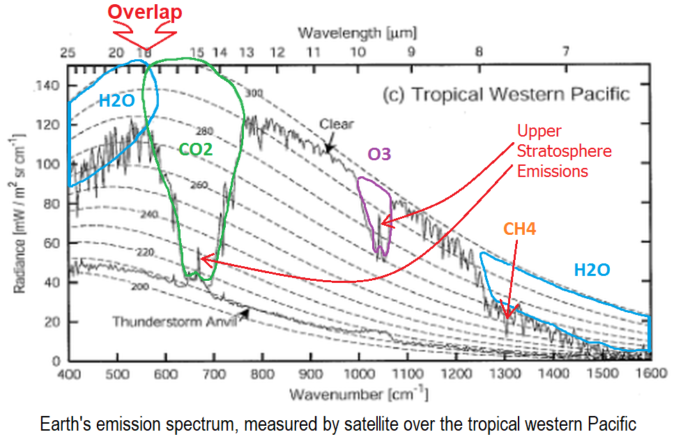
The 61 iLectureOnline lectures yo cite @538 makes much of how much IR makes it unabsorbed from the surface into space. The GH-effect does not work like that, It relies on the temperature of the atmosphere at the altitude from which IR can make it unabsorbed into space.
Add H2O and this will not effect the 15 micron band. The level of CO2 means the altitude with a clear run at space is far above any significant H2O effect. So that important altitude remains defined by CO2.
Add more CO2 and the important altitude rises and, excepting the small central part that is already up in the stratosphere, such a rise in altitude means a lower temperature at the altitude emitting into space. The lower the temperature, to less the emitted radiation (as per the S-B curves) and the resulting need for the planet to warm until inward/outward radiation are again in balance.
- Sea level rise is exaggerated
Daniel Bailey at 00:43 AM on 10 September, 2019As MA sagely notes, Chen 2014 is dated and newer studies with later data show an acceleration in SLR and with the mass component also increasing.
Per Yi et al 2017 - Acceleration in the Global Mean Sea Level Rise: 2005–2015:
"Global mean sea level rise has been accelerating for more than 100 years, and the acceleration in the last two decades seems to further increase"
And
"Our results show that the acceleration during the last decade (0.27 ± 0.17 mm/yr2 ) is about 3 times faster than its value during 1993–2014. The acceleration comes from three factors, that is, 0.04 ± 0.01 mm/yr2 (~15%) by land ice melting, 0.12 ± 0.06 mm/yr2 (~44%) by thermal expansion of the seawater, and 0.11 ± 0.02 mm/yr2 (~41%) by declining land water storage."
And
"we demonstrate that current advances in satellite gravimetry, and marine in situ measurements enable us to detect the acceleration in global sea level rise from 2005 to 2015, 11 years in total"
Other studies:
Cazenave et al 2018 - Global Sea Level Budget 1993–Present
"Ocean thermal expansion, glaciers, Greenland and Antarctica contribute by 42%, 21%, 15% and 8% to the global mean sea level over the 1993-present. We also study the sea level budget over 2005-present, using GRACE-based ocean mass estimates instead of sum of individual mass components. Results show closure of the sea level budget within 0.3 mm/yr. Substantial uncertainty remains for the land water storage component, as shown in examining individual mass contributions to sea level."
"Most recent studies (e.g., Dieng et al., 2017a, Ablain and Jugier, 2017b, Chen et al., 2017a, Chen et al., 2017b, Nerem et al., 2018b, WCRP, 2018) show that the GMSL is accelerating, and that this acceleration mostly arises from accelerated Greenland and Antarctica ice mass loss."
SLR Components, p. 1645, Figure 3:

Other salient studies:
- Dieng et al 2017 - New estimate of the current rate of sea level rise from a sea level budget approach
- Ablain and Jugier 2017
- Chen et al 2017a - The increasing rate of global mean sea-level rise during 1993–2014
- Chen et al 2017b - Groundwater Storage Changes: Present Status from GRACE Observations
On 2018 sea level rise acceleration:
"Global sea level rise is not cruising along at a steady 3 mm per year, it's accelerating a little every year, like a driver merging onto a highway, according to a powerful new assessment led by CIRES Fellow Steve Nerem. He and his colleagues harnessed 25 years of satellite data to calculate that the rate is increasing by about 0.08 mm/year every year—which could mean an annual rate of sea level rise of 10 mm/year, or even more, by 2100.
"This acceleration, driven mainly by accelerated melting in Greenland and Antarctica, has the potential to double the total sea level rise by 2100 as compared to projections that assume a constant rate—to more than 60 cm instead of about 30." said Nerem, who is also a professor of Aerospace Engineering Sciences at the University of Colorado Boulder. "And this is almost certainly a conservative estimate," he added. "Our extrapolation assumes that sea level continues to change in the future as it has over the last 25 years. Given the large changes we are seeing in the ice sheets today, that's not likely."
Also per Nerem et al 2018:
"the observed acceleration will more than double the amount of sea-level rise by 2100 compared with the current rate of sea-level rise continuing unchanged. This projection of future sea-level rise is based only on the satellite-observed changes over the last 25 y, assuming that sea level changes similarly in the future. If sea level begins changing more rapidly, for example due to rapid changes in ice sheet dynamics, then this simple extrapolation will likely represent a conservative lower bound on future sea-level change."

- Sea level rise is exaggerated
MA Rodger at 20:10 PM on 9 September, 2019Ossyrial @305,
You appear to have spotted some of the reasons Chen et al (20140 'Global sea level trend during 1993–2012' have given for their 'deceleration 2004-12' result. They do also see a significant level of uncertainty in their result although this is not so well handled when presenting their result.
In a broader context, Visser et al (2015) reviews various methods being used to derive acceleration/deceleration in SLR, methods which do yield contradictory results.
And the lead author X Chen has published since with Chen et al (2017) 'The increasing rate of global mean sea-level riseduring 1993–2014' which provides a result that supersedes the contradictory result of Chen et al (2014) in that it corrects satellite data and better accounts for other variable factors.
- Models are unreliable
NoctambulantJoycean at 07:24 AM on 31 August, 2019@rupisnark 1151
Christy's offers his usual distortions that he's been giving for decades. His core argument is that climate models exaggerate bulk tropospheric warming, especially in the topics, and this results from climate models over-estimating climate sensitivity (over-estimating CO2-induced warming). His conclusion is wrong, and the discrepancies he points out are primarily not due to model error, but instead primarily due to errors in inputted forcings for the models, along with internal variability and observational uncertainty (ex: Christy showing tropospheric warming estimates contaminated by stratospheric cooling). So the models aren't greatly over-estimating climate sensitivity.
If you want an introduction to this subject, then I recommend reading "A response to the “Data or Dogma?” hearing", "Fact sheet for “Causes of differences between model and satellite tropospheric warming rates”", along with the papers with the following DOI numbers: 10.1175/JCLI-D-16-0333.1 ; 10.1038/NGEO2973 ; 10.1002/2017GL073798
Here is a list of some of the problems:
1) If bulk tropospheric warming was muted relative to surface warming, especially in the tropics, then that would be a sign of a muted negative lapse rate feedback. That would increase climate sensitivity, not decrease it, contrary to what Christy claims. And there's plenty of evidence of a multi-decadal, positive water vapor feedback.
2) If Christy's position was right, then we'd expect to see a strong model vs. observational analyses discrepancy pre-1999. But we don't. We instead see it post-1999, as one would predict if the issues were with errors in inputted forcings over that period, not over-estimated climate sensitivity.
3) The models don't greatly exaggerate temperature responses to volcanic eruptions in the way one would expect if Christy were right about over-estimated climate sensitivity.
4) A number of papers showed that errors in inputted forcings largely explained residual post-1999 differences between surface analyses vs. models; that would also imply a contribution to post-1999 bulk tropospheric discrepancies as well.
5) Christy has a decades-long history of too hastily jumping to model error as an explanation, when the actual explanation was something else. This includes the notorious case in which he claimed models over-estimated satellite-based bulk tropospheric warming, when actually Christy screwed up the sign of the diurnal drift correction for his UAH satellite-based analysis.There are other problems with Christy's position, but I think that list should be enough to get you started.
- Increasing CO2 has little to no effect
Eclectic at 01:59 AM on 17 August, 2019Youjaes @376 , LOL but please do not bite me ;-)
1. . . . was expressed rather ambiguously. For each rise (or fall) of temperature in glaciation/de-glaciation, the first 10% is caused by slight variation in "insolation" and the subsequent 90% is caused by change in CO2 level (i.e. change in GreenHouse Effect). Rough figures, of course.
So your comment #1 was 90% wrong. Ah, if only you had read the Original Post and subsequent comments! ;-)
2. Ice core data conforms with the 10% / 90% description (above).
No problemo !
3. The so-called (but poorly-named) GreenHouse Effect [ = GHE ] has already been shown with data from satellites. Long ago. ( But half the crazies at WhatsUpWithThat blog . . . are still in full denial about it all ! . . . even though the good Mr Watts occasionally whispers that they're wrong to deny it. )
No need for backyards or front yards being involved.
4. As global warming has proceeded, wind speeds have slowed very slightly, I am told. But WUWT has made a mountain out of a molehill, on that. Kind of a nothingburger. Strange, since WUWT is usually trying to make molehills out of mountains ! ;-) ;-) ;-)
- Models are unreliable
MA Rodger at 22:05 PM on 29 July, 2019rupisnark @1120,
We discuss the serious error in John Christy's June 2019 GWPF talk. I could start running through the points @1120 and setting the record straight but as #1120 was the outcome of a previous record-straightening exercise @1119, I don't think a further round of record-straightening would achieve anything more than add to the length of this comment thread.Perhaps then, rather than demonstrate the utter incomeptence engendered within the grand denialist presentation set out in John Christy's June 2019 GWPF talk (my original idea), perhaps it would be best to describe the nub of his theorising and why it is failing to establish itself. Note that this will be a little more technical than simple identification of gross error within his talk (error which was not of itself fundamental to Chrisity's argument).
Happily, this will be on-topic for this thread as Christy does attempt to refute the reliability of climate models.
Climate models have developed in complexity through the dacades. They all (simple and complex) show the same basic result from AGW. This result is disputed by Christy using a rather narrow argument. Christy first dismisses the performance of these various models at reproducing the global average surface temperature (GAST) increase. He insists "models are often adjusted to broadly match its (GAST's) evolution over time." GAST is thus, according to Christy, not an independent measure and thus should not be used to test the models (McKitrick & Christy 2018).
This argument is repeated by Christy in his June 2019 GWPF talk:-"We cannot use the surface temperature, because the surface temperature record was used in the development of the model. That’s just as if I gave all the answers out to my students on Monday, I gave them the final on Friday, and they all did spectacularly well. Well, because I gave them the answers ahead of time! You cannot use surface temperature as a metric to test your model because that was used to tune the model, and you are not doing a legitimate scientific test."
(The actual abilities through the decades of the various models at projecting GAST is briefly reviewed by CarbonBrief.)
Instead of GAST, Christy uses specifically "the temperature of the atmosphere between 30,000 and 40,000 feet in the tropics, 20oN to 20oS." Given his insistence on not testing on 'Friday' what had been shown on 'Monday', Christy's choice is particulalry poor. His choice coincides with the long contentious "tropical hotspot" which has been argued over for decades. (So Christy is effectively testing on 'Friday' what had been shown on 'Monday'). And the "tropical hotspot" isn't a marker of AGW but of warming generally. I don't think Christy disputes that is happening. And as for measuring it to check whether it is there and to what extent, that introduces yet another layer of great uncertainty. (See this SkS post of 2009. And Christy in not addressing uncertainty plus other failings is considered by this 2016 post at RealClimate.)
So it is true that our present measurements suggest the "tropical hotspot" isn't as vigourous as expected, at its upper altitudes (although present at its lower altitudes).
Christy attempts to use the uncooperative "tropical hotspot" as some sort of essential failing of CMIP5 models and by implication as an essential failing of all models. As set out above, such attempts are poorly contrived and to-date even a corrected argument is far from unconvincing. - Models are unreliable
MA Rodger at 06:15 AM on 23 July, 2019rupisnark @1117/1118,
In reverse order.
1118
♣ "Your website ... already do(es) that job." Firstly, SkS is not my website. Secondly, SkS addresses distortions that are prediminantly of 'denialist' origin, not "non-denialist". The non-denialist distortions would be a more interesting subject, if you know of any.
♣ Whether you have the time to cope with all the nonsense served up by Christy, or not. We haven't got very far with the content of this Christy talk in more than one iteration. And there is the question of whether I (or others) could be fussed to continue untangling the garbage fo you into chunks you will understand.
♣ NINO1+2 & NINO3. Note these Sea Surface temperatures (which C&M 2017 appears to say it uses to subtract ENSO from its TLT record) are not de-trended (as for instance the AMO is) so they do still have an AGW signal. Subtracting the NINO signals will thus also subtract some AGW signal.
♣ Does C&M(1994) repeat the method of C&M(2017)? The implication is that it does (note that I have not access to C&M1994) but one difference is the UAH TLT v5.6 record was not used in 1994 as it didn't exist. The corrections to the UAH data set (mainly not the result of work by the UAH team) would have made significant changes to the 1994 result. So it is strange that C&M(2017) only finds a very small difference.
♣ Christy was one of six lead authors of Chapter 2 of IPOCC WG1 TAR (1990). Note the prmary finding of that chapter "The warming rate since 1976, 0.17°C/decade." This contradicts the primary finding of both C&M(1994) and C&M(2017).
♣ The GWPF are anti-scientific to the point of being bare-faced liars. I will be happy to demonstrate that fact if you are interested. If Christy is happy to give the GWPF the time of day, he will get no respect from me!!!
1117
♣ Have you understood correctly? What we can call Slide 1 of Christy (2019) is saying AGW is trivial to the point of insignificance. That is not borne out by the science. And denying the energy imbalance is pretty unforgiveable. You bat the "~750 Million Units" into the long grass but there is also the "6 trillion" which is part of the talk transcript While the 750M quantity could be considered as the rough total (that's total as in down to absolute zero) heat content of the atmosphere per sq metre of the planet, the 6T quantity would be 80 times more than the equivalent for the oceans (which are usually considered the largest thermal pool the climate has to cope with). So what the 6T quantity is supposed to be, I know not. I assume it is just meant to appear very very big.
♣ Slide 1 of Christy (2019) says it takes the values from AR5 Fig 2.11. It is Christy's comparison, not mine. - Models are unreliable
rupisnark at 19:06 PM on 22 July, 2019MA Rodger @1113. I am trying to work out for myself the truth and have little time for personal attacks. You may not like Christy's opinions but he was a lead author on one of chapters of one of the previous IPCC reports and has a distinguished academic record. He has doen imprtant work in relation to satellite data and worked to correct errors that he admitted he made. Are lead authors of IPCC reports not to be trusted? He may be wrong, but please stick to evidence not personal attacks.
I will review in detail the criticisms of the points you have made. I would like to understand which of his points you are willing to conceed, where he is exaggerating and where he is downright wrong.
My limited study so far has found distortions of information from both sides. Please help me to ascertain whether the distortions come from both sides equally or 90% from one side.
- Antarctica is gaining ice
MA Rodger at 21:31 PM on 21 July, 2019icowrich @492,
GRACE did show a loss of Antarctic ice mass 2002-16 as the NASA graphic below illustrates. We all await the GRACE-FO data (which should soon start appearing here). The numbers are now being published (here) but so far only in a form that will require a bit of processing to show the sort of data graphed out below.
Note this is all land ice. Sea ice floats so is invisible to GRACE.

The work by Zwally (that I know of) also did not concern Antarctic Sea Ice, Sea Ice Extent or otherwise. Mind, satellite data did show a small increase 1979-2015 in Antarctic Sea Ice Extent but that dramatically turned into a decrease 2015-17 - as graphed here - (usually 2 clicks to 'download your attachment').
Zwally et al (2015) concerned analysis of the land ice and the altitude of the ice surface. This showed an increase in altitude suggesting an increase in ice mass. The controversy revolved around levels of snowfall and the process of snow-compaction-into-ice as well as canculation of data uncertainties. It had some merit but obviously the GRACE data is a very strong counter-argument which makes the controversy more academic than a battle over results.
- Antarctica is gaining ice
icowrich at 20:32 PM on 21 July, 2019My understanding is that the GRACE satellite shows that Antarctica was been losing mass throughout the years during which Zwally showed increases in sea ice extent. Since ice extent is a 2D measure, it can't acocunt for ice thickness the way GRACE gravity wave measurements can.
I'm not sure where to find the newest data from GRACE-FO, which llaunched in May, 2018 (I couldn't interpret it, anyway), but I am interested to see how the continent's mass has changed in recent years. - 2019 SkS Weekly Climate Change & Global Warming Digest #28
nigelj at 07:02 AM on 16 July, 2019Regarding "Non-peer-reviewed manuscript falsely claims natural cloud changes can explain global warming". This being an alleged reduction in low cloud cover.
There's another similar research paper produced by a Japanese group (sorry can't remember where I saw this), that mentions that cosmic rays have an influence on cloud cover. They don't attribute the reduction in low cloud cover directly to cosmic rays, but they mention it in passing as if to suggest it might. However cosmic rays have been increasing slightly over the warming period of 1980 - 2018, so this should actually be producing more low cloud cover, so it is not an explanation for reductions in low cloud cover. So this research looks nonsensical as well.
This article is also relevant. It does seem to suggest low cloud cover is reducing.
“But a new study published in the July 24 issue of Science is clearing the haze. A group of researchers from the University of Miami and the Scripps Institute of Oceanography studied cloud data of the northeast Pacific Ocean — both from satellites and from the human eye — over the past 50 years and combined that with climate models. They found that low-level clouds tend to dissipate as the ocean warms — which means a warmer world could well have less cloud cover. “That would create positive feedback, a reinforcing cycle that continues to warm the climate,” says Amy Clement, a climate scientist at the University of Miami and the lead author of the Science study.”
“Getting data on cloud cover isn’t easy. There is reliable information from satellites, but those only go back a few decades — not long enough to provide a reliable forecast for the future. Clement and her colleagues combined recent satellite data with human observations — literally, from sailors scanning the sky — that go back to 1952, and found the two sets were surprisingly in sync. “It’s pretty remarkable,” says Clement. “We were almost shocked by the degree of concordance.”
“The data showed that as the Pacific Ocean has warmed over the past several decades — part of the gradual process of global warming — low-level cloud cover has lessened. That might be due to the fact that as the earth’s surface warms, the atmosphere becomes more unstable and draws up water vapor from low altitudes to form deep clouds high in the sky. (Those types of high-altitude clouds don’t have the same cooling effect.) The Science study also found that as the oceans warmed, the trade winds — the easterly surface winds that blow near the equator — weakened, which further dissipated the low clouds.”
“The question now is whether this process will continue in the future, as the world keeps warming. Scientists create climate models to try to predict how the earth will respond to higher levels of greenhouse-gas emissions, but only one model — created by the Hadley Centre in Britain — includes the possible impact of changing cloud behavior. And the bad news is that the Hadley model contains particularly high temperature increases for the 21st century, in part because it sees dissipating cloud cover as a positive-feedback cycle — meaning the warmer it gets, the less cloud cover there will be, which will further warm the earth. Though it’s just one data set over one part of the earth’s surface, the Science study indicates that the pessimistic Hadley model may be right. “These low clouds are like the mirrors of the climate system,” says Clement. “If they disappear, you might see that positive-feedback cycle.”
- Climate sensitivity is low
Eclectic at 16:10 PM on 14 July, 2019Penguin ~ some more details about the JK&PM paper you mentioned :-
It is not a paper in a peer-reviewed scientific journal. It has been described as a re-hash of an older (and non-peer-reviewed) paper from Energy & Environment journal (which is a social journal, not a scientific journal).
It was based on a limited amount of information from old satellite data ~ which was subsequently found to be faulty. You can find extensive criticisms of it, by various respected scientists, at the high-quality blog climatefeedback.org/claimreview/non-peer-reviewed-manuscript-falsely-claims . . . . (etcetera)
Not only that, but JK&PM have made a number of other gross mistakes (such as saying that only a tiny portion of the 20th & 21st Century rise in atmospheric CO2 level derives from human influence).
Penguin, the short version is: the "No experimental evidence (etcetera)" manuscript was authored by crackpots and is rubbish from beginning to end. Laughable !
Penguin, if you'd like to gain some climate knowledge in a relaxed easy-going way, then have a look at "Climate Change — the scientific debate" by youtuber Potholer54 (a science journalist) and the whole follow-up series of videos (most, fairly short!) Not only very informative, but done in an entertaining & often humorous manner.
- Arctic icemelt is a natural cycle
MA Rodger at 18:59 PM on 20 June, 2019With the absence of any further comment from commenter bruce, it might be worthwhile joining a few dots to make sense of his intervention @70.
The insistence that Arcric SIE annual minimums have "not decreased since 2007" follows from denialist insistence that there has been an Arctic version of the 'hiatus' - Arctic Sea Ice has not been diminishing as it did in previous AGW years and the trend is now flat. Swart et ak (2015) 'Influence of internal variability on Arctic sea-ice trends' has been cited as showing evidence of this 'hiatus' operating over the 6-year period 2007-13 and which is now assertedly extended for significantly more years. Thus the "not decreased since 2007" is not interested in the 2012 minimum as the denialist assertion concerns the multi-year trend not the individual years.
The data used for IPCC FAR Fig20 is described thus:-
"Sea-ice conditions are now reported regularly in marine synoptic observations, as well as by special reconnaissance flights, and coastal radar. Especially importantly, satellite observations have been used to map sea-ice extent routinelysince the early 1970s.The American Navy Joint Ice Center has produced weekly charts which have been digitised by NOAA. These data are summarized in Figure 7.20 which is based on analyses carried out on a 1°latitude x 2.5° longitude grid."
It is obviously not the best of data given it shows such a small drop in SIE 1979-1990. It may be possible to find this data within literature of the time (the likes of say Mysak & Manak (1998) also use some JIC data) but it doesn't in anyway resemble modern satellite SIE data.
The AMO's "close correlation with Arctic ice" is probably simple nonsense. Even denialists like Connolly et al (2017) found it difficult to fabricate an Arctic SIE racord based on Arctic temperature that was much different to more respectable records using similar methods. The graphic below is from Cea-Pirón & Cano-Pasalodos presented within a Judith Curry blog-comment-thread. SIE records such as HadISST & Marsh et al (2016) developed from historical ice records show significantly higher SIE over the earlier pre-1950 years, perhaps 2M sq km higher. None of these show any AMO-like wobbles.

But what Connolly et al did manage to achieve was to present a graphic to the world (below) from Alekseev et al (2016) [paywalled] (but without the actual post-1979 SIE data plotted as in Alekseev et al (2015) Fig3b) and without mentioning the finding predicting of an ice-free Arctic summers by 2030.

If you are happy with the most basic of similarities being considered as being a "close correlation", the likes of this Alekseev et al (2016) graph may be assumed as an upside-down AMO graph but the assertion doesn't actually pass muster. Firstly the Alekseev et al graph is simply an upside-down version of a rather crude Arctic summer temperature record which are then no more than assumed as a proxy for Arctic summer SIE minimums. And even then, the upside-down AMO does have a very different shape. The 1950 AMO(us-d) was the same value as recent values with a peak inbetween in the 1970s (rather than 1960s) and a 'hiatus' since 1999. So AMO(us-d) is a long way off from being a proxy for Arctic SIE values.
- Arctic icemelt is a natural cycle
MA Rodger at 21:12 PM on 18 June, 2019bruce @70,
May I add some numerical bones to the comment from Eclectic @71,
DMI Arctic Sea Ice plots the 2016 minimum as being 1.7cukm below the average minimum 2004-13. Using PIOMAS monthly data the 2016 minimum sits 2.2cukm below th 2004-13 average, this not a great difference given the measurements being undertaken. So your assertion that one of these must be wrong requires some explanation.
You further assert that 2007 provides the lowest annual minimum for Arctic Sea Ice Extent in JAXA, DMI, NSIDC & MASIE when all these show the minimum year as being 2012. A plot of rolling 12-month averages (as per the graph in the OP above) shows a reasonably constant reduction in Arctic Sea Ice Extent, from 12.3M sqkm in 1979 to 10.3M sq km today. The lowest annual average Arctic SIE occurred in 2016.
You assert solely on the basis of IPCC FAR Fig 7,20a (below) that 1979 saw "probably the highest extent since about 1910." Fig 7.20a does show a downward wobble in 1974 prior to the satellite era (as does the graph in the OP above) but this is small relative to the reduction in SIE over the satellite era. The 1974 dip, all of 0.3M sqkm, is shown in the graph in the OP above which also shows the reduction in SIE over the satellite era, something not well set out in Fig 7.20a.

Finally, while values for the AMO does have reasonably uncontroversial sources, this is not the case for all sources of 20th century Arctic SIE records. Perhaps you could thus be clear as to your source of 20th century Arctic SIE data.
- Arctic icemelt is a natural cycle
bruce at 17:51 PM on 18 June, 2019Japanese (JAXA), Danish(DMI), US (NSIDC) and US MASIE data show minimum Arctic ice extent has not decreased since 2007.
DMI shows minimum Arctic ice volume has not decreased since 2003 when readings first began, however PIOMAS shows a decrease. One is obviously wrong.
The first IPCC report in 1990 showed sea ice extent from the early Nimbus satellites from 1973 to 1990. (Observed Climate Variation and Change chapter 7) Ice extent grew 500,000 square kilometres from 1973 to 1979 which was probably the highest extent since about 1910.
Ice decreased significantly in the 1920's through to the 1950's and increased until 1979. The current satellite monitoring started in 1979 but if it had started in in the 1920's, it would probably would be about the same as now.
If you look at the Atlantic Multidecadal oscillation index, you will see that there is a close correlation with Arctic ice
- IPCC Updates Methodology for Greenhouse Gas Inventories
One Planet Only Forever at 01:28 AM on 15 May, 2019Hopefully the likes of the 'Correction Resistant Conservatives' will not have significant influence on how the New Rules are established, monitored or enforced.
The methods for reporting GHG impacts by nations will always be improving. Hopefully, in the near future satellite data will be able to be reliably used to verify what nations 'report'.
The following articles refer to a Canadian study that used data from air plane flyovers of the Alberta Oil Sands operations as a 'top-down' test of the reported values of impacts that were 'bottom-up' calculated following the existing 'Rules'.
CBC News: "Oilsands CO2 emissions may be far higher than companies report, scientists say"
Digital Journal: "New study: Canada's oil sands emissions are higher than reported"
Many people, particularly Conservatives, are inclined to be 'Rule Followers' as long as the Rules work in their favour. When rules are not in their favour, the worst among us resist correction. They will try to make-up the rules as much in their favour as possible. If they can't get the Rules to be in their favour they will try to win the ability to limit the chances they will be caught or penalized for breaking the Rules.
The United Right Conservative leaders in Canada are continuing to do anything they can get away with to oppose the reduction of climate change impacts. Their history of actions included promotion of efforts to discredit climate science and earlier denial of Climate Science (they now say climate is changing, but try to discredt climate science understanding of why it is changing). Today, their actions include abuse of misleading marketing power to popularize the dislike of Carbon Fee and Rebate programs (calling them a Carbon Tax that will Do Nothing, and claiming they will hurt the Poor when the reality is that the poorer peopl get more rebate than their carbon fees).
The 'correction resistant', can be expected to oppose any correction of GHG impact reporting that reduces their chances of getting away with their developed desires to benefit from understandably harmful and unsustainable activity.
Hopefully, the Harmful New Correction Resistant Leaders of the United Right, who incorrectly get supported by people who mistake them for being deserving Conservative leaders, will not have significant influence on the latest improvements of the rules and their enforcement.
- 10 Indicators of a Human Fingerprint on Climate Change
MA Rodger at 02:56 AM on 5 May, 2019Wilmer_T @100,
The paper you refer to is Varotsos & Efstathiou (2019) 'Has global warming already arrived?', the latest serving from a pair of nonsense-writers. Concerning increased height of the tropopause (fingerprint #9), this is found occurring in climate models and within atmispheric measurements, as shown by Santer et al (2001) cited by the OP above and this finding continues to be observed (eg Xian & Homeyer 2018).
Varotsos & Efstathiou ignore this serious work entirely and instead use UAH TP satellite data to assert there is no increase in tropopause height because there is no increasing trend in UAH TP. The use of such data is mind-blowingly stupid, as worthless as using a twelve inch ruler to measure the width of a human hair. UAH TP does not measure tropopause temperature. It measures a wide range of temperatures from the surface up to 24 km. Thus it is measuring the cooling stratosphere as well as the warming troposphere, two strong signals which will overwhelm entirely any tropopause tempoerature trend. The figure below is sourced from Spencer at UAH.
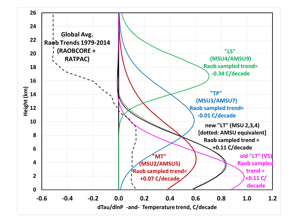
- Climate's changed before
TVC15 at 12:16 PM on 5 April, 2019This is the craziest Gish Gallop I've ever seen. Yes it's one of the deniers I deal with.
Please refute the facts, instead of simply launching emotional diatribes.
1. Is CO2 not .04% of atmospheric gases?
2. Is man made CO2 not 5% of atmospheric CO2?
3. Does water vapor not absorb IR energy over bandwidths 30X that of CO2?
4. Is water vapor not .4-1% of atmospheric gases?
5. Can one accurately compare over time temperature measurements estimated or measured by four different methods?
6. Why don't the "temperature plots vs time" show the error bars for the methods used for temp measurement? (comparing "proxy temps" to digital, satellite proxies, and mercury thermometer measurements should immediately disqualify any scientific comparison).
7. Why did temps not fall in the Great Depression when CO2 production fell 60%? (atmospheric CO2 has a half life of 3 years, not the very long periods suggested)
8. Why did temps fall in ww2? Was the Battle of the Bulge and Stalingrad fought in tropical climates?
9. How can the 1930s be the hottest decade on record when the AGW crowd says temps have continually increased since then?
10. Why has Miami and New York not flooded?
11. Why has there not been worldwide droughts?
12. What happened to the "times without snow"? Tell that to everyone in the US this year.
13. Why are temps falling?
14. Are we not at the beginning of a prolonged solar minimum, similar to the Mauder minimum?
15. Why did the earth not end and temps reach the boiling point of water when CO2 levels were 10X what they are now?
16. What is the contribution of solar activity and sun spots to temps?
17. What is the contribution of the orbit of the earth around the sun?
18. What is the contribution of volcanic activity?
19 If the "warming" models from 20 years ago are wrong, why are they correct now?
20 How did they measure multiple temp points at remote areas of the ocean and polar regions 200 years ago?
21. Have all the locations of temps measured over time been consistent geographic points? (Of course not- there has not been one consistent data point until the last twenty years).
22. Why were temps warmer during the Roman Empire when CO2 levels were half what they are today?
CO2 provides all the carbon that is the building blocks for ALL ORGANIC LIFE on this planet. Every carbon atom in your body that makes up all of the carbon compounds in your body were once CO2. It is not surprising that the death cult of AGW would seek to reduce or eliminate a molecule equally important as water or oxygen for life on earth.
The "optimal" CO2 for plant growth is 900-1100 ppm. We need a lot MORE CO2, not less. Due to higher CO2 levels, plant life has increased over the last 30 years, providing a greening of the planet and higher crop production. Do you want to reduce plant life and cause famines?
- Greenland is gaining ice
Daniel Bailey at 02:35 AM on 26 March, 2019Just because you cherry-pick different dates to suit your purpose does not invalidate the statement:
"Data from NASA's GRACE satellites show that the land ice sheets in both Antarctica (upper chart) and Greenland (lower) have been losing mass since 2002. Both ice sheets have seen an acceleration of ice mass loss since 2009."
- CO2 is plant food
John Hartz at 05:52 AM on 16 March, 2019@ remmons 31:
The NASA article that you reference was published on April 26, 2016. It has been susequently updated by the following article:
Human Activity in China and India Dominates the Greening of Earth, NASA Study Shows, NASA, Feb 11, 2019
The concluding/summary paragraphs of the update article:
The researchers point out that the gain in greenness seen around the world and dominated by India and China does not offset the damage from loss of natural vegetation in tropical regions, such as Brazil and Indonesia. The consequences for sustainability and biodiversity in those ecosystems remain.
Overall, Nemani sees a positive message in the new findings. “Once people realize there’s a problem, they tend to fix it,” he said. “In the 70s and 80s in India and China, the situation around vegetation loss wasn’t good; in the 90s, people realized it; and today things have improved. Humans are incredibly resilient. That’s what we see in the satellite data.”
This research was published online, Feb. 11, 2019, in the journal Nature Sustainability.
The moral of the story: Science is a continuous process.
- Greenland is gaining ice
Daniel Bailey at 09:56 AM on 14 March, 2019Surface melt and snowfall mass balance are not the sum of the total mass balance equation by far. Because calving and discharge from the margins are not factored into that.
Per ther DMI:
And
Which brings it into good agreement with NASA:
"Data from NASA's GRACE satellites show that the land ice sheets in both Antarctica (upper chart) and Greenland (lower) have been losing mass since 2002. Both ice sheets have seen an acceleration of ice mass loss since 2009. (Source: GRACE satellite data)
Please note that the most recent data are from June 2017, when the GRACE mission concluded science operations. Users can expect new data from GRACE’s successor mission, GRACE Follow-On, in the summer of 2019."

More than 100 comments found. Only the most recent 100 have been displayed.

More than 100 comments found. Only the most recent 100 have been displayed.


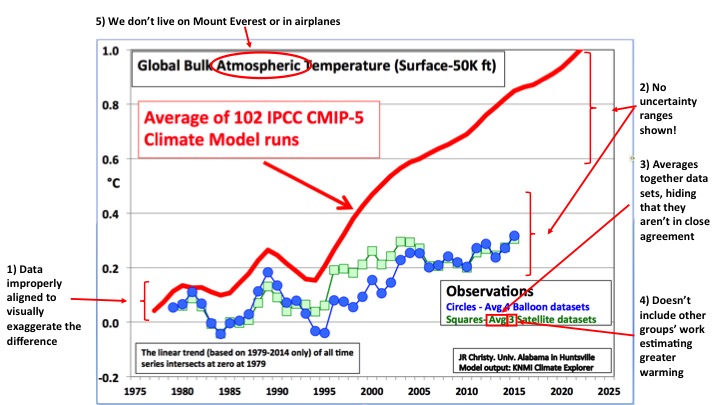
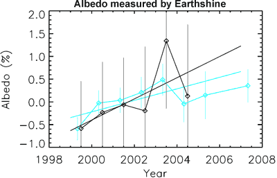
.jpg)
THE ESCALATOR

(free to republish)