


 Arguments


Visualizing daily global temperature - part 2
Posted on 5 May 2025 by Zeke Hausfather
This is a re-post from the Climate Brink
There are is a lot of dire news in the world these days – the dismantling of US climate policy, the apparent canceling of the 6th National Climate Assessment, etc. So sometimes its worth taking a break from doomscrolling and indulging in one’s hobbies.
Some folks collect trading cards, make miniatures, or do crafts. My hobby is making climate data visualizations (which, I suppose, is not the most uplifting occupation!).
A week ago I was playing around with a climate “tree ring” graph that I shared on social media that had daily global surface temperature anomalies between 1940 and 2025 as colored rings. But with reanalysis data (ERA5 here) we have both temperature anomalies (e.g. changes relative to 1850-1900) and absolute temperatures, and I thought it might be interesting to make a similar graph of absolutes as well.
I also wanted to make some improvement to the plot: rather than using rings for years (which created a discontinuity at the start and end of the year) I created a continuous spiral. I also added monthly labels around the outside to make it easier to read.
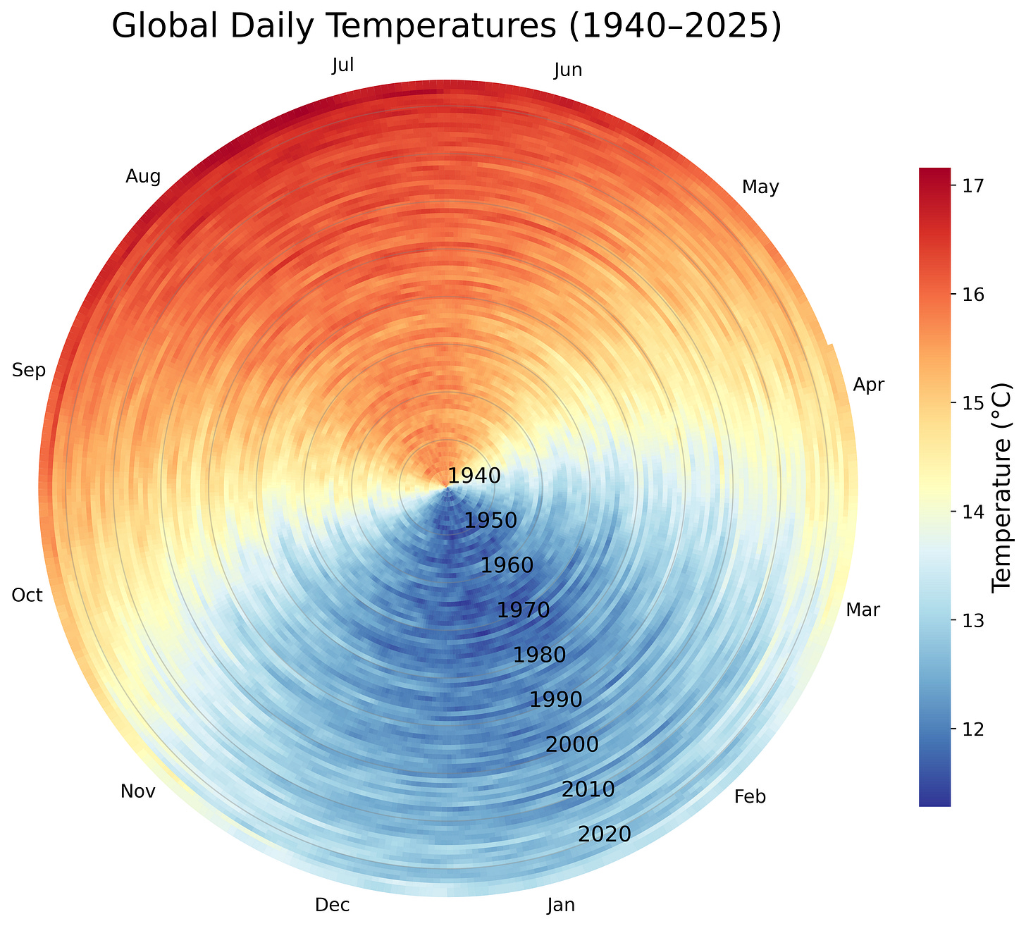
Now, you might ask why there is such a distinct summer-winter cycle in global temperatures. After all, when its winter in the Northern Hemisphere its summer in the Southern. However, the preponderance of global land area in the Northern Hemisphere makes it more prone to larger seasonal swings in temperature. By contrast, the slower warming ocean buffers changes in the Southern Hemisphere, creating a distinct seasonal pattern.
We can also see the dramatic effects of warming on that seasonal cycle; global surface temperatures that were once seen in early April are now being seen in early March, a full month earlier for the world as a whole. For any given location the effect may be smaller, depending on the magnitude of temperature difference between summer and winter.
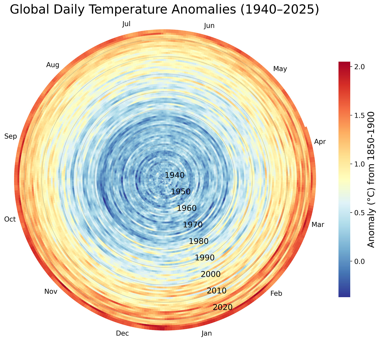
I’ve also created a spiral version of the “tree ring” anomaly plot, shown below:
A “thermal helix”
Now, two dimensional spirals are pretty neat, and I’ve generally thought that adding a third dimension to graphs rarely imparts useful information. I still hold that view, but I’ve added a proviso that they do nevertheless look cool at times. So, here is what happens if we turn the temperature anomaly ring plots into a 3d helix, while letting the rings vary in width depending on their temperature anomaly (from 0C to 2C):
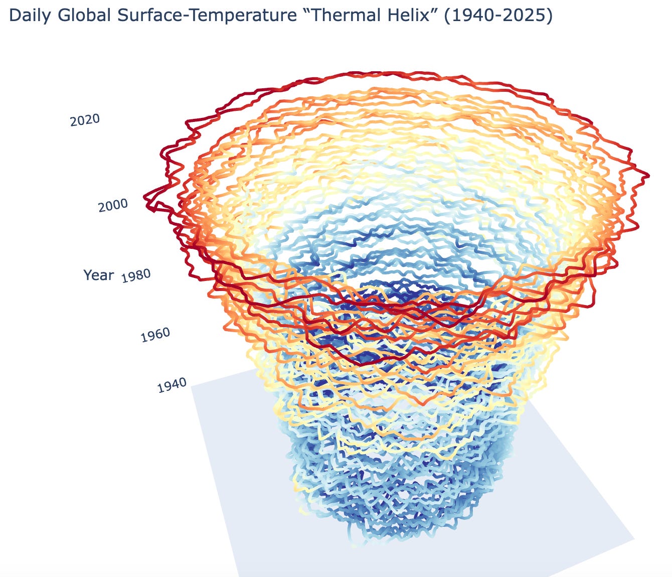
I won’t claim that these graphs are better than the type of standard scientific line plots we release in our monthly Berkeley Earth updates; in most cases they are worse at actually conveying scientific information than a standard line graph. But data visualizations are not just about conveying numbers; they can also be evocative, or even (dare I say) art.


The top picture showing the increase in the daily temperatures over the days of the year from 1940 up to 2025 is formidable. Spring and autumn have become part of summer, and now winter seems on the point of being squeezed out. The impact of this illustration may be due to one's intuitive feeling that temperature is essentially a day to day experience. Here we are presented with a direct link to this experience, and how it has changed over the past 85 years.
Second thoughts: In the tropics one cannot speak of summer and winter. On the equator the sun will cast no shadow on the 21st of March and of September. So when is winter, when summer?