


 Arguments


The human fingerprint in global warming
What the science says...
| Select a level... |
 Basic
Basic
|
 Intermediate
|
 Advanced
| ||||
|
Multiple sets of independent observations find a human fingerprint on climate change. |
|||||||
Climate Myth...
It's not us
'What do the skeptics believe? First, they concur with the believers that the Earth has been warming since the end of a Little Ice Age around 1850. The cause of this warming is the question. Believers think the warming is man-made, while the skeptics believe the warming is natural and contributions from man are minimal and certainly not potentially catastrophic à la Al Gore.' (Neil Frank)
At-a-glance
Since the pre-industrial era, we have burned ever-increasing amounts of fossil fuels. This we can see for ourselves, often just by looking out of the window or hear, by listening to the flow of traffic. The sights and sounds of fossil fuel burning, constant, perpetual.
We cannot see or taste carbon dioxide, one of the two main products of that combustion, the other being water vapour. But it's constantly heading up into our atmosphere – in 2021 alone the figure for such emissions, according to the International Energy Agency, was 36,300,000,000 tonnes of the stuff. Just imagine for a moment that amount of sand piled up in a heap!
Once up there, one key difference between carbon dioxide and water vapour becomes critically important. Water vapour condenses to form clouds and freezes to form ice crystals. Rain, hail, sleet and snow all fall from clouds – it's a constant, ongoing cyclic process, even though different places see much more – or much less precipitation.
Carbon dioxide has no liquid state at the pressures encountered in Earth's atmosphere. Instead, at normal atmospheric pressures, it sublimes from solid to gas at −78 °C. Solid carbon dioxide is also known as dry ice, but cannot form in the range of temperatures found within Earth's atmosphere, although it is produced industrially for various purposes. So as opposed to water vapour, carbon dioxide is an example of a non-condensing gas: once up there it stays up there for a long time. That's why our vast CO2 emissions are causing levels of the gas to build and build.
If you needed a smoking gun in order to accept the above, there is one: carbon dioxide derived from fossil fuel burning has a very distinct chemical fingerprint that is readily measurable in air samples. To find out how we do that, read the further details below. Such measurements, with a trend precisely following the pathway we would expect due to our increasing emissions, show that far from being someone else's problem, one way or another we are all bang to rights in this case.
Please use this form to provide feedback about this new "At a glance" section. Read a more technical version below or dig deeper via the tabs above!
Further details
If you wanted to find a smoking gun with respect to human carbon emissions and their role in global warming, where would you look? There are several and the Intermediate version of the rebuttal lists and describes many of them, but we’ll start here with the most important one.
Fossil fuel production and usage is all well-documented. For that reason, CO2 emissions are also well-documented. In 2019, some 44.25 billion tons (or gigatons) were emitted to the atmosphere (IPCC AR6, WG III Technical Summary 2022). That figure was the highest recorded in a steady year-on year upward annual trend.
So we know all too well that every year of late we have added tens of billions of tonnes of CO2 to the atmosphere. How do we detect that fossil fuel signature in the air?
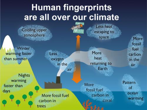
Fig. 1: human fingerprints on the crime-scene of climate change. Note several lines of evidence refer to 'fossil fuel carbon'. Now read on….
The answer lies in carbon isotopes.
Most chemical elements exist in nature as more than one version. These different versions are an element's isotopes. Carbon is no exception to the rule. Its most important natural isotopes are carbon 12, carbon 13 and carbon 14, written 12C, 13C and 14C. All three contain six protons in their atomic nuclei – that's carbon's atomic number and it's fixed. But carbon 12 atomic nuclei contain six neutrons whereas 13C has seven and 14C has eight.
Carbon 14 only occurs in tiny traces – about one atom per gram of carbon is a ballpark figure. It forms in nature through neutron bombardment of nitrogen atoms from cosmic rays near the top of our atmosphere. Man has had a hand here too: nuclear explosions also produce high-energy neutrons and the weapons-testing mania last century increased the amount of 14C by two orders of magnitude. The isotope is useful since it is radioactive and can be used to radiometrically date geologically young materials. Because its decay-rate is rapid (half-life of 5,700 years), anything more than about 50,000 years old is too 14C-depleted for radiocarbon dating. The fossil fuels, millions to hundreds of millions of years old, are devoid of 14C.
Carbon 12 is stable and very common, constituting 98.93% of all carbon on Earth, with carbon 13 making up the remainder, apart from the tiny amount of carbon 14. In that vital process of photosynthesis, carbon dioxide and water are absorbed by plants. These raw ingredients are converted into nutrients (sugar) and as a by-product, two thirds of their contained oxygen are released to the atmosphere, making it breathable by us and our fellow life-forms. The important bit is that during photosynthesis, carbon isotopes fractionate, meaning that the proportions of 12C and 13C are changed by the chemical reactions involved, with a preferential uptake of 12C in that sugar. So photosynthesis produces a shift in favour of 12C.
Any carbon-bearing sample – a bottle of oil, lump of coal, a piece of calcium carbonate such as limestone or a sea-shell, a flask of air - there are numerous examples – can be analysed and its carbon isotopic composition determined. Therefore, its ratio of 13C to 12C (known as delta or d13C) can be calculated and compared to an internationally-agreed standard composition. The equation is as follows:
delta 13C = ((13C/12C sample)/(13C/12C standard) -1) x 1000%
Now, because of that preferential take-up of 12C in plants, the d13C value, expressed in ‰, of anything derived from their decomposition, combustion, preservation or consumption will be similar. As such the smaller (or more negative) d13C value spreads up the food chain, gets preserved in coal, oil or gas deposits, in carbonate rocks like limestones and in shelly fossils.
It should come as no surprise, then, that if you dig up and set fire to fossil fuels, the CO2 emitted in that process will give the atmosphere a more negative d13C – and that's exactly what we find. If all the CO2 in the atmosphere was that outgassed by volcanoes, we would see d13C closer to zero; instead the ongoing trend is more and more negative; a cumulative plot from the Mauna Loa and South Pole air sampling stations (fig. 1) shows values of -7.5‰ in 1980, heading steadily downwards to -8.5‰ in 2020. The estimated pre-industrial value is around -6.6‰ (Graven et al. 2020). This is one smoking gun of man-made carbon dioxide emissions. Another is that because the fossil fuels are devoid of 14C, it follows that fossil fuel CO2 emissions are, too - thereby further diluting the already tiny amount of 14C in the atmosphere.
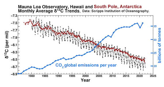
Fig. 1: the carbon isotope record, 1975-2022. Black Dots: Monthly average carbon isotope ratio (d13C) of atmospheric carbon dioxide at Mauna Loa Observatory, Hawai. As with the Keeling Curve of CO2 levels, the graph shows the seasonal wobble caused by photosynthetic plants as leaves grow and then die.Red Dots: Monthly average d13C of atmospheric carbon dioxide at the South Pole, Antarctica.
Carbon isotope ratios are also very useful in geology. Sudden changes in their values, known as positive or negative “excursions”, tell us something monumental has occurred. For example, one of the biggest negative d13C excursions in the geological record marks the end-Permian mass extinction, 250 million years ago (Saitoh & Isozaki 2021).
That one of the most prolonged and voluminous episodes of volcanism in the past 500 million years occurred at the same time as the end Permian mass extinction suggests a lot of CO2 was released back at the time. But volcanogenic CO2, originating in Earth's Mantle, has a “heavier” or more positive d13C of around -6‰. It cannot have caused the negative excursion, but one thing could. In the sedimentary basin through which the magma rose from deep in the Earth there were vast oil and coal deposits and they got comprehensively roasted in the process. It is estimated that as a consequence, the Siberian Traps eruptions released between ten trillion and one hundred trillion tons of carbon dioxide over just a few tens of thousands of years, some of volcanic origin but a heck of a lot from those cooked fossil fuel deposits. What happened in Siberia 250 million years ago thereby presents Mankind with its starkest possible warning about messing with Earth's carbon cycle.
Last updated on 2 July 2023 by John Mason. View Archives


@Julian Flood
Suppose we have a sink into which the faucet is pouring water.We have control of the faucet and can increase or decrease its rate of flow. We may not have the political will to do that, but that's a side issue. The point here is that we can. Now let's say that some natural forces are pouring vinegar, pee, alcohol, orange juice, and milk into the sink at the same time our water is pouring in from the faucet.
If the water level in the sink is rising at only 45% percent of the rate we would expect from the rate of our input from the faucet, why do you think our lack of knowledge of exactly how much of each of the other inputs and our resulting inability to calculate the sum of their effects is important for understanding whether our faucet is causing the water level to rise?
If the rate of increase in the level of water is 45% of the rate we would expect from our input from the faucet, we know with absolute certainty that that 55% of our water is going down the drain and all the other inputs with it as well. I don't understand what is so hard to understand about that? Why do you think there is any need for detailed knowledge about the rest of what's going down the drain?
Now, there is a very significant implication in this. If we know how much CO(2) we're putting out and how much is showing up in the atmosphere (~45% of our input), where is the rest of that CO(2) going? The only reasonable explanation is that the ocean is sequestering the vast majority of it. We do know that the CO(2) level in solution in the ocean has been increasing and ocean water is becoming more acidic. We are also seeing the effects of this on coral reefs and other marine life. As the globe becomes warmer, CO(2) becomes less solube in water, so the 45% figure is bound to go up and accelerate an already undesirabe situation.
So I don't see where your doubts are coming from unless you just don't want to see and are willing to pick at any single little corner you can find, one at a time and out of context with the bigger picture, simply to avoid seeing.
acjames76 - Moore has quite a list of denial myths, errors, and cherry-picks in that document.
First and foremost, he insists on using regional records (Greenland and Vostok) and treating them as global. This includes the rather silly statement "...that global averages are a very poor indicator of actual conditions in either hemisphere." Which is just silly. Regional data will always have higher variations and noise than hemispheric or global signals - any time you see someone preferring a small regional signal to one for a larger area and arguing about global trends, you are seeing cherry-picking fallacies in action.
He also compares against lower tropospheric satellite temperatures shown over a period of less than five years - when about 23-24 years are required to identify statistical trends.
Cycles, cycles, cycles - all ignoring the (measured) forcing contributions from anthropogenic greenhouse gases, with armwaving such as "Perhaps the forces have to do with cycles in solar radiation and solar magnetism, or cosmic radiation, or something we haven’t yet identified".
He also throws in the "CO2 is a trace gas", the "clouds", and "CO2 is plant food" myths - all contradicted by the evidence.
There's plenty more, but in short he's presented a Gish Gallop of nonsense. Not worth the electrons used reading it...
Also responding to acjames @76, expanding on KR's point, arctic and antarctic regions are known to be more sensitive to changes in temperature than tropical regions due to ice and snow albedo feedbacks. Dr Hansen estimates that the Vostock (and Dome C) ice cores in Antarctica show local temperature changes twice that of the global mean, and Greenland icecores are even more sensitive. Nevertheless, taking an average the Greenland and Antarctic icecores is not a bad way to determine the general pattern of global temperature changes, if not the magnitude. It should be noted in doing so that the fact that you are using only two records and both from polar regions (which have greater temperature variability than tropical regions) will mean that you radically over estimate decadal variability in such an average. A one hundred year smooth of the data would give a better idea.
If ignoring the impact of the limited number of sites is bad, when using the data to estimate variability, ignoring polar amplification when comparing with the modern temperature record is absurd. That, however, is exactly what Richard Moore does. Here is the chart he produces by appending the global mean twentieth century temperatures to the polar means as determined from icecores:
The key point here is that to account for polar amplification, we would need to divide the icecore data by two, or equivalently multiply the global data by two for a plausible comparison. Even that would probably underestimate the ratio of polar to global temperature changes. Doing so, however, wold increase twentieth century global temperature equivalence to 1.4 C, well above the highest values from the average ice core data. Further, the highest points in the icecore data are from short term variability and likely reflect regional variation rather than global variation. Applying a smooth to the data would make the modern temperatures stand out still further.
Clearly Moore's argument that modern temperatures are not unusual is fatally flawed.
His argument that it is not CO2 consists, as near as I can make out, solely in citing Spencer and then pointing out that sourcewatch does not link to any rebutals. Sourcewatch is, of course, a website solely devoted to listing institutional and financial connections of various sources of information. It is not part of the ambition of source watch to survey scientific research and rebut particular arguments. Moore has only looked for rebutals to Spencer's claims were we can be confident he would not find them. Had he looked at Skeptical Science, however, he would have been more than satisfied. In particular he would have found a direct rebutal of Spencer's claims about climate sensitivity. By limiting his search, however, Moore gets to falsely pretend that there is no such rebutal available, avoids the need to rebut the rebutals, and gets the falsely play the ad hominen card as well. Not a bad return for being, at best, a slovenly researcher.
Finally, Moore finishes with a conspiracy theory which is not worth commenting on, but certainly makes an interesting point about his intellectual credibility.
I scanned to find a remark on this issue in the comments, but so far haven't seen any. Unless I'm mis-reading something, in the advanced version of this article, the graph labeled thus:
"Figure 9: TOA Radiation (Trenberth 2009)"
Should actually be:
"Figure 1c from Hansen et al (2005) "Earth’s Energy Imbalance: Confirmation and Implications".
The caption for Figure 1 in that paper runs as follows:-
Fig. 1. (A) Forcings used to drive global climate simulations. (B) Simulated and observed temperature change. Before 1900, the observed curve is based on observations at meteorological stations and the model is sampled at the same points, whereas after 1900 the observations include sea surface temperatures for the ocean area, and the model is the true global mean. (C) Net radiation at the top of the atmosphere in the climate simulations. Five climate simulations are carried out that differ only in initial conditions.
This information was provided to me by MA Rodger in another thread.
Further to #80.
There is no Figure 9 in the Trenberth et al (2009) as linked in the advanced level rebuttal. There is a Figure 9 in Treberth et al (2013) "Earth's Energy Imbalance." This figure (presently eluding me on line) plots but a wiggly line 2000-to date showing incoming, outgoing and net radiation, this last compared with El Nino. So the important bit of that Figure 9 is the net value as per the graph below (as shown at the SkS post that this discussion initially began) but with a more recent wobble added on to the end of the trace.
Sadly dvaytw, there is no "clincher" here as the data only starts in 2000. (Mind, OHC does a good job of clinching the "AGW has paused" delusion.)
Which brings me to a follow-on. If the Hansen Figure 1C uses OHC to 'create' a graph 1880-date as could be interpreted from the advanced level post, is that any more strange than Trenberth using satellite data to 'create' such a graph - both are achronistical. Of course Hansen et al uses land temperature for the earliest part of his analysis and adds in SST there after (as the caption says). Trenberth et al (2013) presents a similar graph 1850-to-date (their Figure 1) and both papers then compare these results with OHC data.
MA Rodger I think some of what you're responding to here is brought up in a question I asked in Trenberth on Tracking Earth’s Energy . In any case, thank you.
A follow-up question: so am I correct in understanding that Trenberth and Hansen are using temperature data to calculate the energy balance at the TOA prior to satellite data?
And is there a way to explain the verified energy imbalance, other than the GHE?
Finally, I recall reading the criticism that the margin of error for Trenberth's TOA data is very large. Is this a legitimate criticism?
(Note to moderator: this comment and the one above it may fit more appropriately in the discussion under the "Trenberth on Tracking Earth's Energy" article. )
dvaytw - I am struggling a little to follow you. Can you please be more precise about which paper you mean where you find Trenberth and Hansen discussing TOA energy balance at times prior to the satellite era? In Trenberth et al 2013, there is discussion of how difficult this is given the uncertainity in OHC measurements prior to Argo.
scaddenp @83.
The papers under discussion are Trenberth et al 2013 & Hansen et al 2003, both of which calculate the ERB from back in the 19th century having modelled the climate to fit temperature records. T(2013) figure 1 and H(2003) figure 1c are graphs of this, the latter being figure 9 of the 'advanced' post here but which is mis-referenced.
@82, 83 and 84
I think I understand the importance of Trenberth's satellite data now; it lies not in the amount of increase since the satellites went up (as this was very recent), but in that it matches predictions made with OHC data. Have I got that right?
I also have a question about Evans 2006: he states there that Greenhouse radiation has increased by about 3 W/m2 since pre-industrial times, and a denier pointed out that this matches pretty much exactly the increase in TSI since that time:
Solar Irradiance Since 1660
I realize there are plenty of reasons we know it's not the sun and have pointed them out to him, but am wondering if there is any comment to be made about this correlation.
PS the discussion is happening in the comments here, if anyone's interested:
How to Talk to a Climate Denier
dvaytw @85.
Regarding Trenberth's ERB from CERES, it does suffer massively from calibration issues. Its decadal value is more an inference relying on OHC data than a result in itself. IPCC AR5 Chapter 2 Section 2.3.1 is saying the net satellite measurements are 'calibrated' +/-2 W/m2, which is rather a lot. There is also quite big trend calibration issue (tenths of W/m2 per decade) for which a reference doesn't immediately spring into hand.
What we importantly do have with ERB measurements is sight of the general wobbles which are valuable checks on GCM results. This also allows gaps to be filled in that allow demonstration that some of the crackpot wobblology theories (Staduim Waves etc) are nonsense and cannot be happening due to what we know of ERB. That sort of answers some of your second question @82 and is a bit of background to a graphic of mine that shows ERB less smoothed than normal (here - usually two clicks to 'download your attachment'). Unsmoothed it can be seen how any trend in ERB has yet to emerge from the wobbles.
Your TSI graph comes from Lean(2000) (Data here @ NCDC). More recent assessments of historical of TSI (see graph from CU here) do not yield such a large rise since the seventeenth century. And also, ΔTSI has to be divided by 4 to be equivilant to climate forcing as TSI is measured over the disc and forcing over the sphere. Perhaps one thing to remember with this TSI calibration here is that TSI is a component of the ERB measurement and its 'calibration' has been revised by quite a bit recently, usually downwards, much to the annoyance of denialists.
Positive forcing is now above 3W/M2 (AR5 table A.II 1.2 gives positive forcing of +3.4 W/m2 for 1750-2011and it is rising at about 0.04 W/m2 pa). But there are also less-well defined negative forcings yielding a net anthropogenic forcing of ~+2.3W/m2 for 1750-2011 according to AR5 A.II.
One number I forgot to tap in @86; AR5 A.II gives an average solar forcing over solar cycle 23 (1996-2007) of 0.045W/m2.
In addition to MA Rodger's point that the change in TSI needs to be divided by 4 to account for the disk vs. sphere question, you also have to multiply the value by 0.7 to account for the fact that the earth's albedo averages about 30%. It's the change in absorbed solar that needs to be compared to the greenhouse forcings, not the change in received solar.
Thanks fellows for the info. May I know a good source for a novice's understanding of the "disk vs. sphere question"?
dvaytw @89
Imagine the Earth as a dinner plate, which as it rotates around the Sun always presenting its "face" towards the Sun. The surface area that the Sun irradiates is pi * r**2 where r = radius of the "earth". The "back" side is never irradiated.
Now imagine that the plate is replaced by a ball of the same radius; the surface area has consequently increased. If the ball is not rotating on its own axis, then the surface area that the Sun irradiates is 2 * pi * r ** 2 (the surface area of a hemisphere). If the ball does rotate then (over the period of rotation) then each hemisphere spends half the time irradiated and half the time is dark. So the total area irradiated = 4 * pi * r**2.
So the factor by which the Suns irradiance is diluted by the fact that the Earth is a rotating sphere, rather than a static diskworld is
4*pi*r**2/(pi*r**2) = 4
dvaytv:
To completely muddle Phil's explanation, you need to keep in mind that the sun's rays (at the mean earth-sun distance) are measured at a right angle to the parallel beams. When those rays fall on a surface that is not at a right angle, the intensity is reduced. The mathematics of this is straightforward - the intensity is reduced by sin(angle) [when an angle of 90 is used for the case where the sun's rays are at a right angle to the surface, and 0 for the surface being parallel to the sun's rays].
To get a 24-hr total for the entire earth, you could then calculate the intensity for each point on the surface (including the dark side) for every time of day - accounting for the sun angle and its effect in intensity- and then integrate (sum) over the entire globe and day.
And then, after doing all that, you'd realize that the ratio is 4, and it would dawn on you that the size of the shadow cast by the earth is pi*r^2 and it doesn't matter whether the earth is a disk, or a sphere, or a cone, or any other shape. The size of the shadow tells you how much sunlight it intercepted. For emissions, the shape of the earth does matter, and a sphere is a close approximation.
It's sort of like the joke about the mathematician, who was asked to solve the following:
The mathematician quickly says "120 km". The fellow posing the questions says"
The mathematician says:
[The trains travel for one hour until they meet. The bird travels 120 km in one hour.]
dvaytw @89, first Phil's response is correct, and needs no further addition unless you want to get into the minutia of insolation at particular latitudes at particular times of day.
Second, Bob Loblaw's resonse is also correct, but may confuse at first blush given that insolation is normally calculated at given points using the zenith angle and latitude, such that at noon on the equator on the equinox (and thus ignoring seasons), the angle used is 0 degrees, and consequently the cosine rather than the sine is used:
The formula for declination, to partly take seasons into account is:
δ =23.45*cos(2*π*(JD-172)/365)
To fully take seasons into account, you also need to take into accoun the variations in the Sun/Earth distance. A partial formula for that, plus additional details can be found here.
In the end, daily insolation at the top of the atmosphere, ploted for latitude and time of year looks like this:
The very high summer insolation at the poles surprises most people at first glance, but is due to having 24 hours rather than a mere 12 hours insolation.
Needless to say, this is too much information for most uses, and we can resort back to the annual average figure as calculated by Phil. Needless to say, however, climate models integrate everything based on their smallest time step (typically one to three hours, I believe). I mention that because I have seen a number of "skeptical" arguments based on assuming that climate models use the same simplifying assumptions used in simplified explanation (as if they use no physics more complex than taught in grade six).
ryland (from another thread), you should read Michael Tobis's explanation of how the IPCC's explanation of attribution usually is mis-spun or even dis-spun by the media, and in particular by Curry.
Excellent dynamic graphic at Bloomberg, showing natural versus anthropogenic forcings.
That is an excellent graphic! Have to remember that for class. Thanks Tom D.
Perhaps it is a while since these pages were updated?
In the sections above which discuss the radiation spectra evidence, the links to the following papers do not work: Griggs 2004, Chen 2007, Philipona 2004, Wang 2009, Evans 2006.
Perhaps an investigation into why these links are failing is in order. Is it possible to provide more durable links? Would a more complete bibliographical reference would be a good idea?
Harries 2001
Griggs 2004
Philipona 2004
Evans 2006
Chen 2007
Wang 2009
I am engaged in developing and delivering training courses on AGW to teens and senior citizens in the Washington D.C. area. I find useful text and graphics in all three levels (basic, intermediate and advanced) of this post. Great job!
What would be good is a credible and scrutable discussion and graphic presentation of how the various forcing factors affected the global temperature since 1910; i.e. the steady increase from 1910 to 1940, followed by the slight downward trend from 1940 to 1975, followed by the sharp increase from 1975 to the present. Citing model calculations is useful, but skeptics have done a good job of casting doubt on the credibility of models, and models sound like black-box mumbo-jumbo to a non-technical audience.
A more understandable story emerges if you just examine the trends in sunlight, GHGs and aerosols and relate them to the shape of the curve. Your post does some of that, and I plan to use the insights from it. In addition, I have looked at the graphs of trends in GHGs, aerosols and sunlight since 1910, and I can tell a pretty good qualitative story. But has anyone done a simple quantitative analysis to try and reproduce the shape of the temperature curve?
From the reading I have done, there appears to be some good analysis of the sensitivities of global temperature to changes in GHGs, aerosols and incident sunlight. Has anyone with access to all the basic data simply multiplied the sensitivity times the amount of change for each of these factors and summed them up for each year since 1910? Would an analysis like that produce something that looks even vaguely like the temperature curve? Is it necessary to include other factors? Or is it a futile exercise?
Thanks for the great work you are doing to keep this issue in front of the public.
richieb1234--Bloomberg Businessweek (of all places!) had a really good look at this a few years ago: What's Really Warming the World which is based on NASA-GISS modelling.
richieb1234 @98,
The basic problem you face trying to simply show a tight correlation between forcing & temperature is the impact of large short-term changes in climate forcing caused by volcanoes superimposed on the slower changes in climate forcing, as shown here in IPCC AR5 Fig 8-18. (The numbers are available in AR5 AII table 1.2.)
Because of these more dynamic changes, I have found the task involves far more than forcing and sensitivity. Even using a simple Climate Response Function (the timed progression of a warming resulting from a forcing based on the sensitivity - see for instance Hansen et al (2011) who discuss these at some length.) doesn't overcome the problem. You would end up having to set up what is undeniably a model to convert forcing into the resulting global temperature change. (I would add here that in 1910 the climate system was far from in-balance and so 1910 is not a good date to begin such modelling.) And for such a model not to be actually emprirically-based, you would probably end up with a full GCM model whose credibility has, as you say, been criticised by climate denialists.
This is what is being shown in the link @99. But I would ask if you need the modelling to present the message that the climate forcing of recent times forcing is overwhelmingly anthropogenic with the only significant effect from natural forcing being those short-term volcanic forcings. If the forcings are overwhelmingly anthropogenic, it is surely difficult to argue that it is not the same for the warming.