


 Arguments


How reliable are climate models?
What the science says...
| Select a level... |
 Basic
Basic
|
 Intermediate
| |||
|
Models successfully reproduce temperatures since 1900 globally, by land, in the air and the ocean. |
|||||
Climate Myth...
Models are unreliable
"[Models] are full of fudge factors that are fitted to the existing climate, so the models more or less agree with the observed data. But there is no reason to believe that the same fudge factors would give the right behaviour in a world with different chemistry, for example in a world with increased CO2 in the atmosphere." (Freeman Dyson)
At a glance
So, what are computer models? Computer modelling is the simulation and study of complex physical systems using mathematics and computer science. Models can be used to explore the effects of changes to any or all of the system components. Such techniques have a wide range of applications. For example, engineering makes a lot of use of computer models, from aircraft design to dam construction and everything in between. Many aspects of our modern lives depend, one way and another, on computer modelling. If you don't trust computer models but like flying, you might want to think about that.
Computer models can be as simple or as complicated as required. It depends on what part of a system you're looking at and its complexity. A simple model might consist of a few equations on a spreadsheet. Complex models, on the other hand, can run to millions of lines of code. Designing them involves intensive collaboration between multiple specialist scientists, mathematicians and top-end coders working as a team.
Modelling of the planet's climate system dates back to the late 1960s. Climate modelling involves incorporating all the equations that describe the interactions between all the components of our climate system. Climate modelling is especially maths-heavy, requiring phenomenal computer power to run vast numbers of equations at the same time.
Climate models are designed to estimate trends rather than events. For example, a fairly simple climate model can readily tell you it will be colder in winter. However, it can’t tell you what the temperature will be on a specific day – that’s weather forecasting. Weather forecast-models rarely extend to even a fortnight ahead. Big difference. Climate trends deal with things such as temperature or sea-level changes, over multiple decades. Trends are important because they eliminate or 'smooth out' single events that may be extreme but uncommon. In other words, trends tell you which way the system's heading.
All climate models must be tested to find out if they work before they are deployed. That can be done by using the past. We know what happened back then either because we made observations or since evidence is preserved in the geological record. If a model can correctly simulate trends from a starting point somewhere in the past through to the present day, it has passed that test. We can therefore expect it to simulate what might happen in the future. And that's exactly what has happened. From early on, climate models predicted future global warming. Multiple lines of hard physical evidence now confirm the prediction was correct.
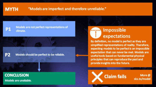
Finally, all models, weather or climate, have uncertainties associated with them. This doesn't mean scientists don't know anything - far from it. If you work in science, uncertainty is an everyday word and is to be expected. Sources of uncertainty can be identified, isolated and worked upon. As a consequence, a model's performance improves. In this way, science is a self-correcting process over time. This is quite different from climate science denial, whose practitioners speak confidently and with certainty about something they do not work on day in and day out. They don't need to fully understand the topic, since spreading confusion and doubt is their task.
Climate models are not perfect. Nothing is. But they are phenomenally useful.
Please use this form to provide feedback about this new "At a glance" section. Read a more technical version below or dig deeper via the tabs above!
Further details
Climate models are mathematical representations of the interactions between the atmosphere, oceans, land surface, ice – and the sun. This is clearly a very complex task, so models are built to estimate trends rather than events. For example, a climate model can tell you it will be cold in winter, but it can’t tell you what the temperature will be on a specific day – that’s weather forecasting. Climate trends are weather, averaged out over time - usually 30 years. Trends are important because they eliminate - or "smooth out" - single events that may be extreme, but quite rare.
Climate models have to be tested to find out if they work. We can’t wait for 30 years to see if a model is any good or not; models are tested against the past, against what we know happened. If a model can correctly predict trends from a starting point somewhere in the past, we could expect it to predict with reasonable certainty what might happen in the future.
So all models are first tested in a process called Hindcasting. The models used to predict future global warming can accurately map past climate changes. If they get the past right, there is no reason to think their predictions would be wrong. Testing models against the existing instrumental record suggested CO2 must cause global warming, because the models could not simulate what had already happened unless the extra CO2 was added to the model. All other known forcings are adequate in explaining temperature variations prior to the rise in temperature over the last thirty years, while none of them are capable of explaining the rise in the past thirty years. CO2 does explain that rise, and explains it completely without any need for additional, as yet unknown forcings.
Where models have been running for sufficient time, they have also been shown to make accurate predictions. For example, the eruption of Mt. Pinatubo allowed modellers to test the accuracy of models by feeding in the data about the eruption. The models successfully predicted the climatic response after the eruption. Models also correctly predicted other effects subsequently confirmed by observation, including greater warming in the Arctic and over land, greater warming at night, and stratospheric cooling.
The climate models, far from being melodramatic, may be conservative in the predictions they produce. Sea level rise is a good example (fig. 1).
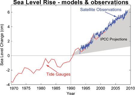
Fig. 1: Observed sea level rise since 1970 from tide gauge data (red) and satellite measurements (blue) compared to model projections for 1990-2010 from the IPCC Third Assessment Report (grey band). (Source: The Copenhagen Diagnosis, 2009)
Here, the models have understated the problem. In reality, observed sea level is tracking at the upper range of the model projections. There are other examples of models being too conservative, rather than alarmist as some portray them. All models have limits - uncertainties - for they are modelling complex systems. However, all models improve over time, and with increasing sources of real-world information such as satellites, the output of climate models can be constantly refined to increase their power and usefulness.
Climate models have already predicted many of the phenomena for which we now have empirical evidence. A 2019 study led by Zeke Hausfather (Hausfather et al. 2019) evaluated 17 global surface temperature projections from climate models in studies published between 1970 and 2007. The authors found "14 out of the 17 model projections indistinguishable from what actually occurred."
Talking of empirical evidence, you may be surprised to know that huge fossil fuels corporation Exxon's own scientists knew all about climate change, all along. A recent study of their own modelling (Supran et al. 2023 - open access) found it to be just as skillful as that developed within academia (fig. 2). We had a blog-post about this important study around the time of its publication. However, the way the corporate world's PR machine subsequently handled this information left a great deal to be desired, to put it mildly. The paper's damning final paragraph is worthy of part-quotation:
"Here, it has enabled us to conclude with precision that, decades ago, ExxonMobil understood as much about climate change as did academic and government scientists. Our analysis shows that, in private and academic circles since the late 1970s and early 1980s, ExxonMobil scientists:
(i) accurately projected and skillfully modelled global warming due to fossil fuel burning;
(ii) correctly dismissed the possibility of a coming ice age;
(iii) accurately predicted when human-caused global warming would first be detected;
(iv) reasonably estimated how much CO2 would lead to dangerous warming.
Yet, whereas academic and government scientists worked to communicate what they knew to the public, ExxonMobil worked to deny it."
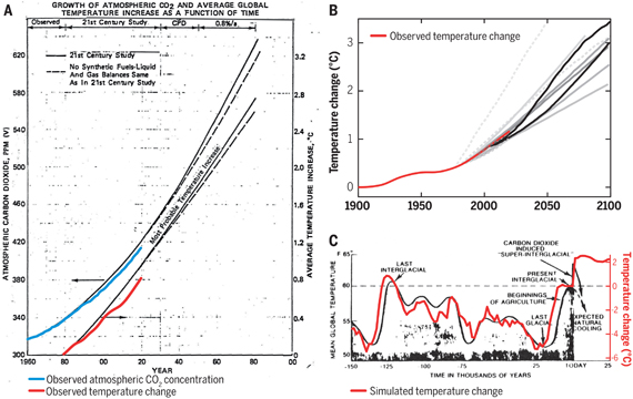
Fig. 2: Historically observed temperature change (red) and atmospheric carbon dioxide concentration (blue) over time, compared against global warming projections reported by ExxonMobil scientists. (A) “Proprietary” 1982 Exxon-modeled projections. (B) Summary of projections in seven internal company memos and five peer-reviewed publications between 1977 and 2003 (gray lines). (C) A 1977 internally reported graph of the global warming “effect of CO2 on an interglacial scale.” (A) and (B) display averaged historical temperature observations, whereas the historical temperature record in (C) is a smoothed Earth system model simulation of the last 150,000 years. From Supran et al. 2023.
Updated 30th May 2024 to include Supran et al extract.
Various global temperature projections by mainstream climate scientists and models, and by climate contrarians, compared to observations by NASA GISS. Created by Dana Nuccitelli.
Last updated on 30 May 2024 by John Mason. View Archives


@MARodger:
"...to happily junk 90% of it because it doesn't meet some level of precision..."
You're putting words in my mouth I didn't say. What I did say and have said all along is that the new ARGO data are much much better. Have you looked at the 5 year data point maps in question? I didn't bother reading your whole post, just as I didn't bother reading the last part of Tom Curtis #897 for the same reason, it's a none quantitative hectoring lecture.
@Tom Curtis #896:
I did a similar exercise, but using the quarterly 0-2000 OHC from 2005 to 2014 inclusive, calculating a rolling 5 year trend of delta GJ/yr and converting to W/m^2. The average of the W/m^2 for the rolling 5 year trend was 0.69 (OHC to 2000 metres is 0.56 W/m^2, corrected by .58/.47), very close to your 0.71. The average of a rolling mean of the CMIP5 RCP4.5 ensemble energy imbalance was 0.98 W/m^2, the same as your number. So our numbers agree over the most recent period. They both show the models are on the hot side.
You are correct the most recent few years the gain in OHC has pickup up.
I didn't bother reading the last part of your very long winded post #897. It didn't seem to have much quantitative content and if I wanted long hectoring lectures I would be posting somewhere else.
[JH] If you can't stand the heat, it's best you get out of the kitchen.
@Moderator #902:
"...[JH] If you can't stand the heat, it's best you get out of the kitchen..."
I'm happy to respond/discuss quantitative arguments. They are the only ones from which you learn something. My point was hectoring lectures are a waste of time for both the lecturer and the lecturee. Ultimately our opinions about other people can't change the numbers, can they? Opinion has a place in these technical discussions since oftimes the the numbers are highly subject to interpretation but repetitive judgements on the motive of your opponent is a kind of opinion that doesn't move the discussion forward. If anything they move the discussion backward since you're less likely to pay attention to someone who hectors you.
I came here as a respite from the monotony of righteous opinion at the Guardian, however here it's not much different. In some ways it's worse in that the technical blogs like Skeptical Science tend to be echo chambers and technical opinion, such as you find it at the Guardian, tends to be more free ranging than here.
Hopefully this opinion will be allowed by the moderators.
[JH] I believe it is time for you to move on to a different venue. You have exhausted our patience and have insulted both Tom Curtis and MA Rodgers. Posting on Skeptical Science is a privilege and not a right.
Klapper - After taking a look at your past comments, I would have to agree with scaddenp. You've apparently decided that CO2 warming, AGW, and all climate modelling are somehow incorrect, and have spent considerable time splitting hairs and decimal points attempting to find some reason to reject them.
Most recently you've been rejecting all OHC data before 2005, you've refused to consider recent volcanic activity that has presented a different actual forcing history than was run on the models, both accepted and rejected model drift in the same (contradictory) argument, making impossible claims for perfection by ignoring uncertainties, and have in essence dismissed the fact that models accurately project climate responses to forcings, which can be seen if you use historic forcings (Schmidt et al 2014, also discussed here).
In short, you've been rejecting every piece of evidence contrary to your conclusions while misinterpreting data you feel supports them. The best description I've seen of such confirmation bias is Morton's demon - IMO you are so afflicted, and quite frankly it's not worth the time to watch you run in circles.
Klapper @902, science is not arithmetic. Specifically, in science the numbers represent actual states in the world. They have meaning. If you base your arguments on rejecting or ignoring those meanings, as evidently you do, it makes discussion impossible. In this case, you ignore the fact that empirical values must be set by observation, and consequently (apparently) are distressed that I cite observational papers in support of a claim that a particular number has a particular value (897:1); are distressed that I find it necessary to explain the basic meanings of certain scientific terms, and how that relates to a simple quantitative argument (897:2); apparently are distressed about my pointing to a simple observational proof about the meaning of some data (897:3); and are further distressed by my again having to explain some very basic facts about models and their relation to the world (897:4). If you were distressed by my explaining these simple facts, be assured I was extremely annoyed that your logic chopping responses made it necessary. In all my impression is that you are keen to seize on numbers that you think "refute AGW", and are both happy to misrepresent those numbers by willful invalid comparisons (ie, comparing non-equal time periods) to exagerate discrepancies), apparently to leave out numbers that weaken your case (eg, the post 2010 NODC data), and above all, to ignore the meaning of the numbers if understanding it will require you to let go of your argument. If you wish to stop wasting my time by discussing science you clearly do not understand on SkS, be my guest.
Moderator Response @903.
I think accusing Klapper of being "insulting" is a bit strong. I would accept that refusing even to read a replying comment is outrageously discourteous. But my characterising Klapper's comments as "pretty-much wrong on every point" without explanation - now that could be construed as being insulting, although if asked I am happy to provide such explanation.
Klapper @901.
I do not see that I did put words in your mouth. You are on record as objecting to the statement "We have OHC data of reasonable quality back to the 1960s" by saying "I've looked at the quarterly/annual sampling maps for pre-Argo at various depths and I wouldn't agree that's true for 0-700 m depth and certainly not true for 0-2000 m. There's a reason Lyman & Johnson 2014 (and other stuides) don't calculate heat changes prior to 2004 for depths greater than 700 m; they are not very meaningful." If you are stating that pre-Argo 0-2000m data is certainly not of reasonable quality, that trying to use it would be not very meaningful, this can only suggest that you are saying it is not useful data and thus it is junk. And others elsewhere have inferred the same from less well defined statements of your position on pre-Argo OHC data, inferences that did not meet objection from you.
I have in the past seen the early OHC data point maps. Sparce data is not the same as no data, is it?
And if you don't read something, how can you know what it is saying? Indeed, was I "hectoring" @900?
Klaper at 903: BS. Tom Curtis and others make a number of substantive arguments backed by the litterature. If you don't want to address the arguments, it's likely because you can't do so without officially abandoning your pet theory. There is lots to be learned from lectures, by the way. And quantitative arguments have meaning only to the extent that we understand the quantities being argued. In this case, the quantities are physical. Physics always win, eventually.
All @90x:
I have been reviewing Hansen et al 2011 (http://www.columbia.edu/~jeh1/mailings/2011/20110415_EnergyImbalancePaper.pdf), and think it would be a useful exercise to update this paper with the very latest data on sea ice (from PIOMASS), continental ice melt (from GRACE), atmospheric heat gain (but from TLT, not surface temperature), land heat flux (let's use HadCRUT4 as the delta T flux driver). Here's my first step, atmospheric heat gain (the easy one), using Hansen's method and replicating his work with one slight difference, I used monthly rather than annual data.
You can see the 2 methods don't give a significant difference (you can cross-check my work against Hansen's Figure 12) . You can also see for the recent years, the the atmospheric input is close to zero for both GISS SAT as the delta T and RSS TLT.
Any comments? This looks like a weekend project, but a great learning opportunity all the same.
@Klapper 908:
In addition to the atmospheric component of global heat changes, I've worked up a graph showing the ice melt component. Arctic sea ice is from PIOMAS data, Greenland and Antarctica are from GRACE data and before that some "generic" estimates of ice mass loss for these 2 continental sheets. Antarctic ice melt is my own model based on average thickness and the delta in ice area. Crude but as you can see, either way ice melt is not a big component of the global heat flux equation.
Compare this with Hansen et al 2011 Figure 12. Ice melt is a very small contribution to the global TOA energy imbalance and recent increases in ice sheet melt are to a degree cancelled out by recent increases in global sea ice. Note I am using the same method as Hansen, a rolling 6 year trend to calculate ice mass changes, and thereby heat fluxs on a global TOA basis.
[RH] Reduced image site to fit page formatting.
Klapper @909.
Do remember there is significant land ice melting that isn't sat on either Greenland or Antarctica. See AR5 Figure 4.25 which suggests such sources added some 4,500Gt to ice loss in 18 years = 250Gt/y. That would add about 0.005 W/sq m to your totals.
@MA Rodger #910:
No, I hadn't forgotten it. I just don't have a database to calculate it from (that I know of). Neither do I know of a database which estimates minus 2000 m heat content. I think I will do my own calculations of the land heat flux, and present all what I have calculated so far (0-2000, sea ice melt, continental ice melt, troposphere heat gain/loss and present that total W/m^2 forcing. The truth is that some components, like montane ice melt are less than the thickness of the line on the graph at these scales (as becomes readily apparent when looking at either my graphs or Hansen et al 2011 Figure 12.
[JH] What exactly are you trying to accomplish with your calculations? What do they have to do with OP? Perhaps you should consider creating your own website to fully display what you are doing rather than expecting SkS readers to give you feedback on your "works-in-progress" on our comment threads.
Moderator Response @911.
The exercise being embarked on is described by Klapper @908 thus - "I have been reviewing Hansen et al. 'Earth's energy imbalance & Implications' (2011) and think it would be a useful exercise to update this paper with the very latest data."I am assuming this exercise addresses specifically Section 9 of that paper although I fear the selective intent indicated @911 suggests some part of the method employed in Hansen et al (2011) Section 9 is being airbrushed away. There is also some issues with the use of TLT, the use of global land ΔSAT for the Land Heat Uptake, etc. However, while this analysis is not being addressed with the rigour it requires, all the palaver is a tiny a bit pointless. The update will, after all simply show that net energy imbalance is still overwhelming recorded in ΔOHC(0-2000) which weighs in at roughly 1.0W/m2 (2010-2014) compared with 0.65W/m2 (1993-2010) & 0.42W/m2 (2005-2010) in Hansen et al (2011).
@MA Rodger #912:
"...suggests some part of the method employed in Hansen et al (2011) Section 9 is being airbrushed away..."
Hansen made an error in Section 9 of Hansen et al 2011. Here's his quote: "The third term is heat gain in the global layer between 2000 and 4000 m for which we use the estimate 0.068 ± 0.061 W/m2 of Purkey and Johnson (2010)."
The 0.068W/m2 from Purkey & Johnson is not for the 2000 to 4000 zone, but the 1000 to 4000 zone, only in the southern ocean, which means he is double counting some heat (1000 to 2000 in the southern ocean). The Purkey & Johson paper is clear about this, as is the text in Hansen et al 2011 elsewhere in the paper. Keep in mind since the J&P 2010 paper is showing neglible abyssal warming in the northern ocean (see Figure 8 in that paper), its not clear the 1000 to 2000 overlap in the southern ocean is a wash with the "missing" 2000 to 4000 in the northern ocean.
As for your last comment: "which weighs in at roughly 1.0W/m2 (2010-2014)", I checked the numbers and the W/m^2 is 0.89. However, keep in mind the model CMIP5 is still increasing and so the model projected imbalance average 2010 to 2014 is 1.04, plus sea ice has been gaining 2010 to 2014 so you have at least one of your factors going negative, albeit one of those that have negible leverage.
You've stated there are "problems" with using TLT as a calculator for net energy change in the atmosphere but surely it's better than what Hansen did which was to use a metric representing maybe the lowest 5 metres of the atmosphere. TLT and TMT combined would likely be the best and certainly more representative of the atmosphere than any SAT data set which has much poorer spatial/volume coverage.
As for land heat, I would not use Hansens method. I think actual data from the boreholes is better, than a heat flux model. Using the 2002 paper by Beltrami et al, the heat flux from borehole temperature profiles was .039W/m^2, but that is land only. If you calculate this to a global TOA basis (and delete the ice covered continents Greenland and Antarctica) you end up with an average heat flux into land of only 0.010 W/m^2, making it another neglible component of the global energy balance. The recent decadal flattening of the surface temperature would indicate land heat flux is likely no higher now than the 1950 to 2000 average which is the basis of the Beltrami number.
In summary, my point was that the models run too hot. It is true that recently OHC gains come close to the model TOA imbalance, but then that happened back in 2002-2003 also and then the rate of ocean heat gain faltered somewhat. The bottom line is that even now, using very short periods to estimate the imbalance, the projected TOA imbalance of the models is higher than the actual TOA global energy imbalance as best we can calculate them.
Klapper @913, you are mistaken about Purkey and Johnson. Specifically, while they mention 0.027 W/m^2 below 4000 meters globally, and 0.068 below 1000 meters "south of the Subantarctic Front of the Antarctic Circumpolar Current" in the abstract, in table 1 they also mention 0.068 W/m^2 globally for below 2000 meters. That the two values coincide does not make it a mistake to use the second figure (from table 1) in estimated OHC change below 2000 meters.
Indeed, Purkey and Johnson quantify the below 1000 meters Antarctic change in OHC because prior estimates of OHC failed to determine the change in polar waters. Ergo, arguably, the 0.032 W/m^2 between 1000 and 2000 meters in the Antarctic should also be added. Indeed, Purkey and Johnson do in fact argue that in the conclusion, estimating that the total contribution from Antarctic Bottom Water (ABBW) to be 0.1 W/m^2 globally averaged. Therefore Hansen may have underestimated additional contribution to OHC based on Purkey and Johnson's paper. Whether he has or not depends on exactly which 0-2000 meter estimate he used, and whether or not it included the 0-2000 meter warming in the Antarctic.
@Tom Curtis #914:
"...in table 1 they also mention 0.068 W/m^2 globally for below 2000 meters..."
If that's the case then Hansen has still made a mistake has he not? He used 0.068W/m^2 for 2000 to 4000, but that number is from 2000 to bottom is it not? In other words he double counted the 0.027W/m^2.
@All #91x:
Here is a graph of the total inputs. OHC 0-2000 is from NODC, pentadal in the early years and quarterly since 2005, land is from Beltrami et al 2002, > 2000 m OHC is from Purkey & Johnson, ice melt is from PIOMAS/my own model for Antarctica sea ice, Ice sheet melt is from GRACE and earlier some generic Wikipedia numbers, atmosphere is from RSS TLT. I started using 5 year trends, then switched to 6 since that is what Hansen used, but then switched back to 5.
Five years might still be a bit short. OHC seems susceptible to even quarterly steps in the rolling trend. For example the 5 year trend centered on August of 2012 is 0.89 W/m2, while May of 2012 is 0.80 W/m2. I think this is the effect of ENSO causing wobbles in heat gain.
Klapper @915, that is far from obvious. Specifically, Purkey and Johnson write:
That is exactly what Hansen did, and as he was following the recomendation of Purkey and Johnson, prima facie he was correct to do so. Further, Levitus et al (2009), from which Hansen obtains his 0-2000 meter data, write:
That appears to suggest that like Levitus et al (2005) (of which Levitus09 is an update), Levitus et al (2009) does not include OHC for the Southern Ocean.
If you want to make the case that the 1000-2000 meters of the Southern Ocean from Purkey and Johnson should not be included, you need to show either by obtaining a definitive statement from Levitus, or by comparing the gridded data, that Levitus et al (2009) included 0-2000 meter data for the Southern Ocean. Absent that, and given that excluding warming through too sparse sampling is as much of an error as including too much by double dipping, it appears that Hansen has proceeded correctly.
Finally, even if he has inadvertently "double dipped" the error involved is appreciably less than the error of the total calculation, and less than the error you made in correcting him @913.
@Tom Curtis #917:
"...and less than the error you made in correcting him @913.."
I didn't actually correct him at 913; I stated I thought he was double counting but did not quantify the amount he was double counting by. However, in my graph presented in #916, I use the 0.068W/m^2 as the total below 2000 metres, as per Purkey & Johnson Table 1, and elimate the 0.027 W/m^2 for the > 4000 m component of heat gain, so my assumption for heat gain since 1990 in my graph is that > 2000 m OHC gain = a constant 0.068W/^2.
Klapper,
I would caution you to slow down with your inputs into this comment thread and consider what you are responding to, rather than bash out the first rebuttal that come into your head.
As an example of this, your response @913 began @910 with my noting that you are ignoring mountain glaciers which you indicate @911 you are happy to do yet @912 I call it 'airburshing away part of the method.' Your response @913 sets out with this in mind but fails to deliver. Instead we get an account of what you see as failings in Hansen's analyses.
The moderator response @911 suggested it was inappropriate for you to be posting such this work-in-progress down this thread. Given these recent responses of yours are proving so inadequate, I am inclined to agree.
Perhaps then it would be better to ignore direct comment on your analysis and rather ask why you feel any result that were obtained has any bearing on what you call "my point was that the models run too hot."? I ask this becuse you could well be setting yourself to support the opposite.
@MA Rodger #919:
"...with my noting that you are ignoring mountain glaciers..."
As you pointed out the montane glacier effect was insignificant to the graph I was producing, being 0.005 W/m^2.
"...The moderator response @911 suggested it was inappropriate for you to be posting such this work-in-progress down this thread..."
The moderator can delete my posts if it's inappropriate. I'll consider this project done and won't however post my next project which is to compare TOA net forcing with ENSO, the AMO and the PDO.
"... I ask this becuse you could well be setting yourself to support the opposite..."
I like to post numbers and let people decide for themselves. I still think the models run hot after this exercise. The average error on the over the last 35 years, model TOA forcing to OHC et al is +0.27 W/^2, so the models are definitely warmer in this analysis period.
In your #912 post you state OHC to 2000 metres weighs in roughly at 1 W/m2, but I disagree. The actual number is 0.89 for a trend centred on Nov 2012 and 0.80 for a trend centered on August 2012. However, I think the issue with your choice of period is that it starts with a strong La Nina and ends with an El Nino (which I intend to investigate further). So is it representative of longer term forcing elements?
[JH] Please do not use the SkS comment threads as a "blackboard" for your next project.
@Rodger MA #919:
There is on point on my graph where the models do seem to make more sense than the empirical data, namely the early 90's when the model shows a sharp TOA forcing reduction due to a 2 W/m^2 spike in upwelling shortwave.
Klapper @920.
You write "I like to post numbers and let people decide for themselves" which is rather generous of you. But you do also present an opinion, writing "I still think the models run hot after this exercise." This implies that in light of your "exercise" you see nothing to contradict your contention that "models run hot." Indeed, you go on to argue that your "exercise" lends support to your 'hot model' thesis. "The average error on the over the last 35 years, model TOA forcing to OHC et al is +0.27 W/^2, so the models are definitely warmer in this analysis period." (My emphasis)
But your 'hot model' thesis is surely to do with the modelled global temperatures being too hot due to their modelled temperature rising too fast. Wouldn't such a 'hot model' not run with reduced TOA energy balance?
@MA Rodger #922:
"Wouldn't such a 'hot model' not run with reduced TOA energy balance?"
If the TOA energy balance was zero (incoming = outgoing), we would for that instant be neither gaining nor losing energy, so although there may be temperature change by heat transfer from one global heat sink to another, total global heat stays the same. An AOCGC model with a positive TOA imbalance (incoming > outgoing) is gaining heat, either in the atmosphere or the ocean, or ice conversion to water (or all three), but it's unlikely you would not see a temperature rise in both the ocean and the atmosphere over longer periods. The higher the positive imbalance the faster the temperature rise, although SAT rise is obviously subject to the percentage of heat sinking into the ocean vs. the atmosphere.
In fact this is what we see in SAT. Over the last 35 years the ensemble modelled temperature rise is 0.25C/decade, while SAT only rose about 0.15 to 0.18C/decade depending on SAT dataset. So both the TOA spread from model to empirical and the SAT warming rate spread agree the models look to be running too hot.
Klapper @923.
You conclude "So both the TOA spread from model to empirical and the SAT warming rate spread agree the models look to be running too hot." but your inclusion of "TOA spread" in this statement is entirely unsupported.
Imagine a world and a model-of-that-world with the model running hot. We impose forcings of equal size onto both. The model SAT rises faster because it runs 'hot'. But all things being otherwise equal, that would reduce the TOA imbalance as a higher SAT leaches more energy back into space. Thus my comment questioning whether high TOA could not be seen as a symptom of a 'cool' model.
But in climatology, things are never 'otherwise equal'. A 'hot' model with increased SAT presumably results in higher 'forcing levels' due to higher positive feedback. Now if the world & the 'hot' model had an SAT that were equal, their conforming increase in SAT would have equalised different proportions of the initial forcing as the level of feedback is different. In the model because of the larger feedbacks, this equalisation will be less - there will be more of the forcing remaining - more TOA imbalance. So we can propose that the TOA imbalance would differ because proportinately less forcing would be equalised in the model. The difference would be most dramaitc in a 'well-equalised' situation, where most of the forcing has been equalised. But let us assume the forcing is roughly half equalised in the world with the 'hot' model showing 33% more TOA imbalance, 33% less forcing equalised, but the same SAT. This implies ECS in the model is 50% too high.
But if in the model both TOA imbalance were higher and SAT were higher (this last the Klapper definition of a 'hot model' and exemplified by the CMIP5 projections 2006-2014) , ECS would have to be now greatly different to balance the books. @923, a value is suggested for the model ΔSAT = 150% of world values yielding a model:world ECS of 2.25:1. But this does not actually relate to the post-2006 period. To compensate for both TOA imbalance and the differences in SAT we are therefore talking, what, ECS proportionately 3:1, 4:1, more.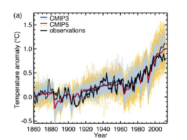
Given the CMIP5 models perform well prior to 2006, is it then at all likely that ECS in the models is so wrong? So how can we simply attribute the post-2006 performance to them being 'hot models'?
This is what a regular contributor to the Telegraph web site has to say.
" . . . the IPCC pseudoscience is based upon 54 years' teaching of incorrect physics.
It all came from Carl Sagan who made 4 basic mistakes but was supported in the Cold War Space Race.
Atmospheric Science then invented spurious physics which it uses to justify the Perpetual motion machine in the models but there is zero experimental proof.
I come from engineering where heat transfer has 90 years of experimental and theoretical proof. it's easy to see where Hansen et al went wrong but they were mentored by Sagan."
Did Sagan make 4 basic mistakes?
Thanks.