


 Arguments


Does CO2 always correlate with temperature (and if not, why not?)
What the science says...
| Select a level... |
 Basic
Basic
|
 Intermediate
| |||
|
Surface temperature measurements are affected by short-term climate variability, and recent warming of deep oceans |
|||||
Climate Myth...
There's no correlation between CO2 and temperature
"Twentieth century global warming did not start until 1910. By that time CO2 emissions had already risen from the expanded use of coal that had powered the industrial revolution, and emissions only increased slowly from 3.5gigatonnes in 1910 to under 4gigatonnes by the end of the Second World War.
It was the post war industrialization that caused the rapid rise in global CO2 emissions, but by 1945 when this began, the Earth was already in a cooling phase that started around 1942 and continued until 1975. With 32 years of rapidly increasing global temperatures and only a minor increase in global CO2 emissions, followed by 33 years of slowly cooling global temperatures with rapid increases in global CO2 emissions, it was deceitful for the IPCC to make any claim that CO2 emissions were primarily responsible for observed 20th century global warming." (Norm Kalmanovitch).
At a glance
If you happen to be reading something about climate change in the popular media, be sure to keep an eye out for certain words. The one in this case is 'deceitful'. Why? Because it's an emotive word. It's a good sign that the writer is not a scientist but someone with a political axe to grind.
The heat-trapping properties of carbon dioxide, water vapour and other greenhouse gases were identified over 160 years ago. After that, climate research continued unhindered for many decades. However, by the second half of the 20th century the seriousness of the threat of climate change was well-understood. That led in due course to the involvement of bodies such as the United Nations. Treaties such as the Kyoto Protocol of 1997 followed.
In response, the fossil fuels sector and their political and media associates, perceiving threats to profitability, turned climate science into a political football. With climate science thus politicised, the arena within which research and outreach were conducted had changed. This was no longer a quiet backwater.
That's the historical context. Now we can get to the meat of the myth. The quote above this piece dates from September 2009. Apart from anything else, it's 14 years out of date now. Globally, the ten warmest years since 1880 have all occurred since the statement was made. According to NASA’s Goddard Institute for Space Studies, the average global temperature has increased by 1.4° Celsius (2.5° Fahrenheit) since 1880.
However, global temperature does not correlate exactly with CO2 emissions on a year in, year out basis.There are other well-understood factors that can warm or cool the climate over such short-term periods. You may have heard of El Nino and La Nina. These phenomena involve above- or below-average sea surface temperatures respectively, in the central and eastern Pacific Ocean. Their effects are global.
A strong El Nino can produce a massive global temperature-spike. Such very warm years once led to people making the claim of, "no warming since 1998". Briefly sounding plausible for a few years, it soon became self-evidently incorrect.
Instead, the correct way to look at temperature trends is to examine them over multiple decades - 30 years is standard in climate science. So to answer the question, "where are we now?", one would look at the temperature record from 1992-2022. Doing so takes out the noise, the ups and downs due to El Nino, La Nina and other factors. And the trend is most certainly upwards.
To the newcomer to climate science, it can be difficult to spot misinformation. However, opinion-pieces that accuse bodies such as the Intergovernmental Panel on Climate Change (IPCC) of intentions like deceit should instantly ring alarm-bells.
It is important to point out that the motive for such political misinformation is to spread confusion and doubt. The organisations behind it simply seek delaying any meaningful action. In kicking the can down the road, they try to deflect the pressure to get their own houses in order, and to hell with the consequences.
Please use this form to provide feedback about this new "At a glance" section. Read a more technical version below or dig deeper via the tabs above!
Further details
The amount of CO2 in our atmosphere is increasing all the time. On February 26th 2024, according to the monitoring resource Daily CO2, it had exceeded 425 parts per million (ppm). That's up by 3.96 ppm since the same time last year - but more importantly, up from around 280 ppm before the industrial revolution - a 50% plus increase.
Pre-industrial levels of CO2 and other greenhouse gases, like methane and water vapour, were sufficient to keep the Earth’s surface 30°Celsius (54°F) warmer than it would have been without them. Since then, we have added 50% more CO2 - but that doesn't mean the temperature will go up by 50% too.
There are several reasons why. Doubling the amount of CO2 does not double the greenhouse effect. The way the climate reacts is also complex and it can be difficult to separate the effects of natural changes from man-made ones over short periods of time.
As the amount of man-made CO2 goes up, temperatures rise but not at the same rate. Estimates vary - climate sensitivity is a hot topic in climate science, if you’ll forgive the pun. Based on multiple lines of evidence, according to the IPCC Sixth Assessment Report (2021), the "very likely range [for climate sensitivity to doubling of CO2] is 2°C to 5°C".
So far, the average global temperature has gone up by about 1.4 degrees C (2.5 F).
"In 2023, hundreds of millions of people around the world experienced extreme heat, and each month from June through December set a global record for the respective month. July was the hottest month ever recorded. Overall, Earth was about 2.5 degrees Fahrenheit (or about 1.4 degrees Celsius) warmer in 2023 than the late 19th-century average, when modern record-keeping began."
Source: NASA.
The speed of the increase is worth noting too. Unfortunately, as this quote from NASA demonstrates, anthropogenic climate change is happening very quickly compared to changes that occurred in the past (text in bold for emphasis):
"As the Earth moved out of ice ages over the past million years, the global temperature rose a total of 4 to 7 degrees Celsius over about 5,000 years. In the past century alone, the temperature has climbed 0.7 degrees Celsius, roughly ten times faster than the average rate of ice-age-recovery warming."
Source: NASA Earth Observatory.
Small increases in temperature can be hard to measure over short periods, because they can be masked by natural variation. For example, cycles of warming and cooling in the oceans such as the El Niño-Southern Oscillation (ENSO) cause temperature changes that can mask small changes in temperature caused by CO2 emissions that occur at the same time. That's why scientists measure changes over long periods so that the effects of short natural variations can be distinguished from the effects of man-made CO2.
The rate of surface warming varies year by year, yet the physical properties of CO2 and other greenhouse gases do not change. Neither has the amount of energy arriving from the sun changed significantly in recent decades. But if that’s true, where is this heat going?
The answer is into the oceans. Fig. 1 is a graphic showing where the heat is currently going:
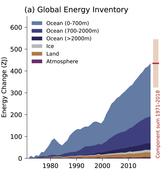
Figure 1: Global Energy Inventory: observed changes in the global energy inventory for 1971–2018 (shaded time series) with component contributions as indicated in the figure legend. Cross-Chapter Box 9.1 Figure 1 (part a) - From IPCC AR6 WGI Chapter 9.
The way heat moves in the deep oceans was poorly understood up until around the turn of the millennium. Since then, vast improvements in measurement techniques, such as the Argo float system, have allowed scientists to far more accurately gauge the amount of energy the oceans are absorbing. Argo floats, numbering several thousands, weigh 20-30 kilograms and are packed with instruments. They typically travel through the oceans around a kilometre below the surface. But they can rise up to the surface or dive down to 2 km. That makes it possible to collect profiles in terms of temperature, salinity and other parameters. So far, over two million such data-profiles have been collected.
Argo data have shown the upper 2,000 metres of the oceans has captured roughly 90% of the anthropogenic change in ocean heat content since the programme started in 1999. Temperatures in the upper 600 metres have been seen to fluctuate with shorter-term climate events like El Niño-Southern Oscillation. In deeper waters, however, there is a more consistent warming trend. In summary, the 700–2,000 metres ocean layer accounts for approximately one-third of the warming of the whole 0–2000 m layer of the World Ocean being mapped by the Argo floats.
So we know that the energy added to the climate system by man-made CO2 is not only apportioned into surface warming, because a large part of the heat goes into the oceans. The rate at which surface temperatures go up is not proportional to the rate of CO2 emissions but to the cumulative total amount of atmospheric CO2. Only by looking at long-term trends - 30 years is the standard period in climate science - can we measure surface temperature increases accurately, and distinguish them from short-term natural variation.
Last updated on 10 March 2024 by John Mason. View Archives


#125 Thanks so much, Tom, for the very thorough explanation, and the corrected scatterplot. Maybe my eyeballs are deceiving me, but I see more or less the same picture as in Wolfe's scatterplot. Random until roughly 340 ppm, correlated until roughly 380, and then random again — with a bit of a spike after 400. What do you see?
victorag @126, for any scatter plot where the data has a correlation less than 1, and conforms approximately to a linear trend, if you take a small section of the total data measured by distance along the x-axis, the subsection of the data will look like it has a much smaller correlation. That only indicates that by using a small section of the data you are maximizing the noise to signal ratio. Because the temperature noise is autocorrelated, the small subsection may give the appearance of a very different trend, but again that is just a product of cherry picking.
If you want to find a genuine divergence from the scatter plot, you need to find a significant body of data that lies more than two standard deviations from the trend line. In this case, that means +/- 0.3 C relative to the line 0.0094X - 3.05. For the demarcated x values, this gives parameters of:
X value Mean -2 SD +2 SD
300 -0.23 -0.52 0.06
320 -0.05 -0.34 0.24
340 0.14 -0.15 0.43
360 0.33 0.04 0.62
380 0.52 0.23 0.81
400 0.71 0.42 1
420 0.89 0.6 1.18
A quick check shows that there are no major clusters of points lying outside the +/- 2 SD limits, and hence no reason to assume a break point in the trend.
We can take this further by extending the data using that from Law Dome. Unfortunately when we do so we are limited to annual values generated by a 20 year spline smooth for CO2, and hence annual values for temperature. That artificially inflates correlation, but not by much given the small variance of CO2 to begin with. It has no effect on trends. So, having done so we find the trend is 0.0097 X - 3.13. The values are within two standard errors of the predicted trend and intercept based on the Mauna Loa data, and are minimally divergent in absolute values. That indicates the observed trend in the Mauna Loa/Temp scatter plot is robust, and has been in effect since 1850 at least. Given that, looking to subdivide the Mauna Loa data is clearly not justified (and not justified on two distinct tests).
There are reasons for a slight visual distinctiveness in the two regions you point out. Specifically, both the rate of increase in CO2 concentration and in temperature have tended to increase over time. This results in the points being more densely scattered on the left of the graph than on the right. This is even more apparent on the Law Dome scatter plot. As it happens there was an acceleration in the increase in CO2 concentration about when CO2 concentration reached 340 ppmv, which accounts for the denser plot below that level. Near 400 ppmv the distinctive appearance results from the reduced linear least squared error fit for temperature (ie, not the underlying trend, but the superficial trend) followed by the spike in temperatures starting around 2013. That reduced superficial trend, however, does not carry the temperature values outside 2 standard deviations of the y estimate, however, and therefore is irrelevant unless it were to continue and carry the values outside that range. Of course, with the recent spike in temperatures it has patently not done so.
(from this site www.walkersands.com/Blog/climate-change-in-the-age-of-google/)
#127 So, Tom, what you are saying is that the congruence I see between these two graphs is a meaningless optical illusion?
One other thing. Your correltion of 0.857 covers the entire scattergram, which was not the point. The claim is that three different scattergrams are represented, the first showing little to no correlation, the middle showing significant correlation and the last also showing no significant correlation. That's what I see in both Wolfe's graph and yours. And if there's a problem assigning a statistically derived value to each of these because they're too short, then as I see that's a problem with the statistical methodology, not with our ability to evaluate the data per se.
#127 P.S.
Tom, if you go to the SkSc trend calculator, setting the start date to 1960, the end date to 2016, and the moving average to 0 — and select HadCrut4, you'll see a more up-to-date representation that's even closer to your scattergram.
Concerning the bogus nature of the Danley Wolfe graphic introduced into this discussion by Victor Gauer (but on the wrong thread).
May I introduce my own graphic of three panels that illustrates the bogus nature of Wolfe's analysis, my graphic linked here (usualy 2 clicks to 'download your attachment')
The top panel reproduces Wolfe's data plot, LOTI (I actually use LOTI as published in May 2014 - what should have been the Wolfe data - it is very close to Wolfe's data and indestinguishable for the data most recent to May 2014) plotted against MLO CO2. Note Wolfe repeatedly says he uses GISTEMP Met Station data but he is obviously wrong. He uses LOTI but adds 14ºC to the values. He calls this "absolute" rather than an anomaly although it is simply the anomaly shifted by 14ºC so not the monthly "absolute" values.
Added to the Wolfe data is the LOTI data for June 2014-to-date as published today. The annual CO2 cycle (unlike the annual LOTI cycle) remains as per Wolfe's plot. Its inclusion has no physical justification, just as retaining the annual LOTI cycle would have no physical justifictaion. Its inclusion is patently wrong.
The central panel plots the same data but adds a trace using 12-month averages for MLO CO2 and a red trace that additionally uses the 12-month averages for temperature. As the rate of increase in CO2 has been rising over the decades, the red trace is effectively the LOTI time series but with the early years squished up and the later years stretched out. The ratio of most-squished:most-stretched is about 1:3. So conpared with the more normal time series plot of LOTI, this CO2-series plot will markedly eccentuate any slowdown in the LOTI record during the later years.
The third panel introduces the trend lines drawn on by Wolfe (the black trace). The flat part of the trend for the later years is not calculated as Wolfe describes. Wolfe's "1998-2014" result can be reproduced (down to the "158 observations") using May 2014 published data and the period 4/2001-5/2014. The other flat trend for the earlier years is undescribed by Wolfe. Importantly, the sloping trend Wolfe shows joining the flat eary section to the flat later section cannot be the result of any analysis. It is probably drawn fancifully simply to connect the top and bottom flat trends. It is entirely bogus.
The yellow trend is the OLS trend for Wolfe's data through the middle part of the data with the narrower yellow lines extending that trend to the ends of the data. The OLS trend for the entirety of Wolfe's data is represented by the white plot and is very little different from the full-length yellow trend plot. It is thus evidently bogus to attempt to argue that there are any periods either at the start or at the end of this data with significantly lower trends. Yet Wolfe does just that!!!
#130 MARodger. Thanks very much for going to all this trouble, MA. I won't respond in detail for the usual reason, so all I'll say at this point is:
I see what Wolfe sees.
[JH] The discussion of scatter plots has now run its course. It's time to move on to other topics.
#121 MARodger:
What Lovejoy's Figure 3a represents to me is how easily data can be distorted to support just about any theory, providing one is clever enough to adroitly juggle the statistics. And of course Lovejoy is not alone. I see this sort of distortion everywhere in the cli. sci. literature.
For some examples see the following list.
It wouldn't be so bad if the various attempts reinforced one another or were even consistent with one another, but in most cases they are not. Extraordinary claims require extraordinary evidence. It's not enough to pull a few rabbits out of a hat. The evidence must be there, it must be clear and it must be objective. While highly complex and even convoluted technical discussions are appropriate in a purely scientific paper, it should be possible to boil all that down into a clear and simple explanation that any educated person can understand. And no, simply reiterating over and over that "climate change is real" won't do.
[JH] Sloganeering snipped.
[DB] This participant has recused themselves from further participation in this venue, finding the burden of complying with this venue's Comments Policy too onerous.
MA Rodger & Tom Curtis:
Because Victor cannot abide by the SkS Comments Policy, he has relinquished his privilege of posting comments on this site. Therefore, please do no post any new responses to him.
Thank you.
Elsewhere, I have noted that:
My respondent, like victorag above, refused to accept the mathematical results based on their eyeballing of the timeseries of the CO2 concentration data plotted alongside the temperature data. They also insisted that the UAH TLT v6 was, despite being still in beta, the "gold standard of temperature records", a claim in stark contradiction to the evidence. Despite this, I thought it would be instructive to run the regressions over the UAH TLT v6 beta 5 vs the Mauna Loa monthly data. Before doing so, I converted the Mauna Loa data to anomaly values, both to eliminate the seasonal cycle and because the UAH data was also in anomaly values (and hence without a seasonal cycle).
Regressing temperature against CO2 forcing, we obtain a result of 0.43 +/- 0.06 C/(W/m^2) with a correlation of 0.556 and an R-squared of 0.309. That regressed value indicates a transient climate response of 1.59 +/- 0.22 C per doubling of CO2, a value well within error of the 2.29 +/- 1 C per doubling of CO2 from the Mauna Loa data (the highest value obtained). The shorter time span and greater perturbation of the satellite record by ENSO fluctuations, however, does reduce the proportion of the variation explained by the change in CO2 concentration (as shown by the smaller R-squared).
AGW deniers typically argue, in the face of this sort of data, that the correlation is a function of the temperature impact on the CO2 concentration, or growth in the CO2 concentration - ie, that the analysis has causation reversed. However, regressing CO2 concentration against temperature gives results of 49 +/- 7 ppmv/oC (Correlation: 0.552; R-squared: 0.305). On the surface, and given the trend increase of 0.41oC over the period analyzed, that would mean temperature accounts for just 19.9 ppmv of the trend 64.6 ppmv increase in CO2 concentration over that period. In contrast, based on the regression, CO2 forcing accounts for 0.404 of the 0.405oC trend temperature increase. In short, temperature explains CO2 concentration far worse than CO2 forcing explains temperature. It is likely that apparent forcing of CO2 concentration by temperature shown by the regression is an artifact of CO2 forcing causing the increase in temperature, particularly given that it is at least twice the value shown in other situations where we know change in temperature drives the increase in CO2, such as durring the glacial/interglacial cycle.
dCO2 concentration is even worse, showing a regression of 0.06 +/- 0.18 ppmv/oC (Correlation: 0.03; R-squared: 0.001). That is, the values are neither correlated, nor stastically significant, although it is possible better results might be obtained with suitably lagged values.
In summary, the evidence remains that there is a strong correlation between CO2 and/or CO2 forcing and temperature, and that correlation is primarilly driven by changes in CO2 concentration driving changes in the Earth's GMST.
Nigelj @ 28 I appreciate the opportunity to explain the design of my linear regression.There are scientific concerns and statistical concerns. When there are known laws of physics you don’t have to use statistical analysis to generate coefficients for calculating the effect of carbon dioxide on air temperature. But in order to calculate the effect that air temperature has on the quantity of carbon dioxide in the air we do. We know that colder water absorbs carbon dioxide at a faster rate than hotter water. Assuming that water temperature and air temperature annually globally vary together we can model that if air temperature goes down the water temperature will go down also and absorb more carbon dioxide. If that assumption is wrong the regression coefficient will tell us with a change of sign. I assume that all of the gross increase in carbon dioxide emissions each year comes from humans burning fossil fuels and other organic material. Since more than average carbon dioxide is being absorbed we think the net growth in carbon dioxide left in the air will be decreased. On the other hand if the air temperature is higher than normal we assume that the water temperature will be higher and that less carbon dioxide will be absorbed. Then the annual growth in carbon dioxide in the air will be larger. To be scientifically correct we have to model changes in the magnitude of the annual increase of carbon dioxide as a function of the air temperature. This makes carbon dioxide the dependent variable and air temperature the independent variable. If we use anomalies as the measure of temperature around the 1981 to 2010 baseline, on the graph of the regression results 0.0 on the x axis will also represent when the anomaly is 0.0. The statistical consideration is that when dealing with time series data and the quantities are autocorrelated the scatter of plots is not a random sample. This problem was avoided by modeling dC for carbon dioxide and anomalies for temperature. Also when it is obvious the variables are correlated with a third variable time you have a multicolinearity problem. Modeling dC and T anomalies avoids this problem also. If you graph the regression, the sloping line wii intersect the y axis at 1.7. This means when the anomaly is 0.0oK the carbon dioxide growth is 1.7ppm/yr. If the temperature anomaly is higher the carbon dioxide growth rate is higher. If the temperature is lower the growth rate is lower. 58% of the variation in the growth rate per year of carbon dioxide is explained by the earth’s air temperature. Between 1979 and 2011 the mean growth was 1.7ppm per year. The regression coefficient says if the air temperature goes up 1.0oK the growth rate of carbon dioxide will go up 1.94ppm/yr for a total of 3.64ppm/yr.
I took time away from my mission because I wanted to prove that I know my science by evaluating Tom Curtis’s carbon dioxide sensitivity coefficient linear regression. I want to tie things up on this subject. Tom Curtis said the GMST is a proxy for air temperature. 70% of GMST temperatures are ship log sea surface temperature. We already know ocean temperature is the primary determinant of carbon dioxide absorption. From a practical point the variation in the data for Tom’s dependent variable comes from the world’s sea surface temperatures. On the independent variable, carbon dioxide radiative forcing is a close derivative of the change in carbon dioxide per year. In essence, regardless of the labels he put on the variables he was regressing sea surface temperatures against the change in carbon dioxide per year. The order of causation is wrong but the attained R2 is the same.
To all between 26 and 33 two corrections: I used UAH Mid Troposphere. I think channel 4 was down in 1912 when I sent this to Dan Lashof at the Natural Resources Defense Council.
There is a typo I need corrected at line 16 for john warner @22 Change, did conform, to did not conform.
My source for the earth’s average annual global surface air temperature of 281.92oK, is NASA 2010 CERES Earth Energy Budget. Notice absorbed by atmosphere is 358.2wpsm. The Stefan-Boltzmann Law Calculator yields an average annual global surface air temperature of 281.92oK.
https://science-edu.larc.nasa.gov/energy_budget/pdf/Energy_Budget_Litho_10year.pdf
I have enjoyed the challenge of communicating on Skeptical Science. I learned a lot.
Note concerning john warner @135 & @136.
These two comments are copies of comments first posted on this comment thread which is also where the referenced previous comments can be found.
john warner @135 & @136.
It is good that you enjoy the challenge. Perhaps you can communicate to us your reasons for considering that "the earth’s average annual global surface air temperature" can be calculated in the manner presented @136. In particular, what possible relevance does an estimated 358.2W/sq m average radiative energy flux between surface & atmosphere have to establishing such a temperature. (I am conscious that this was described as being a rhetorical subject of discussion on the previous thread and this off-topic and that it remains so on this thread.)
And would you communicate your reasoning for suggesting @135 that your methods avoid the problems of autocorrelation as they patently do not.
MA Rodger @ 138 If you do a runs test on carbon dioxide you get all positive changes from one data point to the next. If you do a runs test on changes in carbon dioxide you get a nice scatter of pluses and minuses. Which proves Tom Curtis linear regression data is autocorrelated data. But I also explained that is the least of the problems with is carbon dioxide sensitivity coefficient.
It is not your fault that you misinterperted the earth energy budget. The presention is intentionally misleading. The back radiation 340.3 has no corresponding physical scientific meaning. It is composed of emmitted by atmosphere 169.9 W/m2, plus emitted by clouds 29.9 W/m2, minus greenhouse gases 17.9 W/m2, (not even shown) and the increase in radiative forcing of the surface air by the 12 tons of air above every square meter 158.4 W/m2. (169.9+29.9-17.9+158.4= 340.3). In 1992 I wrote a 42 page paper which my congressman circulated to the relevant commmitties and submitted into the congression record based upon the misleading presentation of absorbed by atmosphere that confused you. I didn't like being tricked into making a fool of myself. That is why I self-educated myself so I can't be fooled again. I am dedicating a lot of my time on Skepticel Science to help those who are making a good faith effort to understand the real science of global warming.
398.2 W/m2 is the radiation power per square meter of the earth surface. Using the Stefan-Boltzmann Law Equation the temperature of the earth surface is 289.48oK. 358.2 W/m2 is the radiation power per square meter of the earth air at the surface. The earth air temperature is 281.92oK at the surface. The difference is 7.56oK. This means that 40.1 W/m2 of the surface power is not absorbed by the air and radiated directly to space.
The CERES mission proves that weather station data is not accurate. If something as simple as his was not settled when AlGore won the noble prize maybe CAGW was not settled either.
The information contained in the earth energy budget is excellent, you just have to know how to draw inferences about the real world from the budget.
john warner @139:
1)
The claim here is that, for each data point in a time series of CO2 concentration, the next data point is higher (all positive changes); but that the series x = CO2(i) - CO2(i-1) gives a variety of positive and negative values ("a nice scatter of pluses and minuses"). I hope I am not alone in seeing the straight forward contradiction in that claim. Perhaps john warner means to claim that ΔCO2 is always positive, while Δ(ΔCO2) provides a scatter of positive and negative values. If so, the point is irrelevant to autocorrelation, which is not a function of slope.
2) Here is the energy budget to which john warner refers:
It is NASA's own estimate comparison of the peer reviewed estimates by Loeb et al, and Trenberth et al, (2009). Of this, john warner says, "The back radiation 340.3 has no corresponding physical scientific meaning" despite the back radiation being an observed quantity from many locations around the Earth.
The back radiation is IR radiation from greenhouse gases (including water vapour) and the cloud base. It's flux is less than that of the surface because it comes on average from a slightly higher altitude than the surface, and hence (because of the lapse rate) a slightly cooler layer than the surface. john warner's decomposition is a fiction.
3) With regard to the energy balance and GMST, because the energy flux is a function of the fourth power or temperature, the mean value of the energy flux does not directly correspond to the mean value of temperature unless the temperature at all points is identical. Trenberth, Fasullo and Khiel (2009) discuss this issue in the special section on "Spatial and temporal sampling" (page 315). Deriving the Global Mean Surface Temperature from the Stefan-Boltzmann Law and the known upward flux is, therefore, a basic mathematical error. Thus, if the Earth had two equal parts, each being isothermal, with the temperature of one being 283 K, and the other 295.6 K, for a mean temperature of 289.3, the net upward flux would average at 398.2 W/m^2. Using that to estimate surface temperature would yield a mean of 289.5 K. The variation in surface temperatures is much larger than the +/- 6 K used in my example, which accounts for the larger discrepancy found by john warner.
I should note that Trenberth et al derived their value from a reanalusis product (NRA), ie, a climate model run constrained to match observational data (ie, weather stations, among other sources). That is, he is using a result obtained premised on the accuracy of weather stations to "show" that the weather stations are inaccurate - while making a mathematical blunder in the process.
John Warner,
Your claim at 139 that "increase in radiative forcing of the surface air by the 12 tons of air above every square meter 158.4 W/m2." is unphysical. The air pressure on the surface is a static force, while the radiation of W/m2 is power. A static force cannot emit power or it would be perpetual motion. You have made several other claims that are unphysical. Making claims that are unphysical are very basic errors that demonstrate you have not mastered of the basic concepts of AGW. It appears from your posting that you have developed your own description of AGW that does not match what professional scientists have developed. What is your background that you are qualified to develop a new area of science?
If you want to convince others here that your ideas have merit I suggest that you start out asking questions about what you think are errors in AGW theory. Discuss only one simple concept at a time to reduce confusion. By discussing the basics you will be able to eliminate the errors that are rife in your posts here. Expounding on your own ideas will not convince others while basic physical errors, like describing a static force as emitting power, are present.
As an alternative you could post your material at WUWT where most of the readers do not understand the science and will lap up your ideas.
Tom Curtis,
I am amazed at your patience on this thread.
[JH] Please keep it civil.
[PS] Also please note, if you wish to change the discussion away from Co2/temperature correlation, then find an appropriate thread and comment there. Leave a comment on original thread indicating where new comment is (the date of top right of a posted comment is a suitable link). Offtopic comments are coming to get deleted.
Google 1976 US Standard Atmosphere Calculator, Digital Dutch and the Stefan-Boltzmann Law Calculator. From the Earth Energy Budget emitted by atmosphere is 169.9wpsm and emitted by clouds is 29.9wpsm. They add up to 199.8wpsm. Entering 199.8 for P yields 243.64oK. Now enter 5,891 meters for altitude and -6.22oK into the Standard Atmosphere Calculator. T=243.638oK Subtract 243.638oK from 281.93oK. Where did thes extra 38.292oK come from? Gravity. The 12 tons of air over the air at the surface increased the Pressure and Density. According to the Ideal Gas Law Pressure and Density determine Temperature according to the following formula. P=CDT Where C is the Gas Law Constant. At 0.0 meters altitude the Ideal Gas Law Calculates:
101325 Pa = 287.052 Pam3/kgoK * 1.25203 kg/m3 * 281.930oK.
How much did the Gravity induced increase in Temperature increase the the radiation emitted by the surface temperature? 154.8wpsm. 199.8wpsm +158.4wpsm=358.2wpsm.
john warner @142.
There are monumental flaws in the argument you present but I will confine myself to just the one monumental flaw. It is true that there is a phenomenon known as Gravitational Compression. The act of compressing a gas does heat the gas (as anybody who has pumped up a bicycle type by hand would have noted). But when the compression stops so does the warming and the elevated temperatures experience cooling (as my bicycle pump plainly shows). So what compression is happening in the Earth's atmosphere? There is none. The Earth's atmosphere has not been compressing for eons.
With deference to the Moderator Response @142, I will not suggest that you are delusional in you belief that you have mastered the understanding required to allow a person to wield the equations that you employ. Rather I will humbly suggest that you are a tad out of your depth here.
[JH] The deleted paragraph is a blatant "ad hominem" attack which is prohibited by the SkS Comments Policy.
You know better than that.
Please take the time to review the policy and ensure future comments are in full compliance with it. Thanks for your understanding and compliance in this matter.
Correction: john warner @ 142
101325 Pa = 287.052 Pam3/kgoK * 1.25203 kg/m3 * 281.93oK.
john warner @142, if you look at the diagram @140, you will notice that the 169.9 W/m^2 from atmosphere, and the 29.9 W/m^2 from clouds are labels for arrows leading upwards. That is, they are the upward IR flux from the atmosphere at the Top Of the Atmosphere (TOA). While it is true that the IR flux from a layer of the atmosphere sufficiently thin so as to absorb essentially none or the IR photons emitted from the layer is equal in both the upward and downward direction, that is not true of the atmosphere as a whole. It follows that upward IR flux at the TOA from atmospheric emission does not inform us regarding the downward IR flux from atmospheric emission at the surface. Ditto for clouds. Reading the chart as it it does is nonsense.
That is most easilly seen with clouds. Clouds are essentially opaque to IR radiation except for all but the thinest clouds. Thus, for a cloud of thickness T (units of meters), the upward emission comes almost exclusively from the cloud top, while the downward emission comes almost exclusively from the cloud bottom. Because of the lapse rate in atmospheric temperatures, that means the downward transmission will have a brightness temperature approximately T x 0.0065 K greater than the upward emission from the cloud top. As the upward arrow in the diagram is radiation to space, if there is high cloud overlying low cloud the difference in brigtness temperature of the upward emission will be a function of the altitude difference between the cloud top of the upper cloud and the cloud bottom of the lower cloud, multiplied by the lapse rate.
Atmosperic emission is not quite so clear cut, but in general, the thicker lower atmosphere results in a shorter free path length for downward emission than for upward emission. That means IR radiation emitted from the atmosphere and reaching the surface comes from much closer to the ground than IR radiation emitted from the atmosphere and reaching space. Dragging numbers at random from a diagram while ignoring context (such as the arrows) does not change this. Invoking an unphysical theory to "explain" a discrepancy that only exists because you have completely, and bizarrely, misread the graph does not change it either.
From the Stefan-Boltzmann Law if we know the temperature we can calculated the rate at which the air is cooling itself. The total air at all altitudes combined radiates to space at the rate of 199.8 W/m2. That is the only energy that needs to be replaced to maintain all of the temperatures of the temperature gradient.
[snip]
[RH] John, before you go any further here, you're going to have to directly and clearly address the shortcomings that have been pointed out so far.
John Warner,
At 142 you claim that according to the ideal gas equation P = CDT where C is the ideal gas constant (normally abbreviated as R), D is density and T is temperature. If that were the case, since all gases have different densities, all gases would have different pressures at the same temperature and volume. All my High School students learn that at the same temperature and volume different gasses have the same pressure. Your equation is falsified by my college textbook (Brown and LeMay: Chemistry the Central Science 11th edition page 407).
I cannot find your value of 287.052 Pam3/kgoK for R anywhere on the Internet. It appears that you made this up. What are these units anyway?
As MA Rodger explained, while pressure and temperature are related, you cannot draw power with gravity as the source. That violates the First Law of Thermodynamics.
Your "calculation" using Boltzamn's law (struck by the moderator) was similarly in error.
Since you have demonstrated that you cannot calculate values from first principles, you must start to reference your material to accepted sources. You need to start asking questions about how the atmosphere works. People here are happy to help you understand. Everything you explain just makes others doubt you more.
[RH] Though it's dubious to believe it would be fruitful, perhaps it would be good to take John's errors one at a time. The list is large and growing, thus the potential for advancing the conversation is diminishing.
I propose John first address the pressure and temperature violation of thermodynamics. Any comments outside of that will be struck until John addresses this one.
[PS] John has bad habit of simply ignoring inconvenient response and then changing to a different tack. He not responded to errors pointed about source of CO2, meaning of correlation, calculation errors and now a monumental misunderstanding of thermodynamics. Furthermore he is repeatedly ignoring moderator instructions to find suitable thread.
I agree that John should respond here to either acknowledge the errors or defend his position and any other response should be deleted. This vaguely resembles Postma's nonsense so perhaps further followup beyond this should go to here.
Michael sweet @ 147
101325 Nm-2 = 287.052 Nm-2m3/kgoK * 1.25203 kgm-3 * 281.930oK
Nm/kgoK
J/kgoK
If you know that a pascal is defined as a Newton per square meter and simplify the expression to a Newton meter which is a Joule you can see that the individual gas constant for air in Standard International Units is 286.9 J/kgoK.
http://www.engineeringtoolbox.com/individual-universal-gas-constant-d_588.html
Would you repost my snipped comment so I can defend it.
[RH] Please respond to Tom's comments below. This needs to be acknowledged and resolved before moving forward.
john warner, given your tendency to ignore rebutals, and just switch topics, the moderators have directed you to stick to the topic @142 until you have acknowledged your errors therein, or proved your views on that topic to be correct. (See Moderator's comment @146, and @147. Particularly the statement that:
)
In light of that, you claim @142 that the ideal gas law states:
P = CDT (1)
where P is pressure, C is a constant, D is density, and T is temperature.
The ideal gas law is normaly given as:
PV = nRT (2)
where P is pressure, V is volume, n is the number of molecules of the substance (in moles), R is the gas constant, and T is the temperature.
Rearranging (2), we get
P = (Rn/V)T (3)
If we then multiply n/V by the molar mass of the substance (M(s)), relying on the fact that M(s) * n equals the mass of the substance, we then get
P = R/M(s) * DT (4)
Substituting with one, we then find that so long as C = R/M(s), your formula is correct. R = 8.3144598 J/(K mol). The molar mass of dry air is 0.02897 Kg / mol. Ergo, in the case of dry air, C= 287.0024 J /(Kg K)
Inserting, that and checking units, we find that the right hand of the equation has units of Joules/meter^3, which reduces to units of (kg x m^2)/(m^3 x sec^2). That cancels to units of kg/(m x sec^2) In the meantime, the left hand has units of pascals, or kgs/(m x sec^2). The two are identical, thereby validating the equation.
Comparing to your exposition @142, I first notice a slight difference in the value of C (about 2%), which is possibly due to rounding errors in the calculation. I also notice @148 that you use correct units for C. It follows that your presentation of the ideal gas law, although ideosyncratic, is valid.
You proceed by saying:
That is ambiguous to me. Are you saying that:
1) Gravity induces a temperture difference in the atmosphere between an altitude of approximately 6 kms and the surface, such that additional energy must be supplied from some other source (ie, not from gravity) to maintain that equilibrium temperature difference (and hence difference in emmitted radiation); or
2) There is an external source of energy which provides the energy allowing the atmosphere to radiate at 199.8 W/m^2 at approximately 6 Km altitude, but the additional emission at the surface is the result of a continuous energy supply to the atmosphere by gravity?
(1) is, of course, the standard theory of the greenhouse effect; while (2) is arrant nonsense.
(PS inline @147, I looked carefully at the post suggested, and Postma's article and I cannot find where he is suggesting the theory such as john warner appears to be expounding above. While we have encountered that theory several times on SkS, it has always to my knowledge, been in comments and lacks a specific article debunking it. Hence, for want of a better location I am continuing to discuss it here.)
john warner @150, are you explicitly stating that your snipped post @146 answers my question at the end of my post @149. In other words, you are explicitly stating that (in my words), "There is an external source of energy which provides the energy allowing the atmosphere to radiate at 199.8 W/m^2 at approximately 6 Km altitude, but the additional emission at the surface is the result of a continuous energy supply to the atmosphere by gravity".
Is that correct?