


 Arguments


What ended the Little Ice Age?
What the science says...
| Select a level... |
 Basic
Basic
|
 Intermediate
|
 Advanced
| ||||
|
The main drivers of the Little Ice Age cooling were decreased solar activity and increased volcanic activity. These factors cannot account for the global warming observed over the past 50-100 years. Furthermore, it is physically incorrect to state that the planet is simply "recovering" from the Little Ice Age. |
|||||||
Climate Myth...
We're coming out of the Little Ice Age
"The global temperature has been rising at a steady trend rate of 0.5°C per century since the end of the little ice age in the 1700s (when the Thames River would freeze over every winter; the last time it froze over was 1804). On top of the trend are oscillations that last about thirty years in each direction. In 2009 we are where the green arrow points [on graph showing said oscillations- SkS], with temperature leveling off. The pattern suggests that the world has entered a period of slight cooling until about 2030." (David Evans)
The argument that we're simply "coming out of the Little Ice Age (LIA)" makes one of two assumptions:
- The planet oscillates around some natural equilibrium temperature such that after it cools, it must warm to return to this temperature, and vice-versa.
- Whatever caused the LIA cooling has reversed phase and is now causing global warming.
The first assumption demonstrates a lack of understanding regarding what causes planetary temperature changes. The second does not hold up under scrutiny of the empirical data.
Climate Change Causes
A long-term increase in the Earth's average temperature is caused by a change in the planetary energy balance (incoming vs. outgoing energy), also known as a 'radiative forcing.' If the amounts of incoming and outgoing energy are equal, the planet is in equilibrium and its temperature will not increase on average.
Note that over short periods of time, energy can be exchanged between the Earth's oceans and surface air through natural cycles such as the Pacific Decadal Oscillation, which can result in a short-term warming of the surface oceans and air at the expense of a cooling of the deeper oceans, or vice-versa. However, these cycles oscillate between positive and negative states, which over the long-term cancel each other out and do not cause significant temperature trends. These oscillations neither create nor retain heat; they simply move it around and thus physically cannot cause global warming or cooling. Further, if these cycles were causing the surface to warm, they would be causing the oceans to cool, which is the opposite of what we observe.
There are many different factors which can cause a planetary energy imbalance. Some of the most common examples are changes in solar activity, atmospheric greenhouse gases, volcanic activity, the Earth's overall reflectivity, and variations in the Earth's orbit around the Sun (also known as 'Milankovitch cycles'). However, the key point is that the planet will not warm or cool over the long-term unless there is a radiative forcing causing a planetary energy imbalance. Thus the planet will not warm simply because it had previously cooled, and the notion that the planet is just "recovering" from the LIA makes no physical sense.
Little Ice Age Causes
Therefore, the only way the current warming could be because "we're coming out of the LIA" would be if whatever caused the energy imbalance resulting in the LIA cooling had since changed state to cause a positive radiative forcing, thus resulting in the global warming we've observed over the past century. Climate scientists have proposed numerous factors which likely contributed to the global cooling of the LIA.
Decreased Solar Activity
The LIA occurred from approximately the 16th to 19th centuries. During this time frame, there were periods of significantly diminished solar activity known as the Spörer Minimum (1460-1550) and Maunder Minimum (1645-1715). These minima were discussed in a seminal study by Eddy (1976). Additionally, the Dalton Minimum was a less prominent period of diminished solar activity observed from 1790 to 1830.
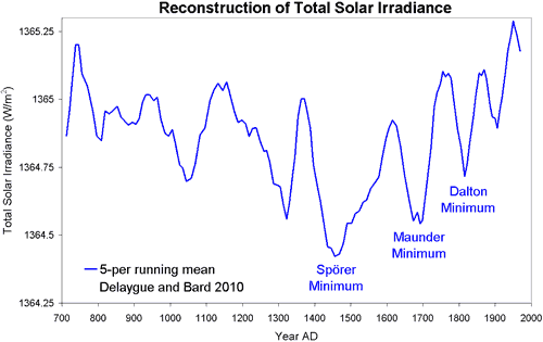
Figure 1: Reconsructed total solar irradiance (Delaygue and Bard 2010)
These periods of diminished solar activity were likely significant contributors to the LIA cooling. And solar activity has increased since the end of the Dalton Minimum to the current 'Modern Maximum'. However, solar activity has not increased on average since the mid-20th century.

Figure 2: Total Solar Irradiance as measured by satellite from 1978 to 2010
Studies quantifying the contributions of various radiative forcings to the global temperature change have estimated that over the past century, the increase in solar irradiance is responsible for about 15-20% of global warming (Meehl 2004). However, it cannot explain the accelerated warming over the past 50 years.
Figure 3: Solar radiative forcing temperature change vs. observed global surface temperature increase (Meehl 2004)
Increased Volcanic Activity
The Earth experienced heightened volcanic activity throughout the LIA. Volcanic eruptions release aerosols into the atmosphere which diffuse sunlight, causing global dimming and cooling. According to Crowley et al. (2000),
"over the interval 1400–1850, the volcanic contribution [to the decadal-scale variance in global temperatures] increases to 41 to 49% (P < 0.01), thereby indicating a very important role for volcanism during the Little Ice Age."
However, volcanic activity has had a net negative forcing (cooling effect) over the past century, particularly since 1950, and thus cannot explain the global warming over this period.
Figure 4: Volcanic radiative forcing temperature change vs. observed global surface temperature increase (Meehl 2004)
Ocean Conveyor Slowdown
Another proposed contribution to the LIA cooling is a slowdown of the thermohaline circulation through an introduction of a large amount of freshwater into the North Atlantic Ocean, potentially as a result of melting ice from Greenland due to warming temperatures during the Medieval Warm Period. The Gulf Stream is part of the thermohaline circulation, and transports warm water from the equator polewards toward Europe. If the North Atlantic Ocean becomes diluted with fresh water, this current could potentially become slowed or even shut down entirely. Broecker (2000) proposed this mechanism as a contributor to the LIA cooling.
However, since the Greenland Ice Sheet has been declining due to the global warming over the past century, and the slowdown and potential shutdown of the thermohaline circulation has become a concern as a result, quite obviously the ocean conveyor has not had a warming effect over the past century.
Decline in Human Population
The Black Death caused a decrease in the human populations of Europe, East Asia, and the Middle East during the 14th century and a consequent decline in agricultural activity. A similar effect occurred in North America after European contact in the 16th century. Ruddiman (2003) suggests reforestation took place as a result of this reduced human population and agricultural activity, allowing more carbon dioxide uptake from the atmosphere to the biosphere, thus having a cooling effect. Ruddiman concluded as follows.
"If the 10-ppm CO2 decreases are caused by plague-induced reforestation events, they would cool northern hemisphere temperatures by ∼0.17°C, assuming a 2 × CO2 sensitivity of 2.5°C."
Of course, we've seen the exact opposite effect in recent centuries, as the human population has continued to grow, increasing deforestation, and of course anthropogenic CO2 emissions through burning fossil fuels. However, it's difficult to classify increased human greenhouse gas emissions as a "recovery from the LIA."
The Planet is not Recovering from the LIA
To sum up, with the exception of the human population, the factors which contributed to the LIA cannot account for the global warming of the past 50-100 years. Further, it is not physically accurate to claim that the planet is simply "recovering" from the LIA. This argument is akin to saying that when you drop a ball off a cliff, it falls because it used to be higher. There is a physical mechanism for these changes. In the case of the ball, it falls because of the gravitational pull at the Earth's surface. In the case of the global temperature, it is warming from the increased greenhouse effect due to human activities.
Advanced rebuttal written by dana1981
Last updated on 6 July 2015 by pattimer. View Archives


Re Akasofu's assertion that "global warming has essentially stopped since 2000", presumably, this is based on the HadCRUT surface temperature record which omits areas of the globe of extreme warming in recent years. A more comprehensive analysis of the Earth's energy imbalance finds the planet continued to accumulate heat past 2000 right up to the end of 2008 (where the analysis ends). Global warming has not stopped.