Climate Science Glossary

Term Lookup

Enter a term in the search box to find its definition.

Settings

Use the controls in the far right panel to increase or decrease the number of terms automatically displayed (or to completely turn that feature off).

Term Lookup

Settings


All IPCC definitions taken from Climate Change 2007: The Physical Science Basis. Working Group I Contribution to the Fourth Assessment Report of the Intergovernmental Panel on Climate Change, Annex I, Glossary, pp. 941-954. Cambridge University Press.

Home Arguments Software Resources Comments The Consensus Project Translations About Support

Bluesky Facebook LinkedIn Mastodon MeWe

Twitter YouTube RSS Posts RSS Comments Email Subscribe


Climate's changed before
It's the sun
It's not bad
There is no consensus
It's cooling
Models are unreliable
Temp record is unreliable
Animals and plants can adapt
It hasn't warmed since 1998
Antarctica is gaining ice
View All Arguments...


Username
Password
New? Register here
Forgot your password?

Latest Posts

Archives

What ended the Little Ice Age?

What the science says...

Select a level... Basic Intermediate Advanced

The main driver of the warming from the Little Ice Age to 1940 was the warming sun with a small contribution from volcanic activity. However, solar activity leveled off after 1940 and the net influence from sun and volcano since 1940 has been slight cooling. Greenhouse gases have been the main contributor of warming since 1970.

Climate Myth...

We're coming out of the Little Ice Age

"The global temperature has been rising at a steady trend rate of 0.5°C per century since the end of the little ice age in the 1700s (when the Thames River would freeze over every winter; the last time it froze over was 1804). On top of the trend are oscillations that last about thirty years in each direction. In 2009 we are where the green arrow points [on graph showing said oscillations- SkS], with temperature leveling off. The pattern suggests that the world has entered a period of slight cooling until about 2030."  (David Evans)

The Little Ice Age was a cooler period spanning the 16th to the 19th century. The river Thames often froze over. The Norse colonies in Greenland were unable to survive the harsh winters. After 1850, temperatures began to rise. But man-made CO2 emissions in the late 19th century were a fraction of current levels. Did human activity take us out of the Little Ice Age? Were there other factors? And what does it mean for current warming? This question is addressed in an analysis which examines the various factors that drove climate since the 19th Century (Meehl 2004).

Climate simulations were run using two natural factors that drive climate - volcanoes and the sun. Volcanic eruptions cool global temperature for a few years after eruption. A drop in volcanic activity after 1915 contributed slight warming in the early 20th Century. However, the greater contributor to warming from 1880 came from the sun which steadily warmed up to the 1940s. When the two factors are combined, they account well for the warming from 1880 to 1940. However, the contribution from sun and volcanoes to global temperature since the 1940s has been a slight cooling effect.
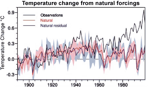

Figure 1: Climate model results from natural forcings compared to observations (black line). The red line is the average of the four-member ensemble. The pink shading is the model range. The blue line is the ensemble mean and the light blue shading is the ensemble range.

To calculate the human influence on climate, three forcings were considered: ozone, sulfate aerosols and man-made greenhouse gases. Sulfate aerosols have a cooling effect, growing stronger after around 1950. Changes in ozone produced a slight warming response. The strongest effect is from greenhouse gases which produced slow warming in the early 20th Century, then accelerated in the 1970s. When all anthropogenic forcings are combined, they show little temperature response from 1880 to to the 1960s. They do a poor job of explaining the warming from 1880 but a very good job of capturing late 20th Century warming.
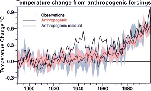

Figure 2: Climate model results from anthropogenic forcings compared to observations (black line).

When natural and anthropogenic forcings are combined, they show close correspondance with global temperature. From this analysis, Meehl concludes that the warming from 1880 to the mid-20th Century was largely natural with the sun being the main contributor. Late 20th Century warming after 1970 is mainly due to man-made influence primarily from greenhouse gases.
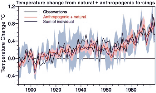

Figure 3: Climate model results from natural + anthropogenic forcings compared to observations (black line).

This analysis is a useful reminder that CO2 is not the only driver of climate. To end the Little Ice Age, the sun did most of the early heavy lifting. When the solar contribution flattened out in the mid-20th century, humanity took the baton and we've been running with it ever since. Meehl 2004 is also confirmation that past climate change tells us how sensitive climate is to radiative forcing. The climate that responded to the forcing from the warming sun in the early 20th century is the same climate that is now responding to the forcing from rising greenhouse gases.

Intermediate rebuttal written by John Cook


Last updated on 23 October 2016 by pattimer. View Archives

Printable Version  |  Offline PDF Version  |  Link to this page

Argument Feedback

Please use this form to let us know about suggested updates to this rebuttal.

Related Arguments

Denial101x videos

Here is the relevant lecture-video from Denial101x - Making Sense of Climate Science Denial:

Additional videos from the MOOC

Expert interview with Tim Osborne

Expert interview with Mike Lockwood

Comments

1  2  3  4  Next

Comments 1 to 25 out of 78:

  1. Mr. Cook: I think the whole flaw in the climate change argument can be expressed examining the words you have just used when saying "What the science really says": "The main driver of the warming from the Little Ice Age to 1940 was the warming sun with a small contribution from volcanic activity. However, solar activity leveled off after 1940 and the net influence from sun and volcano since 1940 has been slight cooling." OK, fine. While I don't necessarily agree with the sun portion (see Reply to Lockwood and Fröhlich - The persistent role of the Sun in climate forcing here - http://www.spacecenter.dk/publications/scientific-report-series/Scient_No._3.pdf/view), let's say everything you have said there is true. Even so, that does NOT automatically mean: "Greenhouse gases have been the main contributor of warming since 1970." Do we have any direct proof of that? Do we know exactly how much radiative forcing the greenhouse gases we emit produce? And do we know how much they produce when within the extremely complex climate system, as opposed to within laboratory conditions? Or is it just an assumption, considering we have exhausted all the possible natural causes that we can think of? I think that there may be other natural causes (maybe even ones we have not yet discovered) causing this kind of warming, at least to a certain extent. Syun-Ichi Akasofu here (http://people.iarc.uaf.edu/~sakasofu/little_ice_age.php) wrote about the possibility that much of the current warming could be simplified down to a natural 0.5 degrees C linear trend, with superimposed fluctuations and oscillations. Most importantly, he also notices that global warming has essentially stopped since 2000. This lack of warming does not agree with IPCC predictions. Instead it gives more credibility to this theory, as it could be explained as the most recent oscillation winding down and continuing on the 0.5 degrees C linear trend.
    Response: The direct proof of the radiative forcing from rising CO2 is explored in the empirical evidence for an enhanced greenhouse effect.

    Re Akasofu's assertion that "global warming has essentially stopped since 2000", presumably, this is based on the HadCRUT surface temperature record which omits areas of the globe of extreme warming in recent years. A more comprehensive analysis of the Earth's energy imbalance finds the planet continued to accumulate heat past 2000 right up to the end of 2008 (where the analysis ends). Global warming has not stopped.
  2. No, I'm not just looking at the CRU measurements. Take a look at NASA's Goddard Institute for Space Studies measuements (http://data.giss.nasa.gov/gistemp/graphs/). They also show global warming slowing down and almost stopping at about 2000. At the very least, if global warming has not stopped, it has definitely slowed down quite a bit, against what the IPCC has predicted.
  3. Sorry, ignore the part about GISS. Check out the University of Alabama in Huntsville's measurements: http://www.nationalpost.com/893554.bin
  4. michaelkourlas, global warming didn't stop nor slowed down, at least if you mean the trend. Maybe temperature did, but it has the bad habit of going up and down in the short run; it always did and presumably will continue to do so. And the neither the IPCC nor the climatologists ever said it will not.
  5. I understand that the overall global warming trend has gone on for hundreds of years since the little ice age. I am not disputing that. What I am disputing is how much warming there has been since the 1980s, which is the warming we would be responsible for. We only started emitting massive amounts of CO2 in 1945 and the first time the temperature started rising after that was in the late 1970s and early 1980s. Thus, the problem is that all the IPCC looks at to make its predictions and recommendations and such is one 30 year trend from 1980-present. 30 years is not really enough to completely determine whether or not humans are having a sizable impact on the climate system in the first place, but if there is a possibility that last 10 years of that series do not conform to the predictions that the IPCC have made... it really throws the IPCC's predictions into doubt.
  6. michaelkourlas, if 30 years are not enough to determine a trend i do not understand how 10 years can be enough. And it's not just 30 years, although smaller the contribution of ghg is sizeble even in the first half of the last century. Also, that the models did not predict the last 10 years is a mith, not least because they never attempted to predict them. I'd suggest to read how meaningfull comparison should be done.
  7. I'm not trying to make predictions off of a 10 year trend. All I am saying is that 30 years, 10 years of which do not follow predicted trends, is not enough to establish that we are having a large effect on climate. In response to "the models did not predict the last 10 years...because they never attempted to predict them", the link you gave actually shows the measurements not following the IPCC predictions.
  8. michaelkourlas, if i got it right, 30 years are enough to establish a trend. If this is true, then the last 10 years are well inside the measured variability and cannot falsify the trend in any way. But, given that you think that fig. 1 in the link i posted before "shows the measurements not following the IPCC predictions" you problably can say almost anything you like. The numbers tell a different story, though.
  9. One can establish a trend from just a few years. The question is whether or not that trend is enough to justify spending large amounts of money and devastating certain economic sectors in the name of 'saving humanity'. I don't think 30 years of data, 10 of which show a decline in temperature, is sufficient for this. As for the IPCC predictions, maybe I'm making a mistake, but I thought that the black line was the IPCC trend, and the blue and red lines showing temperature have deviated from that line since 2005. That's at least 1/6th of the 30 year trend off course.
  10. This is a good site for examining IPCC predictions and their failures.
  11. Also look here for the natural vs anthropogenic prediction information (http://www.appinsys.com/GlobalWarming/PredictionFromCycles.htm)
  12. michaelkourlas wrote "maybe I'm making a mistake, but I thought that the black line was the IPCC trend." Michael, you are indeed making a mistake, as Riccardo tried to explain to you. The IPCC prediction is the entire gray area in that figure. The black line is merely the mean, which is merely the most probable point-by-point portion--the central tendency of the prediction, not the range of the prediction. The range is the gray area. Nobody, least of all the IPCC, expects the actual values to always fall exactly on the line. Nobody even expects the actual values to always fall within the gray area. Instead the expectation is that sometimes the actual values will be above the line and sometimes below the line, but on average they will fall more or less the same amount of time above as below the line, and almost all of the time they will fall within the gray area. When you pick out the most recent four years as being below the black line, you are conveniently ignoring the several periods before that being above the line. Oh, but then you could point to the previous couple years being below the line. But then you'd be ignoring the years before that being far above the line.... And so on. If you play that game all the way back to the start of the graph, you see that on average the actual values spend nearly as much time above as below the line, and always inside the gray area. There are formal, systematic ways of doing the above analysis. They were not invented for climatology. They have been used for many decades in many different fields of science and technology. They are being applied to climatology in exactly the same way. You can start to learn about them by reading Tamino's post "How Long?"
  13. michaelkourlas, you can surely use just a few years to calculate a trend but you can not establish it this way; it would be just a mathematical exercise. Physics, and climate science as well, uses mathematics as a tool but they also give a meaning to the numbers. When the data points have a "noise" of about 0.2 °C and a trend of about 0.17 °C/decade even common sense should convince you that it makes no sense at all to use just 7 years to calculate a meaningful trend. If you really want to understand what is going on with our climate, it would be a good idea not to use "blind" google searches. You know, the internet is a great tool, but you can find almost anything you want. Given that we not always have the knowledge to state the credibility of a source by ourselves, an a priori reasoned choice is mandatory. Or anyone can fool you.
  14. This is the trend I buy on the warming we are seeing now. I do think it is part of the recovery from the LIA and this illustrates the way it rises, but takes beaks for a few decades here and there.
  15. cruzn246, previously you accused other people of relying exclusively on correlation to infer causation. But here you are relying on your superficial extrapolation of past trends, ignoring the causal analyses that are explained in the post at the top of this page! Be sure to click on the "Advanced" version's tab. Read more, type less.
  16. "But here you are relying on your superficial extrapolation of past trends, ignoring the causal analyses that are explained in the post at the top of this page!" Oh my God! I didn't know I had to buy the analysis. Pardon me for having free thought. Excuse me, but climatology is as much about trends as anything. We may not be able to completely explain them, but we see them and recognize them. Heck, the analysis at the top pretty much says that the exact cause of the LIA is a bit of a mystery, but I guess they have everything else after that plumb figured out. :-)
  17. You can see in the first graph they use for the carbon 14 that the last measure is higher than the medieval maximum, but they dismiss the sun as causing this continued warm-up. Then they can the carbon-14 and go to the solar cycles for the next graph. They are not the same thing. Go figure. They could have used this for the whole period.
  18. #16: "I didn't know I had to buy the analysis. Pardon me for having free thought." You don't have to buy they analysis. But if you don't you should present some form of analysis of your own. Otherwise, 'free thought' is just opinion. For example, what is the basis of the straight line in the figure you show in #14? For that matter, where does that graph come from? What is the cause of those wavy ups and downs that ride your straight line? There are temperature reconstructions going back to the LIA (some available in the articles below); yet your graph projects the same straight line backwards as well as forwards. What is the justification for that? See Global warming and the unstoppable 1500 year cycle and The LIA and How we know the sun isn't causing global warming for starters. In my former life in the oil business, we used to say 'a straight line trend is your best friend' at which point someone would reply 'until it stops being straight.'
  19. muoncounter: "For example, what is the basis of the straight line in the figure you show in #14? For that matter, where does that graph come from?" Since Google is still our friend :D ...it's from here: Two Natural Components of the Recent Climate Change (3/30/2009): (1) The Recovery from the Little Ice Age (A Possible Cause of Global Warming) and (2) The Multi-decadal Oscillation (The Recent Halting of the Warming) Syun-Ichi Akasofu, International Arctic Research Center, Fairbanks, University of Alaska http://www.webcommentary.com/docs/2natural.pdf
  20. More on Syun-Ichi Akasofu: click! Agrees with: Ray Evans, Gerhard Gerlich, Roy Spencer, John Christy, Sarah Palin, Vincent R. Gray, Qing-Bin Lu, Denis Rancourt Disagrees with: Martin Parry, IPCC, Al Gore, Svante Arrhenius, Rajendra Pachauri, Gavin Schmidt, RealClimate
  21. 19: "Two Natural Components of the Recent Climate Change" Wow, a paper (published, when?) that sets out to fit straight lines to data and ends up with ... straight lines. And uses the fact that you can fit straight lines to data as proof that straight lines are appropriate: "An intuitive approximation of the changes shown in Figure 1a (NASA:GISS). It is shown as the red line." "The red straight line was drawn by the JMA." And once 0.5C/century is established as the slope of all these lines (with the explanation in Fig 2a that it is "caused by natural cause" -- I didn't make that up), said line is projected back to 1500. Very insightful work. I enjoyed this quote from p. 7: "Although the global average temperature (T) changes can be approximated by a linear relation as a fraction of time (t) (T = at), CO2 changes are more like T= bt^2, suggesting that the T-CO2 relation is not simple." But temperature itself is a simple straight line +/- some decadal ups and downs? I found the graph on watts up, doc, where the word was ... it's all good.
  22. "For example, what is the basis of the straight line in the figure you show in #14?" The line is simply placed there by the man who made the chart. Fits pretty good. For that matter, where does that graph come from? My, you get your shorts in a wad when something contrary comes up. What is the cause of those wavy ups and downs that ride your straight line? Decadal shifts in the NAO and PDO most likely. It's an accurate temperature record so what does it matter? "There are temperature reconstructions going back to the LIA (some available in the articles below); yet your graph projects the same straight line backwards as well as forwards." It's not an important part of the graph. He is just trying to show warming from 1880 through 200. God, i see so many graphs from the pro folks that start in 1980, what is the problem with this? What is the justification for that?
    Response: Please use the preview when posting anything other than plain text. Thanks.
  23. Re: Akasofu Kevin Trenberth offers up some perspective on Akasofu. Speaks for itself. The Yooper
  24. "A long-term increase in the Earth's average temperature is caused by a change in the planetary energy balance (incoming vs. outgoing energy), also known as a 'radiative forcing.' If the amounts of incoming and outgoing energy are equal, the planet is in equilibrium and its average temperature will not increase on average." I couldn't resist commenting on this. Are we in equilibrium? Is it possible to be in equilibrium? Think about it folks. Do we know exactly what output from the sun produces this state? I truly doubt we are ever in equilibrium. It's just such a hard thing to achieve in any system, much less an extremely complicated one like ours.
  25. @cruzn246: I don't think you understand what equilibrium means in this context.

1  2  3  4  Next

Post a Comment

Political, off-topic or ad hominem comments will be deleted. Comments Policy...

You need to be logged in to post a comment. Login via the left margin or if you're new, register here.

Link to this page


The Consensus Project Website

THE ESCALATOR

(free to republish)


© Copyright 2024 John Cook
Home | Translations | About Us | Privacy | Contact Us