


 Arguments


Is Antarctica losing or gaining ice?
What the science says...
| Select a level... |
 Basic
Basic
|
 Intermediate
| |||
|
Antarctic sea ice extent has expanded at times but is currently (2023) low. In contrast, Antarctica is losing land ice at an accelerating rate and that has serious implications for sea level rise. |
|||||
Climate Myth...
Antarctica is gaining ice
"[Ice] is expanding in much of Antarctica, contrary to the widespread public belief that global warming is melting the continental ice cap." (Greg Roberts, The Australian)
At a glance
Who discovered the great, South Pole-straddling continent of Antarctica? According to the National Geographic, Captain Cook came within an estimated 80 miles of it in the late 1700s, but the three first 'official' discoveries all took place in 1820 by Russian, British and American teams of seafarers respectively.
Since that initial discovery, Antarctica has attracted and inspired researchers and explorers alike. It's a challenging place, fringed by sea-ice that, unlike the Arctic, has not steadily declined but whose extent fluctuates on a seasonal basis: it's currently (February 2023) at a very low coverage, but it can and does recover from such dips. Antarctic sea-ice is no great problem, with the exception of albedo-loss in low extent years: if it all melted, it would have no effect on global sea-levels. It's the stuff on land we need to focus upon.
The land of Antarctica is a continent in two parts, divided by the 2,000 m high Transantarctic Mountains. The two parts differ in so many respects that they need to be considered separately. East Antarctica, that includes the South Pole, has the far greater landmass out of the two, some 4,000 by 2,500 kilometres in size. Although its massive ice-sheet, mostly grounded above sea level, would cause 52 metres of sea level rise if it completely melted, so far it has remained relatively stable. Snow accumulation seems to be keeping in step with any peripheral melting.
In contrast, in the absence of ice, West Antarctica would consist of islands of various sizes plus the West Antarctic Peninsula, a long mountainous arm pointing northwards towards the tip of South America. The ice sheet overlying this mixed topography is therefore grounded below sea level in many places and that's what makes it far more prone to melting as the oceans warm up. Currently, the ice-sheet is buttressed by the huge ice-shelves that surround it, extending out to sea. These slow down the glaciers that drain the ice-sheet seawards.
The risk in West Antarctica is that these shelves will break up and then there will be nothing to hold back those glaciers. This has already happened along the West Antarctic Peninsula: in 1998-2002 much of the Larsen B ice-shelf collapsed. On Western Antarctica's west coast, the ice-sheet buttressing the Thwaites Glacier – a huge body of ice with a similar surface area to the UK - is a major cause for concern. The glacier, grounded 1,000 metres below sea level, is retreating quickly. If it all melted, that would raise global sea levels by 65 centimetres.
Such processes are happening right now and may not be stoppable - they certainly will not be if our CO2 emissions continue apace. But there’s another number to consider: 615 ppm. That is the CO2 level beneath which East Antarctica’s main ice sheet behaves in a mostly stable fashion. Go above that figure and the opposite occurs - major instability. And through our emissions, we’ve gone more than a third of the way there (320 to 420 ppm) since 1965. If we don’t curb those emissions, we’ll cross that line in well under a century.
Please use this form to provide feedback about this new "At a glance" section. Read a more technical version below or dig deeper via the tabs above!
Further details
Arguments that we needn't worry about loss of ice in the Antarctic because sea ice is growing or even that sea ice in the Antarctic disproves that global warming is a real concern hinge on confusion about differences between sea and land ice, and what our best information about Antarctic ice tells us.
As well, the trend in Antarctic sea ice is not a permanent feature, as we'll see. But let's look at the main issues first.
- Sea ice doesn't play a role in sea level rise or fall.
- Melting land ice contributes to sea level rise.
- The net, total behavior of all ice in the Antarctic is causing a significant and accelerating rise in sea level.
Antarctic sea ice is ice which forms in salt water mostly during winter months. When sea ice melts, sea level does not change.
Antarctic land ice is the ice which has accumulated over thousands of years in Antarctica by snowfall. This land ice is stored ocean water that once fell as precipitation. When this ice melts, the resulting water returns to the ocean, raising sea level.
What's up with Antarctic sea ice?
At both poles, sea ice grows and shrinks on an annual basis. While the maximum amount of cover varies from year to year, there is no effect on sea level due to this cyclic process.
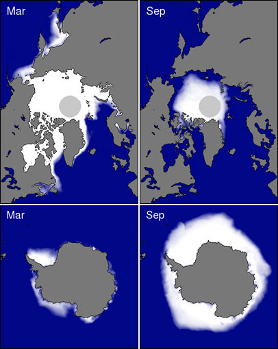
Figure 1: Coverage of sea ice in both the Arctic (Top) and Antarctica (Bottom) for both summer minimums and winter maximums. Source: National Snow and Ice Data Center
Trends in Antarctic sea ice are easily deceptive. For many years, Antarctic sea was increasing overall, but that shows signs of changing as ice extent has sharply declined more recently. Meanwhile, what's the relationship of sea ice to our activities? Ironically, plausible reasons for change may be of our own making:
- Ozone levels over Antarctica have dropped causing stratospheric cooling and increasing winds which lead to more areas of open water that can be frozen (Gillett & Thompson 2003, Thompson & Solomon 2002, Turner et al. 2009).
- The Southern Ocean is freshening because of increased rain and snowfall as well as an increase in meltwater coming from the edges of Antarctica's land ice (Zhang 2007, Bintanja et al. 2013). Together, these change the composition of the different layers in the ocean there causing less mixing between warm and cold layers and thus less melted sea and coastal land ice.
Against those factors, we continue to search for final answers to why certain areas of Antarctic sea ice grew over the past few decades (Turner et al. 2015).
More lately, sea ice in southern latitudes has shown a precipitous year-on-year decline (Parkinson 2019). While there's a remaining net increase in annual high point sea ice, the total increase has been sharply reduced and continues to decline.
How is Antarctic land ice doing?
We've seen that Antarctic sea ice is irrelevant to the main problem we're facing with overall loss of ice in the Antarctic: rising sea level. That leaves land ice to consider.

Figure 2: Total Antarctic land ice changes and approximate sea level contributions using a combination of different measurement techniques (IMBIE, 2017). Shaded areas represent measurement uncertainty.
Estimates of recent changes in Antarctic land ice (Figure 2) show an increasing contribution to sea level. Between 1992 and 2017, the Antarctic Ice Sheets overall lost 2,720 giga-tonnes (Gt) or 2,720,000,000,000 tonnes into the oceans, at an average rate of 108 Gt per year (Gt/yr). Because a reduction in mass of 360 Gt/year represents an annual global-average sea level rise of 1 mm, these estimates equate to an increase in global-average sea levels by 0.3 mm/yr.
There is variation between regions within Antarctica as can be seen in Figure 2. The West Antarctic Ice Sheet and the Antarctic Peninsula Ice Sheet are losing a lot of ice mass, at an overall increasing rate. The East Antarctic Ice Sheet has grown slightly over the period shown. The net result is a massive loss of ice. However, under a high-emissions scenario, ice-loss from the East Antarctic ice-sheet is expected to be a much greater in the decades after 2100, as reported recently by Stokes et al. (2022). That’s a scenario we must avoid at all costs.
Takeaway
Independent data from multiple measurement techniques (explained here) show the same thing: Antarctica is losing land ice as a whole and these losses are accelerating. Meanwhile, Antarctic sea ice is irrelevant to what's important about Antarctic ice in general.
Last updated on 14 February 2023 by John Mason. View Archives


Bart @549... I'm not quite in agreement what you're stating is interesting. It just doesn't strike me as implying anything relevant.
As I said, I was hoping for a more serious discussion on this site.
What went wrong: in my first post I wanted to show the graph with the SMB as well. I must have done something wrong, for it didn't came up. Sorry for that. But this information is not so hard to find. MA Rodger succeeded in doing this, Bob Loblaw preferred to show a stupid graph about cherry-picking. Well, that's not the point here.
Anyhow. The correlation between SMB and mass change was not clear, so I put them together in one table. The SMB is calculated over November - November. The original graph gives the anomaly of the SMB. The average mass of the anomaly seems to be some 2700 Gigaton, so I added that to the anomaly. Then the discharge of the ice sheet can be calculated as the difference between the GRACE data and the SMB.
The result is interesting: there don't seem to be much correlation between SMB and discharge. Strange enough, in the last year with little sea ice the discharge was even less then normal.
An important thing could be that GRACE isn't measuring the total amount of ice, but only the amount above the sea level. So, increased calving from floating iceshelfs isn't noticed.
"The average mass of the anomaly"
this must be: the average mass of the SMB.
Bart... You're still claiming it's interesting without stating why it's interesting or what this possible correlation would imply. In my mind that doesn't make it interesting.
"As I said, I was hoping for a more serious discussion on this site."
You're hoping for a serious discussion on something that you are failing to seriously discuss. Does the correlation you're proposing extend outside of the past decade? Does it have any substantive implication for longer trends? What are the physics related to this proposed correlation? What are the dynamics of this process? You're going to have to offer up a lot more and get more clear on what you're discussing in order to have a more serious discussion.
Bart @ 552:
The point in my comment at 534, responding to your first comment, was that it is a huge mistake to try to make extrapolations into the future from a short time period. We see it all the time: temperature (The Escalator), sea ice coverage, etc. People that want to believe a particular thing, and ignore the long-term trend by saying "look at this!" from a short period of data at the end of a noisy data set.
If you had followed the link to The Escalator, you would have seen that the very first sentence says:
That you choose to call it "a stupid graph" indicates that you still don't understand the error in drawing grandiose claims from short periods of data.
Now, you are saying "The result is interesting: there don't seem to be much correlation between SMB and discharge. Strange enough, in the last year with little sea ice the discharge was even less then normal."
No, this is not at all interesting. As has been said to you previously, relationships between precipitation, accumulation, glacier flow, discharge, and sea ice are not simple. Rob Honeycutt has posed a number of questions to you in comment 554 that are germane to the point. Unless you understand why those questions are important, and can begin to think of answers to them, you are not looking at the topic seriously.
The very first response I gave to you - the first paragraph - was:
I suggest that you actually try doing some reading, starting with the blog post (both the basic and intermediate sections) and then through the numerous comments, and maybe then you'll have enough understanding to be able to engage in a "serious discussion".
The simple answer is that you seem to be expecting a simply answer and a simple relationship for a complex system, and you are simply wrong.
Bob Loblaw, I'm afraid we don't get any further in the discussion. It's a pity. Lets see what more information comes to us in the coming time.
Have a nice day!
Bart.
Bart @ 556:
"More information" does cometh rather quickly. The following in-depth artice was posted on BBC's Future feature yesterday:
Why East Antarctica is a 'sleeping giant' of sea level rise by Alec Luhn. Future, BBC, Mar 12, 2023
The lede for the above article:
Scientists once thought the East Antarctic ice sheet, which contains enough water to raise sea levels 52m (170ft), was stable. But now its ice shelves are beginning to melt.
A key pragraph from the article related to your comments on this thread:
Ah, thank you John Hartz @557
Yes, I noticed the article too. Indeed, the iceshelfs are the missing part of information and indeed, they are more vulnerable when the sea ice extent is low. But when we look at the position of the Conger's ice shelf (it's in the red circle on the map below) there is something strange. There isn't much inflow of ice from the ice sheet above. And when there isn't inflow, an ice shelf will disappear sooner or later. Maybe the pattern of the ice flow has changed during the years?
So, let's hope that the other ice shelfs are doing better. At least, the collapse of the Conger's ice shelf didn't influence the mass balance of the total ice sheet (the non-floating part) too much last year. It showed an increase of mass.
Bart... Did you happen to notice the title of the article John posted?
"Why East Antarctica is a 'sleeping giant' of sea level rise"
Don't you think that's interesting?
"Did you happen to notice the title of the article John posted?"
Well I did! I have the strange habit to start with the title when I read an article ;-). And here it's about sea level rise. That item has my attention. I live in The Netherlands, which is a very low lying country. Large parts of it have a certain risk for flooding, by the sea of by rivers. My own house is only at 10 centimetres above sea level! But for centuries, the land is well protected by dikes. So, the risk is not so very high. But we have to be prepared for the future. The land will sink further, the sea level will rise higher, the rainfall will be more irregular and so on. So yes, sea level rise is a big issue here.
About the article. The disappearance of the ice shelf itself is no good news. But when I look at the position of it, I don't see a lot of ice from the ice sheet that will be on the move now. That's my point.
We have to monitor Antarctica very well, try to understand how it works, try to predict what will happen. But not with panic, that won't help us.
Bart... "Sleeping giant" implies (and the research is showing) this is not a small amount of sea level rise we're talking about. Levies in The Netherlands have worked for centuries because, in the past, we didn't face such threats as sea level rise from a rapidly warming climate.
When you say "the risk is not so high," based on all the research I've read, I would have to differ. Based on the article John just posted, this should be very clear. The risk, particularly for places like exactly where you live, are in severe peril in the coming century and beyond.
Likewise, Florida in the US is facing a similar crisis. Within the next couple of decades property in most of southern Florida is going to become uninsurable. That is a big f-ing deal!
What this conversation come down to is, you seem to be looking for reasons to wish away the current climate crisis. I can promise you, the "interesting" items you're finding are not indications the problem is small or far in the future. The problem is now. The problem is severe. The problem is going to continue to get worse for at very least the next 20-30 years until we can get the entire global economy off of fossil fuels.
Trying to politely minimize the problem is a form of denial.
Bart Vreeken @551,
The Antarctic SMB & the GRACE anomaly don't seem to be showing much. It did occur to me that the SMB plot you presented upthread @533 does show some similarity to the average annual SIE as the years with a positive SMB anomaly are also the years when the average SIE drops below the long-term average. (Okay 2021/22 didn't quite regain the average. Ave annual SIE in JAXA 2003-22 is 11.61 sq km). You juxtapose an SMB graphic with Antarctic SIE annual minimum graphic @546. (Note JAXA 2023 min was 1.95M sq km.) The annual average (change from previous year) provides apparently a better match to SMB than does the annual minimums. Thus the SEI Change-From-Previous-Year from the JAXA data run (sq km):-
2004,105000
2005,-266000
2006,-252000
2007,245000
2008,562000
2009,-177000
2010,98000
2011,-633000
2012,523000
2013,531000
2014,236000
2015,-365000
2016,-1192000
2017,-466000
2018,251000
2019,-140000
2020,719000
2021,17000
2022,-817000
I agree with Rob Honeycutt's evaluation that Bart Vreeken appears "...to be looking for reasons to wish away the current climate crisis."
I also agree that "Trying to politely minimize the problem is a form of denial."
I refer to the ways that people like Bart make their claims as versions of "Passionate Pursuit of Positive Perceptions" which evades or delays learning that "developed desires and beliefs are incorrect understandings that are harmful (some misunderstandings can be helpful, but most misunderstandings are harmful in some ways)".
People can have many motivations for not seeing (or seeking) the evidence of harm done and failing to understand that harm done is not excused by benefits obtained. But they share a desire for the benefits they hope to get from the continued popularity of harmful misunderstandings, which includes evading reducing the harmfulness of the things they want to benefit from and evading having to make amends for harm done that they benefited from.
An interesting question for someone like Bart Vreeken would be:
How much sea level rise should the current population pay today to improve the Flood mitigation systems of the Netherlands to be able to deal with the future problem?
A Pursuer of positive perceptions may try to claim that nothing, or very little, needs to be done to improve the flood protection of the Netherlands. Or they may argue that the problem is not being caused by continued fossil fuel use. Or they may claim that Others are causing the problem. Or they may claim that "Future generations" will be able to do what needs to be done (at no cost to the people who benefited from causing the need for the future attempts to deal with and repair of the harm done).
A closing comment: The Promotion of Positive Perceptions that are harmful misunderstandings is one of the most harmful things a 'supposedly higher status, more influential person' can do. There clearly needs to be more immediate and effective "Governing/Limiting" of the behaviour of higher status people who pursue and promote harmful misunderstandings. And the higher status people need to lead that helpful corrective Governing/Limiting of harm done, or lose their higher status and influence.
People like Bart are not the major problem. Higher status people arguing like Bart does rather than helping people like Bart learn to be less harmful and more helpful are the major problem.
Before I get forced to switch to moderator role, can we please take it easy on speculating about Bart's motives?
I also wonder what his end goal is in posting here. I've tried to get him to be specific about what his point is (as have others), and he seems reluctant to do so. Hopefully that will change (but I'm not optimistic).
Pfff, it looks like knowledge of psychology is more useful here then knowledge of Antarctica and climate change. How to react? A person called 'One Planet only forever' makes his or her own analyzation about 'people like me'. But isn't even willing to tell his or her own name. Why is that? I think an open discussion without hide-and-seek is more effectful and respective. About my motivation: my only motivation is trying to understand Antarctica and sharing information on that. And discussing that, but in a positive way. OK, lets stay on topic.
We had a discussion about the the collapse of the Conger glacier's ice shelf. Here's an article on Change in Antarctic Ice Shelf Area from 2009 to 2019. In this period the ice shelves around Antarctica have gained a modest 0.4 %, or 5,304.5 km2 the study says. The study does not include the last three years. A low sea ice extent won't be good for the ice shelves, so I think we can expect that they lost some of there area.
egusphere.copernicus.org/preprints/2022/egusphere-2022-1087/egusphere-2022-1087.pdf
And then a rectification. I made calculations on the total discharge of Antarctica, based on the Surface Mass Balance (SMB) and the GRACE data. But the SMB calculated here also includes the ice shelves, and that part does not count for the mass change of the ice sheet. So, the SMB for the grounded ice will be less, and the discharge of the grounded ice will be less. In the literature I found numbers like 1750 Gt/yr.
[BL] I tried to give gentle advice - which applied to all - but now I have to shift to moderator role.
I have snipped the portions of this comment that violate the Comments Policy.
We still see that Antarctica as a whole has a better period. Over the last three years, there has been no net decrease in land ice. The small amount of sea ice must play an important role in this. As a result, more snow falls. Apparently, that was enough to compensate for the increased melting and calving along the edge.
Changes to the floating ice shelves cannot be measured in this way.
[BL] Back to this again, with three months more noise to add to the end of the longer-term trend?
Once again, you are rambling and failing to make a clear explanation of what you expect people to see. The latter part of your comment (marked as "warning") is an assertion of highly speculative, unsupported statements made before.
If your intention is to return to previous posting patterns, expect to see strong moderation of your comments.
Please note that posting comments here at SkS is a privilege, not a right. This privilege can be rescinded if the posting individual treats adherence to the Comments Policy as optional, rather than the mandatory condition of participating in this online forum.
Please take the time to review the policy and ensure future comments are in full compliance with it. Thanks for your understanding and compliance in this matter.
Bart @566... When posting a graph like this it would be wise and honest to make a clear notation clarifying it is a modification of the original graph from NASA, citing yourself as the source of the modifications. Otherwise you're misleading people to believe the modifications come directly from NASA.
[BL] Indeed.
In particular, Bart's graph in comment # 566 has crossed out the value 149 Gt/yr and replaced it with 114 Gt/yr. The 149 is from NASA, and the 114 is from Bart. The difference between those two values was discussed in March, when Bart first introduced the 114 number in his first comment on this thread (#533). The 149 Gt/yr value is explained in the comments that follow.. I had linked to a site with GRACE data in comment 534, and explained the 149 Gt/yr number in comment #540.
If Bart is hoping that the previous discussions on this matter will be forgotten, he is wrong. If he is hoping to be able to post the same claims he made in March, without reflecting on the counter-arguments that were made then, he is wrong. He should in particular read the section of the Comments Policy on excessive repetition:
Comments should avoid excessive repetition. Discussions which circle back on themselves and involve endless repetition of points already discussed do not help clarify relevant points. They are merely tiresome to participants and a barrier to readers. If moderators believe you are being excessively repetitive, they will advise you as such, and any further repetition will be treated as being off topic.
Hi Rob Honeycutt @567, there is no modification at all on the original graph from NASA itself. You can find the source below:
climate.nasa.gov/vital-signs/ice-sheets/
I only added the exact month of some of the extremes. And as you can see, I made my own calculation of the 'rate of change', with a very different result. Its calculated over 20 full years since February 2003, to avoid seasonal effects. (2280 Gt / 20 = 114 Gt/y). Where the 149 Gt/y published by NASA comes from, I really don't know. In the previous version it was 151 Gt/y.
[BL] "There is no modification" and "I have only added" are mutually contradictory claims. This does your credibility no good.
Where the 149 Gt/yr number comes from was discussed in March. Please read over the older discussion before posting again.
"Where the 149 Gt/yr number comes from was discussed in March"
OK, let's have a look at the data of IMBIE, then. IMBIE is the Ice Sheet Mass Balance Inter-comparison Exercise. They compare data from different sources: gravimetry, altimetry, input-output.
essd.copernicus.org/articles/15/1597/2023/
There, the average number over April 2002 - December 2020 is 114,9 Gt/Yr. Very much like my calculation, but without the data of 2021 and 2022.
[BL] Once again, you are following the same path you followed in March. Instead of explaining what the source of your figures and numbers and results are the first time you post them, you are forcing people to ask questions, guess at the meaning of your material, speculate on how values are derived, etc. Only then do you provide relevant details.
For the final time, read the Comments Policy. In this case, the section that applies is:
No link or picture only. Any link or picture should be accompanied by text summarizing both the content of the link or picture, and showing how it is relevant to the topic of discussion. Failure to do both of these things will result in the comment being considered off topic.
If you post any further images without a clear indication of what modifications you have made and the source of any data you present, or comments that lack clarity, they will be considered off topic and deleted.
And again, like you did in March, you are jumping from GRACE to mass balance, to whatever pops up in your head next., Take the time to prepare one comprehensive and coherent comment, instead of a bunch of small scattered ones.
Bart @568... Wrong answer. Clearly all the red notations are your modifications, thus an unwary viewer might assume those notations are coming directly from NASA when they are not.
"Where the 149 Gt/yr number comes from was discussed in March"
OK, let's have a look at the discussion in March. The 149 Gt/yr number comes from a video by NASA, published April 1, 2021.
https://climate.nasa.gov/climate_resources/265/video-antarctic-ice-mass-loss-2002-2020/
The selected data runs from October 2002 (+65 Gt) to February 2020 (-2808 Gt). That's already cherry-picking, for the ice mass tends to be low in February. Why do so? Maybe the publication date gives a hint ;-).
But ignoring the last two years, like Bob Loblaw does, is even more cherry-picking. This is how it looks like:
Is it also cherry-picking to end in February 2023? Not really, for it includes all the available data. Maybe we have a relatively high amount of ice now, according to the trend. But we won't know until afterwards. And remember that these are cumulative data. The amount of ice above the previous trend will first have to melt away again. That makes this figure different from a figure in which the temperature is displayed.
[BL] Accusing commenters here of cherry-picking, when all they are doing it trying to explain how the NASA numbers were determined by NASA, is a violation of the comments policy. The numbers that went into the 149 gT/yr value were clearly stated last March in comment #540.
No accusations of deception. Any accusations of deception, fraud, dishonesty or corruption will be deleted. This applies to both sides. You may critique a person's methods but not their motives.
Accusing NASA of cherry-picking, when they used what was probably all the available data at the time the analysis was done - and then claim that your analysis also ending in February is not cherry-picking because it is "all the available data", is hubris.
Your argument about how the last few years changes the trend results was addressed in comment # 543, last March.
Once again, you are attempting to attribute great significance to short-term noise.
You are adding nothing new to the discussion. Repeating arguments without addressing the counter-arguments falls under the sloganeering category in the Comments Policy.
No sloganeering. Comments consisting of simple assertion of a myth already debunked by one of the main articles, and which contain no relevant counter argument or evidence from the peer reviewed literature constitutes trolling rather than genuine discussion. As such they will be deleted. If you think our debunking of one of those myths is in error, you are welcome to discuss that on the relevant thread, provided you give substantial reasons for believing the debunking is in error. It is asked that you do not clutter up threads by responding to comments that consist just of slogans.
If you continue to simply re-assert opinions with no substantive argument, expect to see your comments deleted.
[BL - added] Attributing the 149gT/yr number to a commenter (me) that simply demonstrated the source of the number is scientific malpractice. Such dishonesty will not be tolerated here.
There is something wrong with the link above. It should be:
climate.nasa.gov/climate_resources/265/video-antarctic-ice-mass-loss-2002-2020/
'Accusing NASA of cherry-picking, when they used what was probably all the available data at the time the analysis was done - and then claim that your analysis also ending in February is not cherry-picking because it is "all the available data", is hubris.'
Please have a better look.
- The data of the analysis by NASA run up to August 2020, but the last part is not used
- The data of my analysis starts and ends in February, so there is no seasonal effect.
[BL] and it was explained back in March that the 149 gT/yr came from picking the maximum and the minimum. You can question that methodology, but accusing people of "cherry-picking" is an accusation of dishonesty.
Do you understand?
You seem beligerently intent upon missing the forest for the trees, Bart.
Let's put it this way: Are you suggesting the most recent changes in ice mass are indicative of a substantive change in the trend? And if so, what do you think is driving such a change?
@571... "The amount of ice above the previous trend will first have to melt away again."
Come again? Would like to explain that?
[BL] Bart appears to think that the processes that have decreased Antarctic ice mass by 2500 Gt in the last 20 years will have some sort of difficulty in removing 330 Gt that have accumulated in the past three years.