Climate Science Glossary

Term Lookup

Enter a term in the search box to find its definition.

Settings

Use the controls in the far right panel to increase or decrease the number of terms automatically displayed (or to completely turn that feature off).

Term Lookup

Settings


All IPCC definitions taken from Climate Change 2007: The Physical Science Basis. Working Group I Contribution to the Fourth Assessment Report of the Intergovernmental Panel on Climate Change, Annex I, Glossary, pp. 941-954. Cambridge University Press.

Home Arguments Software Resources Comments The Consensus Project Translations About Support

Bluesky Facebook LinkedIn Mastodon MeWe

Twitter YouTube RSS Posts RSS Comments Email Subscribe


Climate's changed before
It's the sun
It's not bad
There is no consensus
It's cooling
Models are unreliable
Temp record is unreliable
Animals and plants can adapt
It hasn't warmed since 1998
Antarctica is gaining ice
View All Arguments...


Username
Password
New? Register here
Forgot your password?

Latest Posts

Archives

What evidence is there for the hockey stick?

What the science says...

Select a level... Basic Intermediate

Recent studies agree that recent global temperatures are unprecedented in the last 1000 years.

Climate Myth...

Hockey stick is broken

“In 2003 Professor McKitrick teamed with a Canadian engineer, Steve McIntyre, in attempting to replicate the chart and finally debunked it as statistical nonsense.  They revealed how the chart was derived from "collation errors, unjustified truncation or extrapolation of source data, obsolete data, incorrect principal component calculations, geographical mislocations and other serious defects" -- substantially affecting the temperature index.” (John McLaughlin)

At a glance

The Hockey Stick is a historic graph dating back to a paper published in 1999. It showed Northern Hemisphere temperature variations over the near-thousand year period from 1000-1998. The 'blade' of the stick represented the rapid warming of the late 20th Century. It has an iconic status, both in climate science and in the murky world of science-misinformation, where, naturally, it is despised by all and sundry.

Objections to the Hockey Stick are varied but mostly focussed on the stick's long handle and the data that represents. Obviously, during the centuries going back to 1000, reliable temperature measurements are not available. Fortunately for science, there are things that lived through that long time, such as certain very old trees. They record in the rings of their wood an indication of temperatures, year on year. Gardeners and farmers talk about good and bad growing years and it’s the same for natural systems. For example, cold dry periods make for narrow and densely-packed tree-rings whereas warmer, wetter times lead to more widely-spaced ones.

Importantly, today there are a great many effective past climate indicators, known as proxies because they act in place of thermometers. Because there's a range of indicators, the results from each one can be cross-checked against one another. If a new proxy is any good, its data should agree with that from the other, established ones.

Proxy datasets contain more uncertainty than directly measured temperatures. Everyone knows that. That does not mean they are useless, far from it. Cross-checking means poor data can readily be identified and investigated.

Finally, it's 24 years since the Hockey Stick graph was published. Since then, work on developing and refining the best proxies has been relentless. Better, longer temperature reconstructions have become possible. At the same time, global temperatures have continued to rise. In any of the observation-based records of surface temperature, all of the eight warmest years have been since 2015.

Please use this form to provide feedback about this new "At a glance" section, which was updated on May 27, 2023 to improve its readability. Read a more technical version below or dig deeper via the tabs above!


Further details

Reliable observational temperature records only go back so far in time – in the UK back to 1850 and in the USA to 1880, for example. So how do we find out about conditions going further back, hundreds, thousands or even millions of years into the past? We use proxies.

Proxies are things whose measurable properties are affected in certain, well-defined and understood ways by variations in temperature and other climatic parameters. Although the most well-known proxy work was undertaken by studying the rings of ancient trees, many other things have since shown usefulness in this field. They include data from ice-cores, marine and lake sediments and the fossils they contain, corals, mountain glaciers: as time goes by more and more things have shown themselves to be useful over a variety of time-spans. Armed with such tools, the paleoclimatologist can thereby reconstruct climatic conditions in ancient times, just as the paleontologist can reconstruct ancient ecosystems, from data preserved in the rocks.

By 1999, confidence in paleoclimate proxy data was sufficient to link these ancient records to modern observations and this was done in a famous paper by Michael Mann and colleagues (Mann et al. 1999), showing that global temperature gradually cooled over the last 1000 years, but then rose sharply, beginning in the 20th Century. The shape of the graph (Figure 1) therefore looked like a hockey stick lying flat on the ground with its blade pointing upwards.
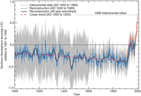

Figure 1: Northern Hemisphere temperature changes estimated from various proxy records shown in blue (Mann et al. 1999). Instrumental data shown in red. Note the large uncertainty (grey area) as you go further back in time.

Controversy, mostly of a manufactured nature, raged over the hockey-stick graph in the years following its publication: it became a symbolic focal point in the online 'climate-wars' that characterised the first two decades of the 21st Century, a time of often bitter battles and recriminations as misinformers attacked climate scientists in any way they could think of.

In the meantime, the expansion of things that were found to work as effective proxies continued apace, so that by the late 2010s we had learned a lot more about paleoclimate going right back through the glaciations and interglacials of the Quaternary and into the warmer late Cenozoic era. The paleoclimate record today stretches a long way back, through tens of millions of years.

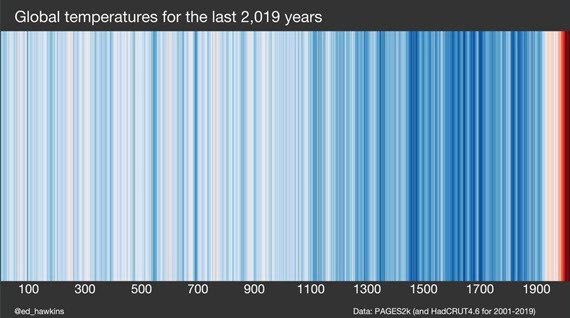
Back to shorter time-spans though, and another visually-catching graphic was recently created by climate scientist Ed Hawkins, using blues for colder years, reds for warmer ones and whites for near-average times. Known as “Warming Stripes'', the initial 2018 graph represented temperatures over the past 200 years, but a more recent version (Figure 2) uses a wide range of reliable proxy data from an international collaboration of scientists, called Past Global Changes 2K (PAGES2K), because it covers the past 2,000 years.
Warming Stripes past 2000 years

Figure 2: Warming Stripes based on PAGES2k (and HadCRUT4.6 for 2001-2019). Source: Ed Hawkins' Climate Lab Book

Warming Stripes is a visually striking graphic due in large part to its simplicity. It's like the Hockey Stick but with 20 years more scientific progress included. But like the Hockey Stick, it confirms the original findings: that the rate of recent warming is very steep in contrast to anything in the past two millennia.

Of course, as one would entirely expect, some crude attempts have been made to doctor Warming Stripes, but they never stand up to the level of scrutiny that scientists apply to their datasets. A graphic circulated in 2019 is one such example. For some unknown reason, its author left off the period 2007-2019, despite the temperature data being readily available. Could it have been because the warmest years on record occurred during this period? You tell us.

Furthermore, an in-depth examination of the graphic in question in a CBS News article shows that in fact it had been put together by crude copying and pasting in Photoshop or a similar application, so badly in fact that the edges of the pasted sections are clearly visible standing out from the top of the graphic. Like all climate misinformation, it just doesn't stand up to scrutiny.

Last updated on 27 May 2023 by John Mason. View Archives

Printable Version  |  Offline PDF Version  |  Link to this page

Argument Feedback

Please use this form to let us know about suggested updates to this rebuttal.

Further reading

The National Academy of Science's summation of the various temperature proxies are available online at Surface Temperature Reconstructions for the Last 2,000 Years.

Tamino has an interesting blog post Not Alike where he compares the Moberg temperature reconstruction (one of the least hockey stick like reconstructions with a distinct Medieval Warm Period and Little Ice Age) to modern temperature trends. He finds modern temperatures are 0.53 deg.C hotter than medieval times and the modern warming rate is 64% greater than the fastest rate in medieval times.

The NOAA Paleoclimatology Reconstructions Network has made available paleo data for download including 92 high-resolution temperature records over the past 2+ millennia.

Denial101x video

Here is a related lecture-video from Denial101x - Making Sense of Climate Science Denial

Additional video from the MOOC

Interviews with  various experts

Comments

1  2  3  4  5  6  Next

Comments 1 to 25 out of 141:

  1. PROXY-BASED RECONSTRUCTIONS...OVER THE PAST TWO MILLENIA ...Using a greatly expanded set of proxy data... Recent warmth appears anomalous for at least the past 1300 years whether or not tree-ring data are used... ...with somewhat greater Medieval warmth in the Northern Hemisphere, albeit still not reaching recent levels. (above from abstract) ...a multiple proxy...database consisting of a diverse (1209) set of annually (1158) and decadly (51) resolved proxy series. including tree-ring, marine sediment, speleotherm, lacustrine, ice core, coral, and historical documentary series... ...59 (extend) back to AD1000... ......the conclusion that recent Northern Hemisphere warmth likely exceeds that of at least the past 1300 years thus appears reasonably robust... Mann et al, Sep2008 (PNAS, so no pay wall) GLOBAL SIGNATURES AND DYNAMICAL ORIGINS OF THE LITTLE ICE AGE AND MEDIEVAL CLIMATE ANOMALY ...The Medieval period is found to display warmth that matches or exceeds that of the past decade in some regions, but which falls well below recent levels globally. Science abstract Mann et al, 27Nov2009 Intervals of regional warmth and cold in the past are linked to the El Nino phenomenon and the so-called "North Atlantic Oscillation" in the Northern hemisphere's jet stream... Comparisons between the reconstructed temperature patterns and the results of theoretical climate model simulations suggest an important role for natural drivers of climate such as volcanoes and changes in solar output in explaining the past changes. The warmer conditions of the medieval era were tied to higher solar output and few volcanoeic eruptions, while the cooler conditions of the Little Ice Age resulted from lower solar output and frequent explosive volcanic eruptions. Penn State press release, Mann et al, 27Nov2009
  2. I would consider moving the Climategate to its one argument. I believe this played much bigger in the media than you give it credit for. Maybe someting like.. Climategate clearly proves that AGW is a myth invented by scientists looking to make a quick buck... I wouldn't of thought to look here for information discussing that information.
  3. Why do you comply same cherry-picking as the IPCC? Many of the graphs presented still have Korrajärvi upside down. And the glacier-graph is ridicilous why do you cut it from 1600 the whole data from Greenland example can be seen here: http://www.foresight.org/nanodot/?p=3553 You are presenting a graph which ends just before the MWP and other warm periods. Why? Secondly, what statistical method allows you to do "the trick". Many other proxies than just tree-rings show the same divergence - which happens to be in the cooling phase of the PDO and between solar maximums. Much more likely explanation for the "divergence" is the UHI-effect and the effect of CO2 being weak (cloud feedback). if you use non-tree ring samples and UAH temperature data you get this: http://wattsupwiththat.files.wordpress.com/2009/04/lanser_holocene_figure11.png The IPCC "hockey stick" reconstructions are just pure quackery to hide the flaws in their biased theory. Even the Institute of Physics is aware of this possible scientific malpractise and cherry picking: LINK
    Response: [RH] Embedded link.
  4. protestant, i guess you've just discoved that climate has changed in the past. It has been warmer and colder, what a surprise! Good for you, next step will be understanding that unfortunately it does tell us much about the ongoing warming trend. PDO and solar minimum has nothing to do with the divergence problem and we cannot attribute it to UHI effct. In this post many proxies (other than tree rings) are shown that confirm the recent sharp temperature increase. Please read the comment policy and resrtain from talking about quackeries and the like.
  5. "Good for you, next step will be understanding that unfortunately it does tell us much about the ongoing warming trend." should read "[...] does NOT tell us much [...]" :p
  6. how boreholes can be used as proxy records? Do they measure the temperature at different depths? Is its temperature determined by the date the borehole was made? Thanks.
  7. Is it safe to say "the last few decades are the hottest in the last 500 to 2000 years"? My local skeptic threw "Vostock Ice Core data which clearly shows the Roman Era as Warmer than now" at me ...
  8. when 18,000 year old glaciers like the Chacaltaya melt away entirely after haveing obviously survived the MWP its a no brainer that it is warmer now at least in Bolivia.
  9. John, I would check whether the Holland paper is peer-reviewed even by E&E "standards". poptech - interesting that you fixate on this. (especially in light of Mann 2009 and all the other reconstructions) What do you think it means? Got "demolitions" for all the other proxy papers as well or this is a crusade against Mann?
  10. By a couple of common metrics such as overweening attention paid to what frankly appear as imaginary slights against the author on the part of a host of what he characterizes as conspirators, that "Casper and the Jesus paper" item appears to have been written by a crackpot. Yet the author has been published, patiently refuted and refuted again in a very professional manner by a number of researchers. I'd call that an excellent demonstration of scrupulous inclusiveness of outsiders on the part of the climate research community.
  11. John, another paper for you. Ice cover in Alps in 2003 at 5000yr low
    Response: That URL gives me a cookie error - is that a problem at my end or the publisher's?
  12. Can anyone tell me if there are temperature reconstructions that specificall avoid the use of the misleading bristlecone pine data? Cheers
  13. I smell a rhetorical question. Marty knows enough about temperature reconstructions to speak of "misleading bristlecone pine data" but wants help finding a reconstruction without 'em. Sorry, I'm not biting. Anybody else up for a pointless argument?
  14. doug_bostrom wrote : "Sorry, I'm not biting. Anybody else up for a pointless argument?" I would direct marty to NOAA Paleoclimatology (hope they're not considered biased and part of the big conspiracy), where he can check out data from boreholes, pollen, insects, etc. But, marty, why do you think bristlecone pine data is 'misleading' ?
  15. I just read an article saying that it was responsible for the hockey stick appearence and wondered if it was true that it makes temperature records have a hockey stick shape. Obviously if there are hockey stick shaped graphs that don't include the tree ring records of bristlecone pine then the article is clearly wrong. The article is on a site called spiked and I was rather hoping that someone knowledgeable about this issue might like to clarify things either here or in a posting to the letters page on spiked. http://www.spiked-online.com/index.php/debates/copenhagen_article/9056/ Since I haven't made up my mind about the science I obvioously flit between sites like spiked and this one. I'll have a look at the NOAA site and if it's not too technical I'll see if I can figure it out myself seeing as no one here can just give me a straight answer to what seemed to me a straight question. cheers
  16. Marty, read the post at the top of this page. See all the graphs of temperature data from sources that do not include bristlecone pines?
  17. marty - an excellent question. Kudos to you for checking additional data sources; many people don't bother. As Tom pointed out, there are a number of different temperature measurements (proxies) listed at the top of the page. I believe the Mann 'hockey stick' is composed of data from ~100 different temperature estimates, including some tree ring data. Mann felt (with some reason) that the later part of the tree ring data set was distorted, possibly due to other influences (drought) on tree growth for those proxies. It doesn't really matter, though, as including/excluding the later period tree ring data doesn't really change the graph by more than a couple percent either way. This is a popular 'skeptic' tactic, marty, which you might see elsewhere - picking a tiny piece of evidence, pointing out issues (correct or not) with it, and using that to claim that a conclusion based on many, independent lines of evidence is therefore invalidated by that tiny piece.
  18. Ok well for the sake of trying the debate I've posted a question about this on the comments box accompanying the article with a link to the article above. unfortunately I couldn't raise KR's claim about the small difference the inclusion/exclusion of tree ring data makes since I hadn't read it at that point. I would like to see what anyone following the link will have to say. I would disagree about the skeptic tactic bit though since it is a 'tactic' used by science in general. A tiny seemingly peripheral detail like the weird backwards looping about of a planet bought the whole glorious earth-centric universe tumbling down. Cheers.
  19. A small inconsistency can be an issue with a larger theory, marty - if the measurement is accurate/repeatable. Retrograde planetary transits certainly fit in that category. Unfortunately, many 'skeptic' arguments involve disagreements on interpretation, completely incorrect data, arguments about data normalization and calibration, etc. - and each (mis)point is used to argue that the Earth isn't warming, or we aren't the cause, or it won't hurt us anyway. An error in measurement (if it exists) is of quite different importance than a solid measurement that contradicts the theoretic predictions. I haven't seen any of those, really; the only recent issues I've seen that required consideration were ocean heating measurements and the tropospheric hot spot - and after the discussions I have to agree that these do NOT invalidate the conclusions of human driven global warming. You might find the list John has put together of the standard arguments quite interesting.
  20. To clarify my previous statement, marty: An invalid measurement (paper, data, whatever) is a lack of evidence for something. It really doesn't say anything about other evidence supporting a particular conclusion, just that the particular measurement has issues. A valid and contradictory measurement, on the other hand, is evidence against something. That's the category that retrograde planetary transits fall into. I really haven't seen any valid contradictory evidence regarding the conclusion of human driven global warming - nothing that held up as valid under examination.
  21. KR says: "I believe the Mann 'hockey stick' is composed of data from ~100 different temperature estimates, including some tree ring data." The Mann hockey stick in MBH98 was mostly created by incorrect standardization (normalization) that overweighted the Bristlecone proxies, a simple error. If you are referring to a newer version of "Mann 'hockey stick'" then please specify what version you are referring to.
  22. Eric - please read the last two paragraphs of this posting for an answer to that question.
  23. John, I don't know what's happening with Tamino's blog, but links are not working anymore. Fortunately internet archive keeps his blog until the end of 2008. Here is the link for the post not alike.
  24. All of the threads from before March or so of this year are gone at Tamino's site. It's a huge loss, as there was a lot of very good information there.
  25. In another thread the so-far unpublished McShane and Wyner paper was pointed out by David Walters. Some (me, for instance) have speculated that McShane and Walters drop some remarks indicating their unfamiliarity with the topic of their statistical analysis, even as they suggest climate researchers in turn are suffering from a lack of statistical expertise. Perhaps this is in fact a problem? 1) Why did McShane and Wyner regress their proxy PCs against the global mean temperature time series rather than against the whole NH temperature field over time, like Mann does? In other words, why throw away all that detailed info and calibrate against aggregated data only? 2) Why did M&W not notice that their calibration using the first PC of the instrumental field, rather than the global mean of instrumental, gives a reconstruction indistinguishable from Mann et al. 2008? 3) …and why did they not use this calibration — also aggregated but apparently better — in their Bayesian run, when it also clearly gives the best fit even by their crippled (because again, taken relative to the instru mean time series, not the whole field) RMSE criterion? "Gavin's Pussycat" at OpenMind Ordinarily I don't think I'd be referring to a blog comment by a cat as opposed to a formal comment or the like but apparently this paper has been pushed into the limelight before benefiting from full review. So, fair game, I guess.

1  2  3  4  5  6  Next

Post a Comment

Political, off-topic or ad hominem comments will be deleted. Comments Policy...

You need to be logged in to post a comment. Login via the left margin or if you're new, register here.

Link to this page


The Consensus Project Website

THE ESCALATOR

(free to republish)


© Copyright 2024 John Cook
Home | Translations | About Us | Privacy | Contact Us