


 Arguments


What evidence is there for the hockey stick?
What the science says...
| Select a level... |
 Basic
Basic
|
 Intermediate
| |||
|
Recent studies agree that recent global temperatures are unprecedented in the last 1000 years. |
|||||
Climate Myth...
Hockey stick is broken
“In 2003 Professor McKitrick teamed with a Canadian engineer, Steve McIntyre, in attempting to replicate the chart and finally debunked it as statistical nonsense. They revealed how the chart was derived from "collation errors, unjustified truncation or extrapolation of source data, obsolete data, incorrect principal component calculations, geographical mislocations and other serious defects" -- substantially affecting the temperature index.” (John McLaughlin)
At a glance
The Hockey Stick is a historic graph dating back to a paper published in 1999. It showed Northern Hemisphere temperature variations over the near-thousand year period from 1000-1998. The 'blade' of the stick represented the rapid warming of the late 20th Century. It has an iconic status, both in climate science and in the murky world of science-misinformation, where, naturally, it is despised by all and sundry.
Objections to the Hockey Stick are varied but mostly focussed on the stick's long handle and the data that represents. Obviously, during the centuries going back to 1000, reliable temperature measurements are not available. Fortunately for science, there are things that lived through that long time, such as certain very old trees. They record in the rings of their wood an indication of temperatures, year on year. Gardeners and farmers talk about good and bad growing years and it’s the same for natural systems. For example, cold dry periods make for narrow and densely-packed tree-rings whereas warmer, wetter times lead to more widely-spaced ones.
Importantly, today there are a great many effective past climate indicators, known as proxies because they act in place of thermometers. Because there's a range of indicators, the results from each one can be cross-checked against one another. If a new proxy is any good, its data should agree with that from the other, established ones.
Proxy datasets contain more uncertainty than directly measured temperatures. Everyone knows that. That does not mean they are useless, far from it. Cross-checking means poor data can readily be identified and investigated.
Finally, it's 24 years since the Hockey Stick graph was published. Since then, work on developing and refining the best proxies has been relentless. Better, longer temperature reconstructions have become possible. At the same time, global temperatures have continued to rise. In any of the observation-based records of surface temperature, all of the eight warmest years have been since 2015.
Please use this form to provide feedback about this new "At a glance" section, which was updated on May 27, 2023 to improve its readability. Read a more technical version below or dig deeper via the tabs above!
Further details
Reliable observational temperature records only go back so far in time – in the UK back to 1850 and in the USA to 1880, for example. So how do we find out about conditions going further back, hundreds, thousands or even millions of years into the past? We use proxies.
Proxies are things whose measurable properties are affected in certain, well-defined and understood ways by variations in temperature and other climatic parameters. Although the most well-known proxy work was undertaken by studying the rings of ancient trees, many other things have since shown usefulness in this field. They include data from ice-cores, marine and lake sediments and the fossils they contain, corals, mountain glaciers: as time goes by more and more things have shown themselves to be useful over a variety of time-spans. Armed with such tools, the paleoclimatologist can thereby reconstruct climatic conditions in ancient times, just as the paleontologist can reconstruct ancient ecosystems, from data preserved in the rocks.
By 1999, confidence in paleoclimate proxy data was sufficient to link these ancient records to modern observations and this was done in a famous paper by Michael Mann and colleagues (Mann et al. 1999), showing that global temperature gradually cooled over the last 1000 years, but then rose sharply, beginning in the 20th Century. The shape of the graph (Figure 1) therefore looked like a hockey stick lying flat on the ground with its blade pointing upwards.
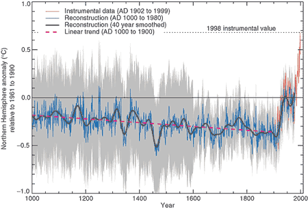
Figure 1: Northern Hemisphere temperature changes estimated from various proxy records shown in blue (Mann et al. 1999). Instrumental data shown in red. Note the large uncertainty (grey area) as you go further back in time.
Controversy, mostly of a manufactured nature, raged over the hockey-stick graph in the years following its publication: it became a symbolic focal point in the online 'climate-wars' that characterised the first two decades of the 21st Century, a time of often bitter battles and recriminations as misinformers attacked climate scientists in any way they could think of.
In the meantime, the expansion of things that were found to work as effective proxies continued apace, so that by the late 2010s we had learned a lot more about paleoclimate going right back through the glaciations and interglacials of the Quaternary and into the warmer late Cenozoic era. The paleoclimate record today stretches a long way back, through tens of millions of years.
Back to shorter time-spans though, and another visually-catching graphic was recently created by climate scientist Ed Hawkins, using blues for colder years, reds for warmer ones and whites for near-average times. Known as “Warming Stripes'', the initial 2018 graph represented temperatures over the past 200 years, but a more recent version (Figure 2) uses a wide range of reliable proxy data from an international collaboration of scientists, called Past Global Changes 2K (PAGES2K), because it covers the past 2,000 years.
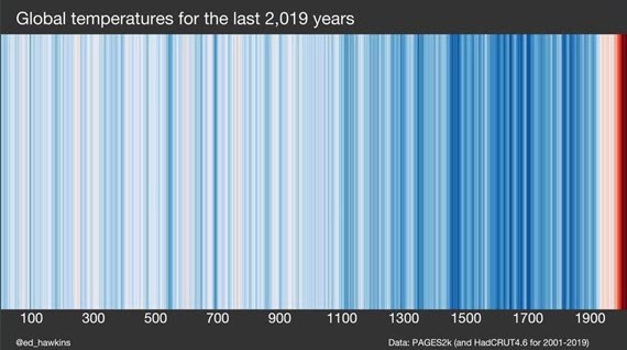
Figure 2: Warming Stripes based on PAGES2k (and HadCRUT4.6 for 2001-2019). Source: Ed Hawkins' Climate Lab Book
Warming Stripes is a visually striking graphic due in large part to its simplicity. It's like the Hockey Stick but with 20 years more scientific progress included. But like the Hockey Stick, it confirms the original findings: that the rate of recent warming is very steep in contrast to anything in the past two millennia.
Of course, as one would entirely expect, some crude attempts have been made to doctor Warming Stripes, but they never stand up to the level of scrutiny that scientists apply to their datasets. A graphic circulated in 2019 is one such example. For some unknown reason, its author left off the period 2007-2019, despite the temperature data being readily available. Could it have been because the warmest years on record occurred during this period? You tell us.
Furthermore, an in-depth examination of the graphic in question in a CBS News article shows that in fact it had been put together by crude copying and pasting in Photoshop or a similar application, so badly in fact that the edges of the pasted sections are clearly visible standing out from the top of the graphic. Like all climate misinformation, it just doesn't stand up to scrutiny.
Last updated on 27 May 2023 by John Mason. View Archives


[DB] Links to the once-lost Tamino/Open Mind posts can be found in this post here:
http://www.skepticalscience.com/Open_Mind_Archive_Index.html
The post you seek is located here:
http://web.archive.org/web/20080911215131/http://tamino.wordpress.com/2008/08/10/open-thread-5-2/
The specific portion of the thread in question begins here:
http://web.archive.org/web/20080911215131/http://tamino.wordpress.com/2008/08/10/open-thread-5-2/#comment-21873
[DB] Tamino also deals with the PCA/non-PCA kerfluffle in this post at RealClimate:
http://www.realclimate.org/index.php/archives/2010/07/the-montford-delusion/
The link for the 'NOAA Paleoclimatology Reconstructions Network' returns a 'forbidden' message.
The Tamino 'Not Alike' link also goes nowhere (not found).
There is an awesome new post on RealClimate about tree rings, soundly refuting McIntyre and other critics.
Hi all. The framing of this page is erroneous. The "skeptic argument" and "what the science says" do not refer to the same issue.
McIntyre and McKitrick purported to refute/debunk a specific paper -- the Mann 1998 paper. That is all. Their debunking (if it was truly a debunking, which it appears to be) stands. It's not refuted by all the other, later research that reaches similar conlcusions as Mann.
If the point here is to say that the hockey-stick-is-bogus argument is wrong because of all the other evidence, that's fine. But as far as I can tell, McIntyre and McKitrick were right in their criticism of that particular Mann paper, on various methodological grounds.
Phronesis,
Are you talking about science or public relations? I will grant you than Mann and McIntyre disagreed about how to do the analysis. Mann thinks he was correct and McIntyre thinks Mann was incorrect. This issue has been resolved by collecting more data and redoing the analysis in a way that everyone agrees is correct. When that was done it was found that Mann was correct in his interpretation of the data. How does the noise that McIntyre continues to make relate to the data proving that Mann was correct all along? When extensive reanalysis and massive amounts of new data confirm the original finding that means Mann was right and McIntyre was incorrect all along.
Phronesis - "McIntyre and McKitrick purported to refute/debunk a specific paper -- the Mann 1998 paper... as far as I can tell, McIntyre and McKitrick were right in their criticism of that particular Mann paper" Unfortunately for your argument, they utterly failed to make their case.
M&M's several papers on the subject have been at the center of numerous peer-reviewed refutations (five of them listed here), with numerous errors and erroneous claims pointed out at RealClimate, including critical failures to apply PCA selection rules to identify significant components; an error that alone invalidates their work. Similar errors in PCA selection (which would have distinguished invalid noise-generated hockey sticks as insignificant) and a rather amazing amount of cherry-picking in their 'red-noise' model are discussed on Deep Climate, notably with an unconventional 'red-noise' model that actually was derived from the proxies (rather than a theoretic red-noise spectra), and therefore included the 'hockey-stick' - no surprise that they found it in their 'noise'.
The M&M critcisms of Mann's work are completely invalid, on various methodological grounds.
Is MBH1998 without flaw? Hardly - it's the initial paper in the field applying PCA and machine learning techniques to multi-proxy climate data, and as such is rather rough around the edges. Their centering method is arguably not the best available, additional proxies and further clarification of then-existing proxies have improved the data, and there are reasonable arguments for different combinatorial and statistical techniques.
But methodological issues with MBH1998 don't invalidate the general conclusions, that recent temperatures are the warmest in the last 1000 years. And many papers, many reconstructions, looking at the issue come to the same conclusions.
[Source, data here]
At this point I see (IMO) unsupported objections raised against MBH1998 to be a clear identifying marker of someone in climate science denial.
Michael and KR, thanks for the correction. I'll read the material you linked. I'm a social scientist so I know PCA – hopefully I'll be able to understand what I'm reading. I didn't find a published refutation of M&M, and the more bloggy stuff I'd seen were ad hominem attacks on McIntyre for not being a climate scientist. I did not take that as a good sign. I will say that if Mann's methods were invalid (I'm not sure if Michael is conceding or disputing this), but the conclusions turned out to be correct, I'd still cross out Mann's paper and only care about the subsequent, valid work (perhaps including Mann's.)
I will say that McIntyre was spot on in his debunking of the recent Psych Science paper on belief in conspiracy theories and AGW skepticism -- there I'm in the comfy surrounds of my own field and expertise. His regression diagnostics were solid. There were hardly any participants in the dataset that fit the advertised effects. The paper should not have been published, and it's the first time I've ever seen a social psychologist (the lead author) say that we shouldn't care about outliers (in response to McIntyre) –- we're all trained contrary to that notion (McIntyre showed that a handful of outliers (5?) drove a huge part of the reported correlations.) Maybe McIntyre's skill with the social psychology paper biased my judgment of what he had done with the Mann paper -- well, it's kind of easy to debunk social psychology papers, which says something about the state of social science.
[DB] All discussions of conspiracies and AGW skepticism shoud take place on a more appropriate thread, like this one:
Recursive Fury: Facts and misrepresentations
Phronesis - I have replied on the appropriate thread.
The link to the Oerlemans paper is dead; consider replacing it with this: http://www.sciencemag.org/content/308/5722/675.full
I have been playing around with the top 100 (cherry picked) Hockey Stick Index (HSI) that are all that are supplied by McIntyre and McKitrick in supplementary data for their 2005 paper in GRL. In doing so, I noticed certain defects in the Hockey Stick index they used. Of these, the most glaring is that for any straight line with a any slope other than zero (fat) or infinite (vertical), it indicates that the straight line is a hockey stick. Even with white noise added, so long as the Signal to Noise ratio does not excede one, the line will probably (>50% chance) be given a HSI greater than 1, the conventional benchmark used by McIntyre to indicate something is a hockey stick.
Here is an example of a straight line "hockey stick":
In this case, the HSI is less than that for MBH 98 or 99, but the mean is of the 132 realizations is greater. That is, according to the M&M05 HSI, a straight line with white noise and a S/N ratio of 1.25 or more is more like a hockey stick than are MBH98 and 99.
This fact does not depend in any way on the slope (provided it is neither flat nor vertical). Negative slopes will yield negative HSI's, but M&M05 (correctly) regard negative HSI's as equivalent to positive values in that the MBH98 reconstruction method flips the sign on proxies if that yields a better fit to the temperature data (which is not an error).
From this it follows that the HSI developed by M&M cannot consistently distinguish between a straight line and a hockey stick shape. I suspect there are other shapes that it cannot distinguish either, but for now we need only consider the straight line. That means that, from the M&M05 HSI, we are unable to determine whether or not half of the 10,000 pseudo proxies are distinguishable from a straight line. Nor, using that index, are we able to distinguish MBH98 from a straight line. That means that as a statistical test of the tendency of short centered PCA to generate shapes similar to that of MBH98, the test is totally without power. It tells you absolutely nothing.
The total statistical power of the first part of M&M05, it turns out, comes from the visual comparison between MBH98 (fig 2) and the MBH first Principle Component of the North American Tree Ring Network (fig 3). That's it. And as everybody should no, eyeball Mark 1 has very little statistical power as well.
Not being content with finding a flaw with M&M05 statistical test, I looked to see if they could have done better. In the end I developed five variant Hockey Stick Indexes (vHSI) that were superior as a statistical test of a hockey stick shape (although not necessarilly under all circumstances). These were,
Here are the results, comparing MBH 98 and 99 to the cherry picked top 100 HSI pseudoproxies from M&M05:
The twelve point mean is the average of the 12 pseudoproxies used by McInyre (and Wegman) in various illustrations M&M's results. MBH98 PC1 is the first principle component of the reconstruction of 1450-1400 temperatures from MBH98.
As can be seen, MBH98 and 99 are statistically distinguishable from even the cherry picked top 1% of pseudoproxies, with differences in index values never less than 2 standard deviations above the mean, and for one index nearly 10 standard deviations above the mean. MBH98 PC1 does not perform as well, but still can be statistically distinguished from the cherry picked top 1% in 3 out of the five tests. (The Inflection point vHSI shows MBH98 PC1 to be just over two standard deviations above the mean.)
This is still a work in progress. I think I need to improve my vHSIs by making comparisons with the instrumental record rather than the calibration period, and a combination of angle based and standard deviation based vHSI would probably be superior. Further, I should make comparisons with the first principle component of the North American Tree Ring data base.
Never the less, even at this stage the results show that you can devise variant Hockey Stick Indexes that are better able to determine a hockey stick shape, and that if you use those vHSIs MBH98 and 99 stand out as easily statistically distinguishable from PC1s generated from red noise using short centered PCA. Further, those vHSIs are demonstrably superior to that of M&M05 in that at least none of them will mistake a straight line for a hockey stick (except the pure inversion method, which is why it was not shown ;)) So not only did M&M05 use a test with no statistical power, without validating the test; but alternative tests exist which would have refuted their thesis.
The take home is that the first part of M&M05 is simply scientific garbage. It has no scientific merit whatsoever.
When I get around to it, I am going to see if I can develop even better vHSIs, but probably will wait at least till I have a copy of the NOAMER PC1, and ideally until I (or a colaborator) can generate a full set of pseudoproxies without the cherry picks for statistical comparisons. (Help with either would be appreciated.)
Unless I am mistaken, the IPCC published Mann's 1995 "Hockey Stick" graph in "Science" magazine. They also published the graph for roughly the same time frame 5 years earlier in the same "Science" magazine. In the 1990 graph, the Medieval period showed massive heat for a few hundred years, much hotter than today. Much, much hotter than today. Mann's 1995 graph conveniently changed his later graph by illiminating that great warming period. That specific act is why the world is full of deniers. (Also because the water levels have not risen at Malibu Beach.
Gumball.
No. The IPCC does not publish original research in journals. It only reviews the original research. IPCC authors may publish their own work in journals like Science, because as experts they do some of the original research being reviewed. Science may have published an IPCC figure from a report, but they are not doing so as the IPCC.
I have a guess as to what you're talking about, but the dates don't match up. You will have to provide more specific — providing links to these figures etc — before anyone can clear up your confusion about this.
And as an aside, the tide gauge data at Santa Monica does not seem to squate with your assertion of no sealevel rise. But given possibility of local tectonics, dont you think a better guage of sealevel rise would from satellites or analysis of the global tide guage data?
What is your evidence that a perception of a Mann graph is the reason for climate denial? In my experience, denial is mostly rooted in political values and identity and will jump on any ridiculous excuse to bolster a position. A cool-headed review of all available data seems beyond many people.
Gumball67 @143:
1) As Stephen Baines has already noted, the IPCC does not publish original research. Rather, it reviews original research already published in the peer reviewed literature.
2) Michael Mann's iconic hockey stick graph, as reproduced by the IPCC in the Third Assessment Report (IPCC TAR, 2001) was published in the Geophysical Research Letters in 1999 (PDF version of paper).
3) That version was an update and extension of the prior version published in Nature in 1998, which only extended back to 1400 (PDF version of paper).
4) Those papers were revolutionary in being among the first to use actual temperature proxies from a several cites around the globe to determine NH temperatures, and more importantly, being the very first to assess the error margins of the estimates. They represented a major step forward in paleoclimate temperature reconstructions for the last few thousand years, but not the last or most recent step by any means.
5) The graph used by the IPCC in its First Assessment Report (IPCC FAR, 1990) was a version of a graph devised by Hubert Lamb. Hubert Lamb's graph was based on the Central England Temperature series, a thermometer based record of temperatures in central England. That record only extends back to 1659, whereas Lamb's graph extended back prior to 1000 AD. Astute observers will therefore note that he must have relied on other information for the extension, and that other information was anecdotal historical data, mostly from Europe and Greenland. Astute observers will further note that Central England is not the World, or even the Northern Hemisphere. They will even note that Central England plus Greenland is still not the world or the NH and conclude that using strictly regional temperature information (and anecdotal information in the crucial period) is not an adequate methodology, and not to be preffered to using a number of temperature proxies from around the world.
6) In the IPCC Second Assessment Report (IPCC SAR, 1996), the figure based on Lamb's guesses was replaced by proxy data, primarilly that from Bradley and Jones, 1993, which was a reconstruction based on 16 proxies and hence already a quantum leap in methodology over Lamb's free hand line drawn based on regional anecdotes:
(Image version from wikipedia)
The SAR also featured icecore records from around the globe, giving a similar picture.
So, in summary, every feature of your account of the events relating to the IPCC, Lamb and Mann's graph is wrong. But that is indeed why the world is full of deniers. Because it is full of people who seize on convenient "facts" as an excuse to avoid uncomfortable conclusions - never bothering to check their sources. Consequently it is full of people who confidently assert fictions as the basis of their opinions, and then go on to assert fraud by scientists for disagreeing with those opinions (as the scientist's opinions must, being based on facts).
As Scaddenp seems to have forgotten the link, here is the Santa Monica tide guage data:
http://www.psmsl.org/data/obtaining/stations/377.php
And here is the annual data from that site:
The trend since 1933 is 1.37 mm per annum.
Hey guys - would anyone be so kind as tell me or point me to the appropriate response to the denialist talking point, "The hockey stick isn't in IPCC AR5!"
dvaytw, AR5 WGI Chapter 5 pages 409, 413, and 419 all show different versions of holocene temperature reconstructions... aka, 'the hockey stick'.
They may be looking specifically for the work of Michael Mann... which is referenced extensively throughout Chapter 5. Just search on ' Mann' in the text of the chapter. In figure 5.7, the hockey sticks on page 409, the four reconstructions with labels starting with 'Ma' (e.g. 'Ma09rem') are from Mann's work.
The only way of interpreting the claim to be 'correct' might be that Mann's original 1998 'hockey stick' is not included... having since been superceded by subsequent work by Mann and others. So, to rephrase, 'The original hockey stick isn't in IPCC AR5! Instead, they used several of the newer ones which reach the same conclusions with even more conclusive data.'
Oh man, CBDunkerson, man did you just help me put egg on somebody's face. Much appreciated.