Monckton misuses IPCC equation
What the science says...
| Select a level... |
 Intermediate
|
 Advanced
| |||
|
The IPCC surface temperature projections have been exceptionally accurate thus far. |
|||||
Climate Myth...
IPCC overestimate temperature rise
"The IPCC’s predicted equilibrium warming path bears no relation to the far lesser rate of “global warming” that has been observed in the 21st century to date." (Christopher Monckton)
1990 IPCC FAR
The Intergovernmental Panel on Climate Change (IPCC) First Assessment Report (FAR)was published in 1990. The FAR used simple global climate models to estimate changes in the global-mean surface air temperature under various CO2 emissions scenarios. Details about the climate models used by the IPCC are provided in Chapter 6.6 of the report.
The IPCC FAR ran simulations using various emissions scenarios and climate models. The emissions scenarios included business as usual (BAU) and three other scenarios (B, C, D) in which global human greenhouse gas emissions began slowing in the year 2000. The FAR's projected BAU greenhouse gas (GHG) radiative forcing (global heat imbalance) in 2010 was approximately 3.5 Watts per square meter (W/m2). In the B, C, D scenarios, the projected 2011 forcing was nearly 3 W/m2. The actual GHG radiative forcing in 2011 was approximately 2.8 W/m2, so to this point, we're actually closer to the IPCC FAR's lower emissions scenarios.
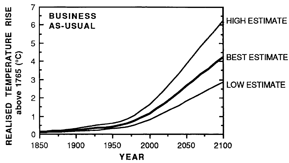
The IPCC FAR ran simulations using models with climate sensitivities (the total amount of global surface warming in response to a doubling of atmospheric CO2, including amplifying and dampening feedbacks) of 1.5°C (low), 2.5°C (best), and 4.5°C (high) for doubled CO2 (Figure 1). However, because climate scientists at the time believed a doubling of atmospheric CO2 would cause a larger global heat imbalance than is currently believed, the actual climate sensitivities were approximatly 18% lower (for example, the 'Best' model sensitivity was actually closer to 2.1°C for doubled CO2).
Figure 1: IPCC FAR projected global warming in the BAU emissions scenario using climate models with equilibrium climate sensitivities of 1.3°C (low), 2.1°C (best), and 3.8°C (high) for doubled atmospheric CO2
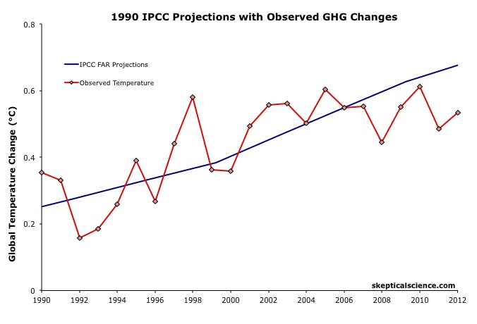
Figure 2 accounts for the lower observed GHG emissions than in the IPCC BAU projection, and compares its 'Best' adjusted projection with the observed global surface warming since 1990.
Figure 2: IPCC FAR BAU global surface temperature projection adjusted to reflect observed GHG radiative forcings 1990-2011 (blue) vs. observed surface temperature changes (average of NASA GISS, NOAA NCDC, and HadCRUT4; red) for 1990 through 2012.
The IPCC FAR 'Best' BAU projected rate of warming fro 1990 to 2012 was 0.25°C per decade. However, that was based on a scenario with higher emissions than actually occurred. When accounting for actual GHG emissions, the IPCC average 'Best' model projection of 0.2°C per decade is within the uncertainty range of the observed rate of warming (0.15 ± 0.08°C) per decade since 1990.
1995 IPCC SAR
The IPCC Second Assessment Report (SAR)was published in 1995, and improved on the FAR by estimating the cooling effects of aerosols — particulates which block sunlight. The SAR included various human GHG emissions scenarios, so far its scenarios IS92a and b have been closest to actual emissions.
The SAR also maintained the "best estimate" equilibrium climate sensitivity used in the FAR of 2.5°C for a doubling of atmospheric CO2. However, as in the FAR, because climate scientists at the time believed a doubling of atmospheric CO2 would cause a larger global heat imbalance than is currently believed, the actual "best estimate" model sensitivity was closer to 2.1°C for doubled CO2.
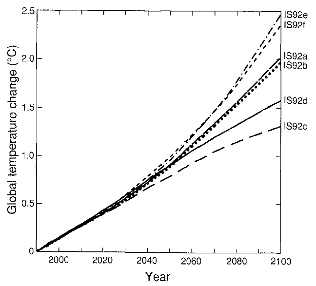
Using that sensitivity, and the various IS92 emissions scenarios, the SAR projected the future average global surface temperature change to 2100 (Figure 3).
Figure 3: Projected global mean surface temperature changes from 1990 to 2100 for the full set of IS92 emission scenarios. A climate sensitivity of 2.12°C is assumed.
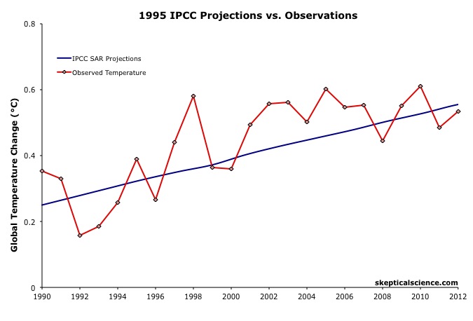
Figure 4 compares the IPCC SAR global surface warming projection for the most accurate emissions scenario (IS92a) to the observed surface warming from 1990 to 2012.
Figure 4: IPCC SAR Scenario IS92a global surface temperature projection (blue) vs. observed surface temperature changes (average of NASA GISS, NOAA NCDC, and HadCRUT4; red) for 1990 through 2012.
Scorecard
The IPCC SAR IS92a projected rate of warming from 1990 to 2012 was 0.14°C per decade. This is within the uncertainty range of the observed rate of warming (0.15 ± 0.08°C) per decade since 1990, and very close to the central estimate.
2001 IPCC TAR
The IPCC Third Assessment Report (TAR) was published in 2001, and included more complex global climate models and more overall model simulations. The IS92 emissions scenarios used in the SAR were replaced by the IPCC Special Report on Emission Scenarios (SRES), which considered various possible future human development storylines.
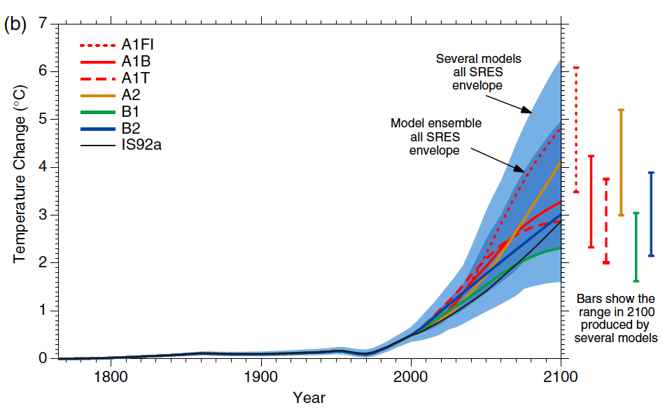
The IPCC model projections of future warming based on the varios SRES and human emissions only (both GHG warming and aerosol cooling, but no natural influences) are show in Figure 5.
Figure 5: Historical human-caused global mean temperature change and future changes for the six illustrative SRES scenarios using a simple climate model. Also for comparison, following the same method, results are shown for IS92a. The dark blue shading represents the envelope of the full set of 35 SRES scenarios using the simple model ensemble mean results. The bars show the range of simple model results in 2100.
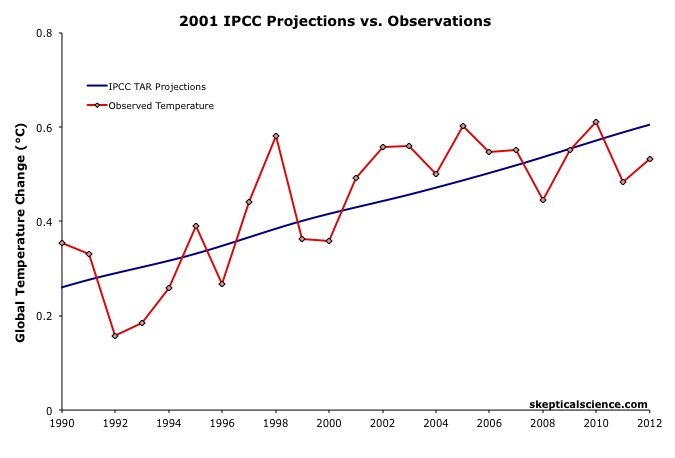
Thus far we are on track with the SRES A2 emissions path. Figure 6 compares the IPCC TAR projections under Scenario A2 with the observed global surface temperature change from 1990 through 2012.
Figure 6: IPCC TAR model projection for emissions Scenario A2 (blue) vs. observed surface temperature changes (average of NASA GISS, NOAA NCDC, and HadCRUT4; red) for 1990 through 2012.
Scorecard
The IPCC TAR Scenario A2 projected rate of warming from 1990 to 2012 was 0.16°C per decade. This is within the uncertainty range of the observed rate of warming (0.15 ± 0.08°C) per decade since 1990, and very close to the central estimate.
2007 IPCC AR4
In 2007, the IPCC published its Fourth Assessment Report (AR4). In the Working Group I (the physical basis) report, Chapter 8 was devoted to climate models and their evaluation. Section 8.2 discusses the advances in modeling between the TAR and AR4. Essentially, the models became more complex and incoporated more climate influences.
As in the TAR, AR4 used the SRES to project future warming under various possible GHG emissions scenarios. Figure 7 shows the projected change in global average surface temperature for the various SRES.
Figure 7: Solid lines are multi-model global averages of surface warming (relative to 1980–1999) for the SRES scenarios A2, A1B, and B1, shown as continuations of the 20th century simulations. Shading denotes the ±1 standard deviation range of individual model annual averages. The orange line is for the experiment where concentrations were held constant at year 2000 values. The grey bars at right indicate the best estimate (solid line within each bar) and the likely range assessed for the six SRES marker scenarios.
We can therefore again compare the Scenario A2 multi-model global surface warming projections to the observed warming, in this case since 2000, when the AR4 model simulations began (Figure 8).
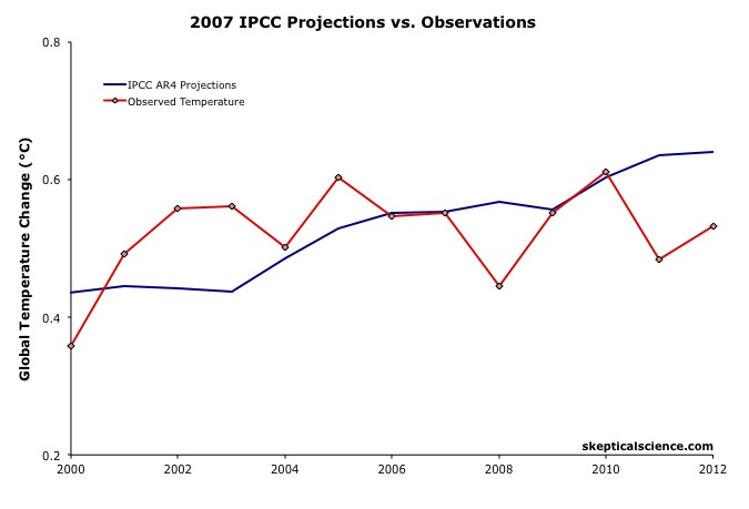 Figure 8: IPCC AR4 multi-model projection for emissions Scenario A2 (blue) vs. observed surface temperature changes (average of NASA GISS, NOAA NCDC, and HadCRUT4; red) for 2000 through 2012.
The IPCC AR4 Scenario A2 projected rate of warming from 2000 to 2012 was 0.18°C per decade. This is within the uncertainty range of the observed rate of warming (0.06 ± 0.16°C) per decade since 2000, though the observed warming has likely been lower than the AR4 projection. As we will show below, this is due to the preponderance of natural temperature influences being in the cooling direction since 2000, while the AR4 projection is consistent with the underlying human-caused warming trend.
IPCC Projections vs. Observed Warming Rates
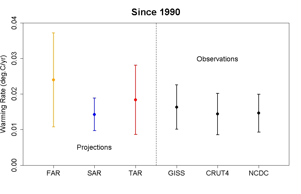
Tamino at the Open Mind blog has also compared the rates of warming projected by the FAR, SAR, and TAR (estimated by linear regression) to the observed rate of warming in each global surface temperature dataset. The results are shown in Figure 9.
Figure 9: IPCC FAR (yellow) SAR (blue), and TAR (red) projected rates of warming vs. observations (black) from 1990 through 2012.
As this figure shows, even without accounting for the actual GHG emissions since 1990, the warming projections are consistent with the observations, within the margin of uncertainty.
Rahmstorf et al. (2012) Verify TAR and AR4 Accuracy
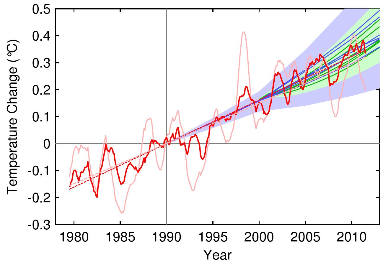
A paper published in Environmental Research Letters by Rahmstorf, Foster, and Cazenave (2012) applied the methodology of Foster and Rahmstorf (2011), using the statistical technique of multiple regression to filter out the influences of the El Niño Southern Oscillation (ENSO) and solar and volcanic activity from the global surface temperature data to evaluate the underlying long-term human-caused trend. Figure 10 compares their results with (pink) and without (red) the short-tern noise from natural temperature influences to the IPCC TAR (blue) and AR4 (green) projections.
Figure 10: Observed annual global temperature, unadjusted (pink) and adjusted for short-term variations due to solar variability, volcanoes, and ENSO (red) as in Foster and Rahmstorf (2011). 12-month running averages are shown as well as linear trend lines, and compared to the scenarios of the IPCC (blue range and lines from the 2001 report, green from the 2007 report). Projections are aligned in the graph so that they start (in 1990 and 2000, respectively) on the linear trend line of the (adjusted) observational data.
TAR Scorecard
From 1990 through 2011, the Rahmstorf et al. unadjusted and adjusted trends in the observational data are 0.16 and 0.18°C per decade, respectively. Both are consistent with the IPCC TAR Scenario A2 projected rate of warming of approximately 0.16°C per decade.
AR4 Scorecard
From 2000 through 2011, the Rahmstorf et al. unadjusted and adjusted trends in the observational data are 0.06 and 0.16°C per decade, respectively. While the unadjusted trend is rather low as noted above, the adjusted, underlying human-caused global warming trend is consistent with the IPCC AR4 Scenario A2 projected rate of warming of approximately 0.18°C per decade.
Frame and Stone (2012) Verify FAR Accuracy
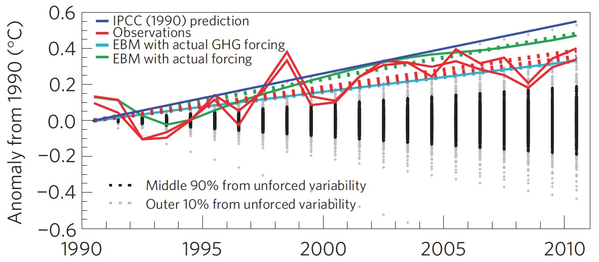
A paper published in Nature Climate Change, Frame and Stone (2012), sought to evaluate the FAR temperature projection accuracy by using a simple climate model to simulate the warming from 1990 through 2010 based on observed GHG and other global heat imbalance changes. Figure 11 shows their results. Since the FAR only projected temperature changes as a result of GHG changes, the light blue line (model-simuated warming in response to GHGs only) is the most applicable result.
Figure 11: Observed changes in global mean surface temperature over the 1990–2010 period from HadCRUT3 and GISTEMP (red) vs. FAR BAU best estimate (dark blue), vs. projections using a one-dimensional energy balance model (EBM) with the measured GHG radiative forcing since 1990 (light blue) and with the overall radiative forcing since 1990 (green). Natural variability from the ensemble of 587 21-year-long segments of control simulations (with constant external forcings) from 24 Coupled Model Intercomparison Project phase 3 (CMIP3) climate models is shown in black and gray. From Frame and Stone (2012).
Not surprisingly, the Frame and Stone result is very similar to our evaluation of the FAR projections, finding that they accurately simulated the global surface temperature response to the increased greenhouse effect since 1990. The study also shows that the warming since 1990 cannot be explained by the Earth's natural temperature variability alone, because the warming (red) is outside of the range of natural variability (black and gray).
IPCC Trounces Contrarian Predictions
As shown above, the IPCC has thus far done remarkably well at predicting future global surface warming. The same cannot be said for the climate contrarians who criticize the IPCC and mainstream climate science predictions.
One year before the FAR was published, Richard Lindzen gave a talk at MIT in 1989 which we can use to reconstruct what his global temperature prediction might have looked like. In that speech, Lindzen remarked
"I would say, and I don't think I'm going out on a very big limb, that the data as we have it does not support a warming...I personally feel that the likelihood over the next century of greenhouse warming reaching magnitudes comparable to natural variability seems small"
The first statement in this quote referred to past temperatures — Lindzen did not believe the surface temperature record was accurate, and did not believe that the planet had warmed from 1880 to 1989 (in reality, global surface temperatures warmed approximately 0.5°C over that timeframe). The latter statement suggests that the planet's surface would not warm more than 0.2°C over the following century, which is approximately the range of natural variability. In reality, as Frame and Stone showed, the surface warming already exceeded natural variability two decades after Lindzen's MIT comments.
Climate contrarian geologist Don Easterbook has been predicting impending global cooling since 2000, based on expected changes in various oceanic cycles (including ENSO) and solar activity. Easterbrook made two specific temperature projections based on two possible scenarios. As will be shown below, neither has fared well.
In 2009, Syun-Ichi Akasofu (geophysicist and director of the International Arctic Research Center at the University of Alaska-Fairbanks) released a paper which argued that the recent global warming is due to two factors: natural recovery from the Little Ice Age (LIA), and "the multi-decadal oscillation" (oceanic cycles). Based on this hypothesis, Akasofu predicted that global surface temperatures would cool between 2000 and 2035.
John McLean is a data analyst and member of the climate contrarian group Australian Climate Science Coalition. He was lead author on McLean et al. (2009), which grossly overstates the influence of the El Niño Southern Oscillation (ENSO) on global temperatures. Based on the results of that paper, McLean predicted:
"it is likely that 2011 will be the coolest year since 1956 or even earlier"
In 1956, the average global surface temperature anomaly in the three datasets (NASA GISS, NOAA NCDC, and HadCRUT4) was -0.21°C. In 2010, the anomaly was 0.61°C. Therefore, McLean was predicting a greater than 0.8°C global surface cooling between 2010 and 2011. The largest year-to-year average global temperature change on record is less than 0.3°C, so this was a rather remarkable prediction.
IPCC vs. Contrarians Scorecard
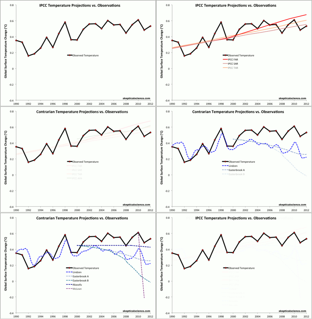
Figure 12 compares the four IPCC projections and the four contrarian predictions to the observed global surface temperature changes. We have given Lindzen the benefit of the doubt and not penalized him for denying the accuracy of the global surface temperature record in 1989. Our reconstruction of his prediction takes the natural variability of ENSO, the sun, and volcanic eruptions from Foster and Rahmstorf (2011) (with a 12-month running average) and adds a 0.02°C per decade linear warming trend. All other projections are as discussed above.
Figure 12: IPCC temperature projections (red, pink, orange, green) and contrarian projections (blue and purple) vs. observed surface temperature changes (average of NASA GISS, NOAA NCDC, and HadCRUT4; red) for 1990 through 2012.
Not only has the IPCC done remarkably well in projecting future global surface temperature changes thus far, but it has also performed far better than the few climate contrarians who have put their money where their mouth is with their own predictions.
Intermediate rebuttal written by dana1981
Update July 2015:
Here is a related lecture-video from Denial101x - Making Sense of Climate Science Denial
Last updated on 13 July 2015 by pattimer. View Archives


 Arguments





KR @25, I have not assumed bcglrofindel does not have valid concerns. I have addressed his concerns by showing why a direct comparison is simply misleading (on numerous grounds). He is quite welcome to respond by showing that he now gets why it is inappropriate.
A word to bcglrofindel, who I hope is still following this thread:
One of the SkS comments policies is "no dog-piling", which is intended to avoid having one poster have to deal with a whole bunch of comments from several people. It can be overwhelming.
In this thread, you've now had several people respond. In your last comment @21, you indicated that you still inidcate a desire for a simple graph, even though there have been several comments saying why this is difficult - some directed to you, some in response to jsmith's earlier graph.
If you still can't see why the graph jsmith provided is misleading, it would help if you told us why you feel that the responses don't explain it well. Please engage in a conversation about these explanations. If the number of responses is too much for the moment, tell us that you wish to discuss one aspect of things, and engage on that aspect. Refrain from introducing new issues until the discussion on that aspect is complete.
Regulars here wil lose patience if they feel that their responses are being ignored. A simple acknowledgement of "OK, I see that now" (as suggested by Tom @ 26), will go a long way in terms of encouraging a productive discussion.
@Bob Loblaw,
Thanks for that. I'm Canadian and so yesterday was remembrance day and thus I was out visiting family and not back in till now.
My background is comp sci, so I very much understand that the original FAR models assumptions matter to the results they plotted and if scenario baseline assumptions aren't met that results will differ. I agree with all of that as self evident. It's also IMHO a very big and broad subject to try and get into.
My question that I still only have a fuzzy yes/maybe/no answer to is about how actual measured temperature compares to the published FAR temperature projections in Fig6.11. I totally understand that those projections had massive spreads within themselves because of the broad number of scenarios and unkowables they were working from. That doesn't stop people I've seen from posting the claim that ALL the FAR Fig6.11 projections are higher than current actual temperatures. I don't have a problem articulating the reasons that would be 'ok' or not a disprove of underlying theory. I can argue for and against that well enough. What I don't know is if that base claim is even remotely true. The best I can do is try and see from the graphs in Fig6.11 what temp increase from 1990 through 2014 the graphs show, which is extremely rough and not in anyway pursuasive. Additionally, if anyone has access somewhere to the actual raw data used for Fig6.11, then it should be trivial to show how actual temperature has tracked to the Fig6.11 scenarios, no? Yes, I know the scenarios Fig6.11 used with radically high assumptions will be too high, and we all know to expect that. I just want to know if people that claim all scenarios in Fig6.11 exceed modern temp can be called liars? More over, if I call them liars, am I actually the one lying?
scaddenp,
We are talking about the 1990 IPCC report, so the current record is about 25 years out and closing on the 30 years you suggest quickly. I also don't think it's the best argument to just tell people well the answer doesn't matter, or is just a strawman. The IPCC temperature projections ARE described in th executive summary as BEST guess changes. The IPCC executive summary IS being used to inform policy changes. When I see someone claiming that the IPCC temperature projections, in ALL scenarios, estimated higher actual temperatures than we see today on actual record I don't feel like telling them it's irrelevant is a strong argument.
More over, my underlying and overarching question was if there is anywhere one can simply go to point out the truth or falsity of such a claim? We have the instrumental temperature record available all over the place online, but referencing it correctly to the IPCC FAR fig6.11 is tricky without the actual data underlying the FAR projections.
My question more simply is if someone claims that the IPCC F(irst)AR overestimated temeprature compared to actual measurements are they making a false statement? If I say that isn't true, am I lying?
Tom Curtis,
I believe responses like yours just drives away skeptics. A question as simple as how do the IPCC projections from 1990 compare to the instrumental record today nearly 25 years later seems a fairly honest starting point. To summarize the correct response to such a query as declaring the very question as "inappropriate" is terrible.
IMHO, the correct responses are one of:
The actual is hotter, and here is why.
The actual is cooler, and here is why.
The actual is very close, and here is why.
bcglrofindel,
I don't have precise data for the answer you want, but would make some points:
(1) el Nino / la Nina phase correlates highly with internal (ie not externally or CO2 driven) temperature variability, and we are currently in a highly el Nino negative period, which therefore would be expected to be unusually cooler than the projections. However there are forcings over the last 10 years (TSI, aerosols) which affect the temperature so I am not sure how dominant this effect is.
(2) I can't give an immediate answer because the correct projection needs to be chosen for CO2 emissions. This does not require much work.
(3) A straight comparison should be doable, as long as careful attention is paid to baselining, and result in a deviation explainable to some extent by variability in aerosols (volcanic and anthropogenic), TSI. The rest will be internal variation (of which the el Nino/la Nina phase is an important component) and errors in the 1990 model assumptions or input data.
I'd like to see the answer but am not in a position myself to provide it. I wonder if a web search would find something?
One point to remember is that all of the un-modelled variability noted above is highly significant - so that we expect the actual temperature to depart a lot from the model average (which is what you see in the graphs). And that the actual temperature represents one run of a model, so that it is much more variable than the variation in model averages.
Another related point is that in doing these comparisons you need to be really careful about (for example) baselining. There is so much decadal randomness that small changes in even quite a long baseline can make a big difference.
You will see that the above is explaining my inability to give a simple answer such as you ask without lots of ifs an buts. Sometimes life is like that! Perhaps somone else can link to a reasonably complete study?
tom_clarke, thanks.
A websearch for that kind of data is what ended up bringing me to this article :). I again appreciate the very great degree of variability there is in projections. The FAR folks did up three separate graphs for CO2 doubling sensitivity of 4.5, 2.5 and 1.5. Then, within each graph they also included 4 different emissions scenarios. I appreciate that leaves lots of room to fall outside the modelled scenarios. At the same time, I don't especially like going overboard in declaring that the entirety of all the scenarios projected by the FAR folks were all to pessimistic. That just about leads to a "told ya so" from the ones claiming the FAR projections are all too hot compared to instrumental records.
IMO, the big problem here is trust and confidence in modelling. Hindcasting accuracy doesn't exactly resonate with a skeptical audience as proof positive. Projections like the FAR that are 25 years old though are pretty powerfull. It's hard to 'fake' getting good results 25 years later. It's also necessary to explaing bad results 25 years later.
That said though, I'm still at the stage of answering the question of whether the projections have yielded good, bad or in between results 25 years later. The graph would seem a simple endeavour. I've tried digitizing data points from Fig6.11 below for sensitivity of 1.5, the coldest, but with emission scenario Business as Usual(the most pessimistic). By digitizing though I mean zooming tight on the image and drawing my own graph lines across to attempt to get close numbers:
1962 - 0.375
1963 - 0.375
1975 - 0.49
1987 - 0.625
1988 - 0.625
2000 - 0.75
2012 - 0.875
2013 - 0.875
"We are talking about the 1990 IPCC report, so the current record is about 25 years out and closing on the 30 years you suggest quickly."
Yes, but it seems you are trying to compare a point - the temperature today - with a position on the curve which is not valid. You can compare the 30 year average with the projected 30 year average. To do otherwise means you are forever wrong - "+ve esno cycle - the models are underpredicting", oops, "-ve cycle. the models are too hot". What the models to do not pretend to do, is predict enso variability and any comparison that do not allow for that is invalid.
bcglrofindel - If you recall, I gave you a graph of temperatures vs. projections earlier in the thread, including the 1990 FAR. More specifically in the collection of SkS threads examining past projections is a direct FAR comparison here:
[Source]
Far more relevant are FAR models using actual greenhouse emissions to present (which didn't exactly match any of the scenarios), as the various scenarios were just that, scenarios, not looking-glass prophetic visions of future economies:
The FAR models were quite simple - but all in all did a reasonable job.
In short: The FAR projections were not exact matches to observed history, but the models they used appear to be in the right range for predicting trends vs. GHG emissions.
I believe that is a sufficient response for the naysayers.
bcglrofindel @ 30, no! Responses like mine may drive away deniers, ie, pseudo-skeptics who want to generate a talking point without understanding it. Genuine skeptics, however, are only interested in apples to apples comparisons. If the IPCC plotted only the expected temperature increase due to green house gases (and did not include the temperature decrease due to aersols), they will want to know that, and want to plot "the temperature increase due to GHG" against the IPCC projections (and will note, unfortunately that no thermometers are only able to distinguish temperature changes due to greenhouse gases). Alternatively, they will want to plot the actual temperature increase against either the IPCC FAR projections adjusted to match the actual change in forcing, or against that scenario which most closely matches the actual change in forcings (scenario B for overall forcings). Further, they will want the reasons for those particular comparisons discussed rather than being presented with an unexplained graph that will only mislead the unwary.
Despite this, you persist in wanting a temperature comparison with the BAU projections despite the known fact that emmissions did not follow the BAU scenario, and the change in forcing between 1990 and 2011 matches the much lower value of scenario B.
It's very important to remember that the scenario projections _are not predictions_! The only 'prediction'(more correctly a conclusion) from the climate model is that of the _relationship_ between emissions and climate change. The only appropriate test is to examine whether the relationship embodied in the physics of the models holds between actual emissions and observed temperatures, not between observations from actual emissions and 'what if' scenarios with wholly different GHG histories.
Complaining about a mismatch between observations and model projections from scenarios that didn't occur, as is so common from 'skeptics', is nothing more than a strawman argument, a logical fallacy.
As a followup to KR's last sentence, you can get a look at what a pseudo-skeptic does with this comparison by looking at this Skeptical Science post about Pat Michaels.
@KR thanks, the graph there is pretty much exactly what I was wanting to track down. When it was in the gif with a dozen other graphs I failed to pick it out specifically.
@Tom Curtis, I understand being enthusiastic when you are passionate about something, but your posts are all coming across way overly aggressive. So much so you don't really even seem to have bothered with reading my actual requests as I never insisted on the BAU scenario comparison, but just any comparison to the entirety of the scenarios used in the FAR including bau, b, c, and d.
@All
IMHO I don't quite agree with the vehement insistance on rejecting the initial query itself. KR's second last post and in particular his source are pretty much exactly what I was looking for from the start. I hadn't thought I'd asked the question that badly? The extensive insistence that we should discourage people from making the query at all, and even further should be shaming them for asking it is, well, wrong. That approach is going to just drive away most people and as likely as not they'll take the extreme defensiveness as proof the claim is true. Meanwhile, the reality is that plotting temp against the FAR scenarios places reality having fallen HOTTER hotter than FAR BAU at 1.5 sensitivity.
Additionally, insisting that under NO CIRCUMSTANCES no circumstances was reality anywhere near even the most optimistic of the FAR's assumptions and scenarios is basically telling a skeptic they were right all along, and exactly the OPPOSITE opposite tactic I'd think should be taken.
Sorry, I don't want to be hyper critical, and doubly so with a good answer to my query in hand. I do however find the extraordinary grilling and condmening of the query as counter productive and frankly damaging and really want to put that out there as something to be cautioned against.
[JH] The use of "all caps" is akin to shouting and is prohibited by SkS Comments Policy.
bcglrofindel - I had forgotten about that earlier FAR specific post; SkS really contains a lot of information. If you're interested in other predictions that have been examined here, the Lessons from Predictions button in the left margin is quite useful.
I'm afraid that much of the strength of the reaction to your questions was based on past experiences - I cannot count how many times someone has commented here and on other climate blogs claiming despite the evidence that mismatches between specific projections and observed temperatures somehow invalidate all climate modeling, despite the projected emissions not matching actuals. The pattern for those 'skeptics' is one of starting out with what sems like a reasonable question, then not accepting the explanations, degenerating into denial, libertarian fantasies, and conspiracy theories while asserting counterfactuals, before their politeness finally expires and moderation kicks in. But it's difficult to distinguish between such people and the genuinely curious early in the exchange.
Note to everyone - As bcglrofindel points out, such a strong reaction can be quite offputting. Save the sarcasm for people who have demonstrated the need for heavy implements in clue delivery.
bcglrofindel I think perhaps it would be a good thing if you were to review the wording of your initial posts here in understanding the reception you have received. jsmith wanted asked a question about why the adjustments made such a large difference compared to the diagram that he introduced into the discussion. It was explained why that diagram was itself highly nuanced (the nuance explaining a lot of the difference). Your first comment began
"If JSmith's methods were wrong can you not at least address his core concern? "
Note that you implicitly question the issues that I had raised (or at least do not accept them), but if his core concern was indeed the discrepancy, then the issue that I had raised explains most of it. You began on this thread by effectively glossing over a substantive issue that had been raised. That is not conducive to scientific discussion.
KR then made the very important point that GCM projections are not intended to be accurate over such short timescales, and gave an appropriate plot of various projections to demonstrate this, but your reply was frankly rather rude "You still aren't giving a simple apples to apples comparison." and went on to ask " Isn't it trivial to plot actual temperature against the 3 projections the IPCC gave in Fig 6.11? "
the answer to this is that "yes it would be trivial, but it would be misleading for the reasons that had already been explained to you, for a start it is important to take into account that the observed forcings did not match those used in the scenarios, so you should adjust for that in order to make a like-for-like comparison"
however you write "That would easily do away with all the hedging and confusion and end the matter, no? "
now "hedging" suggests that someone is being deliberately disingenuous in their presentation of the data. Getting the science right, and adjusting for known problems is not "hedging".
Can you see that your own comments here have not been altogether conducive to good natured discussion.
you carry on
"Why can't I find such a simple plot anywhere? All the places I find such a plot, like JSmith's in thread, it's called out as inaccurate. Can't 3 simple plots done on excel in about a half hour clear this up and silence skeptics?"
I explained why JSmiths plot is problematic (I wouldn't say innacurate, just that there are nuances in its interpretation that you need to be aware of). Now accepting my criticism would be fine, or challenging it, that would be fine to. However you chose a third option, which was to imply that it was some sort of partisan rejection. I find that kind of treatment of my well-intentioned comments to be pretty offensive. However, that is pretty much water of a ducks back these days, so I let it go; others may not have been that charitable.
I suspect that part of the problem here is that the issue is not as straightforward as you think it ought to be, and you are having difficulty accepting that others know more than you do about this. Hopefully this will help you see why you have had the reception you have recieved, it is at least partly your own fault.
In short, it is better to ask questions with some humility, and if you don't understand why something is not done the way you think it should be done, consider that there may be good reasons and ask why, rather than demand plots being drawn to your specifications.
incidentally, it is pretty well known that electronic forms of communication have a tendency to be percieved as being rather more agressive than actually intended, which I think applies to all sides in this discussion. Note my previous comment was intended as helpful guidance for bcglrofindel on adjusting his posting style to be a little less confrontational, and hence improve his/her interaction here.
bcglorfindel wrote "IMO, the big problem here is trust and confidence in modelling."
The graph you propose will not be able to address this question in a scientific manner because projections tend to have stated uncertainties, as do the observations, so you would need to add credible intervals to both before you could really determine whether the models had peformed as well as could be reasonably expected over such a short timescale.
Another important point to bear in mind (and this is really important) which is the mean of an ensemble of model runs is not a projection of the trajectory of the Earth's actual climate, just of theofirced component (i.e. the climate change that results from a change in the forcings, rather than sources of internal climate variability). A fairer comparsion would involve also adjusting the observations to account for the effects of internal variablity (e.g. by regression analysis to remove the effects of ENSO and volcanic forcings which the models do not include).
Performing an apples-v-apples comparsion is not as straightforward as you might think, and performing the comparison properly includes either performing the adjustments to the best of your ability or including the caveats that explain (if not quantify) likely sources of discrepancy.
Given bcglrofindel's comments @38, I am tempted to let him totter of with his stick to the gun fight. However ...
While the two graphs shown by KR @34 are excellent for their purpose, that purpose is not the comparison of post 1990s trends. As the comparison of temperature changes post 1990 is the "purpose" of the pseudo-skeptical interest in the FAR projections, the graphs are not suitable for the underlying purpose. Used as such, a competent* pseudo-skeptic will point out that:
1) The graph shows a multi year average of the GISS temperature record, thereby eliminating (by regression to the mean) some of the lower temperature values in the twenty first century;
2) The graph has no clearly defined baselining procedure (and natural candidates are excluded by relative values); and (most importantly)
3) By taking the change in temperautre from 1880, the graph allows the accumulated relative difference over 110 years to distract from the very different rates of change between observations and IPCC FAR projections post 1990 (and particularly post 2000).
Please note that these are only problems when the graphs are used, contrary to their original purpose, to compare changes in temperature post 1990. Further, note that, with regard to point (2), although the baselining method is not specified, a perfectly valid baselining technique may have been used (and probably was given that Dana constructed the graph). However, if you do not know what it is, you cannot defend its reasonableness, or correct for it if you think it unreasonable.
Because the graphs are not suitable for comparison of post 1990 changes in temperature, the original article included a graph for just that purpose:
Note, however, that for that graph, the IPCC "projection" was adjusted to reflect actual (rather than projected) changes in GHG forcings.
So, once again we return to the same points. A proper comparison requires understanding the difference between projections and predictions, and not expecting the IPCC to "predict" the fall of the former Soviet Union (among other things).
(* The incompetent pseudo-skeptics tend to simply reject such graphs out of hand on the sole basis that they come from Skeptical Science.)
bcgirofindel @38.
Your original comment here talked of JSmith making "mistakes or inaccuracies in matching" data. But JSmith did no matching. Rather, he simply cut and pasted a graphic sourced from the internet, a graphic which originated as part of a piece of denialistic reporting by Der Spiegel.
And I'm still at a loss as to why the "simple apples to apples comparison" called for would require to be with the IPCC FAR graphics rather than the IPCC FAR calculations. Surely we wish to judge the IPCC on the veracity of its calculations not on its abilities in accurately predicting the future w.r.t. such things as the speed with which CFCs would be phased out, the drop in methane emissions from waste tips and petrochemicals, the collapse of Communism, etc.
@Dikran and Tom
If I'd been able to find or see the original source reference to this graph of temp vs. FAR I'd not even have posted as my query was answered:
What I read and could see instead was no mention of how actual temperature compared to the FAR because that was declared misleading, unscientific, etc. JSmith attempted his own graph of same, and it was pointed out that his actual was grossly inaccurate and nothing like what an honest plot of actual vs FAR would look like. However, there was still lack of any plotting of what that different honest FAR vs actual would look like. As it turns out, a separate page on this very site had exactly that graph as linked above. Better still before KR kindly pointed to that graph, I had broken down and endeavoured to digitize the FAR graphs myself and reference temperature trends over the period prior to 1985 from the FAR graphs. Averaging across that time frame, I get the encouraging reward of a near matching to the result of above pre-existing graph.
The only thing I guess I really have left to say is that I don't count that as trivial, dishonest or entirely without value. I still staunchly disagree that looking for that result is inherently dishonest, or even misguided.
The Joe Blow public wants simple tests that lack lengthy qualifications and caveats. The IPCC team that worked on FAR understood that, and half their reason to exist was to endeavor to bridge that gap. To that end, the projections they did included considerations for a broad range of possible unknowns. A key reason for doing this is to span the spectrum of possible future outcomes. Discount their efforts to that at your peril. The CO2 sensitivity ranges they used spanned from 1.5 to 4.5, which if I'm not mistaken is still within the currently expected range? The atmospheric CO2 and CO2 equivalent concentrations they used in scenarios BAU, B, C, D still span the current day values. If I'm not mistaken, falling inbetween BAU and B?
If you start denying those basic coverages, you're discrediting the FAR report and work for any skeptics. They'll just throw your claims right bakc in your face and say see, told ya so. As you've admitted, the IPCC so misjudged climate conditions 25 years later that not even it's defenders expect it to be correct.
Meanwhile there exists the graph I've included showing a tracking of actual temp to IPCC predictions from 25 years ago with the actual temp between the IPCC worst and best scenario estimates. Yes, there are plenty of caveats to be included, but simple is better. Certainly better than throwing the entire IPCC FAR team under the bus for no good reason.
bcglrofindel @45.
"The atmospheric CO2 and CO2 equivalent concentrations they used in scenarios BAU, B, C, D still span the current day values. If I'm not mistaken, falling inbetween BAU and B?"
You are mistaken. For instance, compare the total of equivilant values in AR5 Table AII.2 for AD2000 with those in FAR Table 2.7. AR5 forcings lie below all values used by FAR.
"The only thing I guess I really have left to say is that I don't count that as trivial, dishonest or entirely without value."
IF you conclude from the comparison that the underlying physical model is useless, you are in fact wrong. That is all anyone is saying. The physical model works OK IF the forcings are correct and you use a proper baseline. More recent models do better, and capture a lot more of the natural variability, so the focus on FAR escapes me.
In that light, the comparison in the figure is only really useful to show that it is hard to predict volcanoes, economic and political crises, management decisions, and technological changes that might influence the forcings. But that point is really quite trivial, and is the whole point behind using different scenarios, as you point out.
You must realize that people use the mismatches that stem from the second problem to imply that the first problem is serious, when an appropriate comparison would indicate that the physical model works prety well. They don't always make that argument sincerely, but sometimes they just don't know better. If you go into a discussion not realizing that, you will be unpleasantly surprised by the result.
A not-so-trivial note here: the 1990 FAR models used a direct forcing of CO2 simplified equation of 6.3*ln(C/C0) (see pg. 52 of the FAR Radiative Focing document), while later literature in particular Myhre et al 1998 using improved spectra computed a direct CO2 forcing of 5.35*ln(C/C0), changing that direct CO2 forcing estimate from 4.37 W/m2 to 3.7 W/m2. N2O and CFC simplified values were also updated at that time, those for CH4 were unchanged.
As with the Hansen 1988 predictions, this inaccuracy in early line-by-line radiative codes led to some overestimation of climate sensitivity and warming in those earlier GCMs - which, mind you, was not specifically due to errors in the GCMs, as they were using the best values available at the time.
bcglrofindel - Keep in mind that the FAR results from 1990 are just that, 25yr. old results, that the state of the art and available data has only improved since then, and that current work gives more detailed results that earlier works are generally consistent with.
As with the early 'hockey-stick' work by Mann et al, nobody claims perfection in early work, nor even in current science. But the work since those seminal papers and early reports has only confirmed the general conclusions regarding AGW, and small decades old issues visible only from the perspective of current science don't invalidate the entire field.
In short, we're still seeing warming, it's consistent with about 3C/CO2 doubling +/-, the models are reasonably accurate for longer term trends (just not short term unpredictable variability that they've never been claimed to deal with), and there's really neither evidence nor reason to think that those basic facts will change. No matter how much 'skeptics' re-examine old papers and reports with ever smaller nit-picking.
"Yes, there are plenty of caveats to be included, but simple is better."
Is it? Present that graph without the cavaets to "Joe Blow public", and (especially if he is a republican apparently) he will jump to conclusion that models can't be trusted that climate sensitivity is overestimated. These would be invalid conclusions. You dont jump to the same conclusion for the graph KR showed which compares FAR with actual forcings.