


 Arguments


How sensitive is our climate?
What the science says...
| Select a level... |
 Basic
Basic
|
 Intermediate
|
 Advanced
| ||||
|
Net positive feedback is confirmed by many different lines of evidence. |
|||||||
Climate Myth...
Climate sensitivity is low
"His [Dr Spencer's] latest research demonstrates that – in the short term, at any rate – the temperature feedbacks that the IPCC imagines will greatly amplify any initial warming caused by CO2 are net-negative, attenuating the warming they are supposed to enhance. His best estimate is that the warming in response to a doubling of CO2 concentration, which may happen this century unless the usual suspects get away with shutting down the economies of the West, will be a harmless 1 Fahrenheit degree, not the 6 F predicted by the IPCC." (Christopher Monckton)
At-a-glance
Climate sensitivity is of the utmost importance. Why? Because it is the factor that determines how much the planet will warm up due to our greenhouse gas emissions. The first calculation of climate sensitivity was done by Swedish scientist Svante Arrhenius in 1896. He worked out that a doubling of the concentration of CO2 in air would cause a warming of 4-6oC. However, CO2 emissions at the time were miniscule compared to today's. Arrhenius could not have foreseen the 44,250,000,000 tons we emitted in 2019 alone, through energy/industry plus land use change, according to the IPCC Sixth Assessment Report (AR6) of 2022.
Our CO2 emissions build up in our atmosphere trapping more heat, but the effect is not instant. Temperatures take some time to fully respond. All natural systems always head towards physical equilibrium but that takes time. The absolute climate sensitivity value is therefore termed 'equilibrium climate sensitivity' to emphasise this.
Climate sensitivity has always been expressed as a range. The latest estimate, according to AR6, has a 'very likely' range of 2-5oC. Narrowing it down even further is difficult for a number of reasons. Let's look at some of them.
To understand the future, we need to look at what has already happened on Earth. For that, we have the observational data going back to just before Arrhenius' time and we also have the geological record, something we understand in ever more detail.
For the future, we also need to take feedbacks into account. Feedbacks are the responses of other parts of the climate system to rising temperatures. For example, as the world warms up. more water vapour enters the atmosphere due to enhanced evaporation. Since water vapour is a potent greenhouse gas, that pushes the system further in the warming direction. We know that happens, not only from basic physics but because we can see it happening. Some other feedbacks happen at a slower pace, such as CO2 and methane release as permafrost melts. We know that's happening, but we've yet to get a full handle on it.
Other factors serve to speed up or slow down the rate of warming from year to year. The El Nino-La Nina Southern Oscillation, an irregular cycle that raises or lowers global temperatures, is one well-known example. Significant volcanic activity occurs on an irregular basis but can sometimes have major impacts. A very large explosive eruption can load the atmosphere with aerosols such as tiny droplets of sulphuric acid and these have a cooling effect, albeit only for a few years.
These examples alone show why climate change is always discussed in multi-decadal terms. When you stand back from all that noise and look at the bigger picture, the trend-line is relentlessly heading upwards. Since 1880, global temperatures have already gone up by more than 1oC - almost 2oF, thus making a mockery of the 2010 Monckton quote in the orange box above.
That amount of temperature rise in just over a century suggests that the climate is highly sensitive to human CO2 emissions. So far, we have increased the atmospheric concentration of CO2 by 50%, from 280 to 420 ppm, since 1880. Furthermore, since 1981, temperature has risen by around 0.18oC per decade. So we're bearing down on the IPCC 'very likely' range of 2-5oC with a vengeance.
Please use this form to provide feedback about this new "At a glance" section. Read a more technical version below or dig deeper via the tabs above!
Further details
Climate sensitivity is the estimate of how much the earth's climate will warm in response to the increased greenhouse effect if we manage, against all the good advice, to double the amount of carbon dioxide in the atmosphere. This includes feedbacks that can either amplify or dampen the warming. If climate sensitivity is low, as some climate 'skeptics' claim (without evidence), then the planet will warm slowly and we will have more time to react and adapt. If sensitivity is high, then we could be in for a very bad time indeed. Feeling lucky? Let's explore.
Sensitivity is expressed as the range of temperature increases that we can expect to find ourselves within, once the system has come to equilibrium with that CO2 doubling: it is therefore often referred to as Equilibrium Climate Sensitivity, hereafter referred to as ECS.
There are two ways of working out the value of climate sensitivity, used in combination. One involves modelling, the other calculates the figure directly from physical evidence, by looking at climate changes in the distant past, as recorded for example in ice-cores, in marine sediments and numerous other data-sources.
The first modern estimates of climate sensitivity came from climate models. In the 1979 Charney report, available here, two models from Suki Manabe and Jim Hansen estimated a sensitivity range between 1.5 to 4.5°C. Not bad, as we will see. Since then further attempts at modelling this value have arrived at broadly similar figures, although the maximum values in some cases have been high outliers compared to modern estimates. For example Knutti et al. 2006 entered different sensitivities into their models and then compared the models with observed seasonal responses to get a climate sensitivity range of 1.5 to 6.5°C - with 3 to 3.5°C most likely.
Studies that calculate climate sensitivity directly from empirical observations, independent of models, began a little more recently. Lorius et al. 1990 examined Vostok ice core data and calculated a range of 3 to 4°C. Hansen et al. 1993 looked at the last 20,000 years when the last ice age ended and empirically calculated a climate sensitivity of 3 ± 1°C. Other studies have resulted in similar values although given the amount of recent warming, some of their lower bounds are probably too low. More recent studies have generated values that are more broadly consistent with modelling and indicative of a high level of understanding of the processes involved.
More recently, and based on multiple lines of evidence, according to the IPCC Sixth Assessment Report (2021), the "best estimate of ECS is 3°C, the likely range is 2.5°C to 4°C, and the very likely range is 2°C to 5°C. It is virtually certain that ECS is larger than 1.5°C". This is unsurprising since just a 50% rise in CO2 concentrations since 1880, mostly in the past few decades, has already produced over 1°C of warming. Substantial advances have been made since the Fifth Assessment Report in quantifying ECS, "based on feedback process understanding, the instrumental record, paleoclimates and emergent constraints". Although all the lines of evidence rule out ECS values below 1.5°C, it is not yet possible to rule out ECS values above 5°C. Therefore, in the strictly-defined IPCC terminology, the 5°C upper end of the very likely range is assessed to have medium confidence and the other bounds have high confidence.
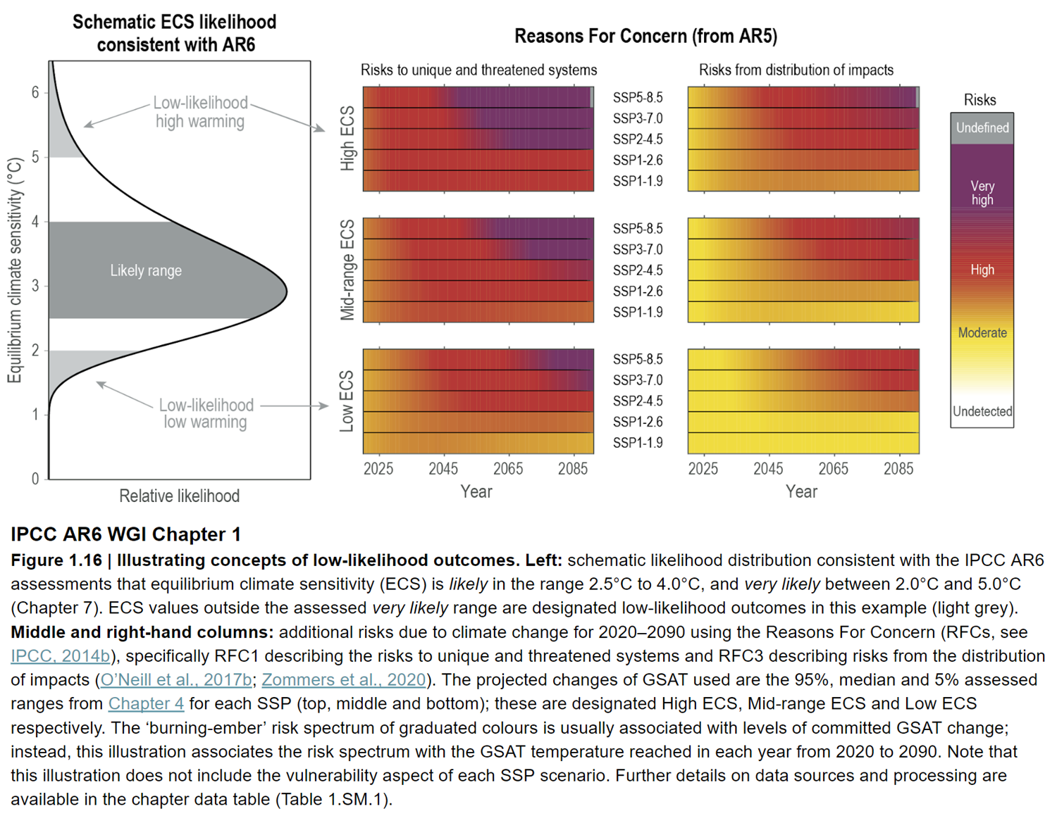
Fig. 1: Left: schematic likelihood distribution consistent with the IPCC AR6 assessments that equilibrium climate sensitivity (ECS) is likely in the range 2.5°C to 4.0°C, and very likely between 2.0°C and 5.0°C. ECS values outside the assessed very likely range are designated low-likelihood outcomes in this example (light grey). Middle and right-hand columns: additional risks due to climate change for 2020 to 2090. Source: IPCC AR6 WGI Chapter 6 Figure 1-16.
It’s all a matter of degree
All the models and evidence confirm a minimum warming close to 2°C for a doubling of atmospheric CO2 with a most likely value of 3°C and the potential to warm 4°C or even more. These are not small rises: they would signal many damaging and highly disruptive changes to the environment (fig. 1). In this light, the arguments against reducing greenhouse gas emissions because of "low" climate sensitivity are a form of gambling. A minority claim the climate is less sensitive than we think, the implication being that as a consequence, we don’t need to do anything much about it. Others suggest that because we can't tell for sure, we should wait and see. Both such stances are nothing short of stupid. Inaction or complacency in the face of the evidence outlined above severely heightens risk. It is gambling with the entire future ecology of the planet and the welfare of everyone on it, on the rapidly diminishing off-chance of being right.
Last updated on 12 November 2023 by John Mason. View Archives


Hey, so I was linking your excellent version of Knutti and Hegerl graphic used in this post and noticed that it uses a potentially confusing notation both here and in the original paper. The 90% confidence interval is labelled "very likely" and the 66% confidence interval is labelled as "likely." That's sensible from a science perspective, but a bit confusing in that values from the 66% region are more likely to be the drawn values than those in the 66-90% interval. Not sure there's any way to better label the figure, but I thougt I'd just put that out there to see if there's a less confusing way of doing so....
Paul,
The 90% interval is from 5% to 95% so it includes the 66% confidence interval. Therefore it is more likely to occur since if the 66% occurs the 90% must also occur.
Michael, I'm well aware of that. My point is that if one didn't go digging through to the original article AND understand IPCC terminology AND frequentist statistics, the graph would seem to be confusing.
If it were labelled for example "66% confidence interval" and "90 % confidence interval" one wouldn't have to go chasing footnotes to understand it....
Paul from VA @310.
You are right that it is confusing, but because it is actually more confusing than you say, as it also refers to "the most likely value."
The caption for Figure 4 (in the Advanced version of this post) says "The circle indicates the most likely value. The thin colored bars indicate very likely value (more than 90% probability). The thicker colored bars indicate likely values (more than 66% probability)." The original Knutti & Hegerl paper sort of copes with this by talking of "most like values" and "likely ... and very likely value ... ranges" (my emphasis) but I would consider this poor description for a Review Article where the audience is very likely less attuned to the underlying science and so more reliant on the actual descriptions presented. And at SkS the audience is even less steeped in the science (although it is an advanced level SkS post).
The problem is also encountered in the other Knutti & Hegerl figure used in the advanced level post (SkS figure 6) where the terms "most likely warming" and "likely range" cope reasonably well. Yet if this is an advanced level post I would have thought the concept of a confidence interval would be preferable as suggested @ 310.
Paul and MA,
This discussion seems to me to come down to how useful the IPCC terms are in a scientific paper. These terms have been discussed a lot beore and some people do not like them. On the other hand, people also did not like using numbers before the IPCC adopted the current terms. It seems to me extremely likely that the scientists reading the review paper are familiar with these terms, the paper is not intended for a lay audience. Most of the users here at SkS are also familiar with these terms. They are not perfect, but they are what we currently have. I imagine that if we switched to new terms someone else would complain. It is difficult to please everyone.
Perhaps you could write a new post that explains things better? Good explainations are always welcome.
Jutland @313, the 7.8 deg C value is for the Earth System Climate Sensitivity, ie, the change in temperature for an initial doubling of CO2 after all feedbacks, including slow responding feedbacks from ice sheets, etc, have stabilized. The value is similar to other reasonable estimates, but the Earth System Response will take several thousands of years to stabilize. The value is therefore largely irrelevant to temperatures over the next century or so. Further, provided we do stop emitting CO2 at some point in the next century, equilibriation of CO2 concentration between the surface and deep oceans will reduce CO2 concentrations to about 50% of their peak increase over preindustrial values, so that the Earth System Response would be to a much lower overall CO2 concentration.
Far more relevant to the immediate future (ie, next 100-200 years) are the Transient Climate Response and the Charney Climate Sensitivity, which the Apollo-Gaia project shows as 3 C (close to IPCC central estimates). The only policy relevant impact of the Earth System Response is that it shows that a stable solution to the problem of global warming will require zero net anthropogenic emissions. Merely reducing emissions to 20% of current values is not a stable long term response.
Jutland@313
The biggest mistake in that booklet is their application of Earth System Sensitivity, which by their own definition works in millenial timescale, to the problem of AGW mitigation, which works on a century (or couple of centuries) timescale. The ESS by thier own definition, is a speculative measure, based on inaccurate deep-paleo data. You cannot expect ESS to play out fully within the mitigation timeframe (until say 2100) IPCC is concerned about. Beyond the timeframe of few centuries, the CO2 level may drop signifficantly due to ocean invasion, so most of the ESS feedbacks may not (and likely will not) play out. The same applies to Hadley & Hansen sensitivities: their positive feedbacks are not rellevant within the timeframe considered. By the same token, the rock weathering negative feedback does not play out within interglacial cycles of 100ky, therefore we don't talk about it while considering Milankovic forcings. While taking about this century, Charney sensitivity is the only one that we can be certain to play out.
Even more erroneour (actually ridiculous for me) is their calculation of Earth System Sensitivity in this booklet.
Check out the figure 8 on age 13. They claim ESS being far more accurate than other sensitivities, because it's derived from "high precision mathematics". That's just pathetically ridiculous. They don't mention how imprecise their input data is: just few points of highly uncertain values from 100 or 40 milion years ago. I'm sorry but if you are trying to estimate ESS from so highly uncertain old data (even ignoring the paleo-expert assertions that Earth sensitivity was different at that time due to continental configurations, etc.), your "high precision mathematics" won't help you to find the precise parameter you're looking for.
"There are some of us who remain so humbled by the task of measuring and understanding the extraordinarily complex climate system that we are skeptical of our ability to know what it is doing and why." Dr John R Christy
Well-quoted, Earthling. I, too, am "skeptical" of John Christy's ability to know what the climate is doing and why.
@316, you mean I've got more reading to do?
Stub for Klapper to move conversation from Guardian to SkS where he believes there are more informed commenters than me.
Just to pick up the conversation with Klapper.
I don't know why you're asking me questions like this that are best answered by people who are experts in the field. All I can do is try to read the relevant research and give my non-professional opinion.
What I'm asking you is, on all these questions you're asking, which you seem to think are evidence of a failed theory of AGW, who are the experts you're asking? You say they're not answering these questions, but are you actually asking anyone who actually would best know the answer?
Rob Honeycutt @321, there has been a recent paper by Smith et al (Feb, 2015) on "Earth's energy imbalance since 1960 in observations and CMIP5 models". For your discussion with Klapper, the key graphs are figs 3 a and b.
To interpret that, No is the net downward energy flux at the Top of the Atmosphere (ie, TOA energy imbalance) determined from observations, being the net difference between satellite observed outgoing long wave radiation and incomeing short wave radiation benchmarked against ocean heat content data from July 2005 to June 2010. Ht MOSORA is the ocean heat content from a Met Office reanalysis. That makes it semi-emperical, being emperical over those zones of the ocean of which we have observations, but using a computer model constrained to the emperical values over those zones where we have observations to fill in those zones in which we do not have observations. Ho and Ht CMIP5 are the multimodel mean equivalents.
Several things are worth noting in Fig 3a. First, No (ie the TOA energy imbalance) from observations and models match closely except for the period of 1972-82. They certainly match well over the last decade, although the observed No is slightly less than the modelled No in that period (of which more later). Second, TOA energy imbalance and OHC should match closely, and do for the models. There are, however, wide disparities between them in observations. That indicates there are more problems with the observations than there are with the model/observation comparison. (For what it is worth, the problems with observations probably relate to the limited region of the ocean in which OHC is directly observed, coupled with problems in the reanalysis.)
Fig 3b is much simpler, and simply shows a direct mean TOA energy imbalance comparison between models and observations over various periods. As you can see, the observations are statistically indistinguishable from the models for all periods. More importantly, "the missing 0.5W/m2 between models and reality" is seen to be a fiction. The actual difference over the most recent decade is 0.11 W/m^2. The 0.5 figure is based on old figures from CMIP 4 and far less accurate observations, and even then is exagerated by rounding. That Klapper is still using it shows he is clinging to old data simply because it is convenient for his message.
The paper also has some interesting information about the cause of the discrepancy between models and observations, encapsulated in Fig 4:
As you can see, the discrepancy between model and observed short wave radiation (ASR) is greater and more persistent than the discrepancy in longwave radiation (OLR) after 2000. Ergo the primary cause of the 0.11 W/m^2 discrepancy between models and observations is the reduced observed shortwave radiation compared to the models. At least part of the explanation of that is that the models cease to use historical data from about 2000 onwards, and hence do not include the short wave forcing from a series of recent volcanoes. If that forcing were included, the discrepancy between models and observations would be smaller, possibly non-existent.
(Note to Rob - I've spelt out in detail a number of points I know you know quite well for the benefit of Klapper and other potential readers.)
Perhaps Tom Curtis might use this recent study to add to the "It's the Sun" post, a counter to the myth that the Earth's temperature still is catching up to the increased input from the Sun that happened before around 1960? The counter to the myth is that if the myth is true, energy imbalance should be decreasing since then, as the increased outgoing radiation due to the Earth's higher temperature increasing compensated for the now-stable input from the Sun. Pretty please?
@Rob Honeycutt #321:
"... who are the experts you're asking?..."
You, and Tom Curtis and if not direct me to the peer-reviewed research that you know of. I admit I have in the past used Skeptical Science as a sounding board for ideas I have, since after a few back and forths on the numbers I can normally see if there is a concrete reason to reject the reason or not.
@Tom Curtis #322:
"...First, ...the TOA energy imbalance...from observations and models match closely except for the period of 1972-82"
Where would you get observations from 1972 for the TOA energy imbalance? For that matter exactly how accurate are the current observations for the TOA imbalance? There's an post over at the Guardian on the water vapour/climate change story by "MaxStavros" which claims the satellite numbers in raw form show an imbalance of 6.5W/m2 at the TOA. Since we know that is impossible the number has been adjusted down to something more believable. I can understand the instruments on the satellite are precise but not accurate, but that means the "observations" are not that reliable. I'm guessing the most reliable number is ocean heat, but that is true only since the ARGO era, from 2004 or 2005. From the NODC data, the warming rate of the oceans, corrected to global area, is about 0.5 W/m2. This is close to other estimates. The following example is ocean plus melting, plus land, but since most of the heat goes into the oceans we would expect the ocean only and total should be close (and they are).
Here's a quote from Jame Hansen et al 2012 at the NASA website: "We used other measurements to estimate the energy going into the deeper ocean, into the continents, and into melting of ice worldwide in the period 2005-2010. We found a total Earth energy imbalance of +0.58±0.15 W/m2 divided as shown in Fig. 1"
http://www.giss.nasa.gov/research/briefs/hansen_16/
Here's the problem with an energy imbalance of +0.58W/m2: the models show a much larger TOA energy imbalance. The GISS model shows +1.2W/m2, and the CMIP5 ensemble mean is +1.0 W/m2 for the 2000 to 2015 period.
[JH] Link activated.