


 Arguments


Sun & climate: moving in opposite directions
What the science says...
| Select a level... |
 Basic
Basic
|
 Intermediate
|
 Advanced
| ||||
|
The sun's energy has decreased since the 1980s but the Earth keeps warming faster than before. |
|||||||
Climate Myth...
It's the sun
"Over the past few hundred years, there has been a steady increase in the numbers of sunspots, at the time when the Earth has been getting warmer. The data suggests solar activity is influencing the global climate causing the world to get warmer." (BBC)
At a glance
Thankfully for us, our Sun is a very average kind of star. That means it behaves stably over billions of years, steadily consuming its hydrogen fuel in the nuclear reaction that produces sunshine.
Solar stability, along with the Greenhouse Effect, combine to give our planet a habitable range of surface temperatures. In contrast, less stable stars can vary a lot in their radiation output. That lack of stability can prevent life, as we know it, from evolving on any planets that might orbit such stars.
That the Sun is a stable type of star is clearly demonstrated by the amount of Solar energy reaching Earth's average orbital position: it varies very little at all. This quantity, called the Total Solar Irradiance, has been measured for around forty years with high accuracy by sensitive instruments aboard satellites. Its average value is 1,362 watts per square metre. Irradiance fluctuates by about a watt either way, depending on where we are within the 11-year long sunspot cycle. That's a variation of no more than 0.15%.
From the early 1970s until today, the Solar radiation reaching the top of Earth's atmosphere has in fact shown a very slight decline. Through that same period, global temperatures have continued to increase. The two data records, incoming Solar energy and global temperature, have diverged. That means they have gone in opposite directions. If incoming Solar energy has decreased while the Earth continues to warm up, the Sun cannot be the control-knob of that warming.
Attempts to blame the sun for the rise in global temperatures have had to involve taking the data but selecting only the time periods that support such an argument. The remaining parts of the information - showing that divergence - have had to be ditched. Proper science study requires that all the available data be considered, not just a part of it. This particular sin is known as “cherry-picking”.
Please use this form to provide feedback about this new "At a glance" section, which was updated on May 27, 2023 to improve its readability. Read a more technical version below or dig deeper via the tabs above!
Further details
Our Sun is an average-sized main sequence star that is steadily using its hydrogen fuel, situated some 150 million kilometres away from Earth. That distance was first determined (with a small error) by a time consuming and complex set of measurements in the late 1700s. It led to the first systemic considerations of Earth's climate by Joseph Fourier in the 1820s. Fourier's number-crunching led him to realise a planet of Earth's size situated that far from the Sun ought to be significantly colder than it was. He was thereby laying the foundation stone for the line of enquiry that led after a few decades to the discovery of what we now call the Greenhouse Effect – and the way that effect changes in intensity as a response to rising or falling levels of the various greenhouse gases.
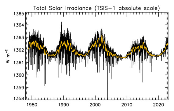
Figure 1: Plot of the observational record (1979-2022) on the scale of the TSIS-1 instrument currently flying on the space station. In this plot, the different records are all cross calibrated to the TSIS-1 absolute scale (e.g., the TSIS1-absolute scale is 0.858 W/m^2 higher than the SORCE absolute scale) so the variability of TSI in this plot is considered to be its “true variability” (within cross calibration uncertainties). Image: Judith Lean.
The Sun has a strong magnetic field, but one that is constantly on the move, to the extent that around every 11 years or so, Solar polarity flips: north becomes south, until another 11 years has passed when it flips back again. These Solar Cycles affect what happens at the surface of the Sun, such as the sunspots caused by those magnetic fields. Each cycle starts at Solar Minimum with very few or no sunspots, then rises mid-cycle towards Solar Maximum, where sunspots are numerous, before falling back towards the end. The total radiation emitted by the Sun – total solar irradiance (TSI) is the technical term – essentially defined as the solar flux at the Earth's orbital radius, fluctuates through this 11-year cycle by up to 0.15% between maximum and minimum.
Such short term and small fluctuations in TSI do not have a strong long term influence on Earth's climate: they are not large enough and as it's a cycle, they essentially cancel one another out. Over the longer term, more sustained changes in TSI over centuries are more important. This is why such information is included, along with other natural and human-driven influences, when running climate models, to ask them, “what if?"
An examination of the past 1150 years found temperatures to have closely matched solar activity for much of that time (Usoskin et al. 2005). But also for much of that time, greenhouse gas concentrations hardly varied at all. This led the study to conclude, "...so that at least this most recent warming episode must have another source."
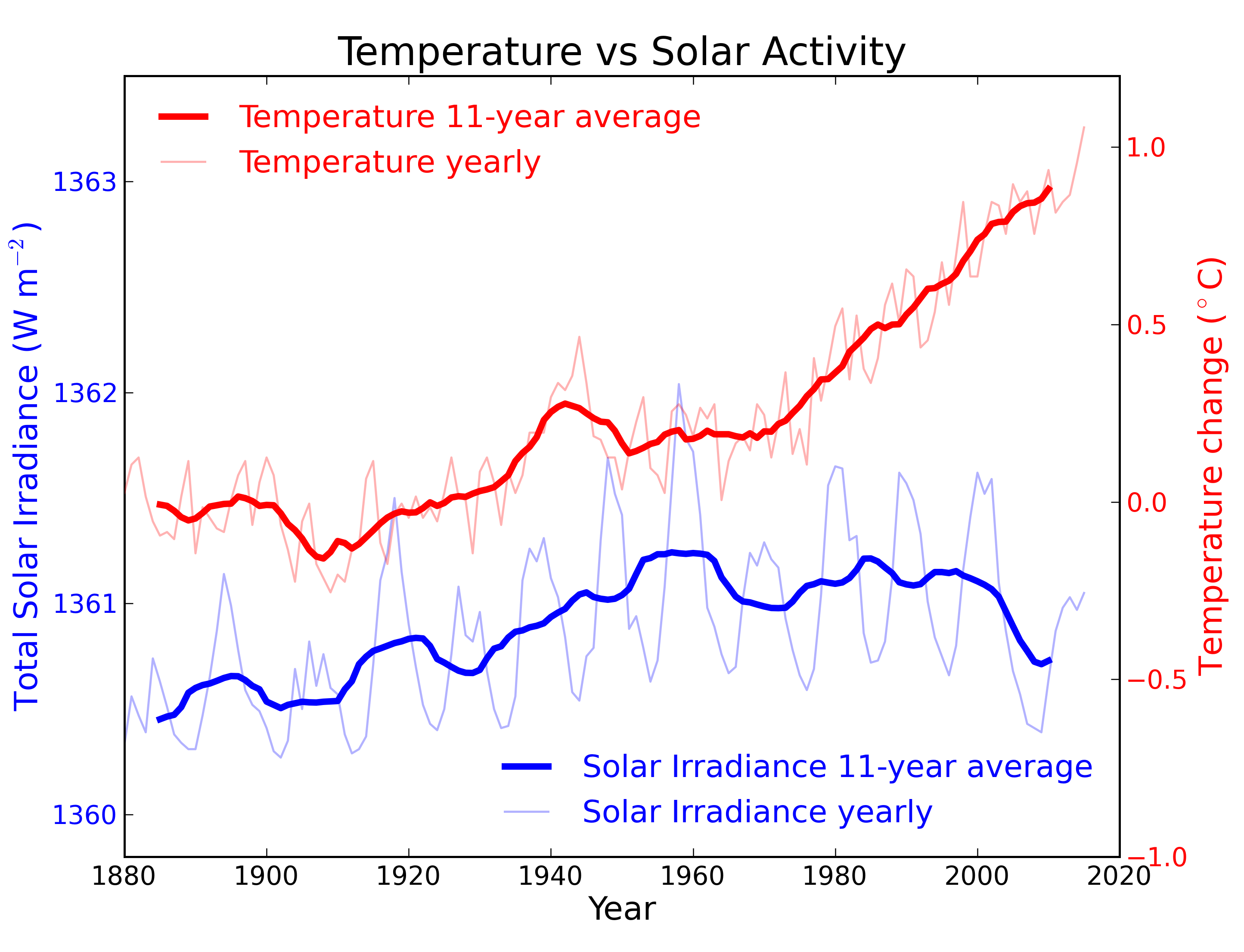
Figure 2: Annual global temperature change (thin light red) with 11 year moving average of temperature (thick dark red). Temperature from NASA GISS. Annual Total Solar Irradiance (thin light blue) with 11 year moving average of TSI (thick dark blue). TSI from 1880 to 1978 from Krivova et al. 2007. TSI from 1979 to 2015 from the World Radiation Center (see their PMOD index page for data updates). Plots of the most recent solar irradiance can be found at the Laboratory for Atmospheric and Space Physics LISIRD site.
The slight decline in Solar activity after 1975 was picked up through a number of independent measurements, so is definitely real. Over the last 45 years of global warming, Solar activity and global temperature have therefore been steadily diverging. In fact, an analysis of solar trends concluded that the sun has actually contributed a slight cooling influence into the mix that has driven global temperature through recent decades (Lockwood, 2008), but the massive increase in carbon-based greenhouse gases is the main forcing agent at present.
Other studies tend to agree. Foster & Rahmstorf (2011) used multiple linear regression to quantify and remove the effects of the El Niño Southern Oscillation (ENSO) and solar and volcanic activity from the surface and lower troposphere temperature data. They found that from 1979 to 2010, solar activity had a very slight cooling effect of between -0.014 and -0.023°C per decade, depending on the data set. A more recent graphic, from the IPCC AR6, shows these trends to have continued.
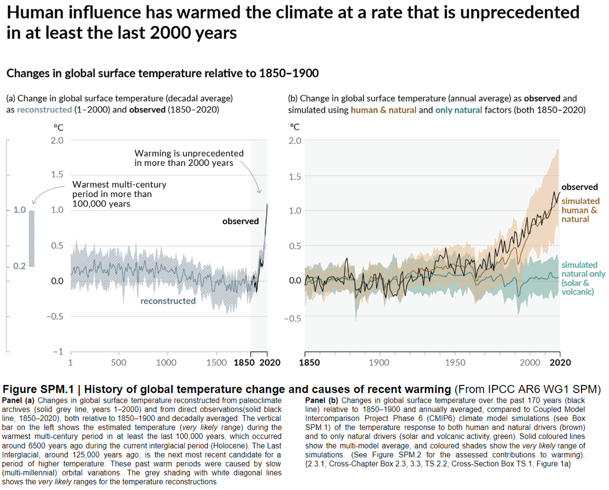
Figure 3: Figure SPM.1 (IPCC AR6 WGI SPM) - History of global temperature change and causes of recent warming panel (b). Changes in global surface temperature over the past 170 years (black line) relative to 1850–1900 and annually averaged, compared to Coupled Model Intercomparison Project Phase 6 (CMIP6) climate model simulations (see Box SPM.1) of the temperature response to both human and natural drivers (brown) and to only natural drivers (solar and volcanic activity, green). For the full image and caption please click here or on the image.
Like Foster & Rahmstorf, Lean & Rind (2008) performed a multiple linear regression on the temperature data, and found that while solar activity can account for about 11% of the global warming from 1889 to 2006, it can only account for 1.6% of the warming from 1955 to 2005, and had a slight cooling effect (-0.004°C per decade) from 1979 to 2005.
Finally, physics does not support the claim that changes in TSI drive current climate change. If that claim had any credence, we would not expect to see the current situation, in which Earth's lower atmosphere is warming strongly whereas the upper atmosphere is cooling. That is exactly the pattern predicted by physics, in our situation where we have overloaded Earth's atmosphere with greenhouse gases. If warming was solely down to the Sun, we would expect the opposite pattern. In fact, the only way to propagate this myth nowadays involves cherry-picking everything prior to 1975 and completely disregarding all the more recent data. That's simply not science.
Longer-term variations in TSI received by Earth
It's also important to mention variations in TSI driven not by Solar energy output but by variations in Earth's orbit, that are of course independent of Solar activity. Such variations, however, take place over very long periods, described by the Milankovitch orbital cycles operating over tens of thousands of years. Those cycles determine the distance between Earth and the Sun at perihelion and aphelion and in addition the tilt the planet's axis of rotation: both affect how much heat-radiation the planet receives at the top of its atmosphere through time. But such fluctuations are nothing like the rapid changes we see in the weather, such as the difference between a sunny day and a cloudy one. The long time-factor ensures that.
Another even more obscure approach used to claim, "it's the sun" was (and probably still is in some quarters) to talk about, "indirect effects". To wit, when studies can't find a sufficiently large direct effect, bring even lesser factors to the fore, such as cosmic rays. Fail.
In conclusion, the recent, post 1975 steep rise in global temperatures are not reflected in TSI changes that have in fact exerted a slight cooling influence. Milankovitch cycles that operate over vastly bigger time-scales simply don't work quickly enough to change climate drastically over a few decades. Instead, the enormous rise in greenhouse gas concentrations over the same period is the primary forcing-agent. The physics predicted what is now being observed.
Last updated on 27 May 2023 by John Mason. View Archives


Jc, rebuttal takes a bit of effort and a paper published by forecaster in an non-climate journal isnt going to get a lot of attention. A quick glance would suggest it certainly wasnt reviewed by any physicist. Would appear to be advanced curve-fitting (mathturbation) and highly questionable reconstructions. For this kind of study to be convincing, you need to develop your model with first half of the data and then show that it correctly predicts the remaining half. (For example of a model that does this well, see here.) There are numerous papers linking global warming to celestial orbits, solar cycles, etc. "With four parameters I can fit an elephant, and with five I can make him wiggle his trunk" was Von Neumann's comment.
Jc @1198, the paper uses four of surface temperature over the last 1000 years to determine independent values for climate sensitivity for CO2, solar activity and volcanoes. In determining independent values, it assumes that a factors impact on temperatures is not a function of alteration of the energy balance, which is unphysical. Using the contrary assumption, based on conservation of energy, that a factors impact is a function of its alteration of the energy balance, you would generate a combined proxy of the factors altering that value and scale it against the temperature proxies. Because of this, I consider the approach of the paper physically invalid regardless of the mathematical validity of the techniques used.
Ignoring that, the uncertainties of the reconstructions of temperatures and forcings over the last 1000 years are very large relative to the uncertainties over the last 136 years. Given this, we would expect the uncertainties to be large relative to climate sensitivity estimates over the instrumental period, wheras de Larminat claims a smaller uncertainty. I would also expect the model(s) obtained over the period of the reconstruction to be tested against the more accurate data, something de Larminat fails to do.
Beyond these more general points, de Laminat uses four temperature proxies, none of which are global. Moberg 2005 is a Northern Hemisphere only proxy, as was Mann 1999. Ljungqvist 2010 reconstructs Northern Hemisphere extratropical temperatures only (30-90 North), and thus covers less than a third of the Earth's surface. Only Loehle 2007 claims to be a global temperature reconstruction, but it takes a simple mean of its (unusually small number of) proxies, and as they are not evenly distributed across the globe, that leads to a very biased coverage. Indeed, 56% of his proxies come from the North Atlantic region (just 22% of the globe), and only two come from the Southern Hemisphere extratropics (both from South Africa). Given that the proxy is generated by taking a simple mean, this is better regarded as a slightly tweaked North Atlantic temperature reconstruction than a truly global one.
Oddly, de Laminat shows a penchant for dated sources. That is clear enough from his use of Loehle 2007 rather than the corrected version, Loehle 2008. It is most obvious in his use of Mann 1999. He defends his choice "there is no reason to discard the reconstruction of Mann: scientific truth does not determine by majority"; but Mann 1999 suffers from a number of minor methodological flaws (some discovered by the original author) and uses a small number of proxies compared to modern reconstructions (other than Loehle). There can be no justification for using it rather than, for example, Mann 2008, which includes a global temperture reconstruction as well. There is even less reason for not using the PAGES 2K reconstruction, the most comprehensive global temperature reconstruction of the last 2000 years.
de Laminat's use of dated, and geographically biased data sets results in regional, particularly North Atlantic temperature variations dominating his results; and is by itself sufficient reason to discount his work.
de Laminat shows his results for what is the best of the reconstructions he uses:
Although he does not directly compare with the recent period, it can be seen his model performs poorly in resolving the 20th century. Out of interest, he also shows a version in which the response to TSI is limited to be no greater than the upper bound of IPCC climate sensitivity (1.62 C/(W/m^2)) As can be seen, so constrained the model works much better in the 20th century (when uncertainties are low), and not appreciably worse in prior periods:
On top of this, he states that for his model, "It can be seen that the output error is large, but comparable with the millennial simulations of IPCC". If comparible, then his model has no claim to superiority even on the geographically biased, uncertain data on which he bases it. It certainly performs much worse on the global, accurate data of the 20th century.
Hi,
it appears the sun is the main driver of climate.
Please, take a look at the plot in this link
https://drive.google.com/open?id=0BzqxWkmUnvnyVlhLUzh5bDY5SG8
As an example, It can be observed how the CET follow quite well the microwave flux from the sun. There's however a significantly different behaviour of CET relative to solar 10.7cm flux after 1991, that's likely the consequence of the Pinatubo eruption cooling on the ocean surface.
Looking back in time we can see a good correlation between CET and the monthly SSN on this linked plot
https://drive.google.com/open?id=0BzqxWkmUnvnyUGw4ejJhZHVlOG8
Data sources:
CET
http://www.metoffice.gov.uk/hadobs/hadcet/data/download.html
10.7cm flux
http://www.esrl.noaa.gov/psd/data/correlation/solar.data
SSN
http://www.sidc.be/silso/datafiles
Thanks for your attention
JLF
Scientists use a metric called Total Solar Irradiance (TSI) to measure the changes in output of the energy the Earth receives from the Sun. And TSI, as one would expect given the meaning behind its acronym, incorporates the 11-year solar cycle AND solar flares/storms.
The reality is, over the past 4 decades of significant global warming, the net energy forcing the Earth receives from the Sun had been negative. That's right: negative. As in, the Earth should be cooling, not warming, if it was the Sun.
Further, even a descent into a Grand Solar Minimum would barely make a dent into our fossil-fuel-emission-driven global warming.
It's not the Sun.
Here's a post on the background of the CET. Tamino expertly unpacks it.
1203 jlfqam:
I’m not a statistician, but the graph in your first link looks more like chaos than correlation to me:
If that graph is your work, I suggest you redo it with 5-year or 11-year running means for both the sunspots and temperature to make the trends easier to detect visually. Use global temperature instead of central England, as that is more relevant for the discussion here.
Links to some datasets for global temperature:
NASA-GISS
HadCRUT4 (the last column is the annual temps)
Berkeley Earth
The graph in my last post disappeared!
I’ll try to post it again:
Hope it stays put this time.
[Rob P] I had a look at the image, in order to fix it, but there was nothing there. Link?
Hi,
thanks for the replies. And the links.
There are no running means on the plots of CET vs solar flux or SSN.
It's just the available data from the links plotted as such. SSN is the monthly mean.
Your running average plot (1205) is interesting, as it show that something has changed since 1990’s, and the cause of the
Cold CET during the second half of Maunder’s Minimum.
In climate data is not as anyone would like to be. Take a look, please, at the plot of NOAA global land and ocean temperature (gmsst) vs solar flux.
Notice, how, after the mid 1990's, gmsst no longer follows the solar 10.7cm flux. Only
https://drive.google.com/open?id=0BzqxWkmUnvnyNFpzbXkwaGxOM1k
Remember that 10.7cm is radiation in the microwave region, which is fully absorbed by water in either state liquid or solid, and converted directly into heat.
Not to mention that, although TSI variations over the solar cycle are in the order of 1-2 per mil.
https://ceres.larc.nasa.gov/science_information.php?page=TSIdata
Or in the past centuries
http://spot.colorado.edu/~koppg/TSI/TIM_TSI_Reconstruction.png
however variations in the 10.7cm range
Between solar maxima and minima, and even between maxima, are significantly larger
https://drive.google.com/open?id=0BzqxWkmUnvnyNFpzbXkwaGxOM1k
gmsst data link:
http://www.esrl.noaa.gov/psd/data/correlation/gmsst.data
If someone has time and patience, I recommend taking a look at the past climate data.
There are two comprehensive databases,
NOAA Paleo:
https://www.ncdc.noaa.gov/data-access/paleoclimatology-data/datasets
and Pangea:
https://pangaea.de/
Freely available but very costly in the resources invested in obtaining valuable data enough to provide the explanation to what’s going on, not only during past times, but also during the present time.
There you may find a great variety of climate proxies that combined in a global picture tell us how the climate works over the last 50Ma (yes, 50,000,000 years).
After that stroll to the past, examination of present day climate data is more easily understood.
I guess very few scientists have done so and consequently there are only a few who have the answer.
On the other side, those who have only examined data with limited span in time or with a lesser variety of proxies or narrow spatial coverage, frankly, do not have the criteria and even less the authority to criticize, refute or anything of the kind.
[DB] As others have already noted, please read the entirety of this post and the comments following it to get a better understanding of the Sun:Climate connection, as far as it's impact on the timescale of human lifetimes. Simply making a visual comparison of a graphic and drawing the inference of a correlation is no substitute for a physics-based analysis.
Inflammatory snipped. Please abide by the Comments Policy of this venue.
"I guess very few scientists have done so and consequently there are only a few who have the answer."
That's quite a bold assumption on your part. There are many 10's of thousands of researchers actively working on various climate related issues as their daily profession. These are people who have the relevant education and who've spent their entire lives working on this area of science. And you honestly think you're coming up with something they've all missed?
My suggestion would be, as a first step, give yourself a healthy shot of humility. The chances that you're seeing something that actual scientists have missed is infinitessimally small. But, you clearly curious about the science, and that's a good thing. Instead of assuming you see something the professionals don't, take some time to educate yourself on this topic. There's lots of good reading material on this website. All that material is backed up with citations of published scientific research. Read and learn.
Moderator:
I tried to post the first link in #1203
(https://drive.google.com/open?id=0BzqxWkmUnvnyVlhLUzh5bDY5SG8)
It was a graph showing annual CET and monthly sunspot numbers back to early 18th century. It appeared briefly in the preview, but disappeared shortly thereafter. And now the link seems to be dead.
[PS] I have converted to a link. A URL to a google drive image viewer is not a suitable source. Actually, if I fetch content link instead, (ie LINK) this works.
[RH] Shortened [PS]'s link. :-)
jifqam @1203 & 1208.
You say @1204 that "it appears the sun is the main driver of climate. " In terms of the recent global warming this is entirely wrong, as has been pointed out in recent comments. The situation is illustrated best with a numerical analysis.
You link to a graph @1204 which compares the time series of Central England Temperature with Sun Spot Number. (Do note the X-axis is labelled thousands of years before present; not a good advert for the graphic.) The relationship between CET & SSN cannot be determined by 'eyeballing' two noisy data plots.
What we can say is that the full annual CET data set (back to the 1700s) and the full annual SSN data set (back to the 1700s & derived from observational records) do show a linear correlation between CET & SSN that is just statistically significant at 2sd if autocorrelation is ignored. By using 11-year rolling averages autocorrelation should be reduced. This shows that the 11-year average CET increases 1ºC (+/-1ºC at 2sd) for 190 increase in 11-year average SSN.
The result should be no surprise. A stronger sun will result in a warmer world. That the result remains statistically significant given the global and regional variation is perhaps a surprise to some.
The implications of this result are that the +0.7ºC increase in CET 11-year average CET since 1970 would have been +0.9ºC(+/-0.2ºC) if there had been no change in solar output. And thus I can tell you that when you say "it appears the sun is the main driver of climate, " you are entirely wrong.
My apologies for the CET vs 10.7cm solar flux, I reused an excel figure from paleo climate proxies and paid no attention to x-axis label.
Here is the updated figure link
https://drive.google.com/open?id=0BzqxWkmUnvnyVkZLTWNmU0xZX0k
Le me apologize for the tone of my writing, english is not my mother tongue.
Let me please ask you, do you know where I can find or, perhaps, could you please write a set of more specific questions to be answered in order to satisfy those in favor or anthropogenic or non anthropogenic cause of climate change?
You know real data will not fit as one may desire.
Thanks for your comments
Best
JLF
The other plots
CET vs monthly mean SSN
and gmsst vs 10.7cm solar flux
it may be intersting to find out why do temperatures sometimes follow the solar cycle and sometimes do not.
[RH] Fixed image width.
Jlfqam 1212:
Your second graph (CET vs sunspot number) is the one I tried to insert in my posts 1206 & 1207.
It's hard to detect a trend visually when the oscillations are so large, but if the curves are smoothed, it should be obvious that CET and sunspots have moved in opposite directions the last few decades, just as sunspots and the global temperature have done.
thanks HK,
This is the key point, why the correlation between CET and SSN or 10.7cm disappeared since the mid 1990's. You can also see the 2009-10 minium was still visible, but briefly.
In fact it appears a temperature buffering or thermostat effect has taken control since the 1990's. The most obvious cause of that change could be the ocean cooling as consequence by the 1991 Mnt. Pinatubo eruption, it's the most significant abrupt event that took place during that decade, and capable of such a change in trend.
That volcanic eruption aerosol cooling added to the ongoing solar irradiance (especially in the microwave range) since the mid 1950's. This process of synergy between solar irradiance and volcanic winter cooling, has happened many times before and can be seen in paleoclimate proxies. The recovery of temperatures will have to wait until the sun enters a new high activity phase. Until then we cannot do anything else.
In the linked plots you may see, how the sun had an effect on the recovery of the Asian Monsoon since the Maunder Minimum that would otherwise continue down to the next glaciation following the decrease in NH insolation.
https://drive.google.com/open?id=0BzqxWkmUnvnyaFZfVndOaFZ6Q0U
ftp://ftp.ncdc.noaa.gov/pub/data/paleo/speleothem/china/dongge_2004.txt
LINK
[RH] Shortened link that was breaking page formatting.
jlfqam... The more relevant point might be: Why do you think there is a correlation? And, why any possible correlation to a very tiny part of the planet (central England) have any meaning at all?
It seems to me you're stretching too far to find something that is not there.
Again, there are researchers out there for whom this is their area of expertise. They clearly tell us that solar irradiance is not the cause of surface warming over the past 50 years.
[PS] Indeed. I feel that participants in this discussion are talking past each other.
I would note the following in hopes of more focussed discussion please.
1/ The total energy reaching the earths surface is absolutely related to temperature, so both changes in the sun and GHGs are acknowledged as causes of warming or cooling.
2/ Small variations in solar output in solar cycle affect temperature but AGW (climate) is concerned with trend. Please focus on data averaged over longer than 11 years.
3/ As with RH comment, please provide some actual evidence, not eyeballing of graphs, for correlation and use global temperatures.
4/ I strongly suggest you read existing papers examining solar influence or their summary in the IPCC report (p688f) so you can make more informed comment. See also here and
here for computation and validation of various influences.
5/ Simply repeating statements without addressing the points of commentators will result in posts being deleted as per comments policy.
I made this graph showing the 11-year moving average of sunspots and global temperature, using annual data between 1880 and 2015. It’s obvious that the sun’s contribution to the global temperature has been somewhere between insignificant and non-existent after the 1950s.
The apparent correlation before that may be partly due to the scaling of the two y-axes, as the change of TSI is too small to explain the warming before 1940.
Data source: SILSO and NASA-GISS
Not only that, HK, we know the radiative forcing of solar relative to human related forcings. It's clear that solar plays a very small role.
jflqam @1214, the correlation between the Central England Temperature Series and the Sun Spot Number using annual means from 1749 to 2015 is 0.122, with an R-squared of 0.015. That is, ignoring other correlated or anti-correlated causal factors, solar variation accounts for just 1.5% of annual variation in the Central England Temperture series. Given the weak correlation between SSN and CET series, the complete breakdown of correlation after 1990 (r=0.101; r^2 =0.01) hardly needs special explanation.
I am sorry, but I am a bit lost with number, especially when restricted to narrow time spans. Please take a look at this figure representing the isotope composition of the most recent layers from the antarctic ice core DomeC, in two time spans, compared the the obvious effect of solar irradiance on the ice, from the model by Lean 2000, which is frequently posted in this forum.
The sun clearly had an effect on the warming of antarctica since Maunder's Minimum to, lets say until the mid 1950's. NO more data is available from that site, unfortunately.
Since the mid 1950's, if solar irradiance is decreasing but temperatures do not, you are right, there must be a buffering or thermostat effect, which is what we have to find before it's too late and the oceans start to cool down until the sun recovers.
Let me also post the linked figures from a previous posting which show how the sun has strenghtened the East Asian Monsoon that had reached a steady stated around 2kaBP after a continuous weakening since the Thermal Optimum of the Holocene around 7-9kaBP, due to the decrease in NH insolation caused by Earth Orbital Cyclicity.
If you are interested we can discuss in detail the ocean circulation mechanisms that have caused the contradictory warming during a net solar irradiance decrease. I have gathered enough data and plots to support that. As mentioned before, after over a decade of "time travel" to past climates, back to 50Ma, thanks to the free paleo climate proxy databases Pangaea and NOAA Paleo, we could select a good deal of hight quality data sufficient to explain how climate works. Unfortunatly it's difficult to publish in official media for the obvious reasons everybody is aware of.
Collaboration of specialists in getting field data, data comparison, mathematical correlation and good scientific writing will be necessary because, unfortunately, those qualities are not available in one single person. In this particular and complex topic of climate, there is no "super scientist" as someone may expect, hence "real" and positive collaboration is the only way to succeed.
Thanks again for letting comments to be posted freely and the constructive replies from readers
Best
JLF
[JH] Please note that all graphics included in comments must be restricted to 500 pixels in width in order to preserve the integrity of the column. You have repeatedly posted graphics that exceed the width restriction. Moderators have reduced the size of the graphics and have politely asked you to adhere to the width restriction. Please do so in the future.
jifqam @1212,
You ask what other questions should be asked "in order to satisfy those in favor or anthropogenic or non anthropogenic cause of climate change?"
The CET and SSN data is but a few centuries in length. (Despite your efforts @1219, you fail to better this. Do remember you need two variables to carry out a comparison.) Both CET & SSN have shown signs of multi-century rising trends but in recent decades CET has continued to rise while SSN has paused and now shows a sharp downward trend. I conclude from this break in correlation that SSN must have no great infulence in CET. However you disagree. You say CET is greatly influenced by SSN but not since 1990. You do not provide an coherent explanation why the correlation held (roughly) for centuries and has now failed. @1212 you said "it may be intersting to find out why do temperatures sometimes follow the solar cycle and sometimes do not." Why is it? Coincidence. That is all. CET &SSN rise not in unison but in coincidence.
Let me make it more difficult for you. The IPCC conclude that CET & other global temperatures are not greatly affected by solar variation (ie SSN variation). IPCC AR5 figure 10.6 (pasted below) shows in figure 10.6 panel d) that the temperature rise resulting from solar forcing is small as are the wobbles in global temperature resulting from the solar cycle. The wobbles are about 0.1ºC in ampitude & result from SSN variation of roughly 200, or 2000(SSN)/ºC(CET). Does CET show such a wobble? What size is it?
If you detrend the wobbles in CET and in SSN by, say, calculating annual variation from an 11-year rolling average, the two records can be analysed for such a wobble. The CET-to-SSN correlation is not statistically significant suggesting SSN is not a major driver of wobbles in CET. But if you calculate correlations for CET with different levels of lag, you encounter a pretty little sine wave of ampitude roughly 0.0005 or 2000(SSN)/ºC(CET). This appears to confirm the IPCC result for the wobble size. They are small like the IPCC calculate. So if the wobbles are small, how can the trend be anything other than small?
jlfqam @1218, I assume your comment that "I am sorry, but I am a bit lost with number, especially when restricted to narrow time spans" is a response to my post @1218.
First, as to the "narrow time spans", the SSN data I had downloaded was the monthly values from 1749 available here. The CET data I downloaded was the mean monthly values available here. I converted both to annual means as that was easier than converting the CET series to anomaly values, a step that would otherwise have been necessary to avoid incorporating the seasonal cycle (which is noise in this context). Therefore the "narrow time span" was merely the full overlapping time span on the data I had available. It was certainly a sufficiently long time span to test your thesis. Given that the data show a low correlation over 266 years, even if adding in the additional 49 years of annual data available on the SSN increased the correlation, it would merely show that increase to be coincidental.
As to what the number mean, if two values are correlated, when one value is high, so also is the other; when one value is low, so also is the other; and when one value is near its mean, so also is the other. That is what correlation means. Pearson's product moment coefficient, or "Pearson's r", measures that tendency. That relationship can be seen when you plot the values against each other rather than each seperately against time, a type of plot which is called a scatter plot. In a scatter plot, values which are perfectly correlated, form a line with a positive slope. Values which a perfectly anti-correlated form a line with a negative slope. Uncorrelated values typically (but need not) form an an amorphous mass, but the trend of their scatter plot exhibits zero slope. These tendencies can be seen in this graph of various scatter plots with their correlation (Pearson's r) shown:
With this explanation, and given that you are "... a bit lost with number", here is the scatterplot of SSN vs CET from 1749-2015, using annual values. (I have normalized the data, ie, subtracted the mean and divided by standard deviation, to bring them to a comparable scale, but that has no effect on the shape of the graph.)
As you can see, there is little apparent trend, and the points are far from forming a simple line. That is, they are poorly correlated.
Given that you are drawing conclusions from the purported high correlation between the two, the actual low correlation refutes you completely.
Turning to the 10.7 cm microwave flux, using annual values from 1947-2015, the correlation is 0.141 and the r^2 is 0.02, indicating that (ignoring other correlated or anti-correlated causal factors), solar variation accounts for just 2% of CET variation. For your convenience, here is the scatter plot showing the low correlation:
And here is the plot of both against time, using normalized values to provide a common scale:
Human instinct makes us pick out commonalities of patterns, so that when we see such a graph we pick out the (approximately) shared peaks prior to 1960, and the strong correlation between 1980-1993. We do not notice the difference of the height of the peaks shared between those two (which indicates a weak correlation), and we tend not to notice the anticorrelation between 1965 and 1980. Particularly if we are committed to a theory that requires correlation between the two data, the graph plotted against time tends to decieve us. But the scatterplot cuts through that tendency to notice only those features which support our theory; as do the raw numbers which show only a weak correlation.
As with the Sun Spot Numbers, the weak correlation rebuts your theory.
If we crunched the numbers, we would make a similar finding with regard to the Dome C Deuterium record (though less so because to compare we would need to smooth the data, and smoothing artificially inflates correlations). We can see this because the scale that shows a strong correlation around 1815 shows a weak correlation elsewhere. Even more, we know this because we know the temperature trough arount 1815 was due to the Tambora erruption, and the resulting "Year without a summer".
Hi,
I hope this time I got the accepted width for the posted figures.
Here I present the isotope composition of a speleothem from Mexico covering the last 2.4ka, but only plotted over the SSN measurments time.
data is available from NOAA
ftp://ftp.ncdc.noaa.gov/pub/data/paleo/speleothem/northamerica/mexico/juxtlahuaca2012.txt
in excel format
ftp://ftp.ncdc.noaa.gov/pub/data/paleo/speleothem/northamerica/mexico/juxtlahuaca2012.xls
Thanks to Tom Curtis 1221-2 for the demonstration, but unfortunately for me I am not good with numbers, I prefer visual correlations as this one,
Notice how the rainfall over the Cave Basin has abruptly decreased after Pinatubo eruption. In fact what I have found is that volcanoes accelerate the cooling caused by decrease in solar irradiance. But volcanoes have another interesting effect on climate.
Regarding MA Rodger 1220, I have a good idea on what is the cause of the lack of correlation after 1990, but since nobody I have already explained how can the global temperatures can increase while the solar irradiation is decrasing does accept the mechanism, I will not tell it here unless I found someone really interested in testing that in a model and willing to publish the results.
Please take a look at this one that shows how Pinatubo eruption of 1991 caused a change in trend on the CH4(atm). I am also trying to find what caused the the turn point after 2000 AD. Or the disturbance of 2 consecutive years after Pinatubo or one year after 2000, on the MLOA CO2 curve, or why methane recovered the production rate after 2006?
The legend
It's also interesting to note that atmospheric CO2 response is very rapid to the volcanic eruption derived cooling of ocean surfaces.
Rampino et al Nature 1992, suggested Toba (Indonesia) eruption around 74kaBP, which lasted 6years (ashes reached E Africa) caused the deepening and extension of an ongoing glaciation. The corresponding full deglaciation was delayed by 40ka, so now here we are as we are.
Here you may find how CO2 responded in a single plot. Notice how minor euptions had barely no effects at the Ka range. However Pinatubo, had only an effect of a couple of years on the CO2.
Frankly, I would not rely on the greenhouse effect of CO2
This picture from a recent paper data shows how WDC, an ice core from an Antarctic region on the Pacific Coast started to warm up a few ka before the CO2(atm) started to rise in concentration
http://www.nature.com/nature/journal/v514/n7524/full/nature13799.html
It's not a matter or refuting or rebuting, it's a matter finding new clues.
The decrease in precipitation over Mexico, it's scary, as it means less rain over many other regions of the Planet.
Take a look at the Great Lakes, I leave you the correlation with SSN.
http://www.tides.gc.ca/C&A/network_means-eng.html
It's time someone starts a global call on how to solve a global cooling situation, which is much worse than a global warming, just because there will be less precipitation, which means less food for the less developed regions.
Thanks again for your patience.
JLF
PS: If you are interested on a discussion on the sources of CO2(atm), I have posted some plots.
http://www.skepticalscience.com/news.php?p=2&t=60&&n=1534#119462
take care
[DB] Off-topic, sloganeering and Gish Gallop snipped. At the bare minimum, you need to acknowledge where others have adequately disproved your position on various points. If you wish to break this into smaller chunks with a demonstrated understanding of the physics involved plus citations to credible literature that supports your position, then do so.
Until then, please refrain from the above or your posting rights in this venue may be rescinded. Please refresh yourself with this site's Comments Policy and ensure that all subsequent comments comport with it.
Thanks for the comments. I temporarily stop posting in order to carefully read the comments.
Best
Message for Tom Curtis,
could you please help me testing if the correlation in the last figure of this posting is strong enough.
http://www.skepticalscience.com/news.php?p=2&t=61&&n=1534#119495
The data sources are
Data sources
http://www.esrl.noaa.gov/psd/data/correlation/nina3.data
LINK
(Note although the file name is ninA3.data it actually refers to ninO3)
http://www.esrl.noaa.gov/psd/data/climateindices/list/
list entry:
Nino 3* Eastern Tropical Pacific SST (5N-5S,150W-90W) From NOAA Climate Prediction Center (CPC): now uses the NOAA ERSST V4
Thanks
JLF
[RH] Shortened link.