


 Arguments


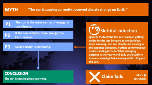
Sun & climate: moving in opposite directions
What the science says...
| Select a level... |
 Basic
Basic
|
 Intermediate
|
 Advanced
| ||||
|
The sun's energy has decreased since the 1980s but the Earth keeps warming faster than before. |
|||||||
Climate Myth...
It's the sun
"Over the past few hundred years, there has been a steady increase in the numbers of sunspots, at the time when the Earth has been getting warmer. The data suggests solar activity is influencing the global climate causing the world to get warmer." (BBC)
At a glance
Thankfully for us, our Sun is a very average kind of star. That means it behaves stably over billions of years, steadily consuming its hydrogen fuel in the nuclear reaction that produces sunshine.
Solar stability, along with the Greenhouse Effect, combine to give our planet a habitable range of surface temperatures. In contrast, less stable stars can vary a lot in their radiation output. That lack of stability can prevent life, as we know it, from evolving on any planets that might orbit such stars.
That the Sun is a stable type of star is clearly demonstrated by the amount of Solar energy reaching Earth's average orbital position: it varies very little at all. This quantity, called the Total Solar Irradiance, has been measured for around forty years with high accuracy by sensitive instruments aboard satellites. Its average value is 1,362 watts per square metre. Irradiance fluctuates by about a watt either way, depending on where we are within the 11-year long sunspot cycle. That's a variation of no more than 0.15%.
From the early 1970s until today, the Solar radiation reaching the top of Earth's atmosphere has in fact shown a very slight decline. Through that same period, global temperatures have continued to increase. The two data records, incoming Solar energy and global temperature, have diverged. That means they have gone in opposite directions. If incoming Solar energy has decreased while the Earth continues to warm up, the Sun cannot be the control-knob of that warming.
Attempts to blame the sun for the rise in global temperatures have had to involve taking the data but selecting only the time periods that support such an argument. The remaining parts of the information - showing that divergence - have had to be ditched. Proper science study requires that all the available data be considered, not just a part of it. This particular sin is known as “cherry-picking”.
Please use this form to provide feedback about this new "At a glance" section, which was updated on May 27, 2023 to improve its readability. Read a more technical version below or dig deeper via the tabs above!
Further details
Our Sun is an average-sized main sequence star that is steadily using its hydrogen fuel, situated some 150 million kilometres away from Earth. That distance was first determined (with a small error) by a time consuming and complex set of measurements in the late 1700s. It led to the first systemic considerations of Earth's climate by Joseph Fourier in the 1820s. Fourier's number-crunching led him to realise a planet of Earth's size situated that far from the Sun ought to be significantly colder than it was. He was thereby laying the foundation stone for the line of enquiry that led after a few decades to the discovery of what we now call the Greenhouse Effect – and the way that effect changes in intensity as a response to rising or falling levels of the various greenhouse gases.
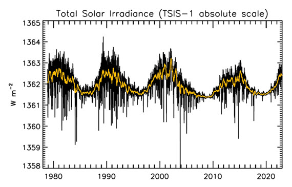
Figure 1: Plot of the observational record (1979-2022) on the scale of the TSIS-1 instrument currently flying on the space station. In this plot, the different records are all cross calibrated to the TSIS-1 absolute scale (e.g., the TSIS1-absolute scale is 0.858 W/m^2 higher than the SORCE absolute scale) so the variability of TSI in this plot is considered to be its “true variability” (within cross calibration uncertainties). Image: Judith Lean.
The Sun has a strong magnetic field, but one that is constantly on the move, to the extent that around every 11 years or so, Solar polarity flips: north becomes south, until another 11 years has passed when it flips back again. These Solar Cycles affect what happens at the surface of the Sun, such as the sunspots caused by those magnetic fields. Each cycle starts at Solar Minimum with very few or no sunspots, then rises mid-cycle towards Solar Maximum, where sunspots are numerous, before falling back towards the end. The total radiation emitted by the Sun – total solar irradiance (TSI) is the technical term – essentially defined as the solar flux at the Earth's orbital radius, fluctuates through this 11-year cycle by up to 0.15% between maximum and minimum.
Such short term and small fluctuations in TSI do not have a strong long term influence on Earth's climate: they are not large enough and as it's a cycle, they essentially cancel one another out. Over the longer term, more sustained changes in TSI over centuries are more important. This is why such information is included, along with other natural and human-driven influences, when running climate models, to ask them, “what if?"
An examination of the past 1150 years found temperatures to have closely matched solar activity for much of that time (Usoskin et al. 2005). But also for much of that time, greenhouse gas concentrations hardly varied at all. This led the study to conclude, "...so that at least this most recent warming episode must have another source."
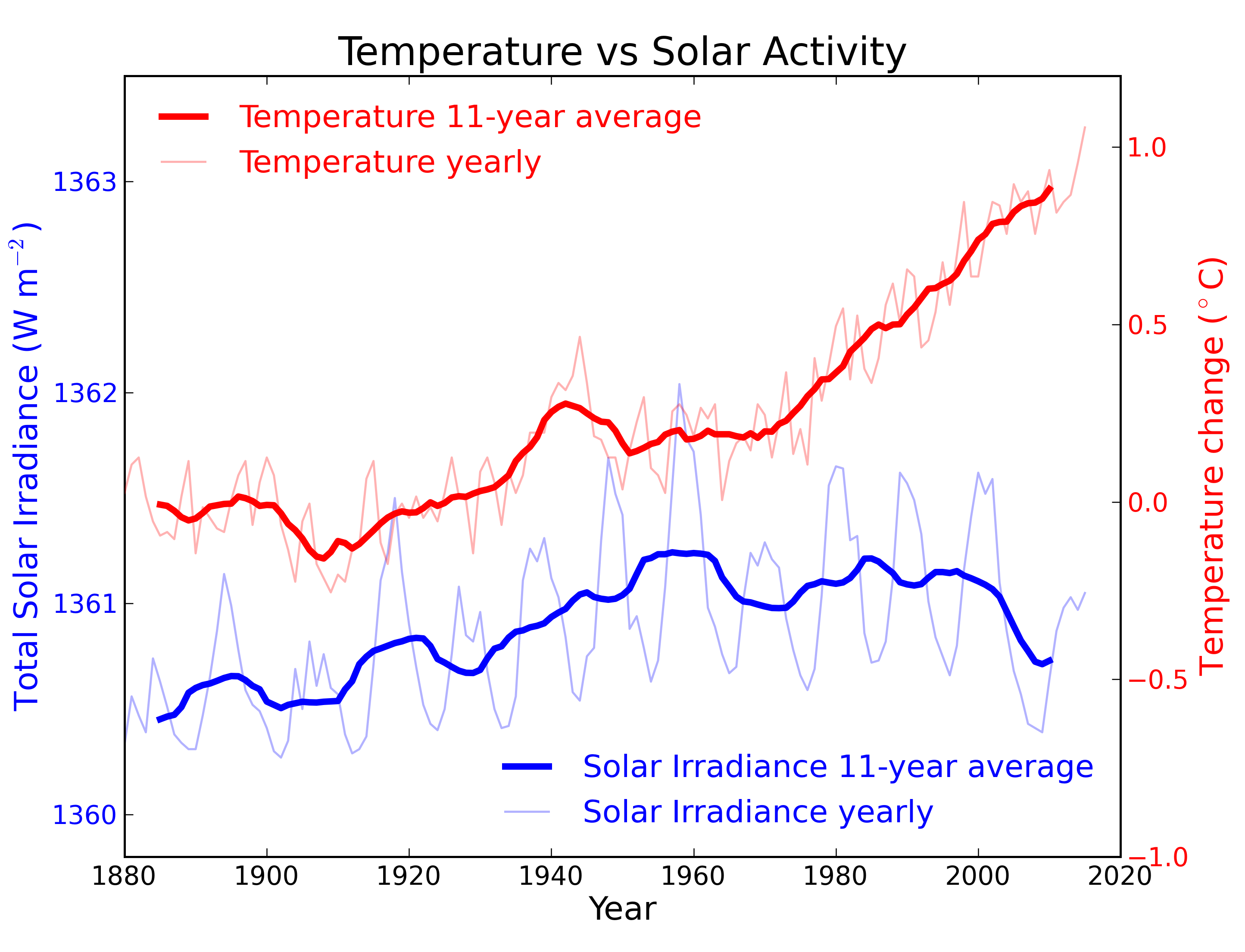
Figure 2: Annual global temperature change (thin light red) with 11 year moving average of temperature (thick dark red). Temperature from NASA GISS. Annual Total Solar Irradiance (thin light blue) with 11 year moving average of TSI (thick dark blue). TSI from 1880 to 1978 from Krivova et al. 2007. TSI from 1979 to 2015 from the World Radiation Center (see their PMOD index page for data updates). Plots of the most recent solar irradiance can be found at the Laboratory for Atmospheric and Space Physics LISIRD site.
The slight decline in Solar activity after 1975 was picked up through a number of independent measurements, so is definitely real. Over the last 45 years of global warming, Solar activity and global temperature have therefore been steadily diverging. In fact, an analysis of solar trends concluded that the sun has actually contributed a slight cooling influence into the mix that has driven global temperature through recent decades (Lockwood, 2008), but the massive increase in carbon-based greenhouse gases is the main forcing agent at present.
Other studies tend to agree. Foster & Rahmstorf (2011) used multiple linear regression to quantify and remove the effects of the El Niño Southern Oscillation (ENSO) and solar and volcanic activity from the surface and lower troposphere temperature data. They found that from 1979 to 2010, solar activity had a very slight cooling effect of between -0.014 and -0.023°C per decade, depending on the data set. A more recent graphic, from the IPCC AR6, shows these trends to have continued.
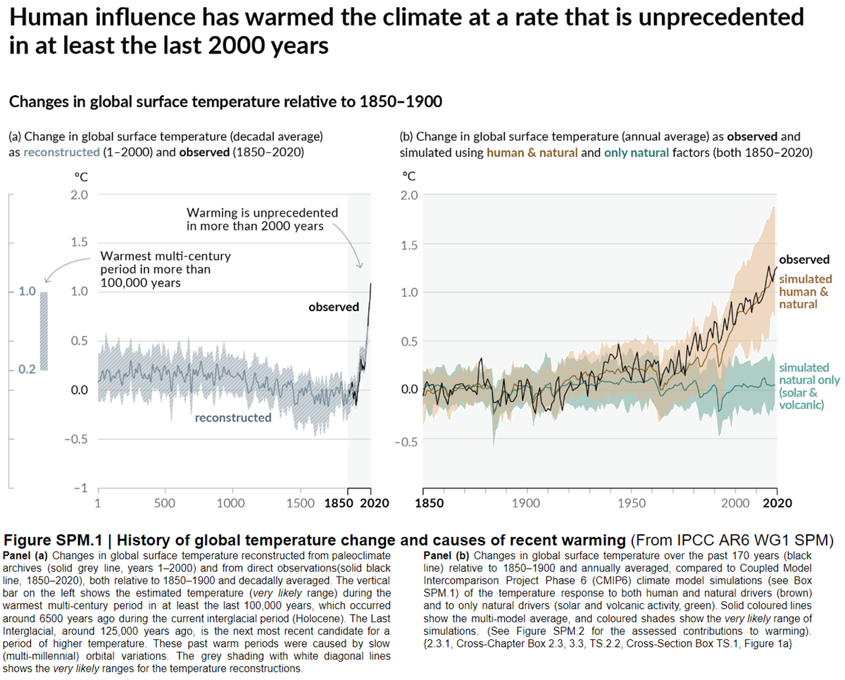
Figure 3: Figure SPM.1 (IPCC AR6 WGI SPM) - History of global temperature change and causes of recent warming panel (b). Changes in global surface temperature over the past 170 years (black line) relative to 1850–1900 and annually averaged, compared to Coupled Model Intercomparison Project Phase 6 (CMIP6) climate model simulations (see Box SPM.1) of the temperature response to both human and natural drivers (brown) and to only natural drivers (solar and volcanic activity, green). For the full image and caption please click here or on the image.
Like Foster & Rahmstorf, Lean & Rind (2008) performed a multiple linear regression on the temperature data, and found that while solar activity can account for about 11% of the global warming from 1889 to 2006, it can only account for 1.6% of the warming from 1955 to 2005, and had a slight cooling effect (-0.004°C per decade) from 1979 to 2005.
Finally, physics does not support the claim that changes in TSI drive current climate change. If that claim had any credence, we would not expect to see the current situation, in which Earth's lower atmosphere is warming strongly whereas the upper atmosphere is cooling. That is exactly the pattern predicted by physics, in our situation where we have overloaded Earth's atmosphere with greenhouse gases. If warming was solely down to the Sun, we would expect the opposite pattern. In fact, the only way to propagate this myth nowadays involves cherry-picking everything prior to 1975 and completely disregarding all the more recent data. That's simply not science.
Longer-term variations in TSI received by Earth
It's also important to mention variations in TSI driven not by Solar energy output but by variations in Earth's orbit, that are of course independent of Solar activity. Such variations, however, take place over very long periods, described by the Milankovitch orbital cycles operating over tens of thousands of years. Those cycles determine the distance between Earth and the Sun at perihelion and aphelion and in addition the tilt the planet's axis of rotation: both affect how much heat-radiation the planet receives at the top of its atmosphere through time. But such fluctuations are nothing like the rapid changes we see in the weather, such as the difference between a sunny day and a cloudy one. The long time-factor ensures that.
Another even more obscure approach used to claim, "it's the sun" was (and probably still is in some quarters) to talk about, "indirect effects". To wit, when studies can't find a sufficiently large direct effect, bring even lesser factors to the fore, such as cosmic rays. Fail.
In conclusion, the recent, post 1975 steep rise in global temperatures are not reflected in TSI changes that have in fact exerted a slight cooling influence. Milankovitch cycles that operate over vastly bigger time-scales simply don't work quickly enough to change climate drastically over a few decades. Instead, the enormous rise in greenhouse gas concentrations over the same period is the primary forcing-agent. The physics predicted what is now being observed.
Last updated on 27 May 2023 by John Mason. View Archives


KR – There have been some refinements in the 3+ years since the paper you linked to. The current version of the equation has R2 = 0.9049 (95% correlation) when compared to a normalized average of reported averages of average global temperatures. Everything not explicitly considered (such as the 0.09 K s.d. random uncertainty in reported annual measured temperature anomalies, aerosols, CO2, other non-condensing ghg, volcanoes, ice change, etc.) must find room in the unexplained 9.51%. If the effect of CO2 is included, R2 = 0.9061, an insignificant increase.
The analysis includes an approximation of ocean cycles that oscillate, with a period of 64 years, above and below a long-term trend calculated using the time-integral of sunspot number anomalies as a forcing proxy. The ‘break-even’ sunspot number is 34. Above 34 the planet warms, below 34 the planet cools.
Graphs of results, the drivers, method, equation, data sources, history (hind cast to 1610), predictions (to 2037) and a possible explanation of why CO2 change (fossil fuel burning) is NOT not a driver are at http://agwunveiled.blogspot.com.
[JH] The use of "all-caps" is akin to shouting and is prohibited by the SkS Comments Policy.
Dan Pangburn - "Everything not explicitly considered..." - I suggest you read up on omitted-variable bias, which leads to over or underestimating the effect of the factor(s) you regress upon when you leave out other important causal factors. You've only regressed upon sunspot numbers, but it's impossible get correct results by sequential regression when there are multiple factors in play. You need to regress against all of them at once (hence the use of multiple linear regression).
The physics indicate that insolation is a factor. But the physics also indicate that GHGs, natural and volcanic aerosols, albedo, land use, black carbon, etc., are also causal factors. Physics informs any regression analysis - ignore causal factors, and your analysis will be in error.
I will also note that your equation appears to have roughly 4 free variables (your constnats) to relate a sunspots and a cyclic pattern to a single temperature value - that appears to be more a curve-fitting exercise then a causal analysis. As John von Neumann said,
A 'break-even' point of 34 sunspots (darn, I was hoping the number would be 42) might fit the data and your equation over a particular period, but you are again utterly ignoring the output side of the equation. Under a doubling of CO2 radiative physics indicates a direct forcing of 3.7 W/m2, and a direct warming of 1.1C (ignoring feedbacks for now). Under those conditions your 'break-even' of 34 sunspots will still lead to a radiative imbalance, a warming; the actual balance point would be where the TSI was 3.7 W/m2 lower to match the decreased energy leaving the climate. There is no fixed breakpoint, what matters is the balance between climate energy input and climate energy output, conservation of energy, and ignoring the output makes your analysis simply a curve-fitting exercise on one aspect of energy input.
And as such, your equation(s) have no predictive power. There is no physical basis for your prediction of a 0.3C temperature drop by 2030 - you've simply ignored multiple causal factors and the energy relationships involved.
KR - The correlation equation initially included CO2 and T^4 considerations but they made no significant improvement in the coefficient of determination (R^2). The correlation with measurements is obviously not linear. Multiple linear regression on the period since 1700 is misleading.
Effectively there are only two free variables in the equation that gives R^2 = 0.9049. C is set to 0 so it has no influence and D simply compensates for the arbitrary reference temperature for the measured temperature anomalies.
The equation was derived using the first law of thermodynamics as described in Ref. 2 in the linked paper.
As shown in Table 1 of the linked paper, R^2 is quite insensitive to the 'break-even' number. 34 gives the highest R^2 1895-2012 and credible estimate back to the depths of the LIA.
The equation allows prediction of temperature trends using data up to any date. The predicted temperature anomaly trend in 2013 calculated using data to 1990 and actual sunspot numbers through 2013 is within 0.012 K of the trend calculated using data through 2013. The predictions depend on sunspot predictions which are not available past 2020
I have made public exactly what I did and the results of doing it including prediction. It will be interesting to see how it plays out.
[JH] You are now skating on the thin ice of excessive repition which is prohibited by the SkS Comments Policy.
Dan Pangborn - I would suggest reading Lean and Rind 2008, who performed multiple regression on temperature data since ~1889, and who conclude:
They certainly found multiple linear regression both possible and useful, as did Foster and Rahmstorf 2010. If your regresssion neglects multiple factors that physics indicates are significant, your model doesn't describe reality. If you're not including the outgoing energy to space, which scales linearly with effective IR emissivity (which changes with GHG concentrations) and by T4, then you aren't accounting for energy conservation. And if your results indicate that CO2 las little or no effect in complete defiance of radiative physics, that should be a huge red flag regarding your analysis.
Quite frankly, I don't see much of use in your analysis. You might try some hold-out tests (derive your model from perhaps the first half or the second half of the temperature data, and using those computed coefficients see how well you can follow the other half) to see just how dependent your fit is on the initial data presented. I suspect you won't be happy with the results.
OK, apparently you don't grasp or at least don't believe what I have done.
Paraphrasing Richard Feynman: Regardless of how many experts believe it or how many organizations concur, if it doesn’t agree with observation, it’s wrong.
The Intergovernmental Panel on Climate Change (IPCC), some politicians and many others mislead the gullible public by stubbornly continuing to proclaim that increased atmospheric carbon dioxide is a primary cause of global warming.
Measurements demonstrate that they are wrong.
CO2 increase from 1800 to 2001 was 89.5 ppmv (parts per million by volume). The atmospheric carbon dioxide level has now (through December, 2014) increased since 2001 by 28.47 ppmv (an amount equal to 31.8% of the increase that took place from 1800 to 2001) (1800, 281.6 ppmv; 2001, 371.13 ppmv; December, 2014, 399.60 ppmv).
The average global temperature trend since 2001 is flat (average of the 5 reporting agencies http://endofgw.blogspot.com/). Graphs through 2014 have been added. Current measurements are well within the range of random uncertainty with respect to the trend.
That is the observation. No amount of spin can rationalize that the temperature increase to 2001 was caused by a CO2 increase of 89.5 ppmv but that 28.47 ppmv additional CO2 increase did not cause an increase in the average global temperature trend after 2001.
What do you predict for 2020?
[PS] Please carefully read the Comments Policy. Compliance is not optional. Note in particular accusations of fraud, and sloganneering. Repeating long debunked myths without offering evidence and demonstrations that you have not even read the science let alone understood do not progress any argument. You would do well to read the IPCC report before making strawman claims about what is and is not predicted.
Dan,
You greatly underestimate the complexity of the issues.
If you want to take the flattish trend in global surface temperatures since 2001 as proof that the IPCC are mistaken, first you have to demonstrate that you understand what the experts in the field say about fluctuations in those surface temperatures. No-one (except you and other deniers) is claiming that there should be a tight one-to-one correlation between CO2 and global surface temperature over the scale of a few years, because of all the various processes that shuffle heat around. Many of those processes have been discussed exetensively on this site, and before making pronouncements that you know better than others you show evidence of having at least done the basic reading that would let you enter the conversation at anything but newbie level.
You are basically attacking a straw man - and not even an interesting or novel straw man, as this is an issue on which hundreds of articles have already been written, and to which you have added no new understanding.
BTW, I had a look at your blog site, and found it full of similar simplistic musings. The most blatant was a graph in which CO2 and temperature were plotted on the same graph, but with the scales adjusted to make the CO2 curve steep and the temperature curve flat. This is the so-called "World Climate Widget", the use of which is a clear marker of someone who is not interested in the truth, but in mathturbation. This graph has been discussed is several places online, including here:
http://www.realclimate.org/index.php/archives/2014/12/the-most-popular-deceptive-climate-graph/
Any claims you had of knowing beter than the world experts on this topic are completely undermined by your use of such cheap parlour tricks.
Leto.
edit:
Many of those processes have been discussed extensively on this site, and before making pronouncements that you know better than others you should show evidence of having at least done the basic reading that would let you enter the conversation at anything but newbie level.
Dan,
"mislead the gullible public"
Because someone believes what the vast majority of climate experts believe makes them gullible? If the scientific understanding changed and some other mechanism (non-human) is determined by science to be the cause of global warming then I would believe that. Would that still be gullible? But I don't see how you can call the public gullible for believing what the experts are saying.
Here is the default Cowtan model including ENSO:
It has an R squared of 0.932, superior to that obtained by Pangburn. I also uses just three parameters, compared to the five used by Pangburn to obtain his fit. In other words, it is a superior model by every measure. Yet Pangburn says of the theory underlying this model that it does not fit the observations.
For comparison, here is Pangburn's own presentation of his model matched against HadCRUT4 and the 95% confidence intervals of Loehle and McCulloch 2008 (a paper fraught with its own problems, but Pangburn's chosen empirical measure):
You will notice that in 1625, the retrodicted temperature by his method is 0.5 C above the upper confidence bound of his chosen paleo-reconstruction. Granted, he has another graph later chosen for its lower sunspot numbers in the 17th century in which his retrodicted temperatures only exceed the 95% value by a small amount (and drop below the lower value later on). Use of that graph, however, constitutes a cherry pick. It follows that Pangburn's model (unlike the IPCC models) has been falsified - and he knows it. You know that he knows it because he truncates the graph so that you cannot see just how far his model falls below the lower bound.
Even with the cherry picked sunspot data, the 17th century trend in Pangburn's model is of opposite sign to the data for a century. Contrast Pangburn's evidentiary standard for his own model, which accepts this discrepancy without qualm, to his standard for the IPCC models - which he claims are falsified by a reduced but same sign trend for 15 years.
And this just glances at the evidentiary contradictions in the empirical results of Pangburn's model. (If you want more, and a laugh, check out his predicted temperature for 2014.) It pays no attention to his assumption of constant outgoing energy over time, his ignoring of the relative strengths of forcings, his insistence that CO2 has no effective greenhouse effect contrary to very direct data - all of which fall into the category of simply unphysical mistakes.
Why is Panburn trying to insult our intelligence so with his hypocrisy?
Moderation Comment
All: Please do not respond to any future posts by Dan Pangburn until a moderator has had a chance to review them for compliance with the SkS Comments Policy.
Thank you.
Tom @1134 (or others), do you have any idea why the otherwise excellent model-data match for the Cowtan model comes a little unstuck around 1940?
Leto @1136, 1944 (-3.27 SD), 1938 (-2.81 SD), 1943 (-2.45 SD) and 1963 (-2.02 SD) are the only years with greater than two standard deviations below the mean error between model and observed temperatures. We would expect values exceeding SD of 3.29 from the mean, assuming a normal distribution, just 0.1%. Ergo, with 131 observations, we expect to see such a value 12.3% of the time. So, while the observation is unusual, it is far from clear that the model has come "unstuck" in 1943.
There is, however, a better than even chance that there is a problem with the 1944 values, and given the closeness in time, possibly also those of 1938 and particularly 1943. Curiously two of those years are at the height of WW2, and one immediately preceeds it. This raises several issues.
First, there were large, and unevenly distributed changes in shipborne traffic in WW2. Specifically, there was a large reduction in shipborne traffic outside of military convoys in the Pacific. In the Atlantic traffic from the US to Brittain and back diverted substantially north or south of normal routes to sale near airbases that provided aircover against submarines. There is a very real possibility that these factors have distorted WW2 SST records. There are also likely to have been disruptions of land records at the same time.
Second, there was a very rapid change in the proportion of SST records taken from engine manifolds rather than by buckets in WW2, with an abrupt change back immediately after. It is not certain the correction for these factors is entirely accurate, with again the possibility of WW2 SSTs being too hot.
Third, one area that certainly saw a marked loss of traffic was the NINO3 to 4 region of the Pacific. That means ENSO records of the period are likely to be unreliable resulting in a potential erroneious ENSO correction.
Fourth, WW2 saw extensive production black carbon and oil slicks, both of which may have markedly reduced albedo. It is not clear that this has been picked up in the forcing records. If they have not been, it may be the case that the WW2 records underplay the forcing in that era.
I suspect the larger errors in the model in and near WW2 are due to some combination of these five factors (chance plus the four potential sources of error). Of the four potential sources of error, two represent potential errors in the temperature record, and two potential errors in the model. Given all of this, it is not clear that there is a problem, and if there is it is not clear that the problem is in the model. It is also possible that some other factor in what was an unusual period (to say the least) was involved.
Given all of this, my inclination is to not give too much weight to errors in the WW2 period. Where I a scientist looking at the temperature record, or the forcing or ENSO history, I would be looking at that period in detail to try and resolve the issue, but the error is not so large that it would trouble me if I could not.
Leto @1136
Further to Tom's comment, this paper is interesting
LINK
Particularly fig 11b.
Significant step changes in the percentage of SST measurements from US ships with a significant rise during the war and a sharp drop in Aug 1945. The paper is using the older HadSST2 dataset for SST's. The more recent version has some correction for this but perhaps ot completely.
[RH] Shortened link.
Thanks Tom and Glenn... Tom's list of "error years" (1938, 1943, 1944, 1963) do not appear to be randomly distributed - if we plotted a rolling 2-year or 5-year average of absolute (or squared) model-data mismatch, I suspect there would be a peak in the 1938-1944 period that stuck out well above the rest of the plot (more than 2 SD), so I was hoping there would be better explanations than "it's chance".
Clearly, there are several potential explanations and it seems more than likely that the data around that time is itself suspect (particularly given the association with WW2 and the change in coverage). That makes the performance of the model even more impressive.
Leto @1139, temperature shows a level of autocorrelation across years. Because of that, clustering of high SD years is not unexpected. If follows that "just chance" cannot be excluded as an explanation for the cluster of high SD years. And even though it is more probable than not that it is not just chance, I certainly cannot claim that just chance is less probable than any or all of the other alternative explanations.
Hi Tom,
If you know of a mathematcal tool that could resolve whether autocorrelation is sufficient to explain the clustering of error years, I would be interested, though it is hardly an important point. (I confess I don't know the correct approach, myself, but eyeballing the graph did not at first suggest to me that simple autocorrelation was enough; looking at it again I am not so sure.)
The bigger problem I have with the "It's chance" line of argument is that it seems to be largely devoid of explanatory power. It is a truism that, within normallly distributed sets of data, a certain proportion will fall below a certain number of standard deviations, but it is a truism that applies as well to good models as to bad. It would remain true even if we added noise to the model to the point that it ceased to be useful. Even Pangburn could raise it in defence of the worst patches of his own model. The 2-SD yardstck is itself modified as the model deteriorates.
If the Minister for Education says: "We have to lift our game, 1% of schools are performing below ther 99th centile", then it is appropriate to point out to the Minister that 1% are always expected to perform below the 99th centile. Conversely, if the principal of a school says: "We have to lift our game, our school is performing below the 99th centile," or even just asks, in the boardroom: "Why are we performing below the 99th centile?", he would be rightly frustrated if his teachers said, "Don't worry, there'll always be 1% of schools below the 99th centile."
Asking why a particular patch of data-model matching is much worse than the rest is more analagous to the second situation, I believe. And while it may have been the case that there was no explanation other than chance, and I agree that thsi cannot be dismissed entirely, I am not surprised there are better explanations.
On the other hand, we have wandered off-topic and I greatly respect the work you do here so I wil leave it at that.
Regards, Leto.
Leto @1141, for comparison, I took HadCRUT4 from 1880-2010 and used it as a model to predict GISS LOTI. To do so, I used the full period as the anomaly period. Having done so, I compared statistics with the Cowtan model as a predictor of temperatures. The summary statistics are (HadCRUT4 first, Cowtan Model second):
Correl: 0.986, 0.965
R^2: 0.972, 0.932
RMSE: 0.047, 0.067
St Dev: 0.047, 0.067
Clearly HadCRUT4 is the better model, but given that both it and GISS LOTI purport to be direct estimates of the same thing, that is hardly surprising. What is important is that the differences in RMSE and St Deviations between the HadCRUT4 model and the Cowtan model are small. The Cowtan model, in other words, is not much inferior to an alternative approach at direct measurement in its accuracy. Using HadCRUT4 as a predictive model of GISS, we also have a high standard deviation "error" (-2.5 StDev in 1948) with other high errors clustering around it.
This comparison informs my attitude to the Cowtan model. If you have three temperature indices, and only with difficulty can pick out that which was based on a forcing model to those which were based on compilations of temperature records, we are ill advised to assume that any "error" in the model when compared with a particular temperature index represents an actual problem with the model rather than a chance divergence. (On which point, it should be noted that the RMSE between the Cowtan model and observations would have been reduced by about 0.03 if I had adjusted them to have a common mean as I did with the two temperature indices.) Especially given that divergences between temperature indices show similar patterns of persistence.
Now, turning to your specific points:
In fact, saying "it's chance" amounts to saying that there is no explanation, so of course it is devoid of explanatory power. In this particular context, it amounts to saying that the explanation is not to be found in either error in the measurements (of temperatures, forcings, ENSO, etc) nor in the model. That leaves open that some other minor influence or group of influences on GMST (of which there are no doubt several) was responsible. "Was", not "may be" because it is a deterministic system. However, the factor responsible may be chaotic so that absent isolating it (very difficult among the many candidates with so small an effect) and providing an actual index of it over time, we cannot improve the model.
Of course it is more analogous to the second situation. But the point is that the "it's chance" 'explanation' has a better than 5% (but less than 50%) chance of being right. That is, there is a significant chance that the model cannot be improved, or can only be improved by including some as yet unknown forcing or regional climate variation. The alternative to the "it's chance" 'explanation" is that the model can be improved by improving temperature, ENSO or forcing records to the point where it eliminates such discrepancies as found in the 1940s. On current evidence, odds on this is the case - but it is not an open and shut case that it is so.
Hi Tom,
Points taken. My rhetorical example was admittedly unfar, as it would obviously be facile and unhelpful to suggest that a model was okay because only 1% of its errors were worse than the 99th centile of its errors. And although I would see it as almost as facile and circular to defend a model because "only" the expected number of its worst errors were beyond some number of SDs of its own error distribution, that is not quite the same as pointing out, as you did, that the most extreme outlier was only ~3.3 SDs worse than the mean errors. If the outliers were several SDs out, we both agree that would be an entirely different situation.
Thanks, and best wishes,
Leto.
I tried a fourier analysis of the solar incidence and temperature data. The idea was that there would be big peaks in the spectra at the frequency of the sunspot cycle. I used a 121 year period where the SATIRE-T2 and NOAA anomaly sets overlap. A nice big peak showed up at just the right spot with the Solar Data. However, with the temperature data, the spectral components were almost missing entirely. They were actually low points in the noise floor.
Any idea what I could be missing?
As a first approximation, that you would get a nice peak in the sunspot power series at the solar cycle frequency is a bit of a no-brainer - like duh man!
Expecting that the temperature data would show a similar correlation is based on assuming a raft of physical realtionships that ae actually unphysical. Starting with the fact that most energy exchange in the climate system is into and out of the oceans which have huge thermal mass and massively damp down any frequency responses to something like solar variations.
So not what are you missing. What are you expecting and are your expectations reasonable; thermodynamically reasonable?
Hello,
I'm curious about the graphs shown here: http://hockeyschtick.blogspot.com.es/2014/08/its-sun_9.html
and here:
http://hockeyschtick.blogspot.com.es/2013/11/the-sun-explains-95-of-climate-change.html
Clearly this isn't published, peer-reviewed science, but I'd like to know if there's any sense to it, and if not, to understand what the problems with it are. I know a little about climate change, particularly regarding reconstructions of past environments, but I'm out of my depth trying to understand these sunspot calculations.
Many thanks.
[TD] Hotlinked the URLs. In future please do that yourself with the link button in the comment editing controls.
APT: Dan Pangburn, the author of those claims, commented here on SkS several years ago. Please read the responses.
Also, the cooling stratosphere is incompatible with increased energy from the Sun.
APT: Dan Pangburn re-appeared in a recent comment. Read the responses there.
Tom Dayton @1147/1148.
I think the two previous excursions of Dan Pangburn here @SkS do not provide a clear explanation of Pangburn's proposition, possibly even less clear than Pangburn's explanation linked to by APT @1146.
APT @1146.
The graphs you link to are simple nonsensical curve-fitting with zero basis in physics. The guts of Pangburn's sunspot equation can be much simplified and still produce the same-shaped resulting graph. That simple equation is:-
where T is temperature and S is sunspot number for year i.
For the last 75 years, the average sunspot number has been about 75, way above the average 34 used in the equation which is why the graphed temperature soars despite the heavily lagging terms employed. Indeed, it is only during the Manuder Minimum & the Dalton Minimum that the average sunspot number drops below 34 allowing Pangburn's graph to dip downward. Including SSN data to 2014 shows that even weak Sunspot Cycle 24 is averaging above 34 and showing a further increase in temperature.
Heavy lagging is used by Pangburn because the T4 term is far too weak to define an equilibrium temperature. If the ~75 average sunspot number of recent decades persisted, the equation tells us global temperatures would rise by over 60ºC before equilibrium appears. Given the forcing involved will be less than 1Wm-2, this means this equation of Pangburn's is suggesting an Equilibrium Climate Sensitivity ECS > 240ºC, an entirely lunatic value.
MA Rodger @1149, 0.003503/17 = (approx) 0.0002. You have misplaced a decimal point. Further, the temperature term takes the fouth power of the ratio between T(i) and T(o), not ratio between T(i) and T(i-1). Consequently it is not always negligible, and is certainly not negligble at T(i) = T(o) + 60. Of course, you did not neglect that in calculating the equilibrium temperature. Neglecting the temperature ratio changes the time to equilibrium but not the equilibrium temperature. That, as you know, is determined solely by the requirement that at equilibrium (T(i)/T(o))4 = s(i)/34, resulting in the integrated term in Pangburn's formula equalling zero. I estimate the increase in temperature at equilibrium to be +62.59 C, or given the baseline temperature, at 75.6 C. Ignoring the misplaced decimal point, a neat analysis, and "lunatic value" is exactly correct.