


 Arguments


How much is sea level rising?
What the science says...
| Select a level... |
 Basic
Basic
|
 Intermediate
| |||
|
A variety of different measurements find steadily rising sea levels over the past century. |
|||||
Climate Myth...
Sea level rise is exaggerated
"We are told sea level is rising and will soon swamp all of our cities. Everybody knows that the Pacific island of Tuvalu is sinking. ...
Around 1990 it became obvious the local tide-gauge did not agree - there was no evidence of 'sinking.' So scientists at Flinders University, Adelaide, set up new, modern, tide-gauges in 12 Pacific islands.
Recently, the whole project was abandoned as there was no sign of a change in sea level at any of the 12 islands for the past 16 years." Vincent Gray).
At a glance
You'd think it would be obvious, wouldn't you? If ice (or snow) melts, you get water. Water flows downhill through gravity and collects wherever it can be retained. In areas that see regular winter snowfalls, the processes involved are familiar. Snow-capped mountains look photogenic but along comes the eventual thaw and the river levels rise sharply with all the meltwater.
Now apply the same basic principles to glaciers and ice-caps. It should not come as a surprise that exactly the same thing happens and where that meltwater collects is ultimately the oceans. Note here that we're talking about land-based ice, not sea-ice: sea-ice is already part of the ocean so does not affect sea levels as it forms and melts every year. But melt enough land-ice and you get very significant change indeed.
What do we mean by very significant? Well, let's look at the transition out of the last ice-age that dominated the last 20,000 years. It began with ice-caps over parts of Europe and North America and ended not so long ago with much of that ice gone but with sea levels having risen by more than 120 metres. If that's not significant, what is?
There's not enough ice left on Earth to raise sea levels by that whopping amount now, but there is enough to raise the oceans by more than 60 metres. Over what sort of time-frame? Well, we know that the current rate of sea level rise is some 3.7 mm a year, or nearly an inch and a half per decade. A lot of that is due to the expansion of the oceans - as things are warmed up they expand. But the rate is accelerating. How fast do we think it can get?
We do have the past to consider: during the glacial meltdown of the past 20,000 years, there was a period ominously named Meltwater Pulse 1A that began some 14,700 years ago. During this enhanced period of melting, sea levels rose by between 16 and 25 metres in about 400–500 years. That's roughly 40–60 mm per year or 16-23 inches a decade.
Could such drastic rates of sea level rise happen again? Probably not but nevertheless it shows what is possible as ice-sheets collapse in a warming world. But even if sea level rise stays at its current rate (it won't), that's getting on for a two-metre increase over the coming 300 years and a one-half to one-metre increase over the next 100 years. Now go anywhere affected by tides and think about all the communities of people that live and work along the shore. Pick the biggest spring tides, take a look at where they reach at high water, maybe watch the waves and surge when a storm occurs, then imagine an extra two metres of water on top of that.
And try to imagine being the decision-makers in the coming decades and centuries, who will have to work out what best to do. What would you think of the people all those years ago, who went around pretending this was not happening? Not favourably, for sure - because of such behaviour, that is how history will remember them.
Please use this form to provide feedback about this new "At a glance" section. Read a more technical version below or dig deeper via the tabs above!
Further details
The climate myth set out in the coloured box above gives an insight into the minds of climate change deniers. Why? Because it's entirely made-up. It annoyed the Realclimate blog's Gavin Schmidt sufficiently for him to write an eloquent debunking in 2012 that is well worth reading because it demonstrates so clearly what we, the scientific community, are up against.
The claim that tide gauges on islands in the Pacific Ocean show no sea level rise is nonsense: the data presented in the Realclimate link above show a variably rising sea level trend at each station. But what about global sea level rise?
Sea level rises as ice on land melts and as warming ocean waters expand. As well as being an existential threat to coastal habitation and environments (think about many of the world's capital cities here), sea level rise corroborates other evidence of global warming
The black line in the graph below (fig. 1) clearly shows sea level is rising; its upward curve shows how sea level is rising faster as time goes on. The upward curve agrees with global temperature trends and with the accelerating melting of ice in Greenland and other places.
Because sea level behaviour is such an important signal for tracking climate change, the misinformers seized on the sea level record in an effort to cast doubt on this evidence. As fig. 1 clearly demonstrates, sea level bounces up and down slightly from year to year so it's possible to cherry-pick data and falsely suggest the overall trend is flat, falling or linear. You can try this yourself. Starting with two closely spaced data points on the graph below, lay a straight-edge between them and notice how for a short period of time you can create almost any slope you prefer, simply by being selective about what data points you use. Now choose data points farther apart. Notice that as your selected data points cover more time, the more your mini-graph reflects the big picture. The lesson? Always look at all the data rather than being fooled by selective presentations.
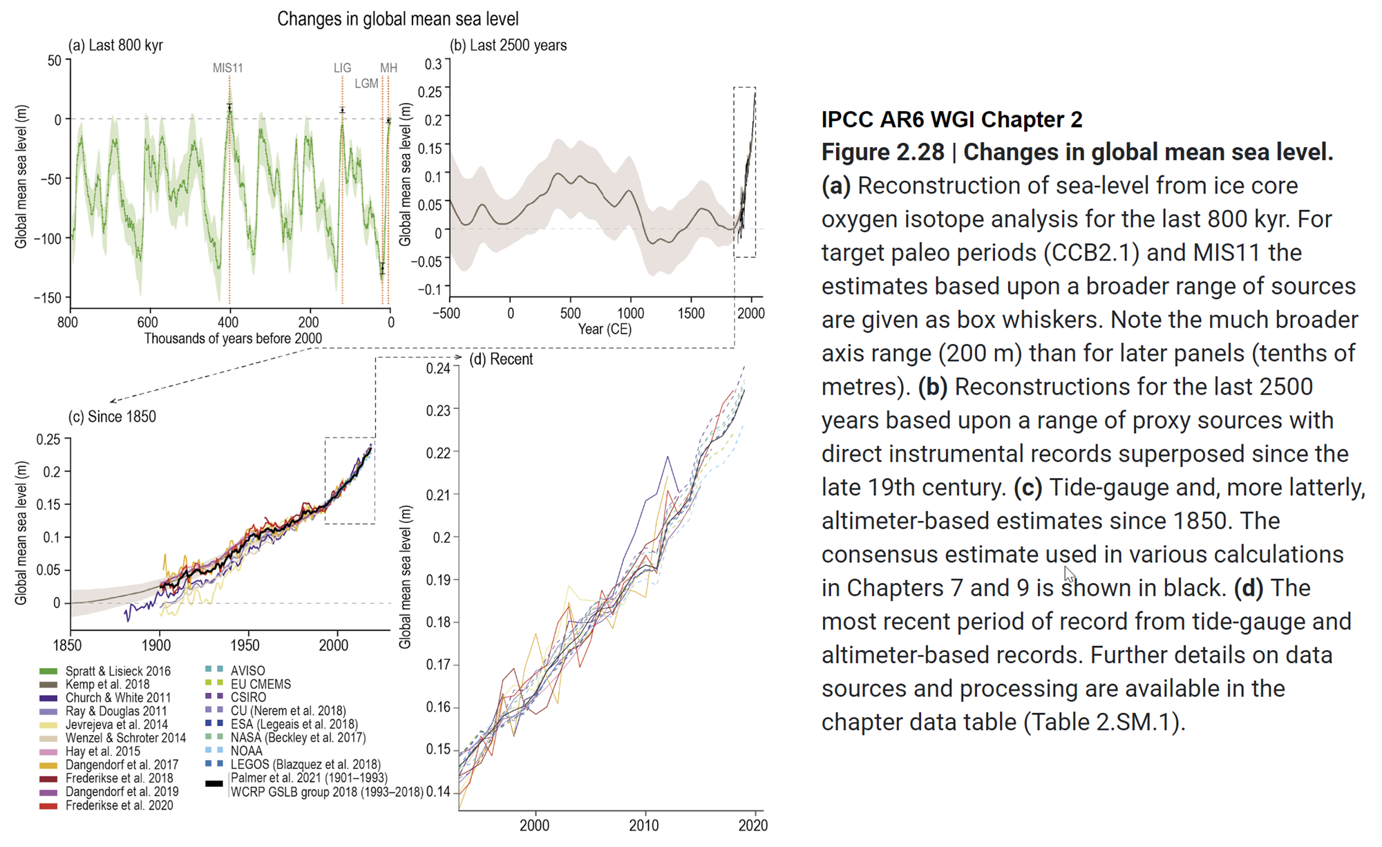
Fig. 1: sea level change, from IPCC AR6 WGI Chapter 2 section Climate Change 2021: The Physical Science Basis. Tide-gauge and, more latterly, altimeter-based estimates since 1850. The full image with all four panels and IPCC caption is available here.
Other denialist arguments about sea level concern the validity of observations, obtained via tide gauges and more recently satellite altimeter observations.
Tide gauges must take into account changes in the height of land itself caused by local geological processes, a favourite distraction for deniers to highlight. It will come as no surprise to learn that scientists measuring sea level with tide gauges are aware of - and compensate for - these factors. Confounding influences are accounted for in measurements and while they leave some noise in the record they cannot account for the observed long-term upward trend.
Various technical criticisms are mounted against satellite altimeter measurements by deniers. Indeed, deriving millimetre-level accuracy from orbit is a stunning technical feat so it's not hard to understand why some people find such an accomplishment unbelievable. It's astonishing that in another breath they are happy to jump aboard an airliner, parts of which are engineered to a similar tolerance!
In reality, researchers demonstrate this height measurement technique's accuracy to be within 1 mm/year. Most importantly there is no form of residual error that could falsely produce the upward trend in observations.
As can be seen in an inset of the graph in fig. 1, tide gauge and satellite altimeter measurements track each other with remarkable similarity. These two independent systems mutually support the observed trend in sea level. If an argument depends on skipping certain observations or emphasises uncertainty while ignoring an obvious trend, that's a clue you're being steered as opposed to informed. Don't be misled by only a carefully-selected portion of the available evidence being disclosed. Look at it all.
Current sea level rise is not exaggerated, in fact the opposite case is more plausible. For one, sea level rise is not the same everywhere. Many areas around the world already experience much faster rates of sea level rise than the average global rate shown in Fig 1. As well, observational data and changing conditions in such places as Greenland suggest if there's a real problem here it's underestimation of future sea level rise. Past IPCC synthesis reports offered rather conservative projections of sea level increase based on assumptions about future behaviour of ice sheets and glaciers, leading to estimates of sea level roughly following a linear upward trend mimicking that of recent decades. In point of fact, observed sea level rise is already above older IPCC projections - and accelerating - while at the same time it appears the mass balance of continental ice once envisioned by the IPCC was overly optimistic (Rahmstorf 2010; Otosaka et al. 2023).
Fast-forward to 2023 and the recent IPCC AR6 Synthesis Report is a bit less nuanced:
Limiting global surface temperature does not prevent continued changes in climate system components that have multi-decadal or longer timescales of response (high confidence). Sea level rise is unavoidable for centuries to millennia due to continuing deep ocean warming and ice sheet melt, and sea levels will remain elevated for thousands of years (high confidence). However, deep, rapid and sustained GHG emissions reductions would limit further sea level rise acceleration and projected long-term sea level rise commitment. Relative to 1995–2014, the likely global mean sea level rise under the SSP1-1.9 GHG emissions scenario is 0.15–0.23 m by 2050 and 0.28–0.55 m by 2100; while for the SSP5-8.5 GHG emissions scenario it is 0.20–0.29 m by 2050 and 0.63–1.01 m by 2100 (medium confidence).
The report goes on to state, however:
The probability of low-likelihood outcomes associated with potentially very large impacts increases with higher global warming levels (high confidence). Due to deep uncertainty linked to ice-sheet processes, global mean sea level rise above the likely range – approaching 2 m by 2100 and in excess of 15 m by 2300 under the very high GHG emissions scenario (SSP5-8.5) (low confidence) – cannot be excluded.
If they cannot exclude such risks - and they know what they are talking about - can you?
Last updated on 20 August 2023 by John Mason. View Archives


Do you mean short-term as in the last La Nina?
That's what the Colorado University Sea Level Research Group said. How short term that is remains to be seen.Are you sure you're taking everything into account with this back-of-the-napkin calculation?
I think the "Back-of-the-Napkin" assessment is accurate I also think that with respect to the information given in the Executive Summary of the AR4's Chapter 5 it's not likely to be that far off the mark. The Chapter 5 Executive Summary quote is in regard to the empirical record and Table 10.7 is a projection, and the 6.8 mm/yr is worst case. Worst case is often what is reported in the popular press. So it ought to be realistic. So how realistic is it that in the next 89 years that the thermal expansion component of sea level rise will go from 0.36 mm/yr to 6.8 mm/yr?Well, observations show the thermal (steric) component of sea level is rising at 0.69mm per year over the last 6 years,
Is rising 0.69 mm/yr or is 0.69 mm/yr? It does make a difference. In any case, do you have a link for that observation? Even at 0.69 mm/yr is it reasonable to expect a possible 6.8 mm/yr due to thermal expansion by 2100?
so your calculations appear to be missing important details - I see a glaringly obvious one in your calculations.
And that glaringly obvious one is?
Camburn ... I think you are overestimating sea level rise. Envisat data, which at this time is the most advanced, iindicates a sea level rise of approx 1.78mm/yr if memory serves me
The IPCC tells us that Over the period 1961 to 2003, global ocean temperature has risen by 0.1°C from the surface to a depth of 700 m. The IPCC also tells us, in table 10.7, that by 2100 we can expect thermal expansion to account for as much as 6.8 mm/yr. I'm questioning if those two facts are compatible. The graph that Albatross put up is nearly a straight line. In order to achieve the 6.8 mm/yr it's going have to change. So, how likely is it that it will begin a sharp upward trend resulting in that 6.8 mm/yr contribution from thermal expansion the IPCC tells us could happen by 2100? As I pointed out earlier, 6.8 mm/yr is worst case, but that's what the popular press will report, so it ought to be reasonable. Is it?
[DB] You continue to be disingenuous with your graph. Envisat data is actually shown here:
[Source]
[DB] "This thread is about sea level rise...right? And one has to look at all the data available....right?"
Excellent point. One in which the entire thrust of your point is lacking in. So, let's look at ALL of the data, shall we? You mean like this, right?
Or this, right?
Or this, right?
Or this, right?
Multiple sources, using the all of the data available, rightly show the long term trend is far worse than your dissembling, cherry-picked case.
That's being a little bit silly. Data is useless without analysis.
Analysis without any data is even more useless.
The point was that your simplistic calculations bore [no] relationship to reality.
What doesn't bear any relationship to reality is the mismatch of claims within the IPCC's AR4.
So, is it reasonable or is it an exaggeration to project that the thermal component of sea level rise by 2100 might be over ten to nearly 20 times what it is today?
Well climate modeling sure suggests an increase in the thermal component.
Climate modelers can most likely make sure their models do whatever they want.
It's to do with the greater temperature rise expected this century.
We are over ten years into the century and certainly sea level is not demonstrating any positive change in trend. this graph
certainly doesn't and if you plot out the tide gage data from PSMSL you will find that the timeline over the last 120 is nearly as straight.
Much more than the 20th century. Like this study for instance: Note the inset portion, where the thermal component reaches 6mm per year by 2100.
The IPCC no doubt got their value for table 10.7 from such a study. I assume they got the value for the observed 0.1°C over 42 years in that 700-meter layer of ocean from a legitimate source.
I'm questioning whether or not it's reasonable that the empirical record described in the Chapter 5 Executive Summary of the AR4 could lead to the worst case projected outcome in table 10.7. If it's reasonable, then the annual rate of sea level rise, and it's claimed that it's mostly thermal expansion, has to change very dramatically in the next few years. The only place I see that happening is in the models. World temperatures have been on an upward trend for 120 years but the sea level trend during that time has remained relatively constant. It's on course for about 275 mm or less than a foot.