Climate Science Glossary

Term Lookup

Enter a term in the search box to find its definition.

Settings

Use the controls in the far right panel to increase or decrease the number of terms automatically displayed (or to completely turn that feature off).

Term Lookup

Settings


All IPCC definitions taken from Climate Change 2007: The Physical Science Basis. Working Group I Contribution to the Fourth Assessment Report of the Intergovernmental Panel on Climate Change, Annex I, Glossary, pp. 941-954. Cambridge University Press.

Home Arguments Software Resources Comments The Consensus Project Translations About Support

Bluesky Facebook LinkedIn Mastodon MeWe

Twitter YouTube RSS Posts RSS Comments Email Subscribe


Climate's changed before
It's the sun
It's not bad
There is no consensus
It's cooling
Models are unreliable
Temp record is unreliable
Animals and plants can adapt
It hasn't warmed since 1998
Antarctica is gaining ice
View All Arguments...


Username
Password
New? Register here
Forgot your password?

Latest Posts

Archives

Are surface temperature records reliable?

What the science says...

Select a level... Basic Intermediate Advanced

The warming trend is the same in rural and urban areas, measured by thermometers and satellites, and by natural thermometers.

Climate Myth...

Temp record is unreliable

"We found [U.S. weather] stations located next to the exhaust fans of air conditioning units, surrounded by asphalt parking lots and roads, on blistering-hot rooftops, and near sidewalks and buildings that absorb and radiate heat. We found 68 stations located at wastewater treatment plants, where the process of waste digestion causes temperatures to be higher than in surrounding areas.

In fact, we found that 89 percent of the stations – nearly 9 of every 10 – fail to meet the National Weather Service’s own siting requirements that stations must be 30 meters (about 100 feet) or more away from an artificial heating or radiating/reflecting heat source." (Watts 2009)

At a glance

It's important to understand one thing above all: the vast majority of climate change denialism does not occur in the world of science, but on the internet. Specifically in the blog-world: anyone can blog or have a social media account and say whatever they want to say. And they do. We all saw plenty of that during the Covid-19 pandemic, seemingly offering an open invitation to step up and proclaim, "I know better than all those scientists!"

A few years ago in the USA, an online project was launched with its participants taking photos of some American weather stations. The idea behind it was to draw attention to stations thought to be badly-sited for the purpose of recording temperature. The logic behind this, they thought, was that if temperature records from a number of U.S. sites could be discredited, then global warming could be declared a hoax. Never mind that the U.S. is a relatively small portion of the Earth;s surface. And what about all the other indicators pointing firmly at warming? Huge reductions in sea ice, poleward migrations of many species, retreating glaciers, rising seas - that sort of thing. None of these things apparently mattered if part of the picture could be shown to be flawed.

But they forgot one thing. Professional climate scientists already knew a great deal about things that can cause outliers in temperature datasets. One example will suffice. When compiling temperature records, NASA's Goddard Institute for Space Studies goes to great pains to remove any possible influence from things like the urban heat island effect. That effect describes the fact that densely built-up parts of cities are likely to be a bit warmer due to all of that human activity.

How they do this is to take the urban temperature trends and compare them to the rural trends of the surrounding countryside. They then adjust the urban trend so it matches the rural trend – thereby removing that urban effect. This is not 'tampering' with data: it's a tried and tested method of removing local outliers from regional trends to get more realistic results.

As this methodology was being developed, some findings were surprising at first glance. Often, excess urban warming was small in amount. Even more surprisingly, a significant number of urban trends were cooler relative to their country surroundings. But that's because weather stations are often sited in relatively cool areas within a city, such as parks.

Finally, there have been independent analyses of global temperature datasets that had very similar results to NASA. 'Berkeley Earth Surface Temperatures' study (BEST) is a well-known example and was carried out at the University of California, starting in 2010. The physicist who initiated that study was formerly a climate change skeptic. Not so much now!

Please use this form to provide feedback about this new "At a glance" section, which was updated on May 27, 2023 to improve its readability. Read a more technical version below or dig deeper via the tabs above!


Further details

Temperature data are essential for predicting the weather and recording climate trends. So organisations like the U.S. National Weather Service, and indeed every national weather service around the world, require temperatures to be measured as accurately as possible. To understand climate change we also need to be sure we can trust historical measurements.

Surface temperature measurements are collected from more than 30,000 stations around the world (Rennie et al. 2014). About 7000 of these have long, consistent monthly records. As technology gets better, stations are updated with newer equipment. When equipment is updated or stations are moved, the new data is compared to the old record to be sure measurements are consistent over time.
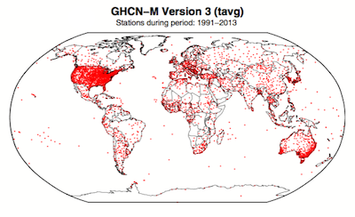
 GHCN-M stations

Figure 1. Station locations with at least 1 month of data in the monthly Global Historical Climatology Network (GHCN-M). This set of 7280 stations are used in the global land surface databank. (Rennie et al. 2014)

In 2009 allegations were made in the blogosphere that weather stations placed in what some thought to be 'poor' locations could make the temperature record unreliable (and therefore, in certain minds, global warming would be shown to be a flawed concept). Scientists at the National Climatic Data Center took those allegations very seriously. They undertook a careful study of the possible problem and published the results in 2010. The paper, "On the reliability of the U.S. surface temperature record" (Menne et al. 2010), had an interesting conclusion. The temperatures from stations that the self-appointed critics claimed were "poorly sited" actually showed slightly cooler maximum daily temperatures compared to the average.

Around the same time, a physicist who was originally hostile to the concept of anthropogenic global warming, Dr. Richard Muller, decided to do his own temperature analysis. This proposal was loudly cheered in certain sections of the blogosphere where it was assumed the work would, wait for it, disprove global warming.

To undertake the work, Muller organized a group called Berkeley Earth to do an independent study (Berkeley Earth Surface Temperature study or BEST) of the temperature record. They specifically wanted  to answer the question, “is the temperature rise on land improperly affected by the four key biases (station quality, homogenization, urban heat island, and station selection)?" The BEST project had the goal of merging all of the world’s temperature data sets into a common data set. It was a huge challenge.

Their eventual conclusions, after much hard analytical toil, were as follows:

1) The accuracy of the land surface temperature record was confirmed;

2) The BEST study used more data than previous studies but came to essentially the same conclusion;

3) The influence of the urban stations on the global record is very small and, if present at all, is biased on the cool side.

Muller commented: “I was not expecting this, but as a scientist, I feel it is my duty to let the evidence change my mind.” On that, certain parts of the blogosphere went into a state of meltdown. The lesson to be learned from such goings on is, “be careful what you wish for”. Presuming that improving temperature records will remove or significantly lower the global warming signal is not the wisest of things to do.

The BEST conclusions about the urban heat effect were nicely explained by our late colleague, Andy Skuce, in a post here at Skeptical Science in 2011. Figure 2 shows BEST plotted against several other major global temperature datasets. There may be some disagreement between individual datasets, especially towards the start of the record in the 19th Century, but the trends are all unequivocally the same.
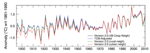
rural-urban T

Figure 2. Comparison of spatially gridded minimum temperatures for U.S. Historical Climatology Network (USHCN) data adjusted for time-of-day (TOB) only, and selected for rural or urban neighborhoods after homogenization to remove biases. (Hausfather et al. 2013)

Finally, temperatures measured on land are only one part of understanding the climate. We track many indicators of climate change to get the big picture. All indicators point to the same conclusion: the global temperature is increasing.


See also

Understanding adjustments to temperature dataZeke Hausfather

Explainer: How data adjustments affect global temperature recordsZeke Hausfather

Time-of-observation Bias, John Hartz

Berkeley Earth Surface Temperature Study: “The effect of urban heating on the global trends is nearly negligible,” Andy Skuce

Check original data

All the Berkeley Earth data and analyses are available online at http://berkeleyearth.org/data/.

Plot your own temperature trends with Kevin's calculator.

Or plot the differences with rural, urban, or selected regions with another calculator by Kevin

NASA GISS Surface Temperature Analysis (GISSTEMP) describes how NASA handles the urban heat effect and links to current data.

NOAA Global Historical Climate Network (GHCN) DailyGHCN-Daily contains records from over 100,000 stations in 180 countries and territories.

Last updated on 27 May 2023 by John Mason. View Archives

Printable Version  |  Offline PDF Version  |  Link to this page

Argument Feedback

Please use this form to let us know about suggested updates to this rebuttal.

Related Arguments

Further reading

Denial101x video

Here is a related lecture-video from Denial101x - Making Sense of Climate Science Denial

Additional video from the MOOC

Kevin Cowtan: Heat in the city

Comments

1  2  3  4  5  Next

Comments 1 to 25 out of 125:

  1. The error is 2.6 K: http://biocab.org/NOAA_vs._UAH.jpg
    Response: When comparing temperature anomalies, the trend is what you want to look at, not absolute values. Temperature anomaly is calculated as the difference from a baseline average. Often different temperature datasets use different baseline periods (eg - 1960 to 1990 or 1978 to 2000). However, the trend will be the same regardless of the period. In the case of the NOAA vs UAH graph, the trends are very similar. An additional complication is there is much uncertainty in satellite data regarding correcting for long term satellite drift (see our Satellite page for more info)
  2. I strongly suspect that periodic physical checks are needed to avoid error. Poor ventilation, not painting when needed, allowing vents to get partially or totally blocked, etc. can have a heating effect on these stations independent of UHI. The abortive attempt to hide the station locations and an awful lot of hot air floating around the Internet about how physical checks aren't really necessary makes me think that the universal commitment to quality is more theoretical on some people's part than real.
  3. John V on CA has results using "good" stations and "bad" stations (per Watts definitions) and comes to results extremely close to GISSTEMP. GISSTEMP is closest to the curve obtained withe the "good" stations. There is a post and a link on Rabett Run, you can also go directly to CA.
    Response: Phillipe, thanks for the comment. You can find Rabett's post here plus here's a direct link to John V's graphs on Climate Audit. What I find particularly interesting is Steve McIntyre's response:
    "...keep in mind that USHCN stations have already passed one cut of quality control. They are represented as “high quality” stations. No such representations have been made for stations in China - they may be good, they may be bad, they may have had accurate records throughout the turmoil of Chinese history, they may not. I don’t know how you’d even begin to place “confidence” in the Chinese record in the absence of such analysis."
    Eg - he concedes that in spite of all those photos of air conditioners and car parks, the US stations are actually good quality. So instead, let's go pick on China instead!
  4. Obviously, it is beyond unthinkable at CA that the evidence pre-existing their "scrutiny" could have any validity. Let us not forget what exactly the CA/McIntyre effort basic drive consists of, in summary: we do not like what the scientific research concludes on this issue, so we are going to review every single detail, fishing for anything that could lead in the direction that we favor. On the other hand, the actual climate research follows this basic process: study climate, by considering the physical laws governing atmospheric dynamics and their interrelations, by modeling these on supercomputers, by gathering as much data as can be obtained and carefully sorting through and analyzing that data. It is not very suprising that when the CA folks actually get into a scientific way to analyze data, their conclusions confirm the prior ones from real researchers.
  5. If what you say is true than McIntyre's error is in conceding that the sites in the US are good. I believe what he is conceding is that they are likely to be better or at least no worse than elsewhere. http://wattsupwiththat.wordpress.com/ So far, with 40% of this supposedly gold standard network surveyed, 85% of sites are showing errors in the site and operations that are likely to be > 1 degree C. In other words larger than the entire GW signal to date. People promoting catastrophic warming scenarios frequently refer to graphs from this very data set to support their claims. It is clear that we just can't make a useful reconstruction of surface temperatures using these sites. I am somewhat dismayed by the idea that modeling with supercomputers is somehow climate research. While going thru and evaluating actual data and methodology is apparently not what "real researchers" do. I could have saved so much time in grad school if I had only known that computer models were real research and the actual data wasn't. Modeling is a valuable tool in science but the models are not evidence in any way of what is happening in the climate. Adding the word supercomputer does not make it science, in fact quite the opposite. By the way since Cray isn't making them anymore what makes a computer super these days?
  6. How do NASA and GISS claim to remove UHI effects? The term Urban heat island is probably not a good one it is a land use issue not simply an urban issue. A station in NYC central park may be just fine while a station in the middle of nowhere can be bad if it is placed on asphalt next to an air conditioner exhaust. Last month, Energy and Environment 18:985-995, published a not very kind report by Douglass J Keenan. It shows that two well known and influential papers, that are still the basis for the IPCC claim that UHI has been removed from the global climate data sets, are in fact incorrect. In fact the word used is Fraudulent. While Tom Wigley has sent me some references on sea temperature that seem pretty robust, (thank you sir) the land surface temperature measurements are in serious trouble. It looks to me like at least half of the late 20th century warming signal in this data is about to vanish. We really need a data set that is not badly contaminated, that uses sites that are properly placed and maintained, USHCN is not it.
  7. It would be nice to give us a little more detail, W.A., especially considering the terminology employed (fraud). What are the papers criticized by E&E (which is itself not a peer-review science publication)? Have the authors responded to it? This journal is far from being an objective reliable source: http://pubs.acs.org/subscribe/journals/esthag-w/2005/aug/policy/pt_skeptics.html This article treats of how UHI affects observations: http://www.ncdc.noaa.gov/oa/climate/research/population/article2abstract.pdf As mentioned higher, John V has plotted the data from the "good" sites (per Watts definition) and has found very good agreement with GISSTEMP, so they must be doing something right. It is worth emphasizing that Watts'effort concentrated on micro site effects, a different problem than UHI; nevertheless, agreement was still there in the data. I would not venture to say that climate science dispenses from going through and evaluating actual data. This RC post is of some interest as to how the UHI effect is accounted for: http://www.realclimate.org/index.php/archives/2007/07/no-man-is-an-urban-heat-island/#more-454 I believe the post references this article: http://www.ncdc.noaa.gov/oa/climate/research/population/article3abstract.pdf Is that one of the 2 criticized by E&E?
  8. Another point, mentioned by John Cook on the "More on Urban Heat Island" thread, is that there is also good agreement with satellite data and weather balloon data, both immune to the micro site effects as well as UHI. If these were really that much of a factor, there would be significant discrepancies, but all the trends are consistentt.
  9. I mistakenly included both UHI and microsite effects in the previous remark, UHI would still apply.
  10. Yes satellite nad balloon data have good agreement, but isn't the important thing here that neither of them correlate well with the surface record? I should have sited the actual papers but I thought you'd rather look yourself now I'll have to remember to dig it back out.
  11. I don't see too much of a disagreement on this graph: http://tamino.files.wordpress.com/2007/08/global2.jpg The sources are: http://data.giss.nasa.gov/gistemp/ http://www.remss.com/pub/msu/monthly_time_series/
  12. "Historic Climate Network surface stations only" That is the graphs and data sets that your post leads to Phillippe. (http://data.giss.nasa.gov.gistemp/) Exactly the portion of the data with which there is a problem. Compare to the Balloon data and the satellite data where the anomally is much smaller, and the trend much less pronounced. Yes the graphs from the surface data agree with the graphs from the surface data.
  13. What are you talking about? The comparison is between GISS and MSU. You say there is a problem with USHCN and by extension GISS, this graph compares the "problem data" to satellite (MSU). Did you even look at REMSS.com? Tamino's graph puts them nicely together so as to compare the trends. I don't see any significant disagreement. You say: "Compare to the Balloon data and the satellite data where the anomally is much smaller, and the trend much less pronounced." Graphs, sources, data, links?
  14. I don't know what you want me to look at. The giss data is clearly surface only. From what I can actually open of the remss data which appears to be similar style data sets, it is clear that the anomaly numbers in the remss data are very much lower that the giss data. for 2007 for instance they appear to be more than a half a degree C lower! We have been discussing the surface station data. I am not familiar with all of the ways these different data sets are compiled. I am pointing out that the USHCN has clearly got problems in their data collection end. Is it your contention that the balloon and satellite data show the large anomaly that the surface stations data does? The satellite and ballon data match each other well but neither is nearly as dramatic as the "surface record".
  15. That's because they are troposphere numbers. They should be like that. The trends are in agreement.
  16. Yeah but they are anomaly numbers, in other words how far they are from some mean. if surface anomaly is +.75 degrees are you saying it's ok that troposhere numbers are only +.25 degrees? Are you saying that it is ok that the surface is warming more than the atmosphere? That would directly falsify the entire greenhouse hypothesis. That can't be right.
  17. Are you saying that it is ok that the surface is warming more than the atmosphere? That would directly falsify the entire greenhouse hypothesis. Are you really sure about that? Did you also look at what reference period is used to compute anomalies?
  18. Yes I am 100% sure about that... if the surface warms more than the atmosphere than the atmosphere cannot be the cause as this would violate the second law of thermodynamics, think in terms of entropy and in terms of what is known as zeroeth law. I suspect that there must be something else in there that we aren't seeing, if they are using different reference periods for their anomaly calculations then combining them in the graphs as they have; that would be amazing incompetence so I doubt that's what it is. It could be what I have suggested on other threads we ought to quit using the land surface record until we get a better handle on what the heck the problems with it are. This meets enormous resistance because the warming signal from balloon measures has been so much weaker and the satellite record is so short.
  19. Back to comment 3 John V's post actually suggests that the CRN5 stations are introducing a poitive bias in the surface results since 1960. He graphs it fartherr down the page.
  20. How significant that actually is remains to be seen. About the satellite record: The T2 channel, used for troposphere measurements is influenced by the stratosphere. The T4 channel is all stratosphere. http://www.ncdc.noaa.gov/oa/climate/research/rss-msu.pdf http://climate.envsci.rutgers.edu/pdf/VinnikovGrody2003.pdf http://climate.envsci.rutgers.edu/pdf/TrendsJGRrevised3InPress.pdf http://www.ncdc.noaa.gov/oa/climate/research/nature02524-UW-MSU.pdf About balloons: http://www.sciencemag.org/cgi/content/short/309/5740/1556
  21. Re-reading through this, it seems that there may be some confusion. "if the surface warms more than the atmosphere then the atmosphere cannot be the cause as this would violate the second law of thermodynamics," The surface is not really the surface as in the surface of a spheroid. Surface temps measurements and estimates are rather the lowest troposheric temps and should be thought of that way. Sea surface temps would probably correspond better to the idea of surface as you use it in you thermodynamic view. But any AIR temperature can not be considered as surface that way, it is always atmospheric, even if it's 2 cm off the ground. "if they are using different reference periods for their anomaly calculations then combining them in the graphs as they have; that would be amazing incompetence so I doubt that's what it is." Actually that's exactly what it is and I don't know who you mean exactly by "they." This graph: http://tamino.files.wordpress.com/2007/08/global2.jpg Is a compilation by Tamino to show agreement in the trends and agreement does show, in spite of having different time periods for anomaly computation. The reference period for GISS is 1951-1980. Obviously, the satellite record can not use this same period. Satellite records use 1979-2000, during which average temps were already higher, making warm anomalies smaller than those seen on GISS. It is not incompetence to represent these on the same graph, so long as we know what we're looking at. In fact, it is a good test of the true trend. Incompetence would lie rather in the ignorance of the difference or using the graph for interpretations that ignore these differences. Putting these on the same graph to verify identical trends is not incompetence. One last thing: satellite measurements are, in fact, lower troposphere measurements, a sizable layer of atmosphere, and even the T2 channel includes a strong stratospheric influence. The papers cited higher give some details on that.
  22. Good job Phillipe that makes much more sense. That part is a baseline problem then and not a totally dumb one. Another way of saying 1979-2000 was already warming though is to say 1951-1980 was the coldest stretch in a century. Too bad GISS used this for a baseline but what can you do about that. Excellent first paragraph too. Though there is a lot of debate about where warming should be greatest vs where it is the greatest. I'm not sure who is right there. I think between the two things you took care of the problem I had with the anomaly numbers. Hurrah.
  23. Glad to help.
  24. And just as a reminder, it does not make any real difference what the ref period is.
  25. According to WikiP. there are around 4000 stations around the world that are used for collecting data. Some are well maintained and calibrated. Some are not. From a fair number of stations the data does not arrive for incorporation at the right time, or sometimes not at all. So the data set is 'adjusted'. On a scale of 1 - 10 how would we rate the accuracy of this data source? And how reliable does this make any model we try to construct? Most of the stations are land-based and the sea based ones limited to particular sea routes; this means we have less data about sea temps then land temps...despite the sea being somewhat bigger. What skew does that put on any resultants?

1  2  3  4  5  Next

Post a Comment

Political, off-topic or ad hominem comments will be deleted. Comments Policy...

You need to be logged in to post a comment. Login via the left margin or if you're new, register here.

Link to this page


The Consensus Project Website

THE ESCALATOR

(free to republish)


© Copyright 2024 John Cook
Home | Translations | About Us | Privacy | Contact Us