


 Arguments


Are surface temperature records reliable?
What the science says...
| Select a level... |
 Basic
Basic
|
 Intermediate
|
 Advanced
| ||||
|
The warming trend is the same in rural and urban areas, measured by thermometers and satellites, and by natural thermometers. |
|||||||
Climate Myth...
Temp record is unreliable
"We found [U.S. weather] stations located next to the exhaust fans of air conditioning units, surrounded by asphalt parking lots and roads, on blistering-hot rooftops, and near sidewalks and buildings that absorb and radiate heat. We found 68 stations located at wastewater treatment plants, where the process of waste digestion causes temperatures to be higher than in surrounding areas.
In fact, we found that 89 percent of the stations – nearly 9 of every 10 – fail to meet the National Weather Service’s own siting requirements that stations must be 30 meters (about 100 feet) or more away from an artificial heating or radiating/reflecting heat source." (Watts 2009)
At a glance
It's important to understand one thing above all: the vast majority of climate change denialism does not occur in the world of science, but on the internet. Specifically in the blog-world: anyone can blog or have a social media account and say whatever they want to say. And they do. We all saw plenty of that during the Covid-19 pandemic, seemingly offering an open invitation to step up and proclaim, "I know better than all those scientists!"
A few years ago in the USA, an online project was launched with its participants taking photos of some American weather stations. The idea behind it was to draw attention to stations thought to be badly-sited for the purpose of recording temperature. The logic behind this, they thought, was that if temperature records from a number of U.S. sites could be discredited, then global warming could be declared a hoax. Never mind that the U.S. is a relatively small portion of the Earth;s surface. And what about all the other indicators pointing firmly at warming? Huge reductions in sea ice, poleward migrations of many species, retreating glaciers, rising seas - that sort of thing. None of these things apparently mattered if part of the picture could be shown to be flawed.
But they forgot one thing. Professional climate scientists already knew a great deal about things that can cause outliers in temperature datasets. One example will suffice. When compiling temperature records, NASA's Goddard Institute for Space Studies goes to great pains to remove any possible influence from things like the urban heat island effect. That effect describes the fact that densely built-up parts of cities are likely to be a bit warmer due to all of that human activity.
How they do this is to take the urban temperature trends and compare them to the rural trends of the surrounding countryside. They then adjust the urban trend so it matches the rural trend – thereby removing that urban effect. This is not 'tampering' with data: it's a tried and tested method of removing local outliers from regional trends to get more realistic results.
As this methodology was being developed, some findings were surprising at first glance. Often, excess urban warming was small in amount. Even more surprisingly, a significant number of urban trends were cooler relative to their country surroundings. But that's because weather stations are often sited in relatively cool areas within a city, such as parks.
Finally, there have been independent analyses of global temperature datasets that had very similar results to NASA. 'Berkeley Earth Surface Temperatures' study (BEST) is a well-known example and was carried out at the University of California, starting in 2010. The physicist who initiated that study was formerly a climate change skeptic. Not so much now!
Please use this form to provide feedback about this new "At a glance" section, which was updated on May 27, 2023 to improve its readability. Read a more technical version below or dig deeper via the tabs above!
Further details
Temperature data are essential for predicting the weather and recording climate trends. So organisations like the U.S. National Weather Service, and indeed every national weather service around the world, require temperatures to be measured as accurately as possible. To understand climate change we also need to be sure we can trust historical measurements.
Surface temperature measurements are collected from more than 30,000 stations around the world (Rennie et al. 2014). About 7000 of these have long, consistent monthly records. As technology gets better, stations are updated with newer equipment. When equipment is updated or stations are moved, the new data is compared to the old record to be sure measurements are consistent over time.
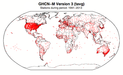
Figure 1. Station locations with at least 1 month of data in the monthly Global Historical Climatology Network (GHCN-M). This set of 7280 stations are used in the global land surface databank. (Rennie et al. 2014)
In 2009 allegations were made in the blogosphere that weather stations placed in what some thought to be 'poor' locations could make the temperature record unreliable (and therefore, in certain minds, global warming would be shown to be a flawed concept). Scientists at the National Climatic Data Center took those allegations very seriously. They undertook a careful study of the possible problem and published the results in 2010. The paper, "On the reliability of the U.S. surface temperature record" (Menne et al. 2010), had an interesting conclusion. The temperatures from stations that the self-appointed critics claimed were "poorly sited" actually showed slightly cooler maximum daily temperatures compared to the average.
Around the same time, a physicist who was originally hostile to the concept of anthropogenic global warming, Dr. Richard Muller, decided to do his own temperature analysis. This proposal was loudly cheered in certain sections of the blogosphere where it was assumed the work would, wait for it, disprove global warming.
To undertake the work, Muller organized a group called Berkeley Earth to do an independent study (Berkeley Earth Surface Temperature study or BEST) of the temperature record. They specifically wanted to answer the question, “is the temperature rise on land improperly affected by the four key biases (station quality, homogenization, urban heat island, and station selection)?" The BEST project had the goal of merging all of the world’s temperature data sets into a common data set. It was a huge challenge.
Their eventual conclusions, after much hard analytical toil, were as follows:
1) The accuracy of the land surface temperature record was confirmed;
2) The BEST study used more data than previous studies but came to essentially the same conclusion;
3) The influence of the urban stations on the global record is very small and, if present at all, is biased on the cool side.
Muller commented: “I was not expecting this, but as a scientist, I feel it is my duty to let the evidence change my mind.” On that, certain parts of the blogosphere went into a state of meltdown. The lesson to be learned from such goings on is, “be careful what you wish for”. Presuming that improving temperature records will remove or significantly lower the global warming signal is not the wisest of things to do.
The BEST conclusions about the urban heat effect were nicely explained by our late colleague, Andy Skuce, in a post here at Skeptical Science in 2011. Figure 2 shows BEST plotted against several other major global temperature datasets. There may be some disagreement between individual datasets, especially towards the start of the record in the 19th Century, but the trends are all unequivocally the same.
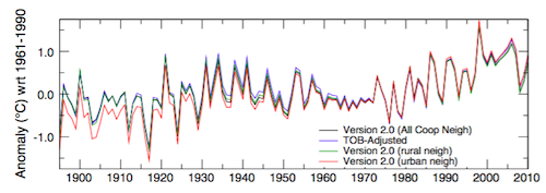
Figure 2. Comparison of spatially gridded minimum temperatures for U.S. Historical Climatology Network (USHCN) data adjusted for time-of-day (TOB) only, and selected for rural or urban neighborhoods after homogenization to remove biases. (Hausfather et al. 2013)
Finally, temperatures measured on land are only one part of understanding the climate. We track many indicators of climate change to get the big picture. All indicators point to the same conclusion: the global temperature is increasing.
See also
Understanding adjustments to temperature data, Zeke Hausfather
Explainer: How data adjustments affect global temperature records, Zeke Hausfather
Time-of-observation Bias, John Hartz
Check original data
All the Berkeley Earth data and analyses are available online at http://berkeleyearth.org/data/.
Plot your own temperature trends with Kevin's calculator.
Or plot the differences with rural, urban, or selected regions with another calculator by Kevin.
NASA GISS Surface Temperature Analysis (GISSTEMP) describes how NASA handles the urban heat effect and links to current data.
NOAA Global Historical Climate Network (GHCN) Daily. GHCN-Daily contains records from over 100,000 stations in 180 countries and territories.
Last updated on 27 May 2023 by John Mason. View Archives


[DB] Per NOAA:
What is a temperature anomaly?
The term “temperature anomaly” means a departure from a reference value or long-term average. A positive anomaly indicates that the observed temperature was warmer than the reference value, while a negative anomaly indicates that the observed temperature was cooler than the reference value.
What can the mean global temperature anomaly be used for?
This product is a global-scale climate diagnostic tool and provides a big picture overview of average global temperatures compared to a reference value.
Why use temperature anomalies (departure from average) and not absolute temperature measurements?
Absolute estimates of global average surface temperature are difficult to compile for several reasons. Some regions have few temperature measurement stations (e.g., the Sahara Desert) and interpolation must be made over large, data-sparse regions. In mountainous areas, most observations come from the inhabited valleys, so the effect of elevation on a region’s average temperature must be considered as well. For example, a summer month over an area may be cooler than average, both at a mountain top and in a nearby valley, but the absolute temperatures will be quite different at the two locations. The use of anomalies in this case will show that temperatures for both locations were below average.
Using reference values computed on smaller [more local] scales over the same time period establishes a baseline from which anomalies are calculated. This effectively normalizes the data so they can be compared and combined to more accurately represent temperature patterns with respect to what is normal for different places within a region.
For these reasons, large-area summaries incorporate anomalies, not the temperature itself. Anomalies more accurately describe climate variability over larger areas than absolute temperatures do, and they give a frame of reference that allows more meaningful comparisons between locations and more accurate calculations of temperature trends.
[DB] Typically, if no baseline is specified it is understood that the baseline used is 1951-1980. However, since the above work goes back to original data any baseline theoretically could have been used (but it's safe to assume that they share a common baseline). JC would be the one to ask for a definitive answer.
If the data is/was so accurate, why does Hansen keep changing it? And why are ALL changes in the direction that support his belief? You would think that at least some "mistakes" were made in the other direction, no? How much cooler are the 30's going to get?
Kevin,
Do you have no clue how this works?
First, "Hansen" doesn't personally go changing things. This habit of deniers of first personalizing the science (it's "Al Gore's" or it's "Hansen's") and then villifying that person is just foolishness.
That said, the data is continually improved because it always helps to make it better... except that the validity and accuracy of the data is already good enough for our purposes.
As far as changes in a direction that "support his belief," scientists don't have beliefs, they have conclusions. It's deniers whose positions are founded entirely on beliefs.
How much cooler are the 30s going to get? LOL. 2013 is going to be a "wake up and smell the thermometer" year for you and your ilk.
Kevin:
The point being made is that, without regard for the accuracy or precision of the instrumental record, you can still replicate the 20th-century global warming signal using only a subset of the data. That is how powerful global warming is.
It would be nice if you could provide a reference to any change to 1930s instrumental data. But based on this thread and the "It's the Sun" thread I don't think we're going to see it.
I should also like to echo Sphaerica's irritation at your peculiar reference to Hansen. As Sphaerica notes, it is done in a style all too remniscent of behaviour characteristic of deniers & cranks.
I should also like to add some irritation at what appears to be another behaviour in the same style: popping on multiple threads with small, largely content-free, smear-like or "gotcha"-style comments. We're at two now. Will there be more?
Actually, this is the "accuracy in the data" thread, not the Sun thread, so it is appropriate to discuss this.
This is from WUWT,
Just because it is from there don't discount it out of hand. It shows temp change since 2008 made to the record, it was originally from Climate4You.
Hopefully the chart comes through, but anyway, it shows significant adjustments, so that should satisfy your need for showing what I was talking about.
I disagree. When it comes to Hansen, who has publically stated his beliefs, and his position, and done so in a manor that can not be confused with stating scientific knowledge or facts. Otherwise, I would agree with you.
See my other posts about appology regarding my smear/gothca impression - not intended.
I also note that, if there is in fact some version of Gistemp which does adjust those years as per the chart, then there the adjustments between that chart and 2013 at most merely restore the values to those of the July 2008 version, and in some years still represent an overall net cooling adjustment.
Kevin, assuming that the methodology of the graph is honest, what makes you think that the adjustments are dishonest? If they were exactly reversed, would you still be complaining?
And what is the method for determining statistical significance in this case? And is that the anomaly? Or is that the absolute temp?
Kevin, to put that diagram into perspective, if you look at GISS LOTI, there has been abou 0.9 degrees of warming since 1911 (the lowest point on the WUWT plot), so the difference between GISS products accounts for less than 10% of the observed warming. There is also the point that the adjustements made since 2008 are likely to have been made for good reasons. If you want to know why "Hansen" (GISS != Hansen) keeps changing the temperature record, then I suggest reading the technical reports and papers might be a good start.
Kevin:
Thank you for returning to follow up. It has been my experience that commenters who post on multiple threads in short order with what appear to be leading questions or comments are engaging in "drive-by" commenting. One rarely sees them again (except, perhaps, for further drive-bys some months in the future). Since you have returned, I apologize for my viscerally hostile reaction.
Further to the graph, posted on WUWT, that you have shared here, I guess my follow-up questions are:
That adjustments have been made does not make them prima facie suspicious. Organizations and people re-evaluate past data using improved methods and make revisions as required (one example might be casualty figures from past conflicts, which are subject to occasional re-assessment - e.g. casualties suffered by the polities of the former Soviet Union during the Second World War). As far as I can see this is normally unremarkable behaviour.
With regards to Hansen's beliefs vs his conclusions, the question is, what evidence is there that any of Hansen's personal convictions (such as those described in, say, his recent book) are inappropriately reflected in his published work? Certainly such a thing is possible, but it doesn't follow that it is occurring without some sort of substantiation.
Kevin, climate4you is run by Ole Humlum, who has written a number of deeply flawed papers on climate science, so pointing out that the plot originates from climate4you rather than WUWT does not make it any more authoritative. This doesn't mean that the plot is incorrect, but it is good cause to be skeptical.
To reiterate what others have said, without details of the source data we can only speculate. However the graph above does look rather different from this one:

Source: here. Links to the source datasets are provided in that post.I plotted the difference between the current GISTEMP, and the archived 2008 data (via WUWT); while the graph is not exactly the same as the one posted by Kevin, they are close enough that I think I have the right data set ( the difference is possibly due to me using Jan-Dec as the year rather than Dec-Nov, but I haven't bothered to check)
Blue is the current GISTEMP up to 2007, with green being the difference between current GISTEMP and GISTEMP in April 2008. Point is overall adjustment is still small.
The green curve can largely be explain through two "big" adjustments made since the RC post linked to in post 249. First is the change from GHCN v3.1.0 to GHCN v3.2.0 for the surface stations in Sep 2012 (documented here), and the switch form HADISST+Reynolds OI ocean data to ERSST (just last month. Confirmation from GISS).
Green is the difference between current GISTEMP and GISTEMP in April 2008. Blue is the shift due to change in Ocean data. Red is shift due to land data change.
Note that the overall trend changes are
Now Kevin,
(1) Most of the adjustment is due to switching from GHCN from v3.1 to v3.2. This is done by NOAA and is due to better algorithm for detecting inhomogeneities in temperature record(see here). Note that this an automated program, so unless you have a valid criticism on the algorithm, you can't simply attribute this adjustment as a reseracher's bias.
If the better algorithm says the temperature needs to be adjusted downwards and it is ignored, you can be sure folks over at WUWT will be all over it.
(2) The change that Dr. Hansen can actually decide on, is the switch of ocean dataset. First off, prior to 2013 the ocean data actually consists of two chucks, HADISST prior to 1980, and Reynold OI dataset from 1980, so it is possible that there are inconsistencies; on the other hand ERSST is a complete dataset.
If the decision to change dataset is to simply inflate the warming, they could've done it back in 2010. Hansen et al (2010) wrote:
Thus they have been evaluating the relative merits of the two datasets for at least two years. Furthermore, in the same paper it was revealed that if they went with a third dataset (HADSSTv2) the warming is even stronger. So the question is, if Hansen's science is based on his personal opinion rather than careful analysis, why did he wait two years? Why didn't he choose the dataset that results in the most warming?
(3) Your claim that "ALL changes in the direction that support his belief?" is demonstrably false. In Jan 2010, an adjustment resulted in a decrease in global trend of 0.005oC/century