


 Arguments


Are surface temperature records reliable?
What the science says...
| Select a level... |
 Basic
Basic
|
 Intermediate
|
 Advanced
| ||||
|
The warming trend is the same in rural and urban areas, measured by thermometers and satellites, and by natural thermometers. |
|||||||
Climate Myth...
Temp record is unreliable
"We found [U.S. weather] stations located next to the exhaust fans of air conditioning units, surrounded by asphalt parking lots and roads, on blistering-hot rooftops, and near sidewalks and buildings that absorb and radiate heat. We found 68 stations located at wastewater treatment plants, where the process of waste digestion causes temperatures to be higher than in surrounding areas.
In fact, we found that 89 percent of the stations – nearly 9 of every 10 – fail to meet the National Weather Service’s own siting requirements that stations must be 30 meters (about 100 feet) or more away from an artificial heating or radiating/reflecting heat source." (Watts 2009)
At a glance
It's important to understand one thing above all: the vast majority of climate change denialism does not occur in the world of science, but on the internet. Specifically in the blog-world: anyone can blog or have a social media account and say whatever they want to say. And they do. We all saw plenty of that during the Covid-19 pandemic, seemingly offering an open invitation to step up and proclaim, "I know better than all those scientists!"
A few years ago in the USA, an online project was launched with its participants taking photos of some American weather stations. The idea behind it was to draw attention to stations thought to be badly-sited for the purpose of recording temperature. The logic behind this, they thought, was that if temperature records from a number of U.S. sites could be discredited, then global warming could be declared a hoax. Never mind that the U.S. is a relatively small portion of the Earth;s surface. And what about all the other indicators pointing firmly at warming? Huge reductions in sea ice, poleward migrations of many species, retreating glaciers, rising seas - that sort of thing. None of these things apparently mattered if part of the picture could be shown to be flawed.
But they forgot one thing. Professional climate scientists already knew a great deal about things that can cause outliers in temperature datasets. One example will suffice. When compiling temperature records, NASA's Goddard Institute for Space Studies goes to great pains to remove any possible influence from things like the urban heat island effect. That effect describes the fact that densely built-up parts of cities are likely to be a bit warmer due to all of that human activity.
How they do this is to take the urban temperature trends and compare them to the rural trends of the surrounding countryside. They then adjust the urban trend so it matches the rural trend – thereby removing that urban effect. This is not 'tampering' with data: it's a tried and tested method of removing local outliers from regional trends to get more realistic results.
As this methodology was being developed, some findings were surprising at first glance. Often, excess urban warming was small in amount. Even more surprisingly, a significant number of urban trends were cooler relative to their country surroundings. But that's because weather stations are often sited in relatively cool areas within a city, such as parks.
Finally, there have been independent analyses of global temperature datasets that had very similar results to NASA. 'Berkeley Earth Surface Temperatures' study (BEST) is a well-known example and was carried out at the University of California, starting in 2010. The physicist who initiated that study was formerly a climate change skeptic. Not so much now!
Please use this form to provide feedback about this new "At a glance" section, which was updated on May 27, 2023 to improve its readability. Read a more technical version below or dig deeper via the tabs above!
Further details
Temperature data are essential for predicting the weather and recording climate trends. So organisations like the U.S. National Weather Service, and indeed every national weather service around the world, require temperatures to be measured as accurately as possible. To understand climate change we also need to be sure we can trust historical measurements.
Surface temperature measurements are collected from more than 30,000 stations around the world (Rennie et al. 2014). About 7000 of these have long, consistent monthly records. As technology gets better, stations are updated with newer equipment. When equipment is updated or stations are moved, the new data is compared to the old record to be sure measurements are consistent over time.
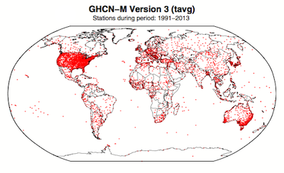
Figure 1. Station locations with at least 1 month of data in the monthly Global Historical Climatology Network (GHCN-M). This set of 7280 stations are used in the global land surface databank. (Rennie et al. 2014)
In 2009 allegations were made in the blogosphere that weather stations placed in what some thought to be 'poor' locations could make the temperature record unreliable (and therefore, in certain minds, global warming would be shown to be a flawed concept). Scientists at the National Climatic Data Center took those allegations very seriously. They undertook a careful study of the possible problem and published the results in 2010. The paper, "On the reliability of the U.S. surface temperature record" (Menne et al. 2010), had an interesting conclusion. The temperatures from stations that the self-appointed critics claimed were "poorly sited" actually showed slightly cooler maximum daily temperatures compared to the average.
Around the same time, a physicist who was originally hostile to the concept of anthropogenic global warming, Dr. Richard Muller, decided to do his own temperature analysis. This proposal was loudly cheered in certain sections of the blogosphere where it was assumed the work would, wait for it, disprove global warming.
To undertake the work, Muller organized a group called Berkeley Earth to do an independent study (Berkeley Earth Surface Temperature study or BEST) of the temperature record. They specifically wanted to answer the question, “is the temperature rise on land improperly affected by the four key biases (station quality, homogenization, urban heat island, and station selection)?" The BEST project had the goal of merging all of the world’s temperature data sets into a common data set. It was a huge challenge.
Their eventual conclusions, after much hard analytical toil, were as follows:
1) The accuracy of the land surface temperature record was confirmed;
2) The BEST study used more data than previous studies but came to essentially the same conclusion;
3) The influence of the urban stations on the global record is very small and, if present at all, is biased on the cool side.
Muller commented: “I was not expecting this, but as a scientist, I feel it is my duty to let the evidence change my mind.” On that, certain parts of the blogosphere went into a state of meltdown. The lesson to be learned from such goings on is, “be careful what you wish for”. Presuming that improving temperature records will remove or significantly lower the global warming signal is not the wisest of things to do.
The BEST conclusions about the urban heat effect were nicely explained by our late colleague, Andy Skuce, in a post here at Skeptical Science in 2011. Figure 2 shows BEST plotted against several other major global temperature datasets. There may be some disagreement between individual datasets, especially towards the start of the record in the 19th Century, but the trends are all unequivocally the same.
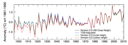
Figure 2. Comparison of spatially gridded minimum temperatures for U.S. Historical Climatology Network (USHCN) data adjusted for time-of-day (TOB) only, and selected for rural or urban neighborhoods after homogenization to remove biases. (Hausfather et al. 2013)
Finally, temperatures measured on land are only one part of understanding the climate. We track many indicators of climate change to get the big picture. All indicators point to the same conclusion: the global temperature is increasing.
See also
Understanding adjustments to temperature data, Zeke Hausfather
Explainer: How data adjustments affect global temperature records, Zeke Hausfather
Time-of-observation Bias, John Hartz
Check original data
All the Berkeley Earth data and analyses are available online at http://berkeleyearth.org/data/.
Plot your own temperature trends with Kevin's calculator.
Or plot the differences with rural, urban, or selected regions with another calculator by Kevin.
NASA GISS Surface Temperature Analysis (GISSTEMP) describes how NASA handles the urban heat effect and links to current data.
NOAA Global Historical Climate Network (GHCN) Daily. GHCN-Daily contains records from over 100,000 stations in 180 countries and territories.
Last updated on 27 May 2023 by John Mason. View Archives


Jennifer Marohasy has been really attacking homogenization this year. Recently she wrote a "paper" detailing her criticisms, directed at a few stations in Australia, who, after homogenization, experienced cool to warm trend shifts. Anyway, I was wondering if anyone was on top of this or could direct me to some information that might clear this up.
http://jennifermarohasy.com/wp-content/uploads/2011/08/Changing_Temperature_Data.pdf
Thanks :)
ronswanson - There is a significant literature on this, for example these papers. For a more informal discussion Victor Venema has written a great deal on the subject. The BEST temperature record project applies a closely related methodology to identify individual station break-points, although they simply separate the data into separate non-overlapping station records rather than correcting a single record for regional consistency.
Station moves occur, as do equipment changes, both of which change the absolute temperatures recorded at the station affected and thus bias anomalies. Homogenization looks at nearby stations that do not experience simultaneous changes to detect and measure how the temperature anomaly offsets have changed for the modified station, and corrections are applied accordingly. Hansen and Lebedeff 1987 demonstrated strong correlations in observed temperature anomalies over distances over 1000km, meaning that nearby station anomalies are very reliable indicators for identifying individual station changes.
As I've said before, It could be argued (and has by people like Marohasy) that it’s better to look at raw temperature data than data with these various adjustments for known biases. It could also be argued that it’s worth not cleaning the dust and oil off the lenses of your telescope when looking at the stars. I consider these statements roughly equivalent, and would have to disagree.
Ignoring known and correctable biases to search out some subset of raw data that seems to support your thesis IMO indicates either (a) deliberate distortion or (more charitably) (b) a huge misunderstanding of science and statistics accompanied by confirmation bias. Either way, such claims are simply not meaningful.
ronswanson - I will also point out that your question seems to indicate that you have not read the opening post nor any of the links provided. I would suggest you do so, as you might find them informative.
ronswanson @301, I am in the process of drawing together a blog post on her criticisms of the Amberley temperature record (because it is geographically close to my location). In essence here claim is that three seperate teams (BOM, GHCN, BEST) have looked at the Amberley data and despite all using distinct methods, have all concuded the slight cooling trend in the raw data is spurious, but that her non-mathematical examination is superior to the consensus of the experts. To do that she compares Amberly to the nearby Archerfield station, but not to the even nearer Ipswich station (available from BEST) that shows the positive trend she says does not exist, or the also nearby Gatton stations (one of which shows the positive trend, and one of which does not)- and certainly not to stations in the wider region which do show the trend.
She says it is ridiculous to consider the discrepancy found independently by three different teams by mathematical analsysis exists because no change in the metadata is recorded at that time, even though BOM warns that the metadata is incomplete and has not had all paper sources entered into the relevant digital database on which she relies.
She also neglects to mention that satellite data over the relevant periods shows a temperature trend consistent with the homogenized BOM (and GHCN and BEST) data, but inconsistent with her data. Presumably climate change deniers John Christy and Roy Spencer are also homogenizing their data to show a trend as well:
She also claims that there are no natural phenomenon consistent with the warming trend, neglecting to mention that Jaccaranda trees in the area are flowering a month earlier than they used to, a fact attributed to global warming. (My attention was first drawn to the early flowering of the Jacaranda's by my mother, who studied in Brisbane in the early fifties, and comments every year when the jacaranda's start blooming on their early flowering.)
So, who are you going to believe - three independent teams of temperature experts, and the (evidently brainwashed) deniers with the satellite data who have so cleverly rejigged the DNA or 78 year old jaccaranda trees to hoodwink us - or former right wing think tank member, Jennifer Marahosy who obviously couldn't have a political reason for her beliefs (unlike those well known lefties, the Jacarranda's).
Tom Curtis asks "so who are you going to believe etc" and then goes on use derogatory terms such as "evidently brainwashed" obviously suggesting any one who may question his conclusions is unsound. Naturally one would assume the three independent teams of temperature experts are more likely to be correct, although one might question the importance placed by Ton Curtis on his Jacaranda observations which could be local and ask why the Jacarandas are not flowering early in Western Australia. However, one is given cause for pause when the reasons given by the BoM for their adjustments are refuted by those who actually worked where the stations in question are sited. Are those who refute what the BoM says "evidently brainwashed"?
Apologies Ton Curtis should read Tom Curtis
Apologies again I should have noted that Dr Marohasy's paper was peer reviewed and asked if the reviewers were "evidently brainwashe"?
Ashton:
1) Read my posts more carefully. I did not say anybody was brainwashed to reject AGW. Rather, I ironically suggested that those who disagree with Marahosy had been "brain washed" to emphasize the fact that, considering who they were, that was not the case and that their independent finding of a positive temperature trend in the Brisbane valley using satellite data was truly independent, and indeed refuted Marohasy.
2) Given that Marohasy accuses BOM of fraudulently tampering with data, something you apparently have no problem with, your taking of offense even at your misinterpretation of what I wrote is simply hypocritical and not worthy of notice.
3) Marohasy has not written any peer reviewed reports on the temperature data. Rather, she has merely echoed the results of an Australian blogger on her blog, and in emails to the Australian, and to a Minister in the Abbot government. I believe it was you, not she who made up the cannard about her findings being from a peer reviewed report.
4) In contrast, the appropriateness and proper conduct of the BOM methods have been peer reviewed, and reported on in a publicly available document. It has also been peer reviewed in the scientific literature.
5) I have been downloading raw temperature data for stations nearby to Amberly today, and in the process noticed that Marohasy has clearly cherry picked her examples. The most telling point is that she cites airport (29.53 km from Amberley) to support her case, but neglects Ipswich (4.73 km away) and two stations at Gatton (37.99 and 38.61 kms distant), all of which show strong positive trends (contrary to my mistaken rememberance in my previous post). A number of other local stations also show positive trends. The key point here is that Marohassy neglects those stations, even though they are in the majority and are often closer and more climactically similar to Amberley than those she does cite.
6) I note you do not report on past and present times of jacaranda blooming in Western Australia. I on the other hand have linked to reports of the phenomenon in Sydney, Ipswich, have verified it in Brisbane, and can confirm it for Grafton (sorry. lossed the link), Camden San Diego (California), Florida (normal flowering time from April to June) and Los Angeles.
Ashton - Marohasy's article is an online publication through the Sydney Institute, "a privately funded not-for-profit current affairs forum encouraging debate and discussion", in Sydney Papers Online, which is most definitely not a peer-reviewed publication.
Your above claim about its review status is wholly in error. And there is no sign that anyone with knowledge or expertise on the temperature records had critical input to the article.
Tom Curtis and KR you ar eboth quite correct and I apologise unreservedly for my sloppy assessment of the piece I read. That said, have you read the piece in the Weekend Australian (http://tinyurl.com/l3r5zs4)? More questions regarding the treatment of temperature data by the BoM which is not coming across at all well in the MSM. It really does give one cause for pause in blindly accepting that what they say is gospel. There does not appear to be any affiliation with the Heartland Institute or the fossil fuel industry.
Ashton @310, the article for which you provide a link just rehashes the same allegations, except for Bourke. Curiously it draws attention to high temperature prior to 1910, as Marohasy notes in her address to the Sydney Institute, "Temperatures before August 1908 were apparently not recorded in a Stevenson screen". Indeed, they may have been recorded on a Glaisher stand, or simply on a thermometer kept within the post office. The site info notes only that an alcohol thermometer of unknown type was installed in 1871. Ironically Marohasy suggests that "the Bureau could easily apply an algorithm to correct for this", but it is a bit hard to device an algoritm for temperature records from a thermometer of unknown manufacture, operated in an unknown environment, and read by various postmen of unknown training. Further, (and here is the irony), we know how Marohasy responds to BOM algorithms that do not give her the message she wants to broadcast.
As to the MSM, the MSM in question is The Australian, which has a well known inability to report accurately or fairly on climate science. This is epitomized by the extended period when a cap and trade scheme was the favoured policy of the then Labor government in which for about a year, the Australian ran an article in the opinion pages on the issue every day, and managed to find next to zero such articles in favour of the policy (and less than 10% of articles by people other than AGW deniers). On climate science (as on many issues) the appropriate comparitor for The Australian is the Soviet era Pravda.
This propaganda approach to "reporting" is shown to be in full force by Friday's article, "Bureau of Meteorology told to be more transparent" in which Graham Lloyd reports the stale knews that a 2011 peer review told the Bureau to be more transparent about its proceedures, but neglects to report the 2 year old news that BOM published in 2012 a freely downloadable PDF detailing it homogenization process along with a host of other information about the ACORN network, and the review itself. I assume supersleuth Lloyd only published on the review because he did not know about it prior to uncritically running Marohasy's story. Don't, however, expect him to catch up to the 2012 developments, however, because they run counter to the angle he is pursuing.
Speaking of the PDF on homogenization, it contains this fascinating figure showing a histogram of corrections to maximum and minimum temperatures as a result of the homogenization process:
Does it not astonish you that with all her close scrutiny of temperature records, Marohasy has not managed to report on one adjustment that has lowered temperatures?
Of course, the timing of the adjustments is relevant in one way, so they also show the adjustments by decade, which are about even, with a spike of positive adjustments in the 1960s, and a large spike of negative adjustments in the 1990s. (That is right, the highest rate, and proportion, of negative adjustments is in the 1990s.) In another way, the timing is irrelevant because the mathematical proceedure used in homogenization (which has been fully described in a scientific paper) does not look at the effect on trends. It has an effect on trends. It causes some trends to increase, and others to decrease (although the later entirely escape Marohasy and Lloyd's attention). Further, overall, the effect does increase trends relative to the raw data. But that effect is the result of a mathematical algorithm that is blind to trends. The change in trend is not a factor in the algorithm in anyway.
If Marohasy were interested in a scientific critique of the BOM's results, she would look in detail at that the algorithm used by BOM to make the adjustments. She would try to show mathematically how it is not blind to trends. She would look at the overall statistics of adjustments, discussing records which had the trends changes downwards as well as upwards. When she doubted a particular adjustment, she would discuss it in detail - not merely handwaving about multidecade trends of just one nearby station (as she does for Amberley). She does none of that - and the reason is that if you even start doing any of that you see she has nothing to argue.
So she cherry picks, knowing that gullible fools will believe what is convenient without appropriate scrutiny.
Speaking of cherry, picking, here is the 120 month running average of the Amberley Mean monthly temperure from BEST, minus the regional expectation (ie, the temperature estimated for Amberley using local stations, but not Amberley):
As can be seen, the BEST "homogenized"(1) Amberley result sits comfortably above the regional expectation until the 1980s, when it drops like a stone and stays well below it. This comparison is not how either BOM or BEST check for inhomogeneities in the data, but it clearly shows that in 1981 something extraordinary happened to the temperature record at Amberley. (The spike at the end is an artifact of my not having as yet deleted the averages that overrun the data, as you can see by the data running on to 2012.)
Using BOM's minimum temperature data for the 10 sites with reasonable length of records closest to Amberley, I calculated a similar value:
These are annual values. The erraticness of the line is partly due to the small number of comparitors, which drop down to for some time periods, but are around seven or eight in 1981. Again the Amberley record plummets in 1981. You will notice that the Brisbane Regional Office (Brisbane Reg) rises sharply around 1969, an inhomgeneneity that would require a downward adjustment if it were an ACORN site (it isn't in that period, although its data is used rather than Brisbane Aero prior to the 1940s).
More importantly, Brisbane Aero shows no inhomgeneity in 1981. Rather, it shows a smaller inhomgeneity around 1987. This is important because it is the negative trend of Brisbane Aero that Marohasy points to suggest the negative trend in Amberley minimum temperatures is due to a regional change. That was unlikely in the first place because of the sharp nature of the change; but even the site Marohasy chooses as showing a similar change in tempertures does not show the change of temperatures at the same time. Therefore they do not have the same cause.
Had Marohasy been interested in a serious scientific critique, she would have investigated and shown that herself. That she obscures the difference in timing of the reduction in temperatures between the two stations with handwaving rather than bringing it out shows her clear intent is to obfusticate and deceive.
(To the moderator, Ashton has not replied in detail to the posts showing Marohasy's claims to be without substance. Rather, he has merely shifted the point of attack to stations that have not been examined in detail. It takes time to do the detailed analysis, so I am not going to do it station by station as Marohasy cherry picks her way around Australia. I suggest that any attempt to simply publish another cherry pick by Ashton should be regarded as sloganeering. I invite him to respond in detail, but simple avoidance should not be acceptable.)
Just realized I failed to include my footnote for the preceding post. In it I referred to the "homogenized" data for BEST. Strictly speaking BEST do not homogenize the data. Rather, they break up records were they recognize an inhomgeniety, and treat the two records as distinct. The resulting long term record is a "break point adjusted record". Here, for example are the breakpoints for Bourke:
And the breakpoint adjusted record:
And the same for Gayndah:
You will notice that except for the initial period, the adjustments to Gaynday reduce the trend.
And finally, for Rutherglen:
Those, with Amberley, are all the stations I have seen Marohasy cherry pick todate. As this is clear evidence that a simple algorithm in fact produces results inline with those produced by application of BOMs distince simple algorithm (and the GHCN's algorithm, which is very similar to that of BOM, though differing on several points), no doubt Marohasy will now accept these adjustments in line with her comments about pre-1910 Bourke temperatures. Or perhaps not.
Tom Curtis. Thanks for you very extensive comment, you certainly provide chapter and verse. It is very impressive. What I and possibly others, think about homogenisation is that in our daily lives we would not consider the temperature on a particular day from a site very distant from our own location as having any relevance whatsoeever on the temperature we ourselves will experience on that day. I can see however that that comment shows I'm not distinguishing between weather and climate. But in all of this particular debate it is the temperature on particular days that is the subject of discussion. With regard to your comments to the moderator. I haven't responded in detail as I don't have the experise that you clearly do, to assemble the relevant data in a time frame that fits into my working life. And as for shifting the "point of attack" as you put it, I don't have any "point of attack". I read stuff in the MSM and from time to time, post my, admittedly superficial, observations hoping that those such as yourself will provide a more expert analysis of these obsertvations. Mostly my hopes are realised. However many readers of the MSM don't do this but accept what they are told without any further thought or follow-up. Should I follow their example? Perhaps I should and perhaps that is why the more sceptical side of the climate debate is still not entirely convinced by the arguments put forward by its proponents. Yes, I do read the Australian, a paper that reports on both sides of the AGW debate. I also read The Guardian, a paper that reports on only one side of the debate. I don't regard articles in The Australian as being any more accurate and relevant or, conversely, more readily dismissable than those in The Guardian and vice versa.
Tom Curtis, this may well be struck out as off topic. I'm in the UK at the moment where the Mail on Sunday, a widely read but sensationalistic newspaper has reported on Arctic sea ice. I don't read this paper as I think it is a "rag" but as my attention was drawn to the report by local radio I looked at it on-line. You yourself might care to do so to see just how the MSM can sway the climate change debate.
Ashton at 313,
There is no such as thing as "both sides" of the "debate." The so-called debate consists of on one side, the science, on the other, people saying the science is wrong without doing any of the work to prove it. Or people saying the science shows things that it doesn't show. Or people organizing harassment campaigns against scientists coming to conclusions they don't like. That is a far cry from a debate.
I'm not sure what you're otherwise saying but it sounds like "I may be taken for a ride but what choice do I have?"
Really?
Ashton @313:
1) Scientific studies have shown that correlation between neigbouring temperature records are high out to a distance of 1200 km. That is unsurprising given the average size of weather systems found on synoptic charts:
In this case, the 10 "nearest" neigbours used were all within 55.1 kms of Amberley. I have since expanded that to the twenty "nearest" neigbours, which are all within 93.4 km of Amberley. Given that, it is hardly surprising that the running 11 year correlation between Amberley and the mean of the twenty nearest neighbours is 0.71, nor that the number would be significantly higher except for an excursion down due to the 1981 inhomegeniety and another around 1963 due to an inhomgeniety at UQ Gatton:
You are are either simply mistaken about the distances involved, or you and your friends are misinformed about the correlation of temperatures with distance.
2) The distinction between weather and climate has no bearing on this topic as it is short term fluctuations in temperature we are concerned about. However, it need not be daily temperatures. My analysis with BOM data has beed done with annual means to make the analysis easier, for example. Monthly means are more commonly used for this type of analysis.
3) We are given many reasons for the repetition of denier memes on this site, and the most common is "I was just asking a question/seeking clariffication". Try as hard as I can, however, I cannot see the question or request for clarrification in the following (from your comment @305):
4) I cannot comment on the Gaurdian, which I do not read. The Australian, on the other hand has four types of stories on climate change. They have the stories in which they report a denier/skeptical point of view in which the denier/skeptic is quoted but no comment is sort from mainstream climate scientists. They have the report of major climate change news (release of IPCC reports etc) that they have to cover, in which the news is reported together with a denier/skeptic take on the news. They have reports of mainstream science fed to them by a denier/skeptic with a ready made criticism by said denier/skeptic which is given most prominence. And they have the reports on some stated (often inaccurate) problem with renewable energy.
Sometimes they are subtle. On one story on sea levels, there "mainstream" contact was in fact a "skeptic", and they failed to contact any genuine mainstream scientists on the subject, even though one of the world's top five scientists in that field is based in Australia.
You may regard that as reporting "on both sides of the AGW debate" but I cannot help but notice that even on the mainstream news items, the denier point of view is given the most prominence.
Further, we do not consider a newspaper reputable if it reports "both sides" of the 911 conspiracy theories. In many cases in which The Australian reports both sides (including this one), the "skeptic" side which is given most prominence by The Australian has as little merit as 911 trutherism.
Ashton @314, that report is certainly off topic on this thread, and introducing it looks remarkably like introducing a new line of attack to me.
A very slight correction to Tom's work-
"the correlation of temperatures with distance."
It should be the correlation of temperature anomalies with distance.
scaddenp @317, as the temperature anomaly is derived by subtracting a constant value from the temperature, the correlation of anomalies and temperatures is the same. What is true is that the average of nearby stations does not predict the temperature at a given station, but the rather the average of the anomalies of nearby stations predicts the anomaly at a given station. Although I did not specify it, I have used the anomalies in my neighbour comparisons.
Tom, it's a subtle point, but temperature anomaly is difference between temperature and the long term average for the station. So a station on by the sea and a station high on a hill might have very different temperatures, but the difference from a long term average at each station will be very similar. That is what I think was missing from your discussion.
scaddenp @320, I agree. However, in caclulating the correlation coefficient, the mean of each time series is subtracted from each value in the time series. Therefore the correlation of absolute temperature values and temperature anomalies will be the same. That is why in calculating the comparison to closest neighbours (as in my third graph @311) it is important to use anomalies, as I did. That is what I did do, although I failed to state it. In contrast, in calculating the correlation coefficient (as in my second graph @316) it is irrelevant whether you use anomalies or (as I did) absolute temperature values.
As I said before, I should have mentioned that I was using anomalies for the neighbour comparisons, but it is irrelevant for correlation coefficients (the point on which you raised the matter).
Okay Tom, understood in the context your analysis.
As someone who takes a passing interest in the climate change debate, what I would like to know is the first (i.e., earliest) year for which we have temperature data for the entire planet, data that no one disputes. My guess is that it's only fairly recently, say a date in the '50s or '60s. Does anyone know?
[Rob P] - "year for which we have temperature data for the entire planet, data that no one disputes"
This is an impossible standard. Some people still insist bigfoot exists, that they've been abducted by aliens, that Earth isn't warming etc. There is always going to someone who disputes the facts.
James P, the thermometer record, particularly that used by HadCRUT4 was very restricted up until 1880. That can be seen in this graph of the percentage of the land/ocean area covered by their record:
After 1880, although coverage was not universal it was also not significantly biased in geographical representation except for sparse coverage in the Arctic, and zero coverage in the Antarctic. Antarctic coverage for all datasets was accomplished in approximately 1957, as part of activities related to the International Geophysical year.
As Rob P notes, there is no such thing as data that no-one disputes, particularly in an era of pseudo-skepticism. Those, however, are the basic facts the fake skeptics will need to studiously ignore, or distort.
The real question is, how much difference does the lack of coverage make? Prior to 1880, arguably it makes a very big difference because their was not only a lack of coverage, but such coverage as existed was heavilly biased towards Europe and North America, along with the North Atlantic. That is the reason GISS and NOAA do not extend their temperature records back prior to 1880. After 1880, however, except for Antarctica, the coverage is typically extensive and not geographically biased such that only minor distortions of the temperature record can be expected.
That last point was ably demonstrated by Caerbannog, who randomly chose 85 rural stations with long records, such that only one station was to be found in any given 20o x 20o cell at any time, and took the simple average to determine a global temperature:
As you can see, divergence from the GISS temperature record is minimal. So, after 1880 coverage issues do not typically impact on estimates of global mean temperature, and to the extent that they do have only a small impact (the 0.05 C uncertainty interval, in fact). Indeed, the improvement of the record over time has recently been illustrated by Gavin Schmidt with a plot of the PDFs of the temperature of successive record warm years in the GISS record:
Rob P. (#323) writes, 'This is an impossible standard' and then goes on to trivialise my point through what is a kind of reductio ad absurdem. This conveniently ignores the fact that we need to have absolutely certain climate information and we need to know for what period absolute certainty exists before we can even begin to discuss climate change in a rational manner. I don't see why anyone would bother otherwise.
[Rob P] - Impossible expectations are one of the 5 main characteristics of scientific denial. See this SkS post: The 5 characteristics of scientific denialism. The meat and potatoes quote:
The authors define denialism as "the employment of rhetorical arguments to give the appearance of legitimate debate where there is none, an approach that has the ultimate goal of rejecting a proposition on which a scientific consensus exists".