


 Arguments


Are surface temperature records reliable?
What the science says...
| Select a level... |
 Basic
Basic
|
 Intermediate
|
 Advanced
| ||||
|
The warming trend is the same in rural and urban areas, measured by thermometers and satellites, and by natural thermometers. |
|||||||
Climate Myth...
Temp record is unreliable
"We found [U.S. weather] stations located next to the exhaust fans of air conditioning units, surrounded by asphalt parking lots and roads, on blistering-hot rooftops, and near sidewalks and buildings that absorb and radiate heat. We found 68 stations located at wastewater treatment plants, where the process of waste digestion causes temperatures to be higher than in surrounding areas.
In fact, we found that 89 percent of the stations – nearly 9 of every 10 – fail to meet the National Weather Service’s own siting requirements that stations must be 30 meters (about 100 feet) or more away from an artificial heating or radiating/reflecting heat source." (Watts 2009)
At a glance
It's important to understand one thing above all: the vast majority of climate change denialism does not occur in the world of science, but on the internet. Specifically in the blog-world: anyone can blog or have a social media account and say whatever they want to say. And they do. We all saw plenty of that during the Covid-19 pandemic, seemingly offering an open invitation to step up and proclaim, "I know better than all those scientists!"
A few years ago in the USA, an online project was launched with its participants taking photos of some American weather stations. The idea behind it was to draw attention to stations thought to be badly-sited for the purpose of recording temperature. The logic behind this, they thought, was that if temperature records from a number of U.S. sites could be discredited, then global warming could be declared a hoax. Never mind that the U.S. is a relatively small portion of the Earth;s surface. And what about all the other indicators pointing firmly at warming? Huge reductions in sea ice, poleward migrations of many species, retreating glaciers, rising seas - that sort of thing. None of these things apparently mattered if part of the picture could be shown to be flawed.
But they forgot one thing. Professional climate scientists already knew a great deal about things that can cause outliers in temperature datasets. One example will suffice. When compiling temperature records, NASA's Goddard Institute for Space Studies goes to great pains to remove any possible influence from things like the urban heat island effect. That effect describes the fact that densely built-up parts of cities are likely to be a bit warmer due to all of that human activity.
How they do this is to take the urban temperature trends and compare them to the rural trends of the surrounding countryside. They then adjust the urban trend so it matches the rural trend – thereby removing that urban effect. This is not 'tampering' with data: it's a tried and tested method of removing local outliers from regional trends to get more realistic results.
As this methodology was being developed, some findings were surprising at first glance. Often, excess urban warming was small in amount. Even more surprisingly, a significant number of urban trends were cooler relative to their country surroundings. But that's because weather stations are often sited in relatively cool areas within a city, such as parks.
Finally, there have been independent analyses of global temperature datasets that had very similar results to NASA. 'Berkeley Earth Surface Temperatures' study (BEST) is a well-known example and was carried out at the University of California, starting in 2010. The physicist who initiated that study was formerly a climate change skeptic. Not so much now!
Please use this form to provide feedback about this new "At a glance" section, which was updated on May 27, 2023 to improve its readability. Read a more technical version below or dig deeper via the tabs above!
Further details
Temperature data are essential for predicting the weather and recording climate trends. So organisations like the U.S. National Weather Service, and indeed every national weather service around the world, require temperatures to be measured as accurately as possible. To understand climate change we also need to be sure we can trust historical measurements.
Surface temperature measurements are collected from more than 30,000 stations around the world (Rennie et al. 2014). About 7000 of these have long, consistent monthly records. As technology gets better, stations are updated with newer equipment. When equipment is updated or stations are moved, the new data is compared to the old record to be sure measurements are consistent over time.
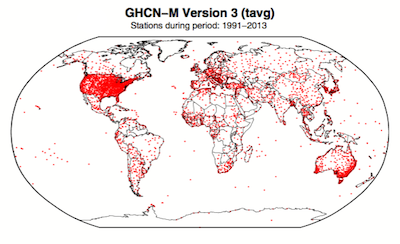
Figure 1. Station locations with at least 1 month of data in the monthly Global Historical Climatology Network (GHCN-M). This set of 7280 stations are used in the global land surface databank. (Rennie et al. 2014)
In 2009 allegations were made in the blogosphere that weather stations placed in what some thought to be 'poor' locations could make the temperature record unreliable (and therefore, in certain minds, global warming would be shown to be a flawed concept). Scientists at the National Climatic Data Center took those allegations very seriously. They undertook a careful study of the possible problem and published the results in 2010. The paper, "On the reliability of the U.S. surface temperature record" (Menne et al. 2010), had an interesting conclusion. The temperatures from stations that the self-appointed critics claimed were "poorly sited" actually showed slightly cooler maximum daily temperatures compared to the average.
Around the same time, a physicist who was originally hostile to the concept of anthropogenic global warming, Dr. Richard Muller, decided to do his own temperature analysis. This proposal was loudly cheered in certain sections of the blogosphere where it was assumed the work would, wait for it, disprove global warming.
To undertake the work, Muller organized a group called Berkeley Earth to do an independent study (Berkeley Earth Surface Temperature study or BEST) of the temperature record. They specifically wanted to answer the question, “is the temperature rise on land improperly affected by the four key biases (station quality, homogenization, urban heat island, and station selection)?" The BEST project had the goal of merging all of the world’s temperature data sets into a common data set. It was a huge challenge.
Their eventual conclusions, after much hard analytical toil, were as follows:
1) The accuracy of the land surface temperature record was confirmed;
2) The BEST study used more data than previous studies but came to essentially the same conclusion;
3) The influence of the urban stations on the global record is very small and, if present at all, is biased on the cool side.
Muller commented: “I was not expecting this, but as a scientist, I feel it is my duty to let the evidence change my mind.” On that, certain parts of the blogosphere went into a state of meltdown. The lesson to be learned from such goings on is, “be careful what you wish for”. Presuming that improving temperature records will remove or significantly lower the global warming signal is not the wisest of things to do.
The BEST conclusions about the urban heat effect were nicely explained by our late colleague, Andy Skuce, in a post here at Skeptical Science in 2011. Figure 2 shows BEST plotted against several other major global temperature datasets. There may be some disagreement between individual datasets, especially towards the start of the record in the 19th Century, but the trends are all unequivocally the same.
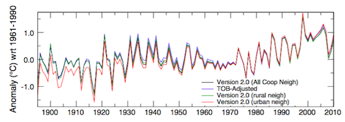
Figure 2. Comparison of spatially gridded minimum temperatures for U.S. Historical Climatology Network (USHCN) data adjusted for time-of-day (TOB) only, and selected for rural or urban neighborhoods after homogenization to remove biases. (Hausfather et al. 2013)
Finally, temperatures measured on land are only one part of understanding the climate. We track many indicators of climate change to get the big picture. All indicators point to the same conclusion: the global temperature is increasing.
See also
Understanding adjustments to temperature data, Zeke Hausfather
Explainer: How data adjustments affect global temperature records, Zeke Hausfather
Time-of-observation Bias, John Hartz
Check original data
All the Berkeley Earth data and analyses are available online at http://berkeleyearth.org/data/.
Plot your own temperature trends with Kevin's calculator.
Or plot the differences with rural, urban, or selected regions with another calculator by Kevin.
NASA GISS Surface Temperature Analysis (GISSTEMP) describes how NASA handles the urban heat effect and links to current data.
NOAA Global Historical Climate Network (GHCN) Daily. GHCN-Daily contains records from over 100,000 stations in 180 countries and territories.
Last updated on 27 May 2023 by John Mason. View Archives


dvaytw @274.
The first criticism, that there is no "global average" temperature, is hardily "fundamental." The word "average" has many meanings. That it is used in a way of which the critic disapproves is of no fundamental importance, except perhaps to the critic himself who is evidently "no statistician."
Given what was said, I guess the critcism is confined to land temperature measurements.
It is true that on land the daily maximum and minimum temperature is all that is recorded. It is the standard practice and dates back to 1772 with the CET. The average of these two readings would then be "the mean recorded temperature" which makes it an average.
The critic appears to be suggesting that an average minute-by-minute daily temperature would yield a result with no global temperature rise. Quite how that could be so is unclear. Both the maximum and the minimum averages have been rising in recent decades. And that the minimums have been rising more steeply than the maximums is symptomatic of increased atmospheric insulation - or an enhanced greenhouse effect.
As for the second criticism, it is pure nonsense. As DSL reminds us, the assertion that urban heat islands have significantly distorted the temperature record is difficult to maintain when the satellite record provides essentially the same result.
dvaytw,
Addressing those points in reverse order:
Figure 5 in the advanced version of this post compares raw data with corrected data, putting the lie to the last claim.
The idea that the average cannot be determined accurately due to sparse samples is disproven by the fact that the same temperature trend can be derived by using approximately 60 rural-only stations (e.g. Nick Stokes' effort referred to in the OP; caerbannog also posts regularly about his downloadable toolkit e.g. comment #8 on this post, which itself is about Kevin C's tool). Anybody attempting to cast doubt on the basis of point 2 really has to explain how the reconstructed record is so robust and insensitive to the particular stations used.
The average = (min+max)/2 temperature issue is irrelevant; all that matters is whether it creates a bias. In the US, where temperatures were recorded by volunteers and the time of day of observation (TOBS) changed over time, it actually does create a bias (a step change to cooler readings at a given station when the change occurs, which caused a reduction in trend over time as the change rolled out), but that can be corrected for, and if it's not, it demonstrably doesn't make much difference. BEST's approach, of simply splitting the station when a step change is detected, deals with this without any correction required.
Finally, a global average is not difficult to work out, but it's also not necessary to compute in order to detect global warming — the issue is the change in temperature not the temperature itself, which is why "temperature anomaly" is always used, and the change is easy to detect. One of the reasons why so few stations are required is that anomalies are strongly correlated over large distances (demonstrated empirically by Hansen et al way back in the 80s) even while the actual temperatures between nearby stations can vary widely (e.g. with altitude and surrounding environment).
I should probably also point out that the "global warming claim" isn't based on "a graph" that shows that "mean annual global temperature" has been increasing. For a start, it goes back over 100 years, with the calculations of Arrhenius that showed increasing atmospheric CO2 concentrations would increase global temperatures, coupled with the fact that we have increased atmospheric CO2 concentrations by about 40% and continue to do so; the graph merely provides evidence to support the theory. Secondly, there's an awful lot more evidence out there than just "a graph". Tell them to look at what's happening in the Arctic sometime.
dvaytw@274:
Your opponent makes this extreme claim:
This "argument" already breaks if it could be shown that there is at least one location where measurements over a long time span have been made with high quality. In fact many institutes or harbours all over the world are sentimentally proud (up and including irrationally proud) of having exactly those measurement series.
Invite your opponent to a search throughout the internet and s/he might find them. But you could even help her/him. For just one example, the "Long-Term Meteoroligical Station Potsdam Telegraphenberg" has a very nice and explaining website. And s/he could even find some very frustrating series to her/his worldview there. As anyone could clearly see by the "annual mean" graph there is a clear trend over the time and this trend is far atop the often cited 0.8/9°C worldwide. This difference is due to one of the predicted outcomes of the enhanced greenhouse effect - higher latitudes will warm up more than the global mean.
But do not hope to convince deniers by facts - here you'll encounter (perhaps) something like "but it is NOT since 1850!" or, if somebody else shows another time serie beginning at around 1840, the goalpost will shift. Or anything else ;-)
Thanks guys for all the tips. My initial tactic was to point out to him that there are so many temperature records showing the same basic pattern; if the measurement system were flawed, errors would be in all directions and there wouldn't be such obvious similarity between them. I also pointed him to a very useful pair of charts: on Wikipedia, 'temperature records by countries'. A quick glance of the 'hottest temperature records' vs. 'coldest temperature records' shows that the former outnumber the latter by a large margin in the last couple decades. So even just looking at that, the trend is pretty obvious.
I have another question, but I don't want to keep bothering y'all for answers, so maybe you could just direct me to the most pertinent article, in response to this point of his:
// ...if anyone wants to claim that CO2 levels in the upper atmosphere are causing ground level increases in temperature, there would need to be much greater warming there, which is demonstrably not happening. //
PS - Moderator, please feel free to delete any of my "please help me with debate" questions to the forum if you feel they are off-topic or don't contribute to the discussion! Thanks in advance!
[JH] We welcome your posts and others like them. The comment threads should, in an ideal world, function as a classroom where honest questions are asked and honest answers are given.
If you have a question and cannot find an appropriate thread to post it on, feel free to post it on one of our "open threads", i.e., the Weekly Digest or the Weekly News Roundup.
dvaytw, in response to the statement that:
I would point out that, first, "skeptics" greatly exagerate the expected amount of warming due to CO2 (and other anthropogenic factors); second, scientists have always expected that other short term factors will cause fluctuations in the increase of temperature so that, over short periods it may be much less than is expected over the long term, or even negative; and that third, a very powerfull short term factor is known to be depressing the rate of temperature decrease, and in fact accounts for nearly all of the discrepancy between the actual temperature increase and that predicted by the models.
With regard to the exageration of the expected rate of warming, this is typically done with graphs such as this one by Murry Salby:
Such graphs may be created in ignorance, by simply scaling the (smoothed) CO2 and Temperature graphs to have a common standard deviation. Such a scaling ignores the fact that annual fluctations in CO2 concentration are too small to significantly effect global temperature, and so on short times variations in CO2 are not expected to match variations in temperature. As a result the scaling does not reproduced the expected temperature increase. That mismatch is exagerated if the match is done between annual (or worse, monthly) temperature variations and a smoothed CO2 curve as done above.
In some instances, however, including that of Salby, the exageration must be deliberate. That is because the same authors show graphs of the expected temperature increase as a function of CO2 concentration over the coming century. As a result, when they show the short term "prediction", they must know that they have changed the relative scales of CO2 concentration and temperature, thereby mistating the predicted increase in temperature from the increase in CO2. This can be seen by comparing the prediction at the scale used for centenial predictions with that used over the last few decades:
As can be seen, with an honest scaling, recent temperature increases have closely matched those predicted by the IPCC Assessement Report 4 (AR4). To avoid any misunderstanding, however, it should be clear that the "prediction" above is produced by simply using the same scale ratio between CO2 and temperature as is used in Salby's centenial comparison, and slightly understates the actual AR4 short term prediction, which was for 0.2 C per decade. Salby's graphic manipulations are discussed in more detail here.
With regard to the expected short term fluctuations, that can be seen in the temperature record up to 2005 (when the short term temperature trend met or exceeded IPCC predictions). During that period, however, there are many short term periods with zero, or slightly negative growth:
Climate scientists are not utter fools. They can read temperature graphs as easilly as anyone else; and could see, therefore, that a prediction of temperature increases without faltering (ie, monotonic increase) was already falsified, and would not be so foolish to frame their predictions in a fashion that was already falsified. The assumption that a short term low trend in temperature increase somehow falsifies AGW, however, tacitly assumes that they were such fools, for it assumes a "hiatus"not greatly different from "hiatuses" that occured before the predictions will falsify AGW.
Nor do climate scientists predict short term fluctuations merely to save appearances. In the CMIP5 model intercomparison for IPCC Assessment Report 5, using the scenario with the strongest warming (RCP 8.5), over 8% of 15 year trends with a start year of 1970 or later, and and end year of 2015 or earlier are smaller than the HadCRUT4 trend since 1998. Indeed, 4.48% are negative and there is one 15 year trend of negative 0.15 C per decade. The prediction of short term fluctuations and hiatuses comes from the models themselves. They are not ad hoc afterthougths. They do not typically show up in statements about predictions because they represent short term chaotic factors that have no influence on the long term trend. Consequently they do not coordinate in position across all models in the ensemble, and do not appear in the ensemble mean. Indeed, the lowest 15 year trend in the ensemble mean over that period is more than twice the HadCRUT4 trend since 1998; but that is because the ensemble mean has eliminated short term non-forced fluctuations while the real world has not. Climate scientists know this, indeed insist upon it. So-called "skeptics", however, blur the distinction whenever possible.
In this regard, it is worthwhile noting that the peak temperature of the 1997/98 El Nino was 0.6 C warmer than the La Nina years on either side of it (see first graph). That is the equivalent of three decades global warming. With ENSO introducing such large fluctuations into short term temperature trends, it is impossible that trends of less than thirty years should consistently show trends near to the long term trend.
Finally, there is, in fact, a known short term non-forced factor that accounts for nearly all of the discrepancy between predicted and observed short term trends. Given the comment in my last paragraph, it will come as no surprise that it is ENSO:
Very clearly, ENSO has had a strong negative influence on the temperature trend since 2006, and arguably since 1998. That ENSO is the major driver of the recent temperature "hiatus". In fact, three very clear lines of evidence demonstrate that beyone reasonable doubt IMO. They are the fact that if you only examine the trends in ENSO equivalent years, all trends are nearly the same and close to that predicted by the models; that if you adjust temperatures for known ENSO states,the result is a trend close to that predicted by the models, and finally, if you constrain a model to match the historical ENSO pattern, it reproduces the historical temperature record. I discuss these points in detail here.
It should be noted that ENSO is not the only known factor that helps explain the reduces recent trends. Tropical volcanism is known to have increased the aerosol load, a factor that should induce cooling if not for a countervailing warming trend. We are also experiencing unusually weak solar activity, which should also have the same effect. Other factors may also have influence, and scientists are examining these factors, and others to determine the relative importance of different factors. But ENSO is the main factor, without doubt. It is sufficiently strong a factor that, if CO2 forcing did not have a significant warming effect, we should be experiencing a significantly negative short term trend in global temperatures, not the weakly positive trend we are currently experiencing.
As I understand the question, it means the questioner expects upper atmosphere to warm. This is a misunderstanding about how the greenhouse works. In fact, the stratosphere is predicted to cool. You might like to look at SoD article on why though though there a number of other resources. However, most deniers are looking for a convenient excuse to ignore science and are unlikely to put the effort needed into understanding this.
Thanks guys for all the tips. My initial tactic was to point out to him that there are so many temperature records showing the same basic pattern; if the measurement system were flawed, errors would be in all directions and there wouldn't be such obvious similarity between them. I also pointed him to a very useful pair of charts: on Wikipedia, 'temperature records by countries'. A quick glance of the 'hottest temperature records' vs. 'coldest temperature records' shows that the former outnumber the latter by a large margin in the last couple decades. So even just looking at that, the trend is pretty obvious.
I have another question, but I don't want to keep bothering y'all for answers, so maybe you could just direct me to the most pertinent article, in response to this point of his:
// ...if anyone wants to claim that CO2 levels in the upper atmosphere are causing ground level increases in temperature, there would need to be much greater warming there, which is demonstrably not happening. //
PS - Moderator, please feel free to delete any of my "please help me with debate" questions to the forum if you feel they are off-topic or don't contribute to the discussion! Thanks in advance!
Sorry, hope this question isn't to far off topic. Today I've read several articles about the moss found on Baffin Island. They said they had determined it was 44K years old from carbon dating. I was just told that when the moss died it would have stopped generating C-14. There is no way to differentiate between dead moss and dead moss covered by ice. So when the researchers can say they have "old" dead moss but they can't say anything about ice unless they can prove that without the ice the moss would have (mysteriously) come back to life and the C-14 started accumulating again.
I have no idea of how carbon dating works on moss so I thought I'd enquire.
I'm not quite sure I understand your question, Stranger. Does it help to consider that neither dead moss nor moss that is in a complete metabolic stasis will replenish C14 from the atmosphere? As well, it's not likely that dead moss exposed to weathering would endure for 44,000 years, not even in a very cold, dry climate.
Maybe if you could point to where you read about this. Was it something to do with this research?
Stranger @23, I assume you are referring to this research, a popular account of which is given here. The same research is detailed more briefly in the link provided by Doug Bostrom.
Given that, all that is required for moss to not accumulate new C14 from the atmosphere is that it be either dead, or unexposed to the atmosphere (ie, covered in ice). There is a slight twist to that. Specifically, if new and living moss grows in the same location as old and dead moss, it will potentially contaminate the age signal, making the older moss appear younger. If you look at this image from the popular report, you will see areas in which new plants is growing by the green colour:
In fact, looking closely, it appears that the new plants are grass rather than moss. That is important for two reasons. First, it makes it easier to distinguish between the old moss and the new growth, thereby avoiding cross contamination. Second, It is my understanding that moss will grow in situations too cold for grass to grow, suggesting a possibility that Baffin Island is now warmer than when the moss was formerly growing, not just when it was ice covered. Of course, that later point depends critically on the species of moss involved, and as the original research is behind a pay wall, I cannot confirm it.
Despite the fact that C14 doesn't distinguish between a merely dead plant, and one covered by ice, the conclusion AGW "skeptics" apparently want to draw from that does not follow. That is because if a soil is not ice covered, and is above freezing for at least part of the year, new plants will grow in it. Those new plants will then show up as having a relatively young age in carbon dating. Thus, for the "skeptic" scenario to make sense, the ice would have had to melt away without temperatures ever rising above freezing. Quite apart from the conundrum in that, temperatures in the area are definitely above freezing for at least part of the year now so even in that scenario, temperatures are still warmer than they have been, likely in the last 110,000 years.
I should note that I am not expert in arctic biota, so there may be some contrived way in which temeratures were briefly warmer in the interval and not shown up based on biology alone. However, the only time since the end of the last ice age in which temperatures may have been warmer is shown by the younger C14 ages across much of the transect to have also been a period when the icecap was growing. (Those younger ages also illustrate my point in the preceding paragraph.)
I should add, the story by Tom Yulsman linked to above, or better, an account by one of the authors of the study would be a wonderful addition to SkS.
Stranger,
In the linked descriptions of the research Dr. Miller, the scientist doing the research, describes the ice caps on Baffin Island as retreating at a rate of 1-2 meters a year. They collect all their samples from the very edge of the ice, less than a meter away. It follows that if the ice retreats a meter a year and you collect your sample from 0.5 meters of the ice that the sample was covered by ice last year. Plants grow very slowly in these conditions so contamination by fresh growth can be eliminated by careful sampling. It is simple enough for the scientists to collect data several years in a row to confirm that the samples were ice covered in the past. Next year you can collect from areas that you document are ice covered this year. For exceptional samples scientists return to the site the next year and confirm their previous result. Tom's picture is of the camp the scientists have. It is not the collection site. In this area the ice does not flow over the ground so old samples have not been disturbed (in most locations flowing glaciers destroy plant samples, that did not happen here). Denier claims that Dr. Miller does not know that that the samples were ice covered in the past are easily shown to be ignorant of the facts. In general, you should question claims that professionals make simple errors that are easily checked. Scientists ensure that their claims are substianted by the data. Is it likely that Dr. Miller would spend months camping on Baffin Island, thinking about the data every day, and make a mistake that could be recognized in one minute by an untrained eye? It is much more likely the deniers have not read the paper and are making up the problems.
The samples are reported variously to be older than 40,000 years and 120,000 old. This is due to the fact that it is not possible to date samples over 40,000 years old using carbon-14. Once samples are 40,000 years old all the C-14 is gone (some scientists claim they can date to 50,000 years ago). The climate 40,000 years ago was much colder than today so the most plausible age is 120,000 years old which was the last time there was an interglacial. (Note that older ages cannot be excluded, the samples could be much older, but not younger, than 120,000 years).
Most of the samples are only about 5,000 years old (easily carbon dated). It is known from other work that it has been getting cooler on Baffin Island for the past 5,000 years (until the start of AGW). This work indicates that climate models have substantially underestimated the warming in this area. That suggests that it will warm more in the future than currently predicted. Those crazy alarmist models, underpredicting warming again!
Thanks Michael and Tom. The article linked was much more informative the the ones I read at Yahoo and other news outlets. The information on the C-14 and the moss was very helpful.
The claim now is that the Arctic has cooled about 1 degree over 5,000 years (with several shorter warm periods between). But the Baffin Island weather station doesn't even show warming from 1970 to present so how can this study claim otherwise?
Stranger,
All the global temperature records show strong warming in the Arctic. This yearly GISS report shows about 1.5 C increase over baseline for the Baffin area in 2011. 2012 is similar. Perhaps you could cite your record that states no warming from 1970 to the present on Baffin Island? I found a reference on WUWT that claims that. Since the sea ice has collapsed in that area the past decade, it is clear that it has been warmer than it used to be. Perhaps WUWT has been cherry picking their data stations again.
Michael, thanks for your comments. I was engaged with someone who most likely saw the WUWT postings. I've hardly ever gone there except when someone at this site links to it.
It seems like when new issues arise I find myself unable to expond on it with someone from the skeptic side who seem to have more experience than I have. The good thing is that when they confond me I'm able to ask you guys to help me see it in a proper context.
So as new issues arise that I'm not familue with I'll make my occasional request to help me out.
[JH] That's what we are here for. Thank you for all that you do.
Stranger @288, if you click on Baffin Island on the map at the Giss Station Data page, you will see a list of nearby stations. If you click on one of those, you will see a graph of the annual temperture data for that station. One example is this, from Frobisher Bay (extreme south of Baffin Island), which definitely shows a trend. So do Clyde, Coral Harbour, Hall Beach, Fort Chimo, and Gothab Nuuk, all selected because they have a complete or almost complete record to 2013 and are within approx 800 km of Frobisher Bay. Many other stations in the area are seriously incomplete, and show apparently no trend. Given that all the stations with nearly complete records and the GISS temperature index for the region all show positive trends, the apparent lack of trend in the incomplete records is likely a function of time period or missing data. However, it is quite possible that you could be shown a temperture series for a station on Baffin Island with little or not trend. There are cherry picking opportunities everywhere ;)
Tom,
Thank you for posting the link to GISS. I wanted to look up that data and did not know the right page.
On WUWT they post only the Clyde data, and they delete the data after 2009 so that it looks flatter. I noticed that you linked all the relevant data and kept in all the data points. Why don't you also only link to the data that appears to support your position best? ;).
I post rarely now because I think your responses are better than mine. Keep up the good work.
Michael, actually, the WUWT graph only extends to 2008. The data available from GISS extends to 2010. However, this is probably only because the copied a graph from a 2009 post on the World Climate Report. The greater contribution to the flatness of the WUWT graph is that they only show summer temperatures, which have not risen as fast as annual temperatures. That is probably because excess energy in summer goes into the arctic ice melt rather than into raising temperatures, as can be seen in this plot of seasonal variation in arctic temperatures based on DMI data:
Thankyou for the compliment, by the way. However, I also enjoy your posts and would like to see more of them.
@292 & 293.
The origin of the Wattsupian graph dates back to the 2009 Axford et al paper on the work at Lake CF8. At the time Wattsupia simply re-posted the World Climate Report nonsense. There is a debunk from 2009 by Dale Husband stating that a quick look at the GISTEMPS data shows the graph is bogus. "That's not even remotely the same chart!" I am presently unable to expand on this as the GISTEMP station page isn't working for me.
MA Rodger @294, the difference between the GISS graph and the WUWT/World Climate Report Graph is that the former is for annual values, while the later is for Summer (JJA) means only. I have downloaded the data, and plotted the graphs myself, and can verify that the WUWT graph is the summer data, as claimed. The claim that the flatness of the summer graph means there has been no warming, however, is simply false. Arctic summer tempertures near ice fields are very constant because of the large amount of ice in the vicinity. The temperature of the ice is, naturally enough, freezing - and prevents temperatures rising more than about 3 C above zero. Excess energy that would have raised temperatures in the absense of ice melts the ice instead.
I should note that WUWT and the World Climate Report correctly identify their graph as being of summer temperatures in each case, so there can be no suggestion that they have passed of summer temperatures as annual temperatures. They have merely misinterpreted the significance of the stable summer temperatures over time.
Hoping this is the right argument/thread for this - as a rank amateur in climate science who logs time in the trenches of conservative message boards trying to engage skeptics on the fence in rational conversation, I continue to run up against folks holding up Mr. S. Goddard's accusations of NASA data fudging courtesy of Dr. Hansen. (I'm not referring to the WUWT-related sea ice debacle, this is brand-new 2013 stuff.)
I won't sully these pages with a link to the nonsense; Google "Goddard Hansen tampering" or just go to his site and you'll find it easily enough. The problem is that I'm unfortunately not statistician enough to refute these charges on a technical platform, so I'm stuck with supplying admittedly ad hom responses pointing out his abyssmal track record and the like.
Could someone provide a concise answer as to where specifically Goddard has been misreading or miscalculating temp data in the last year specifically? More specifically, is the adjustment of the temperature record valid and due to the dropout of poorly cited or obsolete stations, or has there been no adjustment and SG's just misrepresenting the data via improperly constructed graphs, or both?
I've found plenty of explanations for the 2012 debacle, but little re his latest round of histrionics, and would love to know if this is the same deal or some new angle he's adopted. Thanks in advance for any thoughts.
DW
rivetz - It's the same deal, the same nonsense, as has been pushed by climate denialists and conspiracy theorists before. They are claims that corrections for known errors and biases are somehow the result of an Evil Plot, usually tied to Agenda 21 or some other fever dream. And they consist of ignoring known biases, cherrypicking single stations, and other errors.
The adjustments made to the US temperature data, most of which consist of time of observation (TOBS) bias correction, are clearly and publicly documented (see here and here) - the TOBS issue has been a known bias for over 150 years, and its correction entirely justified if you want accurate data.
Here are the various adjustments, along with a link to their public description, documentation, and reasoning. Note the similarity to the data adjustments Goddard and others claim as sinister and underhanded, while congratulating themselves for the discovery! If the people making such claims ever cared to read the documentation they would realize their mistakes.
[Source]
As I've said in previous discussions on the topic, looking at temperatures without correcting for these known and well quantified errors is as foolish as looking for stars without cleaning the dust and oil off your telescope lenses. The results will, in both cases, contain errors.
rivetz @296.
Bar the 2012 post with Gobhard spouting off about US temperatures & discussed @297, I note in a later post from March 2013 it is GISS global temperature that the cretin is getting in a huff over. As examining the ravings of a lunatic is not my favorite pass time, I cannot guarantee that Gobhard is totally out of his tree, but I see no evidence to suggest that he is in his tree.
GISS do not "tamper" but make documented amendments. The only significant amendment since Feb 2012 is the change from using HadOISST to ERSST in January 2013. When I plot the data-copy Goddard shows with the latest GISS data I get the same 1880-2012 graph as Sato did for ERESST-Had+OISST. It is not greatly dissimilar to the plot Gobhard presents 1910-2011.
If there are other posts by the cretin, I would hazard a guess that they are similarly well grounded on another planet (probably the planet Wattsupia).
Siting is irrelevant, the trend line on consistent data collection the only matter of importance.
The evidence is un upward movement in temerature.
Replying to Donny from here.
Except that stations and practises vary worldwide and different times. Furthermore, you are claiming subjectivity when algorithms and methods are published. You asked for consistancy? What is your objection to the BEST methods? What about all the other issues? (Of which change of station is the major one?). What about UHE? Urbanization is not a uniform process?
Oh, and you can do the raw data. See above. Just that no serious researcher would try to draw conclusions from data series that are not comparable. Note also the agreement with proxies like sealevel.